Key Takeaways
- Analogous color schemes revolve around neighboring hues on the color wheel, creating easy harmony in your outfits.
- Layering, proportions, and accent pieces are essential to pull off analogous ensembles.
- Blend texture and fabric choices to keep a look vibrant and distinctive, even with closely related hues.
- Experiment with pattern mixing in harmonious palettes for an out-of-the-box yet unified style.
- From minimalistic daily wear to bolder statements, analogous outfits adapt to any personal taste and season.

Fashion enthusiasts often explore the concept of color balance, yet many overlook the simple charm of analogous color schemes.
By choosing hues that sit next to each other on the color wheel, you naturally create a cohesive, visually appealing wardrobe.
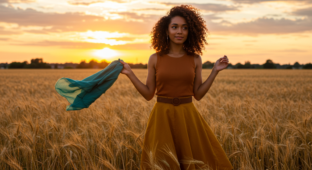
Picture wearing shades of green, teal, and blue: each color flows into the next. These pieces look intentionally put together, but they never clash. Instead, the entire outfit feels polished and pleasantly unified.
When applied to clothing, analogous color schemes allow you to layer garments without feeling overwhelmed by too many contrasting tones.
Because these hues share essential undertones, they look chic when combined in a single ensemble. Whether you prefer subtle transitions of soft pastels or bold leaps between darker mid-tones, analogous color styling offers near-infinite possibilities.
It’s an ideal approach for anyone who wants a sophisticated, harmonious look, while still expressing personal flair. Let’s dive into fourteen sections covering everything from fundamental techniques to advanced tips, ensuring your closet is set for analogous allure in every season.
Understanding Analogous Color Schemes

Importance of Neighboring Hues
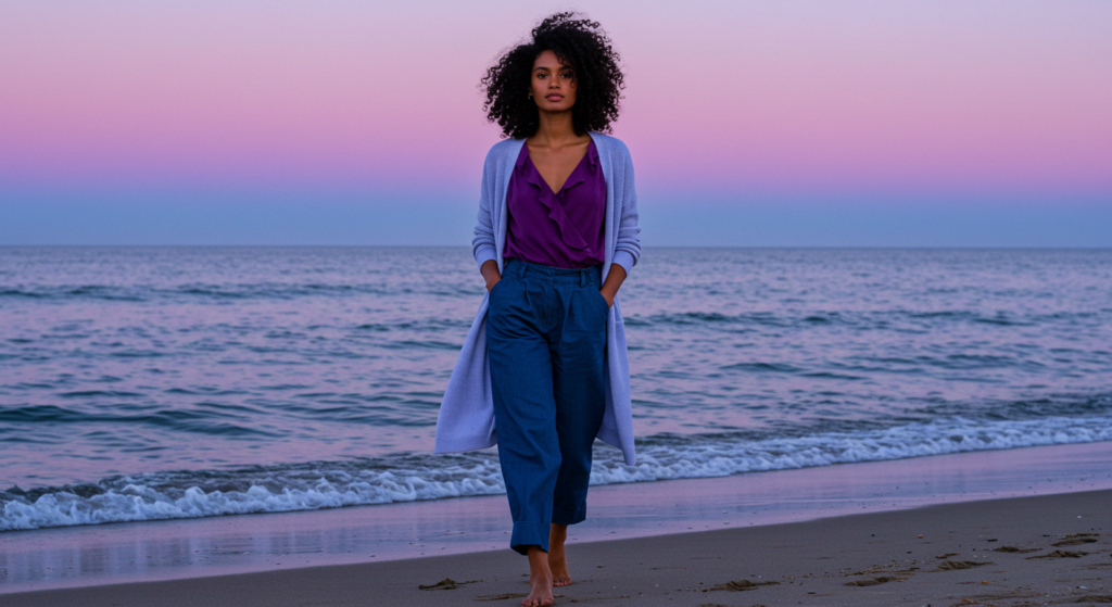
An analogous color scheme typically involves two to four colors that sit next to each other on the color wheel. Think of yellow-green, green, blue-green, and blue in a single outfit.
Because these hues share similar base tones, they feel natural when paired. This continuity offers an inherent sense of harmony, allowing you to mix items without worrying about jarring contrasts.
Beyond ease, the real benefit is the visual flow. When you wear neighboring colors, the outfit looks cohesive from head to toe. It’s like a natural gradient that keeps your look consistent. This can be particularly helpful if you’re new to color coordination but still want a well-thought-out wardrobe.
Classic Examples
Consider a palette of light pink, peach, and soft coral. These tones fall in close proximity on the color wheel, blending warm notes for an appealing outfit.
Another example is navy, teal, and emerald. The cool undertones run seamlessly from one hue to the next. By observing examples like these, you’ll see how effortlessly analogous color schemes bring out the best in each tone.
If you’re a fan of neutrals, try cream, beige, and light brown. Though they may seem muted, they still create a gentle flow that can look both sophisticated and casual, perfect for everything from weekend wear to business-casual ensembles.
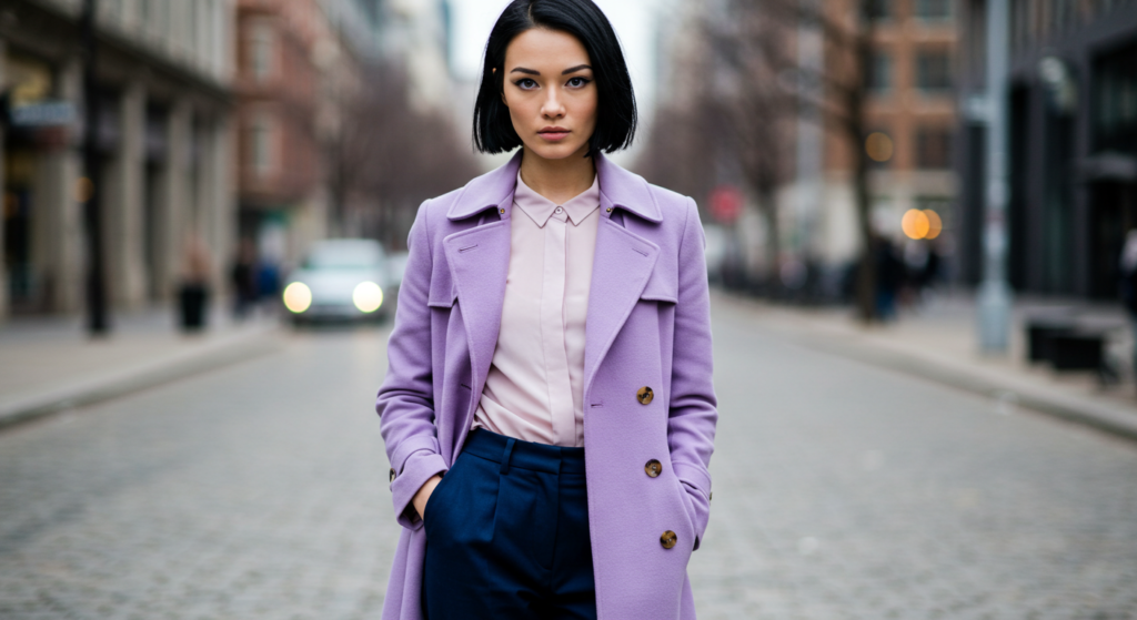
Subtle Transitions vs. Bolder Steps
When choosing analogous colors, you can either opt for gradual shifts or sharper transitions. A subtle transition might involve three pinks of different saturation: pale pink, dusty rose, and fuchsia. This works well for those who prefer understated elegance or a romantic vibe.
On the other hand, bolder steps like gold moving into burnt orange and then deep red can create a more striking look. It’s all about how dramatic you want your gradient to be.
Both methods embrace the same principle of neighborly positioning on the color wheel; it’s just a matter of how you use intensity to express your style.
The Fundamentals of Color Wheel Navigation
Basic Overview of the Wheel
A standard color wheel includes primary, secondary, and tertiary colors arranged in a circular format. Primary hues—red, yellow, and blue—are spaced evenly.
Between them lie secondary colors—green, orange, and purple—each formed by mixing primaries. Further subdivisions appear as tertiary colors (e.g., yellow-green or red-orange).
To form an analogous scheme, pick a slice of the wheel where colors lie in proximity. For instance, if you start with blue, you might naturally move to blue-green and green, or to blue-violet and violet, depending on your preference. This basic wheel knowledge is all you need to begin building harmonious outfits.
Gauging Warm vs. Cool Tones
Warm colors sit on one side of the wheel (red, orange, yellow), while cool colors are on the opposite side (blue, green, purple). Within those halves, you can still create analogous schemes. For instance, you can form a warm yellow-orange-red lineup or a cool purple-blue-green sequence.
Understanding the temperature of colors helps you maintain a consistent vibe. Warm analogous palettes tend to project energy and vibrancy, while cool palettes often evoke a calming, fresh appeal.
Mixing warm and cool can work in a single outfit, but it requires more advanced color balancing—so start with a single temperature range for a straightforward approach.
Identifying Underlying Undertones
Just because two colors are close on the wheel doesn’t always mean they share the same undertone. Blues, for instance, can range from warm turquoise to cool cerulean.
Before finalizing your analogous lineup, inspect whether each hue shares either warm or cool undertones. This step prevents outfits from looking off when the base notes clash.
For a quick check, place two fabrics side by side in natural light. If the pairing seems a bit discordant, they may have mismatched undertones.
If the blend appears smooth and unified, then you’re good to go. By honing this skill, you can build more refined outfits and avoid accidental mismatches.
Using Proportions in Analogous Outfits
The 60-30-10 Principle
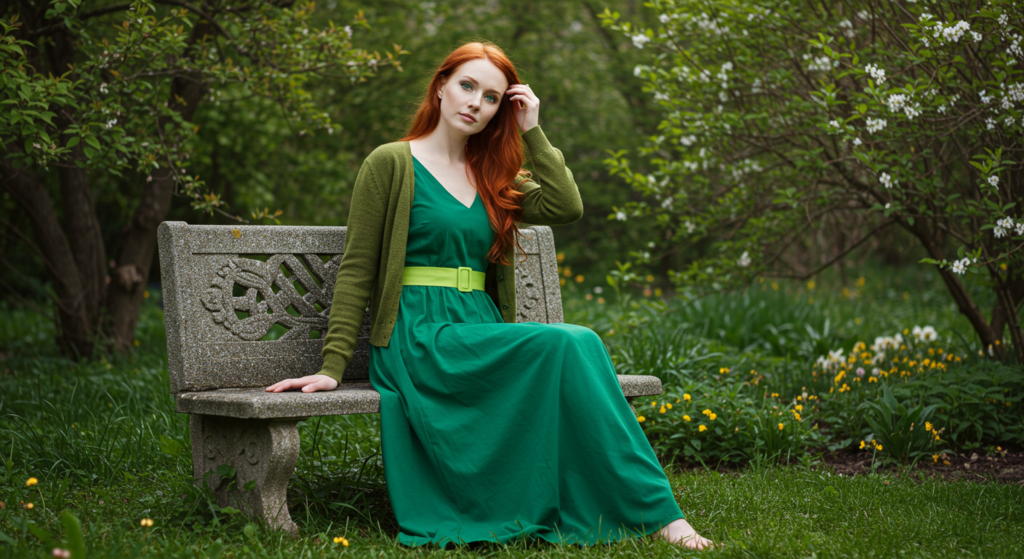
This classic styling rule allocates 60% of your outfit to a main color, 30% to a secondary shade, and 10% to an accent. Let’s say you choose olive as your main color. Then use sage for roughly 30% of your look, and cap it off with a splash of mint for accessories or small details. The result is a layered but uncluttered appearance.
This principle helps you control visual weight, so none of the colors overpower each other. It’s a great tool for ensuring your outfit stays balanced. Plus, deciding on a “hero” hue first can simplify the entire styling process.
Balancing Light, Medium, and Dark Shades
Within an analogous color range, you likely have light, medium, and dark shades. You can distribute them strategically to create dimension.
For example, wear the darkest hue as pants, the medium shade as a top or jacket, and the lightest color for accessories or layering pieces. This keeps the outfit from looking flat, as each hue contributes a unique depth.
You can also invert that approach. If you want a lighter top and a darker pop on top, choose a soft color for your blouse and a bold analogous jacket for contrast. Make sure the third hue sits comfortably in the middle.
Highlighting Focal Points
When wearing complementary or analogous tones, choose which body areas you want to emphasize. If you want to draw attention up to your face, place the brightest or most vibrant color near your neckline. If you prefer to accentuate your legs, choose a bold or deeper color for pants or a skirt, and keep your top a subtler shade.
Focal points can also be an accessory in an accent color that contrasts slightly within the analogous range. For instance, if your core palette is teal and navy, a pop of sky blue in a statement necklace can pull the eyes exactly where you want them.
Layering Techniques for Depth

Outerwear Choices
Layering effectively is a hallmark of good style. For analogous palettes, choose an outer layer that either matches your darkest hue or complements your medium shade. A long coat in a darker tone can anchor lighter garments beneath, while a jacket in the medium shade can unify both darker and lighter elements of your outfit.
Trench coats, blazers, and even denim jackets in a relevant color can become your go-to outerwear. Try mixing textures like wool with silk to avoid a monotonous look. Keep it fresh with varied fabrics that still adhere to the analogous color theme.
Mid-Layers for Transition
Think of mid-layers—like cardigans, vests, or light sweaters—as the bridge between your outerwear and base layers. If you’re working with a three-color scheme, the mid-layer is a great place to incorporate the second color. This ensures the top color doesn’t overwhelm and the base color still has room to shine.
For instance, if your main color is burgundy and your accent is rose, use a magenta sweater as a mid-layer to connect the two. This seamless blend enhances the overall outfit flow without creating blocks of color that feel disconnected.
Under Layers and Base Pieces
Your base layer is usually the top or bottom that touches your skin. This could be a turtleneck, a fitted tee, or any foundation garment.
Keeping this layer in your lightest shade can help it blend naturally under darker or more saturated hues. Alternatively, if you want to ground the outfit, choose a dark base and build lighter layers on top.
When adding complementary textures like lace, ribbed cotton, or knits, you get an extra layer of visual interest without stepping outside the analogous color family. This detail can make even the simplest outfit feel more dynamic.
Accessorizing with Analogous Colors
Jewelry and Metallic Accents
Accessories are a subtle way to play with analogous colors. If your outfit leans toward the cool side, silver or white-gold jewelry often feels more in sync.
For warm palettes, gold or rose-gold can enrich the look. When working with multiple metallics, ensure they don’t clash with your chosen colors.
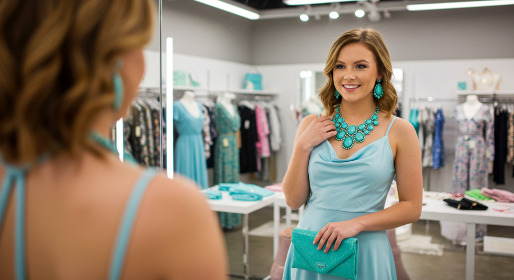
Try picking jewelry with small gemstones or details that match or slightly contrast your main palette. If your base colors are variations of blue, choose a ring with a turquoise stone to tie everything together in a refined manner.
Handbags and Belts
A handbag in an accent color can elevate the entire outfit. If you’ve kept your main outfit in two analogous shades, let the third hue shine through your bag. Similarly, belts can be a great way to break up the color flow, especially when you want to define your waist or hips.
Opt for a belt that is a hue lighter or darker than your pants or skirt for a subtle but effective highlight. If you’re wearing a triple analogous palette, the belt can act as the final puzzle piece that ties the color story together.
Footwear and Other Finishing Touches
Shoes, scarves, hats, and even nail polish can be used to incorporate your third or fourth color. If you’re playing with a green-focused palette (like lime, sage, and forest), you could wear forest green shoes while your top is sage. A lime-colored clutch or scarf completes the trifecta.
These details are crucial for making your outfit look intentional rather than accidental. People notice the consistency, even if they can’t quite pinpoint what makes the ensemble so stylish.
These finishing touches also give you room to experiment without investing in large new wardrobe pieces every season.
Mixing Patterns Within Analogous Schemes
Selecting the Right Scale of Prints
When you mix patterns in analogous color schemes, the key is scale. If you choose a bold floral print in one color, pair it with a smaller stripe or geometric design in the neighboring shade. This layering of patterns keeps each piece distinct without overwhelming the senses.
Large prints often serve as statement items, so place them in areas of your body you want to highlight. Conversely, smaller patterns work better in a supportive role, complementing the main design.
Balancing Negative Space
Negative space refers to the solid or less busy areas around a print. If your first item has an all-over pattern, choose a second piece with a simpler design or more negative space in the same or neighboring color. This ensures your outfit isn’t a clash of too many intense patterns.
For instance, if you have a wide stripe top in teal and navy, pair it with a skirt that has a thin, subtle polka-dot pattern in aqua and teal. The negative space on each garment gives the eyes a place to rest, creating a harmonious blend.
Coordinating Patterns with Solids
Sometimes, you might want just one patterned piece in your outfit. In that case, use solids for the other garments, all in analogous hues.
For example, if you have a stunning floral blouse in pastel pink, fuchsia, and burgundy, then pick solid burgundy pants and a pastel pink jacket. You can add a subtle fuchsia belt for that accent.
This approach highlights the patterned piece as the star of the look, while the complementary solids bolster the cohesive feel. It’s a simple yet effective technique that keeps you from looking too busy.
Analogous Palettes for Different Seasons
Spring Lightness
In spring, lean on gentle, fresh hues like baby blue, mint, and soft turquoise. These colors feel airy, matching the lively atmosphere of the season. Lighter fabrics like cotton or linen in these shades keep you comfortable. Add a pop of pastel pink or lavender if you want a slight contrast.
Accessories such as light scarves in pastel tones can tie it all together. Since spring can still have chilly days, layer with a lightweight jacket in a medium hue like sky or seafoam for a well-rounded transitional look.
Summer Vibrancy
Summer calls for bolder, brighter analogous palettes. Think cobalt, royal blue, and teal. The sunny vibes make it the perfect time to experiment with eye-catching color saturations. You can even bring in touches of lime or aqua for a cool, refreshing twist.
Flowy dresses, capri pants, and breezy tops all lend themselves to this colorful approach. If you’re a fan of beach-ready outfits, try a sarong or cover-up that includes all the neighboring hues in a fun, tropical print.
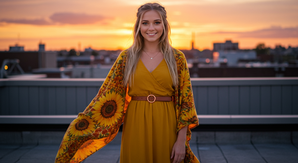
Autumn Warmth and Depth
For fall, turn to a lineup of warm, earthy tones like burnt orange, rust, and deep red. These hues mirror the changing foliage. Incorporate cozy fabrics like wool, cashmere, or heavier cotton knits. Complete the look with boots or a scarf in a shade like maroon to keep the color story intact.
Layering becomes more crucial in autumn. A rust coat, a deep orange sweater, and a burgundy scarf can create a tri-color analogous outfit that looks beautifully seasonal.
Coordinating Analogous Palettes for Various Skin Undertones
Cool Undertones
If your skin leans cool, opt for analogous combinations on the cooler side of the wheel. Think blue, blue-violet, and purple or even blue-green, teal, and navy. These shades emphasize the natural pink or rosy undertones in your skin, giving you a bright, healthy glow.
A tip: incorporate a lighter highlight color near your face—like a pastel lilac—to reflect a subtle radiance. This helps you avoid any potential dullness when wearing darker cool shades.
Warm Undertones
Those with warm undertones tend to shine in earthy, rich colors—like olive, chartreuse, and khaki, or gold, mustard, and marigold. These hues echo the golden undertones in the skin, appearing seamless and radiant.
If you want to go bold, adding a rust or terracotta accent can intensify the warmth. Choose fabrics with a slight sheen—like satin or silky finishes—to amplify that glow even more.
Neutral Undertones
People with neutral undertones can explore both warm and cool palettes without much difficulty. You can wear an analogous set of beige, camel, and light brown one day, and switch to teal, green, and blue the next. The sky’s the limit.
Experiment to see which side of the spectrum you prefer. Neutrals often act as style chameleons, comfortably wearing everything from pastels to jewel tones. Don’t be afraid to break so-called “rules” and try unexpected combos.
Elevating Everyday Wear with Analogous Colors
Casual Denim Approaches
A great way to ease into analogous outfits is by using denim as either a neutral or a part of the color story if it’s a distinct shade. Classic blue jeans can pair with light blue and navy layers for a triple blue ensemble. The subtle variations in denim washes can make the outfit feel dynamic yet relaxed.
If you’re adventurous, pick colored denim in soft teal or burgundy to form part of your scheme. Just ensure you choose a top in a closely related shade to maintain the analogous vibe.
Everyday Layering
For everyday wear, think about how you can rotate knits, tees, and jackets in related colors. Instead of always defaulting to black, consider a monochromatic base of different blues, topped with a slightly different shade in a cardigan. Add an accent scarf in a neighboring hue to bring it all together.
Because these colors are so harmonious, you can create a layered look that feels both comfortable and stylish. Even small, everyday details like socks or hair accessories can tie into your analogous palette for a polished look from head to toe.
Balancing Comfort and Style
Analogous dressing doesn’t have to be high-maintenance. Even if you’re going for a casual style—like leggings and an oversized sweater—you can still apply these principles. Pick leggings in a medium hue, pair them with a lighter sweater, and add a darker vest or jacket in the same color family.
Keeping your wardrobe in cohesive hues can also help you mix and match quickly, reducing the dreaded “I have nothing to wear” scenario. When all your pieces coordinate, you save time and effort, yet still look put-together.
Analogous Color Schemes for Work and Business Settings
Sophisticated Suit Pairings
In business attire, you might think only neutrals are suitable, but you can integrate analogous colors without compromising professionalism. Opt for a navy suit jacket, midnight pants, and a slate or powder blue blouse. The result is refined yet visually engaging.
If you lean toward warmer tones, consider a dark brown blazer with a camel trouser and a beige shirt. Make sure the darkest hue is the most formal piece (e.g., the blazer), so it anchors the outfit in a professional manner.
Subtle Statements with Accessories
If your workplace is more conservative, you can keep your main suit neutral but add a tie, pocket square, or scarf in an analogous set of hues. For instance, a charcoal suit with a tie that shifts from deep teal to emerald can add that refined pop of color.
Women can apply the same principle with scarves, belts, or even a subtle pattern on a blouse. The trick is to select neighboring colors that look complementary but understated, so you don’t stand out more than you’d like in formal settings.
Dress Codes and Adaptations
Always keep your company’s dress code in mind. If bold color is frowned upon, stick to muted or soft analogous palettes. You might choose subtle variations of grey, blue, and blue-grey, creating an almost monochrome appearance with just enough difference to keep it interesting.
However, if your office environment is creative, feel free to push the boundaries. A maroon blazer, a burgundy blouse, and a plum pencil skirt can showcase your sense of style while still adhering to a polished silhouette.
Incorporating Texture and Fabric Variety
Matte vs. Glossy Finishes
Textures can elevate analogous outfits and prevent them from blending into one big color block. For instance, pair a matte sweater in teal with a shiny satin skirt in aqua. The contrast in finishes gives each piece its own spotlight, even though they share neighboring hues.
Glossy materials like silk or sateen reflect light differently than matte textures like denim or cotton. Using both in the same color family adds dimension without relying on color contrast alone.
Layering Heavy and Light Fabrics
Combining heavier fabrics—wool, leather, or thick denim—with lighter materials like chiffon or lace keeps your outfit interesting. Imagine a burgundy leather jacket layered over a magenta chiffon top. Both shades are analogous, yet their fabric differences create a compelling balance between tough and delicate.
In transitional seasons, this method helps you adapt to fluctuating temperatures. You can add or remove layers while keeping your outfit’s color story intact.
Coordinating Patterns with Fabric Textures
When you already have a bold pattern, choose a simpler fabric in a complementary hue for another layer. For example, if you have a striped wool skirt in green and teal, pair it with a smooth, solid teal blouse. The wool’s thickness contrasts nicely with the blouse’s sleekness, keeping the overall ensemble visually rich.
This approach also works in reverse. If you have a velvet top in burgundy, consider matching it with a patterned pant in a lighter burgundy or rose. The difference in texture adds depth, while the analogous color palette ties everything together beautifully.
Color Blocking vs. Analogous Blending
Definitions and Distinctions
Color blocking involves pairing two or more solid blocks of color in one outfit, often with stark contrasts. Analogous blending, on the other hand, focuses on smoothly transitioning between related hues. Color blocking can sometimes be jarring, especially if the colors are complementary (opposites on the wheel).
Analogous blending offers a gentler approach. Even if you apply color blocking techniques with analogous shades, the effect is less abrupt because the colors share common undertones.
Applying Color Blocking Techniques with Neighboring Hues
You can still color block within an analogous palette. For instance, wear a crop top in light pink, a high-waisted skirt in fuchsia, and a jacket in deep burgundy. Though this is a clear color block (separate pieces of distinct colors), the adjacency on the color wheel prevents the outfit from looking too loud.
This strategy is great if you like bold outfits but want a more cohesive, sophisticated edge. The transitions between pink, fuchsia, and burgundy flow smoothly, even as distinct panels.
Pros and Cons
The advantage of analogous color blocking is its inherent harmony. You’re less likely to create a disjointed outfit, and it’s easier to work with since you don’t have to fine-tune complementary hues. However, you lose some of the drama that contrasting colors bring.
If you aim for a balanced approach that still feels vibrant, combine small blocks of a slightly contrasting hue—like adding a peach accent in a pink-red scheme. This micro-level color blocking within an otherwise analogous outfit can produce a lively, multi-dimensional look.
Formal and Special Occasion Styling
Evening Gowns and Suits
For formal events, an analogous color scheme can look spectacular. Picture a flowing emerald green gown layered with a jade shawl, accented by mint accessories. This tonal harmony exudes elegance. Men can try suits in dark navy with a royal blue tie and a subtle light blue pocket square for a cohesive, polished outfit.
To elevate the glamour, choose luxurious fabrics—like silk, satin, or velvet—and incorporate jewelry that either matches or offers a slight metallic contrast. Let the richness of the color family speak for itself without overloading on extra details.
Bridesmaid Dresses
Brides often want a bridal party with dresses that complement rather than compete. Analogous color palettes can be a bride’s secret weapon. Assign each bridesmaid a hue from a shared section of the color wheel, like blush, dusty rose, mauve, and wine. The result is visually interesting without clashing.
Bouquets, boutonnieres, and decor can follow the same palette, tying the entire event together. It’s an easy formula that ensures your wedding photos have a harmonious feel.
Black-Tie Accessories
When the dress code calls for black-tie apparel, you can still bring analogous flair through accessories. A black tuxedo can be paired with a vest and tie in shades of navy or midnight blue. A floor-length black dress can gain new life with a wrap or shawl in graduated hues of purple or green.
This adds a subtle pop of color that stays classy. If you’re hesitant, keep the color limited to a single accessory, like an evening clutch or a statement piece of jewelry.
Advanced Tips for Analogous Dressing
Going Beyond Three Colors
Many people stick to two or three colors for simplicity. However, you can expand to four or five if they sit close on the wheel. For instance, yellow-green, green, blue-green, blue, and blue-violet might seem like a lot, but they blend smoothly if used with restraint.
When dealing with an extended palette, pick one color as your anchor—often the darkest or the lightest—and let the others come in as accents or midtones. This prevents the outfit from appearing chaotic.
Layering Different Saturations
Mixing saturations can add depth to your outfit. A bright teal jacket, a muted teal blouse, and a pastel teal skirt still form an analogous look but with varying intensities. This keeps your ensemble from looking monotonous, even if it’s essentially the same color repeated.
Pick one saturation as your focal point. If you choose a vivid teal jacket, keep the rest in softer tones for balance. This approach is especially useful when you want to create a dramatic effect using just one color.
Texture Blocking as a Complement
Aside from color and pattern blocking, you can block textures. Wear a chunky knitted sweater in a mid-range hue, paired with a sleek satin skirt in a lighter or darker shade. Although you’re staying in the same color family, the textural difference acts like a color contrast, highlighting each piece in a new way.
For a finishing touch, add a small accessory—like a structured leather clutch—in a matching hue. The mixture of knit, satin, and leather in neighboring tones transforms your outfit into a fashion-forward statement.
DIY and Budget-Friendly Analogous Styling
Thrifting and Upcycling
To explore analogous color schemes without breaking the bank, consider thrifting or upcycling. Vintage stores often have unique pieces in interesting shades. If you come across a teal skirt but can’t find a matching top, grab a plain white tee at the same shop and dye it in a shade that complements the skirt.
This approach not only saves money but also lets you personalize each piece. You control the exact hue you want, ensuring it lines up perfectly on the color wheel.
Capsule Wardrobes
A capsule wardrobe with an analogous twist can simplify your daily routine. Pick a color slice you love—like variations of grey, blue, and green—and curate all your main pieces within those hues. This way, everything matches, giving you endless outfit combos while maintaining a harmonious aesthetic.
In a capsule, each item should be versatile. A teal blouse can go with navy trousers, a mint skirt, or a grey pair of jeans. By limiting your color range, you actually expand your styling possibilities.
Accessory Swaps
Not ready to commit to multiple clothing items in one color scheme? Start small. Get scarves, belts, hats, and jewelry in a tight range of analogous hues. Rotate them around your existing neutral clothes. This method is cost-effective and less intimidating if you’re new to color experimentation.
Your black or white basics become the canvas for your seasonal color shifts. For fall, choose warm accessories in rust, copper, and burgundy. In spring, swap them out for pastel accessories in lilac, periwinkle, and sky.
Troubleshooting Common Pitfalls

Avoiding a Flat Look
One risk of analogous styling is that everything can blur together if not managed correctly. Counter this by using at least one contrasting element. Even a minimal shift in fabric texture or a lighter accent color can help break up an otherwise uniform look.
If you feel your outfit looks too one-note, consider introducing a small pop of a neutral like white or black. This small addition often brings clarity and definition, making your main colors stand out.
Over-Accessorizing
When colors are already close together, wearing too many accessories can overwhelm the ensemble. If you have an analogous color story in your clothing, limit your accessories to one or two standout pieces in a supportive hue.
For example, if your outfit is a blend of olive, sage, and lime, a single statement necklace in lime and a pair of simple sage earrings might be enough. Too many large or contrasting accessories could detract from the cohesive look.
Clashing Undertones
Despite colors being neighbors on the wheel, undertones can still clash. Always double-check your pieces in natural lighting before wearing them. If something seems off, see whether it’s the temperature or the saturation level. A small tweak—like exchanging one piece for a warmer or cooler alternative—can make the whole outfit click.
If you still find it challenging, try adding a bridging piece, like a mid-layer in a neutral tone or in a shade that precisely sits between the two clashing hues.
Conclusion
Analogous color schemes offer a smooth path to harmonizing your wardrobe. By focusing on neighboring hues, you reduce the guesswork that comes with balancing multiple colors.
Whether you’re layering for a casual brunch, dressing up for formal events, or curating a polished work look, an analogous palette brings visual unity without monotony.
You can add excitement with textures, patterns, and varying saturations, ensuring each outfit feels fresh. With a bit of practice, you’ll find that analogous dressing streamlines your style choices, letting you confidently experiment without risking color clashes.
From everyday denim to elegant gowns, a well-planned, neighborly palette can amplify your personal flair—truly capturing the allure of harmonious color schemes in clothing.
Summary Table
| Aspect | Key Insight |
|---|---|
| Selection of Colors | Pick hues adjacent on the color wheel (2-4 colors) for a unified look |
| Proportion Rules | Use 60-30-10 for balanced color distribution |
| Layering | Vary textures and light-to-dark gradients to add dimension |
| Accessories | Incorporate small pops of a third or fourth analogous hue for a polished finish |
| Patterns | Mix patterns by balancing scale and ensuring enough negative space |
| Seasonal Adaptation | Adjust warm or cool slices for spring, summer, autumn, or winter |
| Formal Styling | Combine luxurious fabrics with subtle accessorizing for black-tie or special events |
| Troubleshooting | Avoid flat looks, over-accessorizing, and mismatched undertones with thoughtful fabric, accent, and lighting checks |
FAQ

Q: Can I use neutrals with my analogous color palette?
A: Absolutely. Neutrals like white, beige, grey, and black can help ground your outfit. They act as a supporting cast that highlights your main analogous colors while offering contrast and clarity.
Q: What if I only like wearing two colors rather than three or four?
A: Wearing just two neighboring colors still counts as an analogous setup. You don’t need a third or fourth color for harmony, though it can add depth. Feel free to keep it simple if that suits your personal style.
Q: How do I quickly find which colors are next to each other on the wheel?
A: You can look up any basic color wheel online or pick up a physical one from a craft store. Identify your favorite color, then glance at the hues directly adjacent to it. Those are your prime candidates.
Q: Is it still analogous if I vary the saturation levels?
A: Yes. Playing with different saturations—pastel vs. vivid—still keeps you in the analogous family as long as the core hue is similar. It adds extra visual interest without losing that smooth color flow.
Q: Do I need to match makeup to my analogous palette?
A: It’s optional. Some people enjoy matching their lipstick or eyeshadow to their outfit’s color scheme for a unified look, while others prefer neutral makeup. It’s a personal choice. If you do match, keep the makeup subtle, so it complements rather than competes.
Q: Can I incorporate metallics?
A: Definitely. Metallic elements, such as gold or silver, can be a wonderful accent. Choose metals that reflect the temperature of your main palette—gold for warmer hues, silver for cooler tones—or mix them up in a subtle way if you’re feeling adventurous.
Q: How can I transition an analogous outfit from day to night?
A: Swap out a casual item for something dressier. For instance, if you wore flats and a lightweight cardigan during the day, switch to heels and a structured blazer in one of your analogous shades for a night out. Add or modify accessories to amplify sophistication.
Q: What if I get bored with the same slice of the color wheel?
A: You can rotate to a new slice that still resonates with your style. If you spent a season in blue-green territory, try pink-red next. You can also explore varying intensities or throw in a bridge color that nudges you toward a slightly different neighborhood on the wheel.
Q: Will analogous outfits make me look taller or slimmer?
A: Using a vertical column of closely related colors can create a lengthening effect because the eye moves smoothly from top to bottom. While individual body shapes vary, a unified color story generally provides a visually sleek silhouette compared to abrupt contrasts.
Q: Can men use these tips too?
A: Definitely. Analogous color dressing isn’t exclusive to any gender or style. Men can use these same strategies for casual, business, or formal wear by choosing neighboring colors for shirts, ties, blazers, or pants.
Enjoy experimenting with analogous color schemes and watch your wardrobe come to life with harmony and style!
Joanna Perez, with a degree in Creative Writing, excels in recommending distinctive clothing color mixes and trends that deeply connect with readers. She simplifies the often daunting task of color selection, making fashion decisions more personalized and impactful. Her passion for vibrant color palettes and the stories they tell makes her an indispensable voice in the fashion community.
Reviewed By: Marcella Raskin and Anna West
Edited By: Lenny Terra
Fact Checked By: Sam Goldman
Photos Taken or Curated By: Matthew Mansour
