Key Takeaways
- The Age of Enlightenment changed how people saw knowledge, government, and art.
- Many thinkers embraced reason and analysis, leading to social and cultural shifts across Europe.
- White shades appeared in clothing, architecture, and design to show clarity, order, and status.
- Philosophical hues, such as gentle blues or muted grays, gained new meaning in manuscripts and paintings.
- Visual choices during this period reflected curiosity, devotion to learning, and a wish for a brighter society.
- This article explores the era’s main ideas, color uses, and country-based examples without repeating common color psychology themes.
- Readers will find practical examples, helpful tables, and a summary that highlights each section’s takeaways.
Introduction

Why did white gowns, pale backdrops, and pastel details show up so often during the Age of Enlightenment? Was it a pure aesthetic preference, or did it tie to deeper convictions and philosophical changes? Many people see this era as a time of reason, scientific curiosity, and bold new ideas. Yet its color choices also played a part in communicating status, formality, and a forward-looking attitude.
Thinkers like Voltaire or Diderot wrote about liberty and reason. Meanwhile, architects and decorators used crisp whites or simple hues in stately buildings. Scholars studied ancient texts, tested new theories, and wore clothes that often showcased bright linen. Painters moved away from darker backgrounds toward lighter ones. Their color choices matched fresh ways of thinking, as if sunshine had finally broken through centuries of gloom.
This post will cover 14 sections, each split into three smaller parts. Readers can expect a thorough look at how the Age of Enlightenment influenced color choices.
We will trace the role of different European countries, highlight how certain white tones carried symbolic weight, and explain how philosophical hues became more than simple pigments. By the end, we hope to leave you with a broad grasp of how these shifting colors tied to larger social and cultural changes.
Cultural Seeds of the Age of Enlightenment

Intellectual Sparks
Why did the Age of Enlightenment even begin? One factor was the desire for knowledge beyond the constraints of old traditions. New scientific findings drew attention in cities such as London and Paris.
Philosophers questioned assumptions and proposed new ways to interpret life, law, and government. This fresh outlook inspired many to re-examine everything from political rights to everyday style. When folks get curious, it often shows in their surroundings, including the colors they choose to wear or paint on their walls.
Print Revolution
Books and pamphlets were more accessible, thanks to improved printing techniques. This greater supply of printed works brought radical ideas into broader circles. People read essays on reason, morality, and human rights, then gathered for lively talks in salons or coffeehouses.
The printed page itself evolved. Publishers introduced layouts that relied on black ink over white pages, with small decorative flourishes that aimed for a refined style. Even the paper’s whiteness carried a message of clarity and brightness, reflecting the era’s goal of shining light on hidden truths.
Cross-Cultural Exchange
European cities thrived on trade networks. These routes introduced new pigments from Asia or the Americas. Merchants brought not only spices and textiles but also tales of different customs. This cultural mixing shaped how colors were viewed and used. For instance, imported blue dyes once seen only in limited circles gained broader popularity. White fabrics, made from imported cotton or refined linen, took on new forms in both formal and casual clothing, linking local tastes to international commerce.
White as a Symbol of Reason

Architectural Minimalism
During this era, stately homes and public buildings sometimes opted for simple facades. Architects favored pale or neutral walls to stress proportion and harmony. White marble or lighter stone found a place in entryways and columns. This stripped-down approach reminded some of the classical structures of ancient Greece and Rome. White’s use told a story of balance and logic, core ideals that guided these designers.
Fashion Trends
What did people wear? Upper-class individuals often sported lighter outfits, including white ruffled shirts, dresses, or powdered wigs. Crisp whiteness was seen as a mark of refined taste. But it wasn’t all about snobbery. Many also felt that donning white garments showed an embrace of the new age’s pure ideals. Tailors learned to treat linens and cotton to boost brightness, a move that gave wearers a sleek, fresh look.
Ceremonial Spaces
Think about large halls or ballrooms. Many were decked out with white paneling or gilded accents. Chandeliers scattered light across pale walls, making everything glow. In certain gatherings, that brightness was practical. It let people see each other’s faces, read manuscripts, or engage in spirited debates. White sets a stage for dialogue, capturing the hope that reason would bring clarity to human thought.
Philosophical Hues: Beyond Plain White
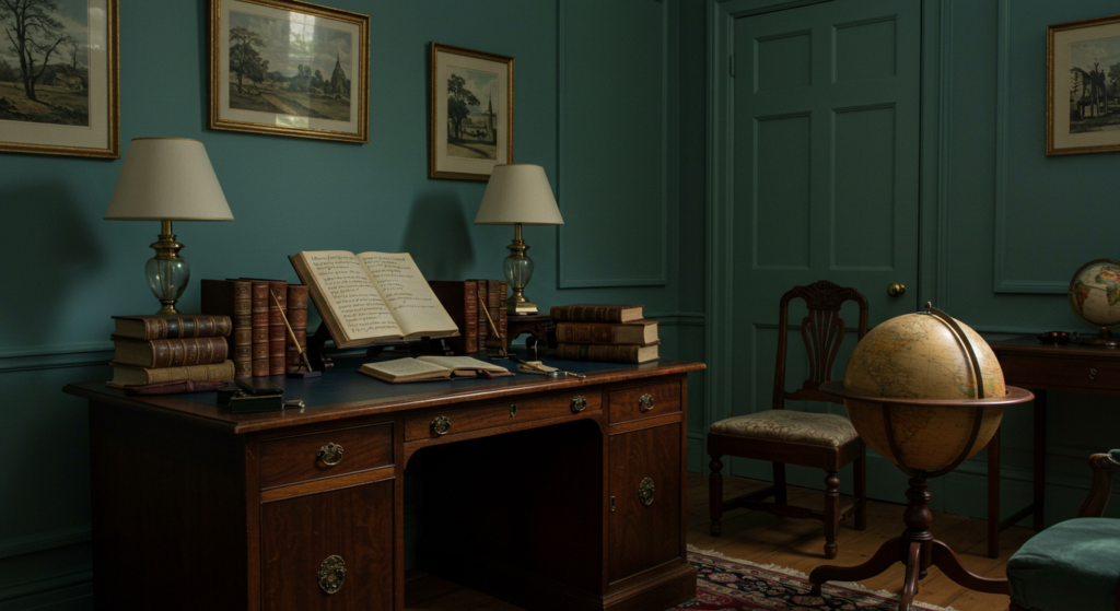
Soft Blues
Scholars sometimes chose gentle blues in their studies or libraries. This hue, while not the standard for big gatherings, offered a serene backdrop for reading and writing. Many believed it complemented the calm focus needed to dive into complex texts. Manuscript covers or bindings often showed understated blue, a nod to the Age of Enlightenment’s emphasis on measured thought.
Muted Greens
Was green popular in Enlightenment spaces? Certain writers mention that green drapery or rugs graced reading rooms. People claimed it helped the eyes rest after long hours peering at pages. The color also nodded to nature’s role in nurturing new ideas. Folks sensed that a link to the outdoors reminded them that science and reason start with observing the natural environment.
Gray Undertones
Some Enlightenment portrait painters added gentle gray in backgrounds or clothing details. This color balanced bright white collars or cuffs, giving depth without overshadowing the subject. A thoughtful scholar might be depicted wearing a gray suit, leaning on a desk with white papers nearby. The subdued tone suggested practicality, discipline, and a focus on intellect rather than flashy display.
France: Heart of Enlightenment Chic
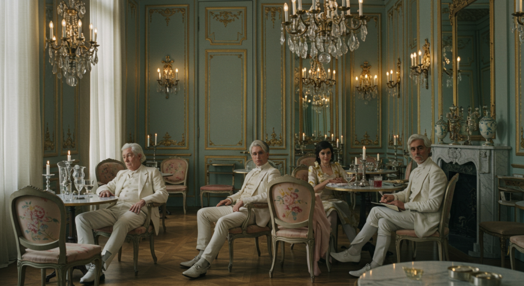
Salons and Gatherings
In Paris, aristocrats and intellectuals convened in elegant salons. These rooms were known for plush furniture set against pastel walls. Hosts chose delicate whites or pale yellows to highlight fine artworks. Thinkers like Voltaire might step inside, share ideas about government or human rights, and see the entire place bathed in soft candlelight. These spaces combined style with substance, each design choice meant to spark both comfort and conversation.
Courtly Dressing
French court fashion was elaborate, and white took center stage in many garments. Ribbons, bows, and lace details were common. Lighter colors signaled sophistication, while the cut of the outfit revealed the wearer’s status. The Enlightenment’s fondness for clarity seemed visible in these pristine fabrics. Though certain dresses or coats were lavish, the emphasis on pale hues revealed an urge to stand out, using white as a backdrop for subtle accent colors like gold or faint pink.
Royal Patronage
Royal figures sponsored artworks that captured Enlightenment themes. Painters highlighted gentle shades that evoked reason and calm. Royal residences displayed marble floors or grand staircases in cool, pale tones. The monarchy, though steeped in tradition, encouraged an aesthetic that matched the intellectual energy swirling in French society. White walls and luminous colors provided an ideal setting for witty dialogue, musical performances, or philosophical banter.
England: Rational Tones in Public and Private

Coffeehouses
While Paris had salons, London had coffeehouses. These spots were less gilded but equally vibrant for debate. Patrons sipped coffee or tea, scanning newspapers beneath whitewashed walls. This bright setting kept discussions lively. Intellectuals, merchants, and curious townsfolk could stand and argue about politics, science, or new inventions. White helped reflect lamp or candle glow, letting people read well into late hours.
Townhouse Facades
Georgian architecture featured a balanced look. Builders used brick exteriors with crisp white window frames and trim. This style combined function with neat aesthetics. White lintels and columns made a statement against darker brick, hinting that order and proportion mattered. The choice underscored a shared Enlightenment belief: practical design can still be tasteful.
Literary Circles
In private libraries, many English writers gathered to share manuscripts. Subtle off-white wallpaper or pale curtains let volumes and readers take center stage. Thinkers pored over treatises on government or updated translations of ancient texts. A calm interior guided concentration and encouraged the exchange of fresh ideas. Even small color choices, like lighter book bindings, aligned with the era’s rational approach.
Germany: Scholarly Hubs and Light-Filled Spaces
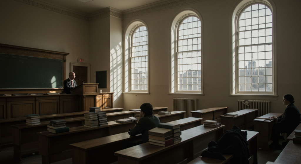
University Influence
Centuries-old universities in places like Halle or Göttingen gained repute during the Age of Enlightenment. Lecturers promoted reason and methodical inquiry. Whitewashed classrooms, large windows, and uncluttered decor tried to keep minds sharp. People believed that brightness improved alertness, vital for dissecting new or controversial arguments. This setting mirrored the drive for objective study.
Music and Composers
German-speaking lands produced famous composers who thrived in bright concert halls. White or pastel backgrounds let listeners focus on the music instead of ornate surroundings. Though some venues still featured baroque flourishes, a shift toward simpler designs began to appear. These spaces felt expansive and airy, matching the uplifting spirit of the era’s compositions.
Private Salons
Across various German courts, smaller salons offered pockets of thought. Walls might be pale green or soft cream, with modest furnishings. Guests gathered to discuss philosophy, read letters from prominent thinkers, or review the latest papers. White or subdued backdrops gave a blank canvas for bold conversation. The concept of reason guided the color palette: uncluttered and balanced.
Italy: Tradition Meets Enlightenment Glow

Artistic Evolutions
Italy housed a long tradition of frescoes and rich color. But as Enlightenment thought spread, some artists experimented with lighter tones. Paintings with religious subjects retained bright gold or strong hues, yet new portraits or secular scenes introduced gentle whites. This created contrast and set a stage for modern ideas to emerge within classic forms.
Printing Centers
Cities like Venice maintained printing centers that circulated advanced works. Workers found better inks and smoother paper stocks. The whiteness of paper mattered. Readers wanted crisp text that symbolized fresh thought and clarity. Business owners recognized that well-printed books, paired with refined covers, sold better than dull or blotchy prints. This emphasis on visual excellence became a hallmark of Enlightenment-era publishing.
Public Forums
Italian piazzas served as open spaces for gatherings. During festivals or formal events, grand buildings showed off white columns or stone steps. These locations often hosted speeches about governance or moral philosophy. Towns wanted to project an image of order and progress, so they updated older facades with pale plaster. The combination of sunlight, open squares, and luminous building fronts symbolized a lighter approach to public life.
Spain: Refined Interiors and Cautious Embrace
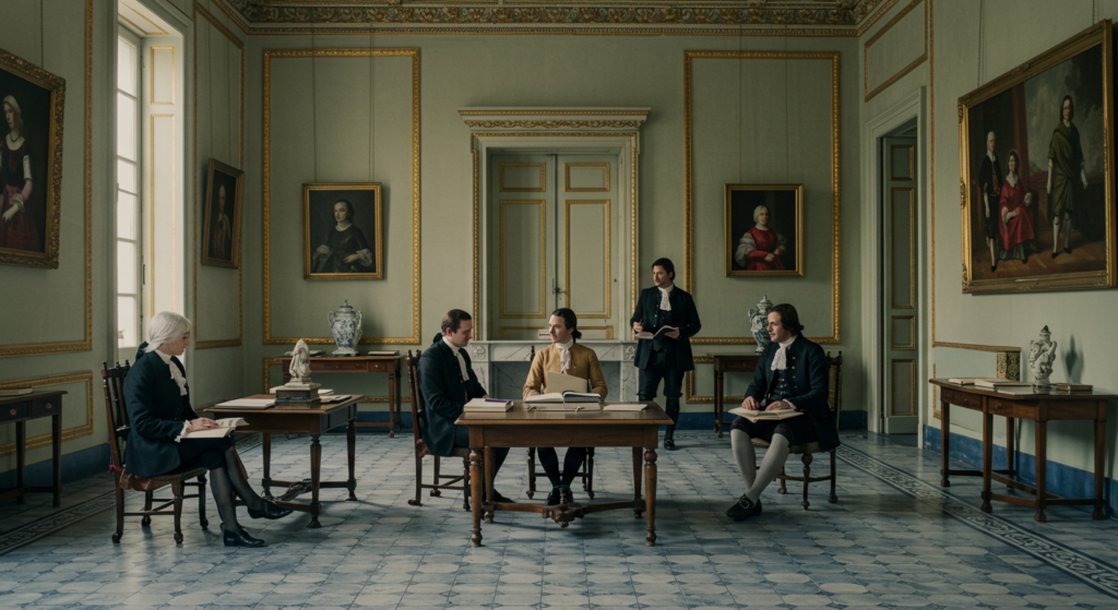
Royal Commissions
Spanish kings observed Enlightenment developments, though with some caution. They hired architects who introduced subtle changes in palace design. White or cream interiors gained favor in certain corridors or private chambers. The monarchy valued classical balance, so these toned-down colors replaced some older, darker motifs. Yet tradition stayed strong, keeping many rooms richly furnished.
Literary Academies
In Madrid or Barcelona, small literary academies appeared. Their meeting halls featured pale walls, letting attention remain on spoken word. Guests recited prose, debated grammar, or read from new essays. The light décor reinforced the sense of intellectual clarity. Even though Spain had deeper ties to long-standing customs, a gentle shift toward Enlightenment thinking showed in these calm settings.
Decorative Ceramics
Spanish artisans made ceramic tiles with lighter patterns. Whites, soft blues, or delicate greens replaced heavier, older styles in some high-society homes. These ceramics lined corridors or patios, reflecting the period’s improved taste for understated elegance. Tiles carried Moorish influences as well, blending historical elements with the new desire for refined, bright surfaces.
Russia: Gradual Transformation Under Enlightenment Ideals
Petersburg Influence
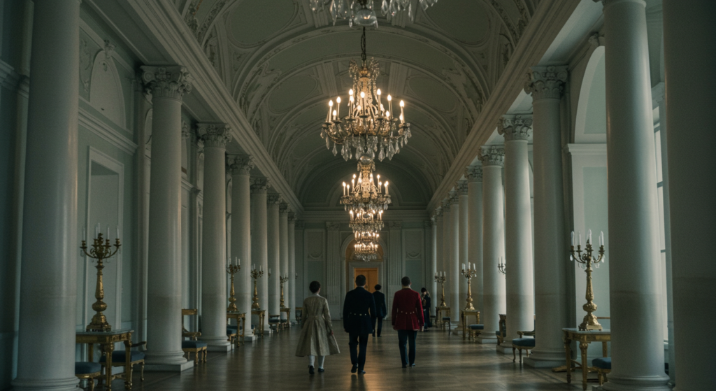
St. Petersburg, founded earlier by Peter the Great, became a showcase for Western-inspired ideas. Structures like the Winter Palace mixed traditional grandeur with a taste for pale exteriors. New projects used white columns or pastel facades to meet trends found in Western Europe. Scholars gathered in some of these halls to talk about math, astronomy, and philosophy. The color scheme spoke to a slow but noticeable shift toward reason and progress.
Intellectual Imports
Select Russian nobles, drawn by European tours, imported books, fabrics, and decorative goods. Their estates might display white dining rooms or reading nooks in subtle shades of green or gold. These changes symbolized interest in Enlightenment thinking. However, the cultural shift was not as widespread as in France or England. That said, each new building or room showing lighter colors hinted at the era’s creeping influence.
Court Events
Empress Catherine the Great supported Enlightenment figures. Court events mixed opulent style with new intellectual energy. Ballrooms sometimes glowed with chandeliers against light walls. Artists produced portraits that softened heavy baroque flourishes. White dresses with small pastel accents appeared at lavish gatherings, mirroring Enlightenment aesthetics seen across the continent.
The Role of Light in Enlightenment Interiors
Candlelit Rooms
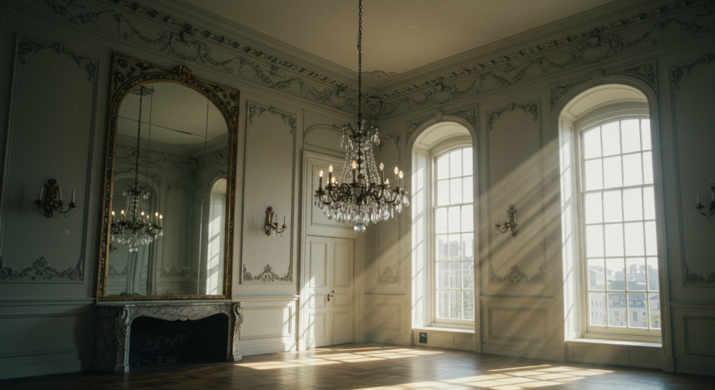
Candles were the standard light source in many places. White walls or ceilings brightened the glow of flickering flames, making spaces appear larger. A single chandelier could illuminate a full gathering, with reflections dancing across mirrors or shiny surfaces. People valued how white backgrounds magnified the limited light, reinforcing an idea that reason can thrive in the right environment.
Daylight Design
Windows grew larger or were positioned to invite natural sunlight. This practice helped reading rooms and studies become more cheerful. Writers could work longer without relying on candles during daytime. That synergy of daylight and white interiors aligned with the Age of Enlightenment’s push for clarity and forward-thinking. Observers found that bright spaces felt more inviting to the mind.
Mirrors and Reflection
Mirror placement also enhanced lighting. Reflective surfaces bounced rays around a hall, giving the illusion of endless depth. White plaster or painted walls paired well with gilded frames. Visitors could observe themselves and each other under a more radiant backdrop, intensifying the sense of a lively intellectual circle. This emphasis on reflection, both literal and mental, became a hallmark of the period.
Paint Pigments and Material Innovations
Lead White
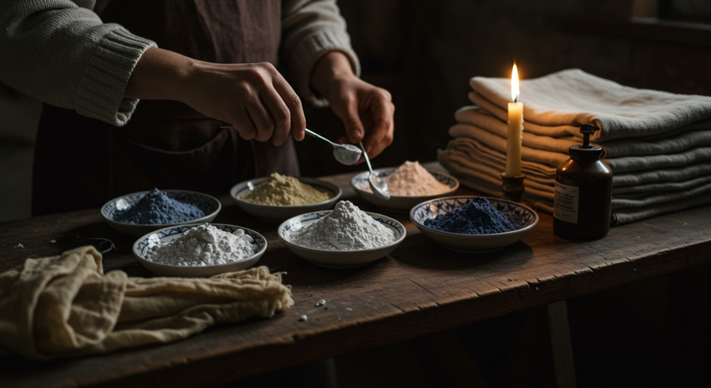
Lead-based whites were common for paint and decorative finishes. Though later found harmful, they produced a sharp, opaque look that many artists loved. Artisans used it on wood panels, ceilings, or smaller accents. It offered a dependable brightness that endured for years if sealed properly. This chalky white was found in pieces from architectural moldings to elaborate frames.
Silk and Linen Treatments
For fabrics, bleaching processes advanced. Textile makers applied improved methods that delivered purer white cloth. Some steps included soaking and sun exposure, producing a bright finish. This practice shaped how tailors could create crisp garments or table linens. Extra-white lace or ruffles symbolized wealth because of the time and resources needed to achieve that luminous shade.
Imported Dyes
While white was prized, other Enlightenment hues relied on new dyes from abroad. Indigo from distant lands turned up in fashionable garments. Workers also experimented with less intense versions of bright dyes to get soft blues, delicate yellows, or pale pinks. White often formed the base, so these tinted fabrics seemed airy yet refined. Such color experiments mirrored the era’s push for new knowledge and variety.
Symbolic Contrasts: Dark vs. Light
A Shift from Heavy Baroque
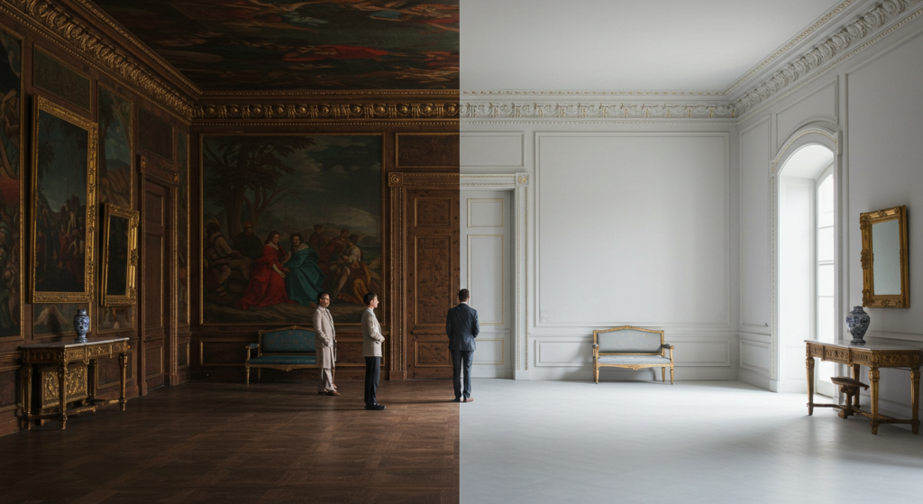
Baroque art and architecture often embraced deep colors and lavish ornamentation. During the Enlightenment, some people saw that style as too heavy. They wanted a simpler look that championed reason and human potential. White or pastel details replaced massive gold frames or thick draperies. This contrast showed the pivot from drama to logic.
Clothing Choices
Richer or darker fabrics were still around, but many in fashionable circles leaned toward pale linens or silks. White gloves, white wigs, and white shirts gained popularity among aristocrats and intellectuals alike. Although black or dark tones remained part of formal wear, the addition of white elements created a stark contrast. It hinted at the tensions between old norms and new ideals.
Paintings and Portraits
Art also reflected this change in palette. Several painters placed subjects in well-lit rooms, making the individual’s expression or clothing pop against a plain background. Shadows were still used for depth, but the overall look tended to highlight each face or posture more than swirling baroque settings. This focus on clarity matched an Enlightenment emphasis on the individual’s capacity for thought.
Uncommon Perspectives on Color in the Enlightenment

Symbolic Messaging
Were color choices just aesthetic? Some historians argue they reflected a broader agenda. For instance, a stark white hall at a royal court suggested transparency and purity. Leaders might hope that such an environment calmed tensions or projected a moral front. When thinkers wrote about the link between good governance and clarity, they sometimes pointed to how clean design mirrored clean intentions.
Literacy and Paper
Many people now read small pamphlets or newspapers in these bright interiors. Paper’s whiteness became a subtle icon of access to knowledge. Writers used black ink on white pages to reach an expanding audience. The strong contrast helped folks of varying literacy levels read with less strain. This simple shift in the availability of white paper formed part of a bigger cultural move toward open discourse.
Scientific Observation
Botanists and natural philosophers kept sketches of flora or mechanical diagrams on pristine sheets. They noted that color-coded drawings made it easier to categorize specimens. White backgrounds highlighted each shape or line. This method helped them share findings with clarity. Detailed images circulated among scholars in different countries, speeding the flow of ideas that defined the Age of Enlightenment.
Common Misunderstandings

Not Entirely Minimalist
Some assume the Enlightenment was an era of stark minimalism. That’s not true. While whites and pale hues gained traction, ornate styles persisted. Upper-class individuals still appreciated fancy trims, embroidered coats, and decorative filigree. The main shift was in how often white was combined with these features to craft a sense of reasoned grandeur, rather than purely flamboyant displays.
Uniform Enlightenment?
Another mistake is to think that every country embraced the exact same color tastes. Although there were shared themes, each region kept certain traditions and flavors. France leaned toward luxurious pastel rooms for salons. England liked crisp white trim on its Georgian houses. Italy balanced older baroque forms with a few lighter elements in new art. The Age of Enlightenment remained diverse, shaped by each locale’s past.
Color Psychology vs. Cultural Use
Some people today link white or lighter hues to psychological effects like calmness. But in the 1700s, color usage was not discussed with modern color psychology language. It was more about symbolism, practicality, and status. Bleached linens were a sign of wealth. Pale walls reflected candlelight. Whites or soft hues implied newness. These choices carried broad meaning without the scientific color psychology concepts we see in current times.
Practical Tips for Enthusiasts
Collecting Enlightenment-Inspired Items
Fans of the period might hunt for authentic chairs or candelabra from that era. If those are hard to find or too costly, consider well-made replicas. Look for white or pale finishes, straight lines, and subtle carvings. That combination captures the Enlightenment’s fondness for order. Adding small pops of pastel on upholstery can bring an extra dash of historical style.
Decorating at Home
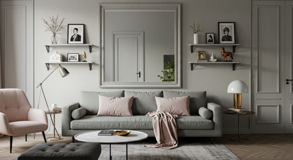
Want to recreate an Enlightenment aura in your living space? Start by painting walls in a soft cream or light dove gray. Pick furniture with clean silhouettes, then add a large mirror or two to bounce light around. Use small bursts of color through rugs, pillows, or drapes. That way, you blend practicality with a dash of historical flair, giving your home a thoughtful but warm feel.
Reading Historical Texts
If you want to dig deeper, try reading original essays from Enlightenment writers or exploring documents about architecture from that time. Notice how they describe light, structure, and clarity. Although the language can feel old-fashioned, you’ll see how color and brightness mattered. This helps you understand why so many halls, libraries, and garments featured white or subdued tones.
Conclusion
The Age of Enlightenment wasn’t just about reason and philosophy. It also embraced an aesthetic that matched its intellectual ideals. Pale backdrops reflected the era’s push for clarity. White garments signaled new ways of thinking.
Pastel touches brought hints of calm. Each color choice told a story of shifting perspectives, as people sought knowledge while retaining a certain sense of style.
Whether seen in a candlelit salon in Paris, a white-trimmed Georgian townhouse in London, or a bright lecture hall in Germany, these shades suggested optimism. The era’s luminaries believed that learning and rational debate could improve societies.
Architecture, fashion, and decorative arts reflected that hope. When you think of the Age of Enlightenment, remember that its glow extended beyond abstract ideas. It radiated in the carefully chosen whites and philosophical hues that defined an entire chapter of European history.
Summary Table

| Section | Main Focus |
|---|---|
| Cultural Seeds | Spread of knowledge, printing, and exchange of ideas shaping Enlightenment color choices |
| White as a Symbol of Reason | Architecture, fashion, and ceremonial spaces highlighting purity and clarity |
| Philosophical Hues | Soft blues, greens, and gray undertones adding depth and calm |
| France | Salon culture, court dressing, and royal patronage with refined whites and pastels |
| England | Coffeehouses, Georgian townhouses, and literary circles blending brick with crisp white details |
| Germany | University settings, music halls, and private salons with light-filled atmospheres |
| Italy | Transition from rich frescoes to pale accents, improved printing, and bright piazzas |
| Spain | Royal commissions, literary academies, and lighter ceramic designs |
| Russia | Western-inspired constructions, imported ideas, and Catherine the Great’s partial embrace of Enlightenment whites |
| The Role of Light | Candlelit rooms, daylight design, and mirrors amplifying brightness |
| Paint Pigments and Material Tech | Lead white, bleaching advances, and imported dyes shaping an era of luminous surfaces |
| Symbolic Contrasts | Shift from heavy baroque to simpler expressions of reason, including balanced use of dark and light tones |
| Uncommon Perspectives | Symbolic messaging, significance of white paper, and the role of scientific drawings |
| Common Misunderstandings | Clarifications about minimalism, regional differences, and the difference between modern color psychology and history |
| Practical Tips | Suggestions for collectors, decorators, and readers interested in Enlightenment-inspired style |
Frequently Asked Questions

Q: How did white become so popular in Enlightenment interiors?
White surfaces reflected the era’s focus on clarity and order. They also amplified candlelight or daylight, making gatherings feel more open. People believed bright rooms encouraged sharper thinking.
Q: Did all countries use white the same way?
Not exactly. France had ornate pastel salons, while England featured white-trimmed brick homes. Germany liked bright lecture halls, and Italy blended older baroque forms with new, lighter touches. Each region mixed Enlightenment tastes with local tradition.
Q: Why were philosophical hues like soft blues or grays also part of the trend?
They offered gentle contrast and complemented white’s brightness. Thinkers felt these subdued tones promoted concentration, calm reading environments, and a subtle nod to reason over spectacle.
Q: Did color choices help spread Enlightenment ideas?
They did, in a sense. Whites and lighter hues fostered spaces that made reading, conversation, and debate easier. Well-lit rooms helped people exchange knowledge more comfortably, which fed into the era’s quest for progress.
Q: Were all the materials safe to use?
Some whites relied on lead-based compounds, which are known today to be toxic. At the time, the health effects were not fully understood. Despite those risks, people prized the brilliant look such pigments provided.
Q: How can I bring some of these styles into my home without it feeling outdated?
Pick calm neutrals or pastels, keep furniture simple, and add mirrors or reflective elements. Focus on clarity, balanced lines, and a bright, open vibe. Subtle nods to Enlightenment themes can work with modern touches, letting you honor the past while keeping your home inviting.
Q: Did Enlightenment thinkers talk about color openly, or was it more of a hidden trend?
They talked more about reason, science, and political rights. Color choices were often implied through interior design, art sponsorship, and fashion. It wasn’t usually the main subject of essays, but it supported the broader theme of clarity and progress.
Q: Is this era’s color scheme too formal for everyday life today?
Not necessarily. Using relaxed versions of these colors, such as cream or light gray, can create a fresh, modern look. It encourages a sense of calm and order without feeling stuffy.
Q: Did any famous artist or architect oppose the new lighter colors?
Some clung to baroque tastes or older methods. The shift wasn’t immediate or universal. Yet the general move toward simpler, brighter palettes gained momentum as Enlightenment values spread.
Q: What if I want more colorful rooms but still like Enlightenment style?
Add pastel or medium-toned accents while keeping base elements in a pale shade. That blend echoes how certain Enlightenment palaces used gold or pastel details against white walls. You get some color without losing the era’s clarity.
Q: Is there a link between the rise of reason and the move to soft colors, or is that overreaching?
It’s fair to see a connection. People favored designs that emphasized clarity, balance, and a break from darker medieval themes. Lighter palettes symbolized the idea of shedding old constraints and looking toward fresh ways of understanding.
Q: Did everyday citizens use these colors, or was it only for nobility and scholars?
The wealthier classes set trends. However, simpler versions reached broader groups. Not everyone had a grand salon. Still, many adapted the new style in smaller ways, such as white linens or modest light-colored walls.
Q: Can I read original sources to see how people described color during this time?
Yes. Look for letters, diaries, or architectural records from the 1700s. Contemporary translations of philosophers’ works might reference clothing or interiors. Archive collections can sometimes reveal details about pigments, fabrics, and design choices that shaped the period.
Q: Did Enlightenment color ideals carry on into later movements?
They paved the way for neoclassical and later minimalist approaches, which also valued harmony and balanced proportions. Those later styles often took these concepts even further, stripping away extra ornament and using color sparingly.
That wraps up our exploration of the Age of Enlightenment, from the widespread adoption of brilliant whites to the philosophical shades that shaped an era. We have peeked into grand salons, coffeehouses, lecture halls, and even private studies.
Each segment of society, from aristocrats in lavish palaces to thoughtful scholars in quiet libraries, found ways to let these luminous hues express their commitment to reason and clarity. May you find inspiration in these historical patterns and use them to brighten your own modern spaces.

Lenny Terra is a vibrant force in the world of fashion and design. Effortlessly blending his expertise in colors with a keen artistic vision, he unveils the most sought-after hues of the season, turning ordinary ensembles into iconic looks. His knack for creating visually enthralling content ensures that every piece resonates with readers, offering them a mesmerizing journey through the realms of color and fashion. Lenny’s unmatched skills not only elevate the aesthetics but also promise an enchanting experience every time. Dive into his creations and let the colors speak for themselves.
Reviewed By: Joanna Perez and Anna West
Edited By: Marcella Raskin
Fact Checked By: Sam Goldman
Photos Taken or Curated By: Matthew Mansour
