Key Takeaways
- White suggests clarity, cleanliness, and simplicity. It often represents a fresh start and serves as a blank canvas in design, branding, or personal expression.
- Across many cultures, white can symbolize innocence, honesty, and fresh beginnings. Its uses vary, though, so always consider context and local traditions.
- White can calm spaces and influence how people feel. It sometimes creates an impression of spaciousness and highlights other colors.
- When combined with other shades, white can play a supporting role that unifies a design. It can also be used alone to emphasize minimalism or authenticity.
- Careful use of white in design or branding can communicate a strong identity. Its presence might add grace or sophistication, depending on fonts, shapes, or textures.
- Meaning of White across cultures differ widely. White might carry celebratory energy in one place and a somber tone in another. Always think about local attitudes.
- To achieve a balanced palette, consider warmer tints or cooler undertones of white, depending on the desired emotional effect.
- White’s visual identity potential is large: from packaging and interior design to fashion. It can illuminate key elements or reinforce a sense of peace.
- Some scientific studies on color show that white can help soothe mental strain, though personal preference varies.
- White tends to align with purity, sincerity, and a desire for cleanliness, but it can also feel sterile if overused.
- By pairing white with thoughtful accents, you can craft unique narratives that suit a brand, home decor plan, or personal style.
- Use white to support your message. It can set a calm tone or create a spotlight for a focal point.
- Whether you choose it for a logo, a living space, or clothing, white has a timeless charm that stands out in many ways.
- Simplicity does not mean boredom. White’s subtle details can be just as powerful as vivid hues if handled with care.
Introduction
Why does white remain such a popular color in so many domains? It may appear ordinary, yet its silent impact resonates across cultures and settings. Some think of it as the color of new pages or stainless surfaces. Others see it as a symbol of dignity, ritual, or unity. White can brighten a room, give a brand a clean look, or add a cool highlight to an outfit. It even shapes how we feel, forming connections between mind and environment.
In this post, we will explore the meaning of white and unpack its links to purity and simplicity. We will ask questions you might be thinking about right now. How does white support other colors? What does it say about an identity? And how can it affect mood? We will discover out-of-the-box angles to use this color effectively. We will also share real tips, simple examples, and practical lists. If you seek a fresh style that emphasizes honesty or calmness, or if you want to handle white in your design, then this post is for you.
The Symbolism and Personality Traits of White
1.1 White’s Emotional Impact and Character
Why does white often bring a sense of clarity? It can sweep away visual chaos, highlighting the essence of an item or space. People associate white with honesty, calmness, and even renewal. It resonates with notions of resilience, sincerity, and purity. It makes a place or product feel safe, straightforward, and bright. At times, it exudes a quiet energy that can spark creativity.
When you see white, you might sense optimism or a peaceful hush. This color feels free from heavy distractions. White reveals shapes and lines without pulling attention from other shades around it. It forms a stage where brighter tones can shine. Its character stays refined, flexible, and often timeless.
1.2 Warmth, Reliability, and Allure
People seldom link white with warmth, yet a certain softness can arise. Off-white or cream shades create gentle and nurturing effects. They suggest a cozy environment while keeping that crisp appeal. In design or branding, white can imply reliability when used with strong lines or subtle textures.
Does it spark allure or charm? In many cultural color meanings, white can appear formal or special, like a bride’s gown or a page ready for a heartfelt message. It stirs curiosity and invites viewers to fill the emptiness with their own ideas. That blank space can be alluring in its own way, as it calls for personal interpretation.
1.3 The Overall Essence of White
White’s essence rests on its capacity to show sincerity, cleanliness, and modesty. It balances well with many colors, or it can stand alone. This color can appear both sophisticated and gentle. It often reflects a desire for neatness, or a break from loud trends. Some see it as a symbol of thoughtful design. Others simply find peace in its quiet presence.
Many interpret white as a vessel for growth. It invites the viewer to project their own story upon it. Think of white as a supportive friend in a colorful domain. It steps back to let other colors highlight your message, while still adding its own understated presence.
The Role of White in Cultural Color Meanings
2.1 Variations in Different Cultures
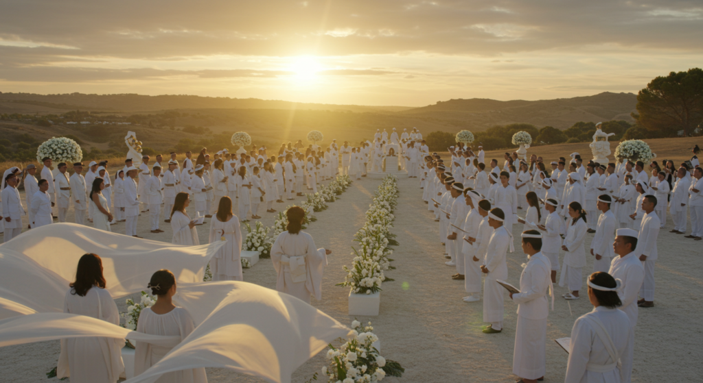
In some parts of the globe, white symbolizes a fresh start or an honored occasion. This might appear in formal attire, religious ceremonies, or design. Elsewhere, it might represent the opposite, such as mourning or solemn occasions. The same color can hold contrasting meanings across different cultures.
These variations suggest that white has multiple personalities worldwide. This is why context matters so much. One person may see white and think of hope. Another may associate it with formality or reflection. Either way, white maintains its link to the idea of something pure—whether that purity is joyful or solemn depends on local customs.
2.2 Local Attitudes and Symbolic Colors
White might also merge with certain symbolic elements. For instance, a style that pairs white with red can feel festive in specific regions. In other places, a white chrysanthemum might be left at memorials. The cultural context can alter the entire emotional color meaning behind white. Observing these shifts is important if you want to use white in branding or design, especially if your audience spans multiple areas.
What questions should you ask when considering cultural color symbolism? Think about the tradition, history, or usage in ceremonies. Also consider how local design trends incorporate white. The color can carry strong emotional connotations that shape how your brand or message is perceived.
2.3 Universal Appeal and Differences
Does white carry some universal message that transcends borders? Often, people associate it with bright cleanliness and newness. Yet the emotional undertone might differ. Some might smile when they see a white lily, feeling calm or nostalgic. Others might recall a uniform or a lab coat, hinting at sterility or seriousness. So while white’s core identity can be recognized by many, the emotional color reaction may vary.
This duality makes white a fascinating color. It can be both universal and very personal. Each culture might have its unique viewpoint, but the sense of purity remains strong in most interpretations.
Meaning of White as a Blank Canvas
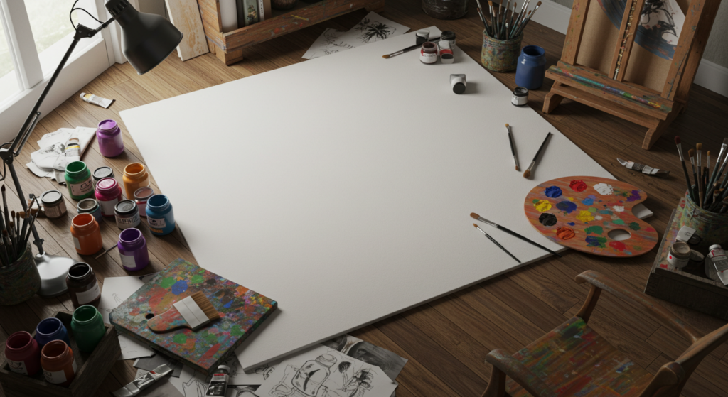
3.1 Sparking Creativity in Art and Design
Why do artists love a white canvas? It gives them an empty space to shape new ideas without constraints. In colors and art, white can serve as the initial step in painting, digital work, or sculpture. It opens the door for countless possibilities. It does not interfere with other colors. Instead, it frames them.
Designers can harness white to make logos pop or to structure a website’s layout. By using white, they create a balanced environment that highlights essential elements. A blank white page can feel liberating, encouraging experimentation and free thinking.
3.2 Encouraging a Fresh Perspective
White can refresh the mind. In creative fields, many suggest working with white backgrounds when testing new color palettes. This helps you see each hue as it is, without tinted bias. White’s neutrality encourages reflection. It also allows you to break away from older patterns.
Have you ever rearranged a room after seeing it painted in white? That shift can prompt new approaches to furniture placement or decor. White fosters a sense of possibility, reminding us that we can build something unique on a clean slate.
3.3 White’s Role in Storytelling
Some might call white a silent narrator. It does not shout, yet it sets the stage. In color storytelling, white can signal an unwritten chapter, a moment of suspense, or a breath of calm in a visually busy piece. It might underscore drama by contrasting with intense hues.
Storytellers in film often use white for symbolic scenes. Think of a bright hospital corridor or a vivid snowscape. It evokes a sense of something either sterile or magical. Each situation changes the emotion it delivers. White can reflect the storyline’s shift or provide a visual breather for the audience.
Meaning of White in Branding and Marketing
4.1 Making a Bold Statement with Simplicity
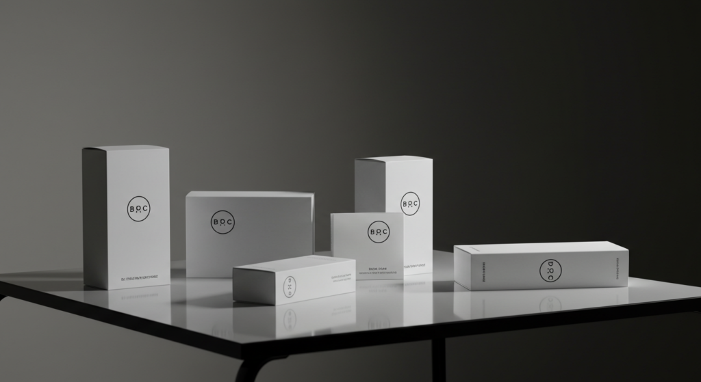
Some brands choose white packaging or minimalistic logos. Why? They aim to broadcast clarity and straightforwardness. This color can feel high-end or approachable, depending on fonts and shapes. Design color meanings often hinge on subtle decisions like how much white is in the background or how it pairs with accent shades.
White can also make a brand’s symbol stand out. Against a white label, a single bold color can pop. When done well, this approach can show confidence. It implies the brand does not need loud designs to catch attention.
4.2 White as a Mark of Trust
People might perceive white-based branding as transparent and honest. If you sell skincare products in white jars, you may seem more reliable or pure. This is not a rule but a trend. If you want to instill a sense of calm or integrity, white can help. Paired with gentle typography, it conveys a welcoming tone.
In color marketing, white can also unify product lines. If each product has a white base but different accent colors, the brand feels consistent. That consistency can build trust among consumers. They know what to expect at a glance.
4.3 Balancing White with Other Hues
Too much white might feel cold or empty. Smart marketers include subtle color accents. For instance, a brand with a white background could add green leaves or pastel lines to warm up the design. A dash of gold might add elegance. A black stripe can form a modern contrast. In psychological color analysis, these small details matter.
When you mix white with balanced color choices, you can guide a viewer’s eye toward your main message. White sets the baseline while other shades tell the story. This technique works in web design, product packaging, or even event flyers.
Meaning of White in Interior Design
5.1 Creating Spaciousness and Calm
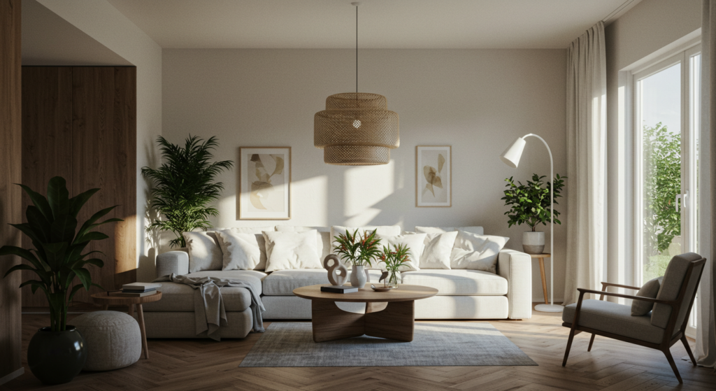
White walls can open up cramped areas. They reflect light, making a room feel larger or more airy. Many interior designers recommend white to create a sense of tranquility in places like bedrooms or reading nooks. When matched with simple furniture, white can reduce visual clutter. This approach fosters a calm vibe that helps people relax.
In interior design color meanings, white also pairs well with natural textures. If you enjoy rustic wood floors, white walls can highlight the grain. If you want a modern look, bright white pairs well with sleek metal or polished surfaces.
5.2 Choosing the Right White
Not all whites look the same. Some contain cool undertones like bluish tints. Others lean warm, with a hint of cream or beige. One color sample may appear too sterile in certain lighting, but perfect in another. So test samples on your walls. Look at them in morning sun, midday light, and evening lamp glow. This can help you find a shade that does not feel harsh.
If you want a crisp, airy space, you might choose a cooler white. If you aim for cozy, try a warmer option. A small difference in tone can change the entire room’s emotional effect.
5.3 Accessorizing a White Space
What if the space feels too empty with white walls, white floors, and white furniture? Bring in color through rugs, pillows, or drapes. A lush green plant can add vibrancy. A few pieces of colorful artwork can energize the room. White is a great backdrop for bold pieces.
In interior design color meanings, white sets a stage that allows each accent color to shine. A bright red sofa stands out more in a white living room than in a darker environment. Consider adding textures, like woven baskets or plush throws, to keep the space comfortable and inviting.
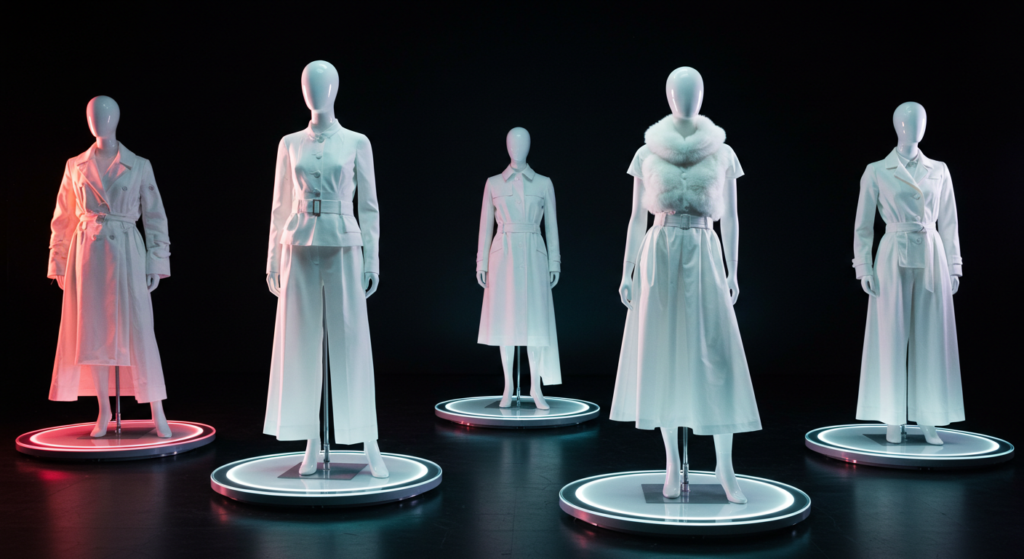
Meaning of White in Fashion and Personal Style

6.1 Projecting Confidence and Elegance
White clothing can signal poise, especially when worn with the right cut or fabric. Many people choose white for formal occasions, like suits or dresses. They might pair it with subtle accessories that reflect personal flair. The symbolic colors at play hint at cleanliness, readiness, and refinement.
Is white always risky to wear? It can get dirty more easily than darker hues. Still, a crisp white piece can make you look fresh and confident. When carefully maintained, white attire tells others you pay attention to detail.
6.2 Combining White with Other Colors
A white shirt can enhance a colorful skirt or pair of pants. It makes the color stand out, resulting in a neat contrast. Accessories that pop, like a bold tie or statement necklace, sit well against a plain white top. White can also soften a bright jacket, preventing the outfit from feeling too intense.
In casual outfits, a white tee can ground vibrant patterns or loud prints. Layering white is easy, too. A white undershirt can peek out from a sweater, giving a cozy, layered effect. White can be the neutral glue that keeps an entire wardrobe harmonious.
6.3 Seasonal Thoughts on White
Some traditions claim you should only wear white between certain months. Modern style has left that behind for the most part, but the association still lingers. White can feel summery because it reflects sunlight and keeps you cooler. However, winter white is also a trend. Warm, off-white sweaters and coats can look chic in cold weather.
There is no strict rule for wearing white anymore. As long as you choose fabrics that match the season—like light linen or heavier wool—you can enjoy white’s clean charm at any time of year.
White and Emotional Branding

7.1 Creating an Emotional Connection
Brands often rely on emotional branding to forge strong bonds with their audience. When they use white, they can evoke feelings of openness or honesty. Think of cosmetics companies that use white to hint at safe ingredients or pure formulas.
White-based marketing campaigns might also bring calmness. The subtle approach can put people at ease. They will focus on the product instead of loud visuals. That gentle environment can foster trust, encouraging customers to explore further.
7.2 Symbolic Colors and Consumer Response
How do consumers respond to brands that emphasize white? Some may view them as high-quality or sophisticated. Others might perceive them as minimalistic or natural. White can shift the emotional tone based on shapes, fonts, or accent details. A brand with crisp lines and white space can feel modern and approachable. Another brand with intricate lines on a white background might feel luxurious.
Since color influences behavior, thoughtful use of white can shape how a buyer feels about the brand. Whether you aim for tranquility, purity, or subtle elegance, white can help deliver that message.
7.3 Branding Narratives Through White
White can be the hero in brand storytelling. A brand might show a white box opening to reveal a special product, suggesting possibility or excitement. Another campaign could feature a white-themed set that amplifies the brand’s main color as an accent. The presence of white frames that color, letting it stand out.
When building a narrative, consider how white can shift mood throughout the brand story. Does it start with an empty space that grows into something colorful? Or does it remain white to underscore a continuing theme of simplicity? Each choice shapes the audience’s perception.
Practical Techniques for Using White in Design

8.1 Strategic Negative Space
Negative space, also known as white space, is not wasted territory. Designers use it to guide the viewer’s eye. By placing important elements within white margins, you help them stand out. This method reduces clutter and clarifies your main point. It can make a design feel polished and thoughtful.
What if you are creating a website? A white background can support easy reading. It can also highlight buttons, images, or text boxes. A well-placed block of white space between sections can prevent visual fatigue.
8.2 Layering Whites and Textures
Consider mixing multiple tones of white with varied textures. You might have a slightly off-white background, a crisp white header, and a textured white element that feels like paper grain. These layers add depth without introducing extra colors. This approach is handy when you want a minimalist aesthetic that does not turn flat.
White-on-white can be elegant in print design, like wedding invitations or packaging with embossed lettering. Subtle shifts in tone can add interest, making each area distinct.
8.3 Accent Colors or Patterns
Because white is so neutral, adding a small pattern or pop of color can work wonders. A bright yellow edge on a white business card, for instance, draws the eye. A soft gray pattern on a white background can appear refined yet not busy. These touches personalize your design, ensuring it stands out from the crowd.
In marketing materials, a stripe of color can unify the layout. The white space around it ensures focus. Many color palette meanings revolve around a base neutral color plus a few accent hues. White can be that stable base that makes your chosen accent more memorable.
White’s Impact on Mood and Behavior

9.1 Calming or Sterile? Finding Balance
White can calm the mind if used with care. However, too much white might feel clinical or uninviting. Some people thrive in a bright, minimal space, while others find it stark. The key lies in balance. Warm lighting, natural textures, or small doses of color can prevent the feeling of emptiness.
In psychological color analysis, white is often described as a color that can reduce mental clutter. But the effect depends on personal preference and the environment’s purpose. A hospital waiting area might feel too barren with stark white walls. Adding plants or calming art might help people relax.
9.2 Possible Effects on Productivity
White spaces sometimes support focus and organization. Offices often use white for walls, desks, and devices. It creates a sense of structure that can help keep minds clear. Yet some employees feel more inspired by vibrant accents. Keep user preferences in mind when designing a workplace.
A hint of color can energize a mostly white environment. If you want to boost creativity, add color-coded sections, bright chairs, or interesting artwork. White can remain the base, providing structure, while the pops of color spark ideas.
9.3 Scientific Studies on Color
A few research papers suggest that lighter environments can lift mood or lessen stress. This is not a rule for everyone, but it does align with many personal anecdotes. Some scientific studies on color also note that white surfaces reflect more light, helping people stay alert. Again, the final outcome depends on each person’s tastes.
Lighting type also plays a role. Natural light bouncing off white walls can foster a pleasant environment. Harsh fluorescent lights on the same walls might strain the eyes. If you are planning a white space, consider how the lighting choice affects overall mood.
White and Visual Identity Through Color
10.1 The Color Identity of White
When people think of color identity, bright hues come to mind. Yet white can define a visual identity just as strongly. If a brand or home consistently uses white, that choice broadcasts a minimalistic or fresh persona. The identity relies on negative space, subtle lines, and a feeling of clarity.
White often aligns with themes of renewal. This might suit businesses focused on health, wellness, or personal growth. It can also benefit tech companies seeking a neat, user-friendly appearance. The color identity of white can adapt, but it usually stays linked to cleanliness and simplicity.
10.2 Pairing White with Other Strong Colors
If a brand’s identity calls for powerful statements, white can serve as a base for flashes of bright color. This approach can make a brand memorable while keeping the message clear. Fashion brands often use a white background with bold typography or striking images.
The synergy between white and strong colors can shape brand perception. For instance, a deep blue logo on white might hint at reliability and calmness. A bright orange accent on white might express energy and spontaneity. The white backdrop keeps the brand’s story in focus.
10.3 Color Psychology Research Insights
Color psychology research often discusses how white projects new beginnings or a sense of cleanliness. Some experts say that too much white might appear bland, but when carefully handled, it can express subtle sophistication. The data is not always conclusive because individual reactions vary. Still, a consistent finding is that white leans toward honesty and clarity. That’s why many personal care or medical brands rely on it.
In building a visual identity, test different whites. Ivory or cream might suit a caring brand. Bright white might suit a cutting-edge tech service. The research suggests subtle shifts can yield distinct impressions.
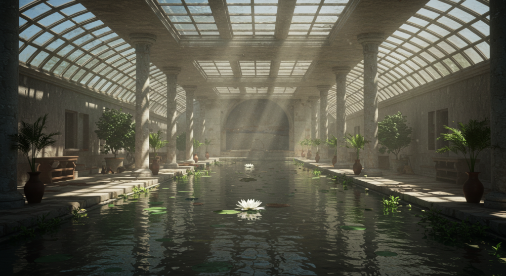
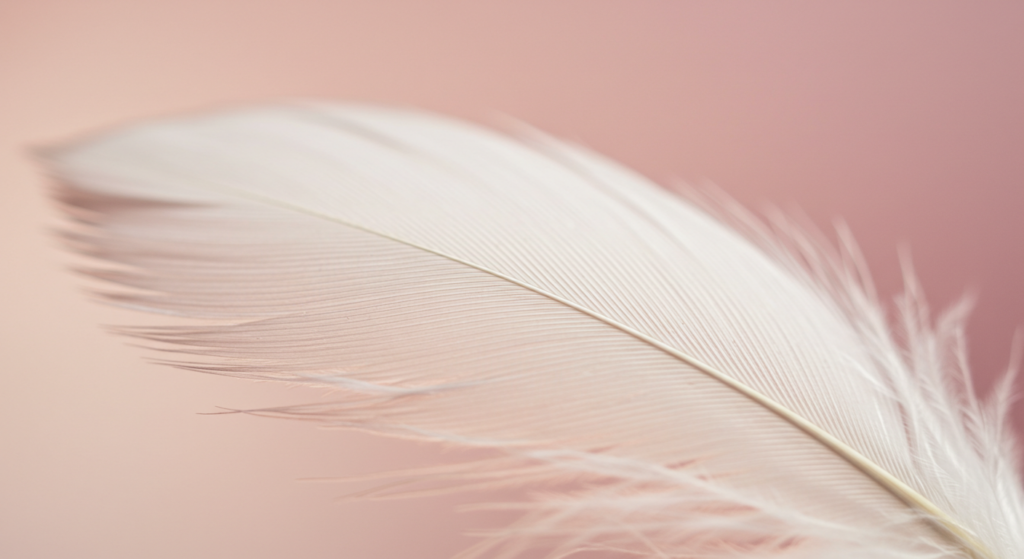
Meaning of White in Nature and Everyday Scenes

11.1 Nature’s Color Meanings: White Flowers and Snow
White appears in nature as blossoms, feathers, clouds, or snowy landscapes. These elements can symbolize new growth or the quiet hush of winter. A white flower can represent a gentle or innocent moment. Fresh snow can suggest stillness, a chance to pause and reflect.
In these scenes, white can feel cleansing. It might wash away visual noise, as everything rests under a coat of snow. Or it might stand as a bright sign of change, like the first white blooms in spring. These observations can guide us in interior design or marketing, where we borrow cues from nature’s color meanings.
11.2 Simplicity in Everyday Moments
Think about white objects in daily life: a porcelain mug, a sheet of blank paper, a pair of plain sneakers. They may appear mundane, yet they can also feel comforting. White coffee cups can be found on kitchen shelves worldwide, offering a sense of familiarity.
The color can blend into daily routines without distracting us. It feels neutral, so it does not overwhelm. That might explain why many home items come in white. It fits any style or decor and encourages a feeling of neatness and calm.
11.3 Observing White for Inspiration
If you are on the lookout for fresh inspiration, take note of white details around you. Clouds drifting through a blue sky. A picket fence bordering a lush yard. These moments might spark an idea for a design concept or brand identity. Even plain white paper can prompt big visions.
Let nature’s use of white remind you of balance. Notice how the bright color sets off other elements in the background. That interplay can help you choose a palette for a project. You may notice that white never truly stands alone—light, shadows, and shapes all play a part.
Combining Warm and Cool Color Symbolism with White
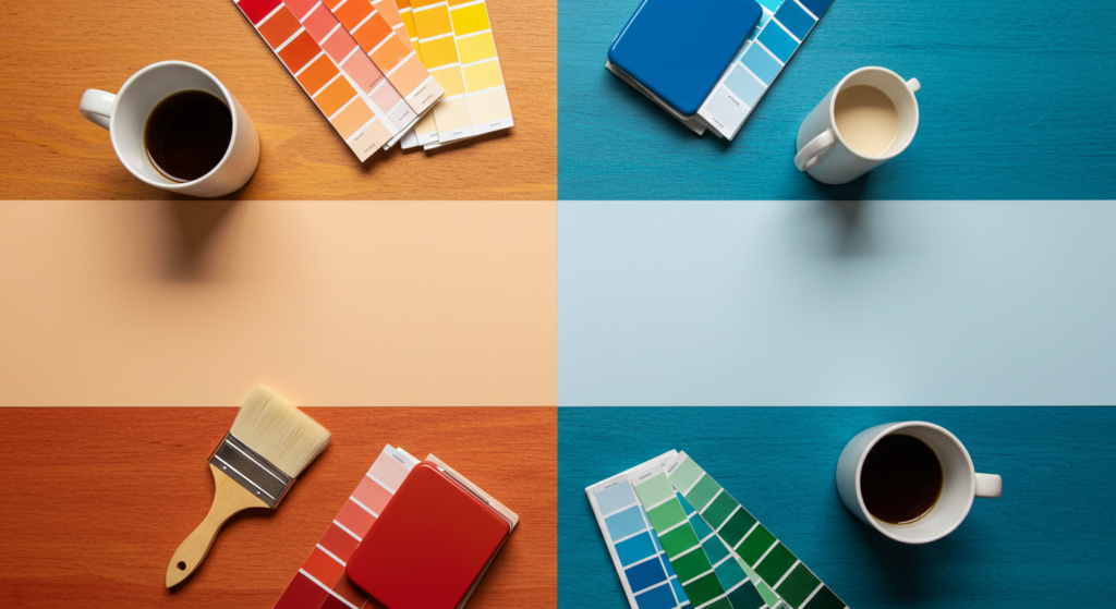
12.1 Warm Color Symbolism
Warm colors like red, yellow, or orange often carry energy or passion. Next to white, they can feel more intense because of the contrast. Think of a white background behind a glowing sunrise photo. That scene might evoke excitement or boldness. White clarifies the warm hue’s dramatic effect.
In design, white can serve as a blank stage for warm colors to shine. It can also soften them by offering visual breathing space. If you want to harness the power of a strong color while avoiding an overpowering look, add extra white to the layout.
12.2 Cool Color Symbolism
Blues, greens, and purples often feel calm or reflective. Placing them against white helps highlight that sense of relaxation. For instance, a spa brand might mix crisp white with soft teal. That arrangement can communicate tranquility and cleanliness. It might also suggest trust.
If you favor a modern or serene vibe, consider white combined with light grays or pastel blues. The result can appear airy and refined. The abundance of white keeps the focus on calmness, letting the cool tones guide the mood.
12.3 Balancing Warm and Cool with White
Want to use both warm and cool colors in one design? White can unify them. You might place a warm accent on one side, a cool accent on the other, and let white connect them in between. This approach avoids clashes. It can also help direct the viewer’s attention where you want it.
In color palette meanings, white often functions as a neutral pivot. It mediates between contrasting tones, ensuring the overall design feels harmonious. This is a handy trick in interior design or branding. With white in play, warm and cool colors can coexist peacefully.
White in Color Trends and Forecasts
13.1 Shifts in Popular Color Palettes
Color trends change, but white retains a strong presence. It supports seasonal hues, from bright summer palettes to deeper winter shades. White tends to appear in minimalistic trends, giving structure to items like furniture or electronics. Its simplicity works well with emerging styles, making it a staple across many industries.
Brands that seek an updated look often refresh packaging or websites with new accent colors, but keep a white base. This strategy allows them to remain consistent while feeling modern. White does not go out of style because it adapts to what is current.
13.2 Accent Color Revolutions
Every year, color institutes suggest trending shades. These might be bold like a certain green or subtle like a dusty pink. White usually pairs seamlessly with them all. It acts as a stable anchor that stops the palette from feeling cluttered.
If you watch color forecasts, you might see predictions about “pearl white” or “alabaster” trending in home decor. These are variations of white that complement popular accent hues. People often rotate through different accent colors, but the white base endures as a backdrop that can handle changes.
13.3 Long-Term Appeal of White
White’s enduring popularity stems from its capacity to highlight other shades and create a fresh vibe. Designers and marketers keep returning to it because it offers clarity and a chance to stand out. From clothing trends to interior design, white remains a blank backdrop that never feels outdated.
This consistency has led to wide acceptance in industries that want to keep things timeless. While some colors come and go, white holds its place. Even when bright neons or deep jewel tones take center stage, white helps everything feel cohesive.
Out-of-the-Box Applications of White

14.1 White in Unexpected Media
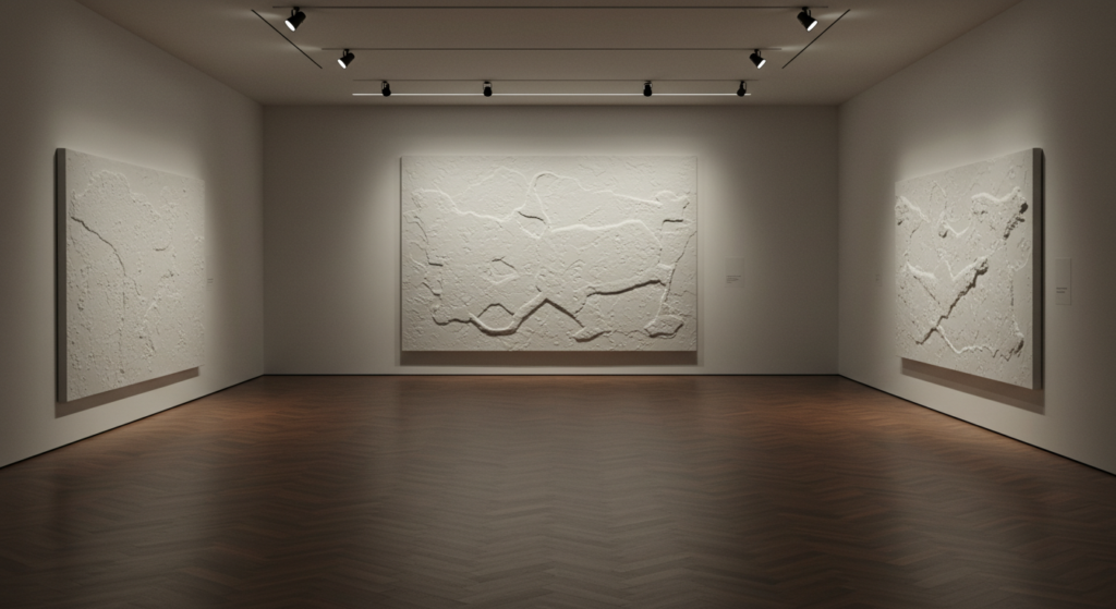
Some artists experiment with white paint in textured works. The piece might appear monochromatic at first, but as you move closer, layers and ridges come into view. This approach shifts the focus onto depth instead of color variety. In packaging, designers sometimes craft all-white boxes with only subtle details or raised symbols.
Even in digital media, white might shape the entire interface. Some app developers rely on large amounts of white for a crisp user experience. The icons or text pop, making the design feel inviting and clear.
14.2 Interactive Experiences
Imagine an event booth done mostly in white. Visitors step inside and see only minimal text or imagery, which draws them closer to find out what is being offered. This can be engaging if executed with good lighting and planning. The hush of white sparks curiosity. People feel encouraged to look for hidden messages or subtle cues.
In color marketing, using an all-white environment can be a bold move. It can work if the brand’s identity matches that minimalist strategy. When visitors remember that space, they recall the lightness and the sense of possibility.
14.3 White as a Personal Statement
If you love color but want to try something new, consider an all-white approach for a small project. It could be a personal scrapbook, a photo album, or a corner in your living space. The interplay of light and shadow can become the primary detail. You might add one small colored element for impact.
White can redefine a personal brand on social media, too. Some influencers use predominantly white feeds, focusing on open spaces and bright lighting. This style suggests purity and calmness. It may appeal to audiences seeking clarity and a break from visual overload.
Conclusion
White stands for more than just cleanliness or a blank background. Its purity and simplicity contribute to its timeless charm.
It adapts across cultures, design settings, and personal styles. Whether you aim to calm a busy environment, showcase a brand’s authenticity, or spark a creative sense of possibility, white can help you shape that mood.
We have seen how it supports other colors, breathes freshness into interior designs, and contributes to branding strategies. We have learned that white’s meaning can differ by region or tradition.
The color is versatile. It can shine on its own or amplify any accent you choose. White’s appeal is quietly powerful. It helps us remember that simple does not mean dull. Instead, it allows us to focus on what truly counts.
Quick Reference
Below is a concise table to remind you of some central ideas on white’s meanings and uses:
| Aspect | Key Point |
|---|---|
| Emotional Impact | Suggests calmness, clarity, and fresh starts. |
| Cultural Differences | Can symbolize joy or mourning, depending on the locale. |
| Design/Branding | Offers a clean slate; highlights other colors or elements. |
| Interior Design | Expands spaces, pairs well with varied textures. |
| Fashion | Conveys confidence, elegance, and a crisp style. |
| Mood Influence | Might soothe or feel sterile if used excessively. |
| Warm/Cool Pairing | Unifies contrasting tones; mediates warm and cool hues. |
| Long-Term Trend | Remains timeless, works across changing color trends. |
| Practical Tips | Test undertones, add accents, use negative space wisely. |
Feel free to keep this table nearby for quick guidance.
FAQ

Q1: Why is white often viewed as a sign of purity?
White represents a clear, untarnished surface in many cultures. This notion stems from its neutral, blank appearance. People associate it with sincerity, cleanliness, and newness. Because it lacks obvious color, it becomes a natural symbol of innocence and honesty.
Q2: How does lighting affect the look of white walls?
Lighting can change white drastically. Natural light makes it appear bright and airy. Fluorescent or harsh bulbs can make it look sterile or even slightly bluish. If you want a cozy vibe, choose warmer bulbs or add natural elements like wooden floors or soft fabrics.
Q3: Can white feel cold in a home?
Yes, it can if the space lacks warmth in furniture or decor. Adding textures such as woven blankets, rugs, or wooden accents can keep the room from feeling chilly. Warm light and plants also help. Think about layering your white elements with subtle color or neutral shades for balance.
Q4: Does white work well in branding if I want a friendly approach?
It can, especially when paired with gentle colors or inviting fonts. White does not have to be formal or distant. If you use it thoughtfully, it can reinforce an approachable, peaceful identity. The key is to add small touches that convey warmth, such as rounded corners or a soft accent shade.
Q5: What is the difference between cool white and warm white?
Cool white might have a bluish or grayish hue. Warm white might appear creamier or a bit yellow. This contrast can be subtle or dramatic based on lighting and adjacent colors. If you aim for a bright, fresh look, cool white may suit. If you want cozy or intimate, warm white might be better.
Q6: How can I use white for a minimalist design without making it boring?
Focus on details like texture, shape, and negative space. For instance, use crisp lines or interesting shadows. Introduce small accent colors or a striking pattern to add dimension. Minimalism is about clarity, and a careful blend of elements can keep white from feeling dull.
Q7: Why do some countries use white for mourning while others use black?
The answer ties into cultural traditions and historical contexts. In certain regions, white symbolizes a return to simplicity or release from earthly concerns. In others, black signals reflection and sadness. Each culture attaches its own meanings to color, including white.
Q8: How can white affect productivity?
Some people find white walls and surfaces help them focus by reducing visual noise. Others may consider it too plain and crave stimulating color. It varies by personal taste, the task at hand, and the environment. Adding small splashes of color in a white space can spark energy if needed.
Q9: Does white always pair well with strong colors?
In most cases, yes. White’s neutrality brings out the brightness of reds, blues, or any bold hue. It can also create a smooth transition between multiple colors. Just be mindful of balance. If you add too many loud shades, the design might feel scattered.
Q10: How do I choose the right shade of white paint?
Test several samples on your wall. Look at them under different lighting conditions. Consider whether you want a crisp, cool effect or a softer, warm glow. Check if nearby colors affect how your white paint appears. A small difference in undertone can change a space’s entire feel.
Q11: Is white always best for a brand that wants a sophisticated look?
White can show sophistication, but it also depends on typography, shapes, and layout. A brand can appear refined even with a colorful backdrop, as long as elements stay cohesive. White’s advantage is that it highlights other details. It can indeed look luxe if well-executed.
Q12: How does white hold up in a busy household or office space?
Maintaining spotless white surfaces can be challenging if there is high foot traffic or messy conditions. However, modern materials and easy-to-clean finishes can help. Regular upkeep is key. Some people choose off-white or patterned textures to hide minor marks or wear.
Q13: Will white ever go out of style?
White has endured through countless trends. It is seen as timeless because it blends with almost any design. While accent colors and patterns rotate in popularity, white remains a reliable staple. Designers and consumers often return to it for clarity and a sense of calm.
Q14: How do I keep an all-white design from being hard on the eyes?
Adjust contrast and lighting. Break up large white spaces with small color accents or text blocks that guide the eye. Use fonts that are easy to read. Consider different tones of white or textures that add dimension. Your design should feel comfortable, not glaring.
Use these insights and techniques to handle white in fresh, practical ways. Remember, its purity and simplicity do not limit creativity.
In fact, those qualities open up room for meaningful color choices, design, or personal style. White can stay humble or stand loud, depending on how you shape it. Enjoy experimenting with this timeless color.

Matthew Mansour, known in the fashion world as a storytelling virtuoso, weaves captivating tales centered around the mesmerizing universe of fashion hues. Possessing a sharp eye for detail, Matthew explores the profound layers of color combinations, turning the simple act of choosing an outfit into a lively adventure. His unique ability to blend emotion and innovation into his writings sets him apart in the sartorial sphere. Each article penned by him carries a touch of magic, inspiring readers to embark on a colorful odyssey through the diverse landscape of apparel shades.
Reviewed By: Joanna Perez and Anna West
Edited By: Lenny Terra
Fact Checked By: Marcella Raskin
Photos Taken or Curated By: Matthew Mansour