Key Takeaways
- Combine colors in fashion by focusing on contrast, harmony, and cohesion.
- Build a versatile wardrobe with neutrals and accent pieces for year-round use.
- Experiment with color blocking, layering, and proportions to create unique outfits.
- Use prints, patterns, and textures to introduce new colors without overwhelming your look.
- Pay attention to garment care to keep colors vibrant and fresh.
- Mix vintage, modern, and sustainable approaches for a thoughtful, stylish wardrobe.
- Stay open to color trends while remaining true to your personal style and comfort.

Clothing colors have always been a central aspect of personal style. From rich jewel tones to classic neutrals, the colors you choose shape how your outfits stand out in everyday life. The goal of this article is to provide a comprehensive, human-friendly guide that covers everything about colors in fashion, from foundational concepts to expert styling tips.
Below, you’ll find 18 sections, each with three subsections, diving deep into various facets of color usage in clothing. We’ll explore how to set up a versatile color wardrobe, how to layer and block colors effectively, and how to maintain colored garments for maximum longevity. We’ll also tackle modern color trends, vintage-inspired palettes, and the interesting ways you can expand your color choices beyond clothes alone.
By the end of this guide, you’ll have the confidence to blend colors in new and exciting ways—whether you’re striving for a simple, minimalist aesthetic or a high-impact, attention-grabbing ensemble. Let’s set aside typical color psychology discussions and instead focus on practical, out-of-the-box techniques and guidance that will truly transform your wardrobe.
The Basics of Color Theory in Fashion

Understanding Hue, Saturation, and Value
Hue, saturation, and value are the fundamental attributes of any color, but in the fashion world, they manifest in practical ways.
- Hue: The underlying color, such as red, blue, or green.
- Saturation: The intensity or purity of a color, ranging from muted to vivid.
- Value: How light or dark a color appears, influenced by adding white (tints) or black (shades).
When putting together outfits, balancing these three elements can help you fine-tune the visual impact of each piece. A softly saturated pink turtleneck can look entirely different from a highly saturated magenta top, even though they’re both in the pink family.
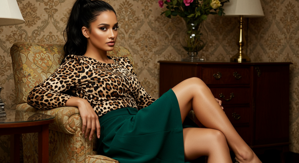
Contrasts and Harmonies
In fashion, contrast refers to placing different shades side by side, while harmony involves finding complementary tones that blend seamlessly. Both have their place in your wardrobe.
- High contrast: Think of pairing bright red trousers with a white shirt. It can create a strong, bold statement.
- Harmonious look: Opt for colors that share similarities, such as a soft beige sweater with a light taupe skirt.
Experiment with these contrasts and harmonies to discover unique outfit combinations that reflect your personal flair.
Building a Foundation for Wardrobe Colors
Creating a cohesive wardrobe starts with core staple colors that anchor your outfits. Generally, these are neutrals—black, white, navy, gray, or beige—that can be paired with brighter tones or other neutrals. Once you have these pillars, you can add colorful accent pieces, such as a deep burgundy jacket or a saffron scarf, to pull your looks together in exciting ways.
Setting Up a Versatile Color Wardrobe

Pillar Pieces
Pillar pieces are those garments that define your everyday style. Examples include:
- A well-fitted black blazer
- A crisp white button-down shirt
- Versatile dark denim jeans
By ensuring these core items come in your preferred neutral shades, you create a reliable framework that adapts to just about any occasion. Whether you’re layering multiple items or aiming for a minimal outfit, these pillar pieces become the canvas for more adventurous color plays.
Coordinating Neutrals
Neutrals are the linchpin of any versatile wardrobe because they are easy to mix and match. Some common neutral ranges include:
- Cool neutrals like gray and black
- Warm neutrals such as beige or khaki
- “Universal” neutrals like navy and white
A collection of neutral tops, bottoms, and jackets can seamlessly integrate with other statement pieces while maintaining a polished appearance. This approach lets you focus on adding color strategically, instead of juggling too many bold tones at once.
Mixing in Vibrant Shades
Once you have your neutral foundation, it’s time to infuse pops of color. These vibrant shades can take the form of:
- A brightly patterned scarf
- Bold footwear or a lively handbag
- Eye-catching prints in skirts or blouses
Placing these vivid hues in key spots can draw attention to specific parts of your outfit and create a memorable visual impression.
The Art of Seasonal Color Usage

Warm Weather Pairings
Hot summers call for breathable fabrics and lighter color choices. Think breezy pastel dresses or linen button-down shirts in shades of cream or mint. Pair them with a pop of color, like coral sandals, for a refreshing, warm-weather ensemble. Layering might be minimal, but color can still shine via accessories such as hats or lightweight cardigans.
Cooler Season Selections
Cooler weather invites darker, richer colors. Deep greens, burgundies, and even certain jewel tones work well in the autumn and winter months. Balance these deep shades with a few neutral layering pieces, such as a charcoal gray coat or a light sweater in beige. This mix of dark and neutral ensures your outfits feel cozy but not monotonous.
Transitioning Between Seasons
The in-between periods—early spring or late fall—can be tricky. Opt for transitional pieces:
- Cardigans or blazers in medium-weight fabrics
- Long-sleeve dresses you can wear with or without tights
- Scarves in mid-range colors
This approach lets you smoothly move from one season to the next without overhauling your entire wardrobe.
Color Blocking Techniques

Bold Blocking
Color blocking involves pairing solid blocks of color in one outfit. It’s a great way to introduce multiple hues without looking chaotic. Some bold examples include pairing a royal blue top with bright yellow trousers, or a vivid purple skirt with a neon green blouse. For a cohesive look, keep your accessories neutral or match them to one of the blocks.
Subtle Blocking
If high-voltage color blocking feels overwhelming, consider a more muted approach. You might wear a navy sweater with a burgundy skirt, adding a thin belt in teal. Each color is distinct, but none is excessively bright. This style retains the visual contrast of color blocking while staying within a more subdued palette.
Choosing Contrasting Colors
Successful color blocking depends on selecting colors that visually pop against each other without clashing. Generally, contrasting colors occupy distant positions on the color spectrum, such as pink and teal, or orange and navy. Test a few pairings in front of a mirror. Don’t be afraid to try unexpected combos, like a maroon top with mustard pants—they can become a signature look.
Layering with Color

Multi-Layer Outfits
Layering is an excellent way to showcase multiple colors while also staying weather-appropriate. Start with a neutral base, such as a white T-shirt, then stack on colorful pieces like a light cardigan in pastel green and a bolder jacket in a deeper forest green. The interplay between different layers adds dimension and interest to your outfit.
The Power of Tonal Layers
Tonal layering is all about wearing different shades of the same color. For instance, a soft lilac blouse under a deeper violet blazer, paired with lavender trousers. This technique radiates sophistication while showing a refined dedication to color continuity. The subtle gradient in tonal layering prevents the outfit from feeling flat.
Layering Textures to Enhance Colors
Fabric texture can amplify or tone down the perception of color. A plush, velvety piece might appear deeper, while a crisp cotton in the same shade looks lighter. Combine various textures—denim, knits, silk—to create a layered look that’s as visually engaging as it is comfortable.
Choosing Prints and Patterns
Stripes, Dots, and Plaids
Classic patterns like stripes, polka dots, and plaids are fantastic ways to integrate multiple colors in a controlled manner. A striped tee with black, white, and red lines can be paired with a neutral skirt and shoes. The pattern itself becomes the focal point, allowing you to limit color chaos elsewhere.
Colorful Florals and Geometrics
Floral and geometric patterns often feature multiple colors at once. Pick a pattern that speaks to your style—bold florals for a statement piece or subdued geometrics for an artsy edge. Keep the rest of the outfit fairly muted so that the patterned garment can truly shine.
Balancing Solid Colors with Prints
To keep balance, try matching one color from the pattern to a solid piece in your ensemble. If your floral skirt has touches of yellow, pair it with a similarly hued top or belt. This creates a sense of unity and keeps your patterned piece from feeling disconnected.
Color Combinations for Specific Occasions

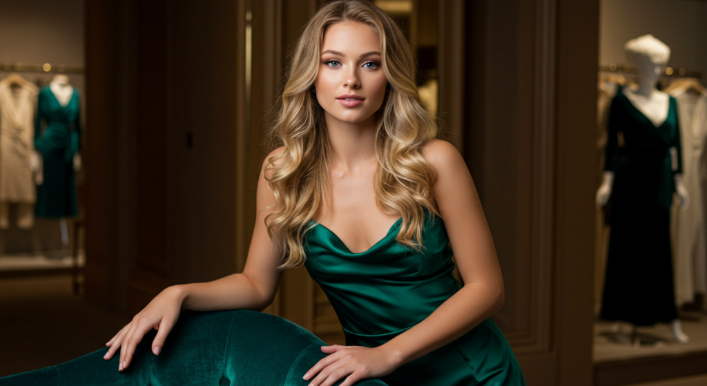
Formal Events
For black-tie and other formal events, classic pairings often rule. Black, navy, and metallic tones (silver, gold) stand out. You can incorporate color via a statement clutch or a richly colored tie. The key is subtlety—a splash of color in an otherwise refined, elegant ensemble keeps things interesting without overpowering the dress code.
Business and Office Wear
Office-appropriate color choices lean toward professional, understated tones. Deep blues, grays, and muted browns are common for suits. If you want to inject more personality, do so through:
- Colored ties
- Tasteful pocket squares
- Subtle patterned blouses
Keep the color usage controlled, so the overall look remains polished and work-friendly.
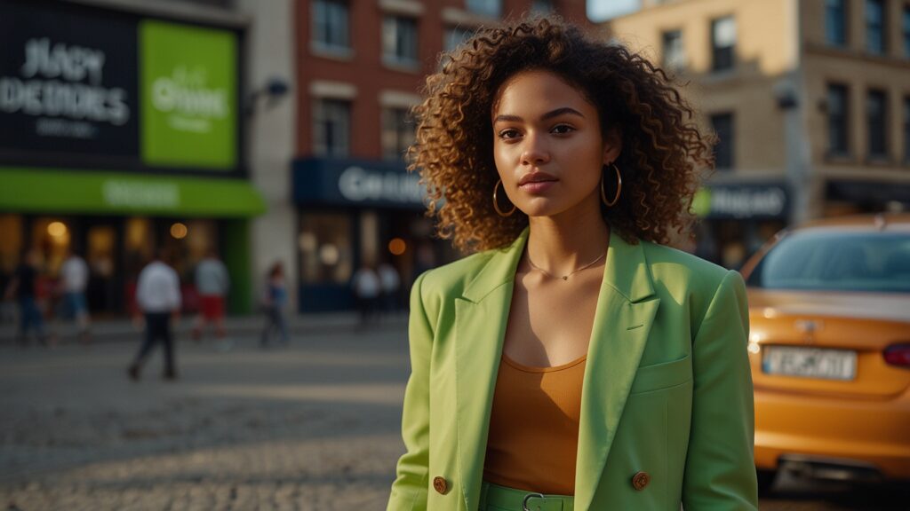
Weekend and Casual Styles
Weekends let you loosen up your color play. Bright T-shirts, patterned sundresses, and colorful sneakers can all come into play. You might pair vibrant leggings with an oversized neutral sweater or go for a head-to-toe pastel lounge set. This is your chance to experiment freely and find out what vibrant combinations resonate with your casual vibe.
Combining Colors with Accessories

Statement Accessories
Statement accessories—chunky necklaces, oversized hats, or bold belts—can be the perfect entry point for color experimentation. If your outfit is mostly neutral, a pop of color in a statement accessory can make a big splash. A bright scarf or a neon watch can also do wonders to enliven an otherwise subdued ensemble.
Matching vs. Mixing
While a perfectly matched set of shoes, bag, and belt can look cohesive and classic, mixing accessories in complementary or contrasting colors offers a more modern twist. A teal bag with red shoes can appear intentional and fashion-forward, provided you ground the look with neutral garments or unify the outfit with another teal or red accent.
Coordinating Footwear and Bags
Footwear and bags are prime real estate for color coordination. They tend to be noticed at different times—footwear from a distance, the bag up close—so creating a color relationship between them ties your look together. If your shoes are bright purple, consider a bag with purple undertones or detailing. This approach provides a subtle visual echo that feels put-together.
Trends in Modern Color Usage
Fashion Runway Highlights
Runway trends can introduce unexpected palettes like neon green with dusty pink or rust orange with lavender. While runway looks may seem intimidating, you can adapt them by using smaller doses of each hue. A neon belt or a rust-colored sweater might be enough to channel the trend without going overboard.
Street Style Influence
Street style is where real-life experimentation happens. Influencers, bloggers, and everyday trendsetters often showcase bold color choices that feel more approachable than runway extremes. Drawing from street style, you might pair comfortable joggers in a vibrant hue with a neutral hoodie, or layer a bright denim jacket over a monochrome outfit to create a pop of unexpected color.
Timeless vs. Trend-Driven Colors
Timeless colors (like navy, black, gray) remain wardrobe staples year after year. Trend-driven colors (like millennial pink or “Gen Z yellow”) come and go. Strike a balance by investing in timeless hues for your big-ticket items—coats, suits, high-quality dresses—and experiment with trendier shades in accessories or more affordable items.
Subtle Yet Impactful Color Accents

Small Splashes of Bright Hues
Even if you prefer low-key styling, small accents of bright color can freshen up your look. This could be as subtle as a colorful sock peeking beneath cropped trousers or a bright hair clip. These small details add a sense of fun and surprise without overwhelming your overall aesthetic.
Neutral Outfits with Colorful Details
Wearing an all-neutral outfit—such as a beige jumpsuit—offers a perfect backdrop for color details like contrast stitching or a statement necklace. This approach feels sophisticated and contemporary, making it perfect for those who want a controlled but still eye-catching style.
Unexpected Color Pairings
Sometimes an offbeat pairing—like olive green with a cool turquoise—can turn a plain outfit into something memorable. If you’re unsure, try these combos in small increments first: a turquoise belt on olive pants, for example. Once you see how it adds a spark of originality, you might be encouraged to scale up.
Handling Color Maintenance and Care

Washing and Storing Colored Garments
Proper laundering helps preserve color vibrancy. Generally:
- Separate lights and darks
- Use mild detergent for delicate fabrics
- Turn garments inside out before washing
When storing, avoid direct sunlight that can fade colors. Neatly fold items to keep the fabric in good shape, especially if they’re prone to stretching.
Preventing Fading
Repeated washing and exposure to heat can dull colors over time. Opt for cool water whenever possible, and air-dry colored clothes to minimize fading. Using fabric conditioners can also help maintain the original color of garments. For especially delicate or richly dyed pieces, consider hand-washing or dry cleaning.
Handling Color-Transfer Issues
Dark jeans and other deeply dyed items can transfer color onto lighter fabrics or upholstery. To avoid this:
- Wash new dark garments separately the first few times
- Check care labels for colorfast instructions
- Use color-catching sheets in the wash if you suspect bleeding
These steps keep your wardrobe free from unexpected stains and ensure each item retains its intended hue.
Balancing Bright and Neutral Shades

Wearing Bold Tones with Ease
If you love bold tones—fiery reds, electric blues, vibrant yellows—wear them with pride. One strategy is to let the bold piece shine as the focal point. Keep the rest of your outfit neutral or subdued so the bright color truly pops. This way, you don’t have to worry about clashing elements.
Grounding Looks with Neutral Pieces
Neutrals remain the best solution for softening a bright outfit. A bright orange top can be paired with cream-colored trousers. A neon green jacket might sit beautifully over a black T-shirt and jeans. Neutral footwear—white sneakers or black boots—finishes off the look without stealing the spotlight.
Combining White, Black, and Gray with Colors
White, black, and gray are the anchor neutrals. When in doubt, a white tee complements any bright color, and black pants ground almost any hue. Gray can be an underrated choice, bringing a softer contrast. Keep these neutrals in mind for quick, fail-safe color pairings.
Texture, Fabric, and Color Interaction
Sheen vs. Matte Finishes
A fabric’s finish can significantly alter how a color appears. A shiny satin top in emerald green projects a sleek, almost opulent vibe, whereas a matte cotton tee in emerald feels casual. By mixing sheen and matte finishes, you create a dimensional look that reveals new aspects of each color under different lighting.
Knit vs. Woven Colors
Knit fabrics like wool or jersey often absorb light, making colors look richer and sometimes darker. Woven fabrics—like crisp poplin—can reflect more light, letting colors appear brighter or more intense. Understanding these differences helps you select fabrics that give the desired color payoff.
Using Fabric Properties to Enhance Color
Some fabrics, like velvet, heighten the depth of darker shades, while sheer fabrics offer a soft wash of color. Play with a variety of materials to see how each one affects your outfit’s overall mood. Layering different fabrics also adds a tactile dimension that complements your color choices.
Playing with Color Proportions

Statement Pieces vs. Subdued Background
If you’re wearing a statement piece in a bold color—like a bright pink coat—keep the rest of your look quiet in more neutral or subdued tones. This ensures your statement color gets the spotlight it deserves. Proportionally, the coat occupies much of your upper body, so it naturally draws the eye.
Proportional Distribution of Color
Balance can be achieved by evenly distributing color across your outfit. If your top is purple, incorporate a purple belt or shoes. This concept isn’t about being too “matchy,” but rather about echoing color in different parts of your ensemble, ensuring the look feels deliberate.
Highlighting Body Sections with Color
Bright colors naturally draw the eye. If you want to highlight your upper body, choose a vivid top. Conversely, if you want the attention on your lower half, opt for bold bottoms. Strategic color placement can emphasize or de-emphasize specific areas, helping you shape your overall silhouette.
Mixing Vintage and Modern Color Palettes

Retro Colors Reimagined
Vintage palettes often include earthy browns, mustard yellows, and avocado greens. Reintroduce them in modern cuts and fabrics to create a fresh take on retro. A mustard-yellow pencil skirt looks thoroughly contemporary when paired with a sleek black turtleneck and edgy boots.
Modern Twists on Classic Hues
Modernizing a classic color can also involve adjusting its finish or saturation. Instead of a fully saturated 1970s orange, you might choose a softer rust shade in a contemporary silhouette. This approach offers a nod to the past while staying firmly rooted in current fashion sensibilities.
Creating Cohesion in Mixed-Era Outfits
Mixing vintage with modern can lead to fantastic contrasts, as long as there’s a color unifier. For example, if you’re wearing a retro blouse in a dusty blue, tie in a modern accessory—a metallic belt or sleek handbag—in a similar color family. This ensures the overall look doesn’t feel disjointed.
Sustainable and Eco-Friendly Color Choices

Low-Impact Dyes and Fabrics
Many brands now offer clothing dyed with less water and fewer chemicals. Look for labels that mention eco-friendly or natural dyes. Organic cotton, hemp, and recycled fabrics often feature more subdued or earthy color palettes due to the gentler dye processes.
Upcycling and Dyeing Techniques
If you’re feeling creative, consider upcycling old clothing by dyeing them yourself with natural dyes made from things like coffee or beets. You might transform a faded white shirt into a soft pink top using beetroot dye. This gives you a unique color piece while reducing waste.
Building a Conscious Color Wardrobe
Constructing a sustainable wardrobe often means quality over quantity. A smaller range of colors that mix and match well can reduce impulse buys. Choose versatile, long-lasting hues like earthy greens or classic blues, ensuring you’ll wear each item many times before it shows signs of wear.
Beyond Clothes: Expanding Color Use
Coordinating Makeup
Color coordination can extend beyond clothes to makeup. A swipe of lipstick or eyeshadow that complements your outfit adds another layer of style. Keep it simple: if you’re wearing bold clothing colors, you might opt for a more neutral makeup palette. Conversely, if your outfit is neutral, a pop of turquoise eyeliner can steal the show.
Nail Polish and Hair Accents
Nail polish offers a small-scale way to experiment with colors. You can either match nails to your outfit for a cohesive look or choose a contrasting color to add a bit of flair. Hair accents—like colored hair ties or headbands—provide yet another avenue to incorporate coordinated or contrasting shades.
Color in Lifestyle and Decor
Expanding your palette doesn’t stop at what you wear. Some fashion enthusiasts carry over their color preferences into home decor, phone cases, or even notebooks. This holistic approach allows you to immerse yourself in your chosen color themes, reinforcing a sense of personal style that transcends clothing.
Future Outlook and Experimentation
Tech Innovations in Color
Fashion technology is evolving, introducing color-changing textiles and smart fabrics that adapt to temperature or lighting. While not yet mainstream, these innovations hint at a future where we can actively modify the hue of our garments throughout the day, creating ever-changing outfits.
Experimenting with Unconventional Hues
Do you have a color in mind that seems too wild—like fluorescent yellow or a muddy olive green? Give it a try on a smaller scale. Test an accessory or an accent piece. Sometimes, the colors we think won’t suit us can be surprisingly flattering if paired correctly. Don’t write off a hue before truly experimenting with it.
Staying True to Personal Style
Fashion is an ongoing journey of discovery. Trends, technology, and personal tastes all evolve. Use colors in a way that resonates with who you are today, but remain open to new directions. Staying true to your personal style doesn’t mean staying stagnant; it means evolving in a way that feels authentic and comfortable for you.
Conclusion
Color has an undeniable power in fashion. Whether you’re partial to a neutral palette or eager to layer bold tones, understanding how to combine hues, textures, and patterns gives you limitless styling possibilities.
By building a versatile color wardrobe and experimenting with various techniques—color blocking, layering, mixing vintage with modern, and so forth—you’ll keep your look fresh and creative all year round.
Remember, there’s no single “right” way to use color. As you explore, stay attuned to what feels best for you, both in terms of comfort and personal expression. Above all, enjoy the process of discovering new palettes and making them your own.
Summary Table

| Aspect | Quick Tip |
|---|---|
| Pillar Pieces | Invest in neutral staples for a solid base. |
| Accent Colors | Add pops of bright hues with accessories. |
| Layering Strategy | Mix textures and tones for depth and interest. |
| Prints & Patterns | Balance with solid pieces for harmony. |
| Seasonal Adjustments | Lighter colors for summer, darker for winter. |
| Care & Maintenance | Wash with care, separate colors, avoid fading. |
| Experimentation | Try unusual color combos, stay open-minded. |
| Sustainable Choices | Look for eco-friendly dyes and fabrics. |
FAQ

How do I start incorporating bold colors if I’m used to neutrals?
Start small with accessories or a single statement piece, like a vibrant scarf or pair of shoes. Once you’re comfortable, expand to bolder tops or pants. Building confidence through gradual steps helps you find your personal comfort zone with color.
Are there any ‘rules’ about wearing multiple bright colors at once?
There’s no hard-and-fast rule, but balance is key. If you’re wearing two bright shades, consider grounding them with neutrals. Alternatively, go for a color-blocked look in well-chosen contrasting colors. Keep accessories minimal or in matching shades so the outfit doesn’t feel overdone.
Do I have to follow seasonal color palettes strictly?
Not at all. Seasonal color recommendations are guidelines, not mandates. You can wear deeper shades in summer or lighter tones in winter if you prefer. The seasonal approach is useful for understanding common trends and fabric weights, but feel free to break the mold.
What about mixing patterns that have different colors?
Focus on a unifying color to tie patterns together. For example, if one pattern includes a hint of green and another features green as well, emphasize that color in your accessories. This shared color creates cohesion, making the overall look feel intentional rather than random.
How can I maintain the vibrancy of colored clothes for years?
- Wash in cold water when possible
- Use mild detergents
- Air-dry or use low heat
- Separate darks from lights
Following these steps helps prevent fading or color transfer, prolonging your clothing’s lifespan.
Use these tips to create a wardrobe that’s as diverse, vibrant, or subtle as you want it to be. Have fun exploring new hues, textures, and patterns, and enjoy the confidence that comes from mastering all you need to know about colors in fashion!
Marcella Raskin is a talented writer and editor with a deep passion for the dynamic realm of clothing colors and patterns. Armed with a strong background in Journalism, she crafts engaging content that empowers readers to select the perfect shades for their outfits. Her pieces provide an in-depth exploration of color trends and expertly curated fashion advice. Beyond her work, Marcella loves discovering new places, connecting with local designers, and advocating for sustainable fashion choices. She is devoted to helping individuals make enlightened color choices for their attire.
Reviewed By: Joanna Perez and Anna West
Edited By: Lenny Terra
Fact Checked By: Matthew Mansour
Photos Taken or Curated By: Matthew Mansour