Key Takeaways
- Daring color combinations can spark new style inspiration and set you apart.
- Balanced contrast is key—pair loud pieces with subtle undertones or carefully chosen neutrals.
- Textures, accessories, and layering create visual interest and unify clashing shades.
- No strict rules apply—fashion should be playful, evolving, and a reflection of your personal taste.
- Confidence is your greatest ally. Own your unconventional color mix, and you’ll pull it off every time.

We’ve all heard the age-old advice: “Don’t wear colors that clash.” But times have changed, and so has the modern wardrobe. The charm of wearing mismatched or contrasting shades is that it challenges outdated style rules.
Rather than clinging to safe combinations, fashion enthusiasts increasingly explore bold, eye-catching palettes. From high-end runway shows to creative street style, color clashing is more than a passing trend; it’s a long-term way to showcase personality and flair.
This comprehensive guide delves into the ins and outs of pairing unexpected hues for everyday outfits, business settings, or special occasions. We’ll explore how to balance loud colors with softer ones, how to integrate patterns, and how to master the art of accessorizing when you’re pushing the limits of the color spectrum.
Get ready to discover the clever techniques fashion experts rely on when going against traditional color-matching rules, and walk away with a renewed sense of style bravery.
Below, you’ll find a deep dive into 14 essential areas that cover everything from layering to sustainable styling. Each section is further broken down into three focused subsections, offering practical tips to help you embrace color clashing with confidence and creativity.
The Art of Contradiction

Breaking Away from Uniformity
Uniform color palettes have their moments, but they can sometimes feel predictable. By deliberately choosing contrasting shades—like an electric-blue top with a mustard-yellow skirt—you create an ensemble that turns heads. The unexpected nature of these combinations shows your willingness to stand out rather than blend in. The key is to ground your outfit with something simpler, whether it’s a neutral shoe or a classic silhouette.
Embracing Improvisation
Improvisation in color choices can breathe new life into your wardrobe. Instead of relying on a rigid outfit plan, pick two or three items at random and see how they interact. Maybe your bold neon sweatshirt pairs surprisingly well with a muted burgundy trouser. This spontaneity sparks creativity, pushing your style beyond the norm. Keep an open mind, and don’t fear unusual matches—they might just become your signature look.
Turning “Mismatch” into Signature Style
If friends often tell you, “That outfit shouldn’t work, but it does,” you’re on the right track. Embrace color dissonance as part of your personal brand. Maybe you gravitate toward clashing accessories—like bright orange earrings with a sky-blue tee—or perhaps you mix patterns in a way that feels refreshingly offbeat. Through consistent experimentation, “mismatch” transitions from a risk into a hallmark of confident, modern style.
Balancing Loud and Subtle Hues

Amplifying Vibrancy with Neutrals
Neutrals—like beige, cream, or navy—can balance bright colors and make them more approachable. For instance, a fiery red blazer over a simple white tee adds energy without overwhelming your entire outfit. It’s about proportion. One or two bright pieces should be paired with calm backdrops so the final look remains cohesive. Neutral accessories—like a black belt or nude pumps—also help anchor a color clash.
Layering Contrasts for a Put-Together Look
Layering is a fantastic way to introduce seemingly clashing colors. Begin with a subtle base—say a gray turtleneck—then add layers like a teal cardigan and a coral scarf. The turtleneck keeps the outfit grounded, while the other two layers reflect different color families. This stacked approach allows you to distribute the vibrancy evenly, so no single item dominates, making each piece pop in just the right way.
Transitioning from Day to Night
A well-structured color clash can effortlessly move from casual daytime errands to an evening out. Pair a bold fuchsia blouse with understated black jeans and a navy blazer. Once nighttime arrives, swap the jeans for a metallic skirt or dressy trousers, and change into statement heels. Keeping a second pair of shoes or an extra layer in your car or bag prepares you for any unexpected switch from day to night.
Color Blocking Reinvented

Beyond Classic Blocking
Traditional color blocking often relies on solid, complementary segments. To break those rules, incorporate unconventional combos—like maroon, olive, and turquoise—into the same outfit. Place them in distinct “blocks,” such as a maroon top, olive pants, and a turquoise accessory. The result is simultaneously chaotic and unified, giving your look an avant-garde vibe that’s perfect for creative social settings.
Playing with Proportion
How you balance proportions determines whether color blocking looks intentional or random. Oversized pieces in bright shades can be offset by fitted items in equally punchy hues. For instance, consider a voluminous burnt-orange coat paired with a sleek, form-fitting magenta dress. When each color occupies a specific space in your outfit, it creates an engaging visual roadmap.
Layering Unexpected Tones
Instead of stopping at two colors, try three or four. The trick is to keep at least one element consistent—such as a tonal accessory or a repeated fabric texture. For example, pair a lavender sweater with emerald-green culottes, then add a bright yellow belt and shoes. The repeated fabric texture in your sweater and culottes anchors the look, even as the colors appear to clash.
The Power of Accessorizing
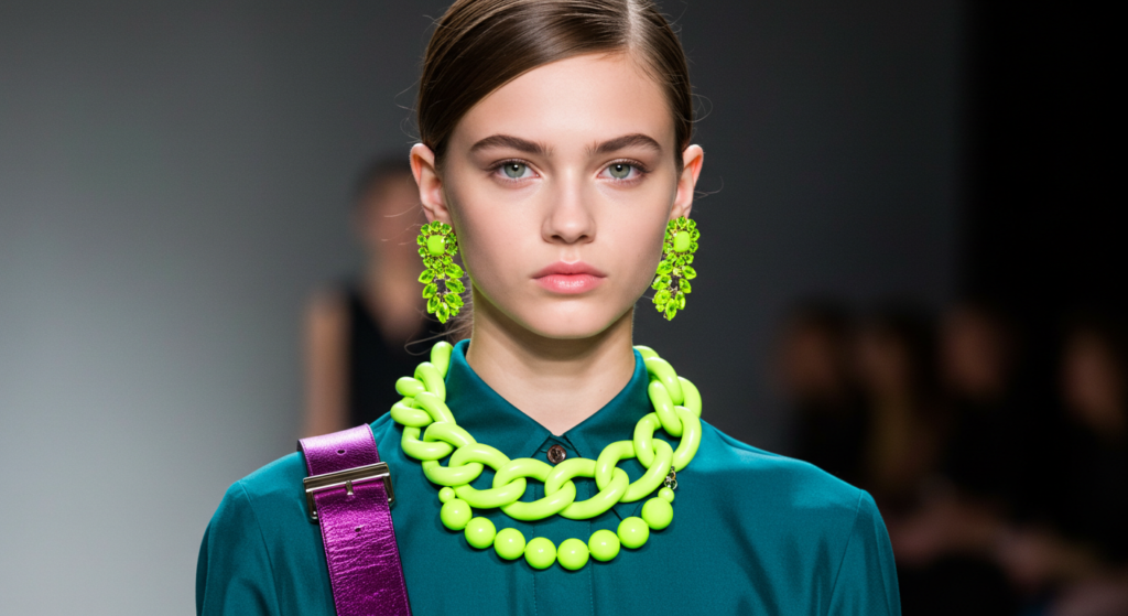
Anchoring Bold Choices
Accessories can either tie an outfit together or push it further into “bold territory.” If your clothing colors already clash, opt for accessories that echo one color from your outfit. For instance, if you’re mixing cobalt and neon green, choose a purse or belt in cobalt to reinforce that dominant shade. This approach keeps the ensemble cohesive despite the clash.
Creating Statement Highlights
Sometimes, a carefully chosen accessory is the star of the show. A neon-yellow handbag paired with a subdued navy jumpsuit draws the eye to that bold highlight. This technique works similarly with a chunky red necklace or bright boots set against an otherwise neutral backdrop. Use these pieces to highlight your color story without overwhelming it.
Accessorizing on a Budget
Bold accessories don’t have to break the bank. Thrift stores, clearance racks, and even online marketplaces often carry vibrant pieces at a fraction of department store prices. If you’re new to clashing colors, experimenting with inexpensive accessories is a safer way to refine your style. Try a bright belt or patterned scarf before investing in a higher-priced statement item.
Patterns and Prints Integration
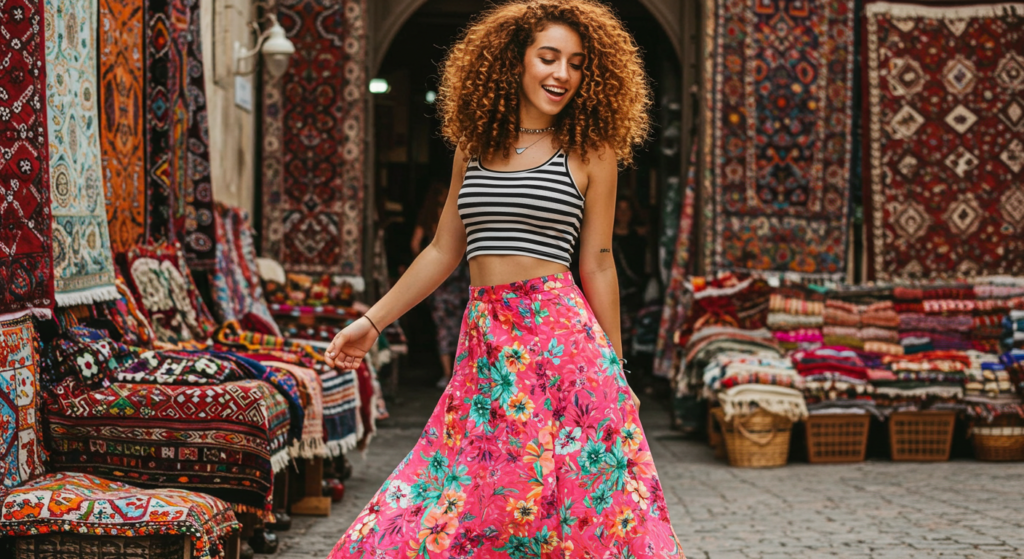
Mixing Stripes and Florals
Combining patterns—particularly stripes and florals—can seem daunting, but it’s an ideal way to master clashing. Try a striped top featuring a bold accent color and pair it with a floral skirt in a related hue. The stripes’ linear clarity can counterbalance the skirt’s softer floral shapes, creating harmony from two seemingly clashing elements. Add minimal accessories to let the patterns shine.
Animal Print with a Twist
Animal prints can be treated like neutrals if used cleverly. A leopard-print blazer with bright pink trousers is a perfect example: the print has a natural earthy tone, but it still registers as a pattern that commands attention. The bright pink introduces a playful jolt of energy, and combining these two unexpected elements can turn basic pieces into a fashion-forward statement.
Subtle to Maximal Print Harmonies
Not all prints need to scream for attention at the same volume. Consider pairing a small, subdued pattern—like a pinstripe pant—with a large, vibrant floral top. This contrast in pattern scale can keep your outfit from looking overwhelming. The difference in size ensures each element still stands out, creating a balanced yet refreshingly clashing arrangement.
Texture as a Color Companion

Velvet, Leather, and Satin
Color isn’t the only way to create a visual clash. Incorporating different textures can amplify or soften bold hues. A velvet emerald skirt might clash brilliantly with a matte leather jacket in burgundy. Or pair a satin top in a bright color with a rough, textured knit cardigan. The tactile difference between fabrics introduces another dimension to your ensemble.
Layering Different Weaves
Combine heavy, chunky knits with smooth, lightweight fabrics for added contrast. You might layer a waffle-knit sweater over a silky chiffon blouse in a contrasting shade. The interplay of thick and thin materials can give your look an intentional, editorial feel. This approach is especially striking when your chosen hues appear to clash, because the textural difference keeps it from looking sloppy.
Transforming Basic Outfits with Texture
When your outfit feels too basic, mix in a surprising fabric to reinvigorate it. For example, if you have a simple T-shirt and jeans in contrasting colors (say, teal top and dark mustard denim), add a textured vest or a quilted jacket. The extra layer not only provides physical warmth but also brings visual depth to your color-clashing ensemble.
Seasonal Twists

Bold Winter Pairings
Winter is often associated with dark, muted colors, but it’s an excellent time to experiment with clashing hues. Pair a bright, jewel-toned coat—like sapphire or ruby—with a contrasting scarf in a neon color. The dreary winter backdrop makes these colors pop even more, injecting energy into the cold-weather wardrobe. Add statement boots, and you’re set for a standout winter look.
Bright Summer Mash-Ups
Summer is naturally a season of bright shades. Instead of the usual pastel florals, try pairing unexpected combos—such as lime green with a soft lilac. Or mix a bold yellow sundress with a cobalt-blue hat. Because sunshine and blue skies dominate summer aesthetics, vibrant outfits feel right at home. Add woven accessories or straw hats for a laid-back seasonal vibe.
Transitional Color Moves
In fall and spring, the weather fluctuates between warm and cool, so layered outfits become essential. Take advantage by layering long-sleeve tops in bold colors under lighter jackets in equally striking tones. For instance, a rust-orange jacket over a pastel-yellow sweater signals a change in seasons. Adapting your clashing color palette to fit shifting temperatures can make your style look both intentional and functional.
Unexpected Color Combos

Orange and Purple
Traditionally considered a “no-go,” orange and purple can look stunning if done thoughtfully. Keep one color slightly more subdued than the other. For example, a deep eggplant sweater can pair well with a bright orange midi skirt. Accessorize with neutral shoes to keep the focus on the main color contrast. These two hues together create a warm, autumn-inspired vibe that works year-round.
Red and Pink
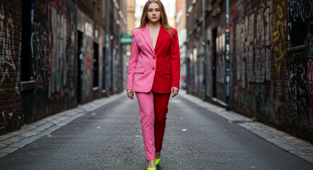
Mixing red and pink was once seen as a fashion faux pas, but modern style norms have shifted. Embrace it fully by pairing a hot-pink blazer with a red mini-skirt or red trousers. The warmth of both colors ties them together, while the slight differences in hue make them clash in a visually arresting way. Add simple gold or silver jewelry for a polished finish.
Green and Blue
Green and blue might be neighbors on the color spectrum, but they can still appear to clash under certain conditions. Think of a teal blouse with a vivid emerald skirt. The subtle difference in undertones can create a dynamic, almost electric effect. If you want to tone it down, incorporate a neutral belt to break up the large blocks of color.
Mixing Pastels with Bold Tones

Mellow Meets Vibrant
Soft pastel shades—like powder blue or mint green—can balance more aggressive hues like neon or metallic. Consider wearing a neon-yellow jacket over a mint-green dress. The result is a bright, clean contrast that feels both playful and refined. This strategy is perfect for events where you want to stand out without being overwhelming.
Saturated Accents
If you’re not ready for a full pastel-and-bold color scheme, introduce a single saturated element. For example, wear a lavender blouse with a deep wine-colored scarf or belt. This method keeps your outfit from feeling too busy, while still infusing that punch of vibrant color. It’s an excellent way to dip your toe into the world of creative color clashing.
Styling Techniques for Pastel-Bold Combos
- Choose complementary silhouettes: A structured pastel blazer can tame an otherwise unruly bold dress.
- Add textural details: Lace or pleated pastels pair beautifully with leather or metallic bolds.
- Use small accessories: Handbags, scarves, or jewelry in pastel or bold hues can subtly accentuate the clash.
Anchoring with Black, White, and Gray

Strong Foundations
Black, white, and gray can serve as a reliable base that allows your bold color choices to really pop. Whether it’s a black leather jacket over a lime-green jumpsuit or a white T-shirt layered under a striking fuchsia cardigan, neutrals anchor the overall look. You can even wear multiple neutrals at once—like a gray top and black pants—to serve as a balanced canvas for a single bold accessory.
Avoiding the Washed-Out Look
When you pair very bright colors with white or gray, there’s a risk they might look too stark or “washed out.” Combat this by adding a third color that has mid-level saturation—something not too dark, not too light. Think of a burnt sienna or a dusty blue. This intermediate color softens the clash between bright color and light neutral, creating a more cohesive appearance.
Elevating Basics into Standout Outfits
Even if your entire ensemble is primarily neutral, a single bold piece can transform it from “basic” to “wow.” A black-and-white look with a sudden pop of neon pink in the form of a blazer or shoes is a guaranteed conversation starter. This approach also lets you keep your capsule wardrobe minimal while still exploring color clashing through statement pieces.
Colorful Office Attire

Refreshing Corporate Looks
Office dress codes can be quite conservative, but a smart color clash can energize your corporate wardrobe. If your workplace allows business-casual attire, pair a muted forest-green blazer with a rust-orange blouse. The toned-down quality of both colors prevents them from feeling too loud, but they still clash in a subtle, interesting way. Complete the look with neutral trousers and closed-toe shoes.
Subtle vs. Bold Statements
Not every clash has to shout. A soft sky-blue button-down worn under a structured burgundy vest can breathe life into your work ensemble without drawing too much attention. If your office culture is more creative, you can go bigger—maybe a bright yellow midi skirt with a deep navy blazer. Understanding your environment’s boundaries lets you play with color clashing appropriately.
Navigating Dress Codes
Formal workplaces or certain events may require more subdued color choices. In such cases, focus on smaller clashes—like a tie or scarf that vibrantly contrasts with your suit. For ladies, a bright heel or bold statement necklace can be enough to showcase your style while staying within the confines of a stricter dress code. Always err on the side of respecting the environment while adding your personal flair.
Evening and Special Occasions
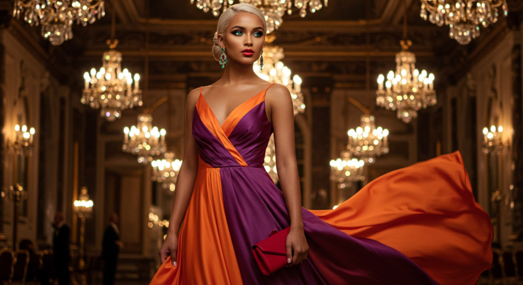
Formal Gowns with Clashing Hues
At black-tie events, you can still experiment with dramatic color clashing. Opt for a gown featuring two bold colors in its design. For instance, a dual-toned purple and orange dress is mesmerizing if executed well. Keep accessories minimal to let the dress shine, and choose a sleek hairstyle to maintain a polished look. Embracing a formal clash can turn heads in the most elegant way.
Cocktail Dresses and Statement Blazers
For cocktail hours or semi-formal parties, a color-clashing blazer adds zest to any classic LBD (little black dress) or simple sheath. Try a bright teal blazer over a black or neutral-toned dress, then add matching teal pumps. Alternatively, pair a daring red blazer with a pastel or metallic mini-dress for an edgy twist that sets you apart from the standard cocktail fare.
Coordinating Couple or Group Outfits
If you’re attending an event with friends or a partner, consider complementary clashing. For instance, if you wear a cobalt suit with an orange tie, your partner could wear an orange dress with cobalt accessories. This not only showcases your collective sense of style but also amplifies the impact of the clashing colors. It’s a fun way to stand out as a stylish duo or group without being overly “matchy-matchy.”
Sustainable Styling
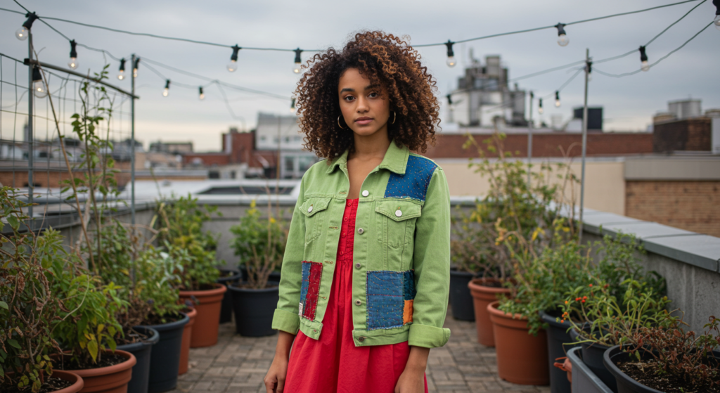
Upcycling Bright Pieces
One of the best ways to embrace clashing colors responsibly is to upcycle old garments. Revamp a dated, bright sweater by trimming or embellishing it. Turn it into a crop top or add new buttons in a clashing color. Not only do you create a standout piece, but you also reduce waste. Upcycling can be as simple as sewing on patches or using fabric paint to add bold designs.
Thrifting Unconventional Colors
Thrift shops often carry unique, offbeat color items that people have discarded. These gems can be perfect for building a color-clashing wardrobe at a low cost. Perhaps you find a lime-green blazer or a hot-pink jumpsuit—items that might be overlooked by others. With a bit of imagination, these thrifty finds can become the cornerstone of your daring style.
Creating Longevity with Smart Choices
Clashing doesn’t mean fast fashion. Opt for quality fabrics and timeless silhouettes in colors that speak to you. A well-made bright coat or blazer can be re-worn for years, layered in new ways each season. Aim for pieces that have sturdy stitching, durable materials, and comfortable fits. That way, you’ll keep clashing in style without constantly replacing your wardrobe.
Confidence and Personal Expression
Building Self-Assurance
Color clashing demands confidence. Start small if you feel hesitant—maybe a single bright accessory or one statement item. As you become more comfortable with unconventional color mixes, gradually increase the boldness. Self-assurance grows with practice, and each successful outfit adds to your style repertoire.
Owning Your Choices
Fashion is personal, and not everyone will understand your mix-and-match choices. That’s okay. What matters most is that you enjoy wearing it. If you feel good, others often pick up on that energy. When you stand by your color combinations—even if they clash fiercely—you radiate a sense of purpose and individuality that’s hard to ignore.
Adapting to Evolving Tastes
Our tastes inevitably shift over time. Maybe you once loved neon pink but now prefer rich jewel tones. Embrace these changes as you refine your color-clashing techniques. You’ll find that some items integrate smoothly with new purchases, while others might be best donated or upcycled. This evolution keeps your style fresh and aligned with your current preferences.
Conclusion

Defying the rules of matching is more than a fashion statement; it’s an exercise in creativity, individuality, and fearless self-expression. When we break away from the notion that all colors must “go” together, we open ourselves up to a world of endless possibilities.
Whether it’s layering unexpected shades, mixing bold prints, or simply adding an accessory that dazzles, clashing colors bring energy and excitement to everyday outfits and special-occasion wear alike.
In this article, we’ve explored the depths of strategic color clashing—from the power of accessorizing to the subtle art of layering different textures. We looked at vibrant seasonal transitions, corporate dress code considerations, and even sustainable approaches to building a clashing-friendly wardrobe.
Ultimately, the goal is to encourage experimentation. If you feel drawn to bright combinations that once made you hesitate, now is the time to try them. Remember: the most important factor in any outfit is how you feel wearing it. When you’re confident, even the wildest color clash can appear harmonious.
Summary Table
| Technique | What It Achieves | Example | Styling Tip |
|---|---|---|---|
| Use Neutrals as Anchors | Balances bright hues or multiple clashes | Lime blazer + white tee + neutral pants | Keep footwear neutral to avoid overwhelming the outfit |
| Mix Different Textures | Adds visual depth and variety | Satin blouse + leather pants in clashing colors | Keep one item structured and the other fluid to balance the silhouette |
| Strategic Layering | Distributes bold hues evenly | Three-layer combos in various bright shades | Choose a subtle base layer to ground vibrant outer pieces |
| Pattern & Print Integration | Keeps the clash deliberate and stylish | Striped top + floral skirt + minimal accessory | Balance large prints with smaller ones for a controlled contrast |
| Bright Accessories | Introduces color clashing without a big investment in clothing | Neutral outfit + neon belt or handbag | Match accessories to one key color for cohesion |
FAQ

Q: Isn’t clashing considered a fashion mistake?
It used to be frowned upon, but fashion evolves. These days, creative clashes are a sign of confidence and personal flair, not a mistake. As long as you feel good in your outfit, it’s a win.
Q: How do I avoid looking like I got dressed in the dark?
Pick a common thread—even if it’s just a color repeated in your accessories. Another option is to unify your outfit through texture. This ensures your clash feels intentional, not random.
Q: Can I clash colors at work without violating a dress code?
Yes, if you keep your clashes subtle. Choose toned-down shades—like maroon and olive—rather than neons. Complement them with neutral trousers and professional silhouettes to keep it office-friendly.
Q: Do I need to match my shoes to my bag when clashing colors?
Not necessarily. In fact, unmatched shoes and bag can be part of the clashing aesthetic. If you’re unsure, match one of them to a dominant color in your outfit for a cohesive touch.
Q: How can I experiment with color clashes without buying a whole new wardrobe?
Start with accessories. Belts, scarves, bags, or jewelry in bright, contrasting shades are budget-friendly ways to test out bold combinations. You can also shop thrift stores for unique pieces that won’t break the bank.
Clashing colors is all about self-expression and breaking free from restrictive style norms. With these tips, you’re ready to turn heads, spark conversations, and enjoy fashion as an evolving art form. Go forth and clash away!

Joanna Perez, with a degree in Creative Writing, excels in recommending distinctive clothing color mixes and trends that deeply connect with readers. She simplifies the often daunting task of color selection, making fashion decisions more personalized and impactful. Her passion for vibrant color palettes and the stories they tell makes her an indispensable voice in the fashion community.
Reviewed By: Marcella Raskin and Anna West
Edited By: Lenny Terra
Fact Checked By: Sam Goldman
Photos Taken or Curated By: Matthew Mansour
