Key Takeaways
- Color theory fundamentals are essential for creating harmonious outfits
- Understanding your skin undertone is crucial for selecting flattering colors
- The color wheel is a powerful tool for outfit coordination and color mixing
- Seasonal color analysis helps determine your most complementary palette
- Neutral colors serve as versatile building blocks in any wardrobe
- Color psychology influences mood and perception through clothing choices
- Mastering color blocking techniques can elevate your style game
- Accessories offer an easy way to experiment with new color combinations
Have you ever stood in front of your closet, overwhelmed by a sea of colors, wondering how to orchestrate the perfect outfit? You’re not alone. The art of color coordination in fashion is a symphony many of us struggle to conduct. But fear not, fellow fashionistas! I’m here to guide you through the vibrant world of color choreography, where every hue tells a story and every shade sets the stage for your personal style opera.
I remember the day I first realized the power of color in my wardrobe. It was a dreary Tuesday, and I’d thrown on a mustard yellow sweater without much thought. Suddenly, compliments were flowing like wine at a gallery opening. My complexion looked brighter, my eyes sparkled, and I felt like I’d discovered a secret superpower. That’s when it hit me: mastering the art of color could transform not just my outfits, but my entire presence.
The Color Wheel: Your Fashion Compass
The color wheel isn’t just for art class anymore. It’s your trusty sidekick in the fashion world, guiding you through the treacherous waters of clashing hues and into the safe harbor of color harmony.
Primaries, Secondaries, and Tertiaries: The Building Blocks
Remember finger painting as a kid? Those primary colors – red, blue, and yellow – are the foundation of all color theory. Mix them together, and you get secondary colors: purple, green, and orange. Keep blending, and you’ll discover tertiaries like blue-green or red-orange. Understanding these relationships is like learning the alphabet of style; it’s the first step to reading the language of fashion fluently.
Complementary Colors: The Yin and Yang of Fashion
Opposites attract, right? That’s the essence of complementary colors. Blue and orange, purple and yellow, red and green – these pairs sit across from each other on the color wheel and create electric combinations when worn together. I once rocked a cobalt blue dress with tangerine accessories to a summer wedding, and let me tell you, heads turned faster than a tennis match at Wimbledon.
Analogous Harmony: The Good Neighbors of Hues
Analogous colors are the friendly neighbors on the color wheel, sitting side by side and playing well together. Think of a sunset – those oranges, yellows, and pinks blending seamlessly. Translating this to your wardrobe can create a sophisticated, cohesive look. My go-to fall outfit? A burgundy sweater paired with plum-colored pants and a blush scarf. It’s like wearing autumn itself.

Undertones Unveiled: Finding Your Perfect Palette
Ever wonder why some colors make you look like a glowing goddess while others leave you feeling washed out? The secret lies in your skin’s undertone.
Warm, Cool, or Neutral: Decoding Your Skin’s Secret Language
Determining your undertone is like finding the key to a locked treasure chest of flattering colors. Warm undertones have a golden or peachy cast, cool undertones lean towards pink or blue, and neutral undertones are the lucky in-betweeners. Not sure which camp you fall into? Try the vein test: look at the veins on your wrist. Green veins signal warm undertones, blue or purple veins point to cool undertones, and a mix of both suggests you’re neutral.
The Gold vs. Silver Test: A Quick Trick
Here’s a party trick that doubles as a style hack: hold a piece of gold jewelry next to your face, then switch to silver. Which makes your skin glow? If gold’s your go-to, you’re likely warm-toned. Silver star? You’re probably cool-toned. Both look equally fabulous? Congratulations, you’re neutral!
Color Draping: The Professional Approach
For those who take their color coordination seriously (and why shouldn’t you?), color draping is the gold standard. This technique involves draping fabrics of different colors near your face to see which ones enhance your natural coloring. I once had a color draping session, and it was like discovering a whole new me. Colors I’d avoided for years suddenly became my best friends, while old favorites were politely asked to leave the party.

Seasonal Color Analysis: Your Personal Palette Prescription
Just as nature has its seasons, so does your personal color palette. Seasonal color analysis is like having a stylist in your pocket, guiding you towards the shades that make you shine.
Spring: Fresh and Vibrant
Spring types bloom in clear, warm colors with yellow undertones. Think coral, peach, golden yellow, and bright green. If you’re a Spring, you’re lucky – you can wear both pastels and bright colors with equal flair. I have a Spring friend who looks absolutely radiant in a mint green blouse; it’s like she carries sunshine wherever she goes.
Summer: Soft and Cool
Summer palettes are all about soft, cool colors with blue undertones. Lavender, powder blue, rose pink, and soft gray are your best friends. Summers glow in muted tones that whisper rather than shout. I once saw a Summer-typed woman in a periwinkle dress at a garden party, and she looked so effortlessly elegant, it was like she’d stepped out of a watercolor painting.
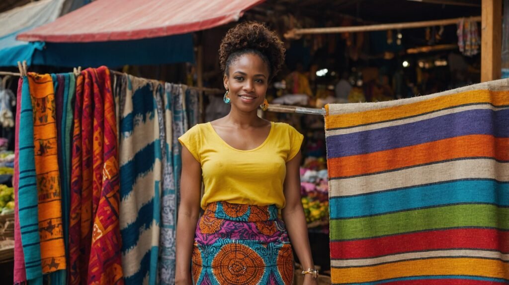
Autumn: Rich and Warm
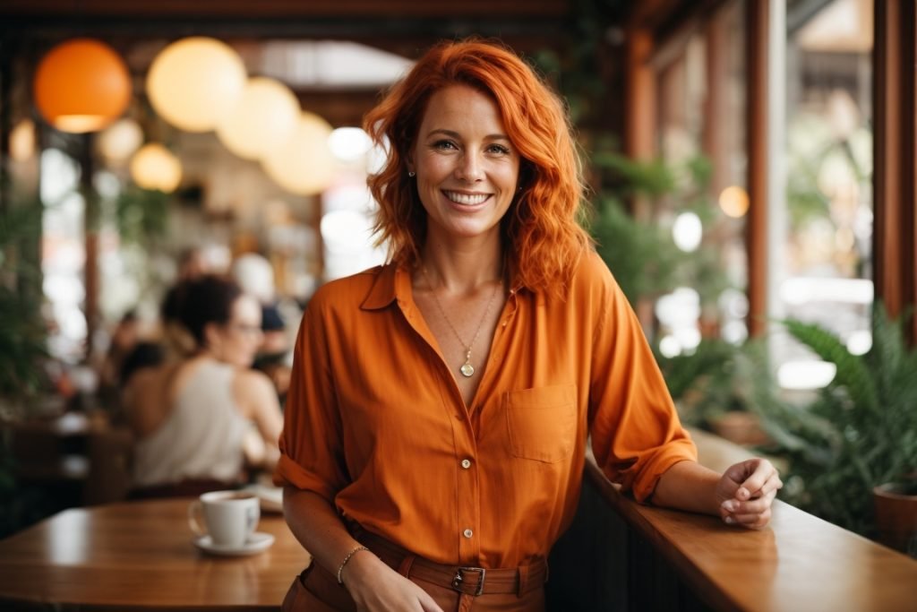
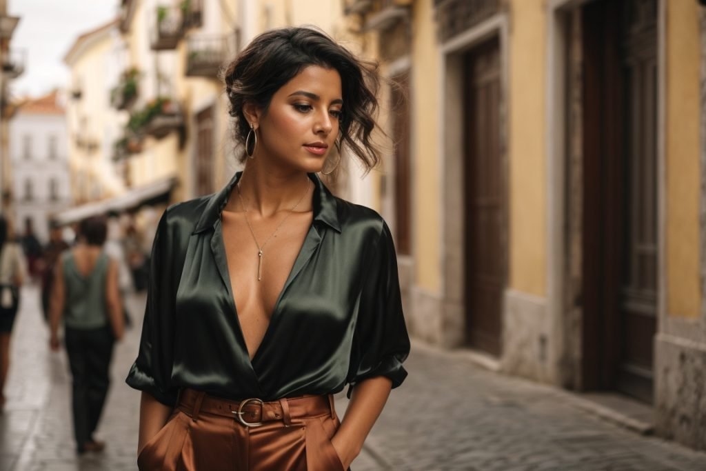
Autumn types shine in warm, rich colors with golden undertones. Think terracotta, mustard, olive green, and russet. These earthy tones complement the natural warmth in Autumn complexions. I’m an Autumn myself, and when I slip on a rust-colored sweater, it’s like my whole face lights up from within.

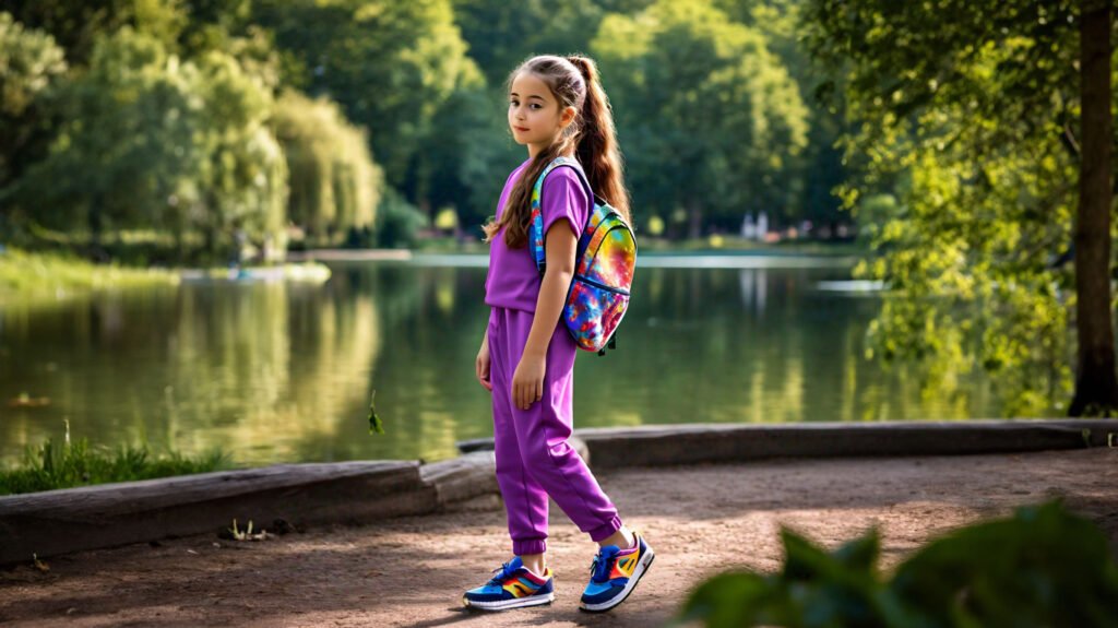
Neutrals: The Unsung Heroes of Your Wardrobe
Neutral colors are the reliable friends of the fashion world – always there when you need them, never stealing the spotlight, but making everything else look better.
Black, White, and Gray: The Classic Trio
These timeless neutrals are the backbone of any wardrobe. Black is slimming and sophisticated, white is fresh and clean, and gray is the chameleon that can swing either way. I once built an entire capsule wardrobe around these three colors, and it was the most versatile collection I’ve ever owned.
Earth Tones: Nature’s Neutrals
Beige, tan, brown, and khaki – these earth tones are like a warm hug for your outfit. They pair beautifully with almost any color and can ground even the boldest looks. My favorite fall ensemble? A camel coat over literally anything. It instantly elevates jeans and a tee to chic territory.
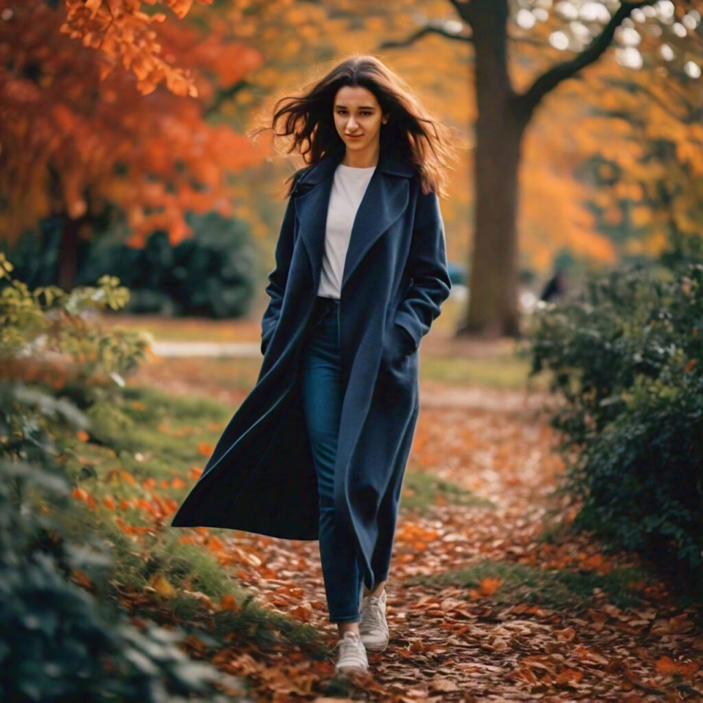
Navy: The New Black
Navy is the dark horse of neutrals – often overlooked but incredibly powerful. It’s softer than black but just as versatile. I started incorporating navy into my wardrobe a few years ago, and it’s been a game-changer. It pairs beautifully with jewel tones, pastels, and even other neutrals.

The Psychology of Color: Dressing for the Mood You Want
Colors don’t just affect how we look; they influence how we feel and how others perceive us. Understanding color psychology can be a powerful tool in your fashion arsenal.
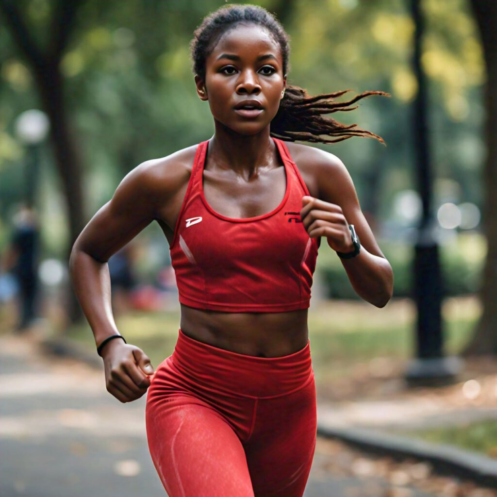
Red: The Power Player
Red is the color of passion, energy, and confidence. Wearing red can make you feel more assertive and even increase your heart rate slightly. I once wore a red blazer to a big presentation, and I swear it gave me an extra boost of courage.
Blue: The Calming Force
Blue is associated with trust, stability, and peace. It’s a great color to wear when you want to appear reliable and calm. I have a pale blue shirt that I call my “interview shirt” because it always seems to put both me and my interviewer at ease.
Yellow: The Happiness Hue
Yellow is the color of sunshine, optimism, and creativity. Wearing yellow can lift your mood and make you appear more approachable. I have a yellow scarf that I throw on whenever I need a little pick-me-up – it’s like carrying a bit of sunshine with me.
Green: The Balancer
Green represents growth, harmony, and balance. It’s a great color to wear when you want to feel centered or when you’re mediating a situation. My olive green sweater is my go-to for family gatherings – it keeps me feeling grounded amidst the chaos.
Purple: The Royal Touch
Purple has long been associated with luxury, creativity, and spirituality. Wearing purple can make you feel more regal and imaginative. I have a deep purple dress that I save for special occasions – it always makes me feel like royalty.
Pink: The Nurturer
Pink is often linked to love, kindness, and nurturing. It’s a great color to wear when you want to appear approachable and caring. I have a soft pink blouse that I often wear when I’m mentoring younger colleagues – it seems to create a warm, supportive atmosphere.
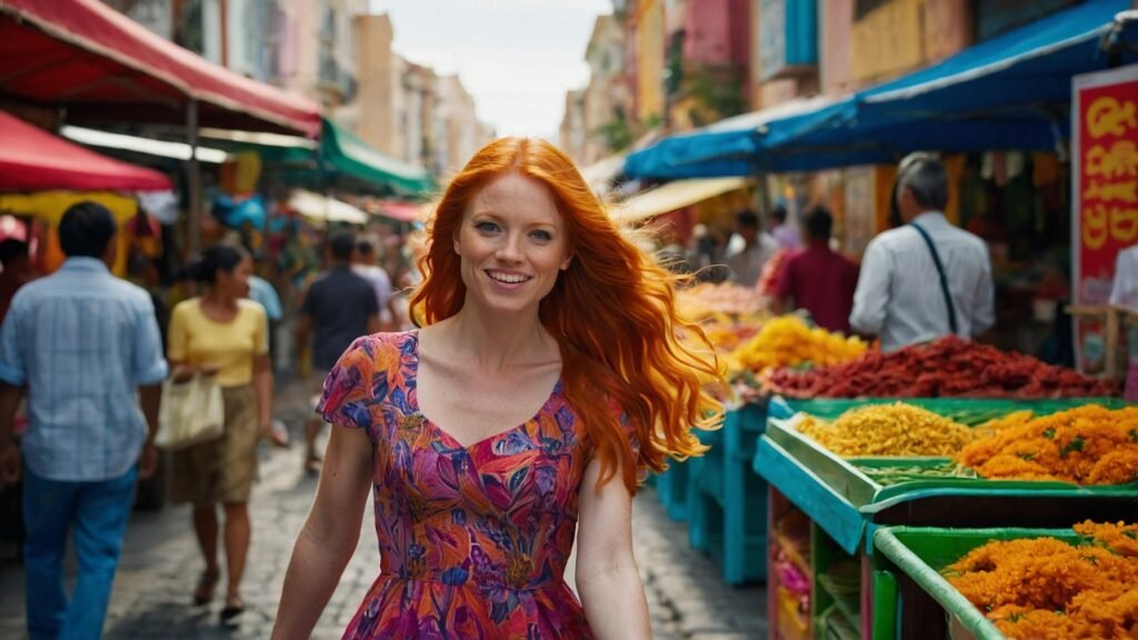
Orange: The Energizer
Orange is the color of enthusiasm, adventure, and sociability. It’s perfect for when you want to feel energized and outgoing. I have an orange workout top that always seems to give me an extra boost at the gym.
Brown: The Stabilizer
Brown represents stability, reliability, and comfort. It’s a grounding color that can make you feel more connected to the earth. My brown leather jacket is like a security blanket – it makes me feel steady and confident.
Color Blocking: The Art of Bold Combinations
Color blocking is like being the conductor of your own fashion orchestra – it’s all about combining solid colors in bold, unexpected ways.
- Complementary color blocking (blue and orange, purple and yellow)
- Analogous color blocking (shades of blue and green)
- Triadic color blocking (red, yellow, and blue)
- Monochromatic color blocking (various shades of the same color)
- Split-complementary color blocking (blue with red-orange and yellow-orange)
- Tetradic color blocking (two sets of complementary colors)
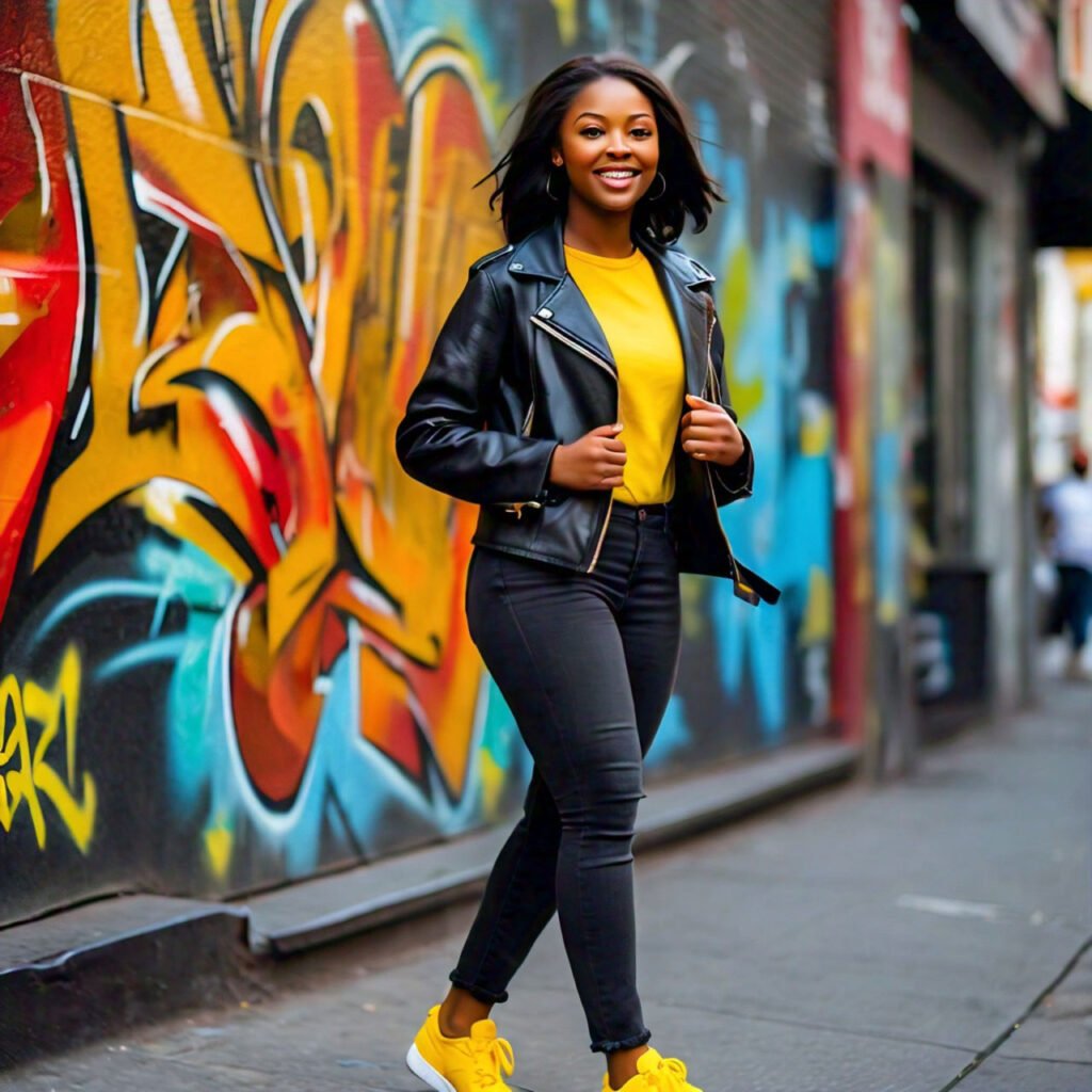
- High-contrast color blocking (black and white with a pop of bright color)
- Pastel color blocking (soft, muted tones together)
- Jewel-tone color blocking (rich, deep colors combined)
- Neutral color blocking (combining different neutral shades)
- Primary color blocking (red, blue, and yellow)
- Secondary color blocking (purple, green, and orange)
- Earth-tone color blocking (combining various shades of brown, green, and orange)
- Neon color blocking (bright, fluorescent colors together)
- Ombre color blocking (gradual color transition from light to dark)

Accessorizing: The Final Flourish in Color Coordination
Accessories are the secret weapons in your color coordination arsenal. They’re like the spices in a gourmet dish – used correctly, they can elevate your entire outfit from bland to brilliant.
Scarves: The Versatile Virtuosos
Scarves are my absolute favorite way to experiment with color. They’re low-commitment, high-impact pieces that can completely transform an outfit. I once turned a simple black dress into a head-turning ensemble with a vibrant silk scarf in shades of teal and coral. It was like painting a masterpiece on a blank canvas.
Jewelry: The Subtle Statements
Jewelry can add just the right touch of color without overwhelming your outfit. A pair of emerald earrings against a crisp white shirt, or a chunky turquoise necklace with a neutral sundress – these small pops of color can make a big impact. I have a collection of colorful statement necklaces that I use to breathe new life into my work wardrobe basics.
Shoes and Bags: The Bold Bookends
Don’t forget about your feet and your carry-all! Colorful shoes and bags can anchor your outfit and tie everything together. I once wore head-to-toe black with cherry red pumps and a matching clutch – it was simple, chic, and made me feel like a million bucks.
Mixing Patterns: Advanced Color Choreography
Once you’ve mastered solid colors, it’s time to level up to pattern mixing. This is where the real fun begins!
Scale is Key
The secret to successful pattern mixing lies in varying the scale of your prints. Pair a large floral print with a small polka dot, or a wide stripe with a tiny check. I once combined a maxi skirt in a large tropical print with a striped tee, and the result was unexpectedly harmonious.
Find a Common Color
When mixing patterns, look for a common color thread to tie them together. This creates cohesion in even the boldest combinations. My favorite pattern mix? A leopard print skirt with a floral blouse that picks up the brown tones from the leopard. It’s wild, but it works!
Balance is Everything
If one pattern is bold and colorful, let the other be more subdued. This creates a sense of balance and prevents your outfit from looking like a clown costume (unless that’s what you’re going for, of course!). I love pairing a colorful plaid blazer with a subtly striped shirt – it’s playful yet polished.
Color and Body Shape: Flattering Your Figure
Colors don’t just affect our complexion; they can also impact how our body shape is perceived. Understanding this can be a powerful tool in your style arsenal.
Vertical Color Blocking for Height
Want to look taller? Try vertical color blocking. Wearing the same color from head to toe creates an unbroken line that elongates your silhouette. I’m on the shorter side, so I love wearing monochromatic outfits when I want to add a few visual inches.
Strategic Darkness for Slimming
Dark colors recede, while light colors advance. Use this principle to your advantage by wearing darker colors on areas you want to minimize and lighter colors on areas you want to highlight. A black pencil skirt with a white blouse is a classic example of this technique in action.
Color Placement for Proportion
Use color to create optical illusions that balance your proportions. If you’re pear-shaped, wear darker colors on the bottom and brighter colors on top to draw the eye upward. Apple shapes can do the opposite. I have a pear-shaped friend who rocks this trick with dark jeans and colorful tops – it works like a charm!

Seasonal Shifts: Adapting Your Color Palette
Just as nature changes its colors with the seasons, so can your wardrobe. Adapting your color choices to the time of year can keep your style fresh and relevant.
Spring: Awakening Pastels
As the world blooms anew, so can your wardrobe. Spring is the perfect time to break out those soft pastels and fresh, clear colors. Think mint green, lavender, peach, and sky blue. I love swapping out my winter neutrals for a palette that mirrors the blossoming world around me.
Summer: Vibrant Brights
Summer calls for bold, saturated colors that can hold their own against the bright sunlight. Coral, turquoise, sunny yellow, and vivid green are all perfect choices. My summer wardrobe is filled with pieces that look like they’ve been plucked from a tropical paradise.
Fall: Rich Earth Tones
As leaves turn and the air crisps, it’s time to shift to warmer, deeper hues. Burgundy, forest green, mustard yellow, and pumpkin orange are quintessential fall colors. I look forward to fall fashion all year – there’s something so cozy and sophisticated about these rich tones.
Winter: Cool and Crisp
Winter’s palette is all about contrast – deep, cool colors punctuated by bright whites and metallics. Navy, charcoal, wine red, and emerald green all shine in the winter months. I have a collection of jewel-toned sweaters that are my winter workhorses.
Color Care: Maintaining Your Vibrant Wardrobe
All this color knowledge won’t do you much good if your clothes fade to a shadow of their former glory. Here are some tips to keep your colorful wardrobe looking fresh:
- Sort laundry by color to prevent bleeding
- Use cold water for most washes to preserve color intensity
- Invest in color-preserving detergents
- Turn garments inside out before washing
- Avoid over-drying, which can fade colors
- Store clothes away from direct sunlight
- Use garment bags for delicate or vibrant pieces
- Spot clean when possible to avoid unnecessary washing
- Follow care labels meticulously
- Consider hand-washing for special or very vibrant items
- Use vinegar in the rinse cycle to set colors
- Dry clean when recommended, especially for rich, dark colors
- Avoid using bleach on colored clothes
- Store seasonal clothes properly to prevent fading and damage
- Refresh faded black clothes with coffee or tea
The Art of Colorful Confidence: Embracing Your Palette
At the end of the day, the most important aspect of color coordination is how it makes you feel. Confidence is the best accessory you can wear, and the right colors can help you radiate that confidence from the inside out.
Trust Your Instincts
While color theory and seasonal analysis are fantastic tools, don’t be afraid to trust your gut. If a color makes you feel amazing, wear it with pride, regardless of what the ‘rules’ say. I have a bright orange dress that, according to my seasonal analysis, I shouldn’t wear. But every time I put it on, I feel like I can conquer the world. So guess what? It’s staying in my rotation.
Experiment and Have Fun
Don’t be afraid to step out of your color comfort zone. Try on that electric blue top you’ve been eyeing, or pair your favorite neutrals with an unexpected pop of neon. Fashion is supposed to be fun, after all. I make it a point to try at least one new color combination every month – it keeps my style fresh and often leads to surprising new favorites.
Build Your Signature Palette
As you become more comfortable with color, you might find yourself gravitating towards certain hues again and again. Embrace this! Developing a signature color palette can streamline your wardrobe and make getting dressed a breeze. My personal palette revolves around deep greens, rich purples, and warm neutrals – colors that make me feel like the best version of myself.
Summary Table
| Color Category | Examples | Best For | Mood Effect |
|---|---|---|---|
| Warm Colors | Red, Orange, Yellow | Energizing outfits, making a statement | Excitement, confidence, optimism |
| Cool Colors | Blue, Green, Purple | Calming ensembles, professional settings | Tranquility, trust, creativity |
| Neutrals | Black, White, Gray, Beige | Versatile basics, grounding bold colors | Sophistication, balance, timelessness |
Conclusion
Mastering the art of color choreography is a journey, not a destination. It’s about discovering what works for you, pushing your boundaries, and expressing your unique personality through the language of color. Remember, there are no hard and fast rules – only guidelines to help you along the way.
As you embark on your color adventure, keep an open mind and a playful spirit. Let your wardrobe be a canvas for self-expression, a tool for boosting your mood, and a source of daily joy. After all, life’s too short for a dull wardrobe!
So go forth, my fellow color enthusiasts, and paint your world with the vibrant hues of your choosing. Whether you’re rocking a monochromatic masterpiece or a bold color-blocked ensemble, wear your colors with confidence. Because when you feel good in what you’re wearing, you’ll light up any room – no matter what colors you choose.
Frequently Asked Questions
How do I determine my skin’s undertone?
Look at the veins on your wrist. If they appear greenish, you likely have warm undertones. If they look blue or purple, you probably have cool undertones. If you can’t quite tell or see both, you might have neutral undertones. Another method is the jewelry test: if gold jewelry complements your skin better, you’re likely warm-toned, while silver suggests cool undertones.
Can I wear colors that aren’t in my “season”?
Absolutely! Seasonal color analysis is a guide, not a strict rulebook. While colors in your season might be particularly flattering, don’t be afraid to experiment with other hues. The most important thing is how a color makes you feel when you wear it.
How can I incorporate more color into a mostly neutral wardrobe?
Start small with colorful accessories like scarves, jewelry, or shoes. These allow you to experiment without committing to a full colorful outfit. As you become more comfortable, try adding one colorful piece to your neutral outfits, like a bright blouse with neutral pants and jacket.
What colors work best for professional settings?
While this can vary depending on your industry, generally, darker colors like navy, charcoal, and deep green convey authority and professionalism. Softer colors like pale blue or lavender can be appropriate while adding a touch of personality. When in doubt, observe what successful people in your field are wearing.
How do I prevent my colorful clothes from fading?
Wash your clothes in cold water, turn them inside out before washing, and avoid over-drying them. Use detergents specifically designed for colored clothes, and consider hand-washing particularly vibrant or delicate items. Always follow the care instructions on the label.
Can I wear black in summer?
Certainly! While black absorbs more heat, making it less comfortable in hot weather, it can still be stylish in summer. Opt for loose-fitting black garments in breathable fabrics like linen or cotton. Pair black with white or bright colors for a seasonally appropriate look.
How do I mix patterns without clashing?
Start by choosing patterns with a common color. Vary the scale of the patterns – pair a large print with a smaller one. Keep the rest of your outfit simple to let the patterns shine. When in doubt, treat stripes as a neutral; they mix well with most other patterns.
What colors are universally flattering?
While individual preferences and skin tones play a role, some colors tend to look good on almost everyone. These include teal, coral, eggplant purple, and true red. Soft white is also flattering on most skin tones.

Neha Z. is not just any writer; she’s a storyteller who has graced the online world with her evocative prose for over half a decade. Venturing into the intricate nuances of women’s lives, she weaves stories that range from life’s highs and lows to the multifaceted essence of femininity. Each piece she pens radiates sincerity and artistry. As you delve into Neha’s musings, you’ll find reflections that echo your own journey and insights that inspire. Immerse yourself in her world, and let her stories touch your heart.
Reviewed By: Joanna Perez and Anna West
Edited By: Lenny Terra
Fact Checked By: Matthew Mansour
Photos Taken or Curated By: Matthew Mansour