Key Takeaways
- Earth tones often bring a sense of depth and honesty to branding and visual identity.
- These muted hues can help your brand appear more grounded and trustworthy.
- Consistent use of earth tones can enhance brand cohesion and set you apart.
- Mixing these shades with modern design trends can spark fresh appeal.
- Thoughtful color choices influence brand perception and brand messaging without relying on cliché color psychology.
- Earth tones can adapt to various brand personalities—from rustic to polished—to support strategic branding goals.
- A proper color palette balances earth tones with accent hues, ensuring visual hierarchy and harmony.
- Guidelines and structured brand assets maintain that authentic vibe across digital branding channels and physical materials.

In branding and visual identity, color choices guide how people perceive your message. When done well, brand colors can speak without a single word. Among the many hues in the creative branding space, earth tones stand out for their understated appeal. Browns, greens, tans, warm grays—these shades evoke a grounded, genuine feeling.
Why do many businesses favor them? Because they provide warmth and a down-to-earth vibe that feels comforting. People often link these colors with nature, stability, and quality. In brand visuals, earthy palettes can introduce a sense of authenticity that’s hard to fake. If your goal is to appear honest, friendly, and real, these tones can set you on the right path.
Below, you’ll find 14 sections packed with actionable advice. Each section includes three subsections that go deep into practical details. You’ll discover how to apply earth tones in logo design, brand guidelines, corporate identity, and more.
You’ll learn to maintain brand consistency and craft a compelling color palette. You’ll also see how these hues partner with typography, brand storytelling, and other design elements.
Whether you’re refreshing an established identity or starting from scratch, this post will equip you with fresh ideas. Let’s explore how earth tones can strengthen your brand visuals and foster a sense of honest connection.
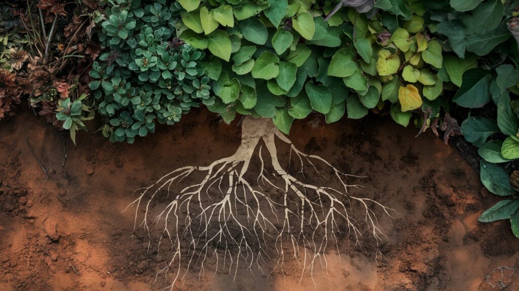
The Roots of Earth Tones in Branding
What Are Earth Tones?
Earth tones refer to colors that mimic natural elements like soil, clay, sand, stone, and foliage. Common examples include warm browns, subtle greens, and soft grays. They aren’t bright or loud. They feel calm and grounded.
Why do people respond to them? Because these colors resemble our everyday surroundings. They hint at reliability and warmth. In a brand identity, these qualities can forge trust. They also give the impression that your brand is in touch with something real, rather than chasing empty trends.
How They Impact Brand Perception
In brand messaging, visuals can speak louder than words. Earth tones send signals. A beige or taupe background suggests quiet confidence. A dusty green accent might whisper, “We value nature and calm.” These hues can influence how viewers size up your brand’s style and purpose.
But do they only fit nature-focused brands? No. Earth tones can work with technology, lifestyle, or even luxury segments if paired well with brand architecture and creative branding elements. The key lies in thoughtful execution. Earthy shades don’t scream for attention. They invite a closer look, making them ideal for brands aiming to feel authentic.
Why Now?
Though they’ve been around for ages, earth tones are gaining renewed interest in visual communication and marketing design. Many brands crave a more human look in a crowded digital environment. Bright colors can feel overwhelming.
Earthy palettes bring a breath of fresh air. They show a shift toward honest storytelling, local sourcing, and sincere brand values.
In short, earth tones aren’t a fad. They represent a broader move toward quiet brand authenticity and brand cohesion. Their subtle strength meets the current desire for realness in products, services, and digital branding presence.
Balancing Earth Tones With Modern Design

Pairing With Neutral Accents
Earth tones shine when paired with proper neutrals like crisp white or charcoal black. White space can showcase the muted colors in your design. A clean layout plus subdued earth tones results in a brand identity that looks uncluttered and approachable.
For instance, a web layout with a warm mocha background, white text boxes, and small black icons can appear sleek. This scheme supports brand messaging that feels polished but natural. Avoid piling too many earth tones at once. Let neutral tints offer clarity so your brand expression remains fresh.
Adding Hints of Bold Color
Too many muted tones can make a design feel dull. A dash of bold color in strategic spots can spark interest. Consider adding a bright accent color—like a goldenrod or a deep teal—to highlight calls to action or brand icons. This technique preserves an earthy palette while adding energy.
Think of it like seasoning in cooking. A pinch of spice elevates the dish. That small pop can steer eyes to your brand personality’s fun side without overshadowing the grounded base. Use it sparingly, though. You want harmony, not a mismatched blend.
Achieving a Cohesive Look
Brand consistency is key. If you embrace an earthy color scheme, apply it across print materials, packaging, web design, and social media. Keep brand guidelines that specify the exact hex codes for each main color, along with recommended accent shades.
Cohesion builds brand recognition. When your audience sees consistent, earthy tones across different channels, they know it’s you. This consistency also prevents confusion. It helps your marketing design appear thoughtful and sets an overall brand experience that feels trustworthy.
Earth Tones and Brand Personality
Soft and Gentle
Some brands want to appear calm, caring, and nurturing. Earthy greens with hints of light brown can create a gentle personality. For example, a small wellness studio might choose sage, cream, and tan. These hues encourage a soothing brand vibe.
This approach pairs well with images of nature or minimal line art. A brand that focuses on self-care or ethical sourcing might find these colors especially fitting. They invoke calm without stating it outright.
Rugged and Outdoorsy
Brands that want a rustic or adventurous feel often rely on deeper earth tones. Think of worn leather browns, dense forest greens, or muted rust. These colors suggest open-air experiences, natural textures, and a willingness to get hands dirty.
Adventure apparel, outdoor gear, or eco-friendly products lean on these shades. They support brand positioning as real, unpolished, and fearless. When combined with robust typography, they can look bold yet comforting—like a cabin in the woods.
Chic and Urban
Is it possible to have an earthy palette that feels city-savvy? Absolutely. A brand aiming for a refined but grounded edge might select taupe, slate gray, or olive. With the right fonts and layout, these colors can blend a modern flair with a raw, authentic charm.
For example, a craft coffee shop with polished concrete floors might use charcoal gray and warm brown in its signage and cups. That color pairing can highlight both quality and approachability. This balanced style appeals to folks seeking an inviting but sleek spot to enjoy a latte.
Practical Logo Design With Earth Tones
Simplifying the Logo
A logo is the quickest identifier of a brand. Earth tones allow for a simplified design that doesn’t rely on flashy shapes. A subtle logomark or wordmark can pop when rendered in a warm sepia or dark clay hue.
In many cases, simpler logos last longer. Overly detailed logos often look dated. With subdued colors, a minimal shape can become timeless. Keep lines neat, and choose one or two brand colors for your main mark. That approach helps your identity stay versatile.
Balancing Typography
Words in a logo need to be legible yet in sync with the brand’s earthy palette. Try pairing a bold serif font in a rich brown with a softer sans serif accent in cream or beige. This contrast keeps things readable but on-brand.
Pay attention to spacing. Too tight, and it looks crowded. Too loose, and it feels disjointed. Earth tones thrive on a balanced layout. Consider a hand-drawn lettered style if it fits your brand story. That can amplify the sense of craft and realness.
Ensuring Scalability
Logos must look good in various sizes. Check how your earth-toned logo appears on tiny mobile screens and large billboards. Muted colors might fade into certain backgrounds. Make sure you keep enough contrast. Test it on both light and dark surfaces to guarantee visibility.
When printing, some earthy hues (like deep browns or forest greens) can shift if not calibrated. Consult a print specialist or rely on recognized color guides like Pantone. Accurate reproduction ensures brand consistency across materials.
Creating Brand Guidelines That Stick

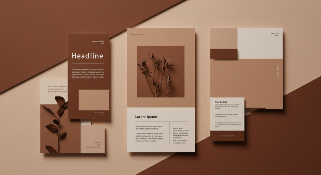
Color Palette Essentials
Your brand guidelines should detail your color palette. Include primary earth tones, complementary neutrals, and any accent shades. Provide hex, CMYK, and RGB codes for each. This clarity removes guesswork when a vendor or designer needs exact matches.
List do’s and don’ts. For instance, “Use Clay Brown (#8F6E51) for backgrounds in digital channels. For text, choose Charcoal Gray (#3C3C3C). Avoid using both at full strength on the same page.” That level of direction helps maintain brand cohesion.
Typography Pairings
Brand guidelines often overlook the synergy between typefaces and color. Offer clear advice on which fonts go best with your earth tones. Spell out which type of headlines pair well with which background color. That detail leads to consistent brand expression.
Include size rules or recommended font weights. Describe how text should appear on dark backgrounds vs. light ones. Show real examples of headings, subheadings, and body text. Users of the guidelines can see your preferred style at a glance.
Logo Usage Rules
Logos can end up misused if people don’t follow brand guidelines. Provide examples of correct placement, minimum clear space, and correct color usage. State how the logo should look on earthy backgrounds vs. neutral backgrounds. Make sure you show which variations to use (light version, dark version, monochrome).
Include correct scaling guidelines and outline potential pitfalls. For example, “Never distort the logo or change the brown to any other hue.” This consistency helps brand recognition by keeping your identity design intact in all contexts.
Building a Strong Visual Hierarchy
Layering With Texture
Earthy palettes often pair well with subtle textures. That extra layer can help guide the eye. Try adding grainy backgrounds or watercolor-like washes behind text blocks. These elements create depth without clutter.
But use textures sparingly. Too many patterns can overshadow your message. Make sure text remains clear and easy to read. The best approach is to place a light texture behind white or cream text, allowing for a comfortable reading experience.
Using Contrast for Clarity
Even with earth tones, contrast is still important. If your background is a warm taupe, pick text in a darker shade. If you use an accent color for headlines, ensure it’s visible enough against your brand’s primary base. This helps direct the reader’s focus in a logical order.
Contrast matters in both digital and print. On screens, consider how your palette looks in different lighting conditions. Test your site in a bright room and a dimly lit space. Make any adjustments to ensure comfort for the viewer.
Organizing Content
To keep content organized, employ bold fonts for headings, subtle lines, or shapes for dividers, and bullet points for lists. Earth tones excel in friendly brand storytelling, but they can confuse if the layout is chaotic.
Break text into digestible segments. Use subheadings that match your brand style. Include ample spacing. When your layout stays tidy, the muted color palette has room to stand out, giving your brand a polished yet grounded feel.
Incorporating Brand Imagery

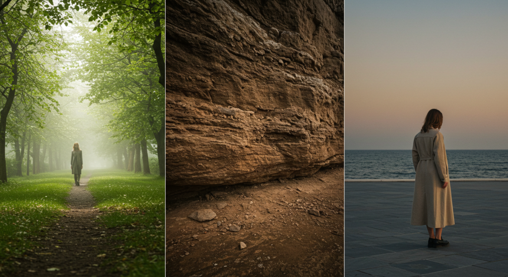
Photography With Natural Backdrops
Earthy palettes often mesh with photos that show soft, natural settings. Think warm wood textures, gentle fields, or rocky surfaces. Even if your brand isn’t nature-based, these backgrounds can highlight a genuine sense of quality.
Balance the composition by using photos that harmonize with your chosen palette. If your brand uses a lot of charcoal gray, look for images that have similar dark elements. Aligning these colors across visuals keeps your brand perception consistent.
Illustrated Elements
Hand-drawn illustrations can give your brand a charming look. Earth tones add life to sketches or diagrams. If your brand is about craftsmanship, these illustrations might communicate that you value care and detail.
Make sure illustrations remain in line with your overall brand strategy. If your voice is modern or sleek, stick to minimal lines and shapes in subtle browns or grays. If you aim for a more friendly tone, pick whimsical sketches that rely on lighter earthy shades.
Consistency Across Channels
Once you decide on a style for images, keep it consistent. Whether it’s for a website banner, a social media post, or a printed brochure, use the same guidelines. That way, your brand identity remains unified. People start to notice patterns. They recognize your brand even before seeing your logo.
In digital branding, file sizes matter. Optimize your images so pages load quickly, but ensure the colors remain true. A muddy or pixelated photo can hurt brand trust. Use recommended tools to compress files without losing color fidelity.
Earth Tones in Packaging Design
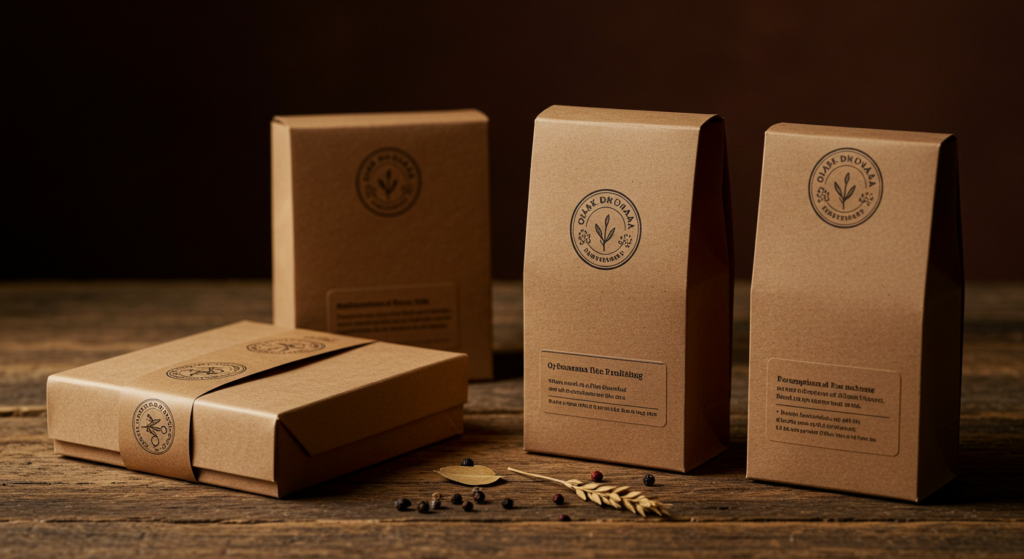
Materials and Textures
Packaging can benefit from an earthy palette in more than just color. Think about paper with recycled textures or matte finishes in rich browns and greens. That tactile element boosts brand authenticity. It also ties back to values like sustainability or craft.
Combine subtle textures with minimal text or logos to keep the design crisp. Some brands add raised ink or foil stamping. However, be sure the metallic accents don’t clash with your earthy vibe. Matte or spot gloss can also create a polished, understated effect.
Practical Tips
Plan your color usage for packaging from the start. Some browns can shift if printed on paper stock that’s too porous. Request physical proofs before mass printing. Also, keep track of label compliance and brand guidelines: your packaging must match the identity you present online.
Think about shelf presence. Earth tones often look calm next to bright competitors. If you want to stand out, use shape or layout differences. Or add a single pop of color that draws the eye to your brand name. This subtle strategy can spark curiosity.
Durable Branding
Packaging endures shipping, handling, and store displays. Earth tones can hide minor scuffs or marks better than pristine white. That’s good news if your product ships worldwide or sees lots of transit.
Still, aim for a protective coating or laminate that preserves brand visuals. Nothing is more frustrating than a design that peels or fades after a few months. Durable packaging extends brand recognition and upholds quality perceptions.
Extending to Digital Branding

Website Layouts
A website that features earth tones can feel cozy and genuine. A soft brown or beige background might make text easier to read than a bright white screen. Consider adding a side panel in a darker shade to frame your content.
Check readability. Keep your text color and background color contrast at recommended accessibility levels. Users on different devices should see your brand’s palette in a consistent way. Also, test hover effects and clickable elements in accent hues so visitors can spot them easily.
Social Media Posts
Scrolling feeds are jam-packed with neon bursts and bright visuals. Earth tones can stand out by offering a quiet break. When potential customers see your posts, they notice the calm vibe. This can spark recognition if done right.
Include brand imagery with mild textures or short captions in earthy text on a neutral background. Keep consistent spacing, fonts, and brand guidelines. People who value a natural aesthetic will feel drawn to your posts.
Digital Ads and Banners
In ads, you have seconds to grab attention. An earthy color palette might not seem flashy, but it can cut through visual noise. Viewers might appreciate a calm design in a sea of bright pop-ups.
Keep your message concise. Use bold typography in a darker earth tone, framed by a lighter shade. Test different placements for your call-to-action button. Maybe a small dash of bright color for the button stands out against the warm background, nudging clicks.
Steering Clear of Cliché Color Psychology

Moving Beyond Standard Meanings
“Blue equals trust. Green equals nature. Brown equals reliability.” These claims can sound stale. People interpret colors in many ways, shaped by personal tastes and cultural contexts. So how do you avoid cliché?
Instead of tying each color to a single meaning, focus on how it fits your brand’s story. Earth tones resonate because they look and feel natural, not because they always symbolize a specific trait. Let your brand strategy define the role of each hue.
Subtle Emotional Resonance
A brand might mention “comfort,” “warmth,” or “calm,” but it shouldn’t rely on overused color psychology claims. Instead, show real examples of how your brand fosters those qualities. Let the colors underscore that message rather than scream it.
When using earthy hues, guide your brand messaging in a way that complements actual brand values or product features. For instance, if your brand invests in fair-trade resources, these tones can reflect that honest approach without stating “brown = honesty.”
Cultural Awareness
In some regions, certain earth tones might carry distinct connotations. Research your target markets. Check if a dark green is associated with a certain holiday or cause. Make sure your chosen palette aligns with the brand architecture you’ve outlined.
Embrace local nuances when relevant. If you want a global presence, keep your brand guidelines flexible enough to adjust minor color details as needed. That level of nuance can strengthen brand authenticity across borders.
Earth Tones and Typography

Contrast and Legibility
When pairing earthy shades with type, aim for clear contrast. Darker backgrounds need lighter text. Lighter backgrounds can handle dark text. If your palette relies on multiple browns or tans, designate at least one as the main text color and another as a highlight for emphasis.
Test paragraphs of text to see if the reader can skim through quickly. If it’s a strain to read large blocks, adjust the shade or line spacing. Legibility is paramount. A brand can’t communicate if the words aren’t visible.
Serif or Sans Serif?
Both can work. A classic serif can hint at heritage or craft. A clean sans serif might reflect modern, straightforward branding. Think about your brand personality and brand positioning. If you aim for a polished, upscale look, a refined serif might suit you. If you want a casual, open vibe, a rounded sans serif might feel more friendly.
Showcase subheadings or pull quotes in a different typeface for contrast. That helps break the monotony of a single font everywhere. Keep a consistent ratio, like one font for headings, another for body text, to maintain brand coherence.
Wordmarks and Taglines
If your brand includes a tagline or slogan, be sure it stands out. Apply an earthy color that contrasts with the background. Use a slightly bolder or smaller typeface to differentiate it from the brand name. This small difference can highlight your brand story or brand values without overshadowing the main mark.
Pay attention to spacing. A cramped tagline can look unprofessional. Enough breathing room around the text ensures clarity. You want your brand message visible at a glance, especially on small screens.
Real-World Applications: Examples

Earth Tones in Corporate Identity
Picture a property development company that wants to show stability and environmental care. It could choose a deep cedar brown for letterheads, a soft moss green for accent lines, and a slate gray for its logo text. This trio suggests a grounded but modern approach. Their business cards, presentations, and signage would echo this earthy palette.
A Hospitality Brand
Imagine a local boutique hotel that aims to exude warmth and relaxation. Its color palette might revolve around sandy beige, clay brown, and a dusty olive accent. The brand guidelines would dictate these colors for its logo, website layout, room keycards, and marketing leaflets. This consistent color family sets a cozy atmosphere from the online booking page to the lobby.
Retail Packaging
A small brand that sells handmade soap could pack each bar in a kraft paper box with an earthy color stamp. Perhaps a gentle sage or cool stone hue for the product label. This look suggests a raw, natural product. When displayed on store shelves, it appeals to shoppers seeking authenticity and thoughtful design.
Merging Earth Tones With Brand Storytelling

Emotional Triggers Without Hype
Brand storytelling can highlight values like craftsmanship, slow-made products, or genuine customer care. Earth tones offer visual support for these ideas. Instead of slapping on bright illusions, these hues let the narrative take center stage.
Consider short, punchy taglines or brand messaging: “Crafted with honesty,” “Rooted in tradition,” etc. Earthy backgrounds offer a gentle stage for these words to shine. They reinforce a sense of sincerity rather than hammering it in.
Finding the Right Voice
Brand storytelling doesn’t have to be pompous. Keep the tone approachable. Show how your brand stands on real principles. Choose brand guidelines that remind every writer or designer to align with that style. Include the right visuals and color palette to back up each word.
When your voice and visuals match, the audience senses genuine unity. That synergy enhances brand trust. If the brand’s story is about sustainability or ethics, highlight photos and details of real materials or processes, anchored by earthy color filters or frames.
Consistency Over Time
Stories grow and shift as businesses expand. Earth tones can adapt if you plan ahead. You might add a slightly bolder accent color for a new product line or campaign, but the core palette remains. This helps your audience see a steady thread across seasons or launches.
Over the years, your brand might adopt new design trends or visual rebranding efforts, but if you maintain an earthy foundation, you keep a recognizable anchor. That fosters brand recognition and brand loyalty.
Mixing Traditional and Contemporary Design Elements

Old-World Inspiration
Some brands, like artisanal bakeries or local craft shops, blend old and new. Earth tones mesh well with old-world fonts, vintage illustrations, or border frames. The result can feel timeless.
Still, be sure your site or print materials remain user-friendly. An old-fashioned look is charming, but basic clarity should guide your design. Balance any antique touches with modern spacing or layout structures.
Minimalism Meets Earthy
A brand that values minimalism can keep lines clean and spacing generous, while the color palette remains soft. Think a simple storefront sign with a tan background and a single line of text in deep brown. That’s enough to project sophistication without flashy gimmicks.
This approach works for consultants, digital services, or high-end fashion lines aiming for a calm but stylish presence. A crisp, airy layout plus these muted tones offers calm, confident branding.
Carefully Chosen Accents
Occasionally, a modern swirl of geometric shapes or an asymmetrical layout will freshen up an earthy design. Select a shape or pattern that links to the brand’s main concept. For example, a wellness brand might use curved leaf outlines. A tech brand that wants an earthy twist could incorporate stylized circuit-like vines.
Such accents differentiate your visuals from typical nature-based designs. They hint at creativity, but you’re still grounded by a stable color palette.
Refreshing an Existing Brand With Earth Tones

Why Refresh?
Maybe your current identity feels stale or unoriginal. An earth-toned refresh can inject an aura of authenticity without tossing out everything you already have. It’s a shift toward calm reliability.
But plan carefully. A sudden jump from neon pink to chocolate brown can confuse followers. If your brand’s established, communicate the reasons behind the color change, and roll it out consistently across channels.
Phased Implementation
A brand refresh doesn’t have to happen overnight. Some brands transition in stages—starting with a new logo, then updating stationery, then rolling out fresh packaging. That allows your audience time to adapt. Track feedback, gauge what resonates, and keep refining.
Use announcements and social media posts to guide your audience through the changes. Show glimpses of the new palette in action. Frame it as an upgrade that brings the brand closer to its core values. Earth tones often suggest growth or a return to roots.
Measuring Impact
Once your new palette is live, measure how people respond. Check social media engagement, store visits, or user feedback on your site. If the brand looks more approachable, do you see more inquiries or conversions?
Track color usage analytics, if possible. Some advanced user interface tools let you see how people interact with certain color-coded elements. If you notice big improvements in brand perception or brand expression, it’s a sign your earth-toned refresh is paying off.
Conclusion

Earth tones, while subtle, pack a powerful punch for building brand authenticity. They create a calm, inviting backdrop for your messaging. They highlight values like honesty and thoughtfulness. They also adapt to different brand personalities—soft, rugged, or urban chic.
A well-planned earthy palette, combined with balanced typography, consistent brand guidelines, and carefully chosen imagery, can set you apart. Whether you’re designing a new identity or revamping an old one, these shades offer a reliable foundation. People crave substance, and earth tones help you deliver it without flashy gimmicks.
Use them in logos, packaging, social media posts, and across corporate identity systems. Maintain brand consistency by following clear rules on color usage and brand messaging. Stick to a cohesive palette that pairs these muted hues with just enough accent color. That’s how you ensure your brand feels approachable yet distinct.
A brand that looks grounded often earns trust faster. With earth tones, you’re tapping into a sense of place and comfort that resonates with many. Stay mindful of how they pair with type, layout, and images. Keep your brand voice calm but confident. Over time, you’ll see how these muted colors speak volumes about who you are and what you stand for.
Summary Table

| Element | Earth-Tone Strategy | Practical Tip |
|---|---|---|
| Logo | Choose subtle, timeless colors | Test contrast on various backgrounds |
| Typography | Pair dark text with light earthy backdrops | Maintain readability with well-spaced fonts |
| Imagery | Include natural or textured visuals | Keep images consistent with brand palette |
| Packaging | Use recycled or matte finishes | Proof colors before large print runs |
| Website | Frame content with muted backgrounds | Check legibility and accessibility levels |
| Social Media | Quiet posts amid bright feeds | Use accent colors to highlight calls to act |
| Brand Guidelines | Document codes for all palette hues | Show examples of correct color usage |
| Accent Colors | Add a spark without dominating the palette | Reserve bright hues for buttons or icons |
| Text Hierarchy | Use size and color contrast for clarity | Subdivide content with subheadings |
| Refreshing | Move in phases for a smooth transition | Communicate changes to followers |
| Storytelling | Align colors with brand values | Avoid stale color psychology claims |
| Materials | Pick tones that hide wear and tear | Use brand-appropriate protective coatings |
| Visual Balance | Combine neutrals and subtle textures | Keep designs minimal for clarity |
| Overall Vibe | Grounded, calm, and real | Track user response for ongoing adjustments |
FAQ

Q1: Are earth tones only for eco-friendly or nature-based brands?
Not necessarily. Earth tones can add a grounded character to any brand—tech, fashion, or corporate. The key is to blend them with fitting layouts, fonts, and brand messaging. You don’t need a forest logo to use these colors well.
Q2: How do I stop an earthy palette from looking dull?
Add a contrasting accent hue in small doses. A mustard yellow, muted coral, or a deeper teal can provide strategic highlights. Also, vary textures and shapes to keep designs engaging.
Q3: Do earth tones work well with modern minimalist trends?
Yes. Minimalism often relies on a less-is-more approach. Muted hues like warm browns or gentle grays fit that style. They reduce visual noise and let key brand elements stand out.
Q4: What about printing costs when using earthy colors?
Sometimes browns and greens require color matching to avoid shifts in final print. Work with a reputable printer who can give proofs. Matte or recycled materials can add a premium feel that justifies any slight extra cost.
Q5: Is it possible to use earth tones in a bright brand identity?
Yes, if done thoughtfully. Use earth tones as the foundation, then add bright touches in text, icons, or brand imagery. This balanced scheme keeps your brand from seeming disjointed.
Q6: Can I switch only my packaging to earth tones while keeping my main logo bright?
Yes, but maintain some link to the rest of your brand guidelines. You might incorporate a subtle earthy element in your online visuals or store signage. Consistency across your channels fosters better brand recognition.
Q7: Do earth tones limit my design options?
Not at all. Browns, greens, tans, grays—these can combine in many ways. With tasteful accent choices, you can craft diverse looks. A skilled designer can explore plenty of variations that still align with your brand personality.
Q8: Should I rely on a professional designer or do it in-house?
That depends on your team’s expertise. If you have the budget, a professional brand consultant can help solidify a strong color system. If not, follow proven guidelines, test widely, and gather feedback to refine your palette.
Q9: How do earth tones influence brand perception across global audiences?
People worldwide recognize these tones as rooted in nature or everyday life. Still, cultural nuances matter. Check how local markets react, and adjust if needed. Some places might associate certain shades with specific traditions or events.
Q10: Can I incorporate glossy metallic accents with earth tones?
Yes, but use caution. Warm metals, like copper or bronze, often mesh better with browns and greens than bright silver. Keep it subtle so the metallic finish doesn’t overshadow your main palette.
Q11: Will a brand with earth tones appear too “homemade”?
Not if executed skillfully. Many top luxury or tech brands use subdued palettes. Pair earth tones with balanced typography and well-planned layouts. That approach looks professional, not amateurish.
Q12: Do I need to change my brand voice to match an earthy look?
Not if your current voice already fits your values. But if you shift to a calmer, more authentic visual, the tone of your text should match. A brand identity revamp often goes hand in hand with a refined voice.
Q13: What file formats should I use for best color accuracy?
For digital channels, PNG or JPEG images with color profiles can work well. For print, use CMYK vector files like AI, EPS, or PDF. Always include brand guidelines with color codes so other creators can stay consistent.
Q14: What if my competitors also use earthy shades?
Stand apart through your unique brand story, distinct typography, or creative patterns. Colors alone don’t guarantee difference. The total brand experience—from packaging to brand voice—makes you memorable.
That wraps up our deep look at earth tones in brand visuals. By applying these insights, you can shape a reliable, authentic identity that resonates long term. Enjoy crafting a calmer, earth-inspired aesthetic that sets your brand apart from the noise.

Sam Goldman, with his intuitive grasp on the art of color selection, navigates the vibrant tapestry of fashion shades, ensuring each ensemble reflects the pulse of modern trends. His knack for crafting unique yet cohesive color combinations unravels the complexities of the fashion spectrum. Beyond being a mere sentinel, Sam’s dedication transforms every reader’s wardrobe journey into a harmonious blend of contemporary elegance and timeless allure. Dive into his writings and emerge with a refreshed perspective on fashion colors.
Reviewed By: Joanna Perez and Anna West
Edited By: Lenny Terra
Fact Checked By: Matthew Mansour
Photos Taken or Curated By: Matthew Mansour