Key Takeaways
- Blue symbolizes trust, stability, and calmness across most cultures
- Different shades of blue evoke varying emotional responses—navy conveys authority while light blue suggests serenity
- Blue has strong connections to nature (sky, water) that influence its psychological impact
- Using blue strategically in design can create professional, calming, or refreshing environments
- Blue’s versatility makes it effective for branding across industries, from tech to healthcare
- Cultural interpretations of blue vary globally, from protection against evil to expressions of divinity
- Blue affects our psychological state by lowering blood pressure and reducing anxiety
- Blue light affects sleep cycles and productivity in unexpected ways
Introduction: The Vast Blue Beyond

Have you ever wondered why Facebook, Twitter, and countless other tech giants chose blue for their logos? Or why hospitals dress surgeons in blue scrubs? Or maybe why you feel so calm staring at a clear blue sky?
Blue isn’t just a color—it’s a feeling, a statement, and sometimes, even a way of life. It’s the color that wraps around us every day, from the sky above to the oceans that cover most of our planet. But its meaning runs deeper than its natural abundance.
As I sit here typing, with my coffee getting cold (again), I keep thinking about how blue affects us on levels we barely notice. It’s the silent influencer in our daily lives, shaping everything from our mood when we wake up to the trust we place in certain brands.
In this deep dive into blue’s meaning, we’ll explore how this seemingly simple color influences cultures, emotions, and even our buying decisions. Whether you’re a designer looking to nail that perfect brand palette, a marketing pro trying to understand color psychology, or just someone curious about why blue makes you feel the way it does—this guide’s for you.
Ready to swim in the deep blue? Let’s dive in.
The Character of Blue: Personality & Emotional Impact

Traits of the Blue Personality
Blue isn’t just a pretty shade—it’s a character with its own personality traits. Ever met someone who’s “true blue”? That’s not random. Blue embodies trustworthiness and reliability, those friends who never let you down. It’s that colleague who always delivers work on time, no excuses.
Blue also radiates wisdom and depth. It’s not a shallow color that jumps from one trend to another. Blue thinks before it speaks. It considers all angles. People drawn to blue often share these qualities—thoughtful, loyal, and consistent.
“I’ve always felt calmer in blue rooms,” my neighbor told me last week. “Can’t explain it, but it’s like the walls understand me.” Sounds weird? Maybe not. Blue personalities tend to be good listeners, much like the color absorbs rather than reflects.
Blue can sometimes be too serious tho. It lacks the spontaneity of orange or the passion of red. But that’s the tradeoff—you get dependability instead of unpredictability.
The Emotional Language of Blue
Blue speaks a unique emotional language. Unlike the shouting reds or screaming yellows, blue whispers calmness to our nervous system. Studies show blue actually lowers blood pressure and slows respiration rates. No wonder we’re drawn to blue skies and oceans when stressed!
But blue’s emotional impact isn’t one-dimensional. Darker blues create feelings of security and trust, while lighter blues promote tranquility and openness.
Have you noticed how time seems to slow down when you’re staring at a vast blue sky? That’s blue working its magic—creating a sense of timelessness and infinity.
Blue can also trigger melancolly though. “Feeling blue” or having “the blues” aren’t just random expressions. Deep blues can remind us of twilight, that in-between time when day surrenders to night, stirring feelings of longing or gentle sadness.
Blue’s Universal Appeal
What makes blue so universally appealing? For starters, it’s everywhere in nature—above us and around us. Our brains have evolved with positive associations to blue environments, signaling safety (clear skies) and essential resources (clean water).
Blue manages to be both masuline and feminine simultaneously. It transcends gender in ways few other colors manage. A navy business suit looks professional on anyone, while a soft baby blue works across nurseries regardless of gender.
Blue’s appeal also stems from its adaptability. It plays well with others, complementing nearly any other color in the spectrum. Try finding another color that works equally well with orange, yellow, white, and purple!
“But blue sometimes feels cold,” you might say. Yes, that’s part of its character too—that cooling sensation that brings relief on hot days but might feel distant in certain contexts. Every personality has its complexities, and blue is no exception.
Blue Throughout History: A Timeless Favorite

Ancient Blue: From Rarity to Royalty
Would you believe blue was once more expensive than gold? In ancient times, blue wasn’t just uncommon—it was practically impossible to produce consistently. The earliest blue pigments came from semi-precious lapis lazuli, mined only in Afghanistan and traded at astronomical prices.
Egyptian pharaohs wore blue as a symbol of divinity and protection. Their famous blue crown (khepresh) wasn’t just a fashion statement—it connected them to the gods and the life-giving Nile. They even painted their tombs blue to ensure safe passage to the afterlife.
“The ancient Egyptians had over 30 words for blue,” my history professor once claimed. That’s probably an exaggeration, but it shows how important this color was in their culture. They didn’t just see blue—they categorized its many variations and assigned specific powers to each.
Meanwhile in ancient China, blue cobalt pigments adorned precious porcelain, creating the distinctive blue and white pottery that would eventually become one of the most recognized art forms worldwide. These weren’t just decorative choices—blue symbolized immortality.
Blue’s Middle Ages to Renaissance Journey
During the Middle Ages, blue underwent a fascinating transformation in Western culture. Initially associated with lower classes and demons (believe it or not), blue gradually elevated its status when artists began using it to depict the Virgin Mary’s robes.
Why Mary in blue? Partly because those expensive lapis lazuli pigments demonstrated devotion by literally putting precious materials on the canvas. But it also symbolized heaven, purity, and truth—values associated with divine figures.
By the Renaissance, Titian and other masters were experimenting with blue in revolutionary ways, creating ultramarine pigments that cost more than the gold leaf in their paintings. Patrons would specifically request—and pay premium prices for—paintings featuring these vibrant blues.
“Ever wonder why old jeans are blue?” My textile designer friend asked me this over coffee once. The answer lies in indigo, another historical blue dye that changed fashion forever. Originally rare and exotic, indigo eventually became the color of workwear and, ultimately, the universal symbol of casual style through denim.
Modern Blue: From Industrial to Digital
The industrial revolution democratized blue. Chemical processes made blue dyes affordable, and suddenly blue wasn’t just for royalty and churches—it became the color of the working class through uniforms and denim workwear.
Fast forward to the digital age, and blue dominates our screens. From Facebook to Twitter, LinkedIn to Skype—tech companies embraced blue for its psychological benefits: trustworthiness, reliability, and non-invasiveness.
But why did tech go so blue-heavy? Besides the psychological factors, blue is statistically the favorite color of most people globally. It’s safe but not boring, familiar but not tired.
IBM became “Big Blue” due to its blue logo and blue mainframe computers, setting a precedent for tech branding that continues today. The connection between technology and blue became so strong that it’s now almost expected in the industry.
Blue screens have taken on new meaning too. The dreaded “blue screen of death” on Windows systems shows how deeply blue has integrated into our technological vocabulary—representing both reliability (in branding) and system failure (in malfunction).
The Science Behind Blue’s Influence

How Our Eyes Process Blue
Ever noticed how blue seems to recede while red jumps forward? That’s not your imagination—it’s your eye physics at work. Blue light has the shortest wavelength in the visible spectrum, which means it’s actually harder for our eyes to focus on.
“My optometrist told me blue light scatters more in our eyes,” a friend mentioned recently after getting new computer glasses. She’s right. This scattering effect, called Rayleigh scattering, is why the sky appears blue—shorter blue wavelengths scatter more easily in our atmosphere.
Our retinas have specialized cells called cones that detect color. Interestingly, we have fewer blue-detecting cones than red or green ones, making blue perception unique. This biological setup might contribute to blue’s calming effect—our visual system literally processes blue differently.
Blue light also affects our circadian rhythms more than any other color. Exposure to blue light suppresses melatonin production, keeping us alert. Great during work hours, not so great when scrolling through your phone before bedtime!
The Psychological Effects of Blue Exposure
Blue rooms actually feel cooler even when the temperature is identical to other colored rooms. In a fascinating study, people consistently estimated the temperature in blue rooms to be several degrees cooler than in red rooms at the exact same temperature.
Looking at blue can temporarily lower your blood pressure and reduce respiratory rate. This isn’t pseudoscience—it’s measurable physiology. Blue environments create automatic calming responses in most people.
“I painted my home office blue last year and noticed I stay calmer during stressful conference calls,” my colleague mentioned. This tracks with research showing blue environments can reduce anxiety and help maintain focus during complex tasks.
Blue also increases feelings of spaciousness. Small rooms painted blue typically feel larger than identical rooms in warmer colors. This spatial effect has made blue a go-to for designers working with compact spaces.
There’s a flip side tho—too much blue can sometimes create feelings of emotional distance or coldness. Balance is key when designing with blue, especially in spaces meant for emotional connection like living rooms or restaurants.
Blue in Nature and Our Evolutionary Response
From an evolutionary standpoint, blue environments traditionally signaled good things for our ancestors: clear skies meant safety from storms, blue water often indicated cleanliness. These associations became hardwired into our brain’s preference systems.
Blue is actually relatively rare in foods—naturally blue edibles are uncommon in nature. Some researchers believe this might explain why blue can be an appetite suppressant. Ever noticed how rare blue is in restaurant interiors? That’s not accident.
“My dietitian suggested I eat from a blue plate to eat less,” a friend told me during her weight loss journey. Surprisingly, research supports this—people tend to eat smaller portions from blue plates, perhaps because the color creates a subtle visual disconnect with most foods.
Our attraction to turquoise ocean waters might have biological roots too. Clear blue-green water typically meant safe drinking and bathing for our ancestors, while murky browns or greens could harbor dangers. These ancient associations linger in our modern aesthetic preferences.
Shades of Blue and Their Distinctive Meanings

Light Blue: The Sky’s Embrace
Light blue—the color of clear morning skies—evokes openness and possibility. Think about how you feel on a perfect spring day when you look up at an endless blue expanse. That’s the emotional essence of light blue: freedom, opportunity, and fresh starts.
In design contexts, light blue creates space and airiness. It’s no accident that Twitter (now X) chose a light blue for its original brand—the color suggests open communication and endless conversation, perfectly matching their platform’s purpose.
“We painted our nursery light blue even before knowing if we were having a boy or girl,” my pregnant coworker shared. “It just feels peaceful and full of potential.” Light blue transcends traditional gender associations, representing new beginnings regardless of who’s arriving.
Light blue also signals approachability and ease. Financial companies often use light blue in their interfaces to make complex information feel more manageable. It reduces the perceived complexity of tasks, making light blue perfect for educational settings too.
Navy Blue: Depth and Authority
Navy blue means business. It’s the power suit of the blue family—commanding respect without intimidation. Unlike black, which can feel severe, navy brings authority with a touch of tradition and reliability.
Look at police uniforms worldwide—navy blue dominates law enforcement attire. This isn’t coincidental. Navy conveys authority while remaining more approachable than black. It suggests protection rather than threat.
Navy also signals expertise and knowledge. Universities often use navy in their branding (think Yale, Columbia, Oxford) to reinforce their academic authority and historical significance.
“I always wear navy for job interviews,” my brother insists. “It’s confident without trying too hard.” He’s onto something—studies show navy clothing in professional settings increases perception of competence and trustworthiness compared to most other color choices.
In interior design, navy creates depth and sophistication. A navy accent wall grounds a space with mature energy. Unlike lighter blues that expand space, navy creates intimate, focused environments perfect for concentration or conversation.
Turquoise: Where Blue Meets Creativity
Turquoise sits at the fascinating intersection between blue and green—borrowing blue’s calmness but infusing it with green’s vitality. This unique position gives turquoise its distinctive personality: refreshing yet stable, creative yet trustworthy.
This dual nature makes turquoise incredibly versatile. Jewelry designers have long recognized turquoise’s special properties—Native American cultures treasured it as a protective stone that also facilitated creative expression and spiritual growth.
“My creative blocks always seem to dissolve when I wear my turquoise necklace,” an artist friend once told me. While that might be psychological, there’s something to the idea that turquoise bridges logical blue thinking with creative green energy.
In commercial applications, turquoise frequently appears in spa and wellness branding. It suggests cleanliness and rejuvenation while maintaining medical credibility—the perfect balance for treatments meant to be both science-based and refreshing.
Turquoise works surprisingly well in tech applications too. It feels more energetic and innovative than traditional corporate blues while maintaining enough blue to preserve trust. This balance makes it popular for forward-thinking financial apps and health technology.
Blue in Different Cultures: Global Perceptions

Western Blue: Trust and Tradition
In Western cultures, blue represents perhaps the widest range of positive attributes of any color. It simultaneously signals professionalism (navy suits), relaxation (blue vacation imagery), cleanliness (blue soap packaging), and reliability (blue bank logos).
American culture particularly embraces blue’s traditional values. “True blue” describes loyalty, while “blue-collar worker” references reliability and honest labor. These idioms reveal blue’s deep connection to core Western values of trustworthiness and authenticity.
Corporate America loves blue for good reason—surveys consistently show blue as America’s favorite color (by a significant margin). Blue logos feel familiar and safe to Western consumers without seeming boring or corporate in the negative sense.
“I’ve pitched blue brand colors to skeptical clients who wanted something ‘more exciting’ only to have their market research confirm blue performed best,” a marketing director confided. This matches broader research showing blue creates the strongest consumer trust in Western markets.
Christianity adopted blue as Mary’s color, associating it with divinity, heaven, and moral purity. This religious connection reinforced blue’s positive associations throughout Western history, making it both spiritually significant and commercially appealing.
Eastern Blue: Immortality and Healing
In Chinese culture, blue connects to healing, longevity, and immortality. Blue was associated with the east direction and with wood energy in traditional Chinese five element theory. This created associations between blue and new growth, flexibility, and health.
Blue and white porcelain became synonymous with Chinese artistic tradition, with delicate blue patterns symbolizing harmony between heaven and earth. These designs influenced global aesthetics, showing up centuries later in everything from Dutch Delftware to English chintz.
“My Chinese grandmother would never wrap gifts in blue paper,” a friend once mentioned. “She said it was associated with funerals.” This highlights how blue, while generally positive across cultures, carries specific ceremonial meanings that vary significantly between regions.
In Hindu tradition, blue skin marked divine figures, most notably Krishna and Vishnu. Blue in this context represented the vast limitlessness of divine potential—as boundless as the sky itself. This connection between blue and divinity appears across multiple Eastern spiritual traditions.
Japanese art and design use blue extensively, particularly the shade known as “ai-iro” (藍色) from indigo dyeing. Traditional Japanese textiles featured this distinctive blue in patterns indicating social status and family affiliations, creating a unique visual language around blue shades.
Middle Eastern and African Blue Traditions
In Middle Eastern cultures, blue—especially turquoise—has been considered protective against the “evil eye” for centuries. Blue eye amulets remain popular protective symbols throughout Turkey, Greece, and surrounding regions.
“My Turkish friend gave me a blue eye ornament when I moved into my new apartment,” a colleague shared. “She said it would protect my new home from envious eyes.” This protective quality of blue spans multiple Middle Eastern traditions, making blue beads and symbols common decorative elements.
North African cultures, particularly Morocco, elevated blue to an art form. The famous blue city of Chefchaouen became blue partly for spiritual reasons—Jewish traditions associate blue with heaven—and partly for practical reasons, as blue pigments repelled mosquitoes.
In ancient Egypt, blue represented fertility and rebirth, connecting the color to the life-giving waters of the Nile. This association with water and life reinforced blue’s positive qualities across North African traditions.
West African textile traditions like adire (indigo-dyed cloth) gave blue spiritual and cultural significance. These complex blue patterns weren’t just decorative—they told stories and preserved cultural knowledge through generations, making blue a carrier of heritage and wisdom.
Blue in Art: Expressive Possibilities
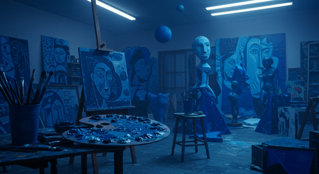
The Painter’s Blue: From Ultramarine to International Klein Blue
Blue has challenged and inspired painters throughout history. True ultramarine blue—made from ground lapis lazuli—was once so expensive that artists saved it exclusively for the most important elements of their paintings, typically the Virgin Mary’s robes.
“When I studied art history, I was amazed that Vermeer nearly bankrupted himself buying ultramarine,” an artist friend told me. This financial sacrifice for blue pigment shows how essential artists considered the emotional impact of true blue in their work.
Picasso’s “Blue Period” (1901-1904) demonstrates blue’s emotional range. Using primarily blue tones, he created works expressing melancholy, loneliness, and introspection following a friend’s suicide. These monochromatic blue works convey emotional depth that multicolor pieces might have diluted.
Yves Klein made blue his signature with the development of International Klein Blue (IKB), a particularly vibrant ultramarine. Klein believed this blue had spiritual properties, representing the immateriality of space and the void. His blue monochromes became some of the most recognizable works in modern art.
Contemporary artists continue exploring blue’s expressive potential. From Olafur Eliasson’s immersive blue environments to Anish Kapoor’s blue pigment sculptures, artists leverage blue’s psychological and perceptual effects to create powerful experiences that transcend cultural boundaries.
Blue in Photography and Film
Cinematographers use blue strategically in film. “Day for night” shooting techniques traditionally used blue filters to simulate moonlight. This technical choice reinforced cultural associations between blue and night, mystery, and dreams.
The “blue hour”—that magical time just after sunset when natural light turns deeply blue—remains photography’s golden hour (ironically). This fleeting blue moment creates a mysterious atmosphere photographers treasure for its emotional resonance and technical qualities.
“I schedule client photoshoots specifically during blue hour whenever possible,” a photographer friend explained. “Nothing matches that dreamy quality and soft dimensionality blue natural light creates.”
Film directors use blue color grading to establish specific emotional tones. Notice how many thriller and horror films use blue-heavy color palettes to create unease, while fantasy films often use blue to suggest magic and otherworldliness.
In contrast, warm-toned films (orange and yellow) typically feel nostalgic or intimate, while blue-toned scenes feel cooler, more objective, or sometimes alienating. Directors like David Fincher masterfully use blue-heavy palettes to create psychological distance that pulls viewers into analytical rather than emotional engagement.
Musical Blues: How Blue Sounds
Blue created its own musical genre. The “blues” emerged from African American spiritual and work songs, expressing struggle, resilience, and longing. This connection wasn’t accidental—blue’s visual associations with melancholy and depth perfectly matched the emotional landscape these musicians expressed.
What makes blues music “blue”? Musicologists point to the flatted third and seventh notes (the “blue notes”) that create the genre’s distinctive sound. These notes exist in an emotionally ambiguous space between major and minor keys—neither fully sad nor happy, but something more complex.
“My jazz instructor said blues lives in the spaces between standard emotions,” a musician friend once explained. “It’s not just sadness—it’s a knowing, experienced kind of feeling.” This perfectly captures how blue operates in both visual and musical contexts.
Modern music producers still use blue in album artwork to signal emotional depth. Notice how albums with contemplative, introspective, or late-night vibes often feature blue cover art. This visual shorthand tells listeners what emotional experience to expect before they hear a single note.
The connection between blue and jazz continues in expressions like “feeling blue” or “blue note”—linguistic connections between color and sound that feel intuitively right even if we can’t fully explain why.
Blue in Marketing and Branding: Trust and Reliability
Blue Brands and Their Psychology
The world’s most valuable brands love blue. Facebook, Twitter (originally), IBM, Intel, Ford, Visa, PayPal, American Express—all built their visual identities around blue. This isn’t coincidence; it’s strategic psychology.
Financial institutions particularly favor blue for its associations with stability and trustworthiness. Would you trust your money to a bank with a bright orange or neon green logo? Probably not. Blue signals responsible management and established reliability.
“When we rebranded, our market research showed blue increased customer trust by 34% compared to other colors,” a bank marketing director shared with me. “Specifically, navy blue outperformed all other options for communicating financial security.”
Tech companies leverage blue’s associations with intelligence and reliability while avoiding the coldness or sterility that white or gray might suggest. Blue technology branding promises innovation grounded in dependability—a powerful combination for consumer trust.
Healthcare brands use blue extensively, drawing on associations with cleanliness and calm competence. Blue suggests medical expertise without the harshness or sterility of pure white, making it ideal for communicating both professionalism and compassionate care.
Blue Packaging and Consumer Behavior
Products in blue packaging are typically perceived as higher quality and more trustworthy than identical products in red or yellow packaging. This perception difference can significantly impact consumer choices, especially for products where reliability matters most.
Dairy products often feature blue packaging, playing on associations between blue, cleanliness, and freshness. Notice how many milk brands use blue as their primary packaging color? This isn’t arbitrary—it’s leveraging blue’s psychological connection to purity.
“We tested four package colors with focus groups, and blue consistently scored highest for ‘trustworthiness’ and ‘quality,'” a product manager at a consumer goods company told me. “Particularly interesting was that participants perceived the blue-packaged product as ‘more effective’ even though they were told the contents were identical.”
Blue packaging also stands out on store shelves, particularly for products competing against predominantly red or yellow competitors. This visibility advantage combines with psychological benefits to make blue a powerful packaging choice.
Weight loss and health products often use blue packaging to signal scientific validity. While red or orange might create more excitement, blue suggests research-backed effectiveness—crucial for products making health claims.
When Not to Use Blue in Marketing
Despite blue’s many advantages, it’s not right for every brand or product. Food companies generally avoid blue packaging because blue suppresses appetite. With few exceptions (blueberries, certain plums), blue food doesn’t occur naturally, creating an unconscious wariness of blue-colored edibles.
High-energy products—sports drinks, energy bars, adventure equipment—often avoid blue in favor of red, orange, or electric green. While blue communicates quality, it lacks the excitement and energy these products want to convey.
“We deliberately avoid blue in our restaurant interiors,” a restaurant consultant explained. “Research shows people eat less and leave sooner in blue environments. We want them comfortable and hungry!” This same principle explains why fast food restaurants favor red and yellow instead.
Luxury fashion brands use blue sparingly, often preferring black, gold, or crimson to signal exclusivity and desire. While blue communicates quality, it lacks the passion or exclusivity luxury marketing requires. Blue feels accessible rather than exclusive—a disadvantage in high-fashion contexts.
Youth-targeted brands sometimes avoid traditional blues, viewing them as too corporate or adult. When youth brands do use blue, they typically choose electric or turquoise blues that feel more energetic and less traditional than navy or corporate blues.
Blue in Nature: Origins of Our Blue Associations
Sky Blue: The Overhead Infinite
Our most fundamental blue experience comes from above—the vast blue sky represents our first and most constant exposure to blue. This universal experience created shared psychological associations with blue that transcend cultural differences.
The sky isn’t actually blue, of course. It appears blue because air molecules scatter short-wavelength blue light more than other colors. This scientific fact doesn’t change our emotional response to sky blue—a color that still signals openness, possibility, and freedom.
“On cloudy days, my mood definitely shifts,” admits a friend who works from home. “Something about losing that blue ceiling affects my thinking.” Research supports this observation—exposure to blue sky views improves mental focus and reduces stress in office environments.
Sky blue’s psychological impact explains its popularity in institutional settings like hospitals and schools. The color suggests expansiveness and possibility while creating calm—ideal for environments focused on healing or learning.
Our positive associations with clear blue skies have evolutionary roots. For our ancestors, blue skies meant safety from storms and optimal conditions for hunting, gathering, and travel. These survival-linked positive associations remain embedded in our psychological responses.
Ocean Blue: Depths and Mysteries
Ocean blue affects us differently than sky blue—where sky blue suggests freedom and expansion, ocean blue evokes mystery, depth, and introspection. The ocean’s shifting blues, from turquoise shallows to navy depths, create more complex emotional responses than the relatively uniform sky.
The ocean’s blues signal both opportunity and danger—beautiful but potentially deadly. This duality makes ocean blues more psychologically complex than sky blues, evoking both attraction and respectful caution.
“I’ve noticed people stare at ocean waves almost in a trance,” observed a friend who lives beachside. “It’s different from how they look at the sky.” This tracks with research showing that viewing ocean scenes triggers more complex brain activity patterns than viewing sky scenes.
Maritime traditions worldwide developed specific vocabularies for ocean blues, recognizing how different blue qualities signaled different water conditions. These detailed blue distinctions weren’t just poetic—they contained practical safety information for sailors and fishermen.
Our fascination with ocean blues appears in language too. We talk about “deep thoughts” and “shallow understanding,” using oceanic blue metaphors to describe mental states. This connection between blue water and introspection appears across diverse cultures and languages.
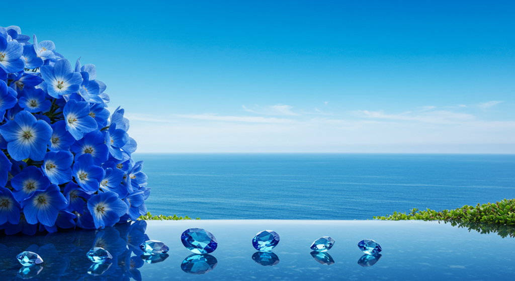
Rare Blue Gems and Flowers
Despite blue’s abundance in sky and sea, it’s surprisingly rare in other natural contexts. Blue flowers represent only about 10% of flowering species, making them relatively unusual in nature. This scarcity contributed to blue’s perceived preciousness throughout history.
Precious blue gems—sapphires, tanzanite, aquamarine—commanded extraordinary prices throughout history, partly due to blue’s relative rarity in mineral form. These blue stones were often attributed mystical properties, particularly relating to truth, fidelity, and protection.
“My grandmother insisted her sapphire ring brought clear thinking,” a friend shared. “She’d twist it when facing important decisions.” This association between blue gems and mental clarity appears in folklore worldwide, suggesting a shared intuitive connection between blue and truth.
Blue flowers like forget-me-nots became symbols of remembrance and fidelity precisely because their unusual blue color made them stand out as special and worthy of significance. Their scarcity made them perfect symbols for rare and valued emotional states.
Blue foods are exceptionally rare in nature, which may explain why blue suppresses appetite. Blueberries, despite their name, are actually more purple than true blue—highlighting just how unusual genuinely blue natural foods really are.
Blue in Interior Design and Fashion
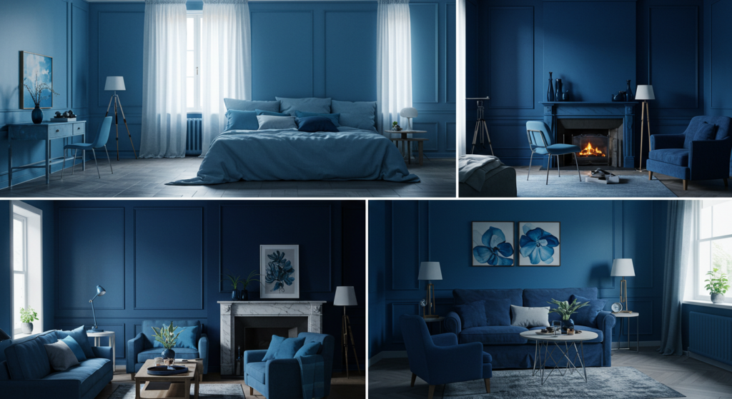
Creating Calm: Blue in Living Spaces
Blue rooms measurably lower blood pressure and heart rate for most people. This physiological impact makes blue ideal for bedrooms and spaces meant for relaxation or concentration. The calming isn’t just psychological—it’s physically quantifiable.
Different blue shades create distinctly different spatial effects. Light blues make small rooms feel larger and airier, while deep blues can make large spaces feel more intimate and focused. This versatility makes blue uniquely useful across diverse interior applications.
“I painted my home office navy after reading about color and productivity,” a freelance writer told me. “My work focus definitely improved compared to the previous beige walls.” Research supports this experience—blue environments can enhance concentration on detail-oriented tasks.
Blue kitchens present an interesting design challenge. While blue suppresses appetite (potentially unwanted in dining spaces), blue also signals cleanliness (highly desirable in food preparation areas). Designers often solve this by using blue on kitchen walls but avoiding blue on dining tables or eating areas.
Blue pairs exceptionally well with natural wood tones, creating balance between cool and warm elements. This natural complementary relationship explains the enduring popularity of blue walls with wooden furniture—a combination that feels simultaneously fresh and timeless.
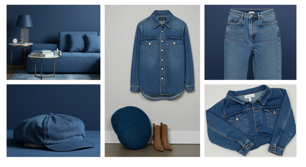
Blue in Fashion: From Denim to Royal Elegance
Denim revolutionized fashion by making blue an everyday color choice. Before denim’s widespread adoption, blue fabric remained relatively expensive and formal. Denim democratized blue, transforming it from a special-occasion color to a daily wardrobe staple.
“Blue jeans might be humanity’s most universal garment,” a fashion historian once told me. “They transcend age, gender, nationality, and social class in ways no other clothing item manages.” This universality stems partly from blue’s unique cultural position—significant without being polarizing.
Navy blazers became a fashion icon because they bridge formal and casual contexts effortlessly. Few other garments transition so smoothly between dressy and relaxed settings, making navy perhaps the most versatile color choice in fashion.
Blue gemstones in jewelry typically symbolize fidelity and truth. Sapphire engagement rings gained popularity as alternatives to diamonds, with their blue color symbolizing loyalty and lasting commitment—qualities particularly suited to marriage symbols.
Royal blue earned its name through association with European monarchy, particularly the blue robes worn by French kings. This historical connection to power and nobility gave royal blue a persistent association with dignity and importance that transcended changing fashion trends.
Blue Accessories and Accent Pieces
Blue accessories provide safe entry points for color-shy decorators. Even traditional or minimalist spaces can incorporate blue accents without risking design coherence. This accessibility makes blue a gateway color for many beginning decorators.
“My interior design clients who claim to hate color will almost always accept blue,” a designer friend observed. “It doesn’t register as a ‘scary color choice’ the way purple or orange might, even when it’s equally bold.”
Blue accent walls create focus without overwhelming a space. Unlike red or orange accent walls that actively demand attention, blue accents gently draw the eye while maintaining a sense of calm. This balanced visual impact makes blue accents particularly useful in bedrooms and offices.
Blue throws, pillows, and rugs can completely transform neutral spaces without requiring major commitment. This adaptability makes blue accessories particularly valuable for seasonal refreshes or rental properties where permanent changes aren’t possible.
Cool blue lighting has become increasingly popular in contemporary interiors, particularly in bathrooms and entertainment spaces. Beyond aesthetic appeal, blue-toned lighting creates visually distinct environments that signal specific functions—relaxation, entertainment, or focus.
Blue in Digital Spaces: Screen Blues

Blue Light and Digital Wellbeing
Blue light from screens affects our bodies more than any other light color. The short wavelength blue light from phones, computers, and tablets interferes with melatonin production, potentially disrupting sleep patterns when used before bedtime.
“I installed a blue light filter on all my devices after learning about its impact on sleep,” a tech-savvy friend shared. “Within a week, I noticed I was falling asleep faster.” Blue light filters that activate automatically in evening hours have become standard features on most devices for this reason.
Our eyes struggle to focus precisely on blue light due to its shorter wavelength, potentially contributing to digital eye strain during extended screen use. This biological reality explains why reading blue text on screens causes more fatigue than reading black text.
Despite these challenges, blue remains the dominant color in digital interfaces. The psychological benefits of blue—trust, reliability, and calm—apparently outweigh the potential physiological drawbacks for most digital designers and brands.
Blue’s documented calming effects may partially counteract the stress of information overload online. This could explain why high-information sites like Wikipedia, news platforms, and business applications frequently use blue color schemes—the color itself helps manage the cognitive load.
Interface Blues: Why Tech Loves Azure
Tech companies overwhelmingly choose blue for interfaces and logos. Beyond trust signals, blue creates less visual fatigue during extended use compared to high-energy colors like red or orange. This practical advantage makes blue ideal for applications designed for long sessions.
Blue elements in interfaces typically receive more clicks than identical elements in other colors (except for call-to-action buttons, where red or orange often outperform). This engagement advantage further reinforces blue’s popularity in digital design.
“When we A/B tested our app interface colors, blue consistently produced longer session times and higher satisfaction ratings,” a UX designer confided. This user preference for blue interfaces appears across demographics and cultures, making it a safe global design choice.
Blue creates perceived reliability in software contexts. Applications handling sensitive information (banking, healthcare, business data) heavily favor blue interfaces to reinforce security perceptions. Users instinctively trust blue digital environments more than other colors.
The famous “Facebook blue” wasn’t chosen arbitrarily. Mark Zuckerberg selected it partly because he has red-green colorblindness, making blue one of the colors he can see best. This accessibility advantage extends beyond Zuckerberg—blue remains distinguishable for most people with color vision deficiencies.
Navigating the Digital Blues
Link blue became standardized in early web design and remains recognizable even as other design elements have evolved. This consistent use created a powerful user expectation—blue text almost universally signals clickable content across the internet.
“We tried changing our links to green during a redesign and user testing showed immediate confusion,” a web developer told me. “People simply didn’t recognize they were links anymore.” This experiment highlights how deeply blue has become embedded in our digital literacy.
Blue progress bars feel longer-lasting but less annoying than red or orange progress indicators. Studies show users perceive identical loading times as shorter when represented with blue progress elements compared to warmer colors.
In video calls, blue backgrounds create professional impressions without the starkness of white or the potential gloominess of darker colors. This practical advantage made blue virtual backgrounds standard for professional remote meetings during the pandemic shift to video conferencing.
Digital blues need careful calibration across devices. What looks royal blue on one screen might appear purple or navy on another due to display variations. This technical challenge requires digital designers to select blues with sufficient flexibility to maintain their essential character across diverse viewing conditions.
Blue in Different Environments: Functional Applications

Blue in Healthcare Settings
Hospitals choose blue for good reason. Studies show blue environments can lower blood pressure and reduce anxiety—crucial benefits in healthcare spaces where patient stress already runs high. This isn’t just decorator preference; it’s evidence-based design.
Surgical scrubs traditionally come in “surgical blue” partly because the color helps reduce eye fatigue during long procedures. The complementary color to blood red, blue creates visual relief that helps surgeons maintain focus during operations.
“When we redesigned our pediatric unit, we chose different blues for different age groups,” a hospital administrator explained. “Brighter blues for young children, deeper blues for teens.” This tailored approach recognizes how age affects color response even within generally positive blue reactions.
Blue wayfinding elements in hospitals consistently outperform other colors for patient navigation success. The color’s association with trust and information makes blue signage particularly effective in complex medical environments where clear direction is crucial.
Mental health facilities increasingly use blue in therapeutic spaces, drawing on research showing the color’s anxiety-reducing properties. Exposure to blue environments demonstrates measurable calming effects for patients experiencing acute anxiety or emotional distress.
Educational Blues: Learning Environments
Blue classroom elements improve focus and reduce hyperactivity compared to red or yellow environments. Studies of classroom color schemes show blue areas support concentrated individual work while reducing disruptive behavior.
“We painted our reading nook blue after learning about color and concentration,” an elementary teacher shared. “Students definitely stay engaged longer in that space compared to our previous bright yellow design.” This experience matches research showing blue environments support sustained attention.
Blue paper can improve reading retention for some learners. Tests show information presented on light blue paper resulted in better recall than identical information on white paper for many students, particularly those with attention challenges.
College and university branding heavily favors blue, drawing on associations with knowledge, wisdom, and academic tradition. This consistent use of blue in educational contexts reinforces the connection between blue and intellectual activity across generations.
Educational software interfaces predominantly use blue color schemes to create calm, focused digital learning environments. This design choice aims to reduce the sensory overload that can interfere with online learning engagement and information retention.
Blue in Corporate and Office Spaces

Blue dominates corporate environments worldwide, appearing in everything from logos to lobby walls. This preference stems from blue’s unique ability to signal professionalism without the coldness of gray or the potential aggressiveness of darker colors.
Productivity research shows blue office environments support analytical thinking and attention to detail. Tasks requiring careful analysis and precision typically see performance improvements in blue spaces compared to red or orange environments, which better support creativity and brainstorming.
“We redesigned our accounting department with blue walls and our marketing department with orange accents,” a facilities manager told me. “Each color supports the type of thinking those teams need most.” This targeted approach recognizes how different blue is from other colors in its cognitive effects.
Blue meeting rooms create perceived objectivity. Studies show identical proposals presented in blue rooms receive more analytical and less emotional evaluation than those presented in rooms with warmer color schemes—a significant advantage for data-driven discussions.
Corporate blue extends beyond walls to business attire. Navy suits remain standard professional wear across industries precisely because the color conveys authority without intimidation—the perfect balance for business interactions.
Cultural Blue: Expressions and Idioms
Blue Language Around the World
English overflows with blue expressions. “Out of the blue” (unexpectedly), “once in a blue moon” (rarely), “true blue” (loyal), “blue blood” (aristocracy), and “blue collar” (working class) show blue’s remarkable range of cultural associations.
“My German friend says they use ‘blue’ to describe drunkenness,” a linguist colleague mentioned. Indeed, “blau sein” (to be blue) means to be drunk in German—one of many fascinating variations in how different languages connect blue to specific states or behaviors.
Japanese linguistic traditions associate blue and green, sometimes using the same word (青, ao) for both colors. This linguistic blending reveals different cultural categorizations of color that affect how blue is perceived and discussed across languages.
In Russian, there are separate basic color terms for light blue (голубой, goluboy) and dark blue (синий, siniy). This linguistic distinction gives Russian speakers different perceptual categories for blue shades, potentially affecting how they process and remember different blues.
Ancient Greek famously lacked a specific word for blue, using terms that encompassed blue, black, and dark colors. Homer’s “wine-dark sea” description highlights how language shapes color perception—ancient Greeks categorized sea colors differently than we do today.
Blue Moods and Emotions
“Feeling blue” became a universal expression of melancholy or sadness, likely connecting to the lower energy and introspection that darker blues can evoke. Music embraced this association with the development of blues as a genre expressing struggle and emotional depth.
Blue Monday—supposedly the most depressing day of the year—falls in January when post-holiday blues combine with winter weather in the Northern Hemisphere. Whether scientifically valid or not, the concept reinforces the association between blue and certain emotional states.
“I’ve noticed blue can feel completely different depending on my mood,” a friend observed. “Sometimes soothing, sometimes sad.” This emotional flexibility makes blue uniquely adaptable across contexts—it can support or reflect nearly any emotional state without seeming inappropriate.
Blue’s emotional associations vary significantly by shade. Light blues generally connect to optimism and possibility, while mid-blues suggest reliability and calm. Darker blues can express either depth and wisdom or sadness and introspection depending on context.
Despite occasional “blue” melancholy associations, surveys consistently show blue as the world’s favorite color across cultures and demographics. This preference suggests blue’s positive emotional associations far outweigh its occasional connections to sadness or depression.
Literary and Artistic Blue References
Literature embraces blue’s complexity. From Picasso’s melancholic “Blue Period” to Tennessee Williams’ emotional “Blue Mountain,” artists leverage blue’s rich psychological landscape to create nuanced emotional environments.
“The Great Gatsby” famously uses the blue-green light across the bay as a central symbol of hope, longing, and the American dream. This literary blue represents something simultaneously within sight yet just beyond reach—perfectly capturing blue’s balance between reality and possibility.
Fairy tales often assign blue to good characters (blue fairies, blue birds) while reserving reds and blacks for villains. This traditional color coding reinforces blue’s cultural position as trustworthy and benevolent across generations.
David Lynch’s “Blue Velvet” explores blue’s darker undercurrents, using the color to suggest mystery and hidden depths beneath seemingly calm surfaces. This artistic treatment highlights blue’s capacity to represent both tranquility and unknown psychological territory simultaneously.
Poets frequently invoke blue to suggest infinity and transcendence. From Wallace Stevens’ “The Man with the Blue Guitar” to Paul Éluard’s “La Terre est Bleue Comme une Orange,” blue in poetry often represents possibility beyond ordinary experience.
Blue Looking Forward: Trends and Innovations

Evolving Blue Technologies
Manufacturers now develop “true blue” LEDs that better replicate natural blue light, addressing concerns about harsh blue light exposure from earlier LED technology. These advanced blues create more natural-feeling illumination while maintaining energy efficiency.
“I switched to circadian lighting with adjustable blue levels last year,” an architect friend shared. “The system reduces blue light automatically in evening hours, mimicking natural light cycles.” This innovation addresses blue light’s impact on sleep while preserving its daytime benefits.
Beyond lighting, material scientists are developing new blue pigments that avoid the toxicity or instability of traditional blue colorants. YInMn Blue, discovered in 2009, offers extraordinary stability and reflective properties while containing none of the toxic components found in older blue pigments.
Electronic paper displays are evolving to render blue more effectively, addressing a longstanding limitation of e-readers. These innovations promise to make digital blue reading experiences more comfortable while maintaining the low power requirements that make e-paper valuable.
Structural blue—color created through microscopic physical structures rather than pigments—represents the cutting edge of blue technology. Inspired by butterfly wings and other natural blue structures, these developments create blues that never fade and change appearance depending on viewing angle.
Blue in Future Design Trends
Color forecasters predict “tech blue”—a slightly electric medium blue—will dominate digital design as users increasingly seek interfaces that feel both innovative and trustworthy. This balanced blue signals technological capability without feeling cold or inhuman.
Sustainability concerns are shifting blue preferences toward naturally derived and less toxic blue pigments and dyes. As consumers become more environmentally conscious, blues created through traditional indigo fermentation and other natural processes are experiencing renewed interest.
“Our interior design clients increasingly request blues paired with biophilic elements,” a design firm principal noted. “Blue walls with living plants create spaces that feel simultaneously calm and alive.” This combination of blue with natural elements represents a growing trend toward environments that support wellbeing.
Fashion forecasts suggest a move toward “functional blues”—shades engineered for specific purposes beyond aesthetics. UV-protective blues, thermally adaptive blues, and blues designed to enhance mood or performance represent the frontier of applied color technology in clothing.
Virtual reality environments heavily leverage blue for orientation and navigation elements, building on established digital design patterns. As VR becomes more mainstream, blue’s role in creating intuitive digital spaces will likely expand further.
The Science of Blue: New Discoveries
Neuroscience continues revealing how blue affects our brains differently than other colors. Recent studies using functional MRI show blue visual stimuli activate different neural pathways than red stimuli, potentially explaining blue’s documented effects on cognition and emotion.
Sleep researchers now recommend blue light filters on devices used before bedtime to protect melatonin production. This evidence-based guidance has transformed product design, with most devices now featuring automatic blue light reduction in evening hours.
“Our research team found blue environments particularly beneficial for neurodiverse individuals,” a cognitive scientist explained. “Especially those with sensory processing sensitivities.” This emerging understanding may eventually inform more inclusive design practices across public and private spaces.
Agricultural scientists are exploring blue light to enhance crop growth and pest resistance. Specifically calibrated blue light can increase nutritional value in some plants while reducing the need for chemical interventions—potentially revolutionizing indoor and vertical farming.
Medical applications of blue light continue expanding, from treatments for seasonal affective disorder to precision therapies targeting specific skin conditions. These therapeutic applications build on growing understanding of how different blue wavelengths affect biological systems.
Practical Applications of Blue: How to Use It

Using Blue for Desired Psychological Effects
Want to create a more productive workspace? Consider medium blues for walls or key furniture pieces. These shades support focused attention without the potential heaviness of darker blues or the potential distraction of brighter colors.
To reduce appetite in dining spaces (useful for mindful eating), incorporate blue plates, placemats, or table linens. Research consistently shows people eat less from blue dishes than identical food served on white, red, or yellow tableware.
“I switched to blue light bulbs in my evening reading nook and noticed I wind down faster afterward,” a friend with insomnia shared. This tracks with research showing reduced blue light exposure in evening hours supports natural melatonin production and sleep readiness.
For meditation spaces, consider softer blue-greens that promote both calm and gentle awareness. These transitional blues create environments that support contemplative practices without inducing the drowsiness sometimes associated with deeper blues.
To enhance perceived trustworthiness in professional settings, incorporate navy blue into presentation materials and business attire. Studies show identical information presented with navy blue elements receives higher credibility ratings than the same content without blue elements.
Choosing the Right Blue for Different Spaces
For small rooms, light blues visually expand the space while creating a sense of calm. Light blue works particularly well in bathrooms and small bedrooms where both spaciousness and relaxation are priorities.
Large gathering spaces benefit from deeper blues that create intimacy and encourage conversation. Navy or indigo accent walls can “pull in” expansive rooms, making them feel more proportional and socially comfortable.
“When we renovated our clinic waiting area, we chose a mid-range blue specifically tested to reduce patient anxiety,” a healthcare designer explained. This intentional blue selection demonstrates how functional color choices can support specific emotional needs in specialized environments.
Home offices work well with blue-green shades that balance focus with creativity. Unlike pure blues that might over-emphasize analytical thinking, turquoise blues support both structured tasks and creative problem-solving—ideal for today’s flexible work demands.
Children’s spaces benefit from more vibrant blue tones that energize without over-stimulating. Bright, clear blues create positive energy while avoiding the potential hyperactivity sometimes associated with red or orange environments.
Pairing Blue with Other Colors: Effective Combinations
Blue and yellow creates one of the most universally appealing color combinations—balancing cool/warm, calm/energetic, and passive/active qualities. This complementary pairing works across nearly any context, from traditional to contemporary environments.
For sophisticated, grounded spaces, pair navy with warm neutrals like camel, taupe, or warm grays. This combination feels simultaneously timeless and current, with the warmth preventing blue from feeling too cool or impersonal.
“In our restaurant redesign, we paired deep teal blue with copper accents,” an interior designer shared. “The combination feels luxurious while still approachable.” This pairing demonstrates how blue can participate in upscale environments when correctly partnered with warm metallic elements.
Blue and white—perhaps the most classical color pairing—creates clean, timeless environments that reference both maritime traditions and fine porcelain. This combination consistently rates among the most universally appealing color schemes across demographics.
For unexpected contemporary interest, try blue with coral or terracotta. These combinations feel simultaneously fresh and grounded, with earthy orange tones warming and balancing blue’s cooler qualities while maintaining color harmony.
Conclusion: The Enduring Power of Blue

Blue’s remarkable versatility explains its enduring popularity across cultures and applications. From corporate boardrooms to nurseries, sacred spaces to casual dining, few colors transition so effectively across contexts while maintaining their essential character and positive associations.
What makes blue so special? Perhaps it’s blue’s unique balance of emotional and practical qualities. Blue calms without sedating, commands attention without aggression, and signals quality without ostentation. These balanced attributes make blue appropriate for nearly any application where color choice matters.
Blue also connects us to our most fundamental natural experiences—the vastness of sky and sea. These universal blue exposures create shared emotional touchpoints that transcend cultural differences, making blue perhaps the most globally acceptable color choice available to designers and brands.
As technology advances, our understanding of blue continues evolving. From blue light’s impact on sleep to the development of new, more sustainable blue pigments, science continues revealing new dimensions of this seemingly simple color. These discoveries will likely expand blue’s applications further in coming years.
Whether you’re designing a space, choosing a brand color, selecting clothing, or simply appreciating blue’s presence in your world, understanding blue’s varied meanings and impacts can help you leverage this remarkable color more effectively. Blue isn’t just a color—it’s a powerful psychological tool waiting to be used.
Summary Table: Blue Meanings at a Glance
| Blue Shade | Primary Associations | Best Applications | Potential Concerns |
|---|---|---|---|
| Light Blue | Openness, possibility, freedom, tranquility | Small spaces, bathrooms, nurseries, digital interfaces | Can feel cold or impersonal without warm accents |
| Medium Blue | Trust, reliability, focus, communication | Corporate environments, productive workspaces, healthcare | Less energizing than warmer colors for creative tasks |
| Navy Blue | Authority, expertise, tradition, security | Professional attire, financial services, education | Can feel heavy or conservative in excess |
| Turquoise | Creativity, refreshment, clarity, healing | Wellness spaces, creative environments, unique branding | May seem less serious for traditional corporate contexts |
| Royal Blue | Confidence, dignity, value, excellence | Premium branding, showcase spaces, formal contexts | Can overwhelm in large applications |
Frequently Asked Questions About Blue
What makes blue the world’s most popular favorite color?
Blue consistently ranks as the most popular color globally due to its universal positive associations with trust, openness, and reliability. Unlike colors that carry strong cultural variations in meaning, blue maintains largely positive connotations across most cultures. Additionally, our daily exposure to blue in nature (sky and water) creates foundational positive associations that transcend cultural differences.
Does blue really suppress appetite?
Yes, research consistently shows blue environments and blue tableware reduces food consumption compared to identical settings with warmer colors. This effect likely stems from the rarity of naturally blue foods, creating a subtle visual disconnect with eating. This property makes blue valuable for mindful eating environments but explains why restaurants typically avoid blue in dining areas.
Which blue is best for improving focus and productivity?
Medium blues (neither too light nor too dark) generally perform best for focus and productivity. These balanced blues create enough visual interest to maintain alertness without the potential anxiety or excitement that brighter or warmer colors might trigger. For optimal focus, look for blues with slight green undertones, as research suggests these perform particularly well for sustained attention tasks.
Can blue really help with anxiety?
Multiple studies confirm blue environments reduce physiological markers of anxiety, including heart rate and blood pressure. This isn’t just psychological—exposure to blue demonstrably affects our nervous system. Medium to light blues show the strongest anxiety-reducing effects, while very dark blues might sometimes create feelings of heaviness for some individuals.
How does blue light affect sleep?
Blue light, particularly from screens and LED lighting, can suppress melatonin production when exposure occurs in evening hours. This disrupts natural sleep cycles and can contribute to insomnia. However, daytime exposure to blue light actually supports healthy circadian rhythms. The key is reducing blue light exposure approximately 2-3 hours before bedtime through screen filters, specialized lighting, or blue-light blocking glasses.
Why do so many businesses and brands use blue?
Businesses favor blue because it consistently outperforms other colors in consumer trust studies while avoiding the potential negative associations of other colors (red’s aggression, yellow’s caution, etc.). Blue creates an ideal balance between appearing innovative yet reliable, professional yet approachable. Additionally, blue shows the least variation in preference across demographics, making it the safest global choice for brands seeking broad appeal.
What colors pair best with blue?
Blue’s versatility allows successful pairing with nearly any color, but certain combinations consistently perform well. White creates clean, timeless pairings with any blue. Warm neutrals (taupe, camel, warm gray) balance blue’s coolness while maintaining sophistication. Yellow or orange create high-energy complementary combinations, while green-blue pairings create harmonious, nature-inspired palettes. For contemporary spaces, blush pink or coral with blue offers unexpected freshness.
Is blue masculine or feminine?
While historically associated with boys in Western cultures (a relatively recent convention starting in the mid-20th century), blue is actually one of the most gender-neutral colors across global contexts.
Navy conveys traditional authority regardless of gender, while lighter blues transcend gender associations entirely. Blue’s perceived gender neutrality makes it particularly valuable for inclusive design applications where avoiding gender stereotypes is important.

Lenny Terra is a vibrant force in the world of fashion and design. Effortlessly blending his expertise in colors with a keen artistic vision, he unveils the most sought-after hues of the season, turning ordinary ensembles into iconic looks. His knack for creating visually enthralling content ensures that every piece resonates with readers, offering them a mesmerizing journey through the realms of color and fashion. Lenny’s unmatched skills not only elevate the aesthetics but also promise an enchanting experience every time. Dive into his creations and let the colors speak for themselves.
Reviewed By: Joanna Perez and Anna West
Edited By: Marcella Raskin
Fact Checked By: Sam Goldman
Photos Taken or Curated By: Matthew Mansour
