Key Takeaways
- Color psychology plays a crucial role in fashion and theatre
- Emotional responses to colors vary across cultures and contexts
- Warm colors like red and orange evoke energy and passion
- Cool colors such as blue and green promote calmness and serenity
- Neutral tones offer versatility and balance in wardrobe choices
- Color blocking and complementary colors create visual impact
- Lighting dramatically affects color perception on stage
- Personal color analysis helps individuals choose flattering shades
- Color trends in fashion constantly evolve and reflect societal moods
- Understanding color symbolism enhances costume design in theatre
Have you ever wondered why you’re drawn to certain colors in your wardrobe or why a particular costume on stage leaves you feeling a specific way?
The psychology of color is a fascinating realm where fashion and theatre intersect, creating a powerful emotional landscape that can influence our moods, perceptions, and even our actions.
As someone who’s spent years exploring the intricate relationship between hues and human emotions, I can tell you that the impact of color goes far beyond mere aesthetics.
The Power of Color Psychology in Fashion
Color is the silent language of style, speaking volumes before a single word is uttered. It’s a form of non-verbal communication that can convey confidence, approachability, or even authority.
The Red Revolution: Passion and Power
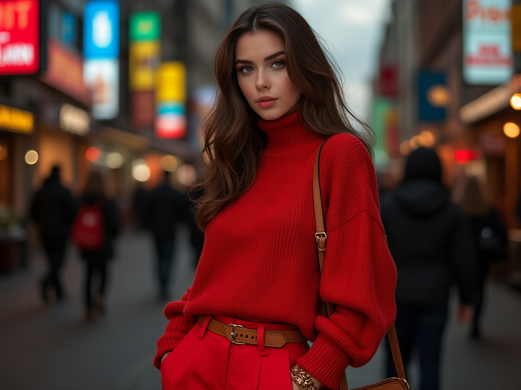
Red. It’s the color of fire, blood, and revolution. In fashion, it’s a bold statement that demands attention. I remember the first time I wore a vibrant red dress to a networking event. The boost in confidence was palpable – I felt like I could conquer the world. That’s the power of red. It’s associated with energy, passion, and determination. Designers often use red to create statement pieces that become the focal point of an outfit.
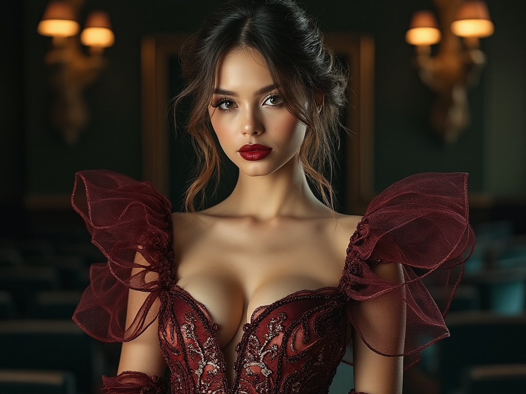
But red isn’t just about power. It’s also the color of love and desire. In theatre, a character dressed in red might be portraying a seductress or a fiery tempered individual. The emotional response is immediate and intense. It’s no wonder that red lipstick has been a symbol of feminine power for decades.
Blue Hues: Serenity and Trust
On the cooler end of the spectrum, we have blue – the color of the sky and sea. It’s a hue that evokes feelings of calmness, stability, and trust. In the corporate world, navy blue suits are a staple because they inspire confidence and reliability. I once consulted for a tech startup that was rebranding, and we chose a deep blue for their logo to convey trustworthiness in an industry often viewed with skepticism.
In theatrical productions, characters dressed in blue often represent wisdom or loyalty. Think of the wise old mentor or the faithful friend – they’re frequently clothed in shades of blue. It’s a color that resonates with our need for peace and tranquility in a chaotic world.
The Green Scene: Growth and Harmony
Green is the color of nature, growth, and renewal. It’s a balancing act between the excitement of yellow and the calmness of blue. In fashion, green has seen a surge in popularity as sustainability becomes a key concern. Wearing green can make us feel more connected to the environment and promote a sense of harmony.
On stage, green costumes might signify characters who are nurturing, prosperous, or in a state of transformation. I once saw a production of “A Midsummer Night’s Dream” where the fairy characters were dressed in various shades of green, perfectly capturing their connection to the natural world.
The Emotional Spectrum of Color Choices
Our wardrobes are more than just collections of fabric; they’re extensions of our personalities and mood regulators.
Warm Colors: Energizing the Soul
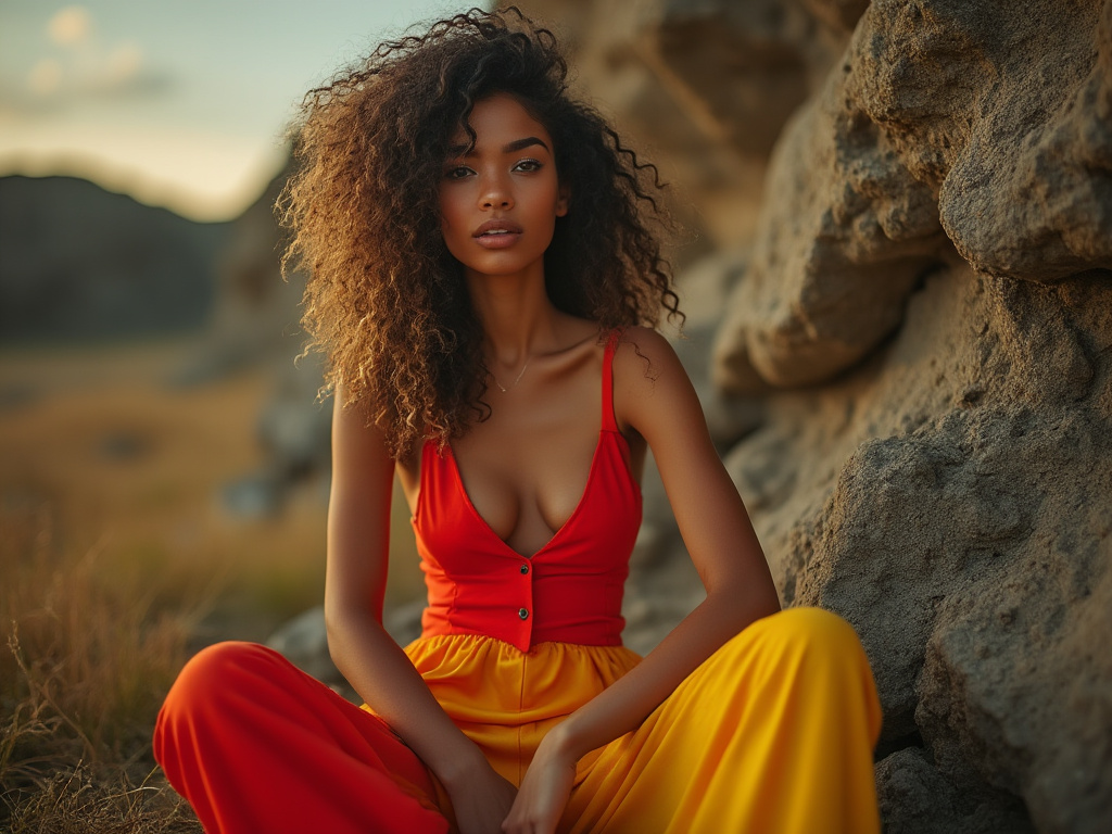
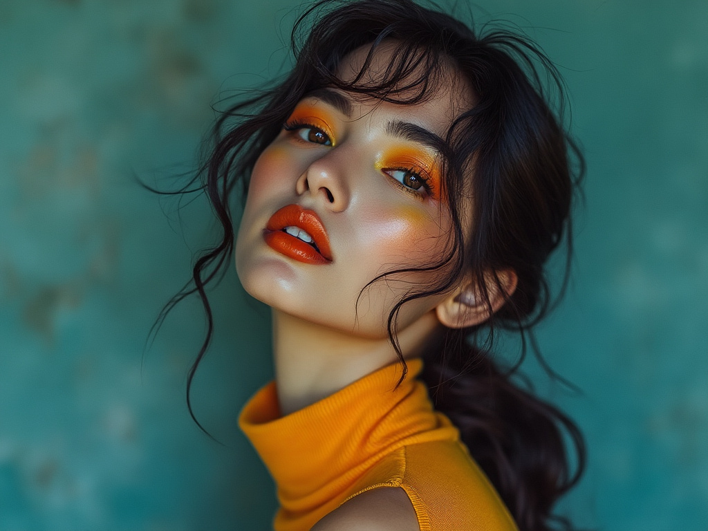
Warm colors like reds, oranges, and yellows are known to stimulate and energize. They’re the colors of sunshine and warmth, evoking feelings of happiness and optimism. I often advise clients to incorporate warm colors into their outfits when they need a confidence boost or want to make a strong first impression.
In theatre, warm colors are used to create a sense of intimacy or to represent passionate emotions. A character dressed in vibrant yellow might be the embodiment of joy and youthful exuberance. I remember a production of “The Lion King” where the use of warm colors in costumes and set design transported the audience to the sun-drenched African savanna.
Cool Colors: Calming the Mind
Cool colors – blues, greens, and purples – have a calming effect on our psyche. They’re often associated with professionalism, intellect, and serenity. When I’m preparing for a high-stress presentation, I’ll often choose a cool-toned outfit to help me feel more collected and composed.
In theatrical lighting, cool colors can create an atmosphere of mystery or melancholy. They’re perfect for dream sequences or scenes set in the moonlight. I once saw a production of “The Glass Menagerie” where the use of soft, cool lighting enhanced the play’s themes of memory and longing.
Neutral Tones: The Versatile Foundation
Neutral colors – blacks, whites, grays, and beiges – are the unsung heroes of both fashion and theatre. They provide a versatile foundation that allows other colors to shine. A well-curated wardrobe often starts with a base of neutrals that can be mixed and matched with ease.
In costume design, neutral tones can help establish a character’s social status or personality. A character dressed entirely in black might be mysterious or rebellious, while one in crisp white could represent purity or naivety. The beauty of neutrals lies in their ability to take on the emotional qualities of the colors around them.
The Art of Color Combinations
The way we combine colors can create powerful emotional responses and visual effects. Here’s a look at some impactful color combinations and their uses in fashion and theatre:
- Monochromatic schemes for a sleek, sophisticated look
- Complementary colors for bold, eye-catching contrast
- Analogous color palettes for harmony and cohesion
- Triadic color combinations for vibrant, balanced outfits
- Split-complementary schemes for softer contrast
- Tetradic color arrangements for complex, rich visuals
- Neutral plus accent color for versatile, everyday wear
- Pastel combinations for a soft, romantic aesthetic
- Jewel tones for luxury and opulence
- Earth tones for a grounded, natural feel
- Black and white for timeless elegance
- Ombre effects for depth and dimension
- Color blocking for modern, artistic expression
- Tonal dressing for a sophisticated, cohesive look
- Contrasting textures in similar hues for visual interest
The Cultural Context of Color Emotions
Color perception isn’t universal. What evokes joy in one culture might signify mourning in another. This cultural dimension adds layers of complexity to color choices in both fashion and theatre.
In Western cultures, white is often associated with purity and is the traditional color for wedding dresses. But in many Eastern cultures, white is the color of mourning. I once attended a fashion show in China where the designer brilliantly played with this dichotomy, creating a collection that challenged cultural norms and sparked conversations about globalization in fashion.
Red is another color with diverse cultural interpretations. In China, it symbolizes good luck and prosperity, making it a popular choice for special occasions. In South Africa, red is the color of mourning. In India, red is often worn by brides as a symbol of marital bliss.
Blue, interestingly, seems to have a more universal appeal. Across many cultures, it’s associated with calmness and stability. This might explain why it’s such a popular color for corporate branding worldwide.
In theatre, understanding these cultural nuances is crucial for authentic costume design. A production of “Madame Butterfly” set in Japan requires a deep understanding of the symbolic meaning of colors in Japanese culture to accurately portray the characters and their emotions.
The emotional response to color can also vary based on personal experiences and associations. I once worked with a client who had a strong aversion to yellow because it reminded her of a traumatic childhood experience. For her, yellow evoked anxiety rather than the typical feelings of cheerfulness.
Age and gender can also influence color preferences. Studies have shown that younger people tend to prefer brighter, more saturated colors, while older individuals often gravitate towards softer, more muted tones. Gender-based color preferences, like pink for girls and blue for boys, are largely social constructs that have evolved over time.
Seasonal variations play a role in our color choices as well. In fashion, we often see warmer, richer tones in autumn collections, mirroring the changing colors of nature. Spring collections tend to feature lighter, fresher hues that reflect the renewal of the season.
The psychological impact of color can even extend to our perception of time and space. Warm colors tend to make a space feel cozier and more intimate, while cool colors can make a room feel larger and more open. This principle is often used in set design to create specific atmospheres on stage.
In the world of branding and marketing, color psychology is a powerful tool. Fast food chains often use red and yellow in their logos and decor because these colors are thought to stimulate appetite and create a sense of urgency. Luxury brands, on the other hand, often opt for black, gold, or deep purples to evoke feelings of exclusivity and opulence.
The Evolution of Color Trends in Fashion
Fashion, like any art form, is in a constant state of flux. Color trends come and go, reflecting the zeitgeist of each era.
The Cyclical Nature of Color Trends
Color trends in fashion often move in cycles, with certain hues dominating for a season or two before fading into the background. These cycles are influenced by a variety of factors, including cultural events, technological advancements, and even global moods.
In the 1960s, we saw an explosion of bright, psychedelic colors that reflected the era’s spirit of rebellion and experimentation. Fast forward to the 1980s, and neon colors took center stage, mirroring the decade’s bold, larger-than-life attitude. The 1990s saw a shift towards more muted, grunge-inspired tones, while the early 2000s brought back candy colors and pastels.
The Influence of Pantone’s Color of the Year
Since 2000, Pantone’s Color of the Year has been a major influence on color trends in fashion and design. This annual selection often reflects broader societal themes and moods. For instance, in 2019, the vibrant “Living Coral” was chosen to represent warmth and nourishment in response to the onslaught of digital technology. In 2020, “Classic Blue” was selected for its reassuring qualities in uncertain times.
Sustainable Colors and Natural Dyes
As sustainability becomes an increasingly important concern in the fashion industry, we’re seeing a renewed interest in natural dyes and earth tones. These colors not only have a lower environmental impact but also connect us to nature in an increasingly digital world.
Color Psychology in Theatrical Costume Design
In theatre, color is a powerful tool for storytelling, character development, and setting the mood of a production.
Character Development Through Color
Costume designers use color to convey a character’s personality, emotional state, and even their character arc throughout a play. A character might start the show in muted colors and gradually transition to brighter hues as they gain confidence or find happiness.
I once saw a production of “The Wizard of Oz” where Dorothy’s iconic blue gingham dress was deliberately chosen to make her stand out in the sepia-toned Kansas scenes, symbolizing her dreams of a more colorful life. In Oz, her blue dress contrasted with the vibrant colors around her, emphasizing her role as an outsider in this new world.
Setting the Mood with Color Palettes
The overall color palette of a production can set the tone for the entire show. Darker, more muted colors might be used for a tragedy or a gritty drama, while bright, saturated colors could be employed for a lighthearted comedy or a children’s show.
In a production of “Chicago” I attended, the costume designer used a predominantly black and red color scheme to evoke the seedy, dangerous atmosphere of 1920s Chicago. The occasional pop of white or gold served to highlight moments of hope or aspiration amidst the darkness.
The Interplay of Costume and Lighting Design
The relationship between costume and lighting design is crucial in theatre. Colors can look dramatically different under stage lights, and lighting designers often work closely with costume designers to ensure that the intended emotional impact of the costumes is preserved.
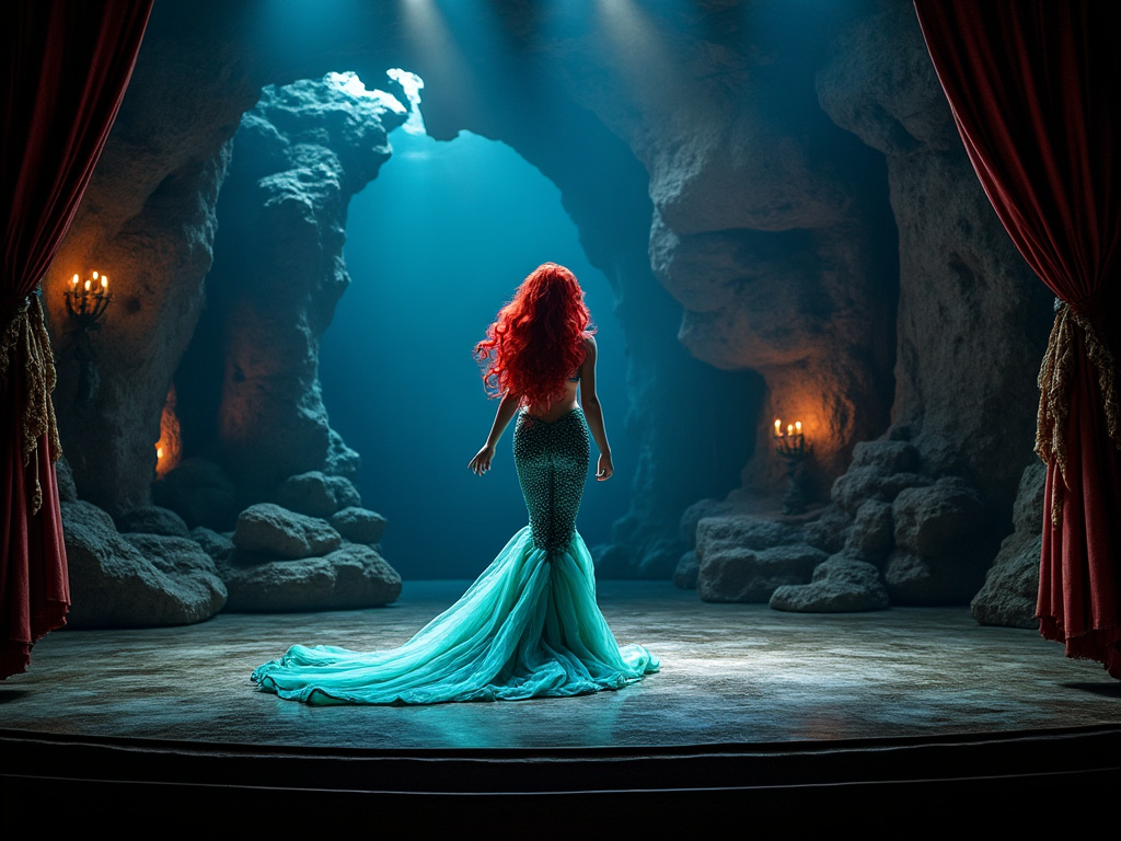
I recall a stunning moment in a production of “The Little Mermaid” where Ariel’s transformation from mermaid to human was achieved through a clever combination of costume and lighting design. As she emerged from the sea, the lighting shifted from cool blues to warm ambers, making her costume appear to change color before the audience’s eyes.
The Science Behind Color Perception
To truly understand the emotional impact of color, we need to delve into the science of how we perceive color.
The Physics of Color
Color is, fundamentally, a property of light. When light hits an object, some wavelengths are absorbed while others are reflected. The reflected wavelengths are what we perceive as color. This is why colors can look different under various lighting conditions – the wavelengths of light present affect which ones are reflected back to our eyes.
The Biology of Color Vision
Our eyes contain specialized cells called cones that are responsible for color vision. Most humans have three types of cones, each sensitive to different wavelengths of light. This trichromatic vision allows us to see millions of different colors.
The Psychology of Color Perception
While the physics and biology of color vision are universal, the way we interpret and respond to colors is influenced by psychological factors. Our personal experiences, cultural background, and even our mood can affect how we perceive and react to different colors.
Color Blindness and Fashion
It’s important to note that not everyone perceives color in the same way. Color blindness, which affects about 8% of men and 0.5% of women, can significantly alter how individuals see and respond to colors. This has implications for both fashion choices and theatrical design, as what looks harmonious to most people might appear quite different to someone with color blindness.
Personal Color Analysis: Finding Your Palette
Understanding which colors suit you best can be a game-changer for your personal style and confidence.
The Concept of Color Seasons
Personal color analysis often uses the concept of “color seasons” to help individuals determine their most flattering palette. This system categorizes people into four main types: Spring, Summer, Autumn, and Winter, based on their skin tone, hair color, and eye color.
Determining Your Best Colors
To find your most flattering colors, consider your skin’s undertone (warm, cool, or neutral), your natural hair color, and your eye color. Colors that complement these features can make you look more vibrant and healthy.
The Impact of Wearing Your Best Colors
Wearing colors that suit you can have a profound effect on how you look and feel. The right colors can make your skin glow, your eyes sparkle, and can even make you appear more youthful. I’ve seen clients’ confidence soar when they discover and embrace their perfect color palette.
Emotional Color Therapy in Fashion
The colors we wear don’t just affect how others perceive us – they can also influence our own emotions and behavior.
Mood-Boosting Color Choices
On days when you’re feeling down, reaching for a bright, cheerful color like yellow or coral can help lift your spirits. I often advise clients to keep a few “mood-boosting” pieces in their wardrobe for those days when they need a little extra emotional support.
Color for Confidence and Empowerment
Certain colors can make us feel more confident and powerful. For many, wearing red can provide a boost of confidence before an important meeting or presentation. Others might find that a deep blue or purple helps them feel more authoritative and in control.
Calming Colors for Stress Relief
In times of stress or anxiety, wearing calming colors like soft blues, greens, or lavenders can help soothe your nerves. These colors are often associated with nature and can help create a sense of peace and tranquility.
The Future of Color in Fashion and Theatre
As we look to the future, the role of color in fashion and theatre continues to evolve and expand.
Technology and Color Innovation
Advancements in textile technology are opening up new possibilities for color in fashion. We’re seeing the development of color-changing fabrics that can shift hues based on temperature or light exposure. Imagine a dress that changes color as you move from indoors to outdoors!
Virtual Reality and Color Experiences
As virtual and augmented reality technologies become more prevalent, they’re creating new opportunities for color experiences in both fashion and theatre. Virtual fashion shows can experiment with impossible color combinations, while AR theatre productions could allow for real-time color changes based on audience reactions.
Sustainable Color Practices
The future of color in fashion is closely tied to sustainability. We’re likely to see more investment in eco-friendly dyes and color processes that reduce water usage and chemical pollution. This shift towards sustainability might also influence color trends, with a greater appreciation for the natural, subtle hues achieved through sustainable practices.
Personalized Color Experiences
Advances in AI and data analysis could lead to more personalized color experiences in fashion. Imagine an app that can analyze your skin tone, personal style, and even your mood to suggest the perfect outfit color for any occasion.
Cross-Cultural Color Fusion
As our world becomes increasingly interconnected, we’re likely to see more cross-cultural influences in color trends. This fusion of cultural color symbolism could lead to rich, complex color palettes that tell global stories.
Therapeutic Color Applications
The use of color for emotional and physical well-being is likely to expand. We might see the development of “therapeutic wardrobes” designed to help manage mood disorders or reduce stress.
Summary Table
| Aspect | Warm Colors | Cool Colors | Neutral Colors |
|---|---|---|---|
| Emotions | Energizing, passionate, optimistic | Calming, serene, introspective | Balanced, versatile, grounding |
| Use in Fashion | Statement pieces, confidence boosters | Professional attire, relaxed casual wear | Wardrobe staples, versatile basics |
| Use in Theatre | Intimate scenes, passionate characters | Mysterious or melancholic moods | Character status, personality traits |
Conclusion
The emotional response to color in fashion and theatre is a complex interplay of psychology, culture, and personal experience. As we’ve explored, the hues we choose to wear or design with can profoundly impact our emotions, perceptions, and even our behavior.
Understanding the power of color allows us to harness its potential, whether we’re curating a personal wardrobe that boosts our confidence or designing costumes that bring characters vividly to life on stage.
As we move forward, the evolving relationship between color, technology, and sustainability promises to open up new frontiers in how we experience and interact with color in our daily lives and artistic expressions.
Frequently Asked Questions
How does color psychology affect our fashion choices?
Color psychology influences our fashion choices by tapping into our emotions and cultural associations. We often select colors that reflect our mood or the image we want to project. For instance, wearing red might make us feel more confident, while blue can help us appear more trustworthy and professional.
Can wearing certain colors actually change my mood?
Yes, wearing certain colors can influence your mood. This is partly due to the psychological associations we have with different colors and partly due to how others react to us when we wear those colors. For example, wearing bright, warm colors like yellow or orange can help boost your energy and mood.
What are the best colors to wear for a job interview?
For job interviews, it’s generally advisable to wear colors that convey professionalism and confidence. Navy blue, dark gray, and black are often recommended as they are associated with authority and competence. A pop of color in an accessory can add personality without being overwhelming.
How do different cultures interpret colors in fashion?
Cultural interpretations of color can vary widely. For example, while white is often associated with purity and worn by brides in Western cultures, it’s traditionally a color of mourning in many Eastern cultures. Red symbolizes good luck in China but can represent danger or passion in Western contexts.
What is the “Color of the Year” and why is it important?
The “Color of the Year” is an annual color selection by Pantone, a company known for its color matching system. This selection influences trends in fashion, design, and marketing. It’s important because it often reflects broader societal moods and can drive color trends across various industries.
How do lighting conditions affect the perception of color in theatre?
Lighting conditions dramatically affect color perception in theatre. Stage lights can enhance, mute, or even completely change how a color appears to the audience. Costume and lighting designers work closely to ensure that the intended emotional impact and visual effects are achieved under various lighting conditions.
What is color blocking in fashion?
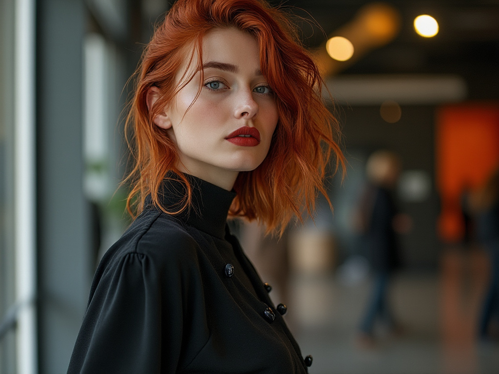
Color blocking is a style technique that involves wearing distinct blocks of colors, often in bold, contrasting hues. This trend creates visual interest and can be used to highlight certain areas of the body or create a striking, modern look.
How can I determine which colors look best on me?
To determine your best colors, consider your skin’s undertone (warm, cool, or neutral), your natural hair color, and your eye color. Personal color analysis, often based on the “seasonal” color system, can help identify the most flattering color palette for your individual features. Experimenting with different colors and noting which ones make you look more vibrant can also be helpful.
Joanna Perez, with a degree in Creative Writing, excels in recommending distinctive clothing color mixes and trends that deeply connect with readers. She simplifies the often daunting task of color selection, making fashion decisions more personalized and impactful. Her passion for vibrant color palettes and the stories they tell makes her an indispensable voice in the fashion community.
Reviewed By: Marcella Raskin and Anna West
Edited By: Lenny Terra
Fact Checked By: Sam Goldman
Photos Taken or Curated By: Matthew Mansour
