Key Takeaways
- Understanding color psychology is essential for creating a wardrobe that boosts confidence and reflects your personality
- Seasonal color analysis helps identify the most flattering shades for your skin tone and features
- Color blocking techniques can transform runway inspirations into wearable everyday outfits
- Neutral colors serve as the foundation for a versatile wardrobe while making statement pieces pop
- Strategic color combinations can create optical illusions that flatter your body shape
- Mastering color coordination helps build a capsule wardrobe that maximizes outfit possibilities
- Trending colors can be incorporated thoughtfully without overwhelming your existing wardrobe
- Investment in timeless color choices ensures long-term wardrobe sustainability and style longevity
Have you ever stood in front of your closet, overwhelmed by a rainbow of possibilities, wondering how to make those fashionable colors work in your everyday life? The journey from admiring runway color trends to actually wearing them can feel like crossing a vast style desert.
But here’s the thing: adapting high fashion colors to real life isn’t about following rules—it’s about understanding the art of color and making it work for your unique style story. Let’s explore how to bridge that gap between runway dreams and daily reality, creating a wardrobe that’s both fashion-forward and perfectly wearable.
The Psychology of Color in Fashion
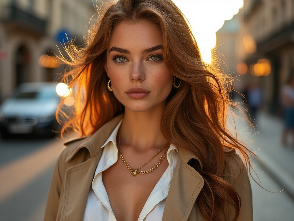
The clothes we wear are more than just fabric and thread—they’re a powerful form of self-expression that can influence both our mood and how others perceive us. When you understand the psychology behind different colors, you can harness their power to create the perfect impression for any occasion.
Understanding Color’s Impact on Mood
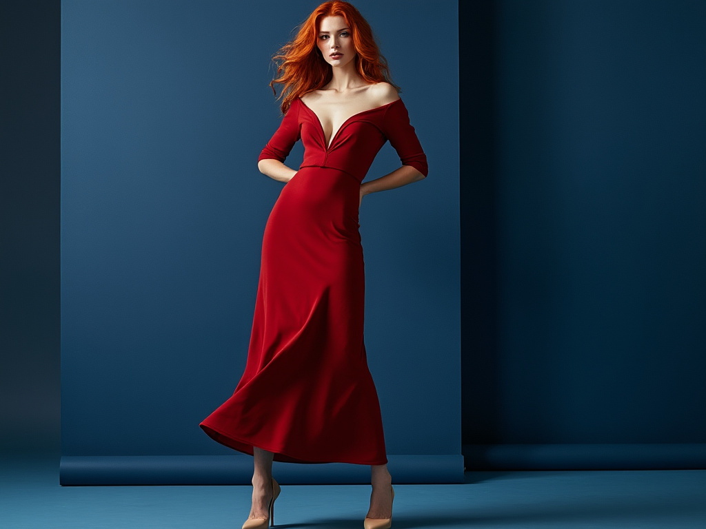
Walking into a room wearing a bold red dress versus a soft blue sweater creates entirely different energies. Research shows that colors can significantly affect our emotional state and confidence levels. Think about how a sunny yellow blazer might brighten not just your outfit but your entire outlook on a dreary Monday morning. Similarly, wearing calming green tones can help center you during high-stress situations, acting as your secret weapon for important meetings or presentations.
Cultural Color Significance
Colors speak different languages across cultures, and understanding these nuances can be crucial for making appropriate style choices. In Western cultures, white often represents purity and new beginnings, while in many Eastern cultures, it’s associated with mourning. The color red, for instance, symbolizes luck and prosperity in Chinese culture but might signal danger or passion in other parts of the world. This cultural awareness adds another fascinating layer to consider when building your color story.
Personal Color Associations
Our individual experiences shape our relationship with different colors in uniquely personal ways. Maybe that particular shade of purple reminds you of your grandmother’s garden, or perhaps a certain tone of blue brings back memories of your favorite childhood vacation. These personal connections can make certain colors feel more meaningful and wearable in your everyday wardrobe. Understanding and embracing these associations helps create a more authentic and confident approach to color in your personal style.
Finding Your Color Palette
Creating a wardrobe that truly works for you starts with discovering which colors enhance your natural features and make you feel most confident. This process is both an art and a science, combining traditional color theory with modern style sensibilities.
Color Analysis Fundamentals
The journey to finding your perfect palette begins with understanding your underlying skin tone. Are your veins more blue or green? Does gold or silver jewelry look better against your skin? These subtle clues help determine whether you have warm or cool undertones. Remember that gorgeous emerald green sweater that made your friend look amazing but washed you out completely? That’s color analysis in action.
Seasonal Color Theory
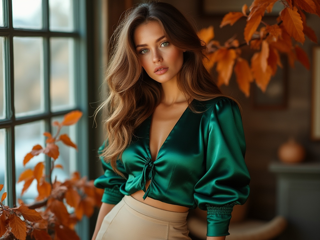
Just as nature changes its palette with the seasons, our most flattering colors often align with specific seasonal characteristics. If you’ve got warm undertones and golden-brown eyes, you might be an Autumn, thriving in rich earthy tones. Meanwhile, those with cool undertones and bright eyes might find their perfect match in Summer’s soft, muted shades.
Creating Your Signature Color Story
Building your personal color story goes beyond just identifying flattering shades—it’s about creating a cohesive narrative that reflects your personality and lifestyle. The key is to select a mix of neutrals and statement colors that work together seamlessly, allowing you to create countless combinations while staying true to your authentic style.
Color Blocking Made Easy
Color blocking has evolved from a runway trend to a practical way of combining colors in everyday outfits. The key lies in understanding how to balance bold combinations with wearable sophistication.
Mastering Basic Color Combinations
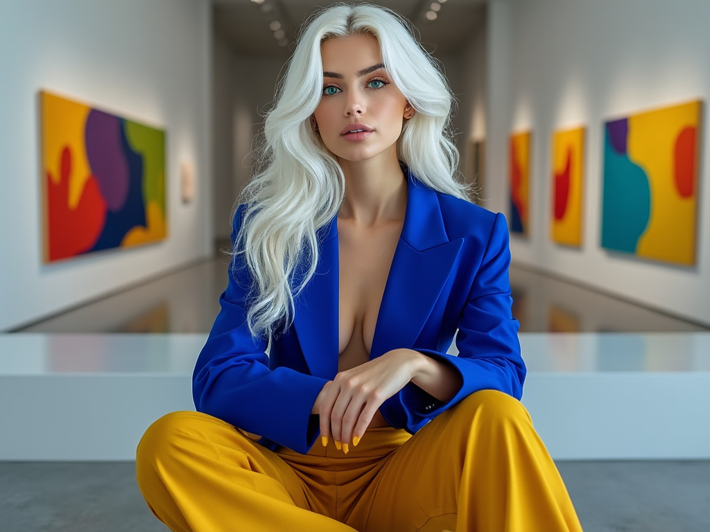
When it comes to color blocking, start with foolproof combinations inspired by nature. Think of a sunset’s orange and purple gradient or the way deep blue ocean meets sandy beige shore. These natural pairings can inspire outfit combinations that feel both bold and harmonious. A cobalt blue blazer paired with crisp white trousers creates a striking yet professional look, while a mustard yellow sweater with navy pants offers a sophisticated take on contrasting colors.
Advanced Color Blocking Techniques
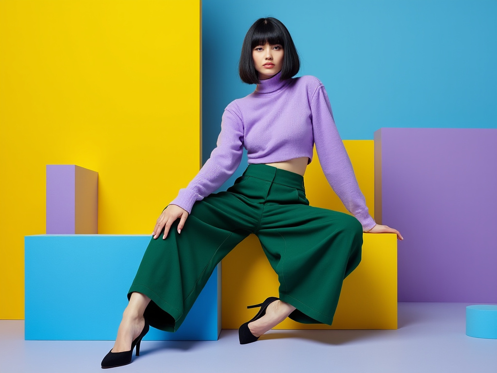
Ready to take your color game to the next level? Experiment with unexpected combinations while maintaining balance through proportion. Try pairing a lilac purple blouse with forest green trousers, anchoring the look with neutral accessories. The key is to keep silhouettes clean and simple when working with bold color combinations. Let the colors do the talking while the shapes provide a sophisticated foundation.
Proportional Color Play
The secret to successful color blocking often lies in the proportions. The 60-30-10 rule suggests using your dominant color for 60% of your outfit, a secondary color for 30%, and an accent color for the remaining 10%. This creates visual harmony while allowing you to incorporate even the boldest runway-inspired combinations into wearable looks.
Building a Color-Smart Wardrobe
The art of creating a versatile wardrobe lies in thoughtful color selection. A well-planned color palette ensures that your pieces work together effortlessly, maximizing your outfit possibilities while minimizing decision fatigue.
Essential Color Categories
Every wardrobe needs a balanced mix of neutrals, statement colors, and accent shades. Think of neutrals as your wardrobe’s foundation—the blacks, whites, grays, and beiges that ground your outfits. Statement colors might include that perfect shade of emerald green or royal purple that makes you feel incredible, while accent colors add unexpected pops of interest to otherwise simple combinations.
Strategic Color Investment
Not all colors deserve equal space in your closet. Invest more heavily in versatile neutrals and colors that you consistently reach for. Consider your lifestyle and typical activities when deciding which colors to prioritize. A corporate environment might call for a larger selection of sophisticated neutrals, while a creative field might allow for more experimental color choices.
Seasonal Color Rotation
Just as nature transitions through seasons, your wardrobe can benefit from thoughtful color rotation. Store away heavy winter burgundies when spring arrives, making room for fresh pastels and lighter neutrals. This not only keeps your closet organized but also ensures your color choices remain seasonally appropriate and exciting.
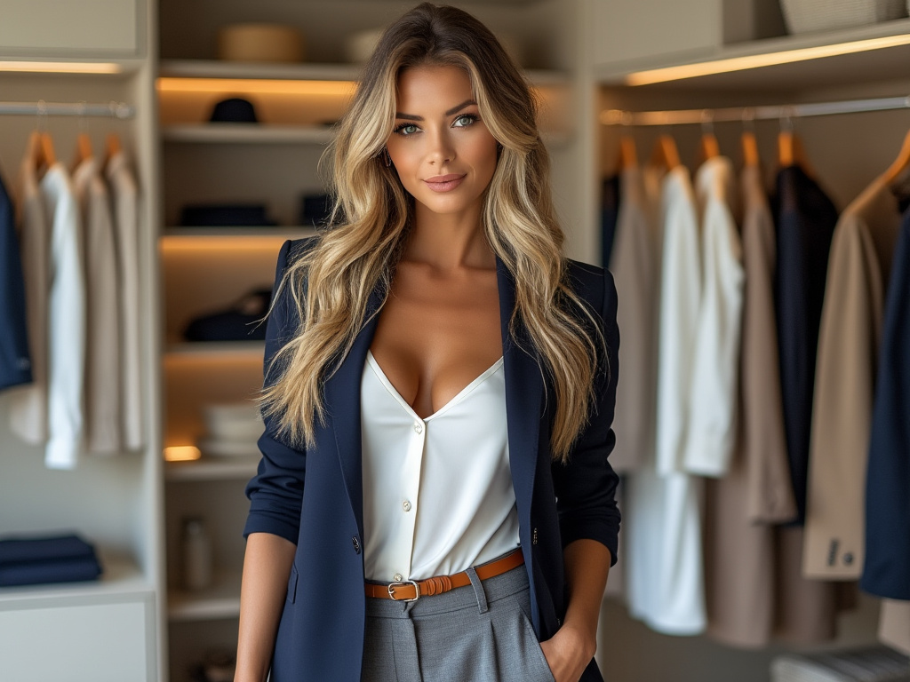
The Art of Color Coordination
Understanding how to combine colors effectively transforms getting dressed from a daily challenge into an enjoyable creative exercise. The key lies in balancing sophistication with personal expression.
- Rich jewel tones paired with deep neutrals create sophisticated evening looks
- Pastel combinations work beautifully for spring and summer wardrobes
- Earth tones provide versatility across seasons and occasions
- Monochromatic looks in varying shades create elegant, lengthening effects
- Complementary colors create vibrant, attention-grabbing combinations
- Analogous color schemes offer subtle sophistication
- Neutral anchors make bold colors more wearable
- Color intensity can be adjusted to suit different settings
- Pattern mixing becomes easier with a consistent color story
- Accessories can introduce experimental color combinations safely
- Light and dark contrast creates visual interest and structure
- Metallics serve as versatile accent colors across palettes
- Seasonal colors can be adapted for year-round wear
- Color families create cohesive, professional looks
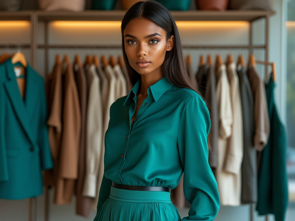
Colors for Every Body Type
Creating flattering outfits isn’t just about choosing colors you love—it’s about understanding how different colors and their placement can enhance your natural features and proportions.
Using Color to Create Balance
Strategic color placement can work wonders in creating visual balance. Darker colors tend to minimize while lighter colors draw attention and can make areas appear larger. Understanding this principle allows you to use color to highlight your favorite features while creating harmony in your overall silhouette.
Color Blocking for Different Shapes
The way you block colors can dramatically affect how an outfit flatters your body type. Vertical color blocking with darker sides and a lighter center can create a slimming effect, while horizontal blocking can add curve and dimension where desired. The key is to experiment with different arrangements while keeping your comfort and confidence in mind.
Color Intensity and Proportion
The intensity of colors you choose and how you proportion them across your outfit can significantly impact your overall look. Bright colors draw the eye, so placing them strategically can help create focus where you want it. Meanwhile, softer tones can help balance an outfit and create a more harmonious overall appearance.
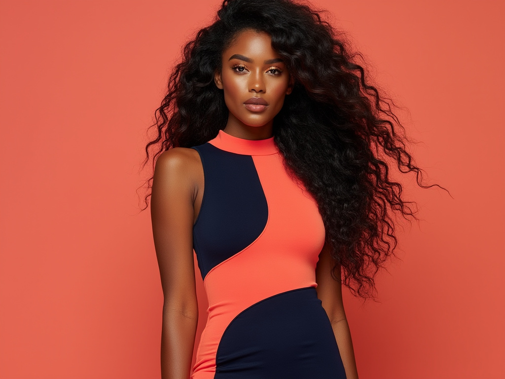
Transitional Color Strategies
Adapting your color choices through changing seasons and occasions requires thoughtful planning and creativity. Building a wardrobe that transitions seamlessly saves both time and money while ensuring you always look appropriately dressed.
Seasonal Color Adaptation
Color choices that work across seasons often involve layering and thoughtful combinations. A summer dress in a jewel tone can transition to fall with the addition of rich, darker accessories. Similarly, winter whites can move into spring when paired with softer, seasonal accents.
Day-to-Night Color Transitions
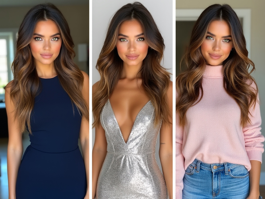
The key to making colors work from office to evening lies in strategic layering and accessorizing. A neutral base outfit can transform with the addition or removal of colorful accessories or layers. Consider how a classic navy sheath dress can go from professional with a beige blazer to evening-ready with metallic accessories.
Color Mixing for Different Settings
Understanding how to adjust color combinations for different environments is crucial. What works for a creative office might need toning down for a conservative setting. The trick is maintaining your personal style while respecting the context of different situations.
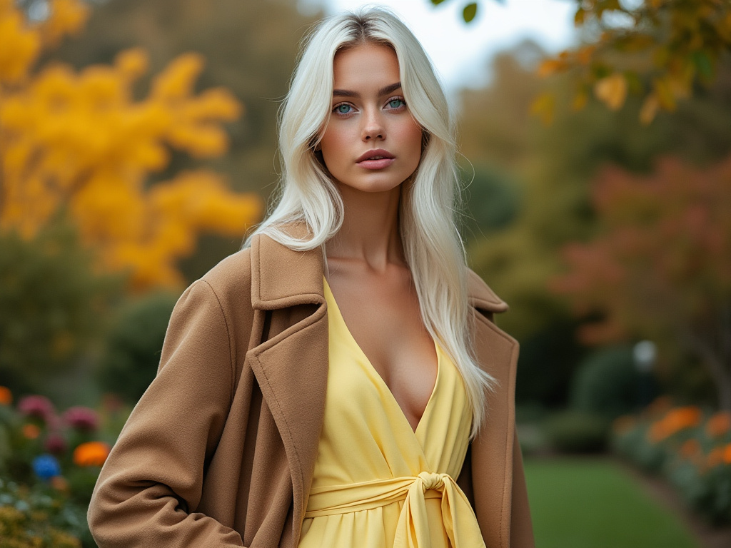
Working with Neutrals
Neutral colors form the backbone of a versatile wardrobe, but mastering their use requires understanding their subtle variations and combining potential.
- Classic black and white combinations never go out of style
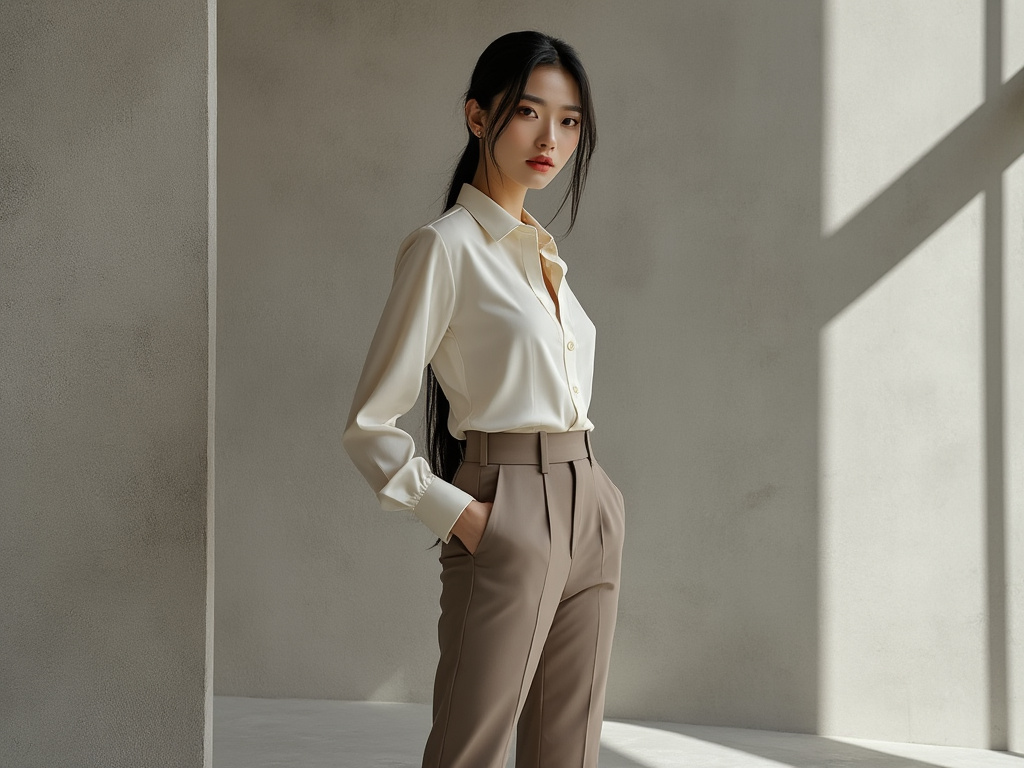
- Varying shades of beige create sophisticated monochromatic looks
- Gray serves as a versatile bridge between warm and cool colors
- Navy offers a softer alternative to black
- Camel tones add warmth to winter wardrobes
- Ivory provides a softer option than stark white
- Charcoal gray works well for professional settings
- Taupe bridges the gap between gray and beige
- Brown tones add richness to neutral palettes
- Olive green functions as a practical neutral
- Metallic finishes elevate simple neutral combinations
- White variations create depth in tonal outfits
- Stone colors offer versatile pairing options
- Natural linen shades provide casual elegance
Incorporating Trending Colors
Staying current with color trends while maintaining a personal style requires balance and strategic planning. Understanding how to incorporate new colors thoughtfully can keep your wardrobe fresh without requiring a complete overhaul.
Trend Analysis and Adaptation
Fashion color trends often cycle through seasons and years, but the key is identifying which trending colors complement your existing wardrobe and personal style. Not every trend needs to be followed—choose those that enhance rather than disrupt your established color palette.
Investment Versus Trendy Colors
When incorporating trending colors, consider their longevity. Invest in high-quality pieces in colors you’ll wear beyond the current season, while experimenting with trendier shades through accessories or less expensive items. This approach allows you to stay current while maintaining a wardrobe that feels authentically you.
Mixing Trends with Classics
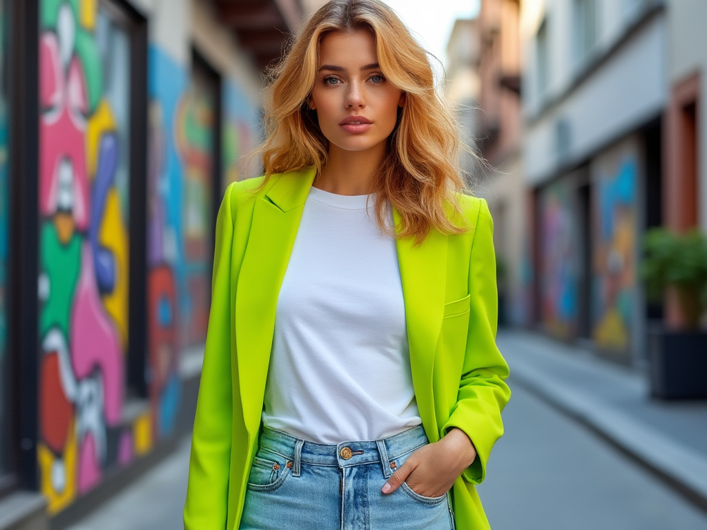
The most sophisticated way to wear trending colors is by grounding them with classic pieces and neutral shades. A trending hot pink blouse becomes more wearable when paired with classic navy trousers, while a trendy lime green accessory can add interest to a timeless black dress.
Advanced Color Theory
Understanding the nuances of color theory helps create more sophisticated and intentional outfits that reflect both personal style and current trends.
Color Temperature and Undertones
Every color has underlying warm or cool properties that affect how it interacts with other shades and your skin tone. Understanding these subtleties helps create more harmonious combinations and ensures your chosen colors truly flatter your complexion.
Light and Dark Value Play
The contrast between light and dark values within your outfit can create dramatic effects or subtle sophistication. High contrast combinations tend to create bold, attention-grabbing looks, while similar values produce more subdued, elegant ensembles.
Color Harmony Principles
Advanced color harmony goes beyond basic complementary pairs to include split-complementary, triadic, and tetradic combinations. These principles provide a framework for creating more complex and interesting color combinations while maintaining visual balance.
Color and Occasion
Different situations call for different approaches to color, from professional environments to special celebrations. Understanding these contexts helps create appropriate and confident color choices.
- Professional settings often require refined color palettes
- Evening events allow for richer, more dramatic color choices
- Casual weekends welcome comfortable, relaxed color combinations
- Special occasions can showcase bold, memorable colors
- Seasonal celebrations inspire festive color choices
- Outdoor events call for nature-inspired palettes
- Formal occasions often benefit from classic color combinations
- Creative environments welcome experimental color play
- Travel wardrobes need versatile color coordination
- Social gatherings allow for personal color expression
- Athletic activities suit energetic color choices
- Cultural events might call for specific color considerations
- Academic settings often prefer conservative color choices
- Networking events benefit from memorable yet professional colors
Essential Color Care Tips
Maintaining the vibrancy of your colored garments requires proper care and attention to detail. Understanding how to preserve colors ensures your wardrobe investments maintain their appeal over time.
Color Preservation Techniques
Proper washing techniques and storage methods significantly impact how well colors maintain their intensity. Using color-protective detergents and washing in cold water can help preserve the life of your colored garments.
Managing Color Bleeding
Understanding which colors are prone to bleeding and how to prevent color transfer can save your favorite pieces from damage. Separating loads by color intensity and using color-catching sheets can prevent unfortunate laundry accidents.
Color Restoration Methods
Even well-cared-for garments may fade over time, but certain techniques can help restore their vibrancy. From specialized color-refreshing products to professional services, options exist for extending the life of your colored clothing.
Summary Table
| Color Category | Best Uses | Key Benefits |
|---|---|---|
| Neutrals | Foundation pieces, professional wear | Versatility, timeless appeal |
| Jewel Tones | Statement pieces, evening wear | Sophistication, drama |
| Pastels | Spring/Summer wear, layering | Softness, approachability |
| Brights | Accent pieces, casual wear | Energy, attention-grabbing |
| Metallics | Accessories, special occasions | Luxury, versatility |
Conclusion
The journey from runway inspiration to real-life application is an art form that combines personal style with practical wisdom. By understanding color theory, knowing your palette, and mastering the art of combination, you can create a wardrobe that’s both fashion-forward and perfectly wearable. Remember that the most successful color choices are those that make you feel confident and authentic.
As you continue to experiment with color in your wardrobe, let your choices evolve naturally with your style journey. The key is not to follow every trend blindly but to develop a thoughtful approach to color that enhances your natural beauty and fits seamefully into your lifestyle. Your perfect palette is out there—it just takes patience, experimentation, and a willingness to step outside your comfort zone occasionally.
Frequently Asked Questions
How do I know which colors suit my skin tone best?
Examine your skin’s undertone by looking at your veins (blue suggests cool undertones, green suggests warm) and testing how different metal jewelry looks against your skin. Cool undertones typically look best in jewel tones and pure whites, while warm undertones shine in earth tones and ivory.
Can I wear colors that aren’t in my “season”?
Absolutely! While seasonal color analysis provides helpful guidelines, personal preference and confidence play crucial roles. Try wearing challenging colors as accessories or pairing them with more flattering shades near your face.
How do I incorporate trending colors without looking overdone?
Start with small doses through accessories or single pieces, and pair trending colors with neutral staples. This allows you to experiment while maintaining a balanced, wearable look.
What are the best colors for professional settings?
Navy, charcoal, black, and other deep neutrals form an excellent base for professional wardrobes. Add personality through controlled pops of color in accessories or subtle pattern mixing.

How can I make bold colors more wearable?
Balance bold colors with neutrals, keep silhouettes simple when wearing bright shades, and consider the proportion of bright colors in your outfit. The 60-30-10 rule provides a helpful framework.
What colors work best for photography?
Jewel tones and rich neutrals typically photograph well. Avoid neon colors and pure white, which can be challenging for cameras to capture accurately. Consider the setting and lighting when choosing colors for photo opportunities.
How do I prevent colors from fading?
Wash colored garments in cold water, turn them inside out before washing, use color-protective detergents, and avoid direct sunlight when drying. Store clothes away from direct sunlight to maintain color vibrancy.
Which colors are truly timeless?
Classic neutrals like navy, black, camel, and white have proven their staying power across decades. Beyond neutrals, certain shades like burgundy, forest green, and deep purple maintain their relevance regardless of trending colors. These timeless colors form the backbone of a sustainable, long-lasting wardrobe.
What’s the best way to mix patterns with different colors?
Begin with patterns that share at least one color in common. Keep scale in mind—pair larger patterns with smaller ones, and anchor busy patterns with solid pieces. Start with two patterns maximum until you feel comfortable experimenting with more complex combinations.
How can I make pastel colors look more sophisticated?
Pair pastels with deeper neutrals like navy or charcoal to add sophistication. Choose refined fabrics like silk or cashmere, and keep silhouettes clean and structured. Mixing pastels with metallic accessories can also elevate their appearance.
What colors work best for virtual meetings?
Opt for solid, medium-toned colors that contrast with your background but aren’t too bright or distracting. Jewel tones like sapphire blue, emerald green, or deep purple look professional and translate well on camera. Avoid busy patterns or neon shades that might create visual noise.
How do I build a cohesive color palette for a capsule wardrobe?
Start with 2-3 neutral bases that work well together, then add 2-3 complementary accent colors that align with your personal style and complexion. Ensure all pieces can mix and match by testing different combinations before committing to your final palette.
Can metallics be worn during daytime?
Absolutely! The key is choosing subtle metallic finishes and incorporating them thoughtfully. A metallic accessory or shoe can elevate a daytime look without appearing overdressed. Matte metallics and pewter tones are particularly versatile for daytime wear.
How do you coordinate colors for a special event?
Consider the event’s formality, timing, and setting. Evening events welcome richer, more dramatic colors, while daytime occasions suit lighter or brighter shades. Factor in the season and any dress codes, then choose colors that make you feel confident while respecting the occasion’s requirements.
What’s the best way to transition seasonal colors?
Layer pieces from different seasons, using color temperature as your guide. Warm autumn colors can work in spring when lightened with fresh neutrals, while summer brights can transition to fall when grounded with deeper tones. Accessories provide an easy way to adjust seasonal color stories without a complete wardrobe overhaul.

Neha Z. is not just any writer; she’s a storyteller who has graced the online world with her evocative prose for over half a decade. Venturing into the intricate nuances of women’s lives, she weaves stories that range from life’s highs and lows to the multifaceted essence of femininity. Each piece she pens radiates sincerity and artistry. As you delve into Neha’s musings, you’ll find reflections that echo your own journey and insights that inspire. Immerse yourself in her world, and let her stories touch your heart.
Reviewed By: Joanna Perez and Anna West
Edited By: Lenny Terra
Fact Checked By: Matthew Mansour
Photos Taken or Curated By: Matthew Mansour
