Key Takeaways
- Italy’s distinct color palettes spring from its diverse landscapes, local materials, and rich history.
- The Italian flag’s green, white, and red tell a story of hope, faith, and sacrifice tied to the nation’s unification.
- Regional colors like Tuscany’s warm ochres or Amalfi’s vibrant blues are deeply connected to local life, architecture, and even practicality.
- Renaissance artists revolutionized color use through pigment innovation and symbolic meaning, influencing Western art profoundly.
- From ancient Roman reds to modern design, Italian color blends tradition with evolving aesthetics.
- Understanding Italian color means looking beyond simple visuals to the geology, history, and culture shaping each hue.
An Italian Color Immersion
Imagine standing in a sun-drenched piazza. The buildings around you glow with warm ochre and terracotta. Maybe a flash of vibrant blue ceramic catches your eye. Or perhaps the simple, powerful green, white, and red of a flag snaps in the breeze. Color in Italy isn’t just decoration. It’s woven into the very fabric of the place. It tells stories of the earth, the sea, the people, and centuries of history.

How did specific colors become so tied to Italy? Why does Tuscany feel warm and earthy, while the Amalfi coast sings with bright blues? What’s the real story behind the flag’s famous stripes? This isn’t about abstract color theories.
It’s about digging into the ground, exploring coastal towns, and looking at how Italians have used pigments pulled from their own environment for generations. Let’s explore the vibrant world of Italian color, from the rolling hills of Tuscany to the cliffs of Amalfi, uncovering the sources and stories behind these iconic hues.
The Tricolore: More Than Just a Flag
Birth of a Symbol
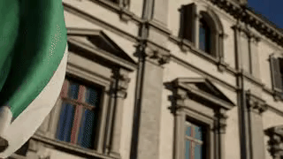
Where did Italy’s green, white, and red come from? Their first significant appearance was with Napoleon’s campaigns in Italy around 1797. Groups like the Cispadane Republic and the Lombard Legion adopted these colors. They were inspired partly by the French flag but chose colors holding local weight. Green often stood for the land’s natural beauty and hope. White represented faith or the snowy Alps. Red symbolized courage or the blood spilled fighting for freedom.
Colors of Unification
These colors didn’t just pop up and stick. They became banners for various groups pushing for a unified Italy throughout the early 19th century. Different regions and movements adopted variations, but green, white, and red kept reappearing. When Italy was finally unified in 1861, this combination felt like the natural, inevitable choice. It had been carried through decades of struggle. It visually represented the hard-won nationhood.
Everyday Hues
Today, the Tricolore‘s colors appear everywhere, far beyond official buildings. Think about food: caprese salad, margherita pizza. Consider brands: the red of Ferrari or Ducati motorcycles. These colors seep into packaging, fashion, and local festivals. They moved from a revolutionary symbol to a comfortable part of Italian identity, a visual shorthand recognized globally. The flag’s colors show how potent symbols can become deeply ingrained in daily culture.
Tuscany’s Embrace: Colors from the Earth

Sienna’s Signature Soil
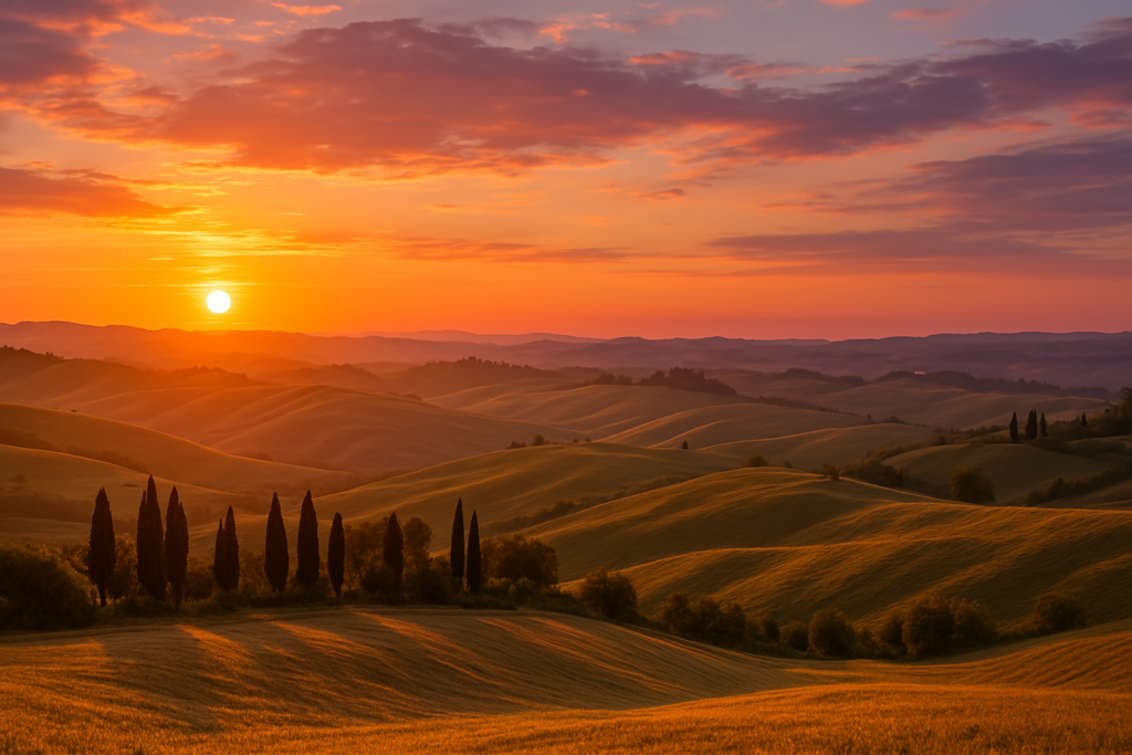
Tuscany’s famous warm palette isn’t accidental. It comes directly from the ground. The earth around Siena, for instance, is rich in iron oxides and manganese. These yield the natural pigments raw sienna and burnt sienna. Artists have prized these pigments for centuries. They give Tuscan buildings their characteristic warm, golden, and reddish-brown tones. Walking through a town like San Gimignano feels like stepping into this earthy palette.
Building with Local Color
Traditional Tuscan architecture uses materials found nearby. Stone quarries provided the pietra serena (a cool grey stone) and pietra forte (a warmer, yellowish sandstone) seen in Florence. Walls were often plastered and painted with washes made from local earths. The result is a harmony between buildings and landscape. Color choices were practical, too. Sometimes warmer tones were used on north-facing walls to visually combat the cooler light.
Landscape on the Plate
The connection extends to food. Think of the golden-green of fresh olive oil. Consider the deep ruby of Chianti wine. Even the vibrant yellow of saffron often used in Tuscan cooking echoes the sunny landscape. This link between land, buildings, and food creates a complete sensory experience. Tuscany’s colors feel authentic because they are authentic – derived from the place itself.
Coastal Blues: Echoes of the Mediterranean

Amalfi’s Dazzling Contrast
The Amalfi Coast presents a stunning color clash: the intense azure and cobalt blues of the Tyrrhenian Sea against steep, sun-bleached cliffs. This blue isn’t just in the water. It appears in the vibrant majolica tiles adorning church domes, like the one in Positano. It’s painted onto window shutters and fishing boats. It decorates the local ceramics famous in Vietri sul Mare. This blue becomes part of the coast’s identity.
Practical Pigments and Island Pastels
Why are towns like Positano painted in a rainbow of pastel shades? One practical reason persists in local lore: fishermen painted their houses distinct colors. This helped them spot their homes from far out at sea. What began as functional slowly evolved into the picturesque aesthetic we see today. It’s a reminder that beauty often emerges from necessity.
Capri’s Special Blue
The island of Capri is known for a specific shade – Capri Blue. It’s a bright, almost electric blue, sometimes leaning towards periwinkle. Its popularity bloomed partly due to the availability of new synthetic blue pigments in the 19th and 20th centuries. This coincided with Capri becoming a fashionable destination. The island embraced this vibrant blue, making it a signature part of its glamorous image. Coastal blues in Italy vary, each telling a story of sea, trade, and local tradition.
Roman Foundations: Imperial Reds and Ochres

The Power of Purple
In Ancient Rome, color meant status. The most prestigious color was Tyrian purple. Making it required thousands of sea snails. It was incredibly expensive. Its use was strictly controlled, reserved mostly for the Emperor and high-ranking senators. Wearing the wrong shade of purple could get you in serious trouble. This solidified purple’s association with power and royalty for centuries.
Red Earth and Legionaries
A much more common, yet still significant, color was red ochre. Derived from iron-rich earth, this pigment was affordable and durable. It appeared everywhere: on the walls of villas in Pompeii, as a base layer for frescoes, and famously, on the shields and tunics of Roman soldiers. This strong, earthy red became visually linked to Roman authority and military might. Its presence felt solid and commanding.
Pompeii’s Palette Preserved
The tragedy of Pompeii’s destruction by Vesuvius in 79 AD had an unexpected outcome. It preserved Roman homes and their colors with amazing clarity. We see walls painted in deep Pompeian red, rich yellow ochres, carbon blacks, and occasional Egyptian blues. These weren’t just random choices. Specific colors and complex painted scenes signaled the homeowner’s wealth and taste. These preserved examples show a sophisticated use of color harmony and contrast.
Renaissance Color: Art and Science Converge

The Pigment Revolution
The Renaissance wasn’t just about perspective and anatomy; it was also about color technology. Artists and artisans developed new ways to create and use pigments. Cennino Cennini’s book Il Libro dell’Arte (around 1400) documented many recipes. Obtaining brilliant ultramarine blue from lapis lazuli was complex and costly. Creating stable reds like vermilion from cinnabar required skill. Mastering these techniques gave artists unprecedented expressive power.
Layering Light and Shadow
Renaissance painters like Leonardo da Vinci explored how color creates form and atmosphere. His sfumato technique used thin, translucent layers of paint. This created soft, smoky transitions between colors and tones. It mimicked how light actually falls on objects. Masters like Titian became renowned for their handling of color, particularly reds, using glazes to achieve depth and luminosity that seemed alive.
Color Carries Meaning
Color choices weren’t just aesthetic; they were symbolic. The Virgin Mary was traditionally depicted in blue, signifying purity and heaven (and using expensive ultramarine showed devotion). Red could mean love, passion, power, or sacrifice depending on context. Gold leaf, common in earlier works, conveyed divinity and wealth. Renaissance artists used this established visual language, sometimes reinforcing it, sometimes playing with it to add layers of meaning to their work.
Venetian Colors: Trade Routes and Rich Hues

A Crossroads for Pigments
Venice’s position as a major trading hub connecting East and West had a huge impact on its art. Exotic pigments flowed through its ports. Think lapis lazuli from Afghanistan for ultramarine, orpiment (yellow) and realgar (orange) from Asia Minor. This availability gave Venetian painters access to a wider, more brilliant range of colors earlier than artists in Florence or Rome.
The Venetian School’s Vibrancy
This access shaped the distinctive style of the Venetian School. Artists like Giovanni Bellini, Titian, Tintoretto, and Veronese became known for their rich, luminous colors and dramatic use of light and shadow. They excelled at depicting luxurious fabrics – silks, velvets, brocades – capturing their texture and sheen through masterful color handling. Their work often feels more opulent and sensory compared to the more drawing-focused Florentine tradition.
Atmosphere and Colorito
Venetian painting prioritized colorito (coloring) over disegno (drawing and design), which was central in Florence. Venetian artists often built up forms directly with color and brushwork, rather than relying on detailed preliminary drawings. This approach contributed to the atmospheric, dynamic quality of their paintings. The shimmering light on water, the textures of fabrics, the glow of sunsets – these were captured through a deep understanding of color interaction.
Sicilian Chromatics: A Cultural Mosaic

Layers of Influence
Sicily’s color palette tells a story of its complex history. Sitting at the crossroads of the Mediterranean, the island absorbed influences from numerous cultures. Greek temples contribute stark whites and stone tones. Roman villas add ochres and reds. Byzantine mosaics blaze with gold leaf and deep blues and greens. Arab rule brought intricate geometric patterns and vibrant tilework. Norman architecture incorporates strong reds and intricate stonework. All these layers blend together.
Decorative Traditions
This mix is visible in Sicilian ceramics, particularly the colorful Caltagirone majolica. You see bold yellows, deep blues, antimony oranges, and copper greens, often depicting historical scenes or traditional motifs. Elaborate patterns adorn pottery, tiles, and even the famous Sicilian carts (carretti siciliani). These carts are painted with incredibly bright, detailed scenes using primary colors, a folk-art tradition that continues today.
Architecture’s Colorful Language
Sicilian Baroque architecture often uses contrasting colors for dramatic effect. Churches might feature facades combining local pale limestone with darker volcanic stone details. Interiors explode with colored marbles, frescoes, and gilded stucco. This isn’t just decoration; it’s a visual expression of the island’s layered heritage and exuberant spirit. Sicily’s colors are a vibrant testament to centuries of cultural exchange.
Italian Food: A Feast for the Eyes

Market Colors
Walk through any Italian food market. It’s an explosion of natural color. Deep purple eggplants, bright red tomatoes, vibrant green zucchini, sunny yellow lemons. The colors signal freshness and quality. This visual connection to ingredients is fundamental to Italian cooking. The presentation often highlights the natural beauty of the food itself.
Regional Specialties, Regional Hues
Regional dishes often reflect local color palettes. Pesto Genovese from Liguria is a vibrant green. Risotto alla Milanese gets its rich yellow from saffron. Polenta in the north offers earthy yellows and golds. Squid ink pasta (pasta al nero di seppia) provides a dramatic, deep black. These aren’t artificial colors, but hues derived naturally from the core ingredients, tying the food visually to its place of origin.
The Caprese Example
Think about a simple Caprese salad: red tomatoes, white mozzarella, green basil. It mirrors the colors of the Italian flag. Whether intentional or not, it creates an immediate visual connection to Italy. This simple dish highlights how deeply ingrained these colors are. They appear naturally in one of the country’s most beloved culinary combinations. Food in Italy engages sight just as much as taste.
Fashion’s Colors: From Sumptuary Laws to Style Icons
Restricted Rainbows
In Medieval and Renaissance Italy, color in clothing was serious business. Many cities enacted sumptuary laws. These rules dictated who could wear what colors and fabrics. Expensive dyes like crimson (from kermes insects) or true purple were often reserved for nobles and high clergy. Wealthy merchants might show status with rich blacks or deep blues. Commoners usually wore undyed wools or simpler colors derived from local plants – browns, greens, yellows. Color was a clear marker of social standing.
The Rise of Italian Fashion Houses
Fast forward to the 20th century. Italian fashion designers became world leaders, known for bold yet sophisticated color use. Think of Valentino’s signature Valentino Red. Consider Gucci’s iconic green and red stripe. Or Versace’s opulent golds and vibrant, sometimes clashing, patterns. These designers often drew inspiration from Italy’s art history and landscapes, but reinterpreted color with modern flair and luxury materials.
La Bella Figura
Color plays a role in the Italian concept of la bella figura – making a good impression. It’s not just about expensive clothes, but about wearing things well, with confidence and an eye for detail. This often involves skillful use of color – perhaps a bright scarf adding a pop to a neutral outfit, or a perfectly matched tie and pocket square. Color coordination and knowing what suits you are part of this cultural appreciation for aesthetics.
Architecture Beyond Tuscany: Regional Palettes

Liguria’s Painted Houses
Travel along the Ligurian coast, especially the Cinque Terre. You’ll see villages clinging to cliffs, their houses painted in a jumble of bright colors: pinks, oranges, yellows, reds. Like Positano, this tradition likely had practical roots, helping sailors identify their homes. Today, it creates an incredibly picturesque scene. The colors stand out dramatically against the blue sea and green hillsides.
Rome’s Travertine and Terracotta
Rome has a different feel. Much of its historic center features buildings made from travertine, a light-colored limestone, giving parts of the city a warm, honeyed glow. You also see lots of terracotta – in roof tiles, chimneys, and decorative elements. Plastered walls are often painted in shades of ochre, burnt orange, or pale yellow. It’s generally a warmer, more earth-toned palette than the bright coastal towns.
Bologna’s Red Reputation
Bologna is nicknamed La Rossa (“The Red”) for a reason. Many of its historic buildings and famous porticoes feature brickwork and plaster in shades ranging from deep terracotta red to softer burnt oranges. This consistent color scheme gives the city center a unique visual identity. It feels warm, historic, and cohesive. Regional variations show Italy’s color story is incredibly diverse.
Ceramics and Crafts: Color Baked In
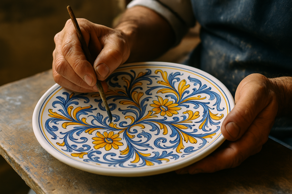
Majolica’s Brilliant Glazes
Italian majolica (tin-glazed earthenware) is famous for its bright colors and detailed decoration. Originating perhaps from Moorish Spain via Majorca, the technique flourished during the Renaissance, especially in towns like Faenza, Deruta, and Gubbio. Tin glazing created an opaque white surface perfect for painting. Potters used mineral oxides for color: cobalt for blue, copper for green, antimony for yellow/orange, manganese for purple/brown. The results were vibrant, durable ceramics.
Regional Styles in Pottery
Different regions developed distinct ceramic styles. Deruta became known for intricate blue, yellow, and orange patterns, often with metallic luster glazes. Faenza produced elegant bianchi di Faenza (whites of Faenza) with delicate blue or polychrome designs on a white ground. Sicilian pottery, as mentioned, often features bold primary colors and narrative scenes. These traditions continue today, keeping craft skills and color knowledge alive.
Glassmaking in Murano
Venice’s island of Murano is synonymous with glassmaking. For centuries, Murano artisans have perfected techniques for creating colored glass. They add metallic oxides to molten glass to produce stunning hues: cobalt for deep blues, gold for ruby red, manganese for violet, copper for greens and reds. Murano glass became prized across Europe for its clarity, brilliance, and incredible range of colors, used in everything from chandeliers to delicate sculptures.
Modern Italian Design: Tradition Meets Innovation

Echoes of the Past
Contemporary Italian designers often reference their country’s rich color history, but in new ways. A furniture designer might use a deep terracotta color reminiscent of Tuscan earth, but apply it to a sleek, modern sofa shape. An architect might use contrasting local stones in a contemporary building, echoing Baroque techniques but with clean lines. There’s often a respect for traditional palettes, even when the form is entirely modern.
Bold Color Statements
Italian design isn’t afraid of bold color. Think of Alessi’s playful kitchenware often featuring bright primary colors. Or Memphis Group design from the 1980s, which radically combined geometric shapes with vivid, unconventional color combinations like pinks, turquoises, and lemons. While minimalism exists, many Italian brands embrace color confidently, using it to create excitement and personality.
Material and Finish
Modern Italian design also focuses intensely on material quality and finish, which impacts color perception. The way light reflects off high-gloss lacquer versus matte paint, or polished chrome versus brushed brass, changes the color experience. Italian designers are masters at combining materials and finishes to create sophisticated color interactions, showing a deep understanding inherited from centuries of art and craft.
Preserving Color Heritage

Restoration Challenges
Restoring historic buildings and artworks in Italy presents unique color challenges. Centuries of dirt, pollution, and old varnishes can drastically alter original colors. The Sistine Chapel cleaning in the 1980s and 90s was controversial precisely because it revealed Michelangelo’s unexpectedly vibrant palette, shocking viewers used to seeing muted tones. Restorers must carefully analyze original pigments and techniques to make informed decisions.
Documenting Traditional Techniques
Organizations and individuals work to document and preserve traditional methods of pigment making and application. This includes studying old recipes, analyzing materials from historic sites, and sometimes reviving techniques that were falling out of use. This ensures that the knowledge behind Italy’s color heritage isn’t lost, providing valuable information for artists, historians, and conservationists.
Inspiration for the Future
Understanding Italy’s color history provides endless inspiration. It shows how color can be deeply tied to place, materials, culture, and time. It demonstrates sophisticated use of symbolism and harmony. By studying how Italians have used color – from ancient earth pigments to Renaissance glazes to modern design – we can learn more about the power of color in our own world. Italy’s chromatic feast continues to nourish global aesthetics.
Conclusion
Italy’s relationship with color is far more than just visually pleasing. It’s a deep conversation between the land, its resources, and the people who have lived there for millennia. The warm earth tones of Tuscany aren’t just paint choices; they are the earth.
The bright blues of the Amalfi coast echo the sea that shapes local life. The flag’s red speaks of sacrifice and passion that forged a nation.
From the calculated status symbols of Roman purple to the revolutionary pigments of the Renaissance and the confident hues of modern design, Italian color tells a rich, ongoing story. It’s baked into ceramics, woven into fashion, built into architecture, and even served on the plate.
To truly appreciate Italy’s chromatic feast is to understand the history, geology, and human ingenuity behind every shade. It’s a legacy painted across the entire country, vibrant and enduring.
Summary Table: Key Italian Color Connections

| Color/Region/Concept | Key Associations & Origins |
|---|---|
| Tricolore Colors | Green (hope, land), White (faith, Alps), Red (sacrifice, love); Unification |
| Tuscan Earth Tones | Raw/Burnt Sienna, Ochre; Local soil pigments, Architecture |
| Amalfi/Coastal Blues | Azure, Cobalt, Capri Blue; Sea, Majolica tiles, Practicality (fishing) |
| Roman Red/Purple | Red Ochre (power, military), Tyrian Purple (imperial status) |
| Renaissance Pigments | Ultramarine (lapis), Vermilion (cinnabar); Art technique, Symbolism |
| Venetian Palette | Rich, Luminous Hues; Trade routes, Exotic pigments, Colorito |
| Sicilian Mix | Golds, Blues, Reds, Geometric Patterns; Byzantine, Arab, Norman influence |
| Italian Food Colors | Natural hues from ingredients (tomatoes, basil, saffron); Regional identity |
| Fashion Reds/Blacks | Valentino Red (modern), Crimson/Black (historical status) |
| Regional Architecture | Ligurian pastels, Roman travertine, Bologna’s terracotta red |
| Ceramic Glazes | Cobalt Blue, Copper Green, Antimony Yellow; Majolica tradition |
| Murano Glass Colors | Ruby Red (gold), Deep Blues (cobalt); Glassmaking techniques |
Frequently Asked Questions (FAQ)

- Are specific colors legally protected in Italy? Generally, no. While certain historic colors like Tyrian Purple were restricted in Roman times, modern Italy doesn’t have laws preventing use of specific colors. Brand colors (like Ferrari Red) might have trademark protection, but that’s different.
- What about colors in regions not mentioned, like Umbria or Puglia? Italy is incredibly diverse! Umbria, “the green heart of Italy,” features softer greens and earth tones. Puglia, especially in the south, is known for its stark white buildings (città bianche) contrasting with the blue sky and sea, plus colorful ceramics from Grottaglie. Every region has its subtle chromatic identity.
- Is there a single “Italian color”? No, that’s the beauty of it. Italy’s color identity lies in its regional diversity and historical depth. If anything unites them, it’s often a connection to natural materials and a sophisticated handling of color developed over centuries.
- Why avoid color psychology? While interesting, discussions about “blue is calming” or “red is exciting” can be very general and subjective. This guide focuses on the specific historical, cultural, and material reasons behind Italy’s color use, which is more concrete and directly tied to the country itself.
- How has modern paint technology changed Italian color? Synthetic pigments offer consistency, durability, and a wider range of hues than many traditional pigments. This allows for easier maintenance of painted buildings and new possibilities in design. However, there’s also a growing appreciation for traditional, natural pigments, especially in historical restoration.

Lenny Terra is a vibrant force in the world of fashion and design. Effortlessly blending his expertise in colors with a keen artistic vision, he unveils the most sought-after hues of the season, turning ordinary ensembles into iconic looks. His knack for creating visually enthralling content ensures that every piece resonates with readers, offering them a mesmerizing journey through the realms of color and fashion. Lenny’s unmatched skills not only elevate the aesthetics but also promise an enchanting experience every time. Dive into his creations and let the colors speak for themselves.
Reviewed By: Joanna Perez and Anna West
Edited By: Marcella Raskin
Fact Checked By: Sam Goldman
Photos Taken or Curated By: Matthew Mansour