Key Takeaways
- Color saturation plays a crucial role in fashion and personal style
- Understanding color theory enhances your ability to create impactful outfits
- Highly saturated colors make bold statements, while muted tones offer versatility
- Balancing saturated and desaturated hues creates visually interesting ensembles
- Seasonal color analysis helps determine which saturation levels suit you best
- Experimenting with color intensity can dramatically transform your wardrobe
- Accessories are an easy way to introduce pops of saturated color
- Lighting conditions affect how color saturation is perceived in clothing
Color is the silent language of fashion, speaking volumes about our personality, mood, and style preferences. Yet, many of us overlook a crucial aspect of color theory that can elevate our wardrobes to new heights: saturation.
The intensity of a hue can make or break an outfit, transforming a simple ensemble into a show-stopping look. As we dive into the world of color saturation, prepare to unlock a new dimension of style that will revolutionize how you approach getting dressed each day.
The Color Wheel’s Hidden Power
The color wheel is more than just a circle of hues; it’s a roadmap to sartorial success. At its core, it holds the secret to understanding how different saturation levels can work together harmoniously.
Vibrant Virtuosos: High-Saturation Hues
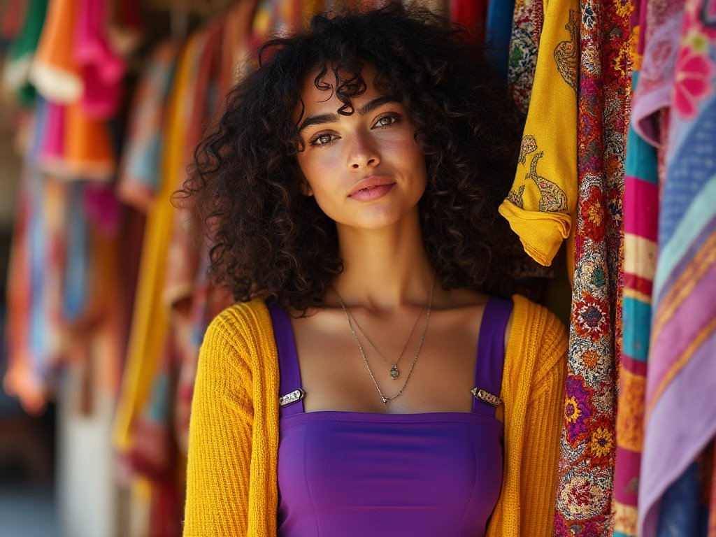
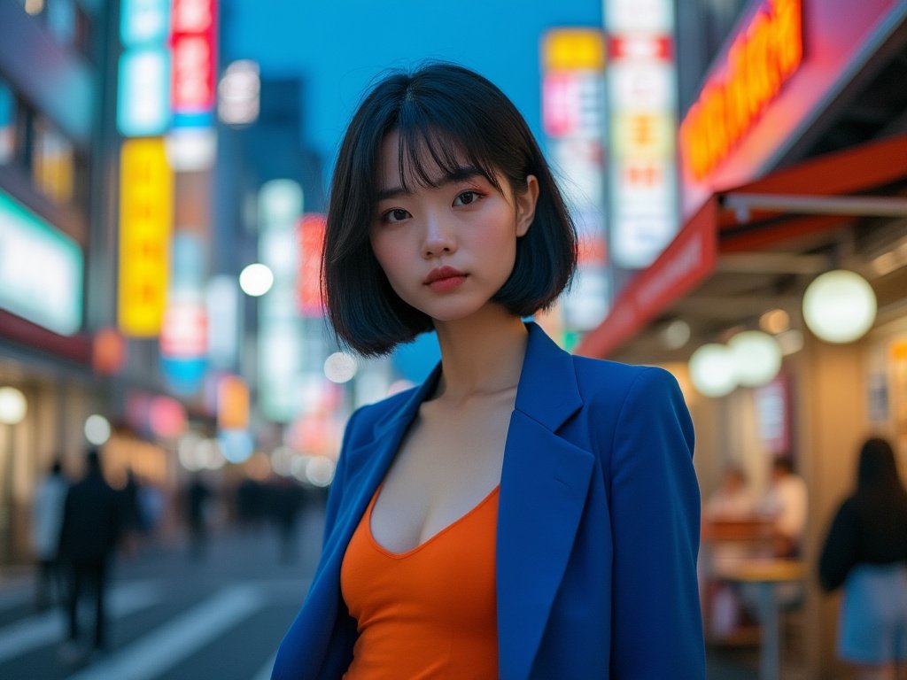
When it comes to making a statement, highly saturated colors are your best friends. These vivid, intense shades demand attention and exude confidence. Picture a cherry red dress that turns heads at a summer soirée or an electric blue blazer that commands respect in the boardroom. High-saturation hues are not for the faint of heart, but for those who dare to stand out.
Muted Marvels: The Subtle Charm of Low Saturation
On the flip side, low-saturation colors offer a different kind of allure. These subdued tones whisper rather than shout, creating an air of sophistication and versatility. A dusty rose blouse or a sage green pair of trousers can seamlessly transition from day to night, offering endless styling possibilities. Low-saturation hues are the chameleons of your wardrobe, adapting to various settings with ease.
The Middle Ground: Medium Saturation Magic
Nestled between the extremes lies the sweet spot of medium saturation. These colors strike a balance between vibrancy and subtlety, making them incredibly wearable for everyday looks. A medium-saturated teal sweater or mustard yellow scarf can add just the right amount of personality to an outfit without overwhelming it. These hues are the workhorses of a well-rounded wardrobe, offering both impact and versatility.
The Psychology of Color Intensity
Color saturation doesn’t just affect how we look; it influences how we feel and how others perceive us. Understanding this psychological impact can be a powerful tool in your style arsenal.
Emotional Resonance: How Saturation Affects Mood
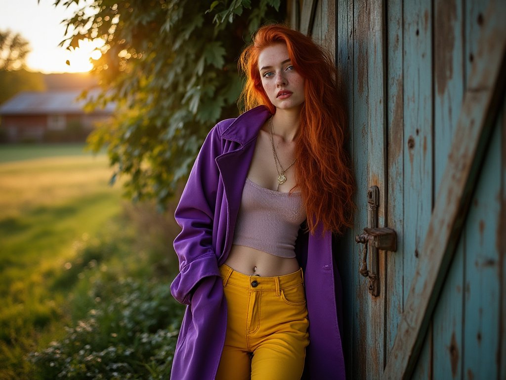
Have you ever noticed how wearing a bright, saturated yellow can instantly lift your spirits on a gloomy day? Or how a deep, rich burgundy can make you feel more grounded and sophisticated? The intensity of colors we wear can significantly impact our emotional state. Highly saturated hues tend to energize and excite, while less saturated tones can calm and soothe. Next time you’re feeling down, try reaching for that vibrant emerald green top – you might be surprised at how it affects your mood.
First Impressions: The Power of Saturation in Social Settings
In social situations, the saturation of your outfit can speak volumes before you even say a word. A highly saturated ensemble might convey confidence and approachability, perfect for networking events or first dates. Conversely, muted tones can project an air of mystery and elegance, ideal for more formal occasions. By consciously choosing your color saturation, you can tailor the message you’re sending to the world.
Cultural Context: Saturation Across Borders
It’s fascinating to observe how different cultures perceive and utilize color saturation in their traditional dress. In many Latin American countries, vibrant, highly saturated hues are celebrated and worn with pride. Meanwhile, Japanese fashion often embraces more muted, low-saturation palettes that reflect a preference for subtlety and harmony. As our world becomes increasingly connected, understanding these cultural nuances can help you navigate global fashion trends with sensitivity and style.
Mastering the Art of Color Mixing
The true magic happens when you start combining different saturation levels in a single outfit. This is where your creativity can really shine.
Contrast is Key: High and Low Saturation Pairings
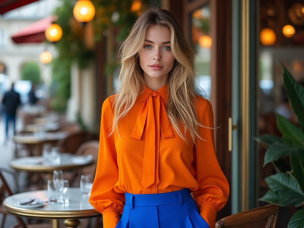
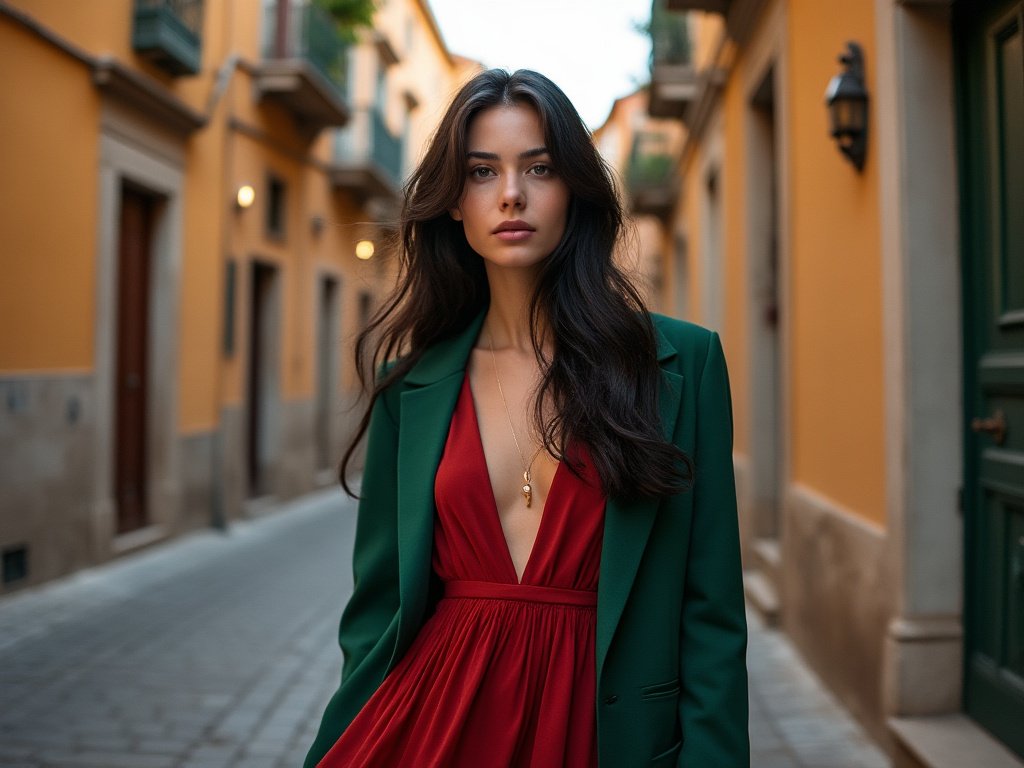
One of the most impactful ways to use saturation is by creating contrast. Pairing a highly saturated item with a more muted piece can create a visually stunning effect. Imagine a vivid cobalt blue blouse paired with soft gray trousers, or a pale blush skirt complemented by a deep maroon handbag. These combinations draw the eye and create depth in your ensemble.
Gradient Glory: Creating Saturation Continuums
Another approach is to create a gradient effect with your saturation levels. Start with a highly saturated piece as your focal point, then gradually decrease the intensity as you move outward. For example, you could wear a bright coral top, paired with medium-saturated peach pants, and finish with low-saturation nude shoes. This technique creates a cohesive look that’s both striking and sophisticated.
Monochromatic Magic: Playing with Saturation in One Color Family
Don’t be afraid to experiment with a single-color family. Mixing different saturation levels of the same hue can create a rich, layered look that’s both cohesive and interesting. Try pairing a pastel lavender sweater with deep purple accessories, or combine various shades of green from forest to mint. This approach allows you to create depth and dimension while maintaining a harmonious color story.
The Seasonal Saturation Guide
As the world around us changes with the seasons, so too should our approach to color saturation. Each season brings its unique palette and energy, offering fresh opportunities to play with color intensity.
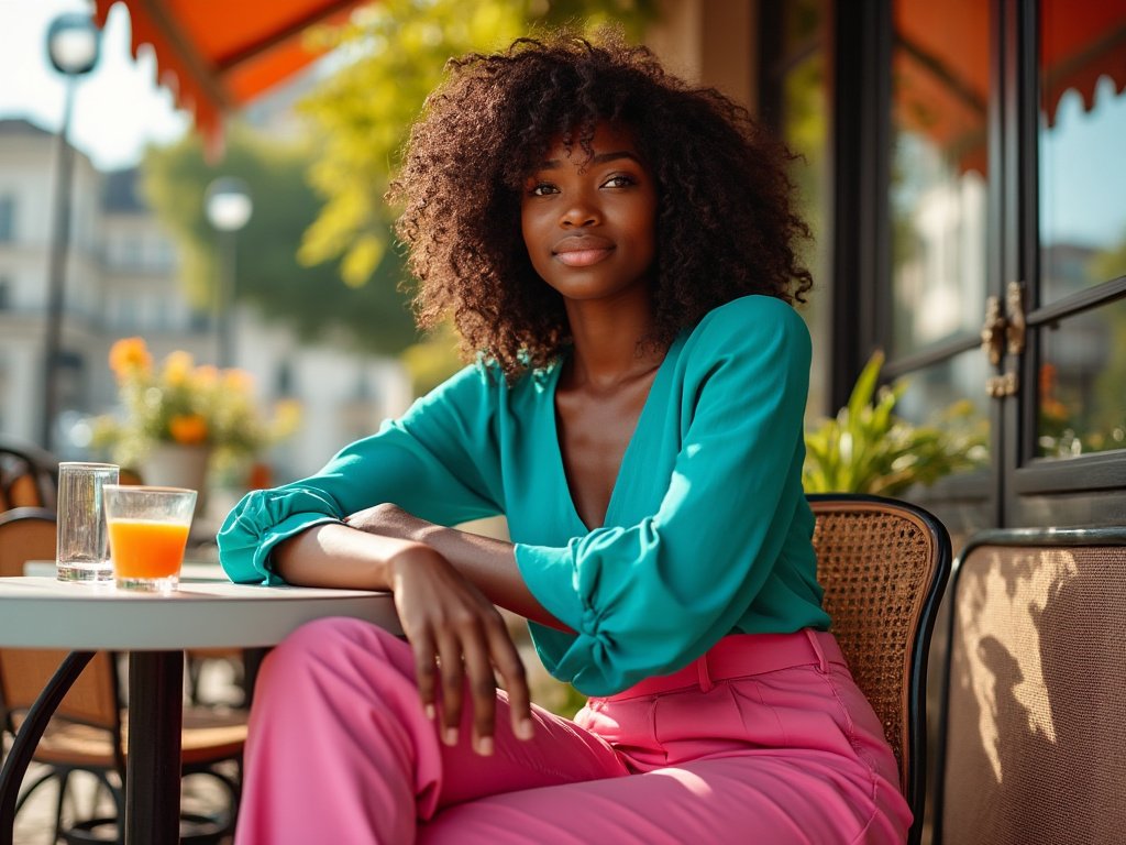
- Spring: Embrace medium to high saturation pastels and fresh, vibrant hues
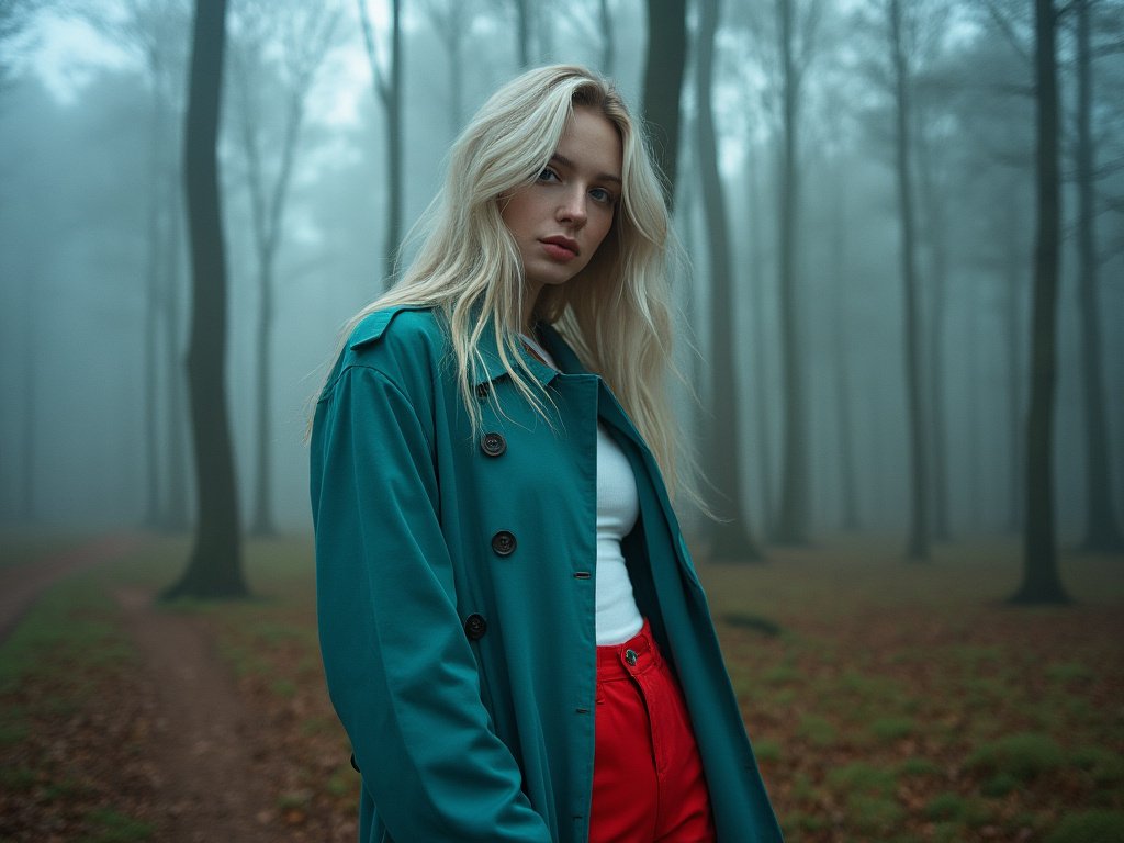
- Summer: Opt for soft, low-saturation shades mixed with pops of bright color
- Fall: Explore rich, deeply saturated earth tones and jewel hues
- Winter: Contrast stark whites and blacks with highly saturated bold colors
- Transitional seasons: Mix saturation levels to reflect the changing environment
- Holiday seasons: Incorporate traditional colors in varying intensities
- Resort wear: Experiment with tropical, highly saturated tones
- Back-to-school: Choose energizing medium-saturation hues for a fresh start
- Wedding season: Balance muted pastels with touches of vivid accent colors
- Festival season: Go all out with maximum saturation and eclectic combinations
- Workwear: Incorporate saturated accessories to enliven neutral office attire
- Evening wear: Play with saturation levels in luxurious fabrics for added drama
The Fabric Factor: How Texture Affects Saturation
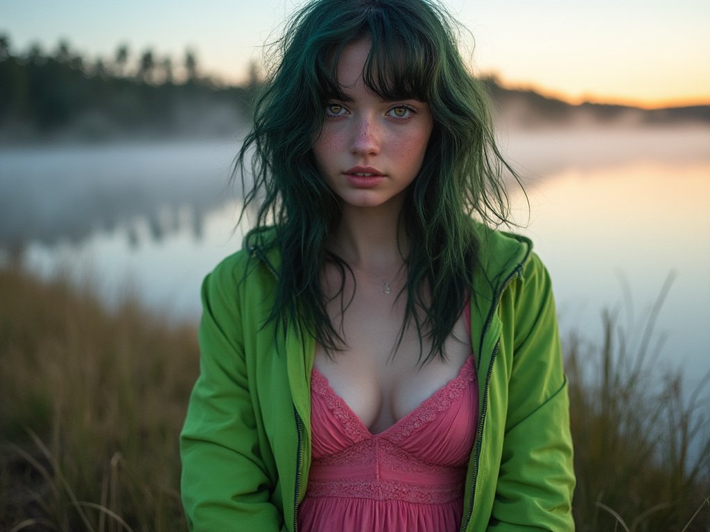
When it comes to color saturation, the fabric of your clothing plays a crucial role that’s often overlooked. The texture and material of a garment can dramatically alter how saturated color appears, adding another layer of complexity to your style choices.
Consider silk, for instance. Its lustrous surface reflects light in a way that can make colors appear more vibrant and saturated. A royal blue silk blouse might seem to glow from within, its color intensity amplified by the fabric’s natural sheen. On the other hand, a cotton t-shirt in the same hue would likely appear more muted and casual.
Velvet is another fabric that interacts uniquely with color saturation. Its plush pile absorbs and reflects light in a way that can make even less saturated colors appear rich and deep. A burgundy velvet dress, for example, might look almost three-dimensional in its color intensity, creating a luxurious and opulent effect.
In contrast, materials like linen or wool tend to absorb more light, which can make colors appear less saturated. This doesn’t mean they’re any less stylish – in fact, the natural, slightly muted look of these fabrics can be incredibly chic. A sage green linen suit, for instance, exudes an effortless, understated elegance that’s perfect for warm-weather formal events.
Synthetic fabrics like polyester or nylon can vary widely in how they affect color saturation. Some may enhance vibrancy, while others might flatten colors. This is why it’s always important to see clothes in person or check customer reviews when shopping online – the way a color looks on your screen might not accurately reflect its real-life saturation.
Understanding these fabric-color interactions can help you make more informed choices when building your wardrobe. For example, if you’re looking to make a bold statement with a highly saturated color, opt for fabrics like silk or satin that will enhance its vibrancy. If you prefer a more subdued look, natural fibers like cotton or linen can help tone down even the brightest hues.
Don’t be afraid to mix and match different fabrics to play with saturation levels within a single outfit. A matte cotton skirt in a saturated teal might pair beautifully with a shimmery, less saturated seafoam green silk blouse, creating an interesting interplay of color intensities.
Remember, the way fabric affects color saturation can also change depending on lighting conditions. Natural daylight will reveal the true saturation of a garment, while artificial lighting can alter our perception. This is why that perfectly saturated red dress might look slightly different in your bedroom mirror compared to under the fluorescent lights of your office.
Accessorizing with Saturation in Mind
Accessories are the secret weapons in your style arsenal, especially when it comes to playing with color saturation. They offer an easy way to experiment with different intensity levels without committing to a full outfit.
Statement Pieces: High-Saturation Accents
Bold, highly saturated accessories can breathe new life into an otherwise neutral outfit. A vibrant emerald green handbag paired with an all-black ensemble instantly elevates the look from basic to breathtaking. Similarly, a set of chunky, candy-apple red bangles can add a playful pop of color to a simple white summer dress. These high-intensity accents draw the eye and create focal points in your outfit, allowing you to direct attention where you want it.
Subtle Sophistication: Low-Saturation Details
On the flip side, low-saturation accessories can add depth and nuance to your look. A pale gray scarf draped over a navy blue coat creates a sophisticated, tonal effect. Or consider a pair of dusty rose earrings to complement a floral print dress – they add interest without competing with the main attraction. These muted accents can tie an outfit together, creating a cohesive and polished appearance.
Mix and Match: Creating Balance with Accessories
The real fun begins when you start mixing accessories of different saturation levels. Try pairing a highly saturated belt with low-saturation shoes, or combine a bright, bold necklace with more subdued earrings. This approach allows you to create balance and visual interest in your outfit. Remember, accessories are easily interchangeable, so don’t be afraid to experiment until you find the perfect combination.
The Art of Color Blocking with Saturation
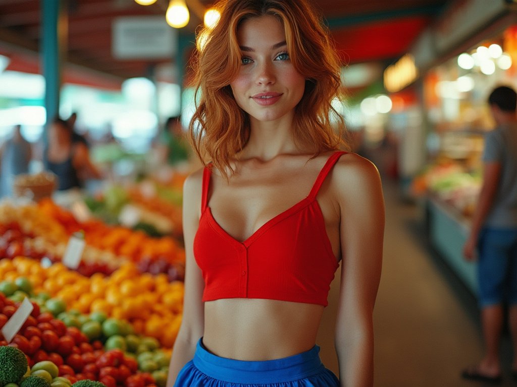
Color blocking is a timeless trend that takes on new life when you factor in saturation levels. This technique involves pairing distinct blocks of color in an outfit, and understanding saturation can take your color blocking game to the next level.
High-Impact Combinations: Saturated Color Blocks
For a bold, eye-catching look, try color blocking with highly saturated hues. Pair a bright yellow top with electric blue pants, or combine a vivid purple skirt with a lime green blouse. The key here is to choose colors that are of similar saturation levels but different hues. This creates a harmonious yet striking effect that’s perfect for making a statement.
Subtle Sophistication: Muted Color Blocking
If you prefer a more understated approach, try color blocking with low-saturation shades. A pale pink blazer paired with light gray trousers creates a soft, sophisticated look that’s perfect for the office or a casual brunch. The key is to choose colors that are close in saturation level but different enough to create distinct ‘blocks’ in your outfit.
Playing with Contrast: Mixed Saturation Blocking
For a truly dynamic look, try combining blocks of high and low saturation colors. A highly saturated royal blue top paired with pale khaki pants creates an interesting contrast that’s both stylish and balanced. This technique allows you to incorporate bold colors without overwhelming your outfit.
The Impact of Lighting on Color Saturation
One often overlooked aspect of color saturation in fashion is the role that lighting plays. The way we perceive color intensity can change dramatically depending on the light source, which can have a significant impact on our outfit choices.
Natural Light: The Great Revealer
Natural daylight is generally considered the best light for accurately perceiving color saturation. Colors tend to appear their truest and most vibrant under natural light. This is why that perfect shade of red you chose in the store might look slightly different when you get home. When planning outfits, try to check them in natural light whenever possible to get the most accurate representation of their saturation levels.
Artificial Light: The Great Transformer
Different types of artificial lighting can alter our perception of color saturation in various ways. Fluorescent lights, common in office settings, can make colors appear cooler and less saturated. Incandescent bulbs, on the other hand, tend to warm up colors and can make them appear more saturated than they actually are. LED lights can vary depending on their color temperature, but generally provide a fairly accurate representation of color.
Evening Light: The Saturation Shifter
As natural light fades in the evening, our perception of color saturation changes. Colors that appeared vibrant during the day might seem more muted in the soft light of dusk. This is something to keep in mind when planning outfits for evening events. You might want to choose slightly more saturated colors than you would for daytime wear to ensure they still have impact in lower light conditions.
Saturation and Skin Tone: Finding Your Perfect Palette
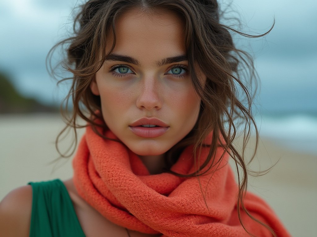
Understanding how different saturation levels interact with your skin tone can help you choose the most flattering colors for your wardrobe. While personal preference should always come first, knowing which saturation levels complement your natural coloring can be a helpful guide.
Cool Undertones: Embracing the Spectrum
If you have cool undertones to your skin, you might find that you look best in colors with blue, green, or purple bases. In terms of saturation, many people with cool undertones find that they can wear a wide range of intensities. Highly saturated jewel tones like sapphire blue or emerald green can look stunning, while softer, less saturated pastels can create a lovely, ethereal effect.
Warm Undertones: The Golden Rule
Those with warm undertones often have a golden or peachy glow to their skin. Colors with yellow, orange, or red bases tend to be particularly flattering. When it comes to saturation, warm undertones often shine in rich, deeply saturated hues like burnt orange or mustard yellow. However, softer, more muted earth tones can also create a beautiful, harmonious effect.
Neutral Undertones: The Versatile Canvas
If you have neutral undertones, congratulations! You likely have the most versatility when it comes to color saturation. Both highly saturated and more muted tones can work well, allowing you to choose based on personal preference and the occasion. Don’t be afraid to experiment with the full spectrum of saturation levels to find what makes you feel most confident.
The Evolution of Color Saturation in Fashion History
Color saturation has played a fascinating role in the evolution of fashion throughout history. Understanding this journey can provide valuable context for how we use color intensity in our wardrobes today.
Ancient Hues: The Birth of Saturated Dyes
In ancient times, highly saturated colors were a sign of wealth and status. The process of creating vibrant dyes was labor-intensive and expensive, making brightly colored clothing a luxury. The deep purple of Tyrian dye, extracted from sea snails, was so prized that it was reserved for royalty in ancient Rome. This association of saturated colors with luxury and power has persisted throughout fashion history.
The Industrial Revolution: Democratizing Color
The Industrial Revolution brought about significant changes in textile production, including the development of synthetic dyes. Suddenly, highly saturated colors were more accessible to the masses. This led to a explosion of color in fashion, with vibrant hues becoming increasingly popular across all social classes.
The Roaring Twenties: Embracing Vibrancy
The 1920s saw a cultural shift towards more expressive and daring fashion choices. This was reflected in the use of bold, highly saturated colors in clothing and accessories. Art Deco influences brought geometric patterns in vivid hues to the forefront of fashion.
Wartime Austerity: The Rise of Muted Tones
During World War II, fabric rationing and a more somber national mood led to a preference for less saturated, more practical colors. Khaki, navy, and other muted tones dominated wardrobes out of necessity and patriotic duty.
The Swinging Sixties: Psychedelic Saturation
The 1960s brought a rebellious spirit to fashion, with young people embracing highly saturated, psychedelic colors. Neon brights and clashing color combinations became symbols of youth culture and social change.
Minimalism and Grunge: The Pendulum Swings
The late 20th century saw various movements that embraced less saturated color palettes. The minimalist fashion of the 1990s favored neutral tones, while the grunge movement popularized muted, washed-out hues. These trends demonstrated how saturation levels in fashion can reflect broader cultural moods and attitudes.
The Digital Age: Infinite Color Possibilities
Today, advances in digital printing and dyeing technologies have made it possible to achieve an almost infinite range of color saturations in textiles. This has led to a democratization of color choices, allowing designers and consumers to experiment with saturation levels like never before. From ultra-saturated neons to barely-there pastels, the full spectrum of color intensity is at our fingertips.
Saturation Strategies for Different Body Types
Understanding how color saturation interacts with different body types can help you create flattering, balanced outfits that make you feel confident and stylish.
Curvy Figures: Playing with Contrast
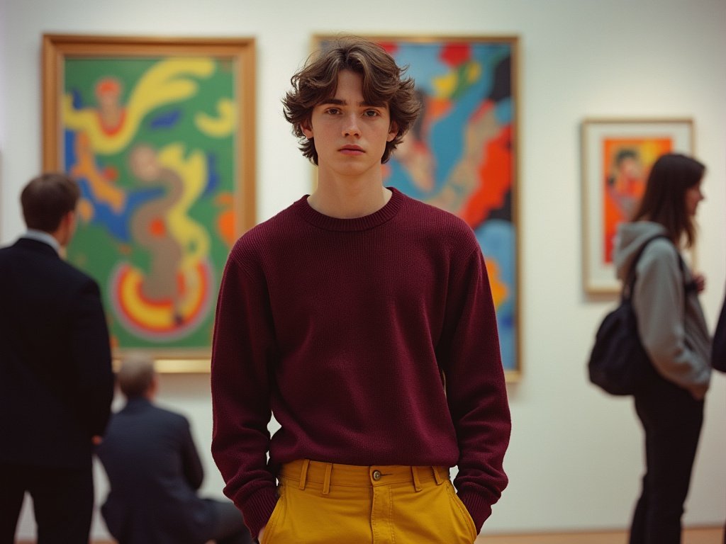
For those with curvy figures, using varying levels of saturation can create beautiful, flattering silhouettes. Try pairing a highly saturated top with less saturated bottoms to draw the eye upward. Alternatively, a monochromatic look in medium saturation can create a sleek, elongating effect.
Petite Frames: Vertical Saturation Gradients
If you’re petite, consider creating vertical saturation gradients in your outfits. Start with a more saturated color at the top and gradually decrease saturation as you move down. This can create the illusion of height and elongate your silhouette.
Athletic Builds: Softening with Saturation
For athletic body types, playing with softer, less saturated hues can add a touch of femininity if desired. Try pairing a pastel blouse with more structured, highly saturated bottoms for a balanced look that combines strength and softness.
The Future of Color Saturation in Fashion
As we look to the future, it’s clear that color saturation will continue to play a crucial role in fashion. Emerging technologies and changing cultural attitudes are shaping new trends in how we use and perceive color intensity.
Smart Fabrics: Dynamic Saturation
Imagine a future where your clothes can change color saturation at the touch of a button. Smart fabrics with color-changing properties are already in development, promising a world where we can adjust the intensity of our outfits to suit our mood or environment.
Sustainable Dyes: Eco-Friendly Saturation
As sustainability becomes increasingly important in fashion, we’re seeing a rise in eco-friendly dyes that can achieve a wide range of saturation levels. From plant-based dyes to innovative recycling processes, the future of color saturation is looking greener than ever.
Virtual Fashion: Unlimited Saturation Potential
With the rise of digital fashion and virtual try-on technologies, we’re entering an era where we can experiment with color saturation like never before. Virtual wardrobes allow us to play with extreme saturation levels that might be impractical in physical clothing, pushing the boundaries of color theory in exciting new ways.
Summary Table
| Saturation Level | Characteristics | Best Uses | Complementary Pairings |
|---|---|---|---|
| High Saturation | Vibrant, bold, attention-grabbing | Statement pieces, accent colors | Low saturation neutrals |
| Medium Saturation | Balanced, versatile, wearable | Everyday wear, mix-and-match pieces | Both high and low saturation items |
| Low Saturation | Subtle, sophisticated, calming | Base colors, professional wear | High saturation accents |

Conclusion
As we’ve explored throughout this guide, color saturation is a powerful tool in the world of fashion. It has the ability to transform outfits, influence moods, and express individuality. By understanding the principles of color intensity and how to apply them, you can elevate your personal style to new heights.
Remember, there are no hard and fast rules when it comes to color saturation in fashion. While guidelines can be helpful, the most important thing is to wear what makes you feel confident and authentic. Don’t be afraid to experiment with different saturation levels, mixing and matching until you find combinations that resonate with you.
As you move forward in your style journey, keep an open mind to the possibilities that color saturation offers. Whether you’re drawn to the bold impact of highly saturated hues or the subtle sophistication of muted tones, there’s a whole spectrum of color intensity waiting to be explored in your wardrobe.
Frequently Asked Questions
How does color saturation differ from color hue?
Color saturation refers to the intensity or purity of a color, while hue is the actual color itself (like red, blue, or yellow). A highly saturated color is vivid and intense, while a less saturated version of the same hue appears more muted or grayish.
Can I wear highly saturated colors if I have a more reserved personality?
Absolutely! Your clothing choices don’t have to directly reflect your personality. In fact, wearing highly saturated colors can be a great way to step out of your comfort zone or express a different side of yourself. Start small with saturated accessories if you’re hesitant.
Are there any colors that look good on everyone regardless of saturation?
While personal preferences and skin tones play a role, certain colors like navy blue, teal, and soft white tend to flatter a wide range of people at various saturation levels. However, the key is finding the right saturation that complements your individual coloring.
How can I incorporate highly saturated colors into a professional wardrobe?
For professional settings, try using highly saturated colors as accents rather than the main focus. A vibrant tie, scarf, or piece of jewelry can add personality to a more conservative outfit without being overwhelming.
Does the time of year affect how I should use color saturation in my outfits?
Generally, highly saturated colors are associated with spring and summer, while fall and winter often feature more muted tones. However, these are just guidelines. Don’t be afraid to wear bright colors in winter or subdued hues in summer if that’s what you prefer.
How do I prevent my outfit from looking overwhelming when using multiple saturated colors?
Balance is key. Try pairing one or two highly saturated pieces with more neutral or less saturated items. Alternatively, choose colors that are adjacent on the color wheel for a harmonious look.
Can color saturation affect how formal or casual an outfit appears?
Yes, saturation can influence the perceived formality of an outfit. Generally, less saturated colors tend to appear more formal and sophisticated, while highly saturated hues can give a more casual, playful vibe. However, fabric choice and cut also play significant roles in formality.
How does color saturation interact with patterns in clothing?
In patterned clothing, varying the saturation levels of different elements can create depth and interest. For example, a floral print might use highly saturated flowers against a less saturated background for contrast. Experimenting with saturation in patterns can lead to unique and eye-catching designs.

Gabrielle J. Smith is the pulsating essence that brings life to the world of fashion and color. With an innate talent for understanding the nuances of hues, she has the uncanny ability to paint narratives with her words, diving deep into the realm of color trends and the art of harmonizing them. Not just an expert in the field, Gabrielle also plays a pivotal role in strengthening the cohesion of our team, ensuring growth and harmony. Each of her articles is a testament to her passion, weaving captivating tales that resonate with readers and fashion aficionados alike.
Reviewed By: Joanna Perez and Anna West
Edited By: Lenny Terra
Fact Checked By: Matthew Mansour
Photos Taken or Curated By: Matthew Mansour
