Key Takeaways
- Scarlet projects a strong identity that captures attention and sparks intrigue.
- This hue embodies passion, vitality, and a touch of mystery, which makes it appealing across many design fields.
- By tapping into scarlet’s vibrant allure, artists, designers, and marketers can enhance emotional resonance in their work.
- Cultural color meanings often align scarlet with confidence, energy, and a sense of drama.
- When used thoughtfully, scarlet promotes a memorable and impactful presence in branding, art, and interior design.
Introduction
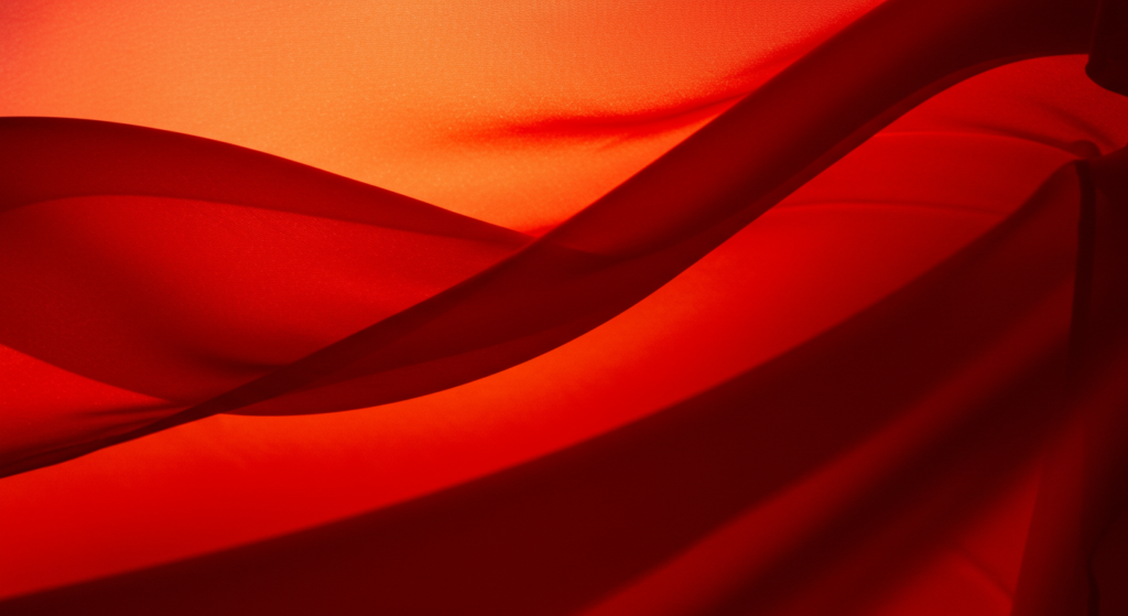
Scarlet sits on the color spectrum between red and orange. It attracts the eye in an instant and whispers promise of excitement. When we see scarlet, our minds might drift to flowers in bloom, ribbons in ceremonies, or perhaps the glow of a sunset. Yet, scarlet isn’t a mere decoration. It embraces a unique symbolism that shapes how we feel and act in its presence.
Symbolism and Personality Traits of Scarlet
Scarlet brings an air of resilience and warmth. Its vibrancy can suggest sincerity, while its depth hints at reliability. In certain contexts, scarlet captures elegance and creativity, both of which add sparkle to any design. This fiery shade can also express passion and optimism, although it carries a bit of mystery. Because it’s bold, scarlet can nudge us toward innovation and sophistication.
At times, it also radiates energy, bringing fresh clarity and balance to an overall palette. Some find it charming and authentic, while others see it as a sign of confidence and wisdom. A hint of spontaneity pulses through scarlet’s core. In certain artistic works, it can suggest a sense of tranquility anchored by an underlying dynamism.
Overall Essence
Scarlet doesn’t fit into neat boxes. It carries many possible interpretations. This color’s allure evolves depending on context. Some may see it as bold. Others call it refined. One might even call it intimate. No single description covers scarlet’s full power. That’s what makes it special: it’s open enough for each person to add their own meaning.
In this piece, we’ll explore scarlet’s many angles in depth. We’ll talk about color psychology, cultural color meanings, branding, marketing, art, design, and more. If you’ve been curious about its symbolic qualities, you’re in the right spot. Let’s jump in.
The Essence of Scarlet

Defining Scarlet
Scarlet sits in a distinct spot on the color wheel. It has more orange than the typical crimson shade, yet it retains a fair portion of red’s intense energy. Because of this mix, scarlet often sparks immediate notice. This hue aligns well with color theory concepts that highlight warm tones’ ability to convey excitement and draw the eye.
Some might confuse it with vermillion or other bright reds. The difference lies in scarlet’s particular vibrancy and sun-kissed glow. Vermillion leans a bit darker, while scarlet beams like a bright flame. This difference affects how people respond. Color interpretations revolve around subtle details, so those small shifts in hue can alter our emotional reaction.
In design color meanings, scarlet often represents courage and power. It can shift a project from ordinary to memorable. Whether used in fashion, branding, or art, scarlet’s distinct presence can’t be ignored. Its color attributes ensure it stands on its own.
Emotional Impact
Scarlet holds a fiery intensity that stirs emotions linked to passion and urgency. When we encounter this color, our pulse might quicken. It’s not always mild. There’s something electric that travels through viewers. This factor influences colors and mood in a very direct way.
Because scarlet leans warm, it often evokes sensations of comfort and encouragement. At the same time, it can prompt feelings of adventure or decisiveness. People prone to excitement might gravitate toward scarlet because it reaffirms their energetic nature.
Its emotional color meanings vary by culture. Some communities connect scarlet with luck or leadership, while others pair it with warnings or caution. There’s no single universal meaning, but in many circles, scarlet stands for life, fire, and celebration.
Symbolic Qualities
Scarlet represents strength, romance, and even spiritual significance in certain traditions. Its use in ceremonies or costumes often points to an honor or status. In color symbolism, scarlet shows us the spark that drives action. It can embody revival or renewal, depending on the surrounding context.
In some belief systems, scarlet might signify a test or a challenge. Individuals who favor scarlet could be seen as risk-takers. They feel comfortable pushing boundaries in creative fields or public life. Color connotations don’t always stay the same across time, but scarlet tends to keep its bold edge.
From a visual color language standpoint, scarlet asserts itself. It rarely fades into the background. This quality makes it perfect for those who want to stand out. On the other hand, designers must handle it with care. Too much scarlet can overwhelm. The key is striking a balance.
Cultural Ties to Scarlet
Historical Perspectives
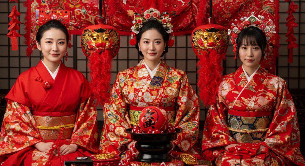
Through many eras, scarlet has played a notable part in cultural celebrations. It’s turned up in ancient banners, religious robes, and royal attire. In medieval Europe, scarlet cloth was prized for its depth of color, which many saw as luxurious. Different groups assigned distinct symbolic colors to reflect hierarchy or status, and scarlet often signaled power.
In certain regions, scarlet functioned as a mark of good fortune or spiritual strength. Cultural color meanings shift with time, but scarlet remains tied to big events and achievements. Its presence in ceremonial garments still stands for reverence and respect.
Cross-Cultural Variations
Around the world, scarlet doesn’t follow a single interpretation. In some places, it’s worn during festivals to signal joy. In other areas, it might hint at seriousness or warning. These color associations can change how a design or product is received.
Cultures vary in their approach to color. A shade revered in one location might carry a different meaning elsewhere. That’s why businesses aiming for global outreach must be mindful of how scarlet translates in their target markets. Color branding strategies often require local input to avoid misunderstandings or negative connotations.
Modern Attitudes
Today, scarlet appears in fashion lines, product packaging, and interior design. Many see it as a statement color for those not afraid to be seen. The psychological effects of color remain significant here. Scarlet can spark passion, motivation, or even a sense of competitiveness.
When you choose scarlet for a brand or an outfit, you’re communicating confidence. Modern audiences often react to this color with curiosity or admiration. That said, some folks might find it too intense for everyday use. Balancing scarlet with neutral tones or calmer hues can help keep it welcoming.
The Role of Scarlet in Branding

Why Brands Use Scarlet
In branding, color is a powerful tool. Color impact in design shapes how consumers perceive products and services. Scarlet shows strength, excitement, and bold action. A brand that wants to highlight ambition might rely on scarlet elements in its logo or marketing materials.
Think about global brands recognized by red or scarlet logos. They aim to energize their audience. The bright hue stands out from a sea of subtle brand colors. Scarlet might also suggest speed or urgency, which can help certain industries. Tech startups and sports teams, for instance, sometimes embrace this color to indicate forward momentum.
Emotional Branding with Scarlet
Emotional branding hinges on building strong bonds with customers through shared values or experiences. Scarlet’s direct style can make a statement about a brand’s passion for quality or willingness to innovate. People may form a stronger emotional link to a product or service if the brand’s color aligns with a sense of dynamic purpose.
Color psychology research shows that bold reds often spur action and confidence. Customers might feel compelled to explore a product that uses such a color. When integrated well, scarlet can inspire trust or encourage quick decisions. This can be a double-edged sword, though: too much red-based color may raise stress levels. Moderation and thoughtful placement matter.
Tips for Scarlet Logos and Packaging
If a company is set on using scarlet in its logo or packaging, it should consider contrast. Placing scarlet against white or black can help the design pop. Brands also need to think about cultural nuances, ensuring the color doesn’t clash with local traditions.
Font choice counts, too. A sleek, modern typeface may pair better with scarlet’s edginess than a whimsical font. Also, a brand can use scarlet as an accent, highlighting key details on a package without overwhelming the consumer. The goal is to harness scarlet’s vibrant flair without drowning out the rest of the design elements.
The Scientific Roots of Scarlet

Understanding Light and Wavelength
Scarlet appears where the visible light spectrum tilts toward red, but with a dash of orange. The human eye perceives scarlet because of how wavelengths bounce off surfaces. Our color perception depends on these tiny shifts in the light we receive.
Scientists who study color theory examine how different wavelengths stimulate our cone cells. Scarlet sits in a place that triggers a reaction often tied to urgency and focus. That’s part of why scarlet feels so intense to us. It’s not just psychological—there’s a biological factor in how our eyes detect bright reds.
Human Responses in Studies
Some scientific studies on color have examined how red-based hues, including scarlet, affect people’s alertness. Researchers note that warm tones can heighten awareness or even nudge people to take action. This might explain why warning signs or hazard labels often use forms of red, though they may lean more toward standard primary red than scarlet.
Participants in these studies sometimes reported feeling energized when shown bright red or scarlet tones. A few also felt a bit of stress or pressure. The response varied, but it’s clear that scarlet can evoke a strong, direct reaction.
Why Scarlet Stands Out
Scarlet’s chroma level keeps it looking vivid. When you see it next to cooler hues, it seems to leap forward. This effect arises from the way scarlet’s wavelength interacts with the eyes’ receptors. While some colors fade into the background, scarlet does the opposite. Designers often use it to lead the viewer’s gaze.
The interplay of light, biology, and emotional interpretation makes scarlet a prime candidate for color storytelling. The science backs up what artists have long known: a bright red tone can drive drama or highlight key elements in a piece.
Shades and Tones of Scarlet
Variations of Scarlet
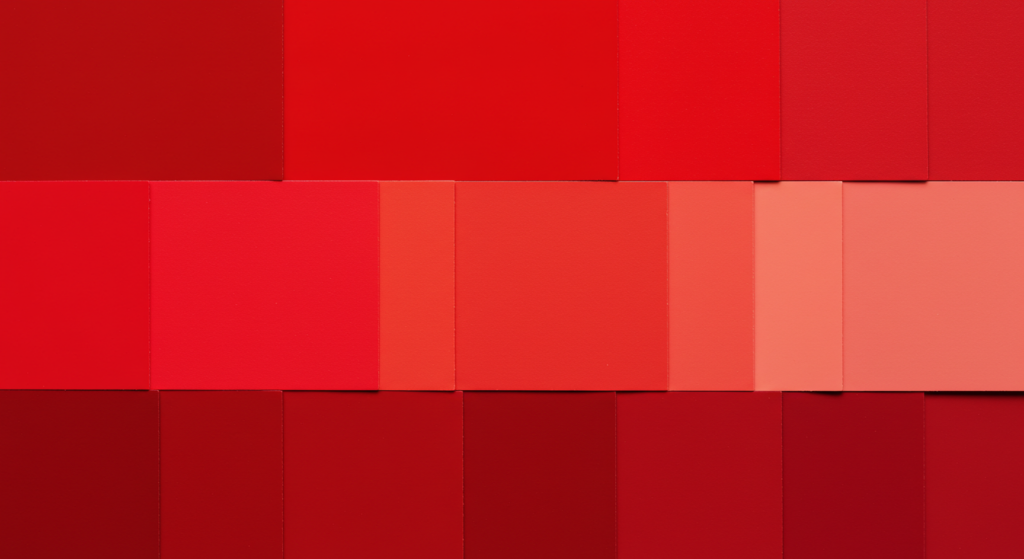
Not all scarlet shades are identical. Some lean closer to pure red, while others draw in a bit more orange. This range can stretch from a deep scarlet with more richness to a lighter scarlet that feels airy. Each variation carries a different vibe, even if they share the same name.
Color palette meanings often change with shifts in saturation and brightness. A bright, light scarlet might appear playful or cheerful. A darker scarlet might seem more dramatic or even regal. Subtle differences can alter a project’s final impact.
Mixing Scarlet in Design
When you mix pigments to achieve scarlet, it takes patience. Too much orange, and you veer toward a pumpkin hue. Too much red, and you risk sliding into crimson territory. Painters and graphic designers often consult color theory charts to find the right blend.
Digital tools can help pinpoint the exact hex code or RGB values for scarlet. Some popular codes for scarlet include #FF2400 or #CD202C, though each might vary slightly. Designers often experiment with complementary and analogous colors to create harmony. A balanced palette could involve scarlet, a cool neutral, and perhaps a soft beige.
Choosing the Right Shade
Picking the right shade of scarlet depends on the context. If you want something bold for a retail ad, a bright version might capture more attention. For an interior design project aiming for a cozy lounge, a muted scarlet could bring warmth without too much brightness.
Tackling these choices requires an awareness of color influences on behavior. A bright hue might inspire shoppers to act fast, while a muted tone might encourage them to linger and appreciate the ambiance. It’s best to test a few samples under various lighting conditions. Natural and artificial light can change how scarlet looks.
Using Scarlet in Interior Design

Adding Warmth and Character
Scarlet can add zest to a living space. When placed on walls, furniture, or accessories, it infuses warmth and draws immediate focus. For those seeking a cozy vibe, a scarlet throw blanket or accent rug might do the trick. This pop of color can lift the energy in a neutral-toned room.
Interior design color meanings often revolve around comfort, so scarlet should be used in moderation. If you coat all four walls in scarlet, it might feel overbearing for some. Instead, many designers suggest a single scarlet accent wall or decorative pieces. This way, the color’s charm remains front and center without dominating everything else.
Balancing Light and Space
Because scarlet is strong, it benefits from balanced lighting. In a room with lots of sunlight, scarlet can glow in a cheerful way. At night, warm lamps can enhance the color’s depth. Make sure your space has enough natural or artificial light to keep scarlet from feeling too heavy.
If your room is small, adding scarlet in careful doses can still work. For instance, a scarlet couch pillow or vase might deliver the right pop of color. Pairing it with cream, light gray, or other neutrals can make the space seem larger. This approach ensures that scarlet’s warmth complements the environment.
Ideas for Different Rooms
- Living Room: A scarlet accent chair or velvet drape might create a focal point.
- Kitchen: Bright scarlet bar stools or small appliances can add a lively touch.
- Bedroom: Consider scarlet bedding or a patterned rug with hints of scarlet.
- Home Office: A scarlet lamp or desk accessory may spark creativity during long work sessions.
The key is to blend scarlet with other tones so it feels layered. Mix in textures and patterns to give each room a unique atmosphere.
Pairing Scarlet with Other Colors

Complementary Matches
Because scarlet is warm, pairing it with its complementary hue on the color wheel can create bold contrast. Greens, especially muted or sage-like tones, work well. This dynamic interplay can be effective in both design and art contexts.
When you place scarlet next to green, you highlight each color’s vibrancy. This can be striking in brand logos, especially if the company wants an energetic presence. At the same time, it’s wise to test different shades of green, because not every green pairs smoothly with scarlet’s intensity.
Analogous Combinations
Scarlet sits near red and orange. When you combine these neighbors, you get a warm, harmonious palette. This approach can be comforting. It’s often found in nature’s color meanings, like in sunsets or autumn leaves. This range might include variations of red, scarlet, and orange that create a sense of flow.
Analogous color schemes can be great for designs that need unity without too much contrast. They communicate a sense of direction without jarring the viewer. At the same time, you should still include some neutrals, like a sandy beige or creamy off-white, to ground the palette.
Unexpected Palettes
If you want a more unconventional twist, pair scarlet with shades like turquoise or lavender. This creates an element of surprise. It can be pleasing when balanced well, though it may not suit every project. Trendy fashion collections sometimes use these offbeat combos to stand out.
You can also experiment with dark navy for a moody contrast. Color narratives gain complexity when deep blues and bright reds meet. This scheme can feel nautical or regal. It depends on the final arrangement of shapes and textures. Testing your ideas on a small scale before committing is smart.
Scarlet in Art and Fashion
Bold Statements on Canvas
Artists use scarlet for dramatic and emotional scenes. This hue can show intense moments in a painting or highlight a central character’s clothing. In colors in art, scarlet acts like a magnet for the viewer’s gaze. It can accent moments of triumph or heartbreak, depending on context.
Some notable art movements embraced bright reds and oranges to convey raw energy. Expressionist artists, for instance, explored how bold colors like scarlet stir strong reactions. Many painters say this color breathes life into their work. It brings an intensity other hues can’t replicate.
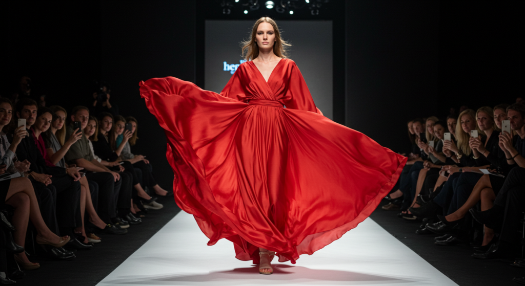
Runway and Street Style
Fashion designers often rely on scarlet for runway pieces that grab attention. A scarlet gown can exude elegance and confidence. In street style, scarlet pants or a jacket might showcase a sense of boldness. People who wear scarlet tend to project a certain swagger.
Scarlet outfits also carry an element of fun. Pairing a scarlet blazer with neutral pants can revitalize professional attire. Even a small scarlet accessory—a scarf or belt—can bring a look to life. Because scarlet goes with many skin tones, it’s a versatile choice for those seeking a statement piece.
Cultural Fashion Traditions
In various parts of the world, scarlet has shown up in traditional attire, festival garments, or wedding outfits. These traditions often embrace the color’s symbolic link to joy, luck, or celebration. In certain ceremonies, scarlet might represent prosperity or a lively spirit.
Fashion lovers who enjoy a global touch might incorporate scarlet details inspired by cultural garments. Whether it’s embroidery or printed patterns, scarlet can remind us of shared heritage and vibrant festivities. This synergy highlights universal color meanings, bridging different style elements with a unifying shade.
Psychological Underpinnings of Scarlet

Modern View on Color Psychology
While classic color psychology often ties red to danger or passion, the modern view is more nuanced. Scarlet can stimulate awareness, but it can also soothe some people if paired with calm surroundings. Psychological color analysis acknowledges that personal experiences shape reactions to color.
A person who associates scarlet with past achievements might feel uplifted when seeing it. Another might feel tension if scarlet reminds them of warnings. These varied responses point to color’s complexity. There isn’t always a single, universal takeaway.
How Scarlet Influences Behavior
Scarlet can nudge people to take action. It’s bright and hard to ignore. Retailers sometimes use scarlet in sale signs to spur quick decisions. Restaurants might add scarlet accents to spark appetite or energy. The color can also signal passion for an event or cause.
However, if scarlet dominates an environment, it could cause visual fatigue. Consumers might rush to finish a task or leave a space if they feel the color is pressing on them. The key is thoughtful application. In the right measure, scarlet empowers. In excess, it might overwhelm.
Balancing the Energy
To keep scarlet’s energy in check, pair it with mellow tones like soft gray, light blue, or cream. This combination can temper scarlet’s boldness while preserving its spark. Individuals who are sensitive to strong colors might find the blend more comfortable.
If you want to ramp up scarlet’s power, set it against white. You create a crisp, high-contrast look that feels modern. This can work well on websites or packaging that aims to be unforgettable. The best approach depends on your design goals and audience preferences.
Scarlet in Marketing
Grabbing Consumer Attention
Marketing campaigns often have mere seconds to hook viewers. Scarlet serves as an immediate eye-catcher. Whether it’s a billboard or social media ad, that pop of intense color can halt a fast-scrolling user. Color marketing thrives on this principle of grabbing attention.
In digital marketing, buttons or call-to-action prompts in scarlet can boost click-through rates if used wisely. People notice a bright button on a webpage more quickly than a muted one. This tactic taps into scarlet’s inherent urgency.
Crafting Emotional Appeal
Colors and emotions go hand in hand. If a brand’s message revolves around passion or excitement, scarlet can align perfectly with that theme. An ad for a high-octane event might use scarlet banners to evoke a thrill. A bold product launch can benefit from this color’s intensity as well.
Using scarlet in marketing materials can create a sense of closeness or importance. Consumers might feel a sudden spark of curiosity. The brand then has the opportunity to channel that interest into a deeper connection, whether it’s a sale or a long-term relationship with the consumer.
Risk and Reward
Scarlet’s benefits in marketing come with some risk. If every competitor in a niche starts using bright reds, the color may lose its impact. Also, certain markets might not respond well to scarlet, especially if they associate it with aggressive or harsh vibes.
Careful market research can gauge whether scarlet will resonate. It’s best to test sample ads or packaging with focus groups. Smaller campaigns might explore new color strategies before a full rollout. That way, brands can refine their approach without alienating potential customers.
Common Mistakes with Scarlet

Overuse in Design
Scarlet is powerful. Use too much of it, and you might drown out your message. Some designers see a bright color and apply it everywhere, resulting in visual overload. A website or package full of scarlet can strain a viewer’s eyes. Instead, think about hierarchy: which elements truly need that punch of color?
Spacing and negative space also matter. By leaving enough white or neutral space around scarlet elements, the color feels more intentional. Minimalistic layouts with purposeful pops of scarlet can create a striking final product that doesn’t exhaust the audience.
Clashing with Surrounding Hues
Scarlet can clash if paired with certain neon colors or if placed against backgrounds that are too similar. This muddles the design’s clarity. A brand might think it’s adding excitement, but if it’s not tested properly, the result might look disjointed.
Always test color combinations across different devices and settings. A phone screen might show subtle differences compared to a desktop monitor. Print materials can shift in hue if the printer’s calibration is off. Checking these details ahead of time prevents design mishaps.
Ignoring Cultural Sensitivities
In global markets, failing to consider local color interpretations can backfire. Some regions could find scarlet offensive or too bold. Others might see it as unlucky. Without research, brands risk negative perceptions or misunderstandings.
Investing in local feedback or cultural advisors can clarify whether scarlet suits a region’s tastes. It’s one reason color marketing must stay flexible. A color scheme that thrives in one part of the world may need adjustment in another. Avoiding these pitfalls protects a brand’s image and message.
Trends Shaping Scarlet’s Future

Evolving Design Trends
Color trends shift, but scarlet remains timeless. Recent movements favor simple palettes with one dominant accent color. Scarlet can hold that accent spot. Many artists and designers continue to see scarlet as a classic choice that feels new when paired with evolving neutrals and textures.
Over the next few years, we might see scarlet combined with earthy tones. This merges modern minimalism with bursts of color. Some interior designers predict scarlet’s popularity in accent furniture and bold decor items. The color’s vibrancy appeals to those who like a bit of drama in their spaces.
Tech and Digital Media
In the digital realm, scarlet’s presence continues to grow. Web designs that rely on bold, user-friendly elements often use bright red touches. App icons or notifications might feature a scarlet dot or logo, signaling urgency or an alert. As consumer attention spans shrink, designers look for ways to stand out, and scarlet does that well.
Virtual and augmented reality environments may incorporate scarlet to guide users or highlight interactive points. This approach leverages color identity in new ways. It’s a developing field, so we’ll likely see more experimentation with scarlet in digital interfaces.
Sustainable and Ethical Design
There’s a growing movement toward mindful, eco-friendly design. While that might not directly relate to scarlet, we can expect color choices to reflect brand values. Brands that market ethical products may choose scarlet to highlight their passion and dedication. It can convey authenticity and bold leadership.
With sustainability in mind, scarlet might appear in packaging or marketing materials that emphasize reduced waste or recycled content. The color can call attention to these items without overshadowing their eco-friendly message. By choosing natural dyes or responsibly sourced pigments, designers can align scarlet with a greener approach.
Practical Tips for Scarlet Implementation

Seasonal Considerations
Scarlet can fit any season, but it feels more at home in colder months or festive times. During the holidays, many cultures embrace bright reds. It can also show up in summer collections for a lively, tropical mood. The key is to pair scarlet with seasonally appropriate complementary hues.
In winter, you might combine scarlet with deep forest green or gold. For summer, you could try mixing scarlet with bright turquoise or sunny yellows. Keeping in mind the color connotations of each season helps maintain a cohesive aesthetic.
Printing and Production
When working with physical materials, always remember that screen colors differ from print colors. Scarlet may shift if the printer uses certain inks or calibrations. Request proofs before printing large batches. This ensures your final product matches your original vision.
Also, consider the substrate. If you’re printing on textured paper or fabric, the color may appear slightly different. Experiment with swatches, especially for apparel or upholstery. This prevents costly mistakes in large orders or design runs.
Digital Platforms
On websites and social media graphics, scarlet can grab clicks and likes. Just be sure it’s not too glaring on mobile screens. Some devices render bright reds as over-saturated. Test your designs on multiple devices. Adjust contrast or brightness as needed, keeping user experience in mind.
Scarlet can also highlight important text or headers. Avoid using it for long paragraphs. That can strain the eyes. Use scarlet for calls to action, icons, or short headlines to direct readers without overwhelming them.
Harnessing the Power of Scarlet

Building a Color Story
When you create a color story for a product or brand, consider how scarlet ties into the narrative. Does it represent a burning ambition or a warm welcome? Is it a symbol of courage or romance? Decide on the key emotions you want to evoke, then let scarlet support that vision.
Think about secondary colors that complete the story. A color identity might revolve around scarlet plus a few neutrals or complementary shades. By mapping out the desired emotional reactions—like excitement, trust, or curiosity—you can plan how scarlet interacts with other elements.
Aligning with Brand Values
If a brand stands for bold innovation or unwavering commitment, scarlet’s synergy might be perfect. The color can embody a spirit of progress. On the other hand, if a brand is laid-back or calm, scarlet might not be the best match. You risk sending mixed signals.
A brand can integrate scarlet in smaller doses if the core values aren’t entirely about energy. For example, a bank that wants to appear stable yet forward-thinking might add subtle scarlet accents. This approach preserves a conservative feel while still hinting at progress.
Leaving Lasting Impressions
Scarlet has a memorable quality. It lingers in the viewer’s mind. If you want your audience to recall a visual, a splash of scarlet can help. Even simple designs become striking with a dash of bright red. This color shapes the overall experience in a strong way.
To harness its influence responsibly, test your designs with a focus group or peers. Gather feedback on whether the scarlet usage feels balanced or off-putting. Adjust accordingly. A fine-tuned design can enjoy scarlet’s full power without risking any negative perceptions.
Conclusion

Scarlet is no ordinary color. It brims with intensity, merges red with touches of orange, and radiates an unmatched sense of boldness. It stands at the crossroads between warm comfort and fiery ambition. In branding, marketing, interior design, or art, scarlet can transform simple ideas into unforgettable moments.
We’ve looked at scarlet’s role across cultures, how it connects with brand identities, and ways to pair it with other hues. We’ve also discussed the scientific and psychological angles behind scarlet’s magnetic pull. If you plan to work with this color, keep its strong personality in mind. A gentle hand can turn scarlet into a highlight instead of an overload.
In the end, scarlet remains open to interpretation. Some see it as a symbol of life. Others embrace its daring edge for creative expression. The color’s flexible nature invites you to shape it to your vision. Use it wisely, and you’ll find that scarlet leaves a vivid impression on everyone who sees it.
Summary Table

| Aspect | Key Details |
|---|---|
| Hue Position | Between red and orange, leaning bright and intense |
| Emotional Traits | Passion, boldness, confidence, energy |
| Cultural Meanings | Varies globally; can represent luck, power, or warning |
| Branding & Marketing | Catches attention, signals urgency, evokes strong feelings |
| Design Usage | Best as an accent; pairs well with neutrals or complementary hues like green |
| Interior Design | Adds warmth and drama; use in moderation to avoid overwhelm |
| Potential Risks | Overuse can cause visual fatigue; cultural perceptions must be considered |
| Future Trends | Continues to appear in minimalist palettes; used in tech, AR/VR, and eco-friendly design |
| Practical Tips | Test small-scale; ensure contrast; balance with softer tones |
| Core Appeal | Vivid, memorable, and capable of conveying deep emotional narratives |
FAQ

Question: Is scarlet the same as red?
Answer: Scarlet is a shade of red, but it carries a bright, orange-tinted tone that sets it apart from basic reds or crimson. It looks more luminous and fiery, which increases its visual impact.
Question: Why does scarlet feel so intense?
Answer: Scarlet’s wavelength triggers strong responses in our eyes. Psychologically, bright reds tend to heighten alertness or excitement. Paired with design choices, it can feel energetic or even urgent.
Question: Which colors pair best with scarlet?
Answer: Neutrals like white or gray help scarlet shine without overwhelming. Greens, particularly sage or forest hues, create striking contrast. Earthy browns or muted oranges can also balance scarlet in a cohesive palette.
Question: How can I use scarlet in a small room?
Answer: Add pops of scarlet through accent pillows, curtains, or a single focal wall. Keep other elements neutral, so the space doesn’t feel cramped. Good lighting prevents scarlet from turning the room too dark or stifling.
Question: Is scarlet suitable for a professional brand?
Answer: It depends on the brand’s personality. If the message is bold and action-oriented, scarlet could fit. If a brand aims for calm or understated vibes, it might be better in smaller accents rather than a central color.
Question: Does scarlet work for eco-friendly designs?
Answer: Yes. Some sustainable brands use scarlet for packaging or labels to show their passion. As long as the color aligns with the brand’s vision and doesn’t imply aggression, it can attract attention to eco-friendly messages.
Question: How do I avoid clashing with scarlet?
Answer: Test your colors on different backgrounds and in varied lighting. Place swatches side by side to see if they harmonize or clash. Rely on a well-structured color scheme, like a complementary or analogous palette.
Question: What emotional response might scarlet trigger in different cultures?
Answer: Some cultures see scarlet as lucky or symbolic of celebration. Others might link it with danger. Research local traditions and beliefs before rolling out a scarlet-focused design to avoid unintentional missteps.
Question: Is scarlet too strong for everyday fashion?
Answer: Not if you use it wisely. A scarlet accessory or a single piece of scarlet clothing can brighten an outfit. Head-to-toe scarlet might be too much for daily wear, though some fashion enthusiasts rock it with confidence.
Question: Can scarlet improve marketing results?
Answer: Scarlet can help ads stand out or nudge viewers toward a call to action. Still, the overall marketing strategy must be strong. Color alone won’t guarantee success, but scarlet can contribute to memorable campaigns.
Question: Are there different hex codes for scarlet?
Answer: Yes. Common ones include #FF2400 and #CD202C. Each version might vary slightly in brightness or orange undertone. Always confirm the exact hue you want with a color picker or swatch test.
Question: What if scarlet feels too bold for my taste?
Answer: Try muted variations or pair scarlet with low-contrast hues. You can also incorporate it in small details. This preserves the color’s spirit without overwhelming your design or space.
Question: Does scarlet fit well with modern interior trends?
Answer: Yes. Many modern styles use neutral backdrops with one eye-catching accent color. Scarlet can fill that role by offering a fresh burst of personality. Keep the rest of the space simple so scarlet stands out elegantly.
Question: Could scarlet lose popularity in the future?
Answer: Like any color, scarlet’s prominence ebbs and flows in trends. Yet it remains a classic. Even if it cycles out of the spotlight, it never truly goes away. Designers often revisit bold reds for their lasting appeal.
Scarlet holds much power in design, marketing, and beyond. Approach it with care, embrace its daring flair, and let it tell a story that sets your work apart.

Joanna Perez, with a degree in Creative Writing, excels in recommending distinctive clothing color mixes and trends that deeply connect with readers. She simplifies the often daunting task of color selection, making fashion decisions more personalized and impactful. Her passion for vibrant color palettes and the stories they tell makes her an indispensable voice in the fashion community.
Reviewed By: Marcella Raskin and Anna West
Edited By: Lenny Terra
Fact Checked By: Sam Goldman
Photos Taken or Curated By: Matthew Mansour
