- Chartreuse and chocolate create a sophisticated pairing that balances bold energy with grounded warmth
- The key to success lies in choosing the right shade of chartreuse—yellow-leaning versions work best with rich browns
- Use the 70-30 rule: let chocolate dominate while chartreuse serves as the accent color
- Natural textures in brown enhance the organic feel of this earthy color combination
- This pairing works across seasons, from spring freshness to autumn richness
- Metallics like gold and bronze bridge these two colors beautifully in accessories
- Start small with chartreuse accessories if you are new to this bold shade
- The combination draws inspiration from nature, mimicking leaves against tree bark
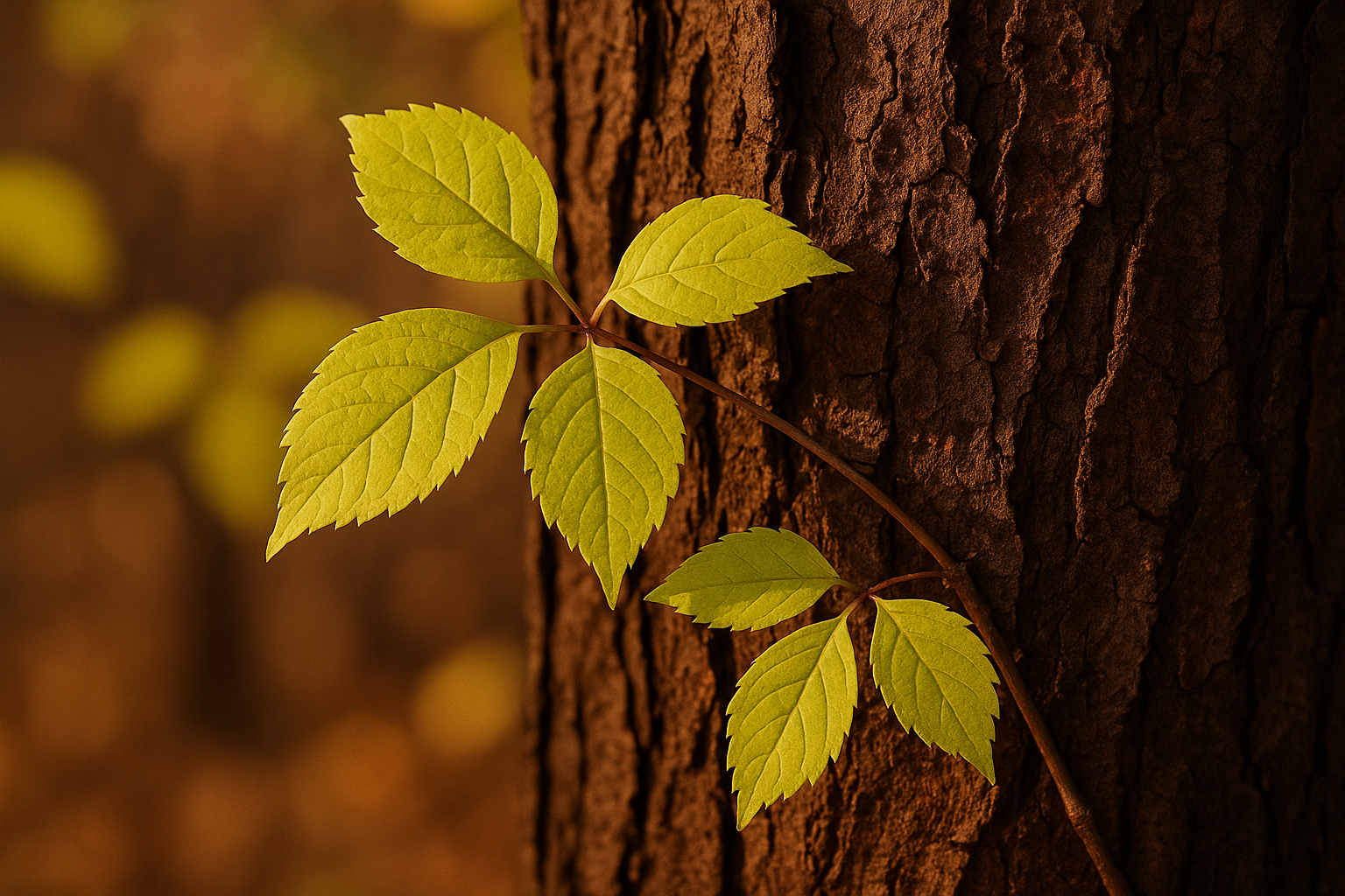
Few color combinations feel as unexpectedly harmonious as chartreuse and chocolate brown. At first glance, these two shades might seem like unlikely partners—one electric and attention-grabbing, the other rich and understated. Yet when brought together thoughtfully, they create an aesthetic that feels both modern and timeless, drawing on the same visual harmony found in nature where bright green leaves meet deep brown bark. This guide explores how to master this distinctive pairing, whether you are building an outfit, decorating a room, or simply seeking to expand your color confidence.
Understanding Chartreuse as a Color
Chartreuse occupies a unique position on the color wheel, sitting precisely between yellow and green in a way that makes it simultaneously energizing and organic. Named after the French liqueur produced by Carthusian monks, this distinctive hue has evolved from a niche shade to a fashion and design staple that designers return to season after season.
The Yellow-Green Spectrum
Chartreuse exists on a spectrum that ranges from almost-lime at its greenest to nearly gold at its yellowest. Understanding where your particular shade falls on this spectrum is crucial for successful pairing with chocolate brown. Yellow-chartreuse tends to feel warmer and pairs more naturally with rich browns, while green-chartreuse creates a cooler, more botanical effect.
The warmth or coolness of your chartreuse also affects how it interacts with your skin tone and the overall mood of your outfit or space. Warmer chartreuses complement golden and olive undertones beautifully, while cooler versions work well with pink and neutral undertones. Experimenting with different positions on this spectrum helps you find your perfect shade.
Why Chartreuse Demands Attention
There is no hiding chartreuse—it is a color that announces itself the moment it enters a room. This high visibility comes from its position as one of the most eye-catching colors in the visible spectrum. Studies show that yellow-green hues are among the first colors the human eye perceives, making chartreuse a natural focal point in any composition.
This attention-grabbing quality is precisely why chartreuse benefits so much from pairing with chocolate brown. The rich, dark brown acts as a visual anchor, giving the eye a place to rest while still allowing the chartreuse to shine. Without this grounding element, chartreuse can feel overwhelming or disjointed within an outfit or design scheme.
Historical Context of Chartreuse
Chartreuse has moved in and out of fashion prominence throughout the decades, experiencing particular popularity during the Art Nouveau movement and again in the 1960s and 1970s. Each revival has brought new interpretations, from the acidic neon versions of the 1980s to the sophisticated, muted chartreuses favored by contemporary designers.
Today’s chartreuse renaissance emphasizes versatility and wearability. Modern interpretations often soften the shade slightly or pair it with unexpected neutrals—like chocolate brown—to make it more accessible for everyday wear. This evolution reflects a broader trend toward bold color used thoughtfully rather than recklessly.
The Richness of Chocolate Brown
Chocolate brown brings warmth, sophistication, and visual weight to any color combination. Unlike cooler browns that can feel sterile or stark, chocolate brown carries hints of red and orange that make it feel inherently luxurious and inviting. This warmth is what makes it such an effective partner for the electric energy of chartreuse.
Warm Brown Versus Cool Brown
Not all browns are created equal when it comes to pairing with chartreuse. Warm chocolate browns—those with underlying red, orange, or golden tones—create the most harmonious combinations. These warm undertones echo the yellow in chartreuse, creating a visual bridge between the two colors that feels natural and intentional.
Cooler browns with gray or taupe undertones can also work with chartreuse, but they create a different effect—more modern and edgy rather than warm and organic. If you prefer this cooler aesthetic, balance it with warm metallics or cream-colored accessories to prevent the combination from feeling too austere.
Texture and Chocolate Brown
Chocolate brown truly shines when rendered in rich, tactile materials. Leather, suede, velvet, and wool all enhance the luxurious quality of this shade, adding depth and dimension that flat colors simply cannot achieve. When pairing with chartreuse, these textures help the brown hold its visual weight against the brighter hue.
Consider how different textures affect the formality of your look. A chocolate brown leather bag reads as polished and professional, while a chunky brown knit feels cozy and casual. Matching your texture choices to the occasion ensures that your chartreuse and chocolate combination hits the right note every time.
Brown as a Neutral Foundation
While brown is technically a color rather than a neutral, chocolate brown functions beautifully as a foundation shade. It provides the stability and versatility of traditional neutrals like black and navy while adding warmth that those cooler shades lack. This makes it an ideal base for showcasing statement colors like chartreuse.
Building a wardrobe with chocolate brown as a core neutral opens up possibilities for bolder color play. Unlike black, which can make bright colors feel harsh, chocolate brown softens and warms everything it touches. This quality makes it particularly forgiving for those still building confidence with color.
Natural Inspiration for This Pairing
The most compelling color combinations often find their roots in the natural world, and chartreuse with chocolate brown is no exception. This pairing appears throughout nature in countless variations, from the obvious—spring leaves against tree trunks—to the subtle, like certain beetle shells or tropical birds. Drawing on these natural precedents gives your color choices an inherent rightness that purely invented combinations sometimes lack.
Studying natural examples can also help you calibrate the proportions and intensity of each color. Notice how nature rarely presents these colors in equal measure; typically, the brown dominates while flashes of chartreuse provide accent and interest. This natural wisdom translates directly to fashion and design principles.
- New spring leaves unfurling against mature tree bark
- Moss growing on forest floors and fallen logs
- Certain species of parrots and tropical birds
- Ripe pears with their characteristic yellow-green skin
- Lichen patterns on rocks and old wood
- Grasshoppers and katydids against wooden fences
- Unripe citrus fruits on brown branches
- Fern fronds emerging from rich soil
- Some varieties of apples with brown stems
- Caterpillars on tree branches
- Certain species of tree frogs
- The edge where meadows meet forests
Mastering the Proportions
The secret to making chartreuse and chocolate work lies not just in choosing the right shades but in balancing their proportions thoughtfully. Because chartreuse carries so much visual energy, it performs best as an accent rather than a dominant color. The classic guideline of 70-30 works beautifully here: let chocolate brown compose roughly 70 percent of your look while chartreuse provides the remaining 30 percent as accent and interest.
This does not mean you need to measure your clothing percentages precisely. The principle simply suggests that chocolate brown should feel like the foundation of your outfit or space, with chartreuse appearing in supporting roles. A chocolate brown dress with chartreuse jewelry, or brown trousers with a chartreuse blouse, both follow this general principle while looking entirely different.
For those who have developed strong color confidence, experimenting with inverted proportions can yield striking results. A primarily chartreuse outfit grounded by chocolate brown accessories creates a bold, fashion-forward statement. However, this approach requires careful attention to the specific shades chosen and works best for those comfortable commanding attention.
The context also matters when determining proportions. Professional environments typically call for more brown and less chartreuse, while creative or casual settings allow for bolder chartreuse presence. Consider not just the colors themselves but how much visual impact feels appropriate for your specific situation.
Accessories offer the easiest way to experiment with proportions without committing to a full outfit. A chartreuse scarf, bag, or pair of earrings can transform a neutral brown outfit into something special. If the result feels too bold, simply remove the accessory; if it feels too subtle, add another chartreuse element.
Prints and patterns that incorporate both colors handle the proportion question for you, ensuring a balanced distribution throughout the design. Look for prints where chocolate brown forms the background and chartreuse appears in motifs or accents—this built-in balance makes styling much simpler.
Remember that proportion extends beyond color to include visual weight. A small chartreuse bag might balance a larger brown garment, or substantial chartreuse earrings might balance brown pieces elsewhere in the outfit. Think about the overall composition rather than strict color percentages.
Finally, consider how lighting affects perceived proportions. Bright light makes chartreuse appear more dominant, while dim lighting emphasizes the chocolate brown. If you are dressing for an event that transitions from day to evening, factor in how the changing light might shift your color balance.
Building Outfits with This Combination
Translating the chartreuse and chocolate pairing into actual outfits requires thinking about silhouette, occasion, and personal style alongside color. The most successful looks integrate these colors in ways that feel intentional and cohesive rather than random or forced.
Casual Everyday Looks
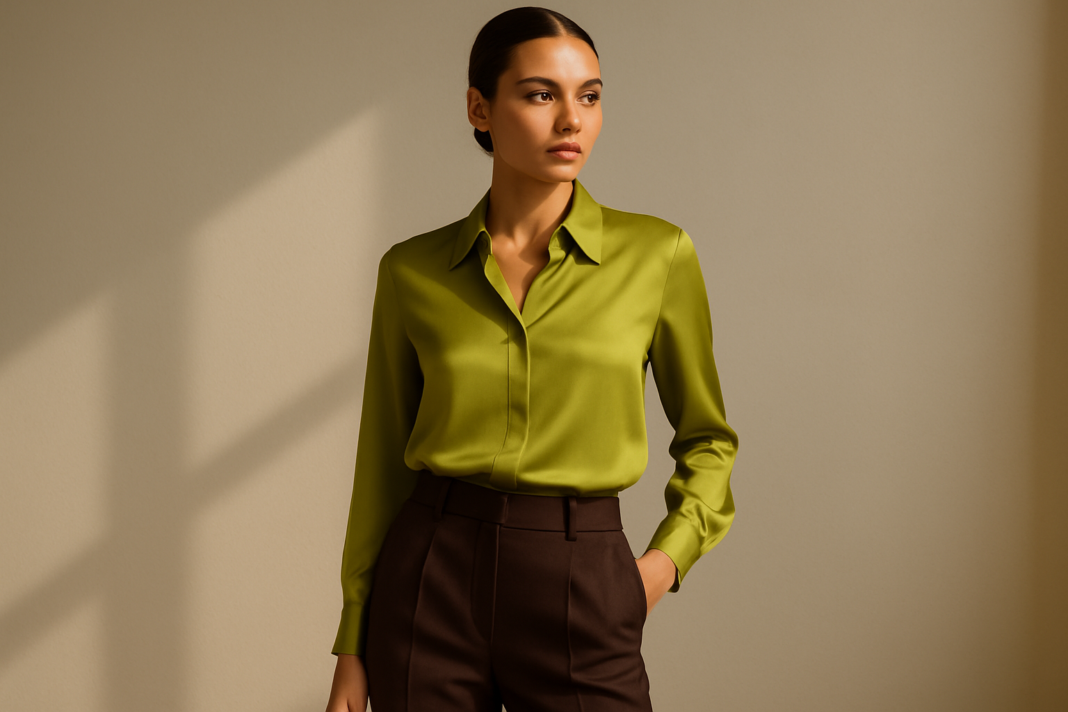
For relaxed daily wear, start with chocolate brown as your base and add chartreuse touches for personality. Brown chinos or jeans paired with a chartreuse sweater or tee create an easy combination that works for errands, casual lunches, or weekend activities. The brown grounds the look while the chartreuse keeps it from feeling boring.
Layering offers another approach to casual styling with this palette. A chartreuse jacket over a brown tee, or a brown cardigan over a chartreuse tank, lets you adjust your color balance throughout the day. This flexibility proves especially useful during transitional seasons when you might shed layers as temperatures change.
Professional Settings
Workwear calls for a more restrained approach to this bold combination. A chocolate brown suit or blazer provides a sophisticated foundation that reads as professional and polished. From there, add chartreuse in controlled doses—a silk scarf, a structured bag, or subtle jewelry. These touches show personality without overwhelming a professional environment.
Consider your specific workplace culture when calibrating chartreuse intensity. Creative industries often welcome bolder color choices, while conservative fields may call for the subtlest chartreuse accents. When in doubt, err toward less chartreuse; you can always add more as you gauge reactions.
Evening and Special Occasions
Formal events provide the perfect canvas for this dramatic color combination. A chartreuse gown or cocktail dress with chocolate brown accessories makes a statement that stands out from the typical black and navy crowd. Alternatively, a rich chocolate brown dress with chartreuse jewelry and clutch offers sophistication with a twist.
Evening lighting often enhances both colors, making chocolate brown appear richer and chartreuse more luminous. Take advantage of this effect by choosing pieces with interesting textures or subtle sheen that catch the light. Velvet, silk, and satin all perform beautifully for evening events.
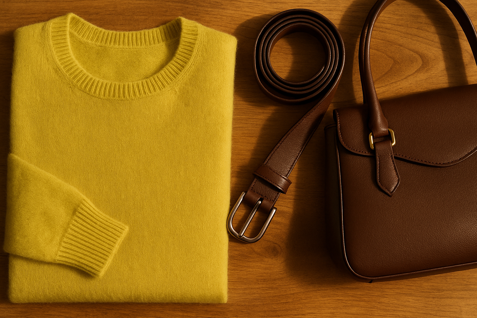
Accessorizing the Chartreuse-Chocolate Look
Accessories provide the finishing touches that elevate a chartreuse and chocolate outfit from good to exceptional. The right accessories can bridge these two colors, add complementary tones, or simply polish the overall look. Thoughtful accessory choices often make the difference between an outfit that feels complete and one that seems unfinished.
When selecting accessories for this color combination, consider whether each piece should harmonize with the existing palette or provide contrast. Metallics generally work to bridge, while black and cream accessories can provide neutral contrast. Your choice depends on the specific effect you want to achieve.
- Gold jewelry warms the combination and connects to chartreuse’s yellow undertones
- Bronze and copper metallics complement chocolate brown beautifully
- Tortoiseshell sunglasses or frames bridge both colors naturally
- Cream or ivory accessories soften the overall effect
- Animal prints in brown tones add pattern without introducing new colors
- Wooden jewelry and accessories enhance the natural, organic feeling
- Woven or raffia bags in natural tones complement summer versions of this look
- Camel or cognac leather works as a lighter brown alternative
- Olive green accessories can extend the green side of the palette
- Black accessories add sharpness and modernity to the combination
- Amber or citrine jewelry echoes chartreuse in a subtler way
Seasonal Variations of This Palette
One of the strengths of the chartreuse and chocolate combination is its adaptability across seasons. By adjusting the specific shades and textures you use, this pairing can feel fresh and appropriate whether you are dressing for spring blossoms or autumn leaves.
Spring and Summer Interpretations
Warm weather calls for lighter, brighter interpretations of both colors. Opt for chartreuse shades that lean toward lime or yellow-green, paired with medium chocolate browns rather than the deepest shades. Linen, cotton, and lightweight knits in these colors feel seasonally appropriate and comfortable.
Summer also invites more adventurous proportions with chartreuse. A chartreuse sundress with brown sandals and bag captures the energy of the season while remaining grounded. The brightness of summer light supports bolder chartreuse presence without the color overwhelming.
Autumn and Winter Approaches
Cooler months suit deeper, richer versions of both colors. Think chartreuse shades that approach olive or khaki, paired with the darkest chocolate browns. Velvet, wool, cashmere, and leather all enhance the cozy sophistication this combination offers for fall and winter.
Layering becomes essential in cold weather, and this color combination layers beautifully. A chartreuse scarf over a brown coat, or a brown sweater under a chartreuse jacket, creates visual interest while keeping you warm. The interplay of colors across layers adds dimension to winter outfits.
Year-Round Wardrobe Staples
Certain pieces work across seasons with only minor styling adjustments. A chocolate brown bag or shoes can anchor chartreuse outfits all year, while a chartreuse silk blouse transitions from summer to fall with a change of layers. Investing in quality versions of these versatile pieces maximizes your wardrobe’s potential.
Consider building a small capsule of chartreuse and chocolate pieces that work together in multiple combinations. This approach ensures you always have options for this color combination without overcommitting closet space to a single palette.
Common Mistakes to Avoid
Even beautiful color combinations can go wrong with poor execution. Understanding the most common pitfalls helps you sidestep them and achieve the sophisticated result this pairing promises.
Mismatched Undertones
The most frequent mistake involves pairing a warm chartreuse with a cool brown or vice versa. When undertones clash, the combination feels disjointed rather than harmonious. Before combining pieces, check that both colors share similar warmth or coolness. Warm chartreuse (yellow-leaning) pairs best with warm chocolate brown (red-undertoned), while cool chartreuse (green-leaning) works with cooler browns.
If you are unsure about undertones, try the pairing in natural daylight, which reveals true colors most accurately. Artificial lighting can distort undertones, leading to choices that look different once you step outside.
Overwhelming Chartreuse Presence
Given chartreuse’s visual power, using too much creates an overwhelming effect that can feel costumey rather than stylish. Unless you are deliberately aiming for maximum impact, keep chartreuse to accent status. Remember that a little chartreuse goes a long way—you can always add more, but you cannot subtract once you have left the house.
Pay particular attention to chartreuse placement. Large blocks of chartreuse near the face can overpower your features, while the same amount at your feet or in an accessory feels balanced. Experiment with placement to find what works best for your specific features and coloring.
Ignoring Texture Balance
Flat, textureless versions of both colors can make the combination feel cheap or uninteresting. Ensure at least one element in your outfit has visual texture—whether through the fabric itself, surface treatments, or structural details. This texture adds the depth and dimension that elevates the color combination.
Consider also how textures interact. Pairing rough with smooth, matte with shiny, or heavy with light creates dynamic contrast that keeps the eye engaged. A chocolate brown leather bag against a soft chartreuse knit, for example, offers more interest than two pieces with identical textures.
Extending the Palette
While chartreuse and chocolate form a complete color story on their own, sometimes you want to introduce additional colors. Choosing the right accent colors expands your options without disrupting the fundamental harmony you have established.
The key to successful palette extension lies in selecting colors that relate to one or both of your base shades. Colors adjacent to chartreuse or chocolate on the color wheel blend smoothly, while complementary colors add energy and contrast. Consider what effect you want before adding new colors to the mix.
- Cream and ivory soften the combination and add breathing room
- Gold bridges both colors and adds luxurious warmth
- Navy introduces depth without competing with chartreuse
- Rust and terracotta extend the brown family warmly
- Sage and olive connect to chartreuse while feeling more neutral
- Burgundy adds richness and pairs beautifully with chocolate
- Mustard yellow echoes chartreuse in a warmer, earthier way
- Teal creates a more complex color story with both shades
- Blush pink offers unexpected femininity against these earthy tones
- Charcoal gray provides cool contrast without the harshness of black
- Caramel and cognac work as lighter brown alternatives
- Forest green deepens the green side of the palette
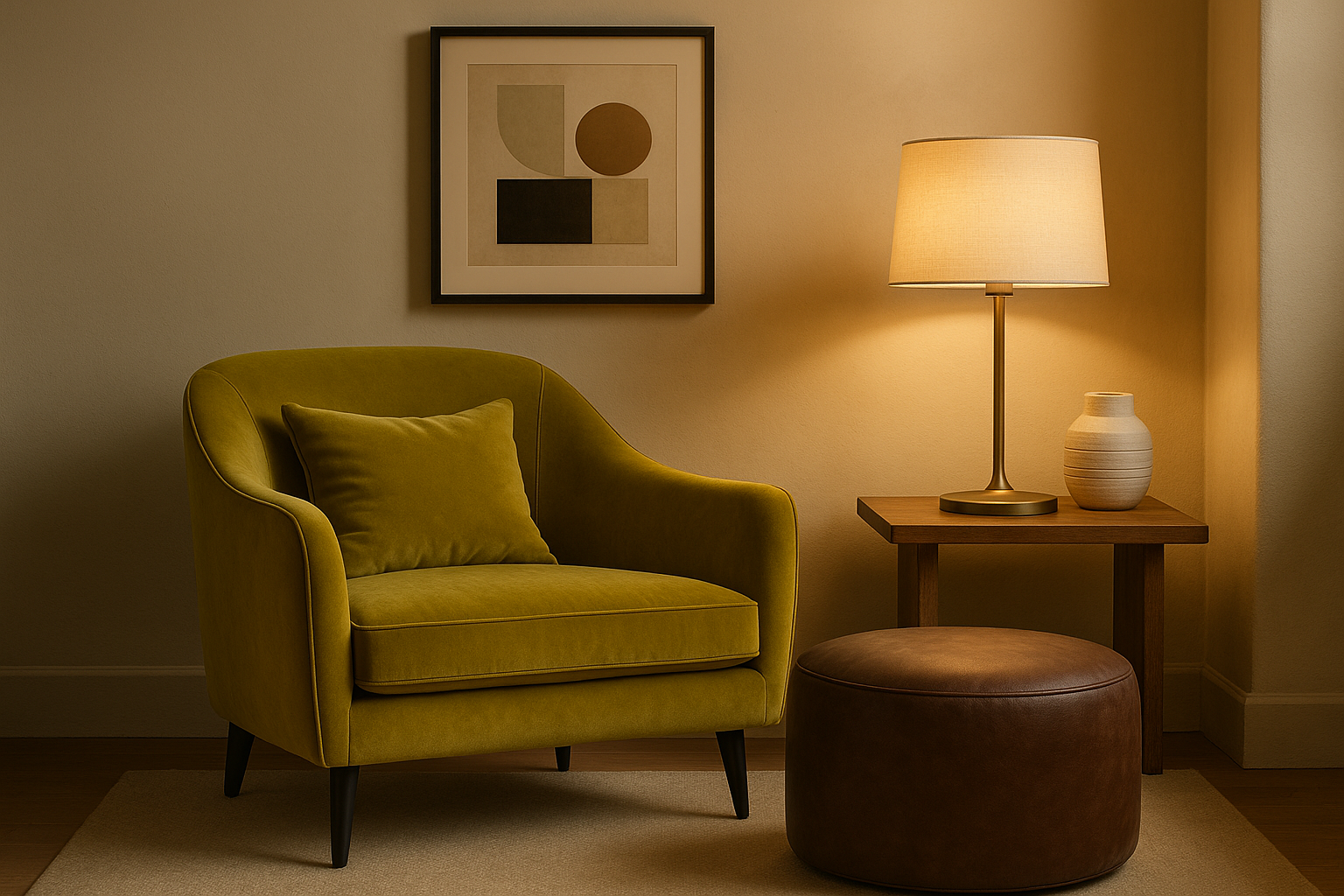
Beyond Fashion: Home and Design Applications
The chartreuse and chocolate combination translates beautifully to interior design and home decor. The same principles that guide fashion choices—proportion, texture, and undertone matching—apply when decorating spaces. Understanding these applications helps you create cohesive environments that feel as put-together as your outfits.
Living Spaces
In living rooms and common areas, chocolate brown often works best as the dominant color, appearing in larger furniture pieces like sofas and chairs. Chartreuse then enters through throw pillows, artwork, lamps, or accent chairs. This distribution creates a warm, inviting space with pops of energy that prevent the room from feeling heavy.
Consider how natural light affects your color choices for interiors. Rooms with abundant natural light can handle deeper chocolates and brighter chartreuses, while darker rooms benefit from lighter versions of both colors. Test paint samples and fabric swatches in your actual space before committing.
Bedrooms and Private Spaces
Bedrooms call for a calmer interpretation of this combination. Use chocolate brown for headboards, bedding, or accent walls, with chartreuse appearing in smaller doses through bedside lamps, throw blankets, or decorative objects. The goal is energizing warmth without overstimulation.
Muted versions of both colors work particularly well in bedrooms. A dusty chartreuse paired with a softer, milk chocolate brown creates a sophisticated palette that promotes relaxation while maintaining visual interest. Save the boldest shades for spaces where energy is more appropriate.
Kitchen and Dining Areas
Kitchens and dining rooms benefit from the appetite-stimulating qualities of both colors. Chocolate brown cabinetry or dining furniture creates a grounding foundation, while chartreuse appears in textiles, dishware, or fresh plants. The combination feels fresh and inviting without overwhelming the practical needs of these functional spaces.
Green plants provide a natural way to introduce chartreuse tones in any room, including kitchens. Pairing potted herbs or succulents with brown pottery or wooden planters extends the color story organically. This approach also adds life and freshness to your space beyond just color.
Building Confidence with Bold Color
For those new to wearing colors as bold as chartreuse, the journey from color-shy to color-confident takes time and experimentation. Starting with the chartreuse and chocolate combination offers a structured way to explore bold color while maintaining a safety net of grounded brown tones.
Begin with accessories if full garments feel intimidating. A chartreuse scarf, bag, or pair of earrings allows you to test the color against your complexion and wardrobe without significant investment. Pay attention to how you feel wearing the color—confidence and comfort matter as much as objective aesthetics.
Gradually increase your chartreuse presence as you grow comfortable. Move from accessories to tops, then potentially to statement pieces like dresses or coats. Each step builds your color confidence while helping you understand how chartreuse works within your personal style.
Notice how others respond to your color choices. Often, bold colors draw compliments and positive attention that reinforce your confidence. These external validations can help overcome the internal hesitation that keeps many people stuck in neutral palettes.
Accept that not every chartreuse shade will work for you. Some may be too yellow, others too green; some too bright, others too muted. Finding your perfect chartreuse requires trying different variations until one clicks. The search itself teaches you about your preferences and coloring.
Remember that color confidence, like any skill, develops through practice. The more you experiment with chartreuse and chocolate—and eventually other bold combinations—the more natural it becomes. What feels daring today may feel like second nature in a few months.
Summary Table
| Aspect | Chartreuse Guidelines | Chocolate Brown Guidelines |
|---|---|---|
| Role in Outfit | Accent color (30%) | Foundation color (70%) |
| Best Undertones | Yellow-leaning for warmth | Red or orange undertones |
| Key Textures | Silk, cotton, lightweight knits | Leather, suede, velvet, wool |
| Seasonal Peak | Spring and summer brightest | Fall and winter richest |
Conclusion
Chartreuse and chocolate brown prove that unexpected color combinations often yield the most satisfying results. By respecting the natural harmony these colors share—visible throughout the natural world—and applying thoughtful principles of proportion, texture, and undertone matching, you can master this distinctive pairing in both fashion and interior design.
Whether you start with a single chartreuse accessory against brown basics or dive into full ensembles featuring both colors, the key lies in intentionality. Each piece should earn its place in the composition, contributing to a whole that feels considered rather than accidental. With practice, the chartreuse and chocolate combination becomes not just a color pairing but a signature element of your personal style.
Frequently Asked Questions
Can I wear chartreuse if I have cool-toned skin?
Yes, but choose your chartreuse shade carefully. Cool-toned skin typically looks best with chartreuses that lean more toward green than yellow. These cooler chartreuses harmonize with pink and neutral undertones better than warm, golden chartreuses. Test different shades against your skin in natural light to find the most flattering option.
What other colors can I add to chartreuse and chocolate?
Cream, gold, navy, rust, and sage all extend this palette beautifully without disrupting its harmony. For a more dramatic effect, consider burgundy or teal as accent colors. When adding colors, maintain the principle of letting chocolate brown dominate while additional colors serve supporting roles alongside chartreuse.
Is this color combination appropriate for professional settings?
With the right approach, yes. Keep chocolate brown as the foundation through suits, blazers, or trousers, and introduce chartreuse through subtle accessories like scarves, jewelry, or bags. The key is restraint—professional environments typically call for smaller, more controlled doses of bold color.
How do I know if my brown and chartreuse shades match?
Check their undertones. Warm chartreuse (yellow-leaning) pairs best with warm chocolate brown (red or orange undertones), while cooler chartreuse (green-leaning) works with browns that have gray undertones. View both colors together in natural daylight, which reveals true undertones most accurately.
Can men wear this color combination?
Absolutely. Chocolate brown is already a menswear staple, and chartreuse can enter through ties, pocket squares, socks, or casual tops. Start with small chartreuse accents against brown suits or chinos, then increase presence as confidence builds. The combination offers a distinctive alternative to typical navy and gray palettes.
What metals work best with chartreuse and chocolate?
Gold and bronze work exceptionally well, bridging the warm tones in both colors. These metals enhance the luxurious feel of chocolate brown while echoing the yellow undertones in chartreuse. Copper and rose gold also complement the palette, though silver and white gold can work for those who prefer cooler metallics.
Is chartreuse the same as lime green?
Not quite. While both exist in the yellow-green family, chartreuse sits closer to the center point between yellow and green, while lime green leans more definitively toward green. Chartreuse typically has more yellow presence, giving it a warmer character that pairs more naturally with chocolate brown than pure lime green would.
How can I use this combination in my home without repainting?
Introduce the colors through textiles and accessories rather than permanent fixtures. Chocolate brown and chartreuse throw pillows, blankets, artwork, lamps, and decorative objects all add the color combination without major commitment. Plants provide a natural source of chartreuse-adjacent green against brown pottery or planters.
]]>
Gabrielle J. Smith is the pulsating essence that brings life to the world of fashion and color. With an innate talent for understanding the nuances of hues, she has the uncanny ability to paint narratives with her words, diving deep into the realm of color trends and the art of harmonizing them. Not just an expert in the field, Gabrielle also plays a pivotal role in strengthening the cohesion of our team, ensuring growth and harmony. Each of her articles is a testament to her passion, weaving captivating tales that resonate with readers and fashion aficionados alike.
Reviewed By: Joanna Perez and Anna West
Edited By: Lenny Terra
Fact Checked By: Matthew Mansour
Photos Taken or Curated By: Matthew Mansour
