Key Takeaways
- High contrast keeps brands clear in every setting.
- Using contrast builds stronger brand identity and brand recognition.
- Strategic branding efforts rely on contrast for memorable visuals.
- Thoughtful contrast extends across logos, typography, and marketing materials.
- Consistency with contrast boosts trust and brand perception.
Introduction
How do you ensure your brand stands out in a crowded market? One important step is choosing color contrast that engages your audience.
Many brands focus on brand colors and imagery, yet overlook how contrast affects visibility and impact. Contrast can sharpen your identity design so people notice it right away. It can even influence how they remember you later.
This post explores practical techniques for using color contrast across digital branding, print media, typography, and more. We will look at ways to keep brand consistency and show how contrast can support brand storytelling without falling into cliches or random color psychology tips.
Our aim is to offer fresh insights. You will learn about color pairings, creative branding methods, and real-world examples. If you apply these ideas, you can strengthen brand visibility and brand experience.
Are you ready to discover how color contrast can spark brand recognition? Let’s begin.
Understanding Contrast

What Is Contrast?
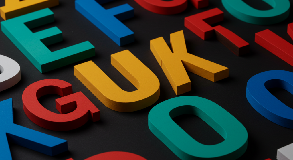
Contrast is the difference between elements in a design. Sometimes it’s about dark and light, like black text on a white background. It can also refer to the way colors, shapes, or textures interact. When applied to branding, contrast can help your brand pop. It keeps your content easy to read and easy to spot in diverse environments.
Why Does Contrast Matter in Visual Communication?
Strong contrast pulls the viewer’s attention. Subtle or low contrast can cause designs to fade into the background. For branding, that’s a problem. You want to stand apart from your competition. Good visual communication relies on contrast to convey brand personality and brand values. That boost in clarity keeps your brand message stable and your content easy to navigate.
How to Measure Contrast
Various tools exist to measure color contrast ratios. Commonly, brand guidelines refer to accessibility standards. Color contrast checkers let you plug in values, revealing if your selected colors create enough separation. This ensures brand materials look crisp in both digital and printed formats. For instance, a contrast ratio of 4.5:1 is often recommended for body text.
Why Contrast Matters for Branding
Boosting Brand Recognition
When you see a bright sign on a busy street, your eyes jump to the text that stands out the most. This simple interaction underlines the importance of color contrast for brand recognition. People store that visual cue in their memory. Over time, they associate that contrast with your brand identity. Inconsistent or low-contrast designs can slip out of the viewer’s mind.
Standing Out in Crowded Markets
Brands compete for attention. Contrast helps you carve out a distinct look. When your competitors rely on muted, pastel palettes, bolder contrasts can make your designs look fresh. On the other hand, if your space is flooded with bright tones, a darker or more balanced approach may stand apart. Contrast is a powerful tool for brand differentiation.
Making Brand Messaging Clear
Your words carry your message. But if your audience strains to read your text, that message fades. High contrast between text and background keeps your content visible. This leads to better comprehension and higher retention. Strong contrast also helps icons, patterns, and other elements remain clear and consistent across channels, from websites to banners.
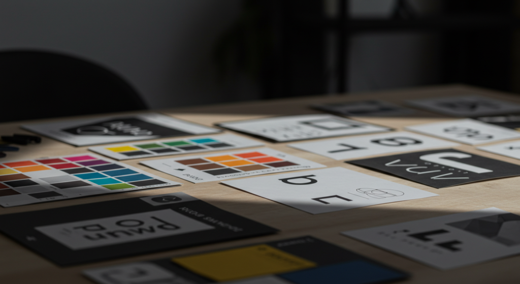
Building Strong Brand Identity with Contrast
Color Pairings That Work
Color pairings shape your brand’s identity design. For example, pairing a bold primary color with a softer secondary color can create a visual hierarchy. This approach also promotes brand cohesion when used in logos, business cards, and product packaging. Simple pairings like black and yellow or dark blue with white can look sharp and universal.
Fostering Consistency Across Touchpoints
Brand consistency involves keeping visual elements aligned across all mediums. This extends to color contrast. If your brand uses a high-contrast scheme online, reflect that same approach in print materials and interior signage. This synergy means people see the same style in every environment. The result? A trustworthy, unified presence.
Leveraging Contrast for Brand Personality
Your brand personality shows through color, shape, and style. Contrast can amplify that personality. For a brand with energetic traits, intense contrasts might fit well. A calmer brand might choose gentler tones but still keep enough contrast for clarity. Remember, it’s not about color psychology clichés. Instead, aim to spark the right mood with thoughtful color differences.
Contrast in Logo Design
Balancing Primary and Secondary Elements
Logo design often involves a principal shape or wordmark plus secondary elements. Proper contrast ensures those extra details do not vanish. For example, if your logo includes a small symbol beside the brand name, make sure the color difference is high enough to keep each piece visible. This balance helps your logo remain recognizable at every size.
Avoiding Contrast Overkill
Some logos suffer from too many contrasting colors. This can result in visual clutter. Stick to a limited palette. Focus on one main contrast pair, then use a third color if needed for accents. This approach keeps the design cohesive and easier to reproduce. Also, limit how many decorative elements you combine to prevent overwhelming your audience.
Using Negative Space Wisely
Negative space, also called white space, enhances contrast by focusing attention on your main shapes and text. If you crowd your logo, the viewer may struggle to identify key details. A clean background around the main symbol lets the brand identity breathe. High contrast between the logo elements and background is often the simplest way to maintain clarity.
Digital Branding and Contrast

Website Interfaces
On digital platforms, color contrast influences user experience. Consider text, buttons, and background colors. If your text has insufficient contrast, people may leave your site. Proper contrast in interactive elements like call-to-action buttons also improves navigation. Bright, eye-catching buttons can guide clicks, shaping brand engagement.
Social Media Graphics
Your social feed might be flooded with competing images. Using strong contrast ensures your brand’s content grabs attention. Keep a uniform color scheme to tie everything back to your brand expression. Then sprinkle in contrasting text or icons. This helps your message appear crisp on platforms like Instagram or LinkedIn. Short, high-impact visuals thrive in a feed of distractions.
Mobile App Design
People browse on small screens. That reduces legibility if your text or icons lack contrast. Developers often follow user interface guidelines that suggest minimum contrast ratios. However, you can exceed those minimums for an even better user experience. Testing on different devices can verify how your brand visuals appear in various lighting conditions.
Print Media and Contrast
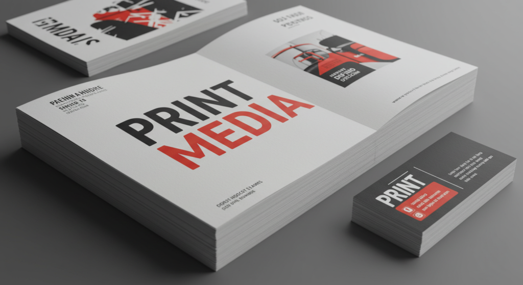
Business Cards
In many situations, a business card offers a first impression. High contrast makes essential details (like name, role, and contact info) easy to read. Experiment with bold background colors, but ensure the text color stands out. If you prefer a clean look, white backgrounds paired with dark text remain a safe and timeless choice.
Brochures and Flyers
Brochures require careful planning. People usually scan them quickly, so contrast helps key points surface. Try structuring your content with blocks of color, each with text that contrasts. Use visuals, graphics, or brand imagery that complement the color scheme. Keep the branding consistent with your digital materials for seamless brand cohesion.
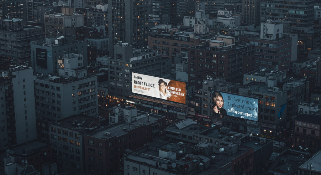
Large-Scale Prints
Banners or posters often appear in bright or unpredictable lighting. You need strong color contrast. Otherwise, your message could get lost in glare or distance. Test your designs by stepping back several feet. If the text loses clarity, adjust the background color or text shade. Simple color blocks and large fonts usually work best in large-scale prints.
Typography and Contrast
Font Weight and Color
Typography can enhance your message or bury it. Color contrast relates to font weight and style. Bold, heavy fonts can stand out against a neutral backdrop, while thinner fonts need more contrast in hue. Experiment with dark grays or rich blues instead of pure black. This can add warmth without losing clarity.
Hierarchy in Text
Create a clear reading path by contrasting headings, subheadings, and body text. For headings, use bold colors or heavier font weights. For the body text, stick to a calmer tone that remains readable. This hierarchy helps your audience process information faster. It also boosts brand consistency across web pages, print materials, and brand guidelines.
Using Light Text on Dark Backgrounds
Some brands opt for dark themes. Light text on a dark background can look modern. However, it can strain eyes if the contrast is not high enough. Choose an off-white or light pastel color that still contrasts strongly with the dark surface. Keep line spacing generous so text blocks remain airy and easy to read.
Contrast for Brand Consistency

Applying Consistent Color Codes
Your color palette should not shift from platform to platform. Always use the same hex or Pantone codes in digital and print. Slight color mismatches can break brand cohesion. For instance, your brand guidelines might specify a main blue color. Stick to it, and ensure you maintain a high-contrast pairing with white or another chosen color across everything.
Standardizing Your Visual Hierarchy
Visual hierarchy relies on consistent contrast levels. Headers, subheads, and body text often follow specific size and color patterns. Keep these patterns the same. That way, viewers recognize your brand design style even if they encounter your content in diverse formats. Standardizing hierarchy fosters better brand perception.
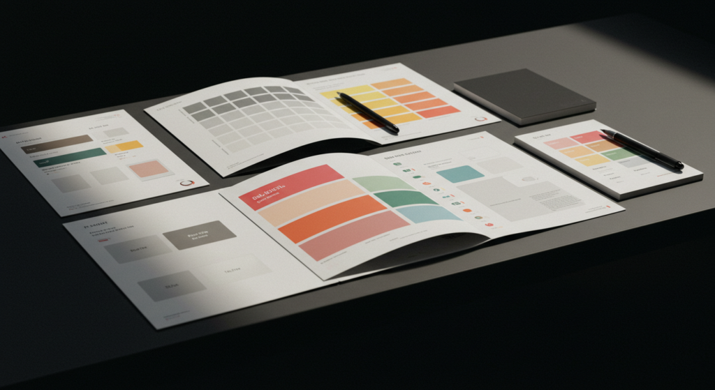
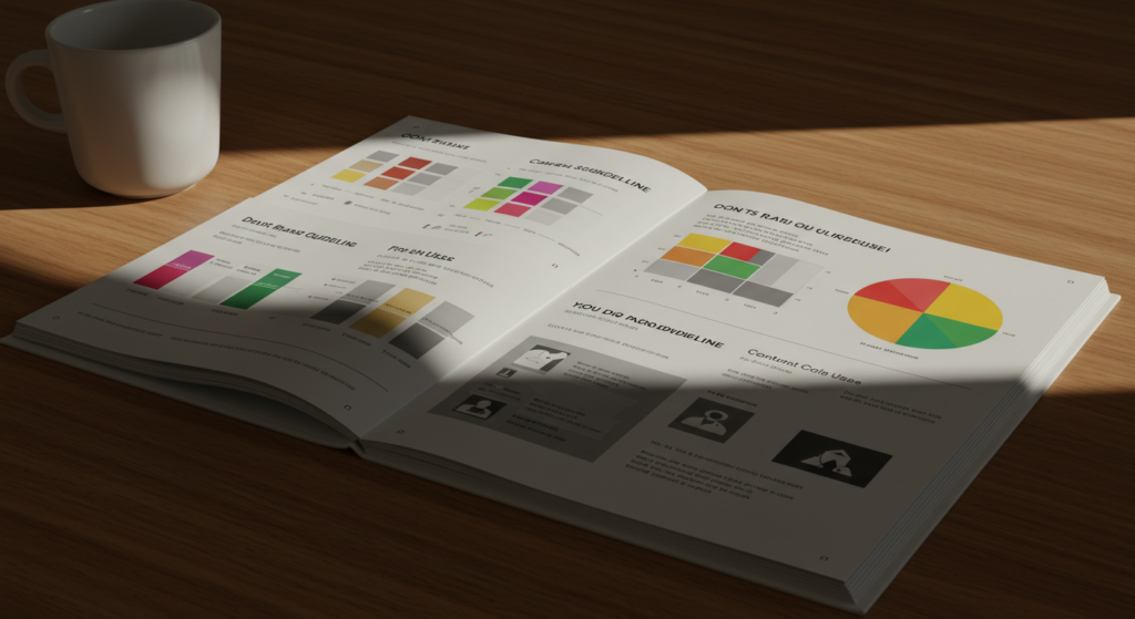
Documenting Contrast Rules
Your brand guidelines document can specify recommended contrast ratios, font weights, or color combos. You might list official background and text colors for digital branding, plus suggestions for print usage. This clarity sets a strong foundation for brand expression. It also helps your creative team avoid guesswork when producing new marketing design pieces.
Contrast in Brand Guidelines
Communicating Standards
Brand guidelines help internal teams, designers, and external partners maintain brand consistency. Include a dedicated section on color contrast. Explain how to handle text, backgrounds, images, and logo usage. Show examples of what is acceptable and what to avoid. This prevents confusion about brand usage and fosters smooth collaboration.
Outline Do’s and Don’ts
A visual chart of do’s and don’ts offers quick clarity. Illustrate correct color pairings. Then show examples where the text fades into the background. This helps everyone quickly grasp the importance of contrast. You can also include instructions on spacing, margin requirements, and resizing guidelines for your logo.
Providing Accessible Color Options
Sometimes, your primary palette may not work for certain accessible design requirements. Offer alternative color pairs that still reflect your brand personality but provide better clarity for certain users. This ensures your brand is inclusive and does not compromise brand visibility. It also broadens your reach, showing respect for different viewer needs.
Enhancing Brand Messaging with Contrast

Highlighting Key Words
In marketing design or social media posts, you often want to spotlight a single word or phrase. Using contrast is a straightforward way to do this. Select a bright accent color or a bold background stripe. Place the keyword there. This quick technique can elevate your brand messaging. It also helps short phrases pop.
Call-to-Action Buttons
A call-to-action button should be seen immediately. Pick a color that jumps out against your background. For instance, if your website is largely white with blue elements, a bright orange button can guide clicks. Avoid choosing a color that blends in. That’s a sure path to missed conversions. Always test multiple contrast levels to find the best solution.
Complementing Brand Storytelling
If your brand story revolves around innovation, you may choose cutting contrasts to suggest bold moves. If your focus is a friendly vibe, you might use softer contrasts that still maintain clarity. Connect your brand’s values and style with the type of contrast you use. Each visual choice can reinforce your main message in subtle yet powerful ways.
Practical Tools and Techniques
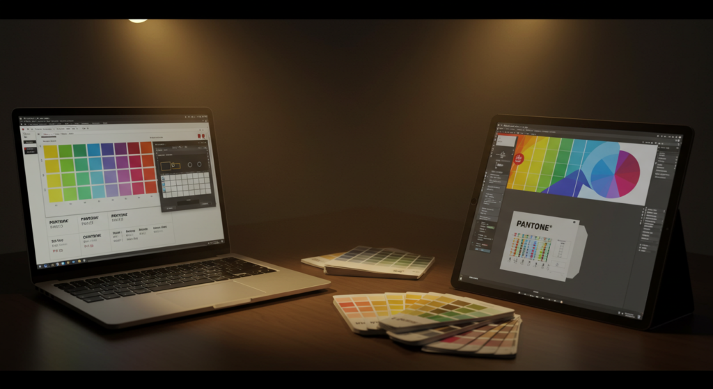
Color Contrast Checkers
Various online contrast checkers and design software features help you verify color pairings. Tools like contrast-ratio calculators reveal numeric scores. You can see if your selection meets accessibility guidelines. Some web design platforms have built-in plugins to check for color contrast issues as you create pages.
Using Contrast Mode Previews
Designers sometimes simulate conditions like low vision or different device settings. This reveals if text or images might vanish. Certain design applications show grayscale or high-contrast previews. By toggling these modes, you can pinpoint problem areas. This type of testing ensures your final design stays visible in real-world scenarios.
Sampling from Successful Brands
You can learn by observing established brands. Study how they use color contrast on packaging, signage, and promotional materials. Notice how they vary their designs while keeping brand synergy. Apply similar approaches but adapt them to your own brand personality. Always remember to preserve authenticity and originality.
Case Studies or Real-World Examples
Minimalist Tech Company
Imagine a tech brand that uses a monochromatic palette. Their site is mostly white, with gray text and an accent of bright blue. The contrast between bright blue buttons and white backgrounds draws the user’s eye toward action items. This approach looks simple, yet it improves brand differentiation. Users immediately know where to click.
Bold Streetwear Brand
A streetwear brand might favor neon colors against black or charcoal backdrops. These vivid contrasts suit their energetic brand expression. Logos pop on merchandise, so fans quickly spot them. Printed packaging follows the same scheme, reinforcing brand recognition across in-store and online experiences.
Luxury Cosmetics Label
Luxury brands tend to use subtle color pairs, like rich brown with metallic gold. Contrast still plays a role. The gold text glimmers against a chocolate background. Clean fonts and generous spacing highlight the product name. This elegant approach remains consistent on ads, product packaging, and digital branding. Shoppers learn to identify that refined contrast.
Common Pitfalls

Ignoring Accessibility
Low-contrast color schemes often fail users with vision challenges. When designers pick style over clarity, brand messaging suffers. People can lose trust if they cannot read or interact with your site. Always test and tweak your colors to maintain a comfortable contrast level.
Overusing Multiple Contrasts
A messy design can happen when too many color contrasts compete on one page. The viewer doesn’t know where to look. Keep your palette consistent. Assign a clear purpose for each color. Let one contrast be the hero, while secondary colors support the layout.
Failing to Test Across Formats
The colors on your laptop screen might look different on a smartphone or in print. If you skip testing, you risk a washed-out brand look in some contexts. Print out your designs to see how they appear physically. Check them on different device screens. Proper testing helps you spot color shifting early.
Future of Color Contrast

Evolving Design Trends
Design trends may shift toward even bolder contrasts. Brands seek ways to stand out in a digital sea of content. Some might reintroduce stark black-and-white visuals with minimal color splashes. Others might layer vivid neon hues. Contrast remains a timeless pillar for brand visibility, even as trends change.
Interactive and Dynamic Contrast
Motion graphics and interactive apps can adjust contrast in real time. Imagine a website that flips from light mode to dark mode, maintaining brand consistency. New design tools can automate color adjustments. This opens up fresh creative branding options while keeping brand guidelines stable.
Growing Importance of Sensory Branding
Many brands now explore multi-sensory elements, like tactile packaging or augmented reality displays. Strong visual contrast carries over into these advanced experiences too. People want clarity in every sense. A cohesive brand identity helps customers feel comfortable and engaged, whether they’re holding a brochure or exploring an immersive digital space.
Conclusion

Color contrast is more than a design detail. It’s a strategic element that affects how people see and remember your brand. If you ignore contrast, you risk losing clarity, brand cohesion, and brand recognition.
By using it wisely, you can captivate viewers in print, digital, and physical settings. From logos to call-to-action buttons, strong contrast provides a visual anchor.
Keep your brand consistent by documenting your contrast rules. Test your designs in various conditions, and learn from other brands that use color contrast well.
Each small tweak, like adjusting font weights or background shades, can enhance brand visibility. Over time, these decisions help you build a trustworthy, recognizable identity that attracts loyal customers.
Summary Table

Below is a quick reference to guide your color contrast decisions:
| Aspect | Key Points |
|---|---|
| Definition of Contrast | Difference in color, tone, or visual weight |
| Brand Recognition | High contrast makes logos, packaging, and ads more memorable |
| Digital Branding | Buttons, text, and icons need ample separation for clarity |
| Print Media | Bold contrasts keep info legible under diverse lighting |
| Typography | Vary font weights and colors to create visual hierarchy |
| Consistency | Use the same color codes and contrast ratios everywhere |
| Brand Guidelines | Provide examples of correct and incorrect usage |
| Brand Messaging | Contrast can highlight calls to action and key words |
| Tools | Contrast checkers, previews, and guidelines help maintain clarity |
| Common Pitfalls | Ignoring accessibility, overusing colors, or missing testing |
| Future Outlook | Dynamic contrast, bold trends, and immersive experiences |
FAQ

1. How do I find the right contrast for my brand’s color palette?
Use contrast checkers to test color pairs. Look for a contrast ratio near or above 4.5:1 for normal text. Adjust if you want bolder or subtler separation, depending on your brand personality.
2. Should I limit my color palette for better contrast?
Yes. Fewer colors make it easier to manage contrast across different platforms. Many successful brands use two or three core colors, plus a neutral background or accent color.
3. Do I need different contrast levels for digital and print?
Possibly. Screens and physical prints handle color differently. Always test your colors in their intended medium. Make subtle tweaks if needed, like lightening a background or darkening text.
4. Can I still have a colorful brand without sacrificing contrast?
Absolutely. You can use bright colors, but ensure each color is balanced with an opposing tone. Set rules about how to place vibrant elements next to calmer colors.
5. How often should I review and update my brand’s contrast strategy?
Review it when you refresh your branding or release new products. Sometimes a regular check once a year can help you keep your designs modern and effective.
Enhancing brand visibility through color contrast pays off in every interaction. A thoughtful contrast approach can unite your brand’s story, visuals, and messaging in a cohesive, memorable way. Aim for clarity, stay consistent, and let your brand’s true colors shine.

Brenda Tillman is a color maestro who brings artistic brilliance to every piece she crafts. Passionate about imaginative expressions, she illuminates the world of fashion with her expert guidance on shades and combinations. Beyond her writings, Brenda is a culinary enthusiast and a global traveler, infusing her work with diverse insights. Her unique touch transforms simple color choices into art.
Reviewed By: Joanna Perez and Anna West
Edited By: Lenny Terra
Fact Checked By: Matthew Mansour
Photos Taken or Curated By: Matthew Mansour