Key Takeaways
- Understanding color theory fundamentals revolutionizes your ability to create harmonious outfits that reflect your personal style and boost confidence
- The color wheel serves as your ultimate fashion compass, guiding you through complementary, analogous, and triadic color combinations
- Seasonal color analysis helps you identify the most flattering shades for your skin tone, making shopping and styling decisions effortless
- Neutrals are the backbone of a versatile wardrobe, acting as perfect building blocks for both subtle and bold color combinations
- Color psychology plays a significant role in how your outfits are perceived, affecting both your mood and others’ impressions
- Pattern mixing becomes intuitive when you understand color relationships and saturation levels
- Digital color matching tools and apps have transformed the way we coordinate outfits and shop for new pieces
- Building a cohesive wardrobe starts with understanding your personal color palette and gradually expanding your comfort zone
Have you ever stood in front of your closet, feeling overwhelmed by a sea of colors that somehow never seem to work together?
You’re not alone. The art of color matching in fashion isn’t just about following trends or arbitrary rules – it’s about understanding the science behind why certain colors play so beautifully together while others clash.
Let’s embark on a fascinating journey through the world of color theory and discover how to create outfits that not only look stunning but feel authentically you.
The Foundation of Color Theory
Color theory isn’t just for artists and designers – it’s your secret weapon for creating outfits that turn heads for all the right reasons. Think of it as the grammar of visual language, helping you speak volumes through your clothing choices without saying a word.
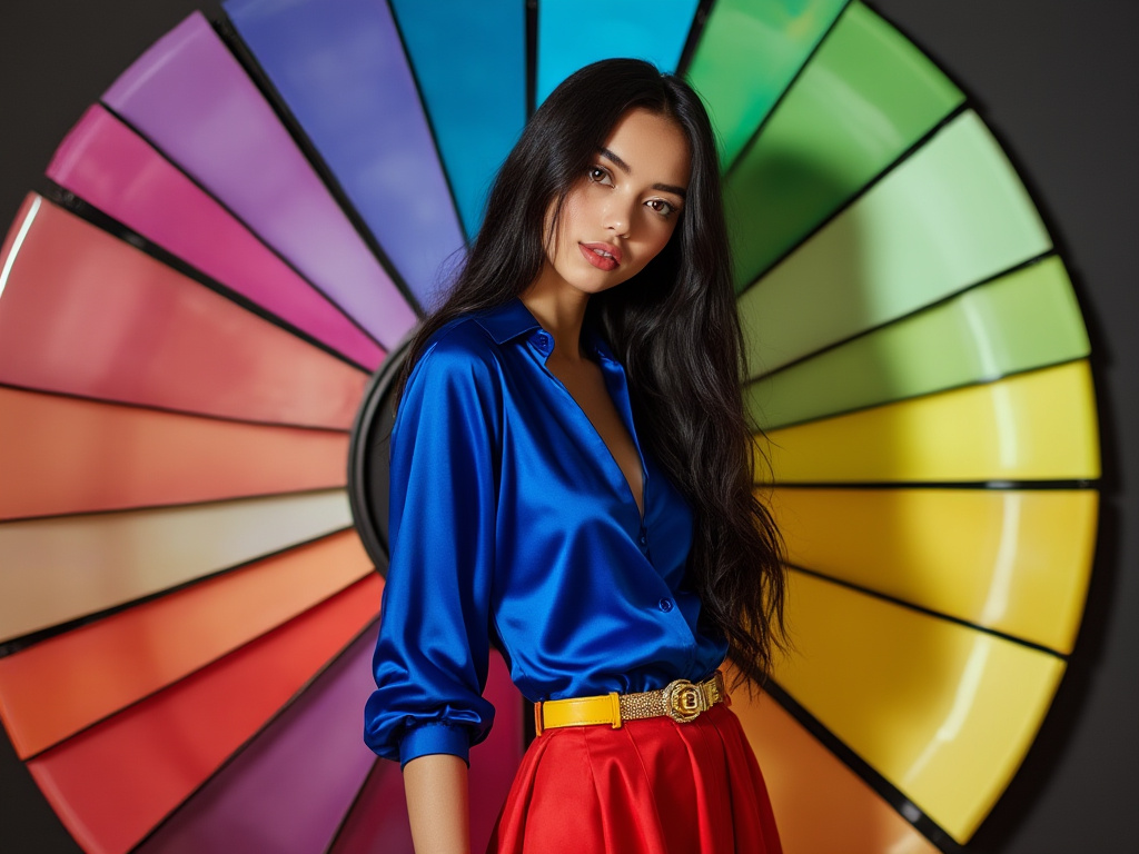
Understanding the Color Wheel
The color wheel is like a compass for your wardrobe navigation. Remember that magical moment in elementary school when you first mixed yellow and blue to create green? That same principle applies to your closet. Primary colors serve as the building blocks, while secondary and tertiary colors offer endless possibilities for creative expression. The relationships between these colors create the foundation for all sophisticated color combinations.
When you understand how colors relate to each other on the wheel, you’ll start seeing outfit possibilities everywhere you look. Those rust-colored boots you never knew how to style? They’ll suddenly make perfect sense paired with a navy blazer, creating a rich, sophisticated contrast that draws from opposite sides of the color wheel.
Color Properties and Relationships
Think of color properties as the personality traits of your wardrobe pieces. Hue, saturation, and value work together like members of a well-coordinated team. Have you noticed how some colors seem to whisper while others shout? That’s the difference between muted and vibrant tones, and understanding this can transform your approach to outfit building.
The relationship between colors goes deeper than just their position on the wheel. Colors can be warm or cool, bold or subtle, and understanding these characteristics helps you create outfits that not only look cohesive but tell your unique style story. It’s like cooking – knowing which flavors complement each other makes the difference between a mediocre meal and a masterpiece.
The Psychology of Color Choices
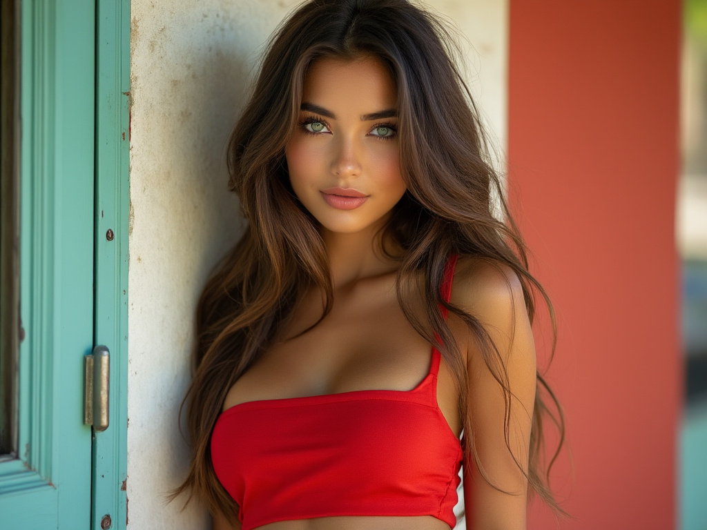
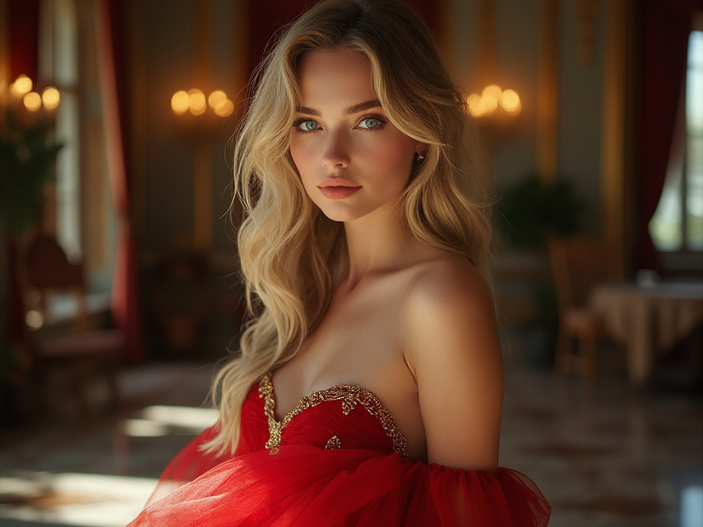
Colors affect our emotions and perceptions in profound ways. Ever wonder why you reach for that red dress when you need an extra boost of confidence, or why that soft blue sweater feels so calming? The psychology behind color choices influences not just how others perceive us, but how we feel about ourselves.
Every color tells a story and evokes specific emotions. Blues can convey trustworthiness and stability, while yellows radiate optimism and energy. Understanding these psychological impacts helps you choose outfits that align with your intentions for any given day or occasion.
Personal Color Analysis
Finding your perfect colors is like discovering a map to your most confident self. It’s not about limiting your choices – it’s about understanding which colors make you shine brightest.
Understanding Your Undertone
Determining your skin’s undertone is like finding the key that unlocks your most flattering color palette. Have you ever wondered why some colors make you look vibrant while others wash you out? The secret lies in understanding whether your undertone is warm, cool, or neutral.
Place a piece of white paper next to your face in natural light. If your skin appears peachy or golden, you likely have warm undertones. If you see pink or blue undertones, you’re probably cool-toned. Those lucky few who look good in both gold and silver jewelry often have neutral undertones.
Seasonal Color Theory
The seasonal color analysis system is like having a personal color consultant in your pocket. Just as nature creates perfect color harmonies in each season, this system helps you identify your most complementary palette.
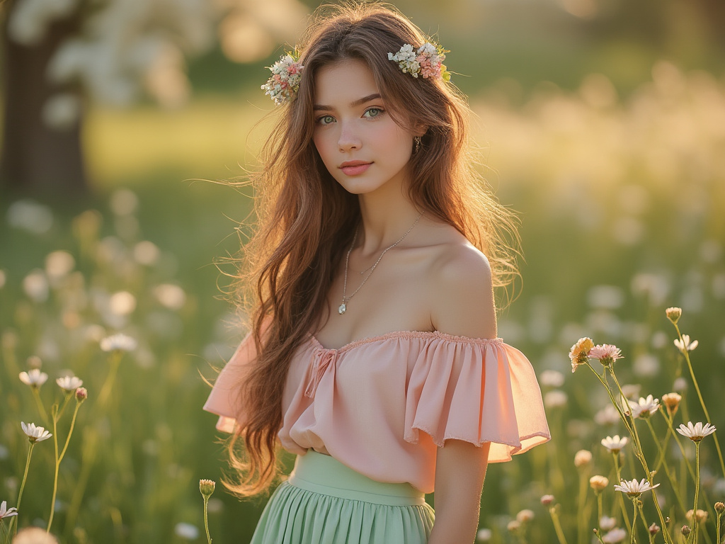
Think about how certain colors in nature always work together – the warm golds and deep reds of autumn, or the soft pinks and greens of spring. Your seasonal color type follows similar principles, creating a harmonious relationship between your natural coloring and your clothing choices.
Finding Your Power Colors
Everyone has certain colors that make them feel invincible – these are your power colors. When you wear them, you radiate confidence and energy that others can’t help but notice. Finding these colors is like discovering your own personal superpower.
The Art of Combining Colors
Creating beautiful color combinations is like composing music – it’s about finding the right notes that work together to create something greater than the sum of its parts.
Complementary Color Combinations
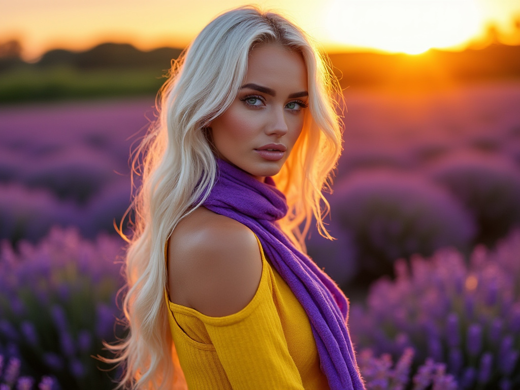
Remember the thrill of discovering that purple and yellow could look amazing together? Complementary colors sit opposite each other on the color wheel and create dynamic, eye-catching combinations that energize your outfits.
These bold pairings don’t have to be intimidating. Start with smaller doses – perhaps a lavender blouse with yellow accessories – and gradually build your confidence with more dramatic combinations. The key is finding the right balance that works for your style and comfort level.
Analogous Color Schemes
Working with colors that sit next to each other on the color wheel is like having a conversation with old friends – everything just flows naturally. Analogous color schemes create serene, harmonious outfits that feel sophisticated and put-together.
Nature provides endless inspiration for analogous color combinations. Think of a sunset’s gradual progression from orange to pink to purple, or the way forest greens blend seamlessly into teals and blues. These natural color stories can inspire your outfit choices.
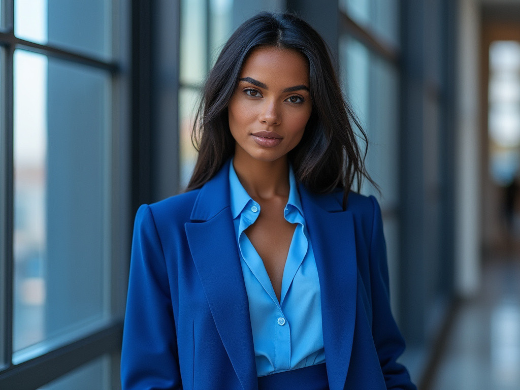
Monochromatic Magic
There’s something undeniably chic about wearing different shades of the same color. It’s like creating a symphony using variations of a single note. Monochromatic outfits elongate your silhouette and create a sophisticated, cohesive look that’s both elegant and modern.
- A crisp white shirt paired with ivory trousers and cream accessories
- Navy blazer layered over a lighter blue shirt and dark denim
- Various shades of gray from charcoal to silver creating depth and interest
- Camel tones from light beige to deep cognac for a luxurious look
- Different intensities of burgundy for a rich, sophisticated ensemble
- Forest green mixed with sage and mint for a nature-inspired palette
- All-black outfits with varying textures and finishes
- Shades of purple from lavender to deep aubergine
- Brown tones from taupe to chocolate creating warmth and depth
- Pink variations from blush to rose for a feminine touch
- Different intensities of red from coral to ruby
- Tonal blue outfit mixing powder blue with cobalt
- Varying shades of yellow from butter to mustard
- Multiple green hues from olive to emerald
- Classic gray scale from dove gray to charcoal
Advanced Color Techniques
Like a master chef who knows exactly which spices will elevate a dish, understanding advanced color techniques allows you to create sophisticated and unique combinations that set your style apart.
Working with Neutrals
Neutrals are the unsung heroes of any wardrobe. Think of them as the canvas upon which you paint your colorful masterpieces. They provide balance, sophistication, and endless versatility to your outfits.
The beauty of neutrals lies in their ability to work with literally every other color in your wardrobe. A well-chosen collection of neutral pieces becomes the foundation for countless outfit combinations, allowing your statement pieces to truly shine.
Pattern Mixing
Pattern mixing is like speaking a sophisticated visual language. When you understand how colors work together, combining patterns becomes less intimidating and more intuitive. The key is finding common colors or complementary hues that tie different patterns together harmoniously.
Consider starting with patterns in the same color family but different scales, or mixing geometric patterns with florals that share a common color. It’s like creating a collage where each element contributes to a greater whole.
Seasonal Transitions
Transitioning your color palette between seasons is an art form in itself. Just as nature gradually shifts its colors throughout the year, your wardrobe can evolve with subtle changes in tone and intensity.
Tools and Resources for Color Matching
Modern technology has revolutionized how we approach color matching in fashion. From smartphone apps to professional color analysis tools, we have more resources than ever to help us make confident color choices.
Digital Color Tools
The fashion world has embraced technology with open arms, offering various apps and digital tools that make color matching easier than ever. These tools can help you identify colors, create palettes, and even find specific pieces in your desired hues.
Who would have thought that your smartphone could become your personal color consultant? From capturing colors in the wild to creating digital wardrobe inventories, technology has transformed how we approach color coordination.
Professional Color Analysis Services
Professional color analysis goes beyond basic seasonal categorization to provide personalized insights into your most flattering colors. Think of it as having a scientific approach to discovering your perfect palette.
These services can be particularly valuable when building a capsule wardrobe or investing in key pieces. The expertise of a professional color analyst can help you make confident decisions about which colors will serve you best in the long run.
Color Matching in Practice
Real-world application of color theory requires both knowledge and intuition. It’s about finding the sweet spot between understanding the rules and knowing when to break them creatively.
- Start with a neutral base and add one bold color accent
- Use the 60-30-10 rule for balanced color distribution
- Consider the undertones of each piece in your outfit
- Pay attention to how colors change in different lighting
- Use accessories to experiment with new color combinations
- Look to nature for inspiration in color pairing
- Consider the occasion when choosing color combinations
- Balance warm and cool tones for visual interest
- Use color blocking techniques for dramatic effect
- Layer similar shades for sophisticated depth
- Incorporate patterns as a way to combine multiple colors
- Use metallic accessories as neutral accents
- Consider texture when working with monochromatic looks
- Use color to create focal points in your outfit
- Mix unexpected colors for unique personal style
The Role of Lighting
Never underestimate the impact of lighting on how colors appear. Different types of light can dramatically affect how colors look, both individually and in combination with each other.
Natural Light
Natural light is the most revealing and honest lighting condition for assessing colors. The way colors appear in daylight can be quite different from how they look in artificial lighting, which is why it’s essential to consider where and when you’ll be wearing certain combinations.
The quality of natural light changes throughout the day and across seasons. Morning light has a different character than afternoon sun, and cloudy days create their own unique lighting conditions that can affect how colors appear.
Artificial Lighting
Different types of artificial lighting can significantly alter how colors appear. Fluorescent lights might make some colors appear harsh or washed out, while warm incandescent lighting can enhance certain hues and mute others.
Understanding how your clothes will look in various lighting conditions helps you make better choices for specific occasions. What looks perfect in your home mirror might appear quite different under office lighting or in evening environments.
Color Temperature Considerations
The temperature of light, measured in Kelvin, can dramatically affect how colors appear. Warm lighting tends to enhance warm colors while potentially dulling cool tones, and vice versa with cool lighting.
Pattern and Texture Interactions
The interplay between patterns, textures, and colors adds another layer of complexity to creating successful outfits. Understanding these relationships helps you create more sophisticated and interesting combinations.
Pattern Scale and Color
When working with patterns, consider both the scale of the pattern and its colors. Larger patterns make more of a statement, while smaller patterns can read as texture from a distance.
Pattern mixing becomes more successful when you understand how colors work together within different patterns. A small floral print might work beautifully with a larger geometric pattern if they share a common color story.
Texture and Color Perception
Different textures can affect how colors are perceived. A velvet piece might appear richer and deeper in color than the same shade in a cotton fabric, while sequins and metallics can create fascinating color effects as they catch the light.

Building a Balanced Wardrobe
Creating a well-balanced wardrobe is like composing a symphony – each piece needs to work both individually and as part of the whole.
Core Color Selection
Start with a foundation of versatile neutrals and gradually add colors that both complement your personal coloring and work well together. Think of it as building a color story that reflects your personality and lifestyle.
The key is choosing colors that can mix and match easily, creating maximum outfit possibilities with minimal pieces. This approach leads to a more sustainable and satisfying wardrobe.
Accent Color Strategy
Strategic use of accent colors can bring life and personality to your wardrobe. Think of them as the spice in your recipe – a little can go a long way.
Color Confidence
Developing color confidence is a journey of exploration and self-discovery. It’s about finding what works for you and feeling empowered to express yourself through color.
Experimenting with New Combinations
Start small with new color combinations and gradually build your confidence. Use accessories as a low-risk way to try out new color pairings.
Maybe you never thought purple and green could work together, but a deep eggplant blazer with a sage green blouse might surprise you. The key is being open to possibilities while staying true to your personal style.
Building Your Color Identity
Your relationship with color is deeply personal and can evolve over time. Don’t be afraid to step out of your comfort zone while staying true to what makes you feel most confident.
Remember that developing your color identity is a journey, not a destination. As you grow and change, your color preferences may shift, and that’s perfectly natural.
Seasonal Adaptations
Learning to adapt your color choices to different seasons while maintaining your personal style is an important skill. It’s about finding the right balance between seasonal appropriateness and personal preference.
Color Trends vs. Timeless Choices
Understanding the difference between trendy and timeless color choices helps you make smarter wardrobe investments. While trends can be fun to experiment with, building a foundation of classic color combinations ensures long-term versatility.
Incorporating Trends
Trends can be a great way to refresh your wardrobe and experiment with new colors. The key is choosing trending colors that complement your existing palette.
Think of trends as seasonal spice – they can add excitement to your wardrobe without overwhelming it. Use them in small doses through accessories or single statement pieces.
Building Timeless Combinations
Classic color combinations have stood the test of time for good reason. They’re like the basic recipes every cook should know – reliable, versatile, and always in style.
Color in Professional Settings
Navigating color choices in professional environments requires understanding both industry norms and personal style. It’s about finding the right balance between expressing yourself and maintaining professional appropriateness.
- Classic navy and white for timeless professionalism
- Charcoal gray with burgundy accents for subtle sophistication
- Camel and black for refined elegance
- Forest green and cream for natural authority
- Deep purple and gray for creative professionalism
- Maroon and navy for traditional settings
- Olive and white for approachable authority
- Teal and black for modern professionalism
- Brown and blue for earthy sophistication
- Plum and taupe for feminine power
- Navy and red for classic confidence
- Gray and pink for soft authority
- Black and ivory for timeless elegance
- Blue and brown for trustworthy presence
- Burgundy and gray for sophisticated power
Advanced Color Psychology
Understanding the psychological impact of different colors can help you make more intentional choices about what to wear in different situations.
Emotional Color Impact
Colors can significantly affect both your mood and how others perceive you. Understanding these psychological effects helps you choose colors strategically for different occasions and desired outcomes.
Whether you’re dressing for a job interview, a first date, or a important presentation, knowing how colors influence emotions can give you an extra edge.
Cultural Color Considerations
Color meanings can vary significantly across different cultures. What’s considered lucky or prestigious in one culture might have very different connotations in another.
Summary Table
| Color Combination Type | Best Uses | Impact |
|---|---|---|
| Complementary Colors | Statement outfits, Special occasions | High energy, Dynamic contrast |
| Analogous Colors | Everyday wear, Professional settings | Harmonious, Sophisticated |
| Monochromatic | Formal events, Minimalist style | Elegant, Lengthening |
Conclusion
Color matching in fashion is both an art and a science, a delicate balance between understanding universal principles and expressing personal style. As you continue to explore and experiment with color, remember that confidence is the most important element of any outfit.
The journey to mastering color in your wardrobe is ongoing and deeply personal. Trust your instincts while using the tools and techniques we’ve discussed as your guide. The most successful color combinations are often those that make you feel most authentically yourself.
Frequently Asked Questions
How do I know which colors look best on me?
Consider your skin’s undertone and overall coloring. The most flattering colors typically complement your natural features. Try holding different colored fabrics near your face in natural daylight and notice which ones make your skin glow and which ones make you look tired or washed out. A professional color analysis can provide detailed insights, but you can also experiment by noting which outfits consistently earn you compliments.
What are foolproof color combinations for beginners?
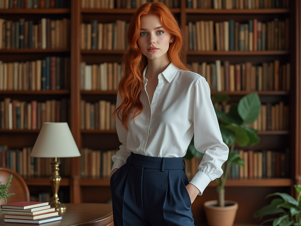
Start with neutral pairings like navy and white, black and beige, or gray and cream. These combinations are virtually impossible to get wrong. As you build confidence, try adding one bold color to a neutral base. Navy with burgundy, beige with forest green, or gray with purple are sophisticated yet approachable combinations that work well for beginners.
How can I mix patterns without looking overwhelming?
The key to successful pattern mixing lies in maintaining a consistent color palette while varying the scale of the patterns. Start by combining patterns that share at least one color. For example, pair a large floral print with a smaller geometric pattern in coordinating colors. Keep the rest of your outfit simple and let the patterns be the focal point.
What colors work best for professional settings?
Traditional business environments typically favor neutral colors like navy, gray, black, and beige. However, you can incorporate subtle color through accessories or secondary pieces. Deep jewel tones like burgundy, forest green, and sapphire blue are also excellent choices for professional settings as they convey authority while adding personality to your outfit.
How do I transition my color palette between seasons?
Adjust the intensity and warmth of your colors as seasons change. Summer calls for lighter, brighter versions of your favorite colors, while fall and winter are perfect for deeper, richer tones. Spring welcomes soft, fresh colors. Keep your core neutral pieces consistent year-round and vary your accent colors seasonally.
Can I wear black with navy?
Absolutely! This once-forbidden combination has become a sophisticated modern pairing. The key is to make it look intentional. Ensure the contrast between the two colors is clear enough to avoid looking like a mismatch. Adding a third element, like a white shirt or metallic accessories, can help tie the look together.
How do I build a cohesive wardrobe with color?
Start by selecting a core neutral color that flatters you and build from there. Add two or three complementary colors that work well together and with your chosen neutral. This creates a foundation for mixing and matching. As you expand your wardrobe, ensure new pieces coordinate with at least three items you already own.
What’s the best way to experiment with new colors?
Begin with accessories like scarves, belts, or jewelry in new colors you’re curious about. This low-commitment approach allows you to test how different colors work with your existing wardrobe. Once you’re comfortable, graduate to smaller clothing items like tops or skirts before investing in larger pieces like coats or dresses in new colors.

Marcella Raskin is a talented writer and editor with a deep passion for the dynamic realm of clothing colors and patterns. Armed with a strong background in Journalism, she crafts engaging content that empowers readers to select the perfect shades for their outfits. Her pieces provide an in-depth exploration of color trends and expertly curated fashion advice. Beyond her work, Marcella loves discovering new places, connecting with local designers, and advocating for sustainable fashion choices. She is devoted to helping individuals make enlightened color choices for their attire.
Reviewed By: Joanna Perez and Anna West
Edited By: Lenny Terra
Fact Checked By: Matthew Mansour
Photos Taken or Curated By: Matthew Mansour