Key Takeaways
- Colors mirror emotions in many small ways. Each shade can hint at a mental state or help shape how one feels.
- Subtle hue shifts in clothes or surroundings can refresh energy or calm the mind.
- Practical color choices often rest on day-to-day needs rather than rules.
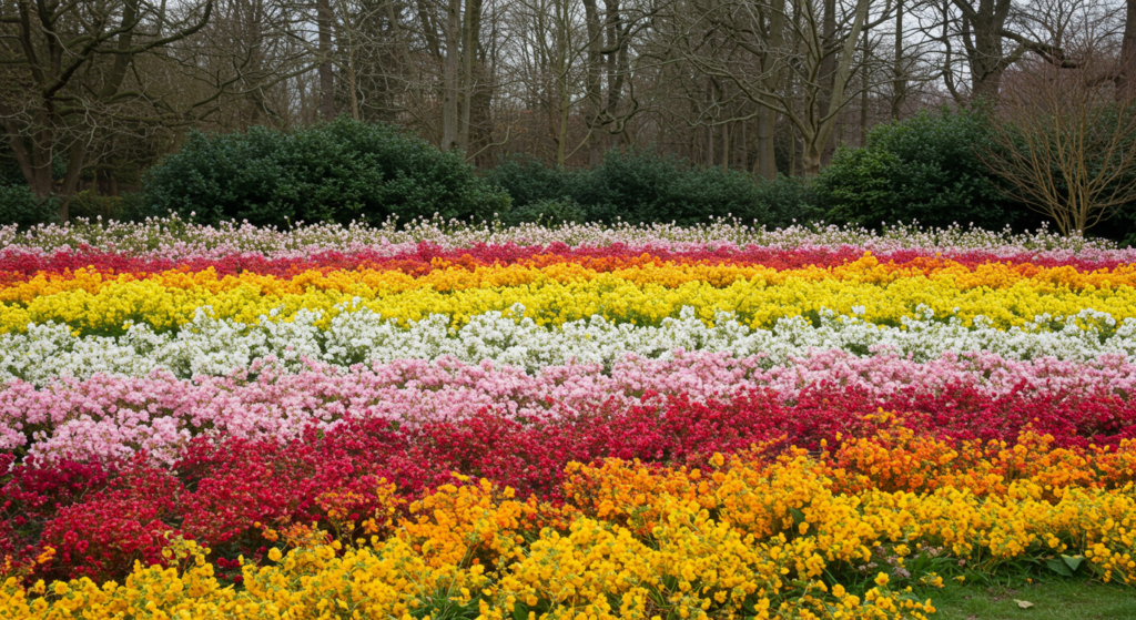
- Nature’s palette offers fresh inspiration for mood tracking or design tweaks.
- Experimentation leads to personal color routines that can brighten life and foster well-being.
Introduction

Have you ever paused to notice why a certain color grabs your attention? Maybe you see a bright banner and feel an instant jolt of energy. Or you spot a soft blue throw blanket and feel relaxed. Color can shift the way you see the moment. It can also shape or reflect your mood.
This post looks at an out-of-the-box approach to using color as a guide to understanding and supporting your emotions. There are no strict rules here. Think of it as a creative way to match your environment with your frame of mind.
Let’s explore how to pick a color that speaks to you and discover the deeper side of each shade. We’ll also cover practical tips for daily living, home design, clothing, and more. By the end, you’ll have a fresh set of ideas that can spark new ways to connect with color.
Color’s Impact on Emotions

The Visual Vibrations
What happens when your eyes see a vibrant hue? Many people notice an instant reaction. Bright tones can wake you up, while cool ones can relax your mind.
These visual cues can act like gentle nudges. They remind you of what you might need at that moment. If you feel stressed, a restful color can help. If you feel sluggish, a bright one can spark some life.
You might also find that certain color intensities prompt stronger emotional shifts. Some folks gravitate toward pastel, while others seek bold jewel-like tones. The key is to notice how your heart or mind responds. That first spark can guide you in crafting your personal “mood palette.”
Personal Preferences
Does color work the same for everyone? Not always. Each person holds memories tied to different shades. Someone might see teal and recall ocean waves, while another sees an old shirt they wore for years. These memories stir emotions. That’s why color can feel so personal.
One way to tap into your preferences is by asking questions: “What color feels like home?” or “Which hue do I reach for when I’m nervous?” Write these questions down in a small notebook or keep them in mind throughout the day. Little by little, you’ll learn which colors spark comfort or excitement.
Cultural Twists
Color also carries cultural meanings. A bright color in one region might be linked to a cheerful holiday, while another culture might see it as a sign of something more serious.
This is not about rules, though. It’s about understanding how the group around you might respond. If you plan a party, and you lean into a color associated with rest in your community, you might find the energy does not match your plan.
That doesn’t mean you need to limit yourself. Instead, you can blend what feels right to you with a sense of what those around you might expect. Sometimes that contrast sparks a lively conversation or opens new insights into how color shapes group mood.
Subtle Hues for Calm

Light Blues at Home
A light blue room can feel like a gentle breeze on a warm day. It doesn’t overpower the space. It whispers. If you choose to paint a wall or add a blue accent pillow, you might sense your stress level dropping. The shade can help the mind stay focused without pushing intensity.
Why does this help at home? Many people come home to unwind. Light blue can serve as a backdrop for peace. You can pair it with white or pastel green accents to create a unified calm theme. If you aren’t ready to paint, try small touches like blue coasters or lampshades.
Soft Greens in Workspaces
Work can get hectic, so a soft green accent can invite balance. Some say it reminds them of nature, of fresh grass and leaves. That gentle link to the outdoors might reset your mental state, especially if you’re indoors for hours. You don’t have to add massive amounts. A single piece of décor, such as a green file folder or a small potted plant, can shift how you feel.
Is green only for a home office? Not necessarily. It can also be used in a larger workspace. If you’re allowed personal items, you might set a soft green mug on your desk. Even small glimpses of green can keep a sense of calm in mind.
Gentle Grays in Outfits
Sometimes, a neutral gray outfit can soothe frayed nerves. It’s understated, and it matches well with many other colors. Picture a soft gray sweater on a brisk day. It doesn’t draw too much attention, but it feels cozy. People often find that wearing gray calms them when they don’t want external fuss.
Still, watch for how your mood reacts. For some, gray might hint at gloom. If that’s the case, a simple tweak—like adding a subtle colored accessory—can balance the mood. The best approach is to experiment. Wear gray on a day when you need to keep things stable, and see if it fits.
Vibrant Tones for Energy

Fiery Reds in Gatherings
Groups sometimes need a jolt. Red can fill that role. A burst of red décor at a gathering can suggest momentum and spark conversation. Maybe you use red napkins or a striking red centerpiece. Guests might feel awake and engaged before they even realize why.
If you don’t want to go bold with décor, consider small details. A bright red pitcher, or red serving bowls, can liven the table. The goal is not to overwhelm. Instead, let that vivid hue add pockets of energy. It might encourage people to perk up and chat.
Bright Yellows in Creative Zones
What helps keep ideas flowing? Some say yellow provides a sense of brightness that cheers up the mind. If you have a space dedicated to painting, writing, or crafting, you can slip in pops of yellow. It might be a lamp shade or a sunny piece of art on the wall.
Yellow does carry intensity, so smaller touches might work better than saturating every inch. One painting might be enough to remind you of that joyful nudge. Keep track of your energy levels on days when you’re surrounded by bright yellow. If it helps you think clearer, continue. If you find it distracting, you can dial it down.
Bold Pinks in Personal Expression
Pink can spark lively feelings, especially a bold magenta or fuchsia. It’s often seen as playful, though not everyone likes it. If you do, it can be a powerful color to lift your spirit. Wearing a bright pink scarf or adding a hot-pink throw pillow can remind you to keep a playful edge.
Think about times when you feel drained. Are you open to something that feels a bit daring? Bold pink might be an option. The color can provide a sense of fun. It might also allow you to show a side of yourself that you usually keep tucked away.
Earthy Shades for Grounding

Browns for Cozy Interiors
Brown can evoke images of tree bark, dark chocolate, or freshly turned soil. These natural references can make spaces feel cozy. People might associate brown with warmth and security. A brown leather chair, a plush brown rug, or wooden beams can all fit that sense of stability.
Brown can also be balanced with a lighter shade to prevent heaviness. Cream or beige curtains can offset a dark brown couch. If you keep it in moderation, brown can create a snug and welcoming vibe, ideal for a living room or reading nook.
Taupe in Accessories
Taupe can be a soft, subtle version of brown mixed with gray. It often works well in accessories. Bags, shoes, and belts in taupe can match many outfits. This can save you time when you’re trying to pick what to wear. You won’t clash with bright clothing, and you won’t fade entirely into the background either.
For moods, taupe holds a grounded feeling without drawing attention. It can be a nice color for transitional periods when you’re shifting from one emotional state to another. That neutral element might steady you and keep stress levels lower.
Forest Green in Outdoor Gear
Forest green can remind you of hiking trails and mountain paths. It’s darker than many greens you see indoors, which can make it feel rich. Consider using forest green for tents, backpacks, or sturdy jackets. The color will blend with natural surroundings, which helps keep you in sync with the outdoor vibe.
Why does it matter for mood? Spending time in nature often resets the mind. If your gear also connects with the environment, that sense of alignment can deepen. You might feel more relaxed and confident. It’s a subtle trick but worth exploring.
Seasonal Influences on Mood
Crisp Winter Whites
Winter can feel cold and dark, so splashes of white might bring brightness to a space. A white throw blanket or a white accent wall can reflect light better, making rooms seem more open. Some say that white can clear the mind, like a blank slate. If winter drags your energy down, white might counter that heaviness.
One challenge is keeping white spotless. Dust or smudges can show quickly. Still, for short bursts of brightness in winter, it works well. You can find thicker textiles, like fluffy white rugs or pillows, to add warmth in the colder months.
Spring Pastels
Spring can signal fresh starts. Pastel shades, like mint green or baby pink, can match that lift. You might see them in nature, too—flowers, budding leaves, and new growth. Pastels in your wardrobe or décor can echo that seasonal change. They don’t scream for attention. They ease you into a sense of renewal.
If you want a simple start, pick one pastel accessory. Maybe you wear a lavender scarf or set a pale green candle on a table. When you notice it, you might sense a hint of excitement about the new season. It can help you greet each day with a fresh perspective.
Autumn Richness
Autumn often arrives with deep oranges, burgundies, and golds. These warm hues can help you savor the shift in weather. They might remind you of a cozy sweater or a mug of hot cider. If you like to match your space to the season, you can swap out lighter accessories for items that carry these rich shades.
The idea is to feel more connected to nature’s cycle. As leaves change color, your environment might change color, too. A burnt orange pillow, a burgundy throw blanket, or a golden table runner can reinforce that autumn mood. This might help you enjoy the season more deeply.
Unique Pairings for Balanced Atmosphere

Blue and Orange Combos
Blue and orange lie across from each other on the color wheel. This contrast can seem bold, but it can also create surprising balance. You see it in nature sometimes, like a bright orange sunset against a deepening blue sky. If you mix these colors indoors, you might spark a lively but balanced energy.
It works best when one color plays the main role, and the other is an accent. For instance, paint your room a soft shade of blue, then add an orange rug. Or wear a denim jacket with a subtle orange scarf. The contrast keeps things from getting dull.
Green and Purple Synergy
Green and purple can offer a refreshing mix. Imagine lilac blooms in a lush garden. If you like an unexpected twist, you might try wearing a muted purple dress with green earrings. Or you could set a green rug against purple walls. Some people worry that these hues clash, but the right shades can complement each other.
This pairing might help you feel both calm (green) and a bit whimsical (purple). That blend can be great if you feel stuck in a rut. It might open your mind to new ideas. The synergy of these two colors can keep your mood balanced yet inspired.
Red and Teal Harmony
Red can be intense. Teal can be soothing. Put them together, and you get a striking combination. You might try red throw pillows on a teal couch or a teal tie with a red shirt. The key is to balance the ratio so they aren’t fighting each other.
If you prefer a calmer vibe, pick a lighter teal. If you want a bolder look, choose a vivid teal that can hold its own next to red. This pairing often suits modern décor, but it can also appear in clothing or accessories when you crave something that stands out.
Choosing Colors for Your Clothes

Office Wardrobe
In an office setting, color choices can reflect your mindset. Some folks stick to neutral palettes, like navy or gray, to keep the tone professional. Others add a pop of color—a bright tie, scarf, or blouse—to show creativity. If you want to boost your mood at work, consider a color that energizes you but doesn’t distract you.
Earthy tones can help keep you grounded, while subtle blues or greens can provide calm focus. It’s about blending comfort with confidence. If you feel good in a color, you might carry yourself with more ease.
Weekend Casual
Weekends allow more flexibility. You can step outside your usual palette. If you’ve had a stressful week, try a hue that signals fun. Maybe you go for a bold pink tee or a sunny yellow cardigan. These choices might remind you to unwind and enjoy your free time.
There’s also room to mix patterns or color-block. If you love color but feel cautious, try layering. Slip a vivid undershirt beneath a neutral top, so you see only a peek of color. You’ll feel playful but not overwhelmed by brights.
Special Events
Parties, weddings, or other events can make color feel exciting. You might choose a color based on the event’s vibe. A sunset wedding might be perfect for warm peach or soft lavender. A night-time gathering might inspire metallic details or deep jewel tones.
Ask yourself how you want to feel. Do you want to stand out? A bright or shiny color might do that. Do you want to keep it simple? A soft pastel or a gentle neutral could work. Consider the environment, too. If the event is outdoors, you can draw from natural colors like leaf green or sky blue to harmonize with the setting.
Colors in Interior Design

Foyer Impressions
When people step into a home, the foyer can greet them with color. If you paint the walls a warm hue, like a sandy beige or light coral, guests might feel welcomed. For a smaller foyer, lighter shades can make it seem open. For a larger foyer, you can experiment with darker shades to create a cozy feel.
Don’t forget about accent pieces. A bold console table or a striking piece of art can offer a focal point. This subtle but clear color statement can set the mood for the rest of the home.
Bedroom Comfort
A bedroom is usually a place to rest, so colors that soothe tend to work well. Soft blues, pale pinks, or muted purples can calm your mind. Some people enjoy deep, cool shades for sleeping. Others prefer something airy. It depends on personal taste.
Try testing small swatches on your walls. Live with them for a few days and notice how you feel each night. Also, consider bedding and curtains. They can shift the mood without requiring a full paint job. A plush, neutral bedspread can anchor the space, letting you swap out colorful pillows or throws as you like.
Kitchen Energy
Kitchens thrive on activity. People cook, gather, and chat there. A dash of color can keep that space lively. Some prefer bright walls, like sunny yellow or teal, but that might feel too intense for others. You can also inject color through dishes, countertops, or small appliances.
If you like neutrals, you can keep your cabinets white, then use colorful accents in your utensils or chairs. This approach lets you swap colors when you want a change. It also helps keep the kitchen from feeling locked into one specific scheme.
Colors for Personal Projects
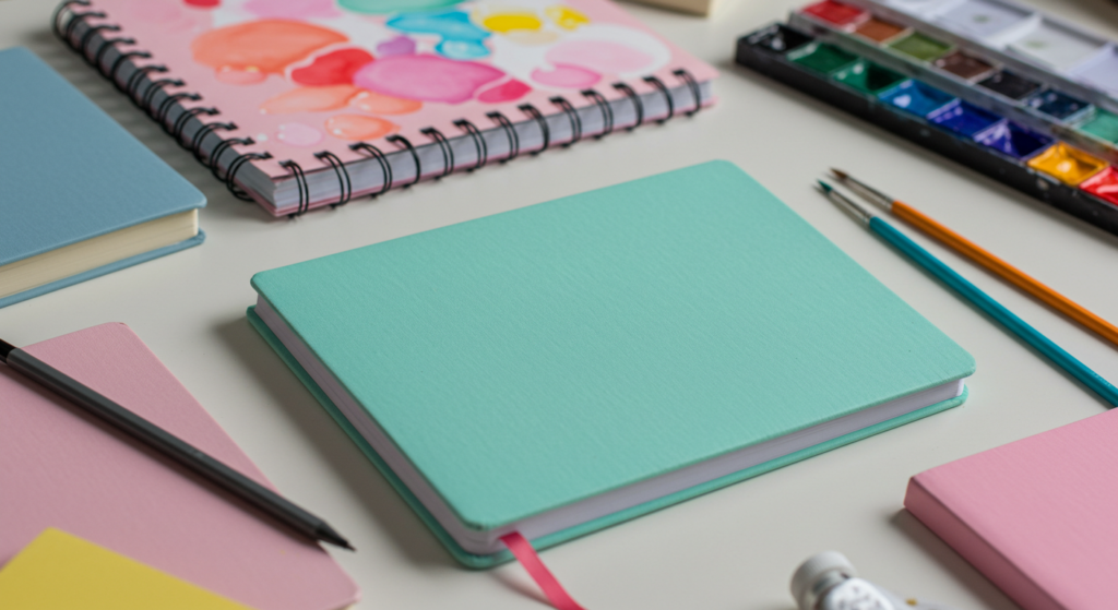
Journals
If you keep a journal, the cover color might impact your willingness to write. A mellow tone like dusty rose or soft green can invite quiet reflection. A bold color like neon orange or bright pink can spark high-energy brainstorming.
It might help to align the journal color with the journal’s purpose. A dream journal might work better in a midnight blue or lavender cover, evoking a night sky. A gratitude journal might shine in a warm, welcoming color like peach or beige.
Creative Art
When you make art, color is part of your toolkit. Even if you draw in black and white, you can add a splash of paint or colored pencil for emphasis. If you find yourself stuck, experiment with a color you rarely use. Perhaps you rarely use neon green. Introduce it in small strokes, and see where it leads.
Some artists use color mood boards, collecting images or swatches that inspire a theme. This approach can guide you toward a cohesive style for a project. Pay attention to how each color on your board makes you feel, then blend them or use them alone.
Gift Wrapping
Gift wrapping can be fun when you match the color to the mood you want to share. A cheerful gift might feature bright paper or ribbons, while a heartfelt one might include soft tones. Patterned paper with small pops of color can strike a balance between playful and elegant.
Think about the recipient. Do they love a certain color? That personal touch might boost their excitement. Also, remember that gift wrapping doesn’t have to be expensive. Simple craft paper with a colorful bow can look great while letting you control the color focus.
Colors in Nature

Observing Sky Tones
The sky shifts color throughout the day. Dawn can show pastel pinks, while midday might be bright blue, and dusk might paint the horizon in orange or purple. Observing these changes can tune you in to small mood changes. You might feel energetic at midday, calm at twilight, or reflective at dawn.
If you enjoy photos, you can capture sky shots at different times. Then note how each color range makes you feel. This practice can help you see how nature’s palette evolves. You might even carry some of these sky-inspired hues into your home or wardrobe.
Outdoor Moods
Nature isn’t limited to the sky. Grass, flowers, rocks, water, and animals each bring color to the environment. Have you ever felt soothed by the sight of a quiet lake or energized by a field of wildflowers? Those colors can offer immediate emotional feedback.
When you hike or walk, keep your senses open. Notice how each color might heighten or calm your mood. This subtle awareness can translate to everyday color choices. If you love the forest’s dark green with flecks of sunlight, maybe your living space can reflect that.
Garden Planning
If you have outdoor space, you can plan a garden based on color. Some folks arrange flowers in zones of purple, pink, and white for a tranquil vibe. Others prefer a riot of color—reds, yellows, and blues mixed together. It depends on what feeling you want to evoke when you step outside.
Planting with color in mind can also help you track seasons. Maybe you start with spring blooms in pastel tones, shift to bright summer flowers, then move to autumn’s deeper shades. This rolling palette might keep your garden interesting and your mood connected to natural cycles.
Psychological Shifts with Color?

(Note: This is not the standard “color psychology” talk, but a personal reflection process.)
The Self-Awareness Approach
Color might guide you to notice your own feelings faster. If you often choose certain hues on rough days, that could be a pattern. If bright colors only appeal to you when you’re upbeat, that’s a clue. This kind of self-awareness can help you handle your emotions more mindfully.
Try a color log. Jot down the colors you wear or notice each day, along with how you feel. After a month, check for patterns. You might find that certain shades track with certain moods. Then you can use that insight to support yourself better.
Reflective Moments
Sometimes, sitting quietly with color can spark reflection. Maybe you hold a swatch of calming blue fabric or study a painting with warm oranges and browns. Observe how the shades shift your internal state. Do they bring up memories or tension relief? This small ritual can help you pause and breathe.
You don’t need special training. You just need a moment of focus. Some people keep a small set of color cards in a desk drawer. When stress hits, they pull out a comforting hue and stare at it for a minute or two. It’s a simple way to ground yourself.
Embracing Surprises
What if a color you dislike suddenly appeals to you? That can happen when emotions change. Maybe you once hated neon green, but after a big life shift, you feel drawn to it. Embrace that surprise. It might signal that you’re growing or seeing life in a new way.
These unexpected color cravings can be reminders that moods aren’t static. You can update your environment or wardrobe to match your evolving mindset. Don’t be afraid to experiment with new color combinations that once seemed out of reach.
Building a Color Routine

Daily Check-Ins
Each morning, you can quickly scan your mood. Do you feel tired, focused, or excited? Choose a color that aligns with or counters that feeling. If you’re sleepy, pick a bright accent. If you’re jittery, maybe stick to softer hues. This small daily habit can encourage more intentional living.
You can do this with clothes, but also with small items like phone cases or notebooks. Over time, you’ll build a system that helps you harness color as a tool. You aren’t forced to do it, but it becomes a gentle ritual that frames your day.
Weekly Color Mix
Over a week, your mood will shift many times. Consider planning a “color mix” where you rotate through a set palette. For instance, Monday might be green for calm, Tuesday might be yellow for productivity, and so on. This rotation can prevent monotony and keep your environment fresh.
Though this might sound random, it can become a fun challenge. It forces you to dig into your closet or décor storage and pull out items you rarely use. You get to see if those items help you tune into each day’s demands. If something doesn’t feel right, tweak it next week.
Monthly Review
At the end of each month, reflect on which colors worked best for your mood. Did the bright pink top you wore every Friday bring you joy? Did the navy sweater calm you on tough days? Summarize these findings in a small journal or digital note.
This monthly review can guide you toward smarter color decisions. You might realize you only wore that purple scarf once, even though you love purple. You might figure out you need more yellow in your workspace. Tracking these details over time helps you build a color routine that feels personalized.
Using Colors in Digital Spaces

Screen Savers
In our tech-driven lives, we spend plenty of time staring at screens. Changing your screen saver or phone background can inject subtle mood shifts. A soothing landscape might help when you feel agitated. A bright pattern might pump up your energy when you’re dragging.
Experiment with various images and note how they affect you. You could shift your background every week or month to keep things fresh. This helps prevent screen fatigue and may even spark a smile during your day.
App Interfaces
Some apps allow you to choose color themes. It might be a simple toggle between light and dark modes, or it might let you set custom accent colors. Consider how these choices influence your focus or comfort. A high-contrast color scheme might make it easier to read. A softer scheme might reduce eye strain.
If an app doesn’t offer many options, you can use external tools or browser extensions to adjust colors. Each small tweak can refine your digital experience so it aligns more with your mood or your tasks.
Online Profiles
Social media platforms allow profile customization. You might add a banner image, choose highlight colors, or switch up your avatar background. Those choices can say a lot about how you want to present yourself. You can update them based on your current mood or message.
Think about the audience you interact with. Are you using bright colors to spread good vibes, or do you prefer neutral tones that signal a calm approach? Either way, it’s a chance to be intentional about color in your digital identity.
Emotional Expression Through Color

Sensing Your Feelings
Sometimes, you might not have words for your mood. You just know you feel off or excited. Color can help you express that moment. You can sketch a shape in a color that feels right or place a color-coded note on your calendar. This method can stand in for words.
As you become more aware of how color reflects your feelings, you might find it easier to talk about them. You could say, “I’m feeling a bit green today,” as a shorthand for feeling relaxed or balanced, if green has that meaning for you.
Matching Palettes
If you often change your environment to match your mood, you can keep a few ready-made palettes on hand. A “cozy palette” might be made up of browns, creams, and soft oranges. A “cheerful palette” might feature yellows, pinks, and light greens. If your mood swings, you can swap out items from your closet or décor to match the relevant palette.
This can be a quick fix if you need a mental boost or a sense of calm. It saves you from hunting for new items each time. You already have a kit of colors you know work well together.
Tracking Shifts
One way to track emotional growth is through a color timeline. Each week, assign a color that best sums up how you felt overall. After several months, you’ll have a visual map of your emotional journey. Maybe you see a progression from darker shades to lighter ones, or a cycle that repeats.
This can help you spot patterns and realize that moods come in waves. If you see that bright colors appear in spurts, you might learn you have bursts of high energy, then retreat to mellow tones. That knowledge might prepare you to ride those waves more smoothly.
Conclusion

Color can work like a subtle thread that weaves through daily life, linking your surroundings to your mood. You might not always be aware of it, yet it can make a difference in how you feel, focus, and connect with the moment.
This post shared practical methods, from small wardrobe tweaks to bigger home-improvement ideas, without strict rules or complicated jargon.
The real key lies in personal exploration. Notice how different hues resonate with you. Try to balance them in ways that fit your unique routines.
Over time, you may see patterns that guide your choices. Stay open to surprises—your color preferences might shift as you do.
Summary Table

Below is a quick snapshot of colors, their typical effects, and potential uses. Keep in mind that your personal experiences may vary.
| Color/Group | Typical Mood | Possible Uses |
|---|---|---|
| Light Blues | Calm, gentle | Bedroom walls, accent pillows, pajamas |
| Soft Greens | Balanced, fresh | Office plants, desk items, calming décor |
| Gentle Grays | Subtle, neutral | Sweaters, rugs, minimalist backgrounds |
| Fiery Reds | Energetic, bold | Party décor, statement outfits, tableware |
| Bright Yellows | Joyful, uplifting | Creative zones, art spaces, cheerful décor |
| Bold Pinks | Playful, lively | Personal accessories, accent pieces |
| Browns/Taupes | Cozy, grounded | Furniture, warm details, neutral outfits |
| Forest Green | Natural, reflective | Outdoor gear, nature-themed décor |
| Crisp Winter White | Clear, open | Throw blankets, brightening small spaces |
| Spring Pastels | Refreshing, light | Seasonal accent pieces, clothes, décor |
| Autumn Tones | Warm, comforting | Pillows, blankets, centerpieces |
| Blue/Orange Combo | Lively contrast | Room color splits, clothing accessories |
| Green/Purple Mix | Whimsical balance | Home accents, fashion statements |
| Red/Teal Pair | Vibrant harmony | Décor touches, bold personal style |
FAQ

Q1: How do I choose a color if I’m feeling stuck?
A: Look at your immediate environment. Spot a color that stands out and ask yourself if it feels comforting or energizing. Pick what pulls you in a positive direction.
Q2: Is there a best color for mood improvement?
A: There is no universal “best” color. Preferences vary. One person might love bright yellow, while another finds it overwhelming. Test different hues and note your reactions.
Q3: Can color alone fix a bad mood?
A: Color isn’t a magic fix. It’s more like a small aid. It can shift your mindset or soften a tough moment, but deeper issues may require other forms of support.
Q4: How can I add color without repainting walls?
A: Use temporary décor: throw pillows, blankets, rugs, curtains, or removable wall decals. You can rotate them to match your current mood or the season.
Q5: What if my cultural background says a color means something different?
A: Cultural contexts do matter. If you live in an area where white is worn at funerals, for example, you might want to keep that in mind. But personal preference still counts. Balance respect for your community with your own expression.
Q6: Do I need to spend a lot to use color effectively?
A: Not at all. Small items like ribbons, bookmarks, fabric swatches, or even sticky notes in varied hues can be enough to prompt emotional shifts.
Q7: How often should I change my colors?
A: It’s up to you. Some people switch colors daily, others do it seasonally. Pay attention to how often your mood changes. Adjust whenever you crave something new.
Q8: Are there colors I should avoid for certain moods?
A: It’s personal. Some might find dark colors too heavy when they feel sad, while others might find them comforting. Track your reactions over time to see what works for you.
Q9: Can I combine many colors, or should I stick to one?
A: There are no strict rules. You can blend colors if you like variety. If it starts to feel chaotic, you can pare things down.
Q10: Why do my color tastes change so much?
A: Human moods shift. Life events, seasons, or even new interests can shape which colors you like. Embrace these changes and explore them for fresh inspiration.
Thank you for reading. May these ideas help you find new ways to express, explore, and enjoy your daily life through the world of color. Remember, there’s no one-size-fits-all solution. Keep experimenting until you uncover what truly resonates with you.

Neha Z. is not just any writer; she’s a storyteller who has graced the online world with her evocative prose for over half a decade. Venturing into the intricate nuances of women’s lives, she weaves stories that range from life’s highs and lows to the multifaceted essence of femininity. Each piece she pens radiates sincerity and artistry. As you delve into Neha’s musings, you’ll find reflections that echo your own journey and insights that inspire. Immerse yourself in her world, and let her stories touch your heart.
Reviewed By: Joanna Perez and Anna West
Edited By: Lenny Terra
Fact Checked By: Matthew Mansour
Photos Taken or Curated By: Matthew Mansour