Key Takeaways
- Bright colors can visually enlarge or cozy up a room when applied strategically.
- Complementary pairings energize interiors without overshadowing existing furnishings.
- Balance matters: offset vibrant shades with neutral or subdued elements for harmony.
- Lighting enhances bold hues, so choose bulbs and fixture placements with care.
- Maintenance is crucial: keep bright walls and fabrics clean and fresh for long-lasting impact.
Have you ever stared at a dull living room, thinking, “Should I toss in some bright pillows or just paint an accent wall in a shocking colur?” Me too, my friend. It’s normal to crave a vibrant home, but the big question remains: How do we use bold color in a way that feels stylish, not chaotic?
This blog post, about bold and beautiful bright hues, helps clarify everything. We’ll tackle illusions, pairings, maintenance, product ideas, and every detail you might want to glean about brightening your space.
I remember painting a single red accent wall in my old studio once, hoping it would transform the vibe. It totally did, but I messed up a corner because I rushed. That taught me the importance of prep and the sheer power of a strong color choice. Now, let’s see how you can get it right, from the start.
Why this matters
People often search for ways to shake up their home decor without messing up. Bold color can do wonders, whether you want a bigger-feeling living area or a cozy reading nook. Let’s jump into the must-know strategies, broken into 14 key sections. Each one has deeper subsections, all compiled in a tidy way that you can read easily.
The Impact of Bold Colors on Room Perception

Bright hues, like vivid blues or intense yellows, can trick our eyes into seeing a space as bigger or smaller than it is. Shocking, right? Let’s explore how color changes our perception of space.
Making a Room Feel Larger
Did you know that certain bright shades, particularly ones with cool undertones, can create an airy feeling? A crisp aqua wall can stretch a cramped living room, kinda like a little magic trick. If you pair that with white trim, the entire room appears larger.
- Tips for bigger illusions:
- Keep floors light or natural in tone.
- Use bright accents that bounce off each other.
- Let windows remain open without heavy drapes.
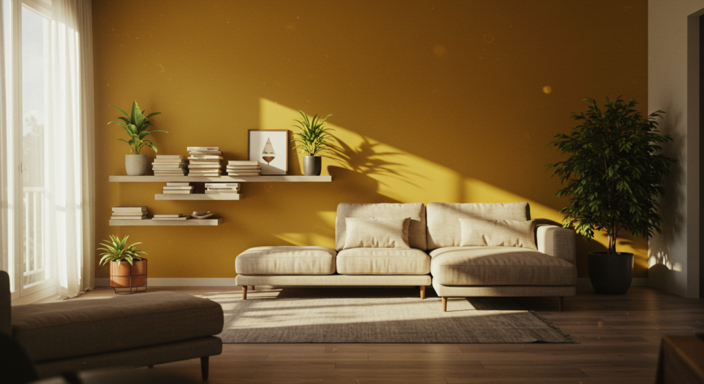
Cozying a Space with Intense Tones
Sometimes, a large room feels too wide open. Bright, warm colors—like a sunny orange or a luscious berry tone—wrap the space in a snug vibe. The closeness might surprise you.
- Tricks for a cozy look:
- Paint walls and ceiling in a matching hue, especially if you love a bold statement.
- Use plush accessories like thick rugs or velvet cushions.
- Dimmer lights or warm-toned bulbs soften harsh corners.
Linking Bright Colors with Neutral Items
Let’s say you want a bright wall, but you fear chaos if everything goes bold. Pair your punchy color with neutrals. Grays, creams, and pale beiges calm the environment and guide focus to your feature shade.
- Key neutral partners:
- White or off-white for a crisp accent.
- Light gray for a subtle but modern vibe.
- Soft taupe if you want something warm yet quiet.
Try combining a lime-green accent wall with a natural jute rug and some neutral seating. It works wonders.
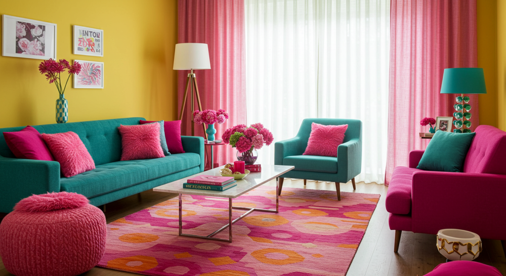
Complementary Color Pairings

Sometimes, one bright color is good, but two can be a showstopper—if they dance well together. Let’s see how to team up complementary tones without turning your home into an art fair gone wild.
Pairing Bright Blues and Oranges
Blue and orange might seem like a wild duo. But when used in moderation, they create a lively, balanced room. If the walls are a tangerine shade, sprinkle the area with teal cushions or maybe a chic lamp. This approach injects energy.
Product suggestion: A bold area rug that combines these two colors in geometric shapes can anchor your living space.
Pink Meets Green
One color screams soft, the other feels earthy. When you combine pink with green, the fresh vibe is unstoppable. Try a soft (but bright) pink sofa with emerald throw pillows, or flip that approach. Watch the room pop.
- Quick pointer: Keep the rest of the decor minimal, so these two star shades get the spotlight.
- A glass-top coffee table or mirrored side table can reflect those fun hues.
Vibrant Yellow and Deep Purple
A bright yellow accent wall behind a plush purple chair? That’s a guaranteed style statement. The contrast demands attention, so use it in places where you want conversation or a lively atmosphere.
- Add metallic details—like gold frames or silver lamps—to lighten the visual impact.
- Keep floor finishes muted for a calmer foundation.
Incorporating Bright Colors into Different Decor Styles

Think bright colors only fit modern spaces? That’s a big no. You can weave them into almost any style, from boho to minimalist. Let’s see how.
Modern Style
Modern interiors love crisp lines and bold statements. If your furniture leans mid-century modern, accentuate the sleek look with a vivid hue for an accent wall or statement piece.
- Consider an electric-blue sectional sofa in an all-white living room.
- Use geometric decor pieces in bright metal finishes to tie the color in.
Bohemian Flair
Boho rooms thrive on layering textures, patterns, and a rainbow of color. You can combine bright pillows, rugs, and wall hangings in an eclectic arrangement.
- Mix embroidered textiles from different cultures.
- Toss a variety of bright throw pillows on a neutral couch.
- Hang a multi-color tapestry on one wall, near a cluster of plants.
Scandinavian Twist
You might think: “Scandi design is all about white walls and soft neutrals, right?” True, but you can still infuse bright color, especially in smaller doses.
- Choose a statement chair in a bright hue, set in a minimal living room.
- Accent with light wood furniture to keep the natural, airy aesthetic.
- Use a single vibrant painting on a gallery wall of mostly black-and-white prints.
Choosing a Focal Wall or Accent Items
You can go big with an accent wall, or you can keep it subtle with a few smaller items. There’s no single correct approach, so let’s check each method.
Painting an Accent Wall
An accent wall is an easy route to create visual drama. Focus on a wall that already stands out, maybe behind a fireplace or a bookshelf. Prep thoroughly: measure, tape edges, and use high-quality paint for best coverage.
Small tip: Glossy or semi-gloss finishes reflect more light, intensifying the color.
Using Color in Textiles or Furniture
Don’t want to commit to painting walls? Embrace bright textiles. A bold sofa in the living room can anchor a neutral space, or try bright curtains for a shot of color that’s easy to switch out later.
- Vibrant rugs can tie multiple colors together.
- Bold ottomans or footstools add a pop without dominating.
Picking Small Decorative Items
Even small items can create large impacts. A bright vase on a mantle, a set of quirky bright candlesticks, or a neon lampshade can transform the vibe of the room.
- Group items of the same color in clusters for more effect.
- Let them stand against a neutral background for contrast.
Balancing Vibrancy with Neutrals
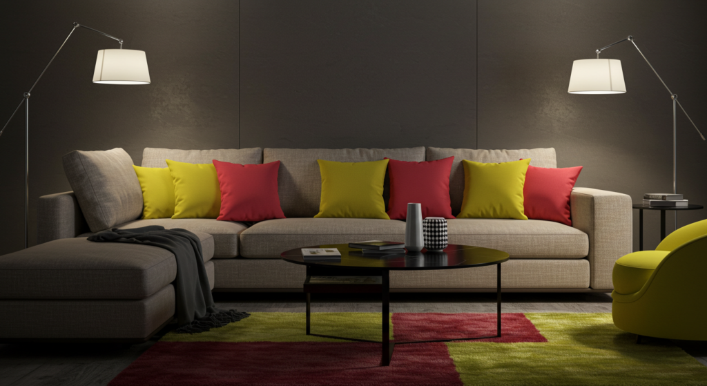
We all want some balance, right? Too many bright shades jumbled together can overwhelm. Mixing them with neutrals ensures your eyes get a place to rest.
Simple Ratio Method
Ever hear of the 70-20-10 ratio? It’s a common concept in design. But let’s keep it straightforward: choose one main color for about 70% of the space, a secondary color for about 20%, and a pop color for the final 10%.
- Example: White walls (70%), bright teal sofa (20%), and hot-pink throw cushions (10%).
Choosing the Right Neutral Base
Neutrals can be warm or cool. Warm neutrals (like beige) pair well with colors such as red or yellow. Cool neutrals (like gray) mesh with bright blues or purples.
- For a living room with a bright green accent wall, consider a soft beige sofa and natural wood end tables.
- For a bedroom with bold turquoise bedding, go for light-gray walls.
Balancing Multiple Brights
Sometimes, we want more than one bright hue. In that case, ground them with a neutral floor or rug. It’s also wise to keep large surfaces either neutral or uniformly bright, so the color combos won’t clash.
- If you want a bright teal chair and a red ottoman, let them share a neutral backdrop.
Dealing with Patterns and Prints
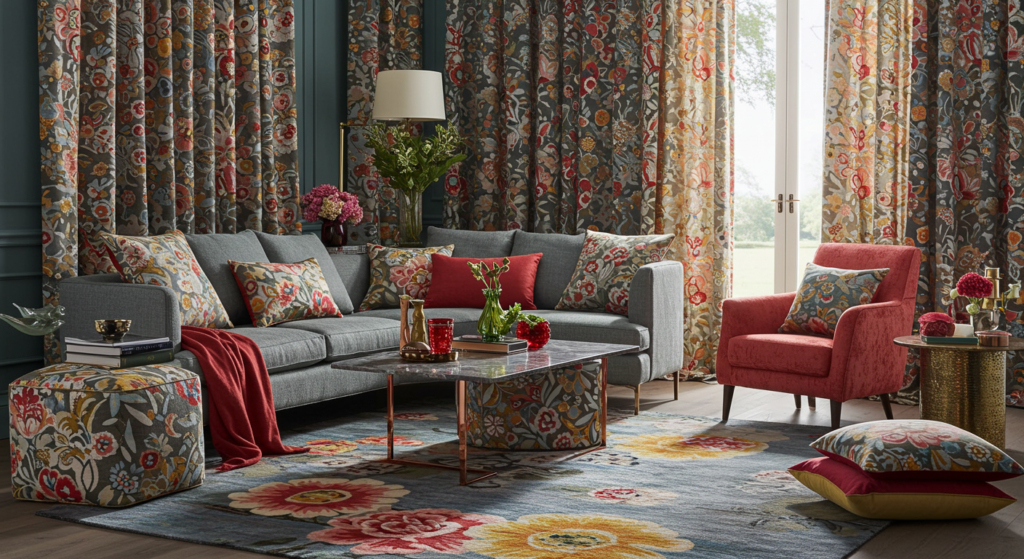
Are you a pattern lover? Patterns can add character, but combining them with bold colors takes finesse. Let’s see how to do it well.
Selecting Bold Patterns
Look for large-scale prints if you want a big statement. Florals or abstract geometrics often pair well with bright colors. Make sure you’re comfortable with the pattern’s energy.
- Stick to one large pattern in a room if you’re unsure.
- Combine smaller patterns, but keep them in the same color family.
Mixing Multiple Prints
If you like to mix prints, pick one color theme or a common thread. You could have big, bold stripes on pillows and small polka dots on a rug, but let them share a bright color palette so it feels cohesive.
- Vary the scale of the prints so they don’t compete.
- Break it up with some solid fabrics in between.
Practical Placement
Place patterned objects strategically. A bold patterned rug often becomes the focal point. Then place simpler items around it so the eyes can rest. Or focus on patterned curtains if your rug and furniture remain simpler.
- Keep patterns away from each other if they clash.
- Keep them near if they complement.
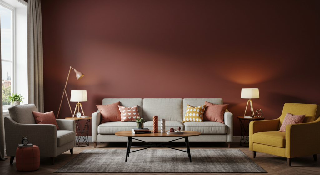
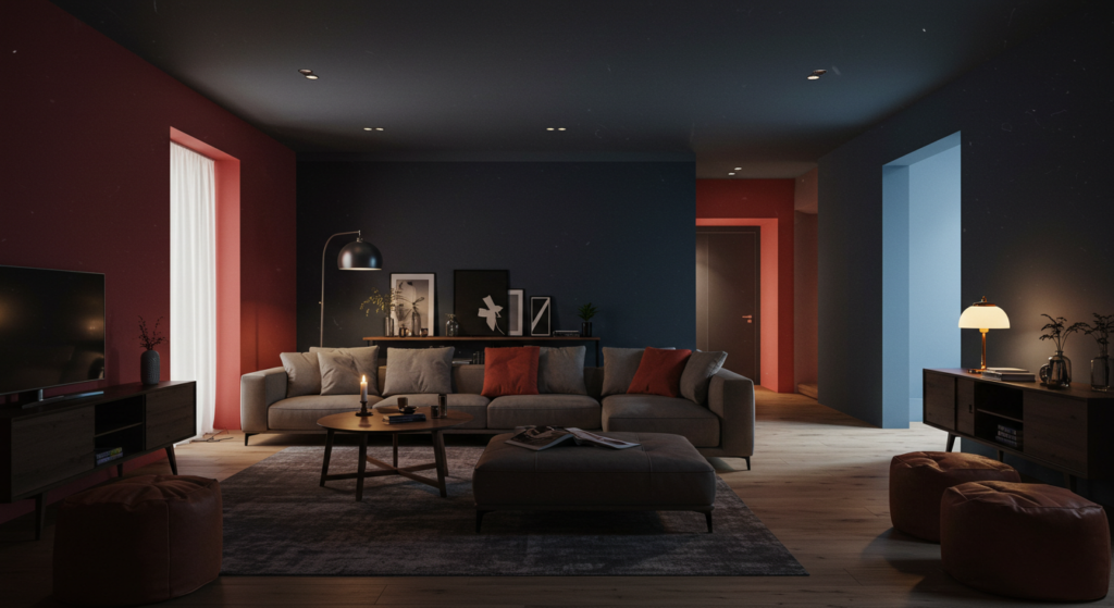
Lighting and Its Role in Showcasing Bold Hues

If you choose bright pink walls but rely on poor lighting, your color might look dull or weirdly tinted. Let’s unravel how to get the lighting right.
Natural Light vs. Artificial Light
Natural light changes throughout the day. In the morning, your bright purple might appear cooler. By late afternoon, it might read warmer. Meanwhile, artificial light’s effect depends on bulb type.
- LED bulbs often come in warm or cool versions.
- Halogen bulbs produce a warm glow that can soften neon tones.
Placement of Light Sources
Think about wall sconces or table lamps that highlight areas of bright color. If you have an accent wall, direct a spotlight or pendant lamp toward it. This draws eyes to the intended focal point.
- Keep reflectors or mirrors near your bright wall to bounce the color around.
- Spread out lighting to avoid harsh shadows.
Bulb Selection
Standard bulbs can skew color slightly, so test a few. Some people prefer daylight bulbs for consistent color, while others prefer warm bulbs for a cozy setting. The best approach is to bring home a few bulbs and see how your bright color changes under each.
- Label packaging usually indicates color temperature, measured in Kelvin.
- Low Kelvin numbers mean warmer light, and higher means cooler, bluish light.
Furniture and Upholstery in Vivid Shades

Picking bright furniture can be a big investment. Let’s consider some ways to ensure it stays stylish and doesn’t overwhelm your space.
Large Furniture Pieces
A bright yellow sofa or a cobalt blue chaise lounge can anchor your living room. But you’ll need to ensure other large pieces stay neutral or at least complementary.
- A bright sofa pairs well with white or neutral walls.
- Use accent pillows in patterns that tie in with the sofa color.
Smaller Seats and Chairs
If you’re worried about a huge block of color, experiment with smaller items. A pair of vibrant accent chairs in a monochrome living room might be all you need for a pop.
- Consider reupholstering thrifted chairs for a fresh color on a budget.
- Think about removable slipcovers if you get bored easily.
Care and Maintenance
Bright upholstery shows stains quickly. Opt for stain-resistant fabrics, and set a routine for cleaning or vacuuming. Spot-clean spills as soon as they happen to keep the color vibrant.
- Some performance fabrics resist spills better.
- Keep them out of direct sunlight if they’re prone to fading.
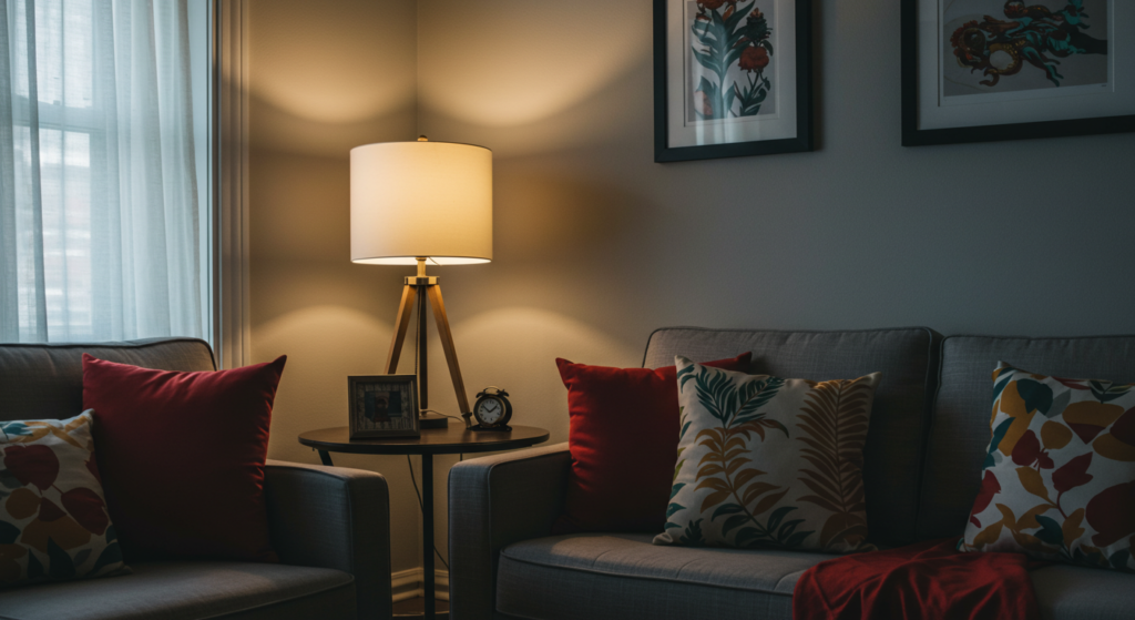
Coordinating Accessories and Artwork

Accessories tie a space together. Whether that’s a bold piece of art or a bright vase, these items unify your theme.
Picking Artwork for Bright Walls
When the walls are bright, your art can either blend or stand out. If the wall is bright red, a piece of black-and-white photography can provide contrast. Or pick a painting that includes a hint of your wall color so it looks cohesive.
- Try frames in neutral tones, like black or gold, if your wall color is very bold.
- Avoid mixing too many bright frames in one area.
Accessories that Complement
Scatter accessories in the same hue across the room. If your accent color is orange, place orange pillows, a small orange vase, or orange coasters around the room for continuity.
- Group accessories together in sets of three for a balanced look.
- Vary the sizes and shapes of these objects for interest.
Showcasing a Collection
Do you collect bright glassware or funky ceramic figurines? Display them in a clear cabinet or on floating shelves. The repeated color fosters a sense of unity, and the variety in shapes keeps it interesting.
- Light them up with under-shelf LED strips.
- Use a neutral backdrop so the collection stands out.
Using Bright Colors in Small Spaces
Sometimes, smaller spaces seem tricky. You don’t want them to feel cramped, but you also want a punch of color. Let’s see how bright shades can work in tight quarters.
Accent Walls in Narrow Rooms
In a narrow room, paint one of the shorter walls in a bold color. This can visually push the wall outward, making the space appear more balanced. Keep the other walls lighter.
- Consider a bright stripe or pattern if you dare.
- Mirrors on the opposite wall can stretch the space further.
Creative Storage Solutions
Use bright bins or shelves to add color without using up extra floor space. In a cramped office nook, bright organizers can give a lively spark.
- Label each bin with small tags to keep track of items.
- Choose plastic or metal bins that are easy to wipe clean.
Functional Decor
If you live in a tiny studio, your furniture might have to serve multiple roles. Pick pieces that add color and function. A bright ottoman with hidden storage or a foldable table in a vivid hue can serve well.
- Tuck away collapsible furnishings when not in use.
- Keep a consistent color scheme so the small space doesn’t feel chaotic.
Color Interplay in Open-Plan Layouts
Open-plan living merges kitchen, dining, and lounge areas. This can be wonderful or it can end up looking messy if the color scheme is all over the place.
Zoning with Color
Use distinct colors to define specific zones. A bright shade on the wall behind the dining table can mark that area. Meanwhile, a different accent color might highlight the living room zone.
- Rugs also help differentiate zones.
- Use color-coded accessories in each section.
Coordinating a Unified Look
While you can zone, you still want unity. To achieve that, choose one main bright color that reappears throughout the entire open space. Then let each zone have a secondary accent color or two.
- Keep a consistent neutral base for floors or major pieces.
- Repeat patterns, shapes, or textures to tie it all together.
Furniture Placement and Flow
In open layouts, you might rely on furniture placement to create a sense of flow. If you have a bold couch in the living area, reflect that color in a small accessory on your dining table, such as a vase or candle holder.
- Align major furniture pieces so they don’t interrupt walkways.
- Use open shelving to allow sight lines across zones.
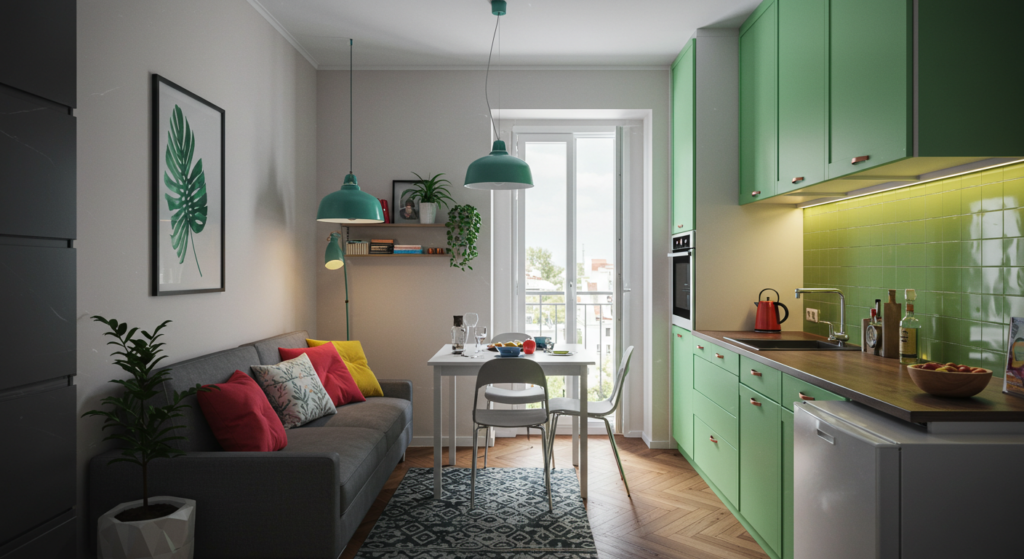
Kitchen and Dining Room Color Boost
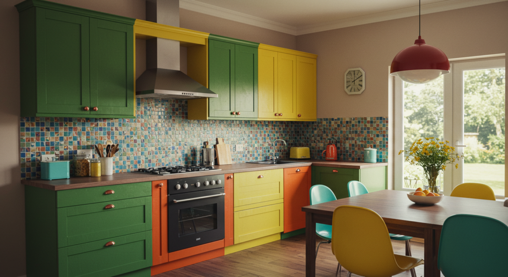
Kitchens don’t always have to be white and silver. A bright, colorful kitchen can spark joy when cooking or hosting.
Bright Cabinets
Paint your cabinets a bold hue, like electric turquoise or sunshine yellow. Pair them with neutral countertops or a white backsplash for contrast. Some prefer a two-tone approach, with the lower cabinets in a bright color and the upper ones in white.
- Cabinet fronts can be changed out if you get bored.
- Use hardware that matches or complements the new color.
Splashy Backsplashes
A bright backsplash can look phenomenal in an otherwise neutral kitchen. Think vibrant mosaic tiles or even a painted glass panel. It’s a smaller area, so you can take a bigger color risk.
- Clean with mild soap to protect the finish.
- Coordinate your dishware to tie the color scheme together.
Colorful Dining Chairs
Replace standard dining chairs with chairs in bright metal or painted wood. If you have an all-wood table, these chairs can inject color without a big paint job on the walls.
- Keep seat cushions comfortable and easy to wash.
- Mix up chair colors for a playful, eclectic look if you enjoy variety.
Outdoor and Patio Color Infusions

Don’t limit your color love to indoor spaces. Patios, decks, and even balconies can benefit from bright cushions, planters, or umbrellas.
Bold Patio Furniture
Try bright plastic or metal chairs. They’re usually weather-resistant and easy to clean. If your table is wooden, those chairs can contrast nicely while remaining functional.
- Metal chairs can be repainted when they fade.
- Colorful seat cushions or pillows can add extra comfort.
Eye-Catching Planters
Plants are naturally green, so choose planters in bright pink, yellow, or orange to create a vibrant setting. Place them in groups for impact.
- Make sure you have proper drainage in those planters.
- Arrange plants at varying heights for a dynamic look.
Painted Features
Paint a section of your fence or exterior wall in a bold shade if local regulations allow. This sets a fun backdrop for your outdoor seating area.
- Weatherproof paint prevents peeling.
- Match or complement your indoor color scheme if you want continuity.
Maintenance Tips for Bright Walls and Fabrics

Bold colors look amazing, but they also show wear and tear more quickly than subtle tones. Let’s explore how to keep them looking fresh.
Cleaning Painted Surfaces
Use a gentle cleanser or a damp cloth to remove marks. Harsh chemicals can dull or strip paint, so test in a hidden area first. A mild soapy solution often does the trick.
- Spot-clean scuffs right away to prevent permanent stains.
- Use a soft sponge or cloth to avoid scratching the paint.
Washing Bright Fabrics
Throw pillow covers or curtains can be washed in cold water with mild detergent. Hot water can cause fading. If you own bright rugs, vacuum them often and consider professional cleaning for tough stains.
- Air-dry whenever possible, as the dryer’s heat might fade the color.
- Check labels for care instructions, especially for delicate materials.
Touching Up Paint
Paint can fade or chip, especially in high-traffic areas. Keep a small container of leftover paint for quick touch-ups. Store it in a cool, dry place, sealed tight.
- Use a small brush for chips and cracks.
- Feather the edges of the new paint to blend with the old.
Conclusion
We’ve explored bold and beautiful color usage, from illusions that expand a tiny space to outdoor color schemes. Bright colors aren’t scary if you approach them with a plan.
Whether you paint an entire wall blazing red or choose a bright teal couch, the idea is to create a purposeful statement.
Color can serve as a tool. It changes how you experience your home every day, and it communicates your personal taste.
That’s pretty cool, right? By balancing vibrant hues with neutrals, mixing patterns with intention, and giving proper maintenance, you can enjoy bright, energizing decor that lasts.
So, what’s your next step? Maybe you’ll paint a single wall in a luscious shade, or maybe you’ll buy a new electric-blue armchair. The options abound, so have fun making your home bold and beautiful.
Summary Table
| Section | Main Idea | Actionable Tip |
|---|---|---|
| 1. Impact of Bold Colors | Colors can enlarge or cozy up a space | Choose cool bright hues to widen, warm to snug |
| 2. Complementary Pairings | Match bright opposites for striking balance | Use color wheels or examples (blue + orange) |
| 3. Incorporating in Different Styles | Bright colors fit modern, boho, and Scandi | Adjust the scale of color usage per style |
| 4. Focal Wall or Accent Items | Accent walls vs. colorful furniture or decor | Pick a key area to highlight |
| 5. Balancing Vibrancy with Neutrals | Avoid overwhelm by grounding bright colors | Use ratio methods (70-20-10) |
| 6. Patterns and Prints | Combine prints with bright hues carefully | Use one large print or multiple smaller ones |
| 7. Lighting’s Role | Proper lighting makes colors pop | Consider bulb temperature and placement |
| 8. Furniture and Upholstery | Bold furniture can anchor a space | Choose stain-resistant fabrics |
| 9. Coordinating Accessories & Artwork | Extend your color theme in smaller items | Repeat accent color in accessories |
| 10. Bright Colors in Small Spaces | Strategic walls and functional decor | Paint the short wall bright; use bright bins |
| 11. Color in Open-Plan Layouts | Zone areas or unify them with color | Keep a main accent color across all zones |
| 12. Kitchen & Dining Color Boost | Vibrant cabinets, backsplashes, chairs | Pair bright cabinets with neutral countertops |
| 13. Outdoor & Patio Color | Extend color fun to outdoors | Use bright furniture, planters, or painted walls |
| 14. Maintenance for Bright Items | Upkeep keeps bold shades looking fresh | Spot-clean & store leftover paint for touch-ups |
FAQ
Q1: Will bright colors make my small apartment look cramped?
A1: Not if you use them right. A bright accent wall can make a small room look more spacious. Choose cooler bright shades like aqua or pale neon green, and keep the other walls light. That helps enlarge the space visually.
Q2: What if I get bored with a bold color?
A2: Start with accent items or even a single wall. You can always repaint an accent wall or replace bright pillows. Larger pieces like bold couches can be reupholstered or covered with slipcovers if you crave a change.
Q3: How do I add bright color if I have neutral furniture?
A3: Incorporate bright accessories like throw blankets, pillows, or rugs. You can also paint a bookshelf or accent table in a bold color. Neutral furniture actually provides a perfect background for vibrant additions.
Q4: Are certain finishes better for bright paint?
A4: Satin or semi-gloss reflect more light, so the color might look a bit stronger. Matte finishes absorb light, creating a softer vibe. If you’re aiming for a lively focal point, a semi-gloss can help the hue stand out.
Q5: Can I mix multiple bright shades in one room?
A5: Sure, but keep it balanced. Use one main bright color and then sprinkle in one or two other brights as accents. Ground them with neutrals to avoid chaos. If you’re mixing big bright items, spread them out so each one has breathing room.
Hope that covers it all. Enjoy your bold and beautiful adventure! And forgive me if I spelled colur in a funny way once or thrice. It’s part of the creative charm. Go make something bright and inspiring!

Sam Goldman, with his intuitive grasp on the art of color selection, navigates the vibrant tapestry of fashion shades, ensuring each ensemble reflects the pulse of modern trends. His knack for crafting unique yet cohesive color combinations unravels the complexities of the fashion spectrum. Beyond being a mere sentinel, Sam’s dedication transforms every reader’s wardrobe journey into a harmonious blend of contemporary elegance and timeless allure. Dive into his writings and emerge with a refreshed perspective on fashion colors.
Reviewed By: Joanna Perez and Anna West
Edited By: Lenny Terra
Fact Checked By: Matthew Mansour
Photos Taken or Curated By: Matthew Mansour