Key Takeaways:
- Gallery walls transform empty spaces into personal art showcases
- Color coordination between art and room decor creates visual harmony
- Frame selection impacts how colors in artwork are perceived
- Balance between cohesion and contrast makes gallery walls dynamic
- Lighting dramatically affects how colors appear in displayed artwork
- Strategic placement based on color intensity guides the viewer’s eye
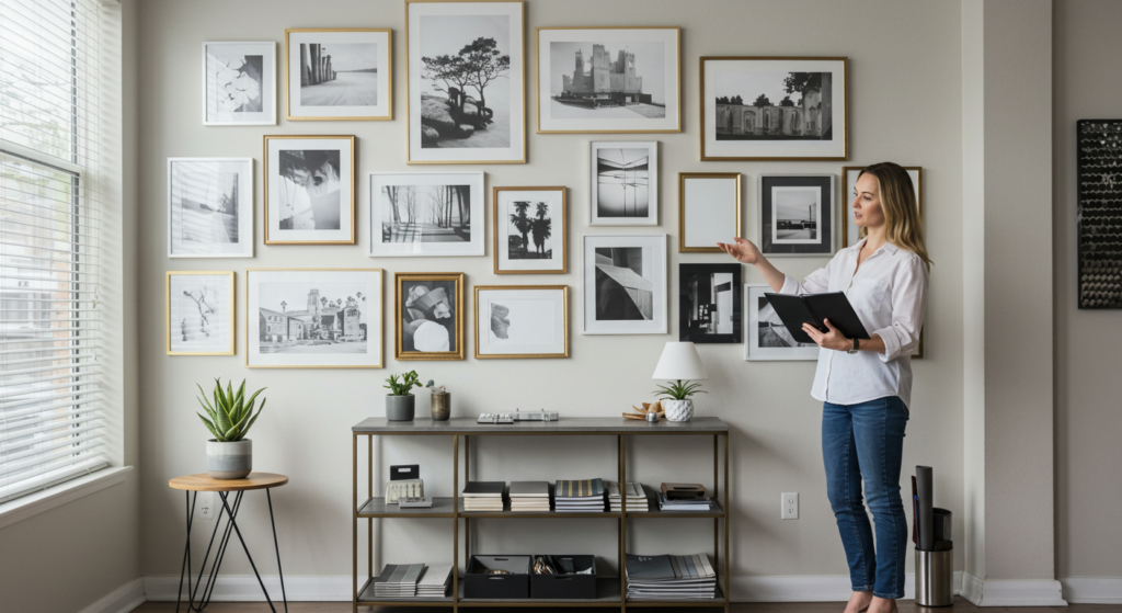
The Canvas of Your Home: Why Gallery Walls Matter
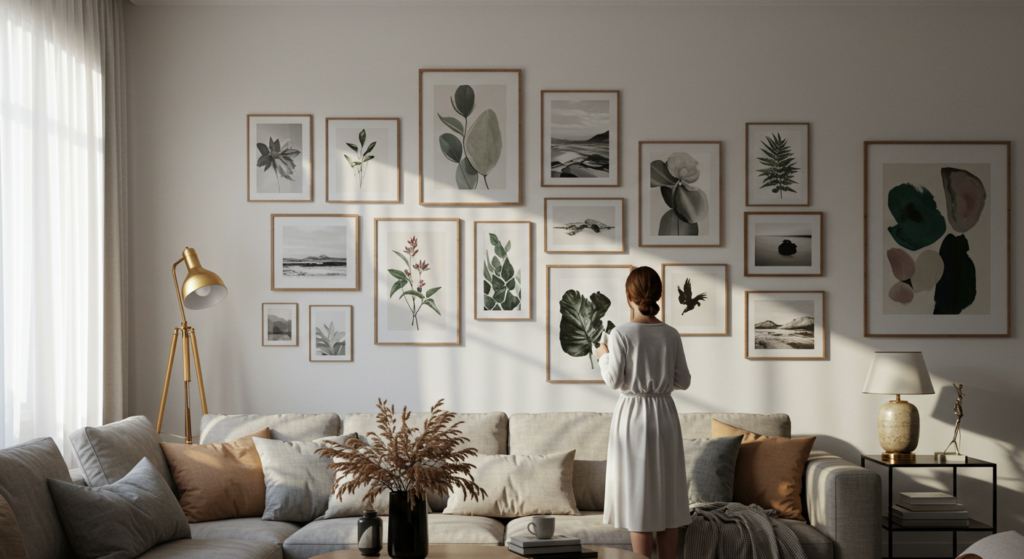
I stood there, coffee in hand, staring at that vast emptiness. The wall had waited patiently for two years – blank, unadorned, full of possibility. How many mornings had I gazed upon it, imagining frames and colors breathing life into its surface? Gallery walls aren’t just arrangements of pictures; they’re visual heartbeats pulsing through our living spaces.
Creating a gallery wall transforms a home from a space where you simply exist to a place that exists within you. When done right, these collections become more than decorative elements – they’re portals into your personal aesthetic, storytellers that whisper your tastes to visitors without speaking a word.
But where to begin? How do the colors in your art interact with your space? Which frames enhance and which distract? The questions multiply like paint droplets splashing across canvas.
This guide walks you through the intricate dance of color, composition, and curation that makes gallery walls sing. Whether you’re showcasing family photos, vintage prints, or modern art, you’ll discover how color becomes the thread that weaves these elements into a cohesive tapestry on your wall.
Finding Your Color Story: Beyond Matching and Coordination
The Art of Color Conversation
Gallery walls speak a language – one where blues might whisper to greens across frames, where warm tones argue pleasantly with cool ones. Your wall doesn’t need perfect matching; it needs conversation.
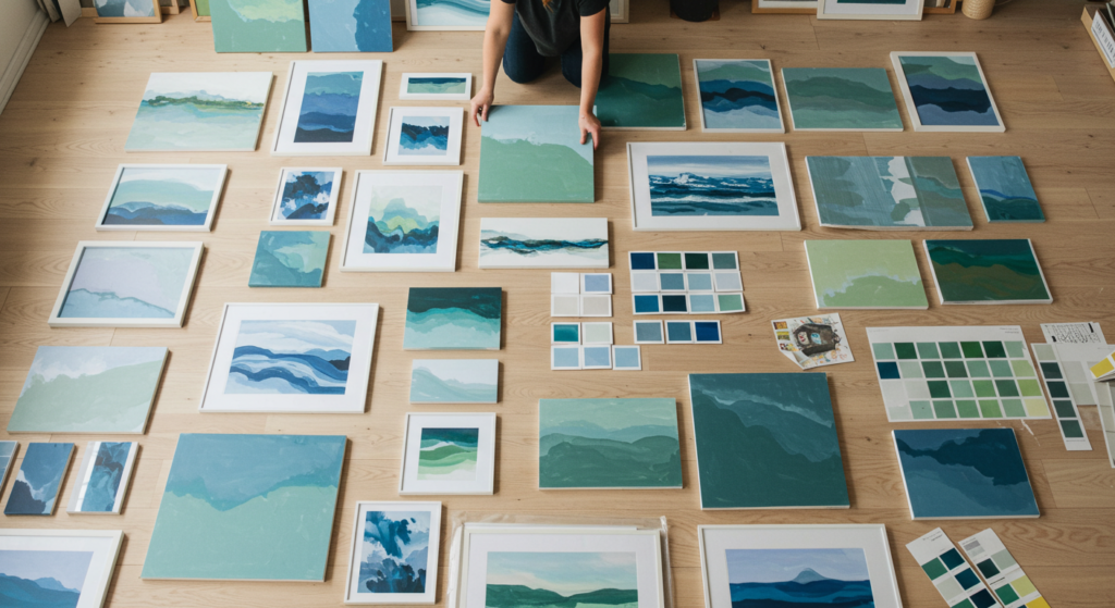
Start by laying all potential artwork on the floor. Step back. What colors jump out? Which pieces speak to each other? Maybe that abstract watercolor with splashes of coral complements the burnt orange in your landscape photo. Perhaps the muted blues in your vintage map play nicely with the navy accents in your child’s drawing.
Don’t search for perfection – search for relationship. The most captivating gallery walls contain pieces that acknowledge each other through shared color notes, like old friends reconnecting across a crowded room.
Color Anchoring: Finding Your Dominant Hues
What story does your space already tell? Your wall color, furniture, and decor establish a foundation. The gallery wall should respond to this narrative, not fight against it.
Is your room awash in neutrals? Consider art with pops of bold color to create focal points. Does your furniture feature rich jewel tones? Look for artwork with complementary or analogous colors to enhance that richness.
Choose 2-3 dominant colors that will appear throughout your gallery. These anchors create visual pathways, guiding eyes across your composition and making disparate pieces feel intentional rather than random.
Beyond the Obvious: Unexpected Color Complements
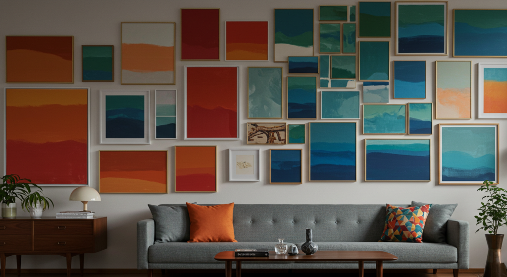
Some of the most striking gallery walls break conventional color rules. Navy blue and mustard yellow. Emerald green and coral. Deep burgundy and pale turquoise.
Try this: select one unexpected color pairing and incorporate both hues across several pieces. This creates tension and energy while maintaining coherence. Your gallery wall should make viewers pause, not instantly understand everything they’re seeing.
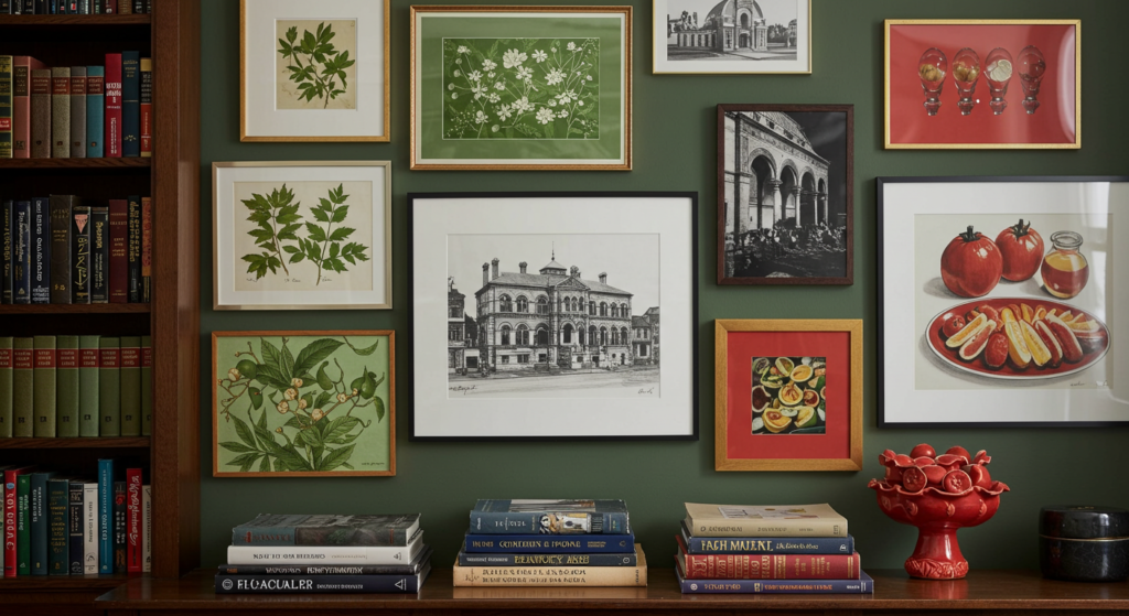
Frame Selection: How Borders Transform Color Perception
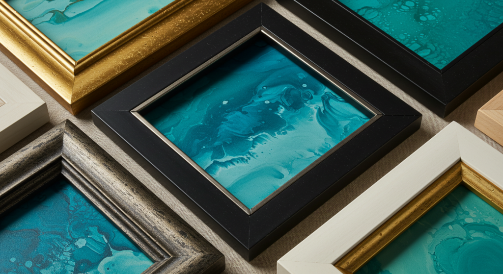
Material Matters: Wood, Metal, and Color Interaction
Frames aren’t just borders – they’re color amplifiers. A warm maple frame intensifies blues and purples within artwork. Black metal frames make yellows and oranges appear more vibrant through contrast.
Mix frame materials based on how they interact with your art’s color palette. Wood brings warmth; metal adds coolness; white creates breathing space. Each choice shifts how viewers perceive the colors within.
For a collection of black and white photographs, try copper or brass frames to introduce warmth without competing with the monochromatic images. For vibrant abstract pieces, consider thin black frames that contain the color explosion without diminishing its impact.
Width and Weight: How Frame Size Affects Color Focus
Thick frames command attention and can either strengthen or subdue colors within. Thin frames let artwork breathe, allowing colors to extend their influence into surrounding space.
For pieces where color is the star – vibrant abstracts or bold graphics – consider minimalist frames that don’t compete. For subtler works with delicate color palettes, wider frames can provide a sturdy foundation that helps those gentle hues stand their ground.
To Mat or Not to Mat: Color Breathing Room
Mats create breathing space between frame and image, affecting how colors are perceived. White mats make colors appear crisper and more saturated. Colored mats can pull out subtle hues within artwork that might otherwise go unnoticed.
Try this unexpected approach: choose a colored mat that picks up a minor accent color in your artwork. If your watercolor landscape has tiny touches of lavender in the distance, a pale lavender mat makes those subtle notes sing without overwhelming.
Composition Strategies: Arranging Art by Color
Color Clustering: Creating Visual Islands
Instead of distributing colors evenly, try clustering similar hues in sections of your gallery wall. Perhaps blues and greens gather in one corner, while reds and oranges congregate in another. This creates a subtle gradient effect across your wall.
Color clustering guides the viewer’s eye on a journey, creating distinct moments within the larger composition. These visual “islands” make large gallery walls feel intentional rather than chaotic.
The Color Path: Leading the Eye
Strategically place pieces with similar colors to create pathways through your gallery wall. Maybe that streak of yellow appears in the upper left piece, then midway down in another frame, then again in the bottom right. This creates movement and flow.
Think of color as a breadcrumb trail guiding visitors through your curation. Each piece becomes a stepping stone in a visual journey rather than an isolated element.
Punctuation with Color: The Power of Contrast
Every gallery wall needs moments that pop – pieces that break pattern and demand attention. These color “punctuation marks” prevent your composition from feeling too predictable.
If your collection skews mostly cool-toned, introduce one vibrant red or orange piece. If you’re working with mostly neutral artwork, add something with unexpected electric blue or vivid purple. These contrast pieces should be strategically placed – usually at the visual center or slightly off-center – to create balance without symmetry.
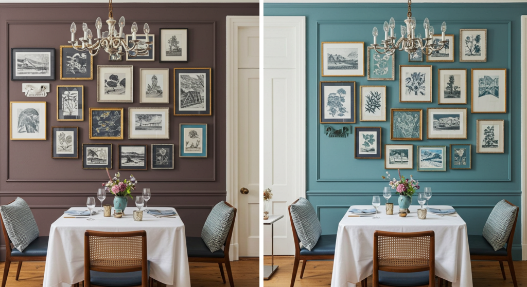
Background Matters: Wall Color and Its Influence on Art
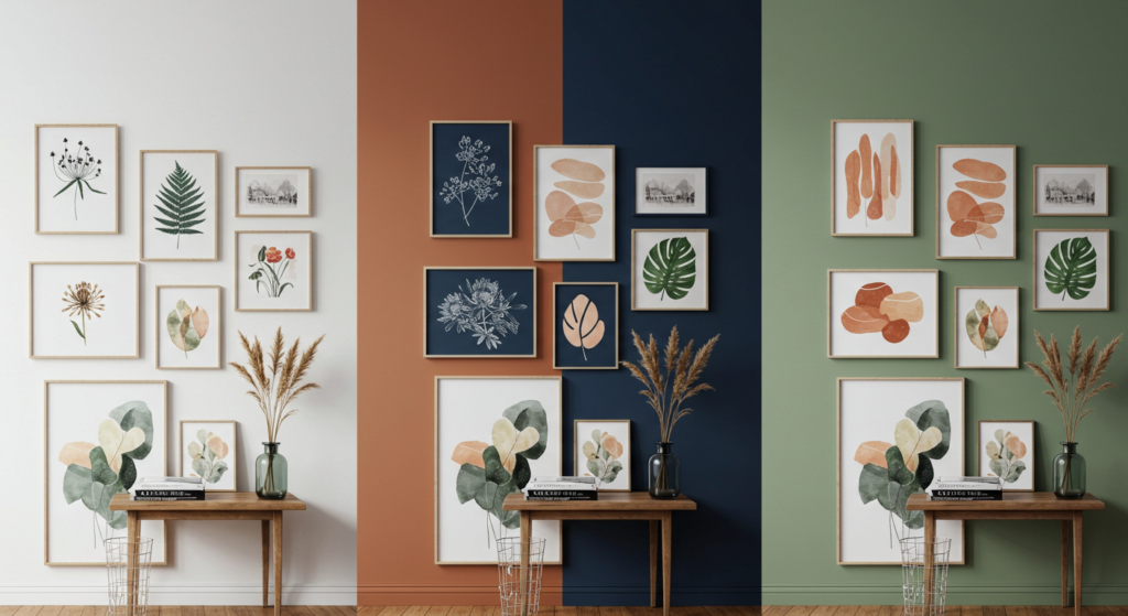
The Neutral Debate: White, Gray, and Beige Backdrops
White walls create a gallery-like setting where colors in artwork stand at full attention. But not all whites are created equal – warm whites (with yellow undertones) make blues and greens recede while amplifying reds and oranges. Cool whites (with blue undertones) do the opposite.
Gray walls temper bright colors, adding sophistication but potentially dampening vibrancy. Light beige backgrounds warm everything, making cool-toned art feel more approachable.
Consider your art collection’s dominant color palette when choosing wall color. If your artwork features mostly vibrant, saturated colors, a crisp white or light gray provides necessary breathing room. If your collection contains more muted or antique pieces, warm neutrals enhance rather than compete.
Bold Wall Colors: When to Embrace the Drama
Dark or colorful walls create dramatic backdrops that transform how art is perceived. Navy walls make yellows and oranges advance dramatically while causing blues to blend seamlessly into the background. Forest green walls lend a rich, historic feel to gold frames and warm-toned art.
If you’re brave enough for a colored backdrop, choose a wall color that complements the majority of your collection while creating striking contrast with select standout pieces. The key is balance – your wall color should be a supporting actor, not the star of the show.
Creating Color Zones: Partial Paint Treatments
Who says your gallery wall needs a single-colored backdrop? Consider color blocking – painting the lower portion of your wall in one color and leaving the top in a complementary or neutral shade. This creates distinct zones that can inform your art arrangement.
Try clustering pieces with cooler tones against the cooler portion of your wall, with warmer pieces transitioning into the warmer section. This creates intentional visual flow while making your gallery wall feel integrated with the broader architecture.
Lighting and Color: How Illumination Changes Everything
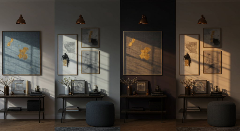
Natural Light and Its Color-Shifting Powers
North-facing rooms receive consistent, cool light that flatters blues and greens but may make reds and yellows appear slightly muted. South-facing spaces get warm, direct light that enhances warm colors but might wash out delicate cool tones.
Map your room’s light patterns throughout the day before finalizing your gallery arrangement. Pieces with subtle color variations deserve spots with consistent lighting, while high-contrast art can handle more dramatic light shifts.
Remember: that perfect arrangement you crafted at 10 AM might look completely different at sunset. Live with temporary placements through different lighting conditions before committing.
Artificial Lighting: Selecting the Right Color Temperature
Lighting temperature dramatically impacts how colors appear. Standard incandescent bulbs cast a yellowish glow that warms everything. LED bulbs come in various temperatures – 2700K feels warm and intimate, while 5000K mimics daylight but can feel clinical.
For most gallery walls, bulbs between 2700K-3000K provide enough warmth to create coziness without significantly distorting colors. If your collection features primarily cool tones, consider slightly higher temperatures (3500K) to maintain their crispness.
Directional Light: Spotlighting and Shadow Play
Strategic lighting doesn’t just illuminate – it transforms. Picture lights mounted above key pieces create focused attention. Track lighting offers flexibility to highlight different areas of your gallery wall.
Consider how shadows interact with your composition. Directional lighting creates dimension, especially with textured pieces or those that incorporate metallic elements that shift with changing light. This shadow play adds another layer of visual interest beyond color alone.
Mixing Mediums: How Different Art Forms Affect Color Perception
Photography and Prints: Managing Color Reproduction
Photographs and prints present unique color considerations. Digital prints typically offer vibrant, saturated colors that can overwhelm more subtle handmade pieces. Vintage photographs might have sepia tones or faded qualities that create interesting tension with contemporary colored pieces.
Balance is key – intersperse bright, saturated prints with more muted pieces to create visual rhythm. Consider black and white photography as a “palette cleanser” between color-intensive groupings.
Paintings and Texture: Dimension Beyond Color
Original paintings bring texture that affects how we perceive color. Thick impasto oil paintings catch light differently than watercolors, creating micro-shadows that add depth and variation even within a single hue.
When incorporating paintings, consider how their textural qualities interact with flatter pieces. Sometimes the most interesting color stories emerge from the contrast between a richly textured oil painting in muted colors positioned beside a flat, vibrant print.
Three-Dimensional Elements: Breaking the Plane
Gallery walls don’t have to be flat. Incorporating small sculptures, textile art, or dimensional objects adds unexpected color moments that literally pop from the wall.
These three-dimensional elements create their own shadows and light interactions, adding complexity to your color story. A small ceramic piece might cast subtle colored shadows onto the wall behind it. A woven textile might filter light through its structure, creating colorful dappled effects.
Scale and Color: Size Relationships That Enhance Visual Impact
Color Weight: How Hues Affect Perceived Size
Colors carry visual weight. Deep blues and purples feel “heavier” than pale yellows and pinks. Large pieces in visually heavy colors can anchor a gallery wall, while smaller pieces in lighter hues create breathing room.
Distribute color weight intentionally. If your focal piece features intense, saturated color, surround it with pieces in lighter or more neutral tones to prevent visual overwhelm. Conversely, a large piece in subtle colors might need smaller, more vibrant companions to create energy.
Tiny but Mighty: Small Pieces with Bold Color Impact
Small artwork in vibrant colors punches above its weight class. A tiny 5×5 piece in electric blue might draw more attention than a large piece in muted tones.
Strategically place these small color bombs to create unexpected moments within your composition. They’re particularly effective as connecting elements between larger pieces or as visual punctuation at the edges of your arrangement.
Oversized Art: Managing Dominant Color Presence
Oversized pieces create dramatic color statements that can either unify or overwhelm a gallery wall. When incorporating a large, colorful piece, ensure it doesn’t monopolize attention by creating intentional echoes of its key colors in surrounding smaller works.
If your focal piece contains multiple colors, select smaller works that pick up individual hues from the larger piece. This creates a color conversation that integrates rather than isolates your statement piece.
Seasonal Adjustments: Refreshing Your Gallery Wall’s Color Story
Winter to Summer: Color Temperature Shifts
Our color preferences naturally shift with seasons. Winter calls for deeper, richer tones that create coziness; summer invites lighter, brighter hues that feel fresh and airy.
Create a core gallery arrangement that stays consistent, but rotate select pieces seasonally. Replace a few darker, moodier works with lighter alternatives when spring arrives. Swap out cool blues and greens for warmer oranges and golds when fall approaches.
Holiday Integration: Temporary Color Moments
Special occasions offer opportunities for playful, temporary color adjustments. December might invite the addition of rich reds or metallics; spring celebrations might incorporate fresh pastels.
Rather than completely redesigning your gallery wall, consider having a few “flexible” spots where seasonal pieces can rotate in without disrupting your overall composition. These thoughtful adjustments keep your space feeling current without requiring complete overhauls.
Trend Responsiveness: Incorporating New Color Directions
Design trends offer fresh color inspiration. While chasing every trend creates visual whiplash, selectively incorporating new color directions keeps your space feeling current.
If this year’s design world is celebrating terracotta and olive green, you might add 1-2 new pieces in these tones rather than completely redoing your gallery wall. Think evolution, not revolution.
Color Cohesion: Unifying Diverse Collections
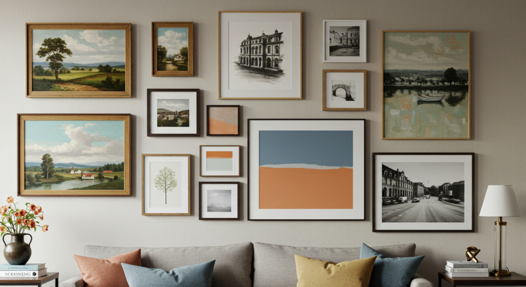
The Common Thread: Finding Shared Color Elements
Even the most eclectic art collections can find unity through color. Examine your diverse pieces for common color threads – perhaps that vintage oil painting shares the same deep blue as your modern abstract print.
Identify these shared color moments and emphasize them through placement. Position pieces with common colors near each other to create subtle linkages that make even disparate styles feel connected.
The Color Edit: When to Leave Pieces Out
Sometimes creating a cohesive gallery wall means making tough choices. That piece you love might fight with everything else because its color palette is completely disconnected.
Be selective. Not everything needs to be displayed at once. Create a rotation system for pieces that don’t immediately fit your color story, allowing your gallery wall to evolve over time while maintaining visual harmony in each iteration.
Framing for Unity: Using Frame Color as a Connector
When artwork lacks natural color connections, frames can create unity. Choosing similar frame colors or materials for pieces with wildly different palettes builds visual bridges between disparate works.
Consider using the same frame style for pieces that otherwise have little in common. This creates an instant collection feel even when individual pieces vary dramatically in style, content, and color palette.
Room Continuity: Connecting Your Gallery Wall to Your Space
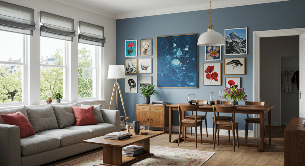
Pulling Room Colors into Your Gallery Selections
Your gallery wall shouldn’t exist in isolation. Look around your room – what colors already live there? The blue in your sofa, the green in your plants, the warm wood tones of your furniture.
Select artwork that references these existing colors to create continuity. This doesn’t mean matching exactly; rather, look for artworks that acknowledge your room’s color palette through complementary or analogous relationships.
Creating Color Echoes Across the Room
Strategic color repetition creates visual rhythm throughout a space. If your gallery wall features a distinctive mustard yellow accent, echo that same yellow in a throw pillow or vase across the room.
These color connections create a subtle sense of intention that makes spaces feel thoughtfully designed rather than randomly assembled. They guide the eye around the room, creating a complete experience rather than isolated moments.
The Bridge Piece: Transitional Art That Connects Zones
In open floor plans, gallery walls can help define transitions between functional areas. Select pieces that incorporate colors from both adjacent spaces to create smooth visual flow.
If your dining area features deep greens while your living space uses warm neutrals, the gallery wall between them might include pieces that thoughtfully blend these palettes, creating a gradient effect that eases the transition.
Statement vs. Subtlety: When to Let Color Shout
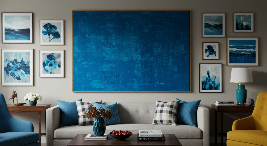
The Focal Moment: Creating Color Hierarchy
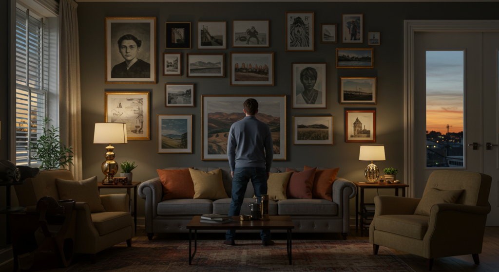
Every compelling gallery wall needs a hero – a piece that commands attention through size, position, or color intensity. This focal point anchors your composition and gives viewers an entry point.
Choose artwork with strong color presence for this role. Position it slightly off-center (perfect centering often feels static) at approximately eye level. Surrounding pieces should support rather than compete with this focal moment.
Background Players: Supporting Art in Complementary Hues
Not every piece needs to scream for attention. Supporting artwork in complementary or analogous colors creates depth and context for your statement pieces.
These background players often work best in smaller sizes or with more subtle color palettes. They create breathing room while maintaining color connection to your more dominant works.
The Power of Neutrals: Creating Color Breathing Space
Strategic use of black and white or neutral-toned pieces prevents color overwhelm. These works provide visual rest within your composition, allowing colorful pieces to shine more brilliantly.
Distribute neutrals thoughtfully throughout your arrangement, using them as buffer zones between more intensely colored works. This creates rhythm and prevents visual fatigue for viewers.
Color and Content: When Subject Matter Influences Palette Choices
Theme-Based Color Stories: Unifying Through Subject
Sometimes content can drive color cohesion. A collection of botanical prints naturally shares a green-dominated palette. Beach scenes typically feature blues and sandy neutrals.
Grouping artwork by theme often creates natural color harmony. Consider creating mini-collections within your larger gallery wall – perhaps a cluster of food-related pieces with warm, rich colors or a grouping of architectural prints in monochromatic tones.
Emotional Color Mapping: Creating Mood Zones
Colors evoke feelings. Cool blues and greens typically feel calming; warm reds and oranges energize. Consider the emotional impact of different sections of your gallery wall.
Map these emotional zones intentionally within your space. Perhaps the gallery wall section near your reading nook features artwork with calming cool tones, while the area near your dining space showcases pieces with warm, convivial colors.
Narrative Through Color: Telling Stories With Hue Progression
Your gallery wall can tell stories through deliberate color progression. Perhaps it begins with darker, more mysterious pieces that gradually transition to lighter, more open works – mimicking a journey from darkness to light.
These narrative color choices add depth for viewers who engage longer with your wall. The initial impression might be simply “beautiful arrangement,” but those who linger discover the intentional color story you’ve crafted.
Installation Strategies: Technical Aspects of Color Display
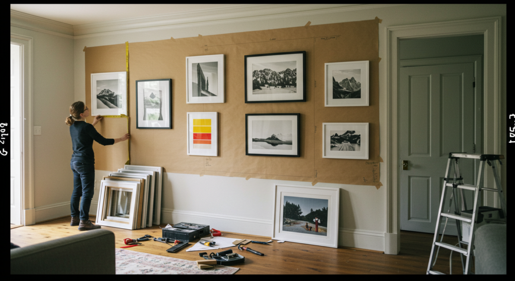
Testing Before Committing: The Paper Template Method
Before hammering a single nail, trace each frame onto kraft paper and cut out templates. Use painter’s tape to position these on your wall, allowing you to experiment with arrangements without commitment.
These templates let you live with your potential arrangement for days, observing how colors interact in different lighting conditions and from various viewpoints. Make notes directly on the templates about adjustment ideas as you observe.
Beyond the Grid: Organic Arrangements Based on Color Flow
Grid arrangements offer clean simplicity, but organic layouts allow more nuanced color storytelling. Start with your anchor piece(s) and build outward, allowing color relationships to guide placement.
Consider creating color pathways that lead the eye through your composition. Perhaps a touch of red appears in the upper corner, then again midway through the arrangement, then once more near the bottom – creating a subtle diagonal color thread.
Spacing and Color Intensity: Adjusting Breathing Room
Highly saturated, intense colors often benefit from more breathing space – the white wall between frames allowing each piece to assert itself without competition. More subtle, harmonious pieces can be hung closer together, creating gentle color transitions.
Vary your spacing based on color intensity. Allow 2-3 inches between frames with bold, vibrant colors. Pieces with similar or complementary palettes can hang just 1-2 inches apart, creating tighter groupings within your larger arrangement.
Summary Table: Color Strategies for Gallery Walls
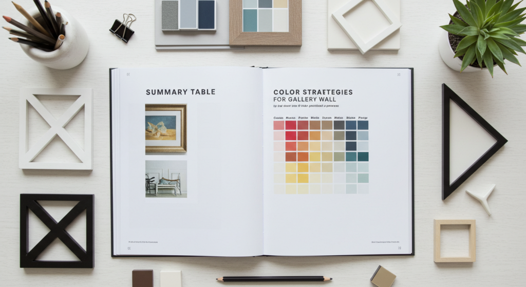
| Approach | Best For | Considerations |
|---|---|---|
| Monochromatic | Creating sophisticated, cohesive look | Vary shades and textures to prevent flatness |
| Complementary Colors | High-energy, vibrant displays | Balance with neutrals to prevent visual fatigue |
| Analogous Colors | Harmonious, flowing arrangements | Add contrast piece for visual interest |
| Color Blocking | Bold, contemporary statements | Maintain some connecting elements between blocks |
| Neutral with Color Pops | Versatile, adaptable displays | Position color pops strategically for balance |
| Frame Color Unification | Eclectic art collections | Choose frame finish that enhances rather than competes |
| Seasonal Color Rotation | Adaptable, evolving spaces | Create “flexible zones” for rotating pieces |
| Room Color Integration | Holistic, designed environments | Avoid exact matching in favor of complementary tones |
Conclusion: Your Wall, Your Color Story
A gallery wall isn’t just decoration – it’s a visual autobiography told through color, composition, and curation. The choices you make – which blues speak to which greens, how that splash of yellow creates unexpected joy – reveal something essential about how you see the world.
Remember that gallery walls evolve. The arrangement you create today isn’t permanent sculpture but living expression that can shift as your collection grows and your color preferences evolve. Give yourself permission to experiment, rearrange, and discover new connections.
The most successful gallery walls balance intention with intuition. They follow enough principles to feel cohesive but break enough rules to feel personally authentic. Your wall should feel simultaneously thoughtful and effortless – a carefully composed space that nonetheless appears to have assembled itself naturally from the colors and images that matter most to you.
As you step back from your completed wall, pay attention to how it makes you feel. Beyond all technical considerations of color theory and composition lies the most important question: Does this arrangement bring you joy when you look at it? If so, you’ve created not just a gallery wall, but a color story worth living with.
FAQ: Gallery Walls and Color
How many colors should I include in my gallery wall?
While there’s no strict limit, most successful gallery walls feature 3-5 primary colors with variations in shade and intensity. Too many unrelated colors can feel chaotic; too few might appear flat. Consider choosing one dominant color, two supporting colors, and perhaps one accent for visual punch.
Should my frames all be the same color?
Not necessarily. Mixed frame colors can work beautifully when approached thoughtfully. Consider choosing 2-3 frame finishes that complement your artwork and room decor. Alternatively, unified frames create cohesion when displaying very diverse art styles or colors.
How do I incorporate black and white art into a colorful gallery wall?
Black and white pieces provide excellent visual rest within colorful displays. Distribute them evenly throughout your arrangement rather than clustering them together. Consider frames that pick up colors from nearby colored pieces to integrate them seamlessly.
My room has colored walls. Should I stick to neutral art?
Colored walls can actually support either approach. A gallery wall in complementary or analogous hues creates sophisticated harmony with your wall color. Alternatively, neutral art with strategic color pops can stand out dramatically against a colored backdrop.
How do I prevent my gallery wall from looking too busy or overwhelming?
Balance is key. Intersperse high-energy, colorful pieces with more subdued works. Incorporate adequate negative space between frames. Consider including a few larger pieces to anchor smaller ones, and distribute colors evenly rather than concentrating them in one area.
Should my gallery wall match my furniture?
“Match” is too strong – “converse with” is better. Look for artwork that acknowledges your furniture’s color palette through either complementary or analogous relationships. This creates thoughtful connection without being predictably matched.
How do I create a cohesive look with art I’ve collected over time?
Frame selection can unify diverse collections. Consider reframing some pieces for greater cohesion. Look for subtle color connections between disparate works and emphasize these through placement. Sometimes editing is necessary – not every piece needs to be displayed simultaneously.
Can I mix different art mediums in one gallery wall?
Absolutely! Mixing photographs, paintings, prints and even three-dimensional elements creates textural interest. The key is finding color connections that thread through these different mediums, creating visual conversation between disparate pieces.

Marcella Raskin is a talented writer and editor with a deep passion for the dynamic realm of clothing colors and patterns. Armed with a strong background in Journalism, she crafts engaging content that empowers readers to select the perfect shades for their outfits. Her pieces provide an in-depth exploration of color trends and expertly curated fashion advice. Beyond her work, Marcella loves discovering new places, connecting with local designers, and advocating for sustainable fashion choices. She is devoted to helping individuals make enlightened color choices for their attire.
Reviewed By: Joanna Perez and Anna West
Edited By: Lenny Terra
Fact Checked By: Matthew Mansour
Photos Taken or Curated By: Matthew Mansour