Key Takeaways
- Experiment with contrasts rather than sticking to predictable outfits.
- Neutrals provide a solid base, helping other colors shine.
- Texture and fabric weight matter just as much as hue.
- Layering with metallic or bold accessories elevates even the simplest ensemble.
- Out-of-the-box approaches to color can refresh your wardrobe instantly.
Color has a way of capturing attention and shaping our style choices. It’s not just about wearing something bright or coordinating a pair of shoes with a belt. In modern fashion, color serves as an integral tool that can influence how we piece together our outfits, think about our closets, and present ourselves to the world.
When we talk about “color psychology” in the context of style, we often imagine the standard associations of red with energy, blue with tranquility, or green with nature. But there’s a world beyond these familiar tropes. This article will explore how color truly influences style choices through practical techniques, pairing ideas, and real-life examples that step outside the typical rules. The goal here is to move away from standard color clichés and delve into the nuances of combining hues, patterns, and textures in your everyday looks.
In the sections below, you’ll find comprehensive discussions on how to coordinate colors with subtlety or boldness, how to pick the right undertones, and how to use accessories as powerful style allies. Whether you’re revamping your closet or simply looking for fresh inspiration, these fourteen sections—and their subsections—are designed to guide you. By the end, you’ll have a deep toolkit for harmonizing shades, patterns, and textures in an exciting, fashion-forward way.
The Art of Subtle Contrasts

The Power of Subtlety
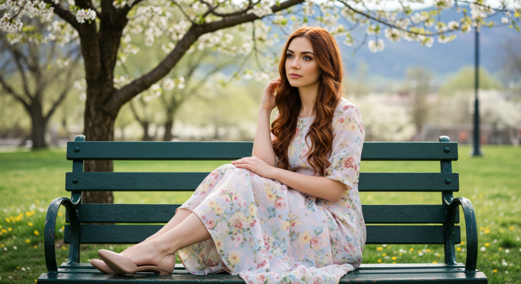
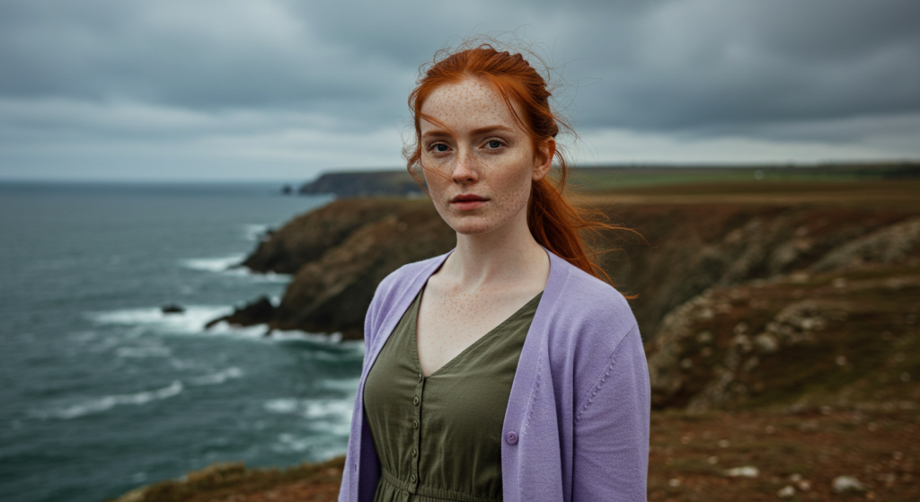
A subtle contrast happens when two colors live next to each other in an outfit without overpowering the overall look. Instead of jumping straight to a high-contrast combination like black and white, you might blend soft grays with ivory, dusty rose with a gentle lavender, or a faded beige with an understated olive. These low-key contrasts create a sense of harmony while still letting each color stand out in its own way.
When choosing a subtle contrast, think about undertones. Beige that leans slightly toward pink pairs differently than beige leaning toward tan. Undertones ensure your outfit looks purposeful, even when the color difference appears minimal at first glance. Subtle contrasts can also help layer different pieces without the final look feeling too “busy.” Think of it like matching piano keys that are close in pitch: the music flows, but there’s still an interplay that keeps it interesting.
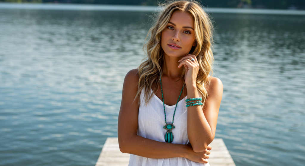
Accessorizing with Gentle Tones
Accessories can make or break a subtle outfit. If you’re working with subdued colors like soft blues, muted browns, or gentle creams, opt for accessories that reflect or slightly contrast those tones. For instance, if your outfit features dusty greens, a warm beige belt can bring out the earthy undertones without clashing. Alternatively, a metallic watch in rose gold can provide a quiet lift to a pastel ensemble.
Scarves, lightweight cardigans, and minimalist jewelry are perfect bridging pieces when you’re aiming for subtle contrasts. They can insert a fresh shade that maintains the overall quiet vibe. A scarf in a delicate peach, for example, could bridge a charcoal top and a pale pink skirt, letting the colors flow.
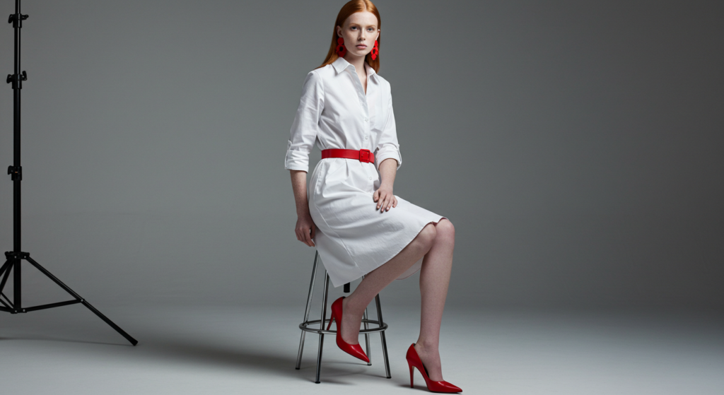
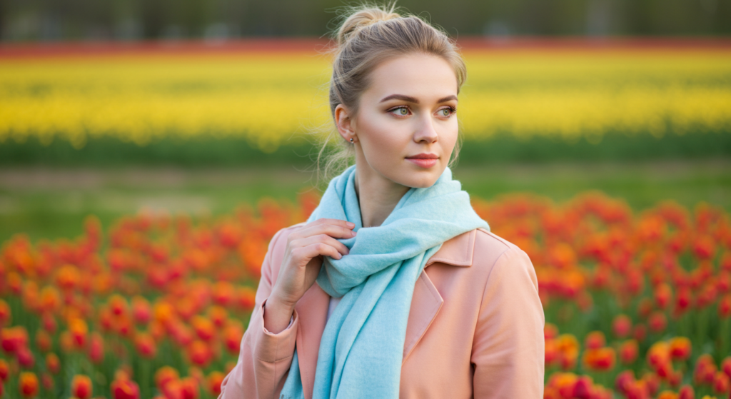
Pairing Pastels with Darks
One of the most visually striking ways to create a subtle contrast is to pair pastels with darker hues. Picture a baby-blue sweater under a navy blazer or a soft blush tee with a deep brown skirt. Pastels bring brightness, while the darks add depth. The result is a balanced and curated look that feels modern.
To pull this off seamlessly, keep your fabrics seasonally and stylistically aligned. A lightweight pastel sweater pairs well with a heavier, structured coat for a fall or winter statement. In warmer months, a pastel linen shirt paired with a darker cotton trouser provides a breezy, refined touch. Just be mindful of the accessories—keep them either in the same color family or choose neutrals that won’t disrupt the flow.
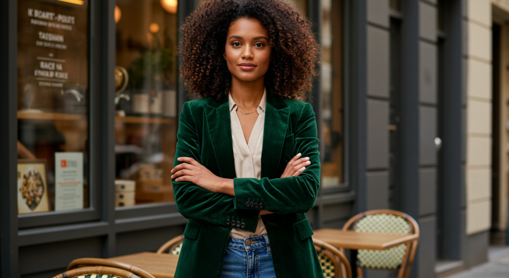
Balancing Bold Hues
Embracing Vibrancy
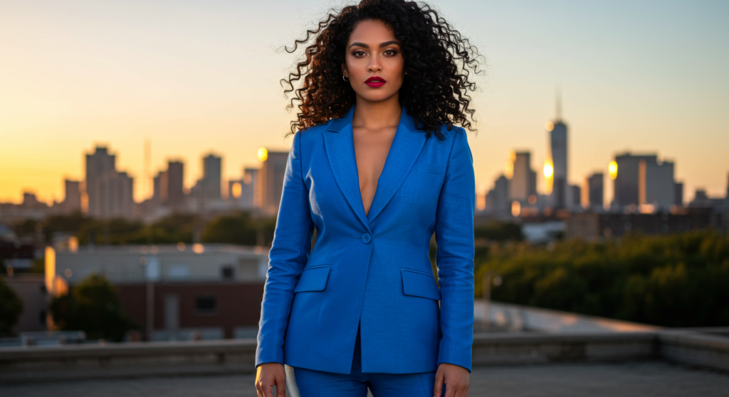
It’s thrilling to incorporate a bold color into your outfit. Vibrant shades like electric blue, fiery red, or sunburst yellow can instantly become the star of your look. To make these colors more wearable, start by using them on a single piece—maybe a statement blazer or a pair of vividly colored shoes. This focal point draws attention without dominating every aspect of your ensemble.
For those new to wearing bold hues, consider one vibrant piece paired with neutral basics. For example, an emerald-green skirt can pop against a white blouse and tan pumps. In this way, you showcase your bold choice without feeling over the top. As you grow more comfortable, you might experiment with adding a second bold item in the same outfit, like a bright bag or statement earrings that tie back to your original color.
Layering with Moderation
When layering bold pieces, moderation is key. Start with the main bold color in your outfit, then layer in supporting items that complement or contrast it in a controlled way. If you have a hot-pink jacket, consider a slightly cooler pink scarf or belt. Alternatively, use a complementary neutral like a gray tee and charcoal pants. This allows the bold piece to remain the focal point, but you still get an interesting layered effect.
A good rule of thumb: two bold items maximum in a single ensemble. If you go beyond that, you risk your look becoming too scattered or loud. Keeping it capped at two ensures clarity of style and fosters a sense of intentional curation.
Creating a Statement
Sometimes, you want your outfit to speak volumes. This might mean wearing a bold jumpsuit in cobalt blue or a coordinated suit in a bright plaid. When going for an all-out statement, keep the silhouette and accessories streamlined. If your outfit is already quite bold in color, minimalistic accessories—like a simple gold necklace or classic watch—help balance the visual weight.
For extra style points, incorporate small echoes of your bold color. A belt, a pocket square, or a small handbag that repeats the color can bring an outfit together. This repetition ties the look together, broadcasting a sense of self-assuredness and flair.
Understanding Undertones in Fabrics

Fabric Weight and Tone
You’ve probably noticed that the same color can look quite different on silk than on wool. Fabric weight and texture affect how a color is perceived, so it’s crucial to consider both. For instance, a burgundy silk blouse might appear more lustrous and vibrant than a burgundy sweater. The color’s undertone might shift depending on how light hits the fabric.
Different weights of fabric also affect how color “sits” on your body. Lightweight fabrics can showcase color in a more translucent or shimmery manner, while heavier fabrics offer a richer, more opaque appearance. Play around with these variations to find what resonates with your personal style. You could even layer different fabrics of the same color to create a monochromatic, yet texturally diverse, ensemble.
Mixing Undertones for Impact
Sometimes, the most eye-catching looks come from mixing slightly different undertones of the same color family. Think about pairing a cool-toned grey trouser with a warm-toned grey top. The effect is subtle yet distinctive. This technique can also apply to browns, greens, or blues, where minor shifts in undertone bring depth and visual intrigue.
When mixing undertones, keep an eye on the rest of the outfit. Accessories in a unifying color, like black or white, can ground the look. Alternatively, a well-chosen metallic piece can also unify differing undertones by reflecting them both in a sleek, modern way.
Seasonal Undertones
Seasonal changes can influence which undertones work best. In fall and winter, richer or more muted undertones complement the muted lighting outdoors. During spring and summer, brighter or lighter undertones work well against sunny skies and vibrant environments. That said, these are guidelines—not strict rules.
If you want to wear a pastel in the middle of winter, simply choose accessories or layers that reflect the season. A pastel sweater can look cozy under a heavy wool coat, especially if you add winter-appropriate footwear and a matching scarf. Ultimately, experimenting with seasonal undertones helps you stay on-trend without sacrificing personal flair.
Neutrals as the Foundation
Why Neutrals Matter
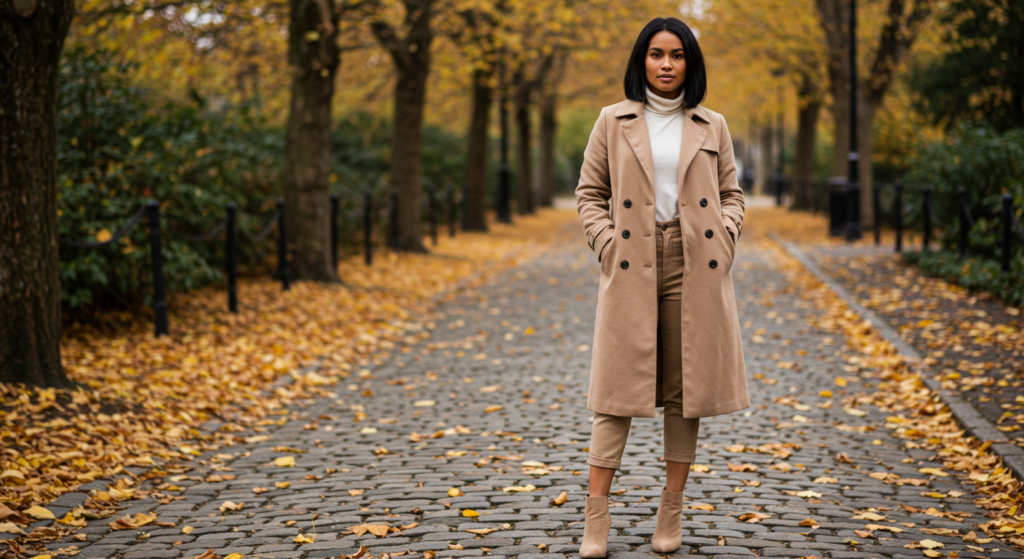
Neutrals—like black, white, beige, navy, and grey—are your wardrobe’s backbone. They adapt to almost any color and keep bolder pieces in check. Neutrals can also act as a palette cleanser, giving your more vibrant items room to shine. Their versatility makes them indispensable when you want a flexible, all-seasons wardrobe.
A great way to start building a color-friendly wardrobe is by investing in high-quality neutral staples. Tailored trousers, well-fitted tees, structured blazers, and classic skirts in neutral shades can be the glue that holds your outfits together. Once these are in place, adding a statement hue or print becomes much simpler.
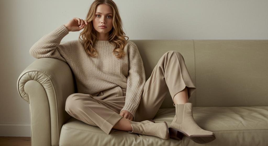
The Modern Monochrome
Monochrome dressing doesn’t have to be boring. By choosing a single neutral color and layering different textures or shades, you can create a chic, contemporary ensemble. For instance, an all-white outfit with varying fabric weights—like a cotton blouse and wool trousers—can look effortlessly elegant. Similarly, all-black can be elevated with a mix of matte and glossy finishes.
The secret to monochrome success lies in the details. Accessories should either blend seamlessly or provide the slightest hint of contrast. Using subtle contrasts in shade—like off-white with white—helps maintain depth within a single color spectrum.
Elevating With Accessories
Neutrals provide the perfect canvas for standout accessories. Take a minimalist outfit—say, a charcoal sweater and black trousers—and add a colorful belt or vibrant handbag. The pop of color becomes even more striking against a neutral backdrop. You can also lean on metallic accessories, like gold hoop earrings or a silver necklace, to add a polished finish without overpowering your look.
Consider also layering accessories to inject a bit more personality. For a neutral outfit, multiple necklaces of varying lengths or layered bracelets can create interest. Because your clothing is understated, the jewelry gets to shine as a thoughtful style element.
Styling with Metallic Accents
Introduction to Metallics
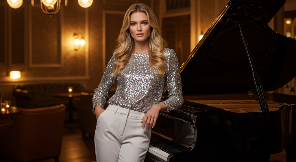
Metallics might sound like they belong strictly at parties or nighttime events, but they’re surprisingly adaptable. Gold, silver, rose gold, and gunmetal can integrate into daytime looks with ease, provided you balance them correctly. Think of metallics as a neutral plus; they reflect light and can serve as a finishing touch or a bold statement piece.
For those unsure about jumping straight to a metallic skirt or top, start small. A metallic belt, subtle metallic stripes on a blouse, or metallic hardware on a bag can introduce that sheen without overwhelming the outfit. Over time, you might find yourself comfortable enough to experiment with more substantial pieces.
Metals for Daytime
For a subtle daytime vibe, choose softer metals like brushed gold or antique silver. These have a slightly muted finish and pair well with casual outfits. A knit sweater layered over a rose-gold camisole can be an interesting way to incorporate metallics without screaming “night out.” Pair these with denim or tailored trousers for an effortless look.
Incorporating metallic footwear is another fun option. Metallic flats or low-heeled pumps can brighten a neutral ensemble. If the rest of your outfit is subdued—such as a cream blouse and black pants—a pair of gold or silver shoes can pull the eye in and give the outfit a lively twist.
Metallics for Night Out
When transitioning to evening wear, metallics become the main attraction. You can embrace high-shine pieces, like a sequined jacket or a metallic shift dress, and keep the rest of the look streamlined. Bold metals also pair beautifully with deeper, richer colors. A silver top could pop against a navy skirt, for instance.
Don’t be afraid to layer metals at night. Mixing gold and silver has become increasingly popular if done with intention. Try wearing a gold cuff on one wrist and a silver statement ring on the other. The key is balance: if you mix metals, make sure it looks deliberate rather than random.
Combining Textures and Colors
Depth in Fabric Choices
Texture isn’t just about how fabric feels; it’s about how it catches and reflects light, influencing the color’s appearance. A velvet dress in emerald green exudes a different aura than a cotton dress of the same hue. This interplay of texture and color can add depth and richness to your outfit.
Don’t shy away from mixing fabrics like leather, silk, or corduroy in a single ensemble. By pairing multiple textures, you create a layered effect that feels curated and visually engaging. Keep in mind that too many textures can read as chaotic—aim for two or three textures at most, especially when they’re in the same color family.
Texture Blending for Versatility
Versatility comes from being able to wear the same pieces in different ways. Mixing textures within a single color palette allows your outfit to transition between occasions. For instance, a ribbed knit top with a slick leather skirt can be dressed down with boots or dressed up with heels and a statement necklace. Because the color palette remains consistent, you can adapt it to various events just by switching accessories.
Texture blending works especially well with neutrals. A monochromatic grey outfit might combine a chunky knit sweater with a satin pencil skirt. Throw on a pair of suede boots, and you’ve orchestrated a trifecta of textures that keeps your look dimensional yet cohesive.
Textured Neutrals as a Base
Textured neutrals—like a tweed blazer or a fuzzy mohair cardigan—can serve as an excellent foundation for more adventurous color plays. The subtle patterns and raised surfaces create their own focal points, which means you can layer in additional colors without overwhelming the eye. For example, a tweed blazer in grey, featuring flecks of black and white, could pair wonderfully with a colored turtleneck. The texture of the blazer allows the color of the turtleneck to pop in a manner that feels elevated rather than random.
If you plan to add a bold accessory—like a statement necklace—over a textured neutral, consider choosing a color that complements the flecks within the neutral piece. This ensures everything feels tied together, which is especially important when dealing with multiple visual elements.
Color Layers in Outerwear
Trench Coats and Blazers
Outerwear is often the first impression people get of your style when you step out. A trench coat in a neutral tone—beige, black, or navy—can instantly refine your look and also serve as a canvas for colorful accents. Alternatively, a blazer in a jewel tone—like sapphire or ruby—can heighten an otherwise minimalist outfit.
Pair your trench coat with a bright scarf, or choose a bold lapel pin on your blazer to inject color. These small additions catch the eye, ensuring that your outerwear stands out while maintaining its functionality.
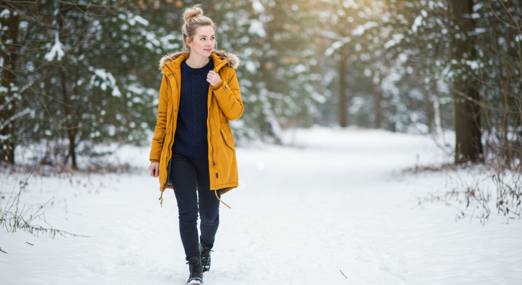
Bold Puffers and Parkas
Gone are the days when puffers and parkas only came in dull, dark colors. These days, you can find them in every imaginable hue. From a bright red puffer to a teal parka, these pieces can add a burst of energy to cold-weather outfits. If you choose a colorful puffer, keep the rest of your outfit simple—like black jeans and a neutral sweater—so the coat remains the star.
For something more adventurous, consider layering complementary colors. A mustard puffer with a burgundy scarf can be a dynamic autumn or winter statement. Just ensure the tones harmonize—picking deeper, more saturated shades helps them mesh rather than clash.
Layering with Scarves and Wraps
Scarves and wraps are not only practical for warmth but also a versatile tool for color layering. A scarf in a contrasting color can enliven a neutral coat, while a scarf that picks up on a subtle tone in your outfit can tie everything together. Wraps, especially those in luxe fabrics like cashmere or pashmina, add softness and dimension to your outerwear.
Consider the size and pattern of your scarf or wrap. A large, patterned scarf can become a statement piece, whereas a smaller, solid-colored scarf might serve as a minor pop of color. Experiment with different tying techniques—like a draped knot or a loop—to find what best complements your coat’s silhouette and your personal style.
Prints and Patterns
Stripes and Checks
Stripes and checks are perennial favorites. They provide structure and visual interest, and they mix well with both solids and other patterns if done thoughtfully. For a more reserved approach, pair a striped blouse with a solid-colored skirt or pants. If you want something bolder, consider pattern mixing—like stripes and checks—in coordinating color schemes.
Stripes can elongate or accentuate different parts of your body, depending on their orientation. Vertical stripes are often considered lengthening, while horizontal stripes can draw attention to your upper or lower half. Checks, too, come in various scales—small checks can appear more subtle, while large checks or plaids make a clear statement.
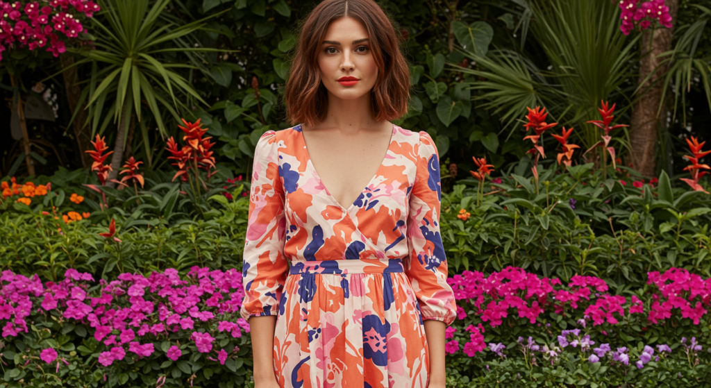
Florals and Abstract
Floral prints often get relegated to spring and summer, but you can wear them year-round by focusing on color palette and fabric weight. Dark florals on heavier fabrics can transition seamlessly into cooler months, especially when paired with appropriate footwear like boots. Abstract prints, on the other hand, can look edgy or artistic, depending on the color scheme.
When mixing florals or abstract prints with other elements, keep the rest of the outfit in complementary shades. If your dress has a strong floral pattern in multiple hues, pick out one of those hues for your cardigan or jacket. This approach ensures the pattern remains the focus but doesn’t feel disconnected from the rest of your look.
Combining Prints with Solid Colors
If you’re nervous about prints, pair them with a solid color in the pattern’s color family. For example, a blouse with blue and white abstract shapes can be matched with white pants. This technique highlights the print without overwhelming the senses. It also helps the printed piece become the outfit’s focal point in a cohesive way.
To add further dimension, consider a subtle texture in your solid piece—like a ribbed knit skirt or textured trousers. The eye picks up on these minor details, granting depth and a sense of style confidence.
Trans-Seasonal Color Palettes
Transitioning From Cold to Warm
It can be tricky to dress when one season slowly melts into the next. To navigate this, choose trans-seasonal color palettes—shades that easily adapt to shifting temperatures. Grays, muted greens, soft browns, and certain blues fit this bill perfectly. They can be lightened up for spring with pastel layers or deepened for fall with warmer tones.
Look for pieces that adapt in weight, too. A lightweight cardigan in a neutral shade can work with a blouse in warmer weather or layered under a heavier coat when temperatures drop. This approach ensures you’ll get more mileage from your clothing, and it keeps your style from looking seasonally confused.
Multi-Functional Pieces
Invest in garments that pull double duty across seasons. A knee-length dress in a comfortable fabric can be worn with tights and a blazer in cooler months, then transition to bare legs in spring or early fall. When you stick to a unified color palette, each piece flows seamlessly into the next season.
Accessories can also be multi-functional. Scarves in medium-weight fabrics, for example, can keep you warm on a chilly spring morning or serve as a wrap on a breezy summer evening. Neutral or universally flattering shades—like navy or charcoal—work in all sorts of weather conditions.
Adapting Trends All Year Round
Fashion trends are cyclical, but color trends often appear season-specific at first glance. Pastels may seem spring-locked, while jewel tones get labeled as fall or winter fare. One trick is to recontextualize these colors for off-seasons by playing with fabric weight and layering. A pastel blazer in a thicker wool fabric could work in autumn, while a jewel-toned tank top in a breathable fabric might be appropriate in summer.
The key is to make sure the seasonal twist looks deliberate. If you’re wearing a traditionally fall color in summer, balance it with airy fabrics and summer-appropriate footwear. If you’re wearing a pastel in winter, pair it with heavier layers and boots, so it feels intentional rather than out of place.
Accessorizing with Pops of Color
Handbags and Shoes
Handbags and shoes offer a quick and often cost-effective way to add color. Suppose you have a capsule wardrobe built around neutral pieces. Introducing a bright or bold accessory—like a red tote or electric-blue heels—can lift your outfit from standard to standout.
Color repetition works wonders here. If your shoes are a statement color, echo that hue in a small element elsewhere—like a belt or a piece of jewelry. This repetition ties the look together, making your style choices seem coordinated rather than random.
Jewelry and Hair Accessories
Jewelry and hair accessories can be subtle or flamboyant. Small pops of color, like a pair of vibrant earrings or a jeweled hairpin, catch the eye without dominating. If you prefer making a bigger statement, large hoop earrings in a neon shade or a chunky colorful necklace might be your style.
Hair accessories—headbands, clips, or decorative pins—are a fun way to integrate color at a different “level” of your outfit. We usually focus on clothing color from the chest down, so adding an accent up top can bring a harmonious balance. Choose something that either complements your outfit’s color scheme or provides a deliberate contrast.
Belts, Scarves, and Hats
Belts are among the most underrated yet powerful accessories. A belt in a striking color can define your waist and bring unity to a look. Whether you’re cinching a dress or adding shape to a flowy blouse, a colored belt can quickly become the star. Scarves and hats function similarly—they can be bold and eye-catching or discreetly elegant, depending on the pattern and hue.
For hats, think beyond basic black or beige. A burgundy fedora or a mustard beanie can be that finishing touch, especially when the rest of your outfit is neutral. Scarves, meanwhile, can add a tactile layer of texture and color. Choose a scarf that contrasts your coat color slightly but still ties into the palette of your outfit’s underlayers.
Tonal Dressing
Definition of Tonal Ensembles
Tonal dressing means building an outfit around different shades of one color family. You might wear a pale blue blouse, medium-wash blue jeans, and a navy jacket. This approach creates a cohesive, elongated look because your eye travels smoothly across the outfit without jarring interruptions.
It’s a style hack that can make you appear both polished and fashion-forward. People often assume tonal ensembles require perfectly matched pieces, but actually, it’s the variation in shade that gives tonal dressing its signature character.
Mixing Shades Effectively
The secret to effective tonal dressing is combining a minimum of two to three shades, ensuring each piece remains distinct. If you wear all pieces in the exact same shade, you risk looking like you’re wearing a uniform. Instead, choose lighter and darker variations of the color. A subtle gradient effect not only looks sophisticated but also adds dimension.
Accessories can either match your color family or provide an intentional contrast. For a cohesive feel, keep accessories in the same palette, but pick a darker or lighter tone. If you prefer contrast, a single accessory in a complementary color can be a striking statement against your tonal outfit.
Creating Visual Continuity
Tonal outfits shine when fabrics and silhouettes are carefully chosen to flatter your shape. Pieces that fit well ensure the outfit flows seamlessly. Think about layering different textures—like satin, knit, and denim—in one color. This prevents the look from becoming flat or monotonous.
You can also play with patterns while keeping the color consistent. A pinstriped blazer, a solid blouse, and subtly patterned pants in the same color family can create an impressive synergy. The patterns and solid pieces work together, guided by the unified hue.
The Role of Color in Formal Attire

Event-Specific Choices
Formal events typically have unwritten dress codes. Black and navy are classics for many formal occasions, but you can branch out by including color in subtle ways. A midnight-blue gown or a deep emerald suit can look just as formal while standing out from the sea of black. If the event is semi-formal, even pastel tones in structured fabrics can appear polished.
Pay attention to context. A charity gala might welcome more vibrant colors, whereas a corporate awards dinner might lean traditional. Always consider the season and the venue. An open-air wedding might allow for breezy, lighter colors, while a ballroom event might call for deeper, more dramatic hues.
Suiting Up with Flair
Suits don’t have to be bland. Men’s and women’s suits today come in myriad colors—burgundy, forest green, or even a refined mauve. If you’re feeling bold, opt for a suit in a saturated jewel tone. Keep the shirt and tie (or blouse) neutral or complementary for a balanced look.
Alternatively, if you have a standard navy or charcoal suit, bring in a pop of color through a pocket square, tie, or lapel pin. These small additions demonstrate personal flair without compromising the suit’s formal vibe. They also let you experiment with color on a smaller scale before committing to a more vibrant ensemble.
Evening Gowns and Cocktail Dresses
For formal evening wear, color can take center stage. Rich, luxurious fabrics like satin or velvet amplify jewel tones, making them look regal. Metallic accents—like beaded detailing or sequined bodices—can also elevate a dress. If you prefer minimalism, a gown with clean lines and a bold color can make just as big an impact.
When choosing a color for a formal dress, consider how it looks under artificial lighting. Ballroom lights, for instance, can change how a fabric catches the eye. Some colors become more luminous, while others might appear dull. If possible, test your chosen ensemble in similar lighting conditions before the main event.
On-Trend Seasonal Hues
Adapting to Fashion Cycles
Fashion cycles might showcase a handful of “it” colors each season. Rather than overhauling your wardrobe, selectively add pieces or accessories in these trending hues. This keeps your style fresh without forcing you to abandon your personal color preferences. If lavender is big this spring, maybe incorporate a lavender scarf or blouse with your existing neutrals.
Remember, trends cycle out as quickly as they appear. Always invest in a balance of timeless hues and seasonal favorites. This approach ensures longevity and prevents your closet from feeling dated once the trend inevitably shifts.
Forecasting the Next Big Color
Following fashion blogs, runway shows, and brand lookbooks can offer clues about emerging color trends. You might notice multiple designers gravitating toward a particular shade—like sage green or burnt orange—months before it hits mainstream stores. Keeping an eye on these cues allows you to plan your purchases strategically.
When you see a trend brewing that resonates with you, consider testing it with an accessory. A small bag or belt in the forecasted color is a lower-risk way to gauge how you feel wearing it and how versatile it is in your wardrobe. If it becomes a staple, you can invest in larger pieces.
Incorporating Runway Inspiration
Runway shows often push boundaries to create memorable visual impact. You might see unexpected color pairings—neon green with pastel pink, or cobalt blue with bright orange. While these combinations might seem extreme for daily wear, they can serve as a source of inspiration.
Dial down the intensity for real-world outfits. Maybe you swap the neon green for a more muted lime, or the bright orange for a softer coral. Taking inspiration from runway extremes is a great way to inject fresh energy into your style without going overboard.
Building a Color-Coordinated Wardrobe
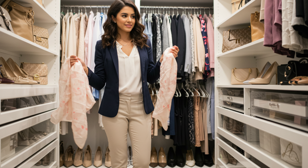
Capsule Wardrobe Basics
A color-coordinated wardrobe often starts with a capsule approach. Pick a handful of base neutrals—like black, grey, navy, and beige—and add a few accent colors that you truly love. Each piece in your closet should pair with multiple other pieces, maximizing outfit possibilities.
Begin by focusing on versatile staples: a good pair of trousers, a pencil skirt, a blazer, and a few quality tops. Choose colors that harmonize. Over time, integrate a few statement pieces that express your personal taste. This blend of basics and statements ensures you’re never stuck with “nothing to wear.”
Expanding Your Palette
Once you’ve established a core palette, you can branch out. Introduce additional neutrals—like olive or charcoal—and accent colors that complement your existing wardrobe. This phased approach keeps your wardrobe cohesive and prevents impulse buys that might not fit in with the rest of your clothes.
To find complementary hues, try referencing color inspiration online or by analyzing outfits you already love. Notice which colors recur in your favorite looks. Perhaps you keep gravitating toward teal or maroon. Adding more items in these shades can make your wardrobe feel personal and consistent.
Maintaining Color Harmony Over Time
A well-curated wardrobe evolves, but it does so mindfully. Before buying something new, consider how it fits with your existing palette. Will you be able to style it with multiple pieces? Does it clash with anything you own? If it’s a new hue you haven’t tried before, invest in a less expensive accessory first to test the waters.
Regular audits of your closet can also help you maintain harmony. Remove items that no longer serve you or that look worn out. Pay attention to how your color preferences might shift over time—seasons and personal changes can influence what feels right. Adjusting your palette to reflect these shifts keeps you feeling inspired by your wardrobe rather than constrained by it.
Conclusion
Color sets the stage for how we dress and express ourselves, yet there’s no single playbook to follow. From subtle contrasts to bold statements, from metallic accents to tonal ensembles, and from staple neutrals to trans-seasonal palettes—the options are nearly limitless. By understanding how to combine hues, patterns, and textures in ways that align with your personal style, you open up a world of sartorial freedom.
Whether you’re new to experimenting with color or a seasoned fashion enthusiast, the core principle remains the same: intention matters. When you choose colors and pieces deliberately, you create a cohesive look that reflects who you are. Each hue, each accessory, and each layering choice contributes to your personal brand of style. Keep exploring, keep refining, and above all, keep having fun with it.
Summary Table
| Technique | Key Benefit | Best Scenario |
|---|---|---|
| Subtle Contrasts | Creates harmony without monotony | Pairing similar tones (e.g., pastels + neutrals) |
| Balancing Bold Hues | Adds energy and focus to the outfit | Occasions requiring a statement piece |
| Undertone Mastery | Ensures colors complement each other | Choosing seasonally adaptable colors |
| Neutrals as Foundation | Versatile, pairs with any accent color | Building a capsule wardrobe, layering basics |
| Metallic Accents | Introduces shimmer and sophistication | Daytime subtlety or full-blown evening glamour |
| Texture + Color | Enhances depth and visual interest | Mixing fabrics like velvet, leather, or silk |
| Colorful Outerwear | Makes a style statement in cooler seasons | Trench coats, puffers, or layered scarves |
| Prints & Patterns | Adds variety beyond solid colors | Stripes, checks, florals, abstract designs |
| Trans-Seasonal Palettes | Bridges gaps between seasons | Shades like muted greens, tans, soft browns |
| Accessorizing with Pops | Elevates neutral or understated ensembles | Vibrant shoes, belts, scarves, hats |
| Tonal Dressing | Achieves a cohesive, modern look | Layering different shades of the same color |
| Formal Attire Color | Differentiates you from classic black ties | Suits, gowns, cocktail dresses in bold or subtle |
| On-Trend Seasonal Hues | Keeps outfits fresh without major overhaul | Adopting runway-influenced color ideas |
| Color-Coordinated Wardrobe | Ensures consistency and versatility | Capsule approach with neutral bases + accent hues |
Frequently Asked Questions

Q: How do I know if two colors are “clashing”?
A: The notion of clashing often depends on context. If the colors appear jarring or disrupt the flow of your outfit, they may clash. A quick trick is to lay your pieces side by side in natural light. If it feels off-balance to your eye, try adjusting the saturation or introducing a bridging piece (like a neutral accessory).
Q: Can I wear bright colors to work without looking unprofessional?
A: Absolutely. The key is moderation and balance. Choose one bright statement piece—such as a blazer or a scarf—and keep the rest of your outfit neutral or subtly complementary. This ensures you stand out in a refined way rather than appearing overly casual.
Q: What’s a quick way to figure out my personal color palette?
A: Observe your current wardrobe. Identify which colors you wear most, which ones make you feel confident, and which shades you gravitate towards. Then look for a unifying theme—maybe you love earthy tones or cool blues. Build your palette around these favorites, integrating versatile neutrals as support.
Q: How do I mix patterns without looking too busy?
A: Start by pairing patterns that share a color family. For example, mix stripes and florals if they both contain a common color. Vary the scale of the patterns—one large, one small—so they don’t compete equally. Keep accessories simple to let the patterns speak for themselves.
Q: I have a limited budget. What’s the most cost-effective way to add color?
A: Focus on accessories. A vivid scarf, belt, or pair of shoes can transform a neutral outfit without costing as much as a full garment. Shop at budget-friendly stores or wait for sales. Invest in items you genuinely love, and you’ll likely wear them often.
Q: Is it okay to wear metallics during the day if they’re too shiny?
A: Absolutely, but consider “toned-down” metallics like brushed gold or subtle metallic threads in a sweater. Pair them with casual fabrics (denim or cotton) to keep the look from feeling too dressy. Moderation is key—one metallic item can make a daytime outfit feel chic, whereas multiple pieces might overpower it.
Embracing the vast possibilities of color in fashion can transform your style journey. Whether you’re aiming for subtlety or high impact, these techniques, tips, and examples provide a roadmap for refining your choices. Stay open to experimentation, and remember that your wardrobe should be a reflection of your evolving tastes. By mastering the art of color coordination, you’ll not only enhance your look but also discover new facets of creative self-expression. Enjoy the process!
Joanna Perez, with a degree in Creative Writing, excels in recommending distinctive clothing color mixes and trends that deeply connect with readers. She simplifies the often daunting task of color selection, making fashion decisions more personalized and impactful. Her passion for vibrant color palettes and the stories they tell makes her an indispensable voice in the fashion community.
Reviewed By: Marcella Raskin and Anna West
Edited By: Lenny Terra
Fact Checked By: Sam Goldman
Photos Taken or Curated By: Matthew Mansour