Key Takeaways
- An organized color palette prevents outfit overwhelm and helps you make better choices.
- Strategic mixing and matching offers more wardrobe variety without overspending.
- Understanding color harmony goes beyond trends and taps into personal style.
- Small details and accessories can elevate simple outfits into statement ensembles.
- Experimentation and creativity will keep your style fresh, dynamic, and confidence-boosting.
Introduction
Color coordination doesn’t have to feel overwhelming. With a few expert tricks for selecting and mixing hues, crafting cohesive, head-to-toe looks becomes effortless—and you’ll exude confidence every time. Think of color as your personal style tool: whether you lean toward minimalist palettes or bold, adventurous shades, these techniques ensure your fashion game is always on point.
This guide dives deep into the secrets of color coordination, offering out-of-the-box tips and practical advice that instantly elevate your wardrobe. From choosing the perfect base colors to mastering advanced layering strategies, you’ll learn how to blend shades seamlessly for any occasion—no more worrying about clashing hues or style missteps.
Below, you’ll find 14 comprehensive sections, each with three actionable subsections packed with fresh inspiration. Use this article as your go-to resource for tackling any color dilemma; by the end, you’ll know what works for you and have the confidence to pull off any color combo you can dream up.
Elevate Your Base: Mastering Neutrals

A. Choosing Trustworthy Neutral Foundations
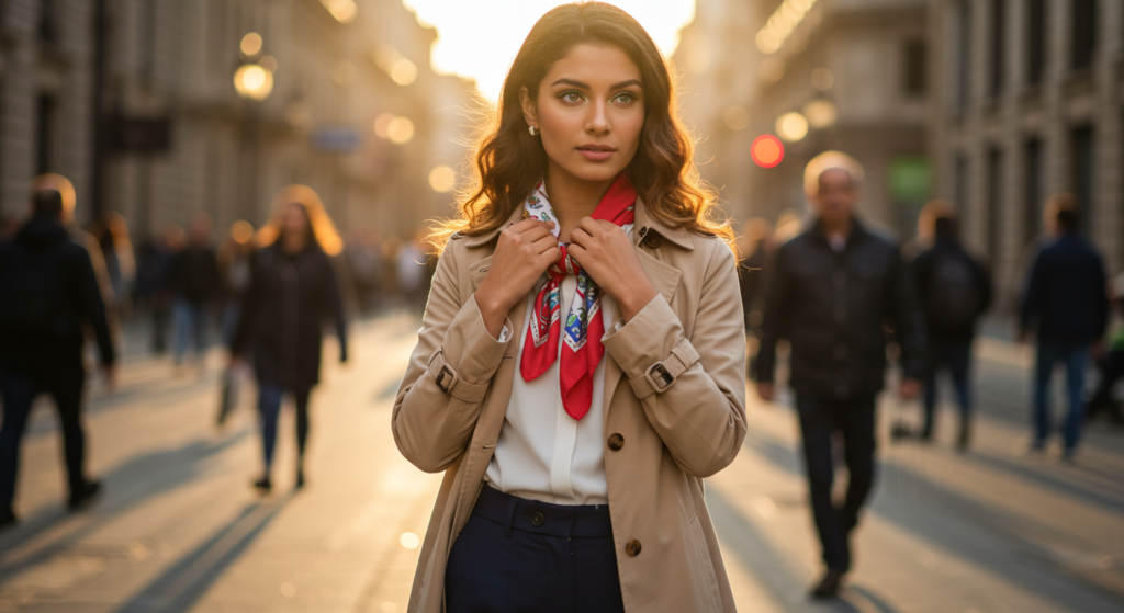
Neutrals are the backbone of any wardrobe. They’re reliable, endlessly versatile, and go well with just about any other color. Popular choices include black, white, gray, navy, and beige. But don’t feel limited. You can also consider muted tones like charcoal brown or dusty olive. The key is to pick a few favorites that flatter your complexion and preferences.
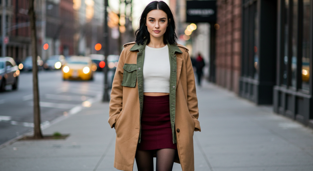
To create a strong foundation, stock up on tops or bottoms in your go-to neutrals. This will ensure you’re never at a loss when you want to introduce pops of color. Also, neutral outerwear—like a beige trench coat or a charcoal blazer—can quickly dress up or down your outfit.
B. Breaking the Monotony with Textures
When outfits rely heavily on neutrals, texture becomes a prime way to avoid a flat look. Texture can come from knitwear, ribbed fabrics, tweed, or even subtle patterns like herringbone. Mixing textures in the same neutral color family keeps the look cohesive but adds visual interest.
For instance, pair a smooth navy blouse with a pleated black skirt to bring dimension to an otherwise muted color scheme. Or consider layering a chunky beige sweater over a silky white shirt for a cozy-chic vibe. Texture is a subtle form of color coordination that appeals to the eye without relying solely on bright hues.
C. Finding Your Go-To Neutral Combos
Try to have at least two neutral color combos that you can reach for when in doubt. A classic example is pairing black and white for an edgy, timeless look. Another is mixing beige and gray, a softer palette that feels approachable and modern. Whether you go for a more stark contrast or a gentle blend, having reliable go-to combos makes mornings simpler.
Suggested Neutral Combos:
- Black + White: Classic and polished
- Gray + Navy: Understated and calming
- Beige + Black: Warm, versatile, and sophisticated
Unexpected Color Pop: Accents That Shine
A. The Power of Contrasting Details
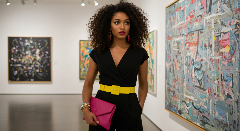
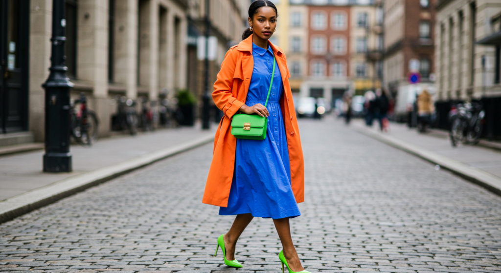
Once you have your neutral base, it’s time for an accent color to shine. Contrasting details can elevate your outfit from simple to striking. Instead of playing it safe with all-neutral accessories, opt for a vibrant belt, a bright handbag, or a bold pair of shoes.
Look for colors that naturally stand out against your base. If you’re wearing black and white, consider red or cobalt blue. For gray and beige combos, softer pastels or metallic accents work wonders. Small touches of unexpected color can transform your look instantly.
B. Wearable Statement Pieces
Your accent color doesn’t have to be relegated to accessories. Consider a statement blazer, a bright skirt, or a vivid scarf as your pop of color. The idea is to keep the rest of your outfit pared back so that your statement piece truly pops.
If you’re feeling extra bold, try adding a secondary accent color that plays well with your statement piece. For instance, a coral handbag can pair beautifully with a teal blazer, as long as the rest of the outfit is neutral.
C. Balancing Boldness
When using accent colors, it’s easy to overdo it. Balance is your friend. If you opt for a bright scarf and a matching belt, keep your shoes and bag neutral. A good ratio to remember is one or two accent pieces per outfit. This helps keep the look harmonious rather than chaotic.
Seasonal Shifts: Adapting Colors All Year
A. Light and Airy for Warm Weather
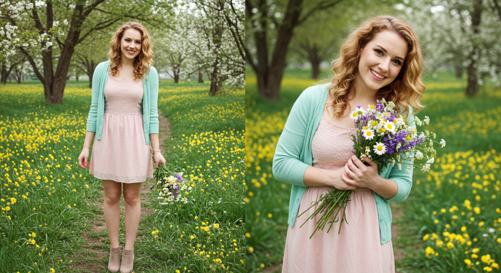
When the temperature rises, it’s time to lean into lighter hues. Pastels like lilac, mint green, and pale pink not only reflect sunlight but also evoke a breezy vibe. If pastels aren’t your thing, try bright but not heavy colors—think coral, turquoise, or lemon yellow. These vibrant hues can pair effortlessly with light neutrals like white or beige to keep your look fresh and cool.
B. Deep and Warm for Cooler Months
For fall and winter, deeper tones like burgundy, forest green, and mustard shine. These colors look instantly cozy and pair well with thicker fabrics like wool or corduroy. Don’t be afraid to mix them with lighter neutrals for contrast. A burgundy sweater with a camel coat can look both autumnal and chic.
If you want a subtle way to bring in seasonal colors, opt for accessories like scarves, hats, or gloves in these richer hues.
C. Transitional Color Pairings
Transition seasons, like spring and fall, can be tricky because the weather changes day to day. One strategy is to keep your base neutral—like a gray sweater and black jeans—while introducing a single seasonal pop. For spring, maybe add a pastel scarf; for fall, try a rust-colored cardigan. This approach allows you to adapt quickly without needing a complete wardrobe overhaul.
Beyond Basic Black: Dark but Distinct Hues
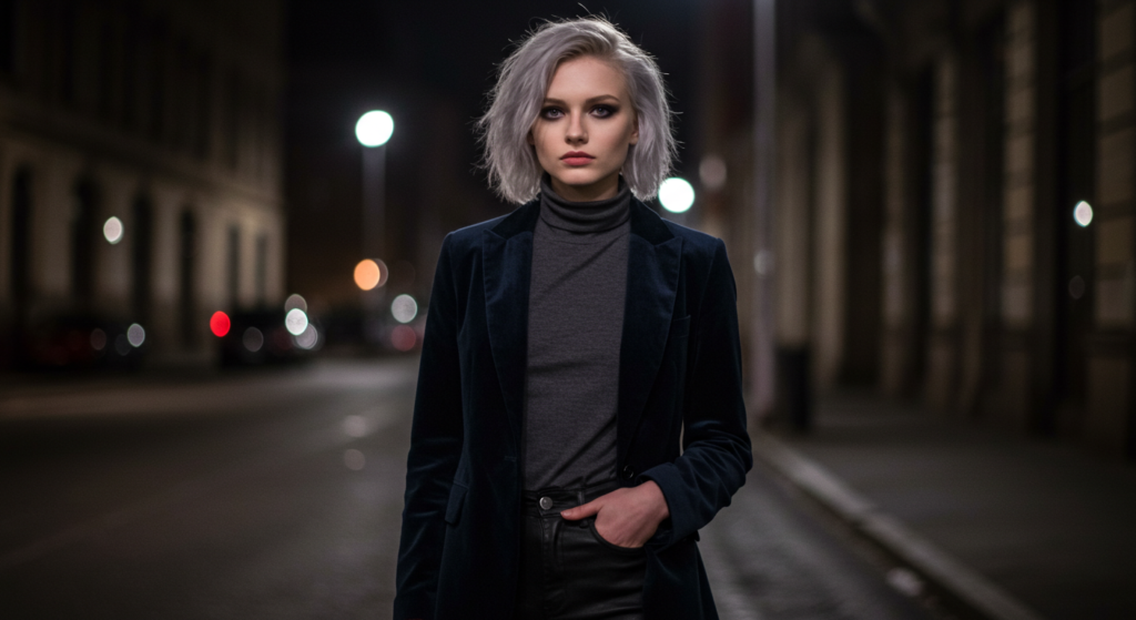
A. The Allure of Navy
Navy is often overlooked but is a stunning alternative to black. It’s less harsh on many skin tones and can evoke a more relaxed vibe while still looking polished. Navy blazers, dresses, or trousers are easy to pair with neutrals like white, gray, or even black if you feel adventurous.
Try mixing navy with unexpected shades like peach, emerald, or even subtle maroons for an out-of-the-box combo that still feels refined.
B. Earthy Browns and Charcoal
Earthy browns like chocolate, espresso, and camel can offer the same sophistication as black but with added warmth. Charcoal gray can also serve as a darker base that isn’t as stark. Combining brown or charcoal with lighter neutrals, such as cream or light gray, creates a balanced outfit.
If you’re feeling playful, incorporate a pop of teal, mustard, or even pink for a lively twist. Earthy bases welcome a wide range of accent colors.
C. Olive and Other Dusky Tones
Olive green, dusty teal, and muted burgundy are examples of dark but distinct hues that set you apart from the crowd. These colors are versatile, pairing beautifully with neutrals like beige, gray, or navy. Olive cargo pants, for example, can be dressed up with a crisp white blouse or dressed down with a simple black tee.
Remember that experimenting with these dusky tones can add depth to your wardrobe. They offer the richness of dark shades without feeling too traditional.
Color Blocking: Bold Statements with Large Panels
A. Principles of Color Blocking
Color blocking is about using large panels of solid color to make a bold visual statement. It involves pairing blocks of color in a single outfit—often in geometric or straightforward shapes. The key is choosing colors that complement or contrast in an intentional way.
Start small by pairing two blocks of color. If you wear a bright top with a contrasting bottom, keep the rest of your look (like shoes or a jacket) neutral to ground the outfit.
B. Tonal vs. Contrasting Blocking
You can color-block by using tonal shades of the same hue—for example, a light pink top with a deeper magenta skirt. This style is easier on the eyes and looks coherent while still showcasing two different shades.
Or you can go for contrasting blocks, like cobalt blue with neon yellow. This approach is high-impact but requires careful consideration so the colors don’t clash. A good rule of thumb is to pick colors of similar saturation levels. If one is very bright, the other should be equally vibrant.
C. Streamlining with Accessories
For a unified look, accessories can tie your color-blocked outfit together. If you have two main colors, choose shoes or a bag that pick up on one of those hues. Alternatively, opt for a neutral accessory if you want the blocks to stand alone.
Consider a color-blocked handbag or color-blocked heels to reinforce the theme. Just be sure not to add too many competing elements that create visual clutter.
Patterns and Prints: Coordinating Color Within Prints
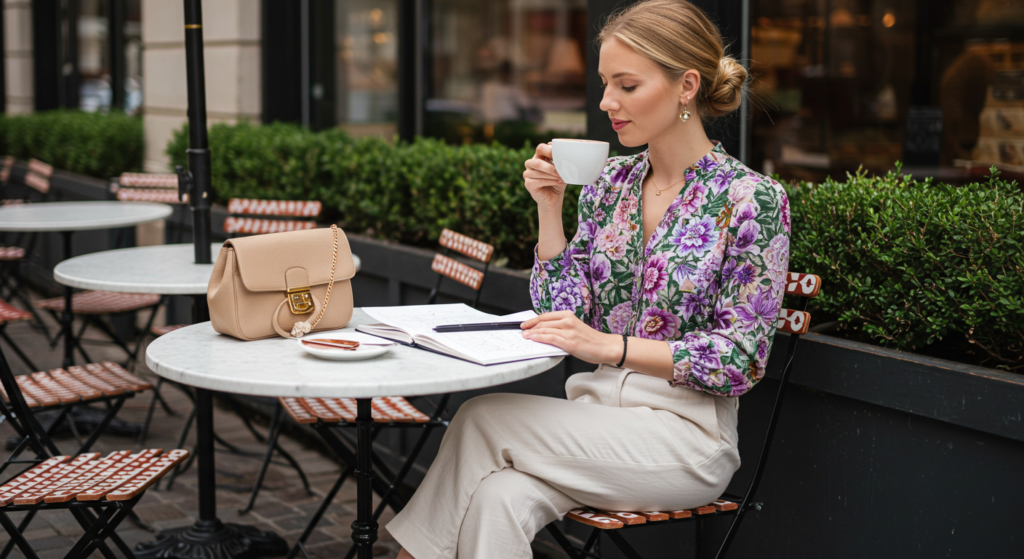
A. Extracting Key Colors
Patterns often contain multiple hues, which can be intimidating. A handy tip is to focus on one or two key colors from the print and use them for the rest of your outfit. If your blouse has pink, green, and yellow, pick just the pink or green to echo in your bottom or accessories.
This approach keeps your look cohesive without looking like a wild mashup. It also offers a direction for your choice of shoes, bag, or jewelry.
B. Mixing Prints Carefully
If you love prints, you can mix them, but do so carefully. Combine prints that share a common color or theme. For example, a black-and-white striped top can pair well with black-and-white polka dot pants. The shared color palette keeps everything under control.
Alternatively, mix large-scale prints with smaller-scale prints, ensuring they don’t compete for attention. A subtle houndstooth skirt can complement a bold floral blouse if they share at least one color and differ in scale.
C. Balancing Busy Prints with Solids
When dealing with a busy print—like a dramatic floral or an abstract motif—it often helps to pair it with a solid piece. That way, the print stands out without overpowering your entire ensemble. This is an easy approach for beginners who want to venture into prints without losing control of the overall look.
Accessories That Make or Break: Colorful Details
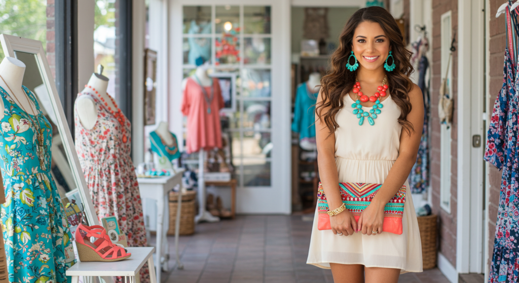
A. Jewelry and Metals
Jewelry offers a subtle yet powerful way to incorporate color. While classic metals like silver and gold are timeless, don’t overlook colorful gems or enamel pieces. A turquoise necklace can brighten a neutral outfit. Alternatively, match metals to your color palette—rose gold can add warmth to pinks and reds, while silver complements cooler hues like blues and grays.
B. Handbags and Belts
Handbags and belts are prime canvases for color experimentation. They’re big enough to be noticed but still small in the context of an entire outfit. If you’re wearing a monochrome look, try a colorful belt to accentuate your waistline and break up the outfit visually.
Handbags can be swapped out easily, so feel free to collect a few in different shades—one that’s neutral, one that’s bright, and perhaps one with a pattern. This rotation will keep your style fresh without requiring new clothing.
C. Footwear Focus
Shoes can anchor or elevate your outfit. Black or nude pumps are classics, but a bold red heel can instantly liven up your entire ensemble. Sneakers, boots, and loafers also come in a range of colors. You might try pairing a neutral outfit with burgundy ankle boots or navy-blue loafers for a subtle but impactful twist.
If you’re unsure, look at your entire outfit in the mirror. Does your footwear color complement or clash with your top or accessories? Adjust as needed.
Dressing for Occasions: Formal vs. Casual

A. Subdued Elegance for Formal Events
Formal events often call for a more restrained color scheme. Neutrals like black, navy, gray, and deep jewel tones (emerald, sapphire) tend to be reliable. If the event is more creative, a classy but bold color such as royal purple or deep wine can stand out.
When coordinating for a formal gathering, less is often more. One statement piece—like a bold necklace or vibrant clutch—suffices. Balance it with understated elements elsewhere in your outfit.
B. Playful Color for Casual Outings
Casual settings let you loosen up. Denim is a casual classic that pairs with almost any color. For a fun weekend look, try bright colors like sunny yellow or candy pink. Prints and statement tees also come into play here.
Casual outfits can handle more color. Experiment with multiple pops of color—like a bright watch band and matching sneakers—just ensure they share a similar tone or saturation level.
C. Smart Casual and Business-Casual Blend
Sometimes you need to strike a balance between formal and casual, like in a business-casual environment. Think muted but interesting. Colors like maroon, olive, or dusty rose can look professional but less stiff than black or navy.
Stick to neat silhouettes—structured pants, button-down shirts, or tailored skirts. Add a subtle accent via a belt or a patterned scarf to keep the look from being too serious.
Capsule Wardrobe Tactics: Fewer Pieces, More Outfits
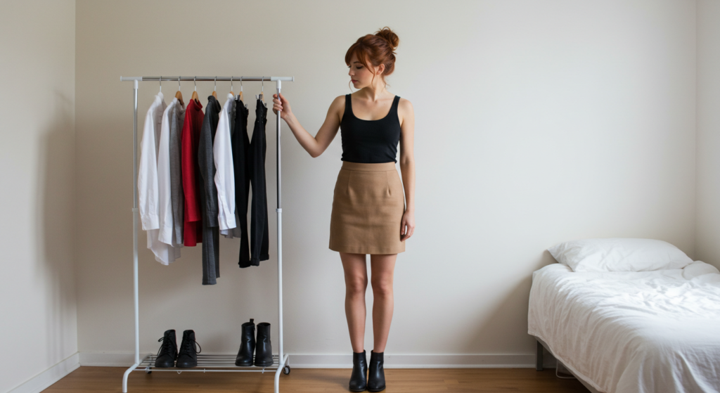
A. Curating a Compact Color Palette
A capsule wardrobe revolves around mix-and-match potential. A tight color palette ensures maximum versatility. Choose three to five core colors that harmonize well—like black, white, beige, olive, and rust. This streamlined palette can create a surprising number of outfits without needing a closet overflow.
B. Investing in Versatile Staples
Focus your spending on high-quality staples you’ll wear again and again—like a great pair of pants, a timeless coat, and a versatile blouse. If your capsule has a consistent color scheme, these staples will pair effortlessly with each other, as well as with pops of color or pattern.
When you’re ready to add a twist, incorporate a trendy or bold item that blends seamlessly because of your thoughtful capsule color palette.
C. Seasonal Updates
A capsule doesn’t mean you never refresh your clothes. Each season, swap in a few items in relevant colors—like pastel or bright for summer and deeper, cozier hues for winter. This approach keeps your wardrobe interesting without undermining its overall harmony.
Layering and Proportions: Color in Multi-Piece Outfits
A. Matching Layered Pieces
Layering helps you manage temperature changes while adding visual interest. But it can also complicate color coordination. A good rule is to match at least one layer to another piece of your outfit, whether it’s the base top matching a cardigan or the outer jacket complementing the pants.
This matching trick visually ties the look together and prevents the outfit from feeling disjointed.
B. Proportional Color Placement
Consider the proportions of color in your layers. For instance, if you wear a long coat in a bold hue, balance it with a simpler outfit underneath. Alternatively, if you have a colorful top peeking out beneath a neutral cardigan, that small pop might be all you need.
Think of each layer as part of a puzzle. You want each piece to fit smoothly with the others, rather than competing for attention.
C. Mixing Textures and Fabrics
Layering also opens the door to combining different fabrics—wool, cotton, denim, silk—that can complement your color choices. A solid wool coat over a patterned silk scarf can look visually appealing. Texture can either tone down or amplify color contrasts, depending on your intention.
Advanced Color Mixing: Triads and Split Complements
A. Triadic Schemes for Variety
While we’re avoiding deep dives into color psychology, a few color-harmony guidelines can still be beneficial. A triadic scheme uses three colors evenly spaced around the color wheel, offering a vibrant and balanced palette.
For a wearable example, consider teal, coral, and mustard. Use each color in different parts of your outfit. Maybe your top is teal, your shoes are coral, and your bag is mustard. Keep everything else simple, so these three hues steal the show.
B. Split-Complementary Confidence
A split-complementary scheme involves choosing one base color and two adjacent colors to its complement on the color wheel. This creates less tension than full complements and is easier to style.
If your main color is lavender, the complement is yellow, so you’d choose the two shades on either side of yellow—like a light gold and a soft lemon. These subtle shifts make your outfit look coordinated but less in-your-face than a direct purple-and-yellow combo.
C. When to Go All-Out vs. Subtle
If you’re new to advanced color mixing, start subtle. Use one color in a small area, like an accessory, and another in a slightly bigger area, like a skirt. The third color might appear in a pattern. As you gain confidence, you can enlarge each color’s presence. Don’t forget that neutrals can act as breathing space between your bolder hues.
Travel Hacks: Coordinating Colors on the Go

A. Packing Light with a Limited Palette
When traveling, packing efficiently is key. Sticking to a limited color palette—like two neutrals and one accent color—ensures that every piece you pack works well with the others. This trick saves luggage space and time when dressing in unfamiliar settings.
B. Quick Transitions from Day to Night
To shift from daytime exploration to an evening event, swap out a casual top for a dressier one in a complementary color or add a statement jacket. Accessories like a bold necklace or dressier shoes can also elevate your day look. Keep neutral bottoms so it’s easy to match multiple tops.
C. Weather Contingencies
Research your destination’s weather. If rain is likely, choose footwear in a dark neutral color that won’t show wear or stains. Add a colorful scarf or jacket so you don’t end up feeling drab in rainy conditions. Layering lightweight pieces in coordinated colors helps you adjust to temperature swings.
Mindful Shopping: Acquiring New Pieces

A. Setting a Color Strategy
Impulse buys often lead to unused items cluttering your closet. Before you purchase, ask yourself: Does this color work with my existing wardrobe? If the answer is no, consider a different shade or skip the item entirely.
Visualize how a potential purchase will pair with at least three outfits you already own. This practice keeps your wardrobe cohesive and your budget in check.
B. Testing Colors In-Store
Don’t rely solely on memory. In-store lighting can be tricky, and online images may not be accurate. If possible, hold the item up to your face to see if it complements your skin tone. Or carry a swatch of a known color from home to see if they match.
Taking a few moments to test colors prevents buyer’s remorse later, especially if you’re investing in pricier pieces like coats or suits.
C. Buying Trends Wisely
Seasonal fashion trends often focus on “color of the year” or new color-block styles. Jumping in can be exciting, but be mindful. Choose trendy colors that you actually like and can wear beyond a single season. Incorporate them in smaller doses—a scarf, a pair of shoes, or a statement tee—unless you’re certain the color complements your usual palette.
Conclusion
Color coordination is both an art and a skill you can master with practice. From establishing neutral foundations to experimenting with bold accents, you have countless ways to express your personal style. Use these tips to plan outfits that make you feel confident and ready to take on the day. Mixing the right shades and tones can have a powerful effect on your self-image, boosting your mood and reflecting your individuality.
Above all, don’t be afraid to experiment. Fashion is an ongoing journey of learning what resonates with you. Keep exploring new combinations, refine what you already love, and remember that a cohesive color scheme can instantly upgrade your entire look. Whether you lean minimalist or thrive on bright, playful palettes, these strategies will guide you toward color-coordinated outfits that stand out in all the right ways.
Summary Table
| Topic | Key Point | Example |
|---|---|---|
| Neutrals | Form a strong base for any outfit | Black, white, beige, gray |
| Accent Color | Add one or two pops to elevate your look | Bold belt, vibrant scarf |
| Seasonal Shifts | Adapt shades for warm or cool weather | Pastels in summer, deep tones in winter |
| Alternative Dark Hues | Explore navy, charcoal, and earthy browns | Navy suit, olive pants |
| Color Blocking | Use large panels of solid colors for impact | Contrasting top and skirt |
| Patterns and Prints | Coordinate outfits by picking key print colors | Floral blouse matched with neutral pants |
| Accessories | Use colorful details to accent your outfit | Turquoise necklace, bright shoes |
| Occasion-Based Dressing | Adjust color intensity for formal or casual events | Jewel tones for evening, playful brights for daytime |
| Capsule Wardrobe | Choose a focused color palette for maximum mix-and-match | Black, white, olive, rust, beige |
| Layering | Match layers thoughtfully to maintain cohesion | Colored cardigan with neutral base |
| Advanced Color Mixing | Combine triads or split-complements for unique looks | Teal, coral, mustard ensemble |
| Travel Wardrobe | Limit your palette to save space and simplify outfits | Neutral bottoms + 1 accent color for multiple combos |
| Mindful Shopping | Test colors and plan before buying | Check if it pairs with 3 existing outfits |
| Trend Integration | Incorporate trendy hues in moderation | Statement shoes in “color of the year” |

FAQ
Q: How many accent colors can I use in one outfit without looking overdone?
A: Generally, stick to one or two accent colors. More than that can clutter your look. One small accent—like a belt—and a second larger accent—like a scarf—often strike the perfect balance.
Q: Are there certain colors that look good on everyone?
A: While there’s no one-size-fits-all color, many people find that teal, navy, charcoal, and shades of berry flatter a wide range of skin tones. It’s still a matter of preference, so trust your mirror and comfort level.
Q: How do I make sure my travel wardrobe has enough variety in color?
A: Choose two neutrals (like black and gray) and one accent color (like red). Pack tops, bottoms, and accessories that can mix and match within those shades. Use printed or patterned items sparingly to add variety.
Q: Can I color-block with patterns, or does color-blocking only apply to solids?
A: You can definitely experiment with patterned pieces in color-blocking, but it’s trickier. If your patterned piece has large panels of color, choose another solid item that picks up one of those colors. Make sure the overall look remains balanced.
Q: Should I match my bag and shoes in the same color?
A: It’s no longer a strict rule to have a matching bag and shoes. While a matching set can look polished, mixing different colors or textures adds personality. If in doubt, keep at least one element cohesive, such as a similar hue or a metallic detail.

Enjoy your journey through color coordination, and remember: with the right approach, you can instantly boost your style and your confidence!

Gabrielle J. Smith is the pulsating essence that brings life to the world of fashion and color. With an innate talent for understanding the nuances of hues, she has the uncanny ability to paint narratives with her words, diving deep into the realm of color trends and the art of harmonizing them. Not just an expert in the field, Gabrielle also plays a pivotal role in strengthening the cohesion of our team, ensuring growth and harmony. Each of her articles is a testament to her passion, weaving captivating tales that resonate with readers and fashion aficionados alike.
Reviewed By: Joanna Perez and Anna West
Edited By: Lenny Terra
Fact Checked By: Matthew Mansour
Photos Taken or Curated By: Matthew Mansour