Key Takeaways
- Brightly painted cabinets can add personality, flair, and a fresh vibe.
- An accent island or a two-tone approach injects visual interest without overhauling everything.
- Proper prep and finishes help paint remain vibrant, even in busy kitchens.
- Dark shades can add drama but need balanced lighting and light decor.
- Painted cabinet interiors give a unique twist that surprises guests.
- Colorful hardware, accessories, and backsplash elements can tie the entire look together.
- Simple techniques like sanding, priming, and choosing quality paint brands matter.
- You can experiment with hardware shapes and metallic accents for a nice pop.
- Use color to enhance space. Light shades can make a tiny kitchen look open, while deeper hues ground large rooms.
- Two-tone cabinets or patterns let you explore design boundaries without going overboard.
- Having fun with color combos can make your kitchen a cheery place for cooking and gathering.
Have you ever gazed at your bland kitchen and thought, “Why does it look so plain?” Many folks get that feeling. They see the same old neutral cabinets day after day, and it starts feeling tiresome. Colorful cabinets can banish that boredom. With a fresh coat of paint, you can truly transform your cooking space.
I once helped my sister paint her cabinets a deep teal, only to watch her grin bigger than I’d ever seen. She’d been reluctant at first, but a bold hue made her kitchen radiant. Tiny dings or older finishes didn’t matter once that color hit the wood. She told me, “I actually enjoy cooking now,” which says a lot.
You might wonder, “Is this approach too extreme or expensive?” Actually, no. Several quick coats and a bit of effort can make a world of difference. In this article, we’ll tackle loads of practical tips so your cabinets can shine bright. We’ll explore different shades, clever design tricks, and the best finishes for durable results.
Think about red, green, blue, or even edgy black. You can tie them into your home decor style with matching accessories. Kitchen design can be fun once you know the ropes. Let’s see how you can spice up your cabinets with colors that make your heart skip a beat.
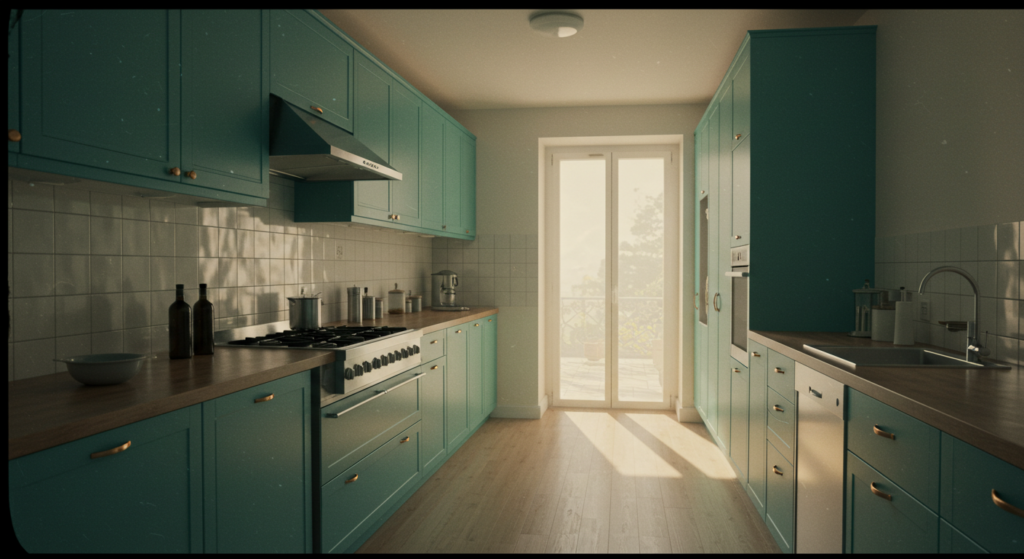
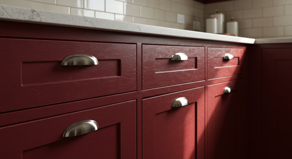
Radiant Red Cabinets
Energy and Placement
Red cabinets beckon attention. They can be your kitchen’s main highlight or a playful accent. Some folks worry that red might overwhelm a space. But if you choose a slightly muted red, or keep it on just the lower cabinets, you’ll strike a nice balance. This setup pairs great with metal hardware in brushed nickel or matte black.
Still, remember that red can draw eyes, so plan your layout. If you have a galley kitchen, place red cabinets on one side and keep the other side neutral. That helps avoid a cramped look. Keep your walls pale or white to offset the bright cabinets.
Balancing With Countertops
You might ask, “What countertop color works best with red?” Many prefer white quartz or light marble. They reflect light and calm the bold hue. Another route is black granite, which can feel modern and sleek.
Consider the overall vibe you want. A balanced aesthetic emerges when the countertop color repeats in other details. Maybe use matching marble tile for a backsplash or incorporate black barstools if you chose black counters. Little tie-ins create harmony.
Small Decor Touches
Decor elements can soften that intense red. If your kitchen has open shelving, add white porcelain bowls or neutral pottery. Place an indoor herb garden near the window. That green pop helps everything feel lively without clashing with the cabinets.
You might slip in some wooden cutting boards for warmth. Their natural tone mellows out the bright color. If you’re game, throw in a few vintage posters that incorporate red accents. This approach helps unify the room.
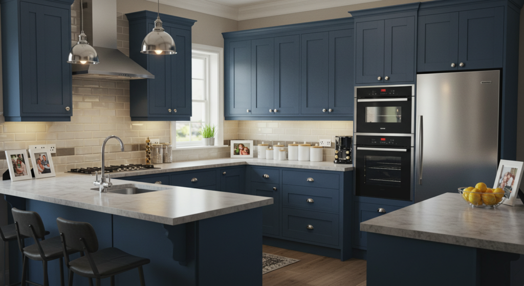
Bold Blue Cabinetry
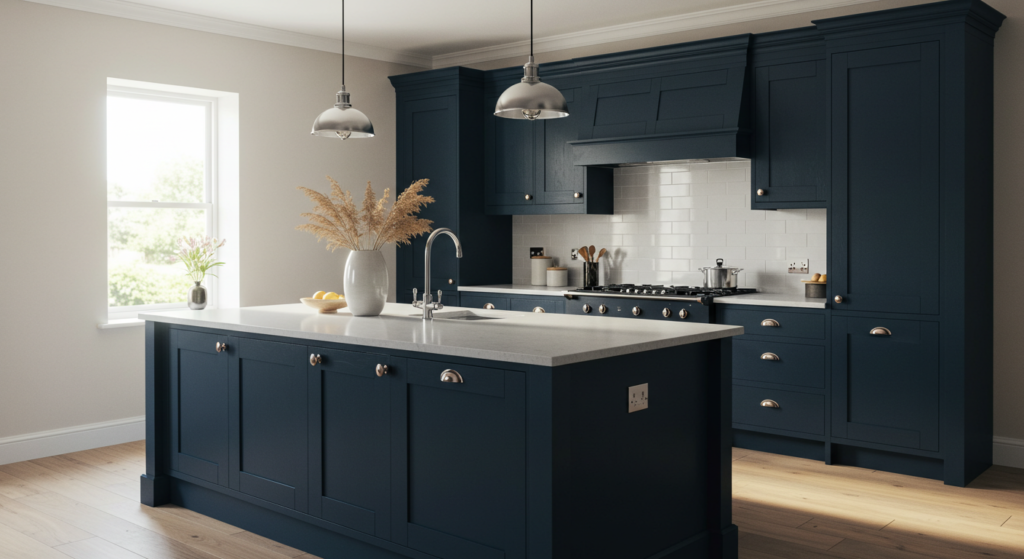
Choosing the Right Shade
Blue has many variations, from moody navy to vibrant teal. It’s important to pick a shade that works with your light levels. If your kitchen has good natural light, you could try a deep navy on all cabinets. But in a dim space, that might feel oppressive. So, maybe pick a brighter teal or royal blue.
Swatches help you see how that color looks throughout the day. Get paint samples from brands like Sherwin-Williams or Behr, brush a bit on a test piece, and observe it under different lighting. That practice can prevent regret later.
Pairing with Flooring
One question often pops up: “Does the floor matter when I choose blue?” Sure, it does. Darker blues pair well with lighter hardwood or even a whitewashed laminate. Meanwhile, bright blues might look extra punchy against a gray tile floor.
You want some contrast between the cabinet color and the floor tone. If both are dark, your kitchen might feel heavy. If both are too bright, it might blind you. Aim for a balanced relationship between those surfaces.
Hardware Selections
Hardware is the cabinet’s jewelry. For blue cabinets, silver-tone pulls add a contemporary edge. Vintage brass hardware can give a nautical or coastal feel. If you lean toward a modern, minimal approach, consider sleek bar pulls in stainless steel.
Coordinate hardware with lighting fixtures, faucets, and other metallic accents. This unifies the design. Some folks even like to mix metals—silver knobs with a gold pendant light—but do so carefully so it doesn’t feel random.
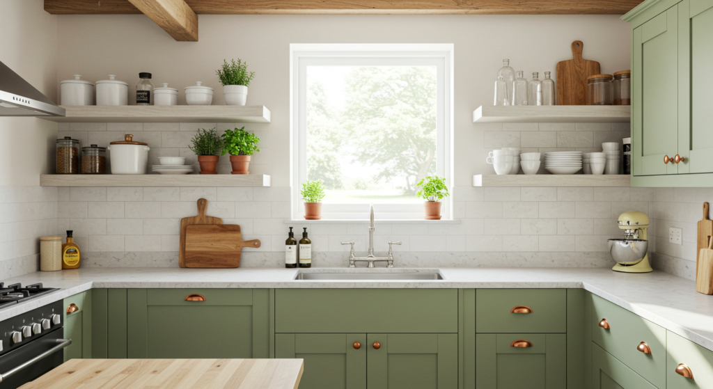
Lively Green Cabinets
Light Green vs. Deep Green
Green cabinets can be unexpected, though they often suit both farmhouse and modern styles. Light mint or pastel green feels breezy and fresh. Deep emerald or forest green adds a refined character. The question is, how adventurous are you?
Lighter shades reflect more light and can make a small kitchen look bigger. Darker tones ground a space. You could opt for a two-tone scheme, with deep green lower cabinets and airy white uppers. That keeps the room from feeling claustrophobic.
Mixing with Wood Details
Green pairs beautifully with wood. If you have wooden beams or a butcher-block countertop, a subtle sage or muted olive can highlight that warmth. The natural brown undertones play nicely with greens, creating an earthy vibe.
For product ideas, you might look into IKEA’s wooden countertop slabs. They’re budget-friendly and easy to install. They complement green cabinets while giving you that organic twist.
Splashes of Accents
A green cabinet base can let you add small bursts of color in other spots. Maybe you hang a few potted plants above a window. Or set up a striking copper pot collection. The green backdrop can let metallic or bright decor items pop.
Try layering small accessories in neutral shades, so your green cabinets remain the star. A subtle runner rug in beige or cream can tie it all together.
Sunlit Yellow Cabinets
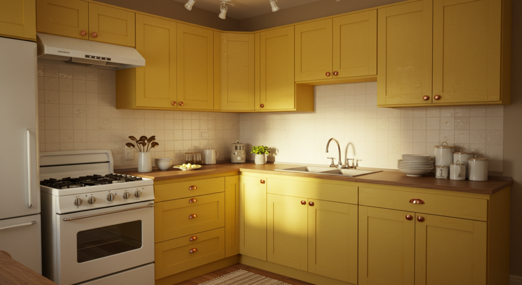
Creating a Warm Glow
Yellow is friendly. It brightens dull kitchens, especially those lacking natural sunlight. If your kitchen gets little daylight, a sunny yellow can create a cheerful mood. But it’s crucial to pick the correct tone. A harsh neon might look jarring. A soft lemon or butter-yellow can still be bold without attacking the eyes.
Dull or pale yellows lean more modern, while bolder bright yellows might feel vintage diner-inspired. Both can work if you style them right.
Countertop and Backsplash Pairings
Marble, especially with subtle veining, looks stunning against soft yellow. Or you can try a white tile backsplash with black grout to bring in a bit of contrast. This can keep the kitchen from looking overly pastel.
You might also experiment with a patterned backsplash. For instance, a tile design that includes touches of yellow can unify the space. People sometimes skip patterns in kitchens, but a small bold area behind the stove might be intriguing.
Easy Decor Uplift
When you choose yellow cabinets, consider matching your dish towels or small appliances. If you have a retro toaster or a bright stand mixer, let them echo that color. It’s a cohesive trick.
Be cautious with multiple bright colors, though. If everything is neon, the space may feel chaotic. Stick to a few accent tones that complement your chosen yellow. That consistency helps maintain a pleasant environment.
Sophisticated Black Cabinets
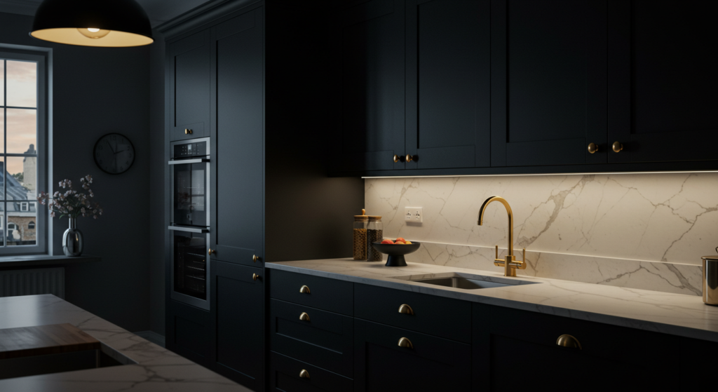
Adding Drama Without Clutter
Black cabinets can look sleek. They create a cool focal point. Some folks worry black will shrink the space. Yes, dark colors can absorb light, but you can offset this with the right lighting plan and finishes. Black can hide stains or scuff marks better than white, too.
One method is to paint an island black while keeping the perimeter cabinets a lighter shade. That adds drama in one spot without overwhelming.
Lighting Essentials
A black cabinet scheme demands good lighting. Pendant lamps over an island, under-cabinet LEDs, and natural sunlight from windows can keep things bright. Reflective surfaces like glossy countertops or a shiny backsplash also help bounce light around.
If your kitchen lacks windows, be sure to install bright light bulbs. You don’t want to strain your eyes while chopping vegetables.
Accents and Hardware
To keep black from feeling drab, pair it with gold or copper hardware. This combination exudes a lavish edge. Or pick polished chrome for a modern, minimalist approach. Don’t skimp on accent colors either. A bowl of fresh fruit in bright reds or oranges can break up the darkness.
You can also install glass-front upper cabinets. The black frames around glass panels look classy and lighten the overall appearance.
Earthy Brown Tones
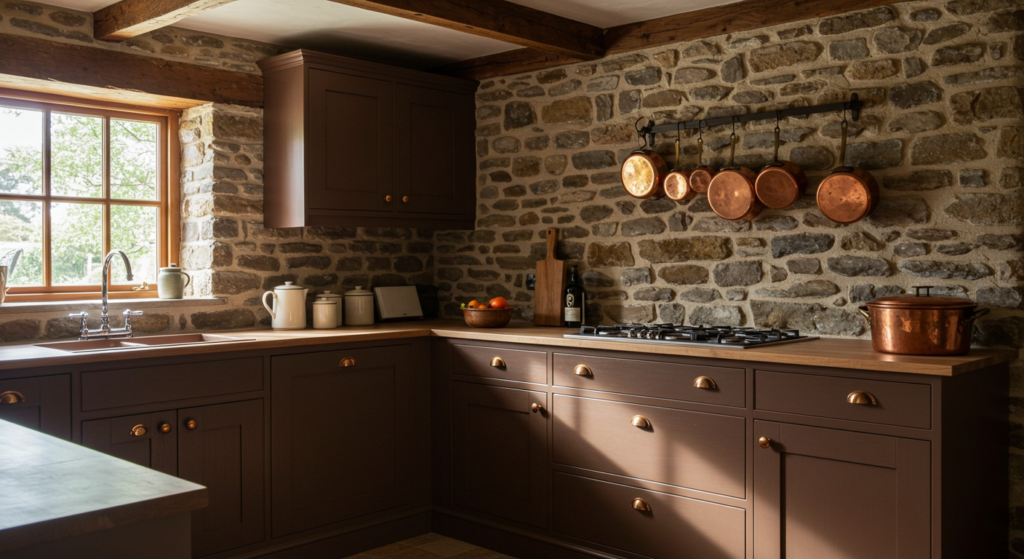
Natural and Cozy
Brown cabinets, whether painted or stained, offer a warm and welcoming environment. They work in rustic, farmhouse, or traditional kitchens. If you prefer a modern style, you can still go for a smooth walnut finish. It’s about choosing the right hue and finish.
Some folks pick a medium chocolate brown to avoid extremes. This tone can hide cooking splatters but won’t make the room too dark.
Matching Stone Surfaces
Earthy browns team up nicely with natural stone countertops. Granite or quartz with brown flecks can unify the look. You might choose subtle veining or marbled patterns that incorporate tans and creams.
If your floor is also wood or laminate, aim for contrast between cabinet and floor color. Let them differ enough to avoid a muddy look.
Accessory Coordination
Textiles like woven placemats or rattan stools fit right in with a brown cabinet theme. These organic materials echo the warm vibe. Adding in a few potted succulents also brings nature indoors.
Small metallic items—like copper cookware—can provide sparkle. The interplay between brown cabinets and warm metal accents feels cozy.
Crisp White Cabinet Contrasts
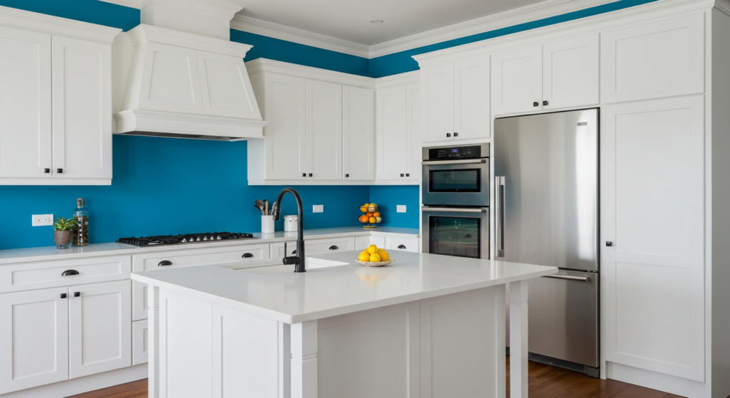
Why Bold Hues Aren’t Only Dark
White can be bold in its own way, especially if you pick a striking shade like bright white or an off-white with a pop of warmth. While white is a classic choice, you can still give it a bold twist with unique finishes and contrasting details.
Shiny lacquered white cabinets can read modern. Distressed white might look more farmhouse.
Pairing With Bold Walls
Sometimes, your walls can carry the bold color instead of the cabinets. That way, white cabinets stand out like a crisp outline. Picture electric-blue walls with bright white shaker cabinets. The interplay can be quite dramatic.
This approach is great for those who prefer safer cabinet choices. If you tire of the bold wall color, repainting the wall is easier than repainting cabinets.
Standout Hardware
On white cabinets, hardware truly pops. Try black pulls for an industrial-chic vibe. Or choose brushed bronze if you want a transitional feel. The good thing about white is it pairs with almost everything.
You might swap out hardware seasonally if you’re the adventurous type. Switching from bronze to a pewter tone is a quick weekend job that changes your kitchen’s character.
Soft Pastels for a Gentle Pop
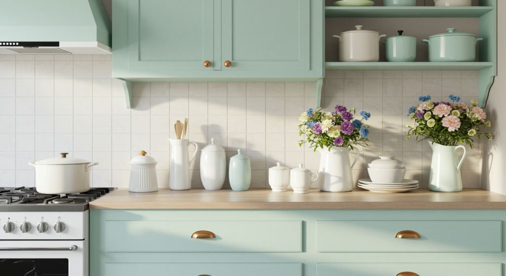
Subtle Color Elevation
Pastels like pale pink, baby blue, or gentle lavender can bring a delicate twist to your kitchen. People often skip these shades, fearing they’ll look childish. But with the right styling, pastels feel grown-up and soothing.
If you have open shelving, pastel cabinets can blend seamlessly with pastel-colored bowls and plates. Keep the rest of the decor neutral to let the pastel shine.
Keeping Things Classy
A pastel color can still be bold if used correctly. For instance, a pastel pink island against gray cabinets can generate subtle drama. Choose a matte finish if you want a more refined look.
Also, avoid pairing too many pastels together. One or two soft shades is often enough. You don’t want the space looking like cotton candy.
Ideas for Accessories
When your cabinets are pastel, try mixing in crisp white dishware. A small vase of fresh flowers on the counter can add a bright note.
If you like a retro vibe, consider pastel-colored appliances, like an old-school pink fridge. Companies such as SMEG offer nostalgic pastel refrigerators that turn heads.
Mixed Metallic Accents
Metallic Paints for Cabinets
Painting cabinets a metallic color may sound daring, but it can result in a high-end, designer style. You could try a brushed-silver finish or even a bold copper-based tone. It’s essential to prep properly: lightly sand, apply a bonding primer, and use a specialty metallic paint.
Metallic finishes reflect light, making your kitchen shimmer. This option pairs well with modern or industrial decor.
Bringing Shine Through Hardware
If fully metallic cabinets feel overwhelming, incorporate metallics as hardware and trim. Maybe paint the main cabinet in a moody charcoal, then add gold trim on the cabinet edges or corners. This detail can set your design apart.
You might also highlight drawer fronts with metallic inlays. A subtle approach can still look stunning.
Coordination with Appliances
Stainless steel appliances complement metallic finishes. If you choose a copper or brass tone, try to keep your appliances consistent. White appliances might clash. Another trick is to integrate your fridge with a cabinet panel, so it doesn’t disrupt the metallic flow.
Don’t forget your sink and faucet. If the cabinets are metallic, a sleek matching faucet ties it all together.
Patterned and Painted Motifs
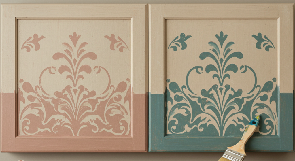
Stencils and Designs
Want to get artsy? Stenciling can add patterns to cabinet fronts. Maybe a geometric design for a modern feel, or a floral pattern for a whimsical vibe. You can purchase stencils online or create your own.
Use painter’s tape to keep lines straight and ensure each design lines up. It’s easier than you think once you get the hang of it.
Painted Scenes
If you have an artistic streak, consider painting a small scene on a select cabinet panel. This might suit a farmhouse kitchen with a simple countryside motif, or a beach-themed scene for a coastal space.
Try to keep it limited so it doesn’t become overpowering. One or two panels can make your cabinets unique.
Sealing the Artwork
Use a protective clear coat over your stenciled or hand-painted designs. This helps guard against moisture, grease, and everyday wear. Several brands offer water-based polyurethane that won’t yellow.
Always let the paint cure fully before applying the sealant. That step ensures you won’t smudge or dull your design.
Two-Tone Cabinet Schemes
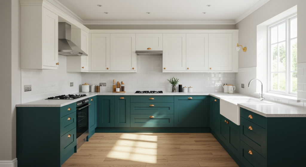
Splitting Top and Bottom
Two-tone cabinets are a popular method to add color without overdoing it. Paint your upper cabinets in a light shade (like a calm white or pale gray) and the lower cabinets in a bold color (like navy, emerald, or red).
This technique visually separates the kitchen, making it feel more spacious. The eye sees the bright upper half, and the colorful lower half anchors the room.
Mixing Colors Wisely
What if you want two bright colors? Some folks combine teal uppers with mustard lowers. That might look super lively if you coordinate with neutral walls and countertops.
Always test your pair of colors to see if they clash. Painted swatches near each other can reveal if they harmonize or fight each other.
Blending Hardware Choices
When you split cabinets into two colors, consider whether to keep hardware uniform or change it per color. Often, one hardware style for both sets fosters a cohesive effect. But if you want an eclectic vibe, you can use different knobs for each color.
Just ensure the styles aren’t too wildly different, or your kitchen might seem disjointed.
Contrasting Island Colors
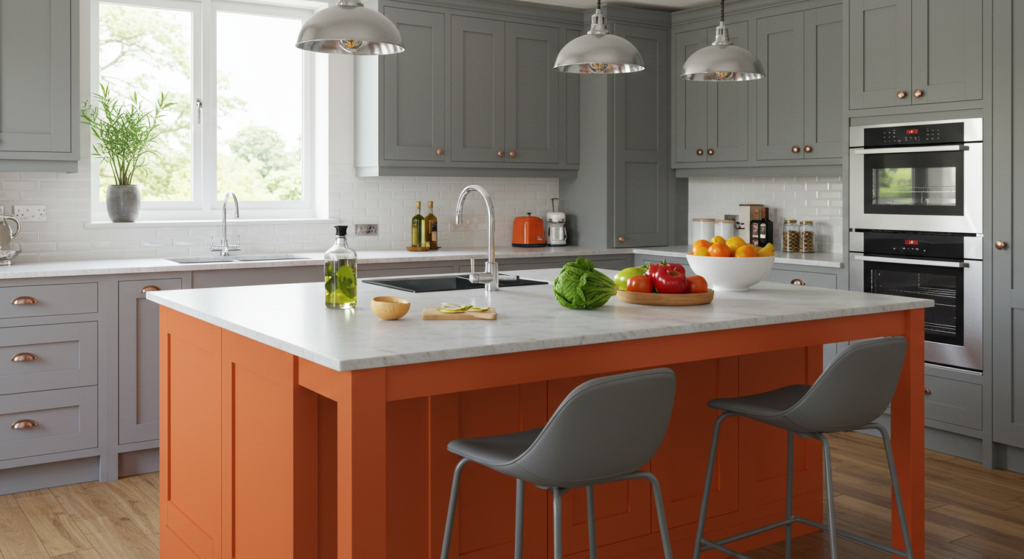
Island as a Focal Point
Many kitchens have a central island that begs for attention. Painting the island in a bold hue can be a simpler route to add color. If the rest of your cabinets remain neutral, the island pops.
Possible combos might be white perimeter cabinets with a black, teal, or mustard island. You can even pick a bright orange if you’re feeling very adventurous.
Tying It to Other Elements
Let’s say you painted the island navy. Consider navy barstools or a rug with hints of navy. Echoing that color helps the design feel intentional.
You could also bring in metallic pendant lights that reflect the island’s tone. Another trick is to install a matching backsplash accent behind the stove.
Low Commitment
If you decide the color is too wild after a year, repainting just the island is easier than redoing all cabinets. This method gives you freedom to experiment without major risks.
It’s a neat idea for folks who want bold color but worry about going overboard.
Painted Cabinet Interiors
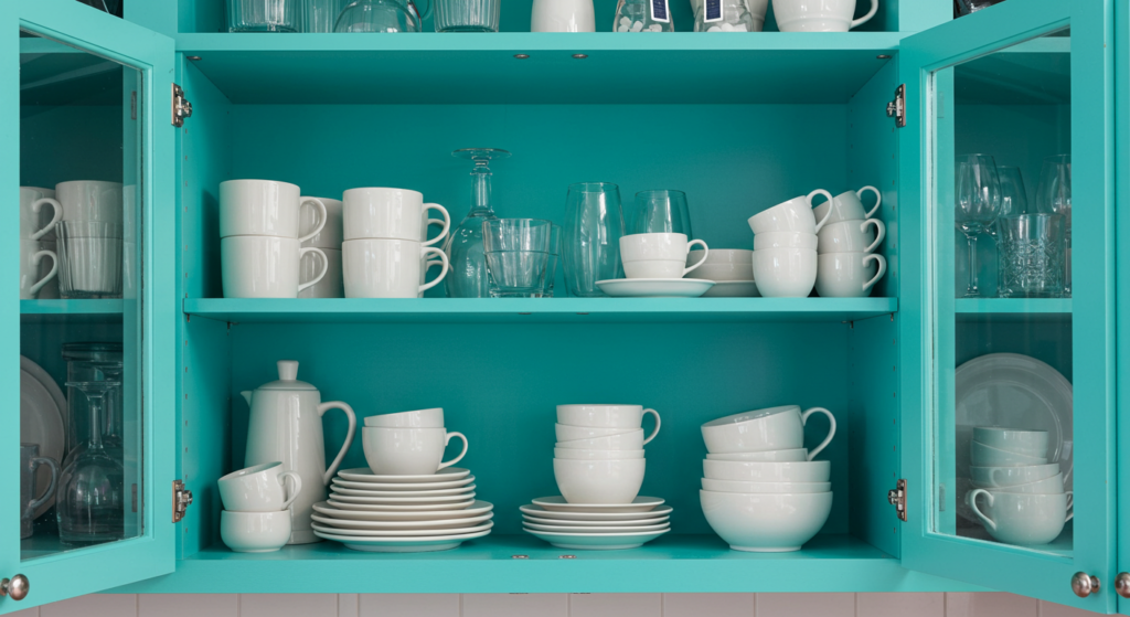
Surprise Element
Painting the inside of cabinets can create a fun surprise whenever you open the doors. This works especially well for glass-front or open-shelf cabinets. You can pick a bright color that complements the exterior.
If your cabinet fronts are a calm gray, a shocking coral interior can add a playful edge. Or choose a pastel inside to lighten a dark exterior.
Steps to Achieve It
Remove cabinet doors and shelves for easier painting. Sand the interior lightly and prime it. Then apply a few thin coats of your chosen color. This approach can be more time-consuming than painting the outside alone, but it’s worth the effect.
If you only want a subtle accent, you can just paint the back panel. That’s often enough to create impact.
Coordinating With Dishes
If you store white dishes in glass-front cabinets, a colorful interior can act like a backdrop for those plates. With a bold color behind them, the pieces almost pop out like an art display.
Pick a color that doesn’t clash with your dishes. You want synergy, not a color war.
Protective Coatings and Finishing Touches

Primers and Paint Types
Proper prep is key for any cabinet painting project. Many folks skip primer and end up with peeling or chipped paint. Use a high-quality bonding primer that sticks well to your cabinet material, especially if you have laminate surfaces.
Latex or enamel paints both work. Enamel often offers a harder finish, which is helpful in a heavy-use space like a kitchen. Water-based alkyd enamel is a great modern choice that combines easy cleanup with durability.
Sealing for Durability
Grease, steam, and spills happen in kitchens. A protective topcoat can keep your paint job intact for years. Look for a clear polyurethane or polycrylic product. If you want a matte look, choose a satin or low-luster finish.
Apply the sealer after your paint fully cures. Follow the manufacturer’s drying times. Don’t rush. If you do, you might get a cloudy finish or weird streaks.
Maintenance Tips
Wipe spills right away, and use mild soap for cleaning. Avoid harsh scrubbing pads. If you spot minor scratches, touch them up with leftover paint.
Regular dusting can also help your cabinets stay vibrant. Grease buildup can dull any color, so a quick weekly wipe keeps them shining.
Contrivances for Accessorizing and Decor Ideas
Lighting Fixtures
Fun pendant lights over an island can tie in with your cabinet color. If your cabinets are bright red, maybe choose a fixture that has red or black accents. This synergy can unify the space.
Track lighting can also help highlight certain areas, like a bold accent cabinet or unique backsplash feature.
Decorative Hardware
Switching your hardware is often an easy upgrade. Crystal knobs, vintage bronze pulls, or modern bar handles can transform the cabinet’s style. If your budget is tight, that small shift can still have a big visual impact.
Sometimes folks buy hardware online from places like Wayfair or Amazon to get a huge range of designs at decent prices.
Floating Shelves and Open Displays
You can pair colorful cabinets with a few floating shelves to break up the lines. Display colorful plates, mugs, or even small potted succulents. This approach can lighten the look if your cabinets are a darker hue.
Just be sure you’re willing to keep those shelves tidy. Clutter will undermine your stylish efforts.
Embracing Your Style
Vintage Vibes
If you love a retro aesthetic, you can combine bold color with vintage appliances or decor. Mint green cabinets might pair well with a retro fridge. Add some old-school diner stools or a checkered floor.
The key is to keep your color palette consistent. Avoid too many random brights that don’t mesh.
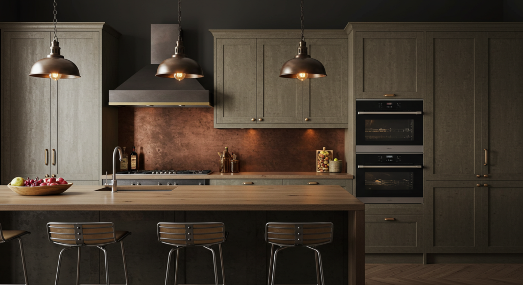
Industrial Edge
An industrial style might feature metal or concrete surfaces. You could paint cabinets a steely gray or gunmetal blue, then showcase exposed pipes or ductwork.
Try pairing that with wooden shelves or butcher-block countertops to add warmth. You want a balance of tough edges and homey details, so it doesn’t feel cold.
Eclectic Euphoria
Some folks don’t want a single style label. They want a bit of everything. That’s okay, too. Maybe mix bright turquoise cabinets with a vintage rug and modern bar stools. Add bohemian touches like woven baskets or macrame plant hangers.
As long as you find ways to tie the colors together, your unique vision can shine.
Conclusion
Colorful cabinets give kitchens a bold statement, turning a functional space into a lively spot. Whether you choose a vivid red, a cool green, or a patterned motif, your creativity can push your kitchen’s style beyond ordinary. By selecting the right paint, prepping the surface, and thinking carefully about hardware and accents, you’ll craft a space that matches your tastes and daily habits.
The best part? You can always tweak and refine the look. If you grow tired of a shade, a fresh coat brings new life. Designing a kitchen with color is more than aesthetics—it’s about making a place you’ll love. Bold cabinets might sound risky, but they often leave homeowners smiling. Jump in and transform your kitchen into a bright, inviting oasis.
Summary Table
| Topic | Key Point |
|---|---|
| Radiant Red Cabinets | Use red selectively and balance with pale walls or neutral floors. |
| Bold Blue Cabinetry | Match shade to your lighting; pair with contrasting flooring. |
| Lively Green Cabinets | Light greens open spaces; deep greens add classy charm. |
| Sunlit Yellow Cabinets | Ideal for dim kitchens; pick a soft yellow for a bright, warm look. |
| Sophisticated Black Cabinets | Good lighting is key; metallic hardware adds interest. |
| Earthy Brown Tones | Match with natural stone; warm accessories create a cozy feel. |
| Crisp White Cabinet Contrasts | Bold walls or standout hardware can keep white from feeling bland. |
| Soft Pastels | Subtle color that still pops; avoid too many pastel clashes. |
| Mixed Metallic Accents | Metallic paint or trim adds luxury; coordinate with appliances. |
| Patterned & Painted Motifs | Stencils or hand-painted designs; seal properly to protect. |
| Two-Tone Cabinet Schemes | Upper & lower color splits keep kitchens bright and grounded. |
| Contrasting Island Colors | The island can be the bold star; easier to repaint if you change mind. |
| Painted Cabinet Interiors | A fun surprise inside cabinets; color behind glass doors. |
| Protective Coatings | Prime, seal, and maintain to keep vibrant cabinets long-term. |
FAQ

1) Do I need to sand my cabinets before painting?
Yes. Light sanding removes old finish and helps paint stick better. If your surface is very glossy, sanding is crucial. Use a medium-grit paper, then wipe away dust. Skipping sanding often leads to peeling paint soon after.
2) Is a primer always necessary?
For the best results, yes. A bonding primer ensures paint adheres well and helps cover any previous stain or color. Some specialty paints say “no primer needed,” but I still recommend priming first for extra durability.
3) How many coats of paint should I apply?
Most folks do two to three thin coats. Don’t glop on thick layers. It might look streaky or bubble. Thin, even layers dry better and look smoother.
4) Will bold cabinet colors make my small kitchen look tinier?
Dark or intense shades can feel heavy in cramped spaces. But you can balance them with good lighting, white countertops, or reflective details. If you’re unsure, try painting just a small section or an accent piece to test.
5) How do I handle hardware placement after painting?
Remove all hardware before you start painting. Store each piece in a labeled bag if your hardware has different sizes or if you have many drawers. After the cabinets are dry, reinstall hardware or switch to a new style.
6) Can I paint laminate cabinets?
Yes, but be sure to sand lightly and use a high-quality bonding primer. Laminate is slick, so give the primer time to cure. Choose paints designed for smooth surfaces. Follow instructions and your paint job should hold up.
7) What’s a quick way to refresh old cabinets if I can’t afford all-new hardware?
Try painting just the doors or adding a fun interior color. You might also replace only the knobs or pulls on highly visible doors. Little changes can make your cabinets look fresh without breaking the bank.
8) Should I remove cabinet doors to paint them?
It’s easier to get a smooth finish that way. Lay doors flat and use small risers so the edges aren’t touching your work surface. You can paint the frames in place, but taking off the doors helps you avoid drips and missed spots.
9) What if I regret my color choice?
You can always repaint, though it’s a bit of work. Testing paint samples on a scrap piece of wood or a spare door can help you dodge disappointment. Also, keep in mind that accessories and lighting can shift how a color looks.
10) Will a gloss finish be better than a matte finish?
Gloss is easier to clean, but it can show imperfections. Matte or satin hides scratches better but might need more gentle care. Consider how busy your kitchen is and how often you wipe down surfaces.
Remember, bold hues can be delightful if you pick them thoughtfully and take a little care with the prep and finish. Have fun transforming your kitchen with bright, head-turning cabinets!

Lenny Terra is a vibrant force in the world of fashion and design. Effortlessly blending his expertise in colors with a keen artistic vision, he unveils the most sought-after hues of the season, turning ordinary ensembles into iconic looks. His knack for creating visually enthralling content ensures that every piece resonates with readers, offering them a mesmerizing journey through the realms of color and fashion. Lenny’s unmatched skills not only elevate the aesthetics but also promise an enchanting experience every time. Dive into his creations and let the colors speak for themselves.
Reviewed By: Joanna Perez and Anna West
Edited By: Marcella Raskin
Fact Checked By: Sam Goldman
Photos Taken or Curated By: Matthew Mansour
