Key Takeaways
- Unexpected color combinations can bring fresh energy to your wardrobe.
- Balancing brightness and subtlety is key to making surprising combos work.
- Accessorizing strategically completes a look, ensuring each color finds its perfect match.
- Experimentation is essential—don’t be afraid to break “fashion rules.”
- Textures and fabrics often influence how colors interact, so choose wisely.

Introduction
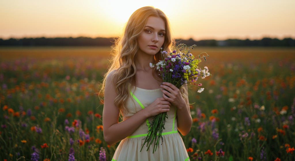
Ever spot a daring color combo that makes you think, “I wish I could pull that off!”? You’re not alone. Many fashion enthusiasts crave that special bit of excitement from wearing surprising and unconventional color pairings. Some color combos—like bright pink with olive green or dusty orange with neon purple—sound outlandish on paper. Yet, when done right, they look undeniably amazing.
Sometimes, the magic of color in fashion is less about rules and more about the art of contrast. Think of a painter who blends hues on a canvas: the perfect splash of color can change the entire mood of a painting. In your closet, it’s much the same. If you can balance, highlight, and contrast each piece, you can create outfits that turn heads and spark compliments.
This article is for anyone seeking fresh color inspiration. We will explore 14 sections—each featuring a bold, exciting color combination or technique—along with three subsections in each for a total of 42 detailed tips and tricks. You’ll also find practical strategies to make each combo wearable in everyday life. Don’t worry if you’ve been told, “Never pair these colors together.” Today, we’re challenging those notions and showing you how these seemingly mismatched colors can become your new style signature.
Let’s dive in and discover Dare to Wear: Surprising Color Combos That Actually Work.
1. Pink & Olive Green
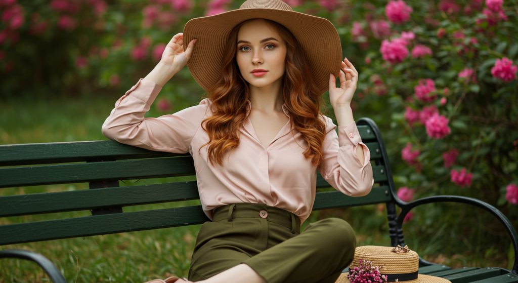
A) Subtle Earth Meets Vibrant Pop
Pink and olive green might sound like polar opposites. One is soft and playful, while the other is grounded and earthy. But that’s exactly why they work so well together. The gentle sweetness of pink adds a spark of brightness to olive green’s somewhat subdued tone. Picture an olive-green jacket layered over a pink T-shirt—effortless yet bold.
B) Accessorizing With Layers
If you’re not fully ready to wear a pink top with olive-green pants, start small. Introduce pink accessories like a bag or scarf. Alternatively, choose olive green footwear or a belt to anchor your pink outfit. The key is to let one shade lead and the other support it.
C) Fabrics and Texture
Textured fabrics enhance this combo’s appeal. Try a chunky olive sweater paired with a smooth pink satin skirt. The interplay of rough and smooth surfaces amplifies the contrast. It’s this element of surprise that turns your outfit into a statement piece rather than just another look.
2. Rust & Lavender
A) Channeling Fall All Year
Rust is typically seen as an autumn tone, reminiscent of falling leaves and cozy gatherings. Lavender, on the other hand, often signals spring. When you combine the two, you get a seasonless palette that defies expectations. This blend is more versatile than people realize, balancing warm and cool notes perfectly.
B) Fitting Them Into Your Wardrobe
Don’t let the idea of lavender scare you away. A lavender blouse under a rust-colored blazer can be a fresh office ensemble. For a weekend look, flip the equation: throw on a rust tank with lavender shorts or leggings.
C) Elevating With Metallics
Accessorizing with metallic details—like gold cuffs or silver-toned shoes—can bring extra sophistication. These subtle metallic touches pick up on the richness of rust while accenting lavender’s soft glow.
3. Mustard & Teal

A) Retro Meets Modern
Mustard and teal together might conjure images of vintage decor, but that’s precisely the charm. This nostalgic nod, reimagined in modern silhouettes, feels simultaneously retro and fresh. It’s especially striking on casual streetwear like oversized sweaters and wide-leg trousers.
B) Mixing Tones
Within mustard and teal, you can vary the intensity—mustard might be more muted or closer to bright yellow, while teal ranges from pale aqua to deep turquoise. Adjust the brightness of each color to suit your taste. A darker teal with a lighter mustard or vice versa can instantly shift the vibe of your outfit.
C) Practical Pairings
If you’re hesitant, keep the more unusual color on top. Pair a mustard sweatshirt with teal jeans, or wear a teal blouse tucked into mustard shorts. With small styling tweaks, this combo can go from eye-catching to truly stunning.
4. Neon Purple & Burnt Orange
A) Dynamic Contrast
Neon purple stands out, no doubt. Burnt orange, although warm, has a subdued, earthy edge. Placing them side by side creates a dynamic visual that’s equally fun and refined. The key is to ensure one color doesn’t overshadow the other.
B) Creative Layering
Consider layering neon purple underneath an open burnt-orange cardigan or jacket. This way, you get that surprising pop of color without letting it dominate. Alternatively, choose color-blocked items—like a dress with contrasting panels—to make both hues shine.
C) Bold Accessories
To really lean into this color scheme, add statement accessories in either neon purple or burnt orange. A chunky necklace or a pair of bold boots can tie it all together. Just be mindful not to overload your outfit with too many competing elements.
5. Navy & Fuchsia

A) Vibrant Sophistication
Navy is a staple in most wardrobes. Fuchsia, however, is usually reserved for special events or accent pieces. When combined, the result is a refined yet lively palette. Navy’s depth anchors fuchsia’s brightness, striking a perfect balance of sophisticated playfulness.
B) Perfect for Formal and Casual
This duo works well in formal settings—imagine a navy suit with a fuchsia blouse peeking out. It also shines in casual outfits, like a fuchsia skirt paired with a navy sweater. If you’re uncertain, switch to a navy dress with a bright fuchsia belt.
C) Styling Tips for Proportions
When using contrasting colors, it’s important to consider proportions. If you’re wearing a large garment in fuchsia, balance it with smaller navy pieces and vice versa. This ensures your outfit feels cohesive rather than overwhelming.
6. Khaki & Hot Pink
A) Minimalism Meets Vividness
Khaki is known for its understated vibe. Add a dose of hot pink, and you have a color combo that instantly shifts from bland to bold. This pairing is especially appealing in modern streetwear, offering a cool minimalistic base with an unexpected splash of color.
B) Accessorize for Impact
If wearing hot pink pants feels too flashy, opt for a hot pink accent: a handbag, a pair of sneakers, or a belt. Let khaki serve as your neutral backdrop, making the pink pop even more.
C) Balancing the Look
For a balanced outfit, keep cuts and silhouettes straightforward. A simple khaki trench over a hot pink T-shirt can be all you need. Avoid adding other strong colors that might cause visual chaos.
7. Red & Mint
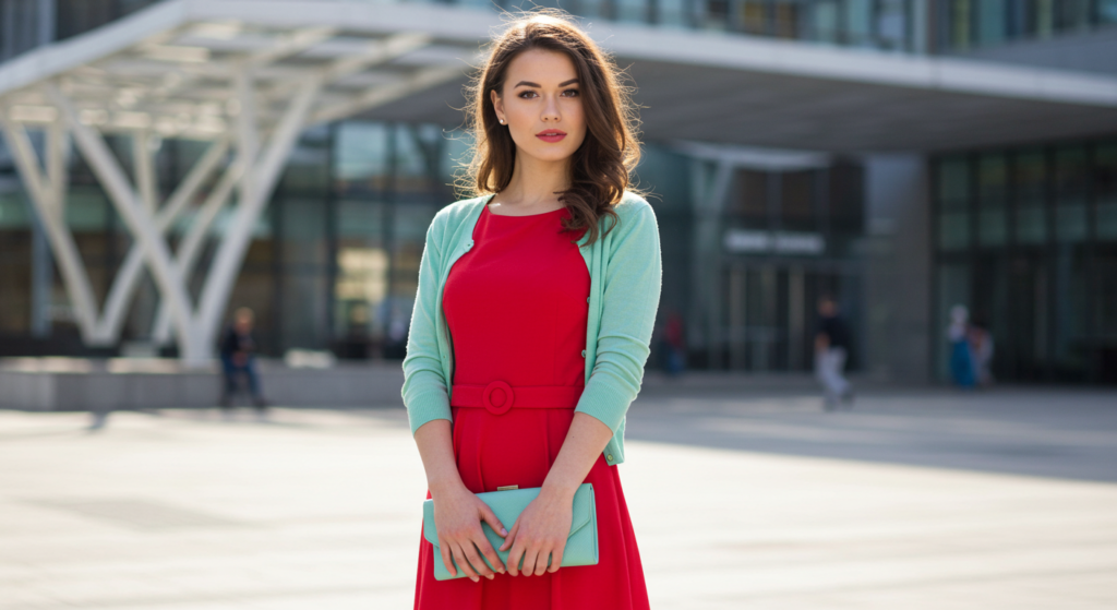
A) Fresh Take on Classic Red
We often see red paired with black, white, or navy. But pairing red with mint offers a bright and refreshing twist. It’s like adding a burst of icy energy to the warmth of red, resulting in a stand-out ensemble.
B) Texture Contrasts
To elevate this pairing, play with textures. For instance, a smooth mint satin blouse with a ribbed red knit skirt or pants can create a pleasing contrast. The difference in texture can be as eye-catching as the color combination itself.
C) Proportional Color Blocking
When blocking red and mint, consider how much of each color you want to showcase. If you’re wearing a large mint sweater, then keep red accents (like scarves or shoes) small and deliberate. This maintains harmony while allowing the colors to shine.
8. Camel & Cobalt Blue
A) Understated Meets Bold
Camel is a classic neutral—warm, soft, and sophisticated. Cobalt blue, on the other hand, demands attention. When you bring them together, each enhances the other’s best qualities. The earthy undertones of camel ground the intense energy of cobalt, resulting in a refined yet striking look.
B) Strategic Layering
A camel coat worn over a cobalt blue sweater is a foolproof way to embrace this combo. Layering not only helps you stay warm but also allows you to show a hint of cobalt without overdoing it.
C) From Office to Weekend
This color pairing travels effortlessly from business-casual to weekend relaxation. Wear a camel blazer with cobalt pants for the office, or a cobalt T-shirt paired with camel joggers for an off-duty look that still feels stylish.
9. Burgundy & Turquoise
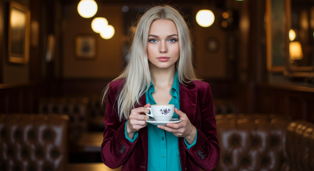
A) Unexpected Elegance
Burgundy is often paired with neutrals or metallics, but mixing it with turquoise creates a surprising level of sophistication. Turquoise pops against burgundy’s richness, while burgundy subdues turquoise’s brightness just enough to create balance.
B) Harnessing Accessories
An easy way to try this is through accessories. A turquoise statement necklace on a burgundy sweater can be a game-changer. Alternatively, a burgundy clutch can accent a turquoise dress without competing for attention.
C) Avoid Overcrowding
Since both are strong colors, keep your outfit streamlined. Avoid adding too many prints or patterns that might distract from the unique color interplay. Stick to solid pieces or minimal patterns to maintain a polished, cohesive look.
10. Brown & Electric Blue
A) Reimagining Neutrals
Brown doesn’t always have to be boring. Pair it with electric blue, and you’ll see how a grounded color can become a high-fashion statement. This combo breathes new life into brown, transforming it from “safe” to “stunning.”
B) Choosing the Right Shade of Brown
Brown ranges from light beige to dark chocolate. Electric blue, meanwhile, is eye-poppingly vivid. The deeper the brown, the more dramatic the contrast. If you prefer a softer aesthetic, go for a mid-tone brown with a slightly muted electric blue.
C) Daytime vs. Evening
For daytime, consider a brown dress with an electric blue belt or shoes. At night, flip the script: go for an electric blue top or blazer paired with brown trousers to draw attention.
11. Charcoal & Chartreuse

A) Modern Twist on Grey and Green
Charcoal is a darker twist on grey that carries a sleek, urban vibe. Chartreuse—somewhere between green and yellow—is undeniably bold. Put these two together for a futuristic color palette that feels surprisingly wearable.
B) Creative Outfit Building
Start with charcoal basics: pants or a skirt. Then layer on chartreuse in smaller doses, like a chartreuse top or accessories. Because chartreuse is striking, it doesn’t take much for it to make a big impact.
C) Metallic and Muted Accents
For finishing touches, metallic accents in silver or gunmetal can play well with charcoal. If you’d like to tone down chartreuse a bit, incorporate muted, nature-inspired elements—like wooden bangles or a beige scarf—to provide extra balance.
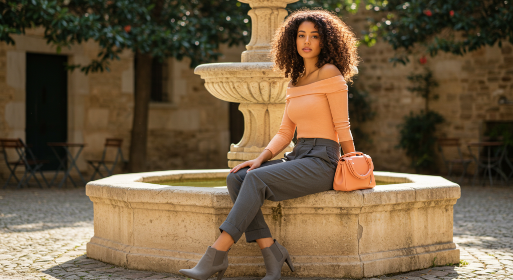
12. Forest Green & Coral
A) Subdued Earth Meets Tropical Zing
Forest green is reminiscent of lush, verdant woods, while coral has a bright, tropical flair. Bringing them together creates an unexpected harmony, balancing natural warmth with a pop of energetic color.
B) Office-Friendly Looks
A forest-green blazer paired with a coral blouse is an elegant way to spice up your work attire. The green reads professional, and the coral injects just enough personality to stand out.
C) Mixing Patterns
If you want to experiment, look for a patterned piece that combines forest green and coral. Stripes, florals, or abstract designs can unify these two distinct colors. Just keep the rest of your outfit neutral to let the pattern do the talking.
13. Peach & Slate Grey
A) Soft vs. Strong
Peach embodies softness and light, while slate grey feels solid and resilient. The result of pairing these two is a modern outfit but still has a gentle elegance.
B) Everyday Wear
You can easily incorporate this combo into your daily routine with a peach top and slate-grey jeans. It’s subtle enough for errands or casual meet-ups but still looks thoughtfully put together.
C) Dressing It Up
For more formal occasions, a slate-grey jumpsuit with peach heels can look incredibly chic. Add a peach clutch for a finishing touch that echoes your accent color.
14. Ivory & Neon Green
A) Clean Canvas, Bold Stroke
Ivory is a sophisticated neutral that acts like a blank canvas. Neon green, on the other hand, is attention-grabbing at its core. When paired, the neon green pops vividly, while the ivory keeps the look balanced and chic.
B) Tailoring is Key
Because neon green can be quite loud, well-tailored pieces ensure the outfit reads as intentional rather than chaotic. A crisp ivory blazer worn over a neon-green top exemplifies sleek confidence.
C) Subtle Details
If head-to-toe neon isn’t your thing, choose small neon green details. Think neon piping on an ivory handbag or neon accents on your shoes. Even a hint of neon can enliven an otherwise simple ensemble.
Conclusion
Fashion is about the unexpected—those moments when you experiment with something new and discover a look that expresses your individuality. While classic color combinations have their place, there’s a special thrill in pushing the boundaries. These 14 sections—and the three subsections within each—offer a glimpse into the limitless potential of daring color combos.
Remember, the key to making any surprising color pairing work is balance. If one shade is loud, let the other be more subdued. Consider fabrics, accessories, and proportions to keep each outfit harmonious. Above all, dress for yourself. When you feel confident in what you’re wearing, that confidence becomes the most eye-catching accessory of all.
Keep experimenting, keep innovating, and keep daring to wear the colors that spark joy for you. With these combos, you’re well on your way to building a wardrobe that stands out in the best possible way.
Summary Table
| Color Combo | Main Appeal | Quick Styling Tip |
|---|---|---|
| Pink & Olive Green | Balances sweetness with earthy tones | Use pink accessories with olive basics |
| Rust & Lavender | Seasonless blend of warm and cool | Try a mustard top, teal pants or vice versa |
| Mustard & Teal | Retro nostalgia made contemporary | Texture contrasts with satin mint top, red knit |
| Neon Purple & Burnt Orange | High-impact contrast of neon and earthy | Layer neon purple under a burnt-orange jacket |
| Navy & Fuchsia | Sophisticated yet playful | Navy suit with a pop of fuchsia shirt |
| Khaki & Hot Pink | Understated base with a vivid pop | Hot pink belt against khaki dress |
| Red & Mint | Refreshing twist on a classic hue | Texture contrast with satin mint top, red knit |
| Camel & Cobalt Blue | Earthy neutral meets vibrant brightness | Camel coat over cobalt sweater |
| Burgundy & Turquoise | Rich, surprising elegance | Turquoise necklace on burgundy sweater |
| Brown & Electric Blue | Warm neutral lit up by vibrant blue | Dark brown with electric-blue pop |
| Charcoal & Chartreuse | Futuristic balance of dark grey and neon green | Minimal patterns to let the color stand out |
| Forest Green & Coral | Nature-inspired duo with tropical energy | Forest-green blazer, coral blouse for the office |
| Peach & Slate Grey | Softness meets urban edge | Peach top, slate-grey jeans for everyday |
| Ivory & Neon Green | Clean sophistication with bright energy | Focus on tailored silhouettes |
FAQ
Q: How do I ensure these surprising color combos don’t look tacky?
A: The secret is balance. If you choose a strong color, let its partner be more muted. Also, consider how you distribute the colors: one as the main piece and one as an accent can often feel more harmonious than splitting them 50/50.
Q: What’s the simplest way to experiment if I’m not used to bold color combos?
A: Accessories are your best friends here. Start with a small pop of the daring color—like a belt, hat, or shoes. That way, you can see how comfortable you feel with the combination before committing to bigger pieces.
Q: How do I choose footwear when wearing bright color combos?
A: When in doubt, neutrals like white, beige, or black can keep the focus on your outfit. If you feel adventurous, try matching your shoes to one of the bold colors in your ensemble for a head-to-toe statement.
Q: Does fabric choice matter with bold color combos?
A: Absolutely. Texture can make or break a look. Combining smooth and rough surfaces adds dimension. For instance, pairing a chunky knit with a silky fabric can elevate a color combo by emphasizing each color’s uniqueness.
Q: Can I wear prints or patterns with these combos?
A: Yes, but proceed carefully. Opt for patterns that incorporate both colors in small doses. Or, choose a pattern in one color and keep the rest of the look in the other color. This approach ensures your outfit remains cohesive.

Feel free to use these guidelines and Dare to Wear: Surprising Color Combos That Actually Work for a stylish, memorable wardrobe that truly reflects your personality. Dress boldly, and watch how you transform everyday fashion into something extraordinary.

Anna West, the visionary behind Clothes Color Guide, is our go-to for all things fashion. Merging the finest of runway trends with everyday style, she demystifies the world of color and pattern. While clothing is her mainstay, Anna also shares insights on interior design, pet care, and relationship advice. Dive into her articles and emerge with a vibrant perspective on style and life.
Reviewed By: Joanna Perez and Marcella Raskin
Edited By: Lenny Terra
Fact Checked By: Sam Goldman
Photos Taken or Curated By: Matthew Mansour