Key Takeaways
- Purple holds a mysterious and royal charm, appealing to both creative minds and practical thinkers.
- Its color connotations stretch across branding, art, and design, influencing moods and emotional impact.
- Purple symbolism can enhance visual identity, interior design, and overall color perception without overwhelming the viewer.
- Culturally, purple takes on many roles, revealing the diverse ways people interpret color.
- Through actionable tips and smart strategies, we can harness purple’s power to strengthen messages in both personal and professional spaces.
Introduction
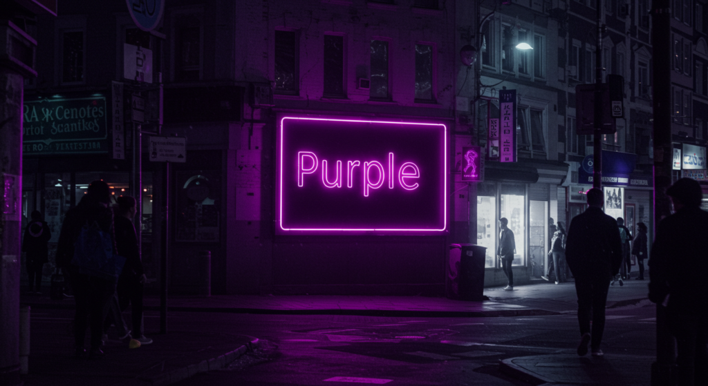
Have you ever wondered why purple sometimes makes your heart jump just a bit? Could it be that purple carries a cozy warmth mixed with a dash of surprise? People have asked these questions for ages, seeking to decode its secrets. Way back, purple dye was rare, so only the elite wore it. That habit shaped the color identity of purple as regal and refined. But there’s more to it than just fancy robes and crowns.
Many folks adore purple because it seems playful yet introspective. Some see a color palette that hints at deep thought, while others see a wave of energy that sparks innovation. We might not always catch it, but purple invites our eyes to linger. If you love how color can sway feelings, or if you just want to spice up your living space, purple might offer something special.
Below, we’ll walk through different ideas, from cultural color symbolism to everyday tips on using purple in branding, design, and beyond. By the end, you might see new ways to express your story through this royal hue. Let’s jump in, yeah? You won’t regret it, hopefully.
The Symbolism and Personality Traits of Purple
Vibrancy and Sincerity
Purple glimmers with vibrancy and a noticeable sincerity. It doesn’t shy away from boldness, but it also whispers gentle secrets. This blend makes it perfect for those who crave depth in a color but don’t want something loud like neon pink or harsh like bright orange. Have you gazed at a lavender field at sunset? The color calls softly, with sincerity hidden in each delicate petal.
Could you imagine stepping into a room painted in pale violet? It might speak to your creative side, nudging your brain to think bigger. That sincerity? It breaks down walls and fosters honest interactions. If you want a color that isn’t screaming for attention, yet still holds intrigue, purple can be your ally.
Warmth and Reliability
People sometimes think purple is cool, but there’s a warmth that nestles under its surface. Call it a subtle glow, or maybe a spark that draws folks closer. This warmth can comfort and reassure. You might wonder, “Is purple reliable enough for a serious brand?” Yes, it can be—especially if you choose the right shade. Royal purple or eggplant can anchor a visual identity, projecting reliability without seeming dull.
In some cultures, purple threads show pride and tradition. We see it in historical attire where cloth was dyed carefully to maintain its beauty. The consistent presence of purple in ceremonies also emphasizes how communities regard it as timeless. It’s not a color that leaps in and out of style every year. Instead, it stands firm, rarely overshadowed by fleeting trends.
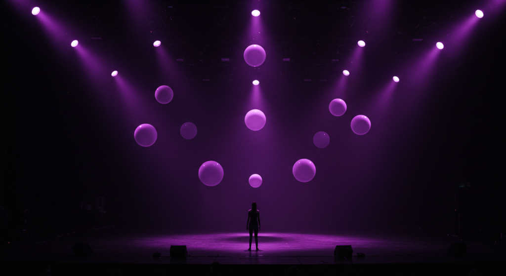
Elegance and Creativity
Elegance resonates deeply with purple, especially in formal settings. Have you glimpsed a wedding with purple accents? They often carry a refined look, balancing showy flair with a tasteful edge. Even in day-to-day life, a purple tie or scarf can exude an air of subtle sophistication.
Yet, the color also screams creativity, though it doesn’t truly scream, it just speaks in its own imaginative voice. Many designers pick purple to give a brand personality, whether it’s for an art studio or a tech startup. There’s a tinge of unique spirit embedded in purple. By weaving it into your visuals, you can project artistry and boldness. People might perceive your work as fresh and innovative—like you have a spark that sets you apart.
In sum, purple merges vibrancy, warmth, and creative energy with a special kind of elegance. If that resonates, you might find yourself drawn toward it. Yet, keep in mind, your personal interpretation counts. No single explanation can capture every facet of purple’s appeal. Perhaps it’s about how it makes you feel, right?
Emotional Impact of Purple
Depth and Passion
Purple can pull you into its depth, almost as if you’re diving into a secret ocean. It captures passion in a subtle way, without flaunting bright gusto like red. If you need color that nudges a deeper connection, purple might be the ticket. It’s the friend who listens quietly, then surprises you with a profound insight.
Try noticing your own reaction when you see purple in art. Does your chest tighten with excitement? Or do you feel calm? People vary, and that’s perfectly normal. The color’s capacity to evoke passion differs from person to person. Some see it as meditative, while others sense a spark of romance. Its ability to hold contrasting feelings is part of its charm.
Calmness and Tranquility
Though it brims with intensity, purple can also carry a calm, tranquil vibe. Imagine staring at a gentle lilac hue on a misty morning. That moment can hush the mind. In color psychology research, softer purples often show connections to reduced stress, especially in restful spaces like bedrooms.
Yet, calmness doesn’t mean dullness. Purple manages to calm while keeping an undercurrent of energy. Maybe that’s why spas sometimes use purple in their branding. They want visitors to feel rested but not half-asleep. Subtle shades, like pastel violet, can transform a hectic office corner into a soothing nook. If you’re seeking a break from daily chatter, consider a small purple accent in your environment.
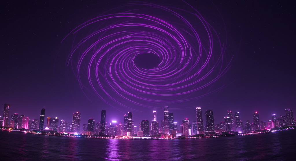
Optimism and Mystery
A pinch of optimism can surface in certain purple hues. Even though it’s often tagged as mystical or secretive, purple also symbolizes looking forward. The brightness in a soft lavender or bright orchid can signal hope and positivity. People might glance at your purple-themed project and feel an uplifting vibe.
Yet, the mystery remains. Purple thrives on contrasts. It reveals a puzzle-like character that draws people in. That sense of the unknown can foster curiosity, encouraging further exploration of your brand, art, or even personal style. If you’re itching to catch attention in an unexpected way, weaving in purple details might be your solution.
Cultural Color Meanings of Purple
Eastern Views
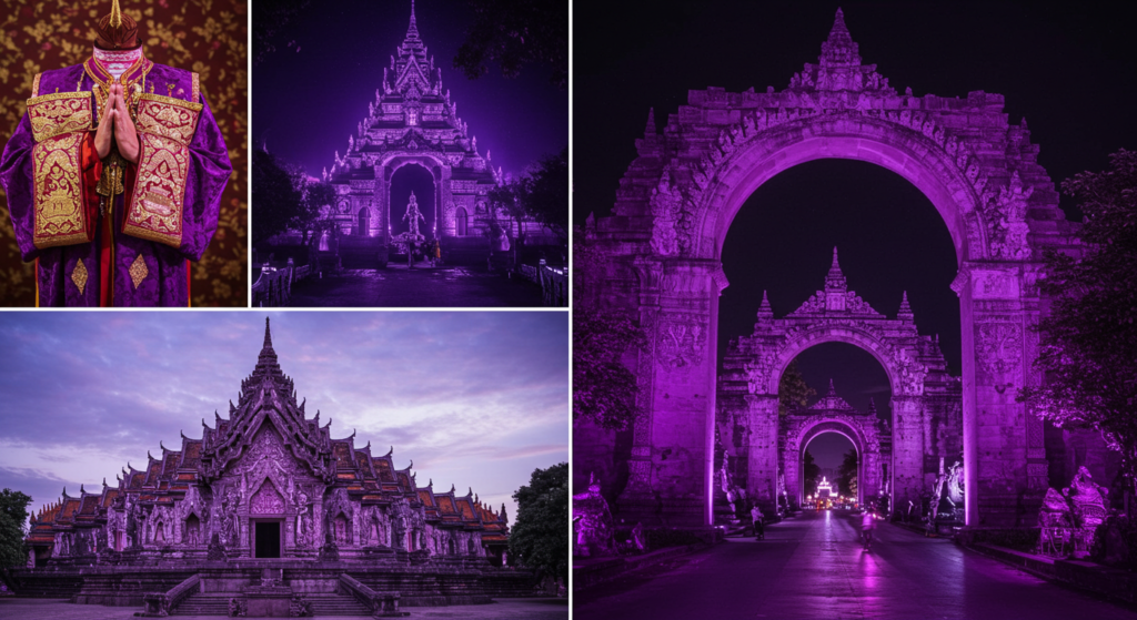
In many Eastern contexts, purple stands for spiritual insight and wealth. People in some parts of Asia associate purple with good fortune and respect. Traditional dresses feature purple embroidery, blending modern style with ancient roots. If you wonder why festival decorations sometimes use purple, that nods to the color’s prestige.
But it’s not always about grandeur. People also embrace purple for solemn events. The color might represent reflection or mourning in certain places. This dual nature can feel puzzling, but each culture forms its own interpretations. Purple’s ability to shift between statuses and moods is quite fascinating.
Western Perspectives
In Western parts of the globe, purple often signals royalty, spiritual significance, or eccentric flair. Historically, European monarchs cherished purple fabric because it symbolized wealth and elitism. Over time, the color also crept into religious garments. You might see priests wearing deep violet vestments, connecting purple to solemnity and devotion.
On a casual note, purple can also be rebellious. Some subcultures pick bright purple hair or clothes to stand out from the mainstream. They celebrate the color’s “rule-breaker” streak. A single shade can embody both tradition and forward-thinking rebellion. That’s quite a combination, right?
Ancient Civilizations
In ancient civilizations—like the Phoenicians—purple dyes were super expensive, making them treasures of high status. Royals and high priests proudly wore purple robes as a mark of authority. Statues or artwork sometimes featured purple accents to highlight grandeur.
These origins fed the universal color meanings we sense today. Because purple was once so rare, it took on mystical qualities. Even modern folks, who can access any color at the click of a button, still see purple as “something more.” Old stories, myths, and art pieces shaped that viewpoint. Understanding these historical ties can enrich your own approach to using purple now.
Purple in Branding and Marketing
Strategies for Emotional Branding
If you want to make an emotional connection, purple can help. Think about well-known brands that use purple. They often portray a mix of reliability and imaginative thinking. People subconsciously read those symbolic colors and feel certain moods.
But how do you implement purple effectively? Avoid drowning every element in it. Instead, use purple as a focal point—like on packaging or a website header. This tactic fosters brand recognition and emotional synergy. If your product leans toward creativity, spiritual calm, or a dash of luxury, purple might become your brand’s best friend.
Visual Identity Through Color
Building a strong visual identity means picking colors that reflect your brand’s spirit. Some brands choose purple to highlight a daring or futuristic side. Others pair it with gold or silver for a luxurious vibe. Meanwhile, a pastel lilac with earthy browns can suggest softness and approachability.
When selecting a purple shade, consider your audience. Do you want to attract young, dynamic individuals seeking novelty? Or is your brand more about trustworthiness and tradition? Each hue offers its own color narrative. So, testing them can reveal which version of purple resonates most.
Standing Out in Crowded Markets
We see countless ads every day. To cut through that noise, a brand must stand out visually. Enter purple, with its unique presence that people don’t see as often as blues or reds in logos. If your brand aims for a quirky or imaginative reputation, purple can stick in people’s minds.
Yet, going full-on purple might daunt certain audiences. So, think about balance. For instance, if you’re launching a new tech product, a bold purple accent can look futuristic. Meanwhile, subtle purple lines in your stationery might hint at creativity but still keep it professional. That’s a sweet spot many marketers love to find.
Purple in Interior Design
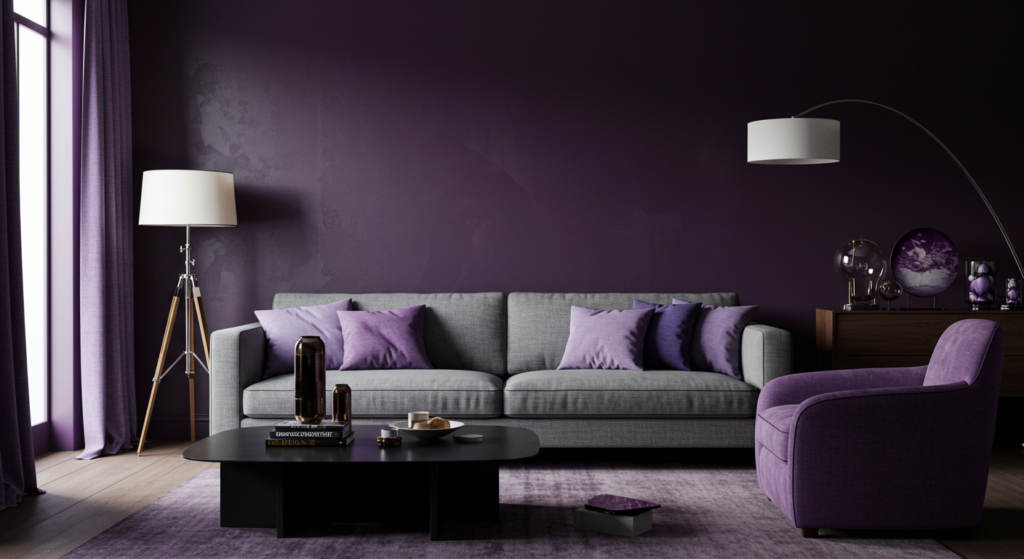
Balancing Purple Hues
Interiors can transform drastically when purple enters. Whether it’s wall paint or accent pillows, selecting the right purple palette is key. Dark eggplant shades bring drama, while soft lavender invites calmness. But if you saturate the space with purple, it might feel too heavy. How do you keep it balanced?
Try mixing purple with neutral tones like gray, beige, or white. These backgrounds highlight purple without overwhelming your eyes. If you love bolder looks, pair purple with a complementary color like mustard yellow or teal. That sparks visual interest without clashing. The trick is finding synergy, so each color complements the other.
Creating Mood-Focused Spaces
What mood do you want to evoke? For a bedroom, gentle purples—lilac, mauve, or pastel violet—may soothe the mind. Pair them with soft textures like plush rugs or comfy blankets to amplify tranquility. In a living room that encourages lively chats, deeper purple hues can add drama.
Or, maybe you want a reading nook that feels cozy and introspective. Purple works there, too. Place a small purple armchair in a corner with warm lighting. You’ll sense an intimate vibe that invites reflection. Purple can be a mood-changer, if used thoughtfully.
Combining Purple with Other Colors
Pairing purple with other hues can unlock creative possibilities. One method: match purple with warm colors like orange, red, or pink for a bold statement. This approach can enliven a playful space, like a family room or a casual cafe.
For cooler combos, consider mixing purple with blues or greens. This can create a calming, nature-inspired palette. Imagine the look of lavender fields under a blue sky. That tranquil scene can be recreated in your office or hallway. When pairing, aim for harmony in tone and saturation. If your purple is deep, pick similarly rich accompanying shades.
Purple in Art and Fashion
Symbolic Colors in Historical Paintings
Throughout art history, many painters used purple to signify wealth or spiritual moments. They often reserved costly purple pigments for focal points—like a regal robe or a key subject’s attire. Because the paint was expensive and rare, artists used it sparingly, which amplified its impact.
Observing classical artworks can reveal how purple subtly shaped a painting’s emotional mood. It gave certain figures a hint of mystique or divine grace. That tradition persists, albeit with cheaper modern pigments. Purple still stands out in art, whether it’s a massive mural or a simple portrait.
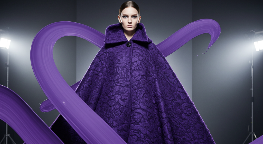
Bold Statements on Runways
Fashion runways frequently spotlight purple pieces, especially when designers want to shock or delight audiences. Models in dramatic purple gowns stride confidently, projecting a sense of mystery mixed with elegance. You might notice celebrities wearing purple suits or accessories to break from the typical black.
Yet, not everyone wants to go all out. Smaller touches—like a purple scarf or watchband—can show individuality without overwhelming your style. If you enjoy playing with color, purple offers a rich playground. Pair it with neutral outfits for a pop of intrigue. Let it reflect your unique flair and personal statements.
Personal Style Infusions
Purple can slip into everyday attire in many ways. Some folks like wearing purple sneakers to express hidden creativity. Others might choose a delicate lilac blouse for a fresh spring look. The color can adapt to personal style, from edgy goth outfits to airy bohemian ensembles.
If you feel unsure, experiment with small steps. Try purple nail polish or a subtle purple hair streak. Notice how people react. You might discover that purple suits your personality better than you thought. It can be both gentle and bold, which is part of the reason so many fashion fans adore it.
Practical Tips for Using Purple
Creating Balanced Color Palettes
Designing a color palette for a website or a living room? Purple can stand strong as the main hue or as an accent. One approach: pick one dominant shade of purple, then add secondary colors that highlight it. For instance, a bold plum accompanied by soft gray. This approach keeps the viewer’s eye from feeling scattered.
If you prefer a lively vibe, use multiple purples in the same palette—like light lavender, medium orchid, and deep eggplant. Vary their saturation and brightness. Adding a unifying neutral—like cream or charcoal—prevents a color riot. Try different combos until you find a pleasing blend.
Pairing Purple with Warm Colors
Purple plus yellow or orange can spark excitement. Imagine a bright purple website banner with sunny yellow text. The contrast demands attention, which can be perfect for announcements. In interior design, pairing these colors can shape a room that feels energetic and welcoming.
But proceed with caution. Too much contrast might strain the eyes. Balance your palette by including a neutral shade or using smaller doses of the warm color. That approach maintains harmony. Warm color combinations can also add a touch of cheer to a child’s bedroom or a playful lounge area.
Pairing Purple with Cool Colors
Combining purple with greens or blues can produce a serene, nature-inspired atmosphere. Think of a subtle violet paint on walls mixed with sage-green furniture. That ensemble can soothe anxious minds. In branding, a teal logo element on a purple background can signify modernity and calmness.
This approach works if you want an environment that feels both refreshing and subtly sophisticated. But again, watch the intensity. If your purple is super vibrant, pick a calmer green or blue. Or if you choose a pastel purple, a bolder green might complement it. Testing swatches side by side can help you see which combos resonate best.
Purple in Modern Digital Spaces
Color Branding in Social Media
Social media platforms often rely on strong color schemes. If you scroll through your feed, certain brands pop out because of their distinct palettes. Purple-based branding can leave a memorable impression. It suggests creativity and a forward-thinking approach.
One tip: keep consistent with your brand’s purple shade. Use it in profile pictures, story highlights, or post borders. This can help your audience recognize your content even before reading your handle. You can also pair your purple with a hashtag that underlines your brand’s identity. But do watch out for color distortions on different devices. Always test how the hue appears on phones, tablets, and computers.
Website Design with Purple Highlights
In web design, purple can highlight calls to action, headers, or navigation bars. If you run an online store for handmade crafts, a gentle lilac background might convey a whimsical charm. For a more corporate site, deeper purple accents can convey trust and elegance.
People do judge a website’s vibe instantly. Purple can help your site stand out, but use it wisely. Overdoing it may distract users from the main content. Consider using white space or neutral backgrounds to let your purple elements shine. Let your site’s purpose guide the placement and intensity of purple.
Apps and User Experience
App developers often incorporate purple for brand distinction. Whether it’s a meditation app with soothing lavender backgrounds or a music app with edgy violet icons, purple can shape user perceptions. It might enhance relaxation, creativity, or even adrenaline, depending on the shade.
When used in UI design, purple should maintain clarity. Buttons or text in dark purple on a black background might be tough to read. Keep accessibility in mind. High contrast ensures people with visual impairments can use your app comfortably. Aim for a user-friendly design that merges style with usability.
Purple and Emotional Branding

Building Trust with Color
Consumers often rely on emotional cues when choosing products or services. Purple can encourage trust by signaling a brand’s thoughtfulness and depth. A bank that wants to appear friendly and approachable might use softer purple tones in marketing. Meanwhile, a software company aiming for bold innovation might pick a striking violet.
The key is consistency. If your brand’s message talks about empathy and personal care, your color usage should match that. Sudden shifts in hue can confuse your audience. They might wonder if you changed your brand identity. Keep your purple branding stable to build a sense of reliability and familiarity.
Storytelling Through Purple
People love a good story, and color can be a powerful part of the narrative. Maybe your brand’s journey involves a creative breakthrough. Purple can visually represent that turning point. You can also use purple in packaging or marketing materials to hint at your brand’s “royal heritage” or “mystical undertones.”
Storytelling becomes more tangible when color is involved. If each chapter of your brand tale features a certain purple shade, your audience can follow the thread. They begin to associate that hue with your mission or achievements. This approach can build a deeper connection over time.
Resonating with Consumer Emotions
Color choices can either support or undermine brand positioning. Purple, with its emotional range, can tap into imagination, curiosity, or calmness. If you’re launching a product that promotes well-being, a lavender-themed campaign could invite serenity. If your offering is more daring—like a new gaming device—an electric purple might spark excitement.
Consumers might not voice it directly, but color resonates on a subconscious level. They might say, “I like how this feels,” or “This brand seems different.” That difference often stems from a carefully chosen color strategy. Purple’s fluid nature lets you fine-tune emotional engagement.
Scientific Studies on Purple

Brain Responses to Purple Stimuli
While not super common, some scientific studies on color do track brain activity in response to hues like purple. Early evidence suggests purple can calm the nervous system or boost imagination, though each individual reacts differently. Our cultural backgrounds and personal memories influence these responses as well.
If you’re curious about data, you can look for research that measures attention, heart rate, or stress levels. Some findings hint that purple backgrounds can lengthen a person’s focus, though it’s not guaranteed. Real-world results often hinge on how you pair purple with other design elements.
Purple’s Effects on Mood
Studies in psychological color analysis sometimes include purple when investigating mood shifts. Subjects in rooms with gentle purple walls reported mild relaxation, but again, it’s not universal. Some folks might find the color overwhelming if it’s too intense.
In marketing, brands rely on these possible mood influences to create environments that encourage spending or brand loyalty. A subtle violet glow in a storefront might entice passersby, while a deep, moody purple might push an upscale, intimate vibe. Still, personal preferences can override any general trends, so be mindful of context.
Potential Health Correlations
A few wellness enthusiasts link purple with certain holistic benefits. They might connect purple with meditative states or a sense of spiritual harmony. While not all claims are backed by robust science, many people do feel calmer in the presence of certain purple shades, especially in yoga studios or retreat centers.
In terms of physical health, there’s no conclusive proof that purple alone heals ailments. But color therapy practitioners sometimes incorporate purple to balance energy or mood. If you believe in alternative therapies, you might explore how purple lighting or decor influences your daily well-being. Just remember that true health improvements usually come from holistic approaches, not just color usage.
Avoiding Overuse of Purple
Common Missteps
Too much purple can weigh down a design. Viewers might experience eye fatigue, or the message could lose clarity. For example, neon purple text on a bright pink background is a recipe for confusion. Another mistake is mixing random purple shades without a clear plan. That can lead to visual chaos.
What’s the fix? Keep it simple. Decide on your core purple shade and only add variations that complement it. Don’t let your brand or space drown in a single color. Balance is your friend. A small approach with consistent accents often yields better results than an all-purple extravaganza.
Overstimulation and Visual Fatigue
Excessive use of saturated purple can cause overstimulation. Some users might find it jarring or headache-inducing. If your website blasts bright violet all over, people might click away faster. Reading text on intense backgrounds is tough.
Consider accessibility. Not everyone’s eyes process color the same. If purple is your background, ensure the text contrasts enough for legibility. And if your brand demands a bold purple presence, distribute it carefully. Small pockets of strong purple can guide attention without overwhelming the entire layout.
Finding the Right Balance
When you see a design that uses purple flawlessly, it’s often due to thoughtful restraint. Complementary colors, plenty of white space, and purposeful highlights keep it appealing. One trick: use purple as an accent color along with neutrals like grays, creams, or blacks.
In a living space, that might mean purple cushions, curtains, or wall art rather than painting every wall purple. In branding, maybe the logo is purple, but the rest of the website is predominantly white or gray. That approach gives purple room to shine without overshadowing everything else.
Purple in Nature’s Color Meanings
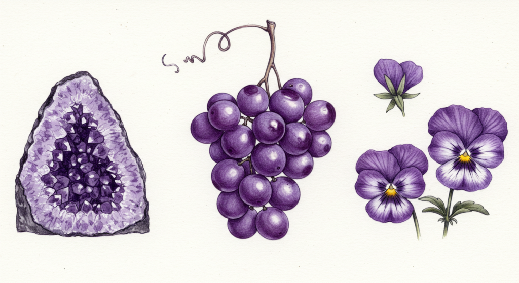
Flowers and Landscapes
Nature showcases purple in blooms like lavender, violets, and lilacs. These flowers often symbolize calmness or first loves. The gentle fragrance of a lavender field can relieve stress, inviting a slower pace. Meanwhile, deeper blossoms like iris or pansies might carry a regal appeal.
Some landscapes feature purple in dramatic sunsets or mountain ranges. Have you ever seen the sky turn a streaky violet at dusk? That moment can spark awe and reflection. Many artists try to replicate those fleeting purples in paintings or photographs, capturing a slice of nature’s silent splendor.
Twilight and Evening Skies
Twilight sometimes weaves a tapestry of purples and pinks across the horizon. People pause to watch, feeling a hush in their thoughts. The color shift from day to night fosters a sense of transition or possibility. Maybe that’s why purple is often called the “bridge” between warm reds and cool blues.
If you’re seeking color palette meanings from real life, look to twilight for inspiration. The gentle fade of sunlight can teach us how to blend purples softly. Interior designers might use these dusk-inspired shades to create a relaxing vibe in bedrooms or lounge areas.
Earthy Combinations
Think purple doesn’t pop up in earthy scenarios? Check out rock formations, minerals like amethyst, or even certain fruits and veggies. Eggplants, grapes, and plums flaunt that rich color, reminding us that purple is part of a natural spectrum.
Nature’s pairing of purple with greens, browns, or earthy reds can guide your own design ideas. You might style a kitchen with purple dishware and dark wooden cabinets. Or fill a garden with purple blooms next to lush, green foliage. Sometimes, nature is the best teacher in color harmony.
Purple Trends and Forecast
Upcoming Design Movements
Design experts often keep an eye on emerging color trends. Purple shades—like Ultra Violet or Very Peri—sometimes get named “Color of the Year.” That hype can make purple more popular, influencing fashion, home goods, and digital design. Brands jump on the wave to appear current, hoping to tap into the color’s fresh vibe.
But trends come and go, so it’s wise to see if the shade aligns with your personal taste or brand essence. If the new purple is too flashy, you can still incorporate it in small ways—like accent pillows or limited-edition packaging. That keeps you modern while respecting your original style.
Purple and Global Events
Occasionally, global events or pop culture moments catapult purple into the spotlight. Celebrities might wear a striking purple gown at an award show. A major movie franchise could feature a purple-centric poster, fueling a wave of interest. People then associate the color with those big moments, boosting demand.
Still, color popularity can shift unpredictably. If you’re a designer or marketer, stay alert to these cultural shifts. Tying a campaign to a color that’s rising in the public eye can improve brand visibility. However, authenticity matters. Jumping on a color bandwagon without a real connection might feel fake to your audience.
Longevity of Purple in Style
Purple has proven it’s no fad. Since ancient times, it has symbolized wealth and status, yet it also adapts to modern trends. While certain purple shades might fade in and out, the overall color remains a staple. It can morph from regal to edgy to whimsical, depending on how people present it.
If you’re wondering whether purple will remain relevant, the answer is yes. It’s anchored in history, but it stays flexible. As you plan your future designs or brand direction, purple can be a stable option, especially if you select tones that resonate with your project’s soul.
Purple Metaphors and Narratives

Symbolic Journeys
Purple appears in many stories and poems as a sign of transformation or spiritual searching. Writers might describe a character “wandering under a purple sky” to hint at internal shifts. That sense of journey can connect with readers who see purple as a color of stepping into new phases.
If you incorporate purple into your own storytelling—through visuals or words—it can represent crossing boundaries or learning hidden truths. Whether you’re designing a book cover or hosting a retreat, consider how purple can reinforce themes of growth and exploration.
Poetic Interpretations
Some folks see purple as the color of otherworldly beauty, weaving it into metaphorical lines. Phrases like “purple dawn” or “purple hush” appear in poems that evoke quiet wonder. These poetic depictions highlight the color’s dreamlike quality, bridging the gap between reality and fantasy.
In marketing copy or social media posts, you can tap into that poetic flair. A well-placed phrase about “purple twilight” might captivate your audience. Just be genuine. Forced usage of flowery language can backfire. The goal is to hint at purple’s emotional resonance in a subtle way.
Interpreting Purple in Everyday Life
Sometimes, the biggest color insights happen in ordinary moments. You see a purple mug in the morning, or a purple pen in your workspace. Do these small details change your mood or spark new ideas? It’s surprising how color can influence daily routines without fanfare.
Embracing purple in small bits can add meaning to your life. Maybe it’s a purple phone case that lifts your spirits whenever you pick up a call. Or a violet candle you light when you need a moment of peace. These minor touches can remind you of purple’s ability to blend depth, mystery, and calmness in one neat package.
Conclusion
Purple remains a puzzle that people never fully solve, which is part of its draw. From ancient civilizations to modern branding, the color weaves a fascinating tapestry of emotional color meanings and cultural connotations. It can broadcast power, encourage reflection, or inspire curiosity. If you harness purple thoughtfully, you can shape moods, communicate brand values, or add spice to your personal environment.
Throughout this exploration, we’ve seen how purple balances depth and vibrancy, offering a unique voice in any design or narrative. Whether you want to subtly hint at mystery or boldly declare creativity, purple can become an asset. The color thrives on contrast, bridging tradition and innovation in ways that leave lasting impressions.
Like any powerful tool, purple works best when used with intention. Find the right balance, pair it with complementary hues, and remain true to your message. Then, watch as purple whispers magic into your projects or surroundings. This color might even surprise you, sparking new ideas or forging emotional connections you never expected.
Summary Table
Below is a quick reference to help you remember how different aspects of purple might apply to your life or projects.
| Aspect | Meaning/Impact | Tip |
|---|---|---|
| Emotional Color Meanings | Depth, mystery, calmness, subtle optimism | Use lighter hues for relaxation; deeper shades for drama |
| Cultural Color Meanings | Regal or sacred in various regions; rebellious in others | Research local traditions to avoid confusion or misinterpretation |
| Branding & Marketing | Emotional branding, distinct identity, creative flair | Apply consistent shade across platforms to strengthen brand recall |
| Interior Design | Can set calming or dramatic tones, depending on shade | Balance purple with neutrals or complementary colors |
| Art & Fashion | Symbolic in historical works; bold or subtle in modern style | Experiment with small items if unsure; big pieces for confident flair |
| Scientific Studies | Suggests possible relaxation or creative stimulation | Combine with thoughtful design to maximize potential benefits |
| Overuse Caution | Overly saturated purple can cause eye strain or confusion | Pair with neutral tones; use as an accent rather than a main color |
| Nature’s Inspiration | Found in flowers, twilight skies, stones (amethyst) | Emulate natural combinations for harmonious color schemes |
| Longevity in Trends | Purple endures through fads, offering flexible style | Adapt shade intensity based on current fashion or design trends |
| Metaphorical Usage | Can represent journeys, transformation, or hidden beauty | Integrate in storytelling for deeper emotional resonance |
FAQ
Q: Is purple always linked to royalty?
A: Historically, yes, purple dye was expensive and worn by wealthy folks. That created a lasting bond between purple and royalty. But nowadays, purple has broader uses and can symbolize many other ideas.
Q: Which purple shades are best for a calming bedroom?
A: Soft, pastel purples like lavender or lilac can relax the mind. Pairing them with white or light gray keeps the space peaceful. Avoid very dark purples unless you want a cocoon-like feel.
Q: Does purple work well with bright oranges or yellows?
A: Yes, that combination can produce a fun, energetic vibe. But use moderation. A small burst of bright color can be striking, while too much might overwhelm the senses.
Q: Are there cultural taboos about purple I should know?
A: In some cultures, purple is connected to mourning or sadness. It’s smart to check local traditions if you plan a design or product launch in different regions.
Q: Can purple really boost creativity at work?
A: Some people claim it helps stimulate the imagination. Studies on color and creativity aren’t conclusive for everyone, but many enjoy the ambiance that purple provides in a workspace.
Q: Which industries benefit most from purple branding?
A: Tech, beauty, wellness, and creative agencies often use purple. Still, any brand aiming for a sophisticated or innovative angle can consider it. The key is matching purple to your brand’s core message.
Q: How can I test different shades of purple in my designs?
A: Make small style boards or mock-ups. Print them or view them on multiple screens. Seek feedback from friends or colleagues. Adjust saturation and brightness until it feels right.
Q: Can purple clash with certain fonts or text colors?
A: Clashes happen if the text color lacks contrast. White often works on dark purple, while black or navy might suit lighter purples. Always check readability before finalizing.
Q: Does a purple accent wall shrink a room?
A: Dark colors can make a space feel smaller, so it depends on lighting and other color choices. A well-lit room with neutral furniture can still look spacious, even with a purple accent wall.
Q: Is purple gender-specific?
A: Not necessarily. Gender associations with color vary by culture and era. Purple can be seen as neutral, even though some societies might stereotype it. Pick purple if it aligns with your intentions, regardless of gender norms.
Purple’s story is forever unfolding. Its ability to convey elegance, creativity, mystery, and warmth keeps it in the spotlight across cultures and generations. If you use it wisely, you might find purple’s subtle magic shining through in ways you didn’t expect. Happy exploring!
Marcella Raskin is a talented writer and editor with a deep passion for the dynamic realm of clothing colors and patterns. Armed with a strong background in Journalism, she crafts engaging content that empowers readers to select the perfect shades for their outfits. Her pieces provide an in-depth exploration of color trends and expertly curated fashion advice. Beyond her work, Marcella loves discovering new places, connecting with local designers, and advocating for sustainable fashion choices. She is devoted to helping individuals make enlightened color choices for their attire.
Reviewed By: Joanna Perez and Anna West
Edited By: Lenny Terra
Fact Checked By: Matthew Mansour
Photos Taken or Curated By: Matthew Mansour