Color. It’s the silent language that conveys emotions, sets moods, and influences our perception. From the fiery reds of a burning sunset to the serene blues of a clear sky, color not only defines our environment but also shapes our interactions with it.
But what lies beneath these vivid surfaces? Let’s embark on an expansive journey into the realm of color theory, where we’ll dissect its science, delve into its psychological impact, and explore its practical applications in art, fashion, and beyond.
Unmasking the Magic: The Science Behind the Hues
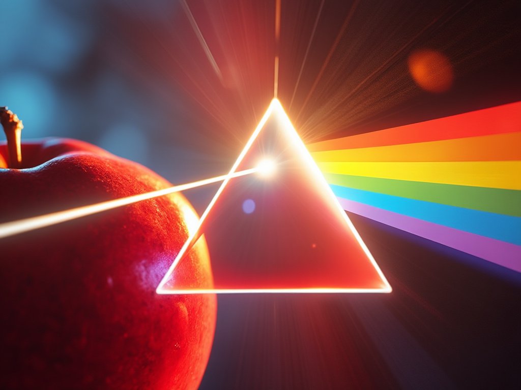
Color, as we see it, is not just a visual feast but a complex dance between light, matter, and our brain. Here’s how it unfolds:
Light’s Journey
Sunlight, appearing white, is actually a blend of all colors. When it hits an object, like a vibrant red apple, the object selectively absorbs some wavelengths while reflecting others. The red apple absorbs all colors except red, which bounces back to our eyes.
Visual Perception
Our eyes capture this reflected light through photoreceptors called rods and cones. Rods help in low light, sensing only shades of gray, while cones are active in color vision. There are three types of cones sensitive to short (blue), medium (green), and long (red) wavelengths. The brain interprets these signals to perceive color.
Characteristics of Color
- Hue: The basic color attribute, refers to the name of the color itself. When we mention red, blue, or yellow, we’re talking about hue.
- Saturation: This is about the purity or intensity of the color. High saturation means the color is vivid and rich, like a neon sign, while low saturation results in a more washed-out, pastel appearance.
- Value: This parameter dictates the lightness or darkness of the color. Imagine a grayscale slider; from white (high value) to black (low value), with various shades of gray in between.
Color Theory Table
| Category | Description | Examples/Application |
|---|---|---|
| Color Models | Different systems for organizing and understanding color. | – RGB: Red, Green, Blue (Digital Displays) – CMYK: Cyan, Magenta, Yellow, Black (Printing) – HSV: Hue, Saturation, Value (Digital Design) |
| Primary Colors | Fundamental colors from which all others are derived. | – RYB: Red, Yellow, Blue (Traditional Art) – RGB: Red, Green, Blue (Light) |
| Secondary Colors | Colors created by mixing primary colors. | – Orange (Red + Yellow), Green (Yellow + Blue), Violet (Blue + Red) |
| Tertiary Colors | Mixtures of primary and secondary colors. | – Red-orange, Yellow-orange, Yellow-green, Blue-green, Blue-violet, Red-violet |
| Color Harmonies | Relationships between colors that create visual appeal. | – Complementary: Opposite on the wheel (e.g., Red & Green) – Analogous: Next to each other (e.g., Yellow, Yellow-green, Green) – Triadic: Evenly spaced around the wheel (e.g., Red, Yellow, Blue) |
| Color Properties | Characteristics that define color. | – Hue: The color itself – Saturation: Purity or intensity of color – Value: Lightness or darkness of color |
| Psychological Effects | Emotional and psychological responses to color. | – Red: Stimulates and excites – Blue: Calms and soothes – Yellow: Invokes happiness, optimism |
| Cultural Significance | Colors have different meanings in various cultures. | – White: Purity in Western cultures, mourning in some Eastern cultures – Red: Luck in China, danger in the West |
| Application in Fashion | How color theory is applied in clothing and textiles. | – Use of complementary colors for contrast, or analogous for harmony. Personal color analysis for individual styling. |
| Application in Marketing | Strategic use of color to influence consumer behavior. | – Color branding (e.g., Coca-Cola’s red), packaging colors to convey luxury, health, or value. |
| Digital vs. Physical | How color behaves differently in digital vs. physical mediums. | – Screens use RGB, while printing uses CMYK; perception can differ due to light reflection vs. emission. |
This scientific understanding forms the bedrock of color theory, guiding how we perceive and utilize color in all aspects of life.
Decoding the Color Models: A Multilingual Approach to Hues

Just as languages differ, so do methods of color representation, each suited for different applications:
RGB Model
Primarily used in digital displays, this additive color model combines red, green, and blue light at varying intensities. On your screen, these lights mix to produce a full spectrum of colors. RGB is essentially how our screens trick our eyes into seeing color.
CMYK Model
This subtractive color model is the standard for color printing. Here, inks of cyan, magenta, yellow, and black are layered to subtract (absorb) varying amounts of light. When you see a printed image, what you’re actually seeing is the reflection of light off the ink that wasn’t absorbed.
HSV Model
A model that’s intuitive for human understanding, where:
- Hue remains the color itself.
- Saturation describes how colorful or gray it is.
- Value refers to how light or dark it is.
This model is particularly useful in digital art where adjustments to these parameters can dramatically alter the mood and appearance of an image.
The Color Wheel: A Roadmap to Harmonious Hues
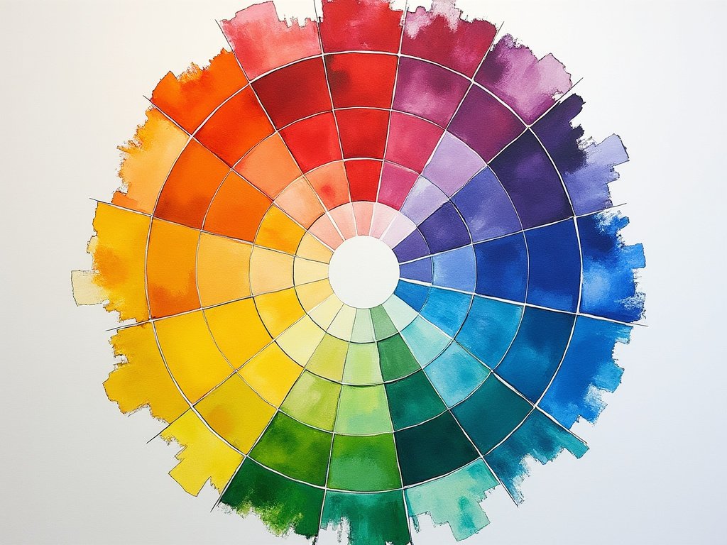
The color wheel is not just a tool but a visual guide to understanding color relationships:
Primary Colors
Red, yellow, and blue are the foundational colors from which all others derive. They can’t be created by mixing other colors.
Secondary Colors
These emerge when two primary colors blend:
- Red + Yellow = Orange
- Yellow + Blue = Green
- Blue + Red = Violet
Tertiary Colors
These are created by mixing a primary color with a secondary color next to it on the wheel, like red-violet or yellow-green, offering a bridge between the primary and secondary hues.
Color Harmonies
Understanding these helps in creating aesthetically pleasing combinations:
- Complementary Colors: Opposite each other on the wheel, they create visual contrast when used together, like blue and orange.
- Analogous Colors: Colors that sit next to each other on the wheel, providing a harmonious, pleasing look with subtle variations.
- Triadic Colors: Three colors evenly spaced around the wheel, offering a balanced and vibrant palette when used correctly.
- Monochromatic Colors: Variations in value and saturation of a single color, which can be serene and sophisticated.
Color Psychology: The Emotions Hidden in Hues
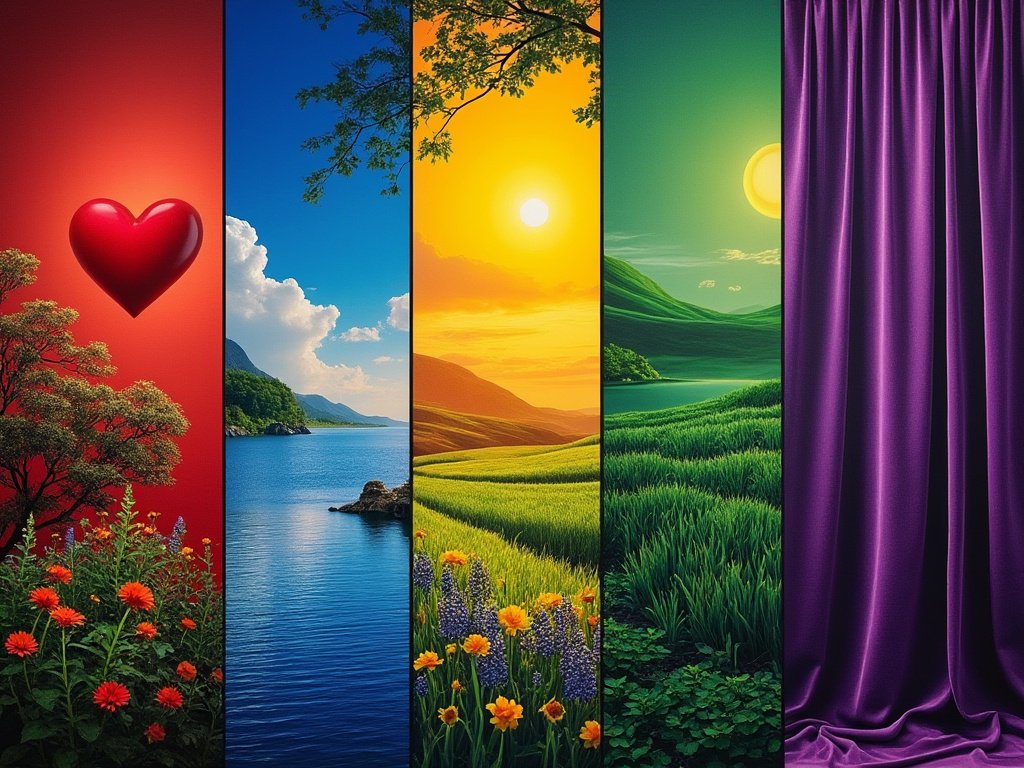
Colors do more than just decorate; they communicate and evoke emotions:
Red
Symbolizes energy, passion, and urgency. It’s why it’s used in warning signs and stop signals. In fashion or design, red can make a bold statement of confidence and power.
Blue
Represents stability, trust, and tranquility. It’s calming, and often used in bedrooms or offices to promote a serene environment. In a professional setting, blue conveys reliability.
Green
Evokes thoughts of nature, growth, and renewal. It’s soothing, and often used in spaces intended for relaxation or healing, like hospitals or spas.
Yellow
The color of sunshine, it’s associated with optimism, cheerfulness, and creativity. However, in large doses, it can be overstimulating.
Purple
Often linked with luxury, mystery, and spirituality. Its use can suggest opulence or creativity, influencing perceptions of sophistication and imagination.
Understanding these psychological impacts allows for strategic use of color in environments, products, and personal style to influence mood and behavior.
Color Theory in Fashion: Weaving a Tapestry of Style
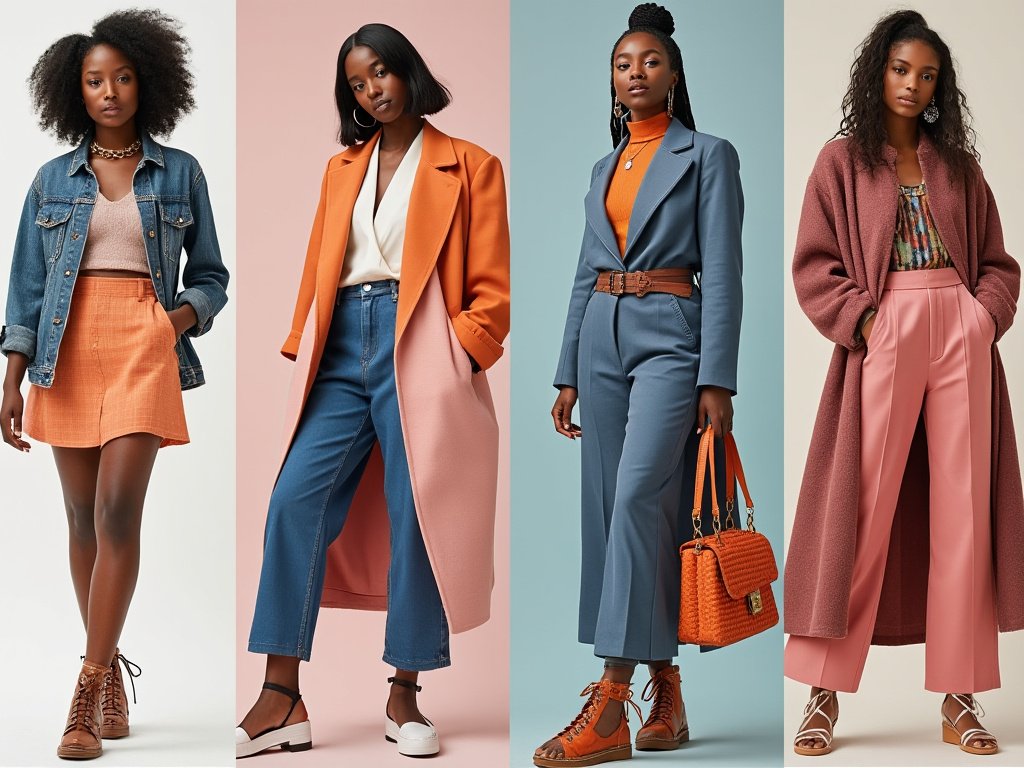
Fashion is perhaps the most personal canvas for color theory, where colors not only reflect trends but also personal identity:
Discovering Your Personal Color Palette
Warm vs. Cool Undertones
Your skin’s undertone significantly affects which colors complement you. Warm undertones glow with autumnal colors, while cool undertones are enhanced by winter hues.
Seasonal Color Analysis
This concept segments people into four color seasons based on their natural coloring, guiding wardrobe choices that enhance one’s natural beauty. For instance, a ‘Spring’ type might look radiant in peach and coral, whereas a ‘Winter’ might be breathtaking in stark whites and deep reds.
The Illusionist: Color’s Power to Transform
Size and Shape
Dark colors can minimize areas, whereas light colors can draw attention or expand the appearance. This understanding helps in tailoring outfits to one’s body shape.
Mood and Personality
Bright colors can project an outgoing personality, while muted tones might suggest subtlety or sophistication. Choosing colors that resonate with your inner self can enhance personal expression.
Balance and Harmony
Using color harmonies from the wheel ensures outfits are visually cohesive. An analogous scheme can create a seamless look, while complementary colors can make a bold, fashion-forward statement.
Riding the Color Wave: Trends and Influences
In the ever-evolving landscape of fashion, color trends are not just fleeting fancies but indicators of cultural shifts and societal moods:
Pantone Color of the Year
Each year, Pantone announces a color that influences design across industries. This color often reflects global sentiments or emerging trends. For instance, a year where sustainability is at the forefront might see a color like “Green Ash” chosen to symbolize environmental consciousness.
Fashion Weeks and Runway Shows
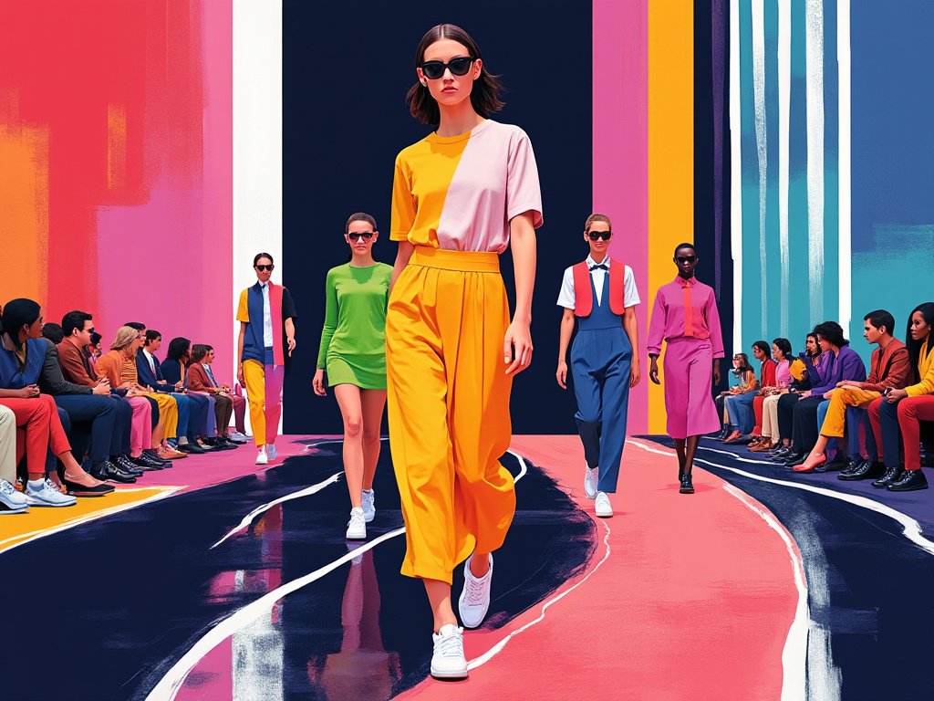
Here, designers set the stage for upcoming trends. Observing the color palettes can provide insights into what will be popular in upcoming seasons. For example, if pastels dominate Paris Fashion Week, we might see a surge in soft, soothing tones in consumer fashion.
Cultural Influences
Color trends can also stem from broader cultural movements. The resurgence of ’70s vibes might bring back earthy tones, while a focus on digital technology might inspire more futuristic, neon colors.
Economic and Social Climate
Economic prosperity might lead to bold, luxurious colors, whereas economic downturns could see a return to more conservative, comforting hues.
Understanding these trends allows individuals to stay current or even ahead of the curve in their personal style or professional projects.
Color and Fabric: A Dynamic Duo
The interplay between color and fabric texture is where fashion truly comes alive:
Texture and Sheen
A high-sheen fabric like satin can make colors appear more vibrant and luxurious, whereas matte fabrics like denim might mute those same colors, providing a casual, earthy feel.
Fabric Influence on Color Perception
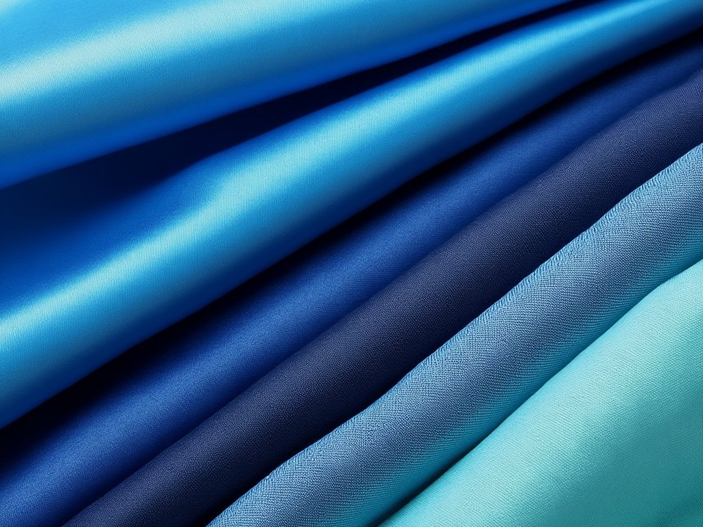
For example, a deep blue might look almost black in silk due to its reflective properties but appear softer in a matte jersey.
Pattern and Print
The scale and style of the pattern also affect how color is perceived. Large, bold patterns can make colors seem more dominant, while small, intricate designs can blend colors into a new, cohesive palette.
Transparency and Layering
Sheer or layered fabrics can create depth or change the color’s intensity. A sheer overlay can soften the color beneath, or contrasting layers can produce an entirely new color interaction.
This dynamic relationship between color and fabric allows for creative expressions that can either emphasize the color or let it harmoniously blend with the texture.
Color Confidence: Embracing Your Unique Style
Color in fashion is not just about following trends but also about personal expression:
Confidence is Key
Wearing colors that resonate with your personality boosts confidence. Whether it’s a splash of red for boldness or a sea green for serenity, your color choice can empower you.
Mix and Match
Experimentation with color combinations can lead to a unique style signature. Perhaps pairing unexpected colors like periwinkle with rust, which might not follow traditional harmony but could express personal flair.
Accessorize with Color
If stepping into a full-color commitment feels daunting, accessories can be your playground. A bright belt, a colorful scarf, or statement shoes can add personality to any outfit.
Breaking the Rules
Fashion is an art, not a science. Sometimes, breaking color theory norms can result in stunning, original looks that define one’s style.
Beyond Fashion: Color’s Universal Influence
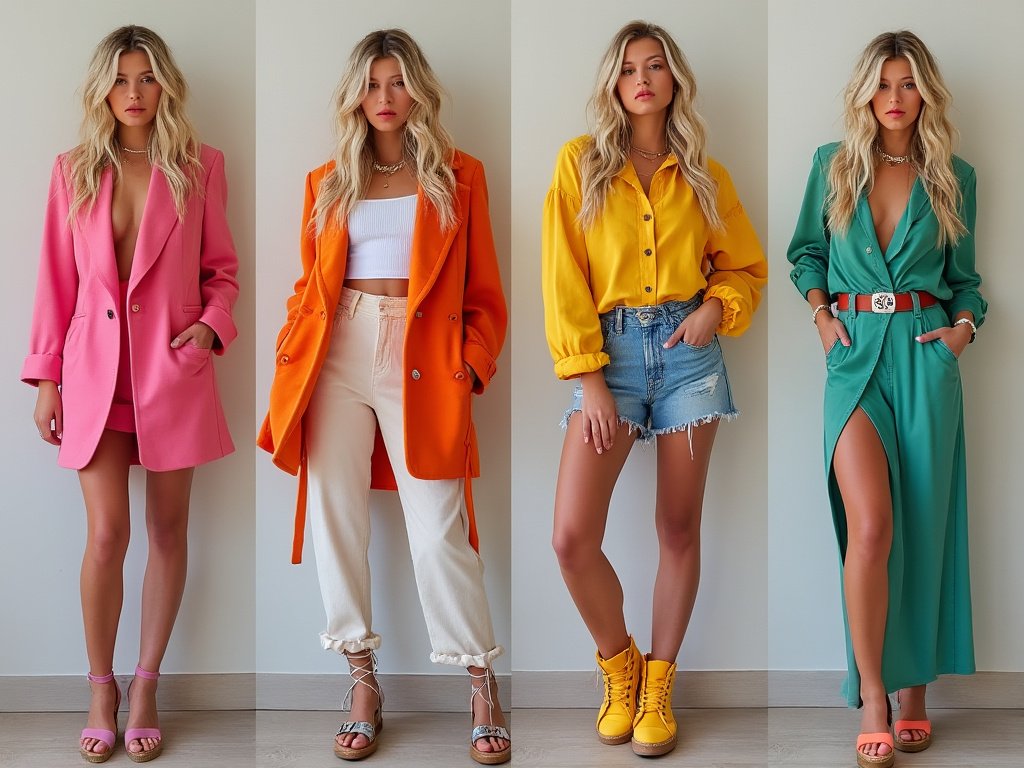
Color theory extends its influence beyond fashion into various domains:
Art and Design
Artists use color to evoke mood, create depth, and guide the viewer’s eye. For instance, Van Gogh’s “Starry Night” uses swirling blues and yellows to convey movement and emotion.
Marketing and Branding
Colors are chosen carefully in branding to evoke specific consumer responses. Think of the calm blue of IBM or the vibrant red of Coca-Cola, each chosen to reflect the brand’s identity.
Packaging
Color can influence purchasing decisions, where bright colors might attract attention, while pastel colors could suggest purity or gentleness, ideal for health products.
Film and Photography
Color Grading in Films
Color grading sets the tone; for example, a sepia filter can evoke nostalgia, while a high contrast, desaturated look might convey dystopia.
Photography
Photographers use color to tell a story or evoke a feeling, manipulating light and filters to achieve the desired effect.
Nature and the Environment
In natural settings, color can indicate seasons, the health of ecosystems, or even danger (like the bright colors of poisonous frogs). Understanding these natural color cues can inspire design or art.
The Cultural Canvas of Color
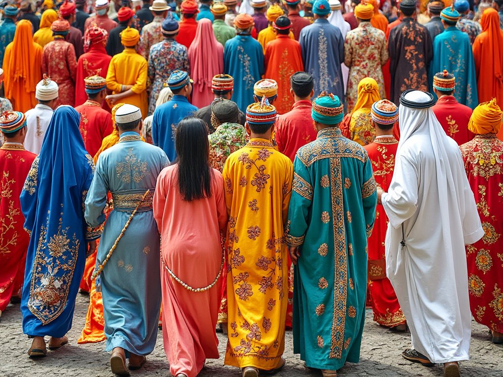
Color isn’t just a universal language; it’s also deeply cultural:
Cultural Meanings of Color
- Red: Often signifies luck and celebration in Chinese culture, passion or danger in Western cultures, and in some African cultures, it might represent vitality and the earth.
- White: While many Western cultures associate white with purity and weddings, in some Eastern cultures, it’s the color of mourning.
- Blue: Can symbolize calmness or sadness in the West, yet in many parts of the Middle East, blue is protective against the evil eye.
Color in Traditional Art and Fashion
Each culture has its own palette of traditional colors used in clothing, art, and rituals, reflecting historical, environmental, and symbolic values.
Color in Festivals and Ceremonies
Festivals worldwide use color to convey joy, spirituality, or significant cultural themes. For instance, Holi in India is famous for its explosion of colors, each with its own connotation.
Understanding these cultural significances can enrich one’s appreciation of global art, fashion, and traditions, fostering a more nuanced approach to color use in international contexts.
Color and Emotion: Painting With Feelings
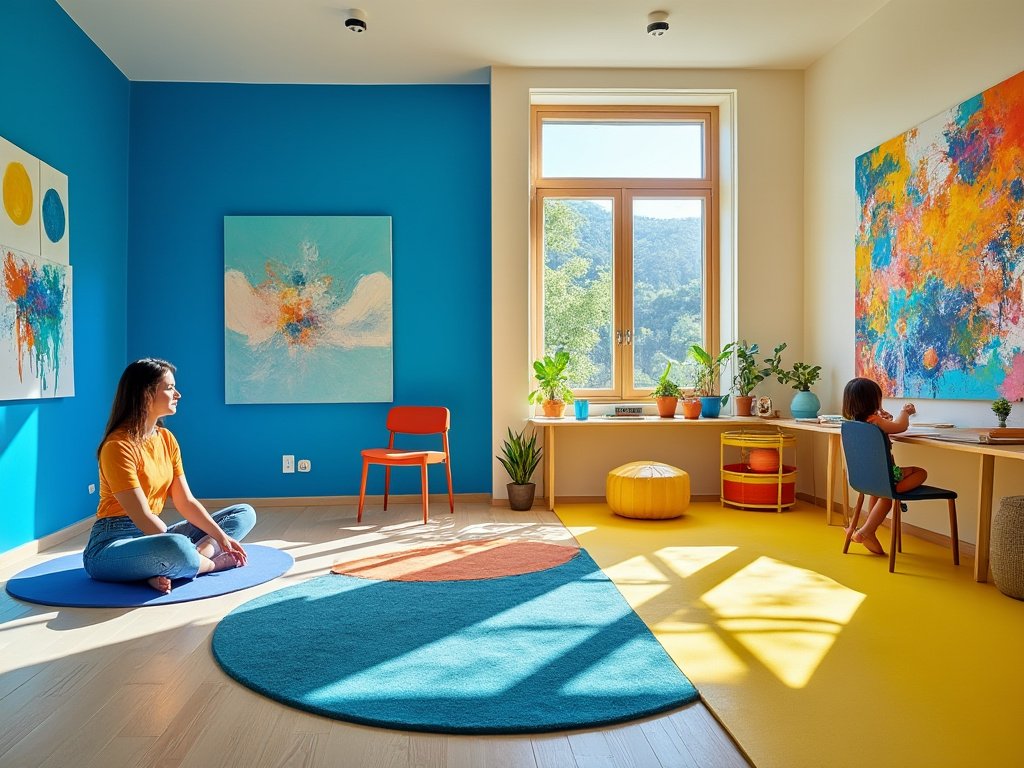
The emotional impact of color is profound and can be harnessed in various creative fields:
Therapeutic Uses of Color
Color Therapy
Utilizes color to balance energy wherever our bodies are lacking, whether emotionally, spiritually, or physically.
Interior Design
Homes and offices often use color psychology to create environments conducive to relaxation, productivity, or creativity. Soft greens or blues might be used in a meditation room, and vibrant yellows in a playroom.
Emotional Design
Products and environments are designed with color to evoke specific emotional responses. A hospital might use soothing colors to reduce patient anxiety, while a gym might opt for energizing colors to motivate.
Art Therapy
Artists and therapists use color to facilitate emotional expression and healing. Participants might be encouraged to paint with colors that reflect their current mood or desired emotional state.
Color in Technology: The Digital Palette
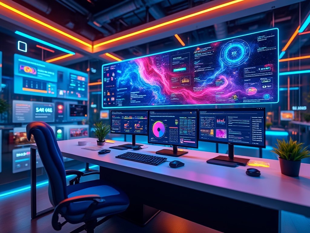
In the digital age, color theory has found new applications:
Digital Art and Design
Digital artists use color not only for traditional artistic expression but also to create immersive virtual realities or interactive experiences where color can change based on user interaction.
User Interface (UI) Design
Color in UI design affects usability, accessibility, and user experience. Bright buttons attract clicks while contrasting colors can guide user flow through an app or website.
Virtual Reality (VR) and Augmented Reality (AR)
In VR, color is crucial for creating believable environments, while in AR, colors can overlay information or change based on real-world context, enhancing or altering user perception.
Color in Coding
Programmers often use color-coded syntax highlighting to differentiate code elements, improving readability and reducing errors.
Color in Nature: An Ever-evolving Artwork

Nature itself provides an infinite canvas for color theory:
Biological Colorations
Animals use color for camouflage, mating signals, or warnings (like the bright colors of poisonous animals). This natural use of color can inspire design in camouflage patterns or vibrant fashion.
Seasonal Changes
The shift from the verdant greens of summer to the fiery reds and oranges of autumn showcases nature’s color palette, influencing seasonal fashion trends and interior decor.
Environmental Indicators
Color can indicate ecological health. For example, clear turquoise waters suggest healthy reefs, while algae blooms might change water color, signaling environmental concerns.
The Future of Color: Innovations and Trends
As we look forward, color technology and theory continue to evolve:
Smart Colors
Fabrics and materials that change color based on temperature, light, or electronic signals, allow for dynamic fashion or adaptive environments.
Eco-friendly Colors
A push towards natural dyes and sustainable color practices in response to environmental concerns, affecting both fashion and industrial color use.
Color in Space Exploration
As space travel becomes more accessible, how we use color in zero gravity or on other planets (considering different light conditions) could redefine color theory applications.
Neuroaesthetics
Studies on how our brain responds to color could lead to personalized color therapies or environments tailored to individual psychological needs based on brain science.
Virtual and Augmented Reality
The development of more sophisticated VR and AR systems where color can dynamically adapt to user’s emotional states or environmental conditions, creating new realms of immersive experiences.
Color and Light: An Illuminating Relationship
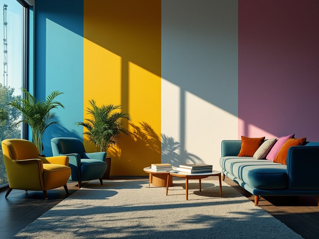
The interaction between color and light is fundamental yet often overlooked:
Light Spectrum and Color Perception
The quality of light significantly alters color appearance. Warm lighting can make reds and yellows pop, while cool lighting enhances blues and greens.
UV Light
Reveals colors invisible under normal light, like the UV patterns on flowers that attract pollinators or the black light effect in art.
Lighting in Art and Design
Artists and designers use lighting not just for illumination but as a tool to manipulate color perception, create moods or highlight specific elements in spaces or artworks.
Architectural Lighting
Buildings can change color through LED lighting for aesthetic, commercial, or seasonal purposes, altering the urban landscape at night.
Natural vs. Artificial Light
Understanding how natural daylight cycles affect color can inform the timing and placement of events or the design of living spaces to maximize natural light benefits.
Color in Marketing: Influencing Perceptions
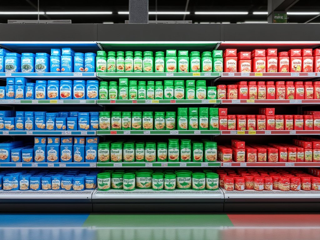
Color is a strategic tool in marketing and branding:
Brand Identity
Companies choose colors that convey their brand’s personality and values. For example, green often signifies eco-friendliness, while black can denote luxury or sophistication.
Consumer Behavior
Colors influence consumer emotions and decisions. Red can create a sense of urgency, often used in clearance sales, while blue can foster trust, commonly used by banks.
Packaging Design
The color of packaging can affect product appeal. Bright, bold colors might attract impulse buyers, whereas elegant, minimalistic colors could appeal to luxury markets.
Advertising
Advertisements use color to draw attention, convey messages, or differentiate from competitors. A disruptive color scheme can make an ad stand out in a sea of sameness.
Color in Health and Wellness
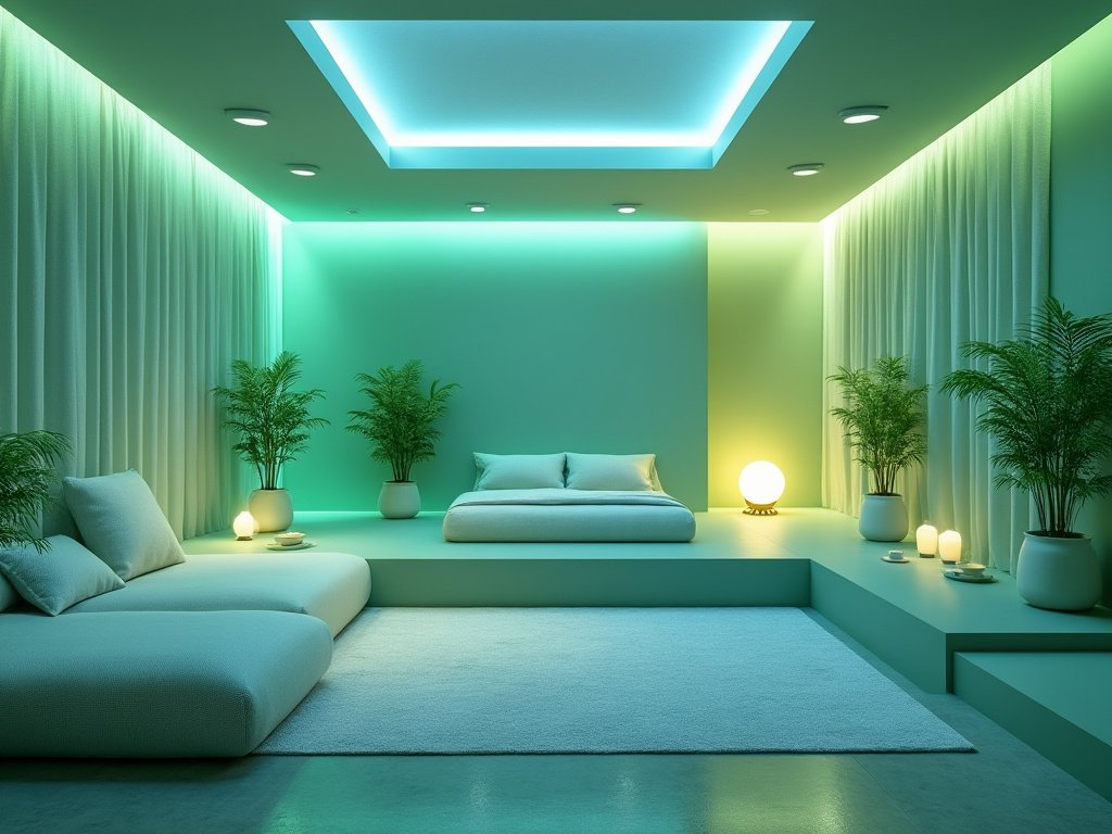
The application of color extends into health and wellness:
Color Therapy
Also known as chromotherapy, involves using colors to balance energy levels or treat certain conditions. Different colors are associated with different healing properties.
Healthcare Environments
Hospitals and clinics use color to create calming environments. Specific colors can help reduce stress levels, aid in healing, or even assist in wayfinding.
Mental Health
Color can influence mood. For instance, blue might help calm patients with anxiety, while yellow could uplift those feeling depressed.
Color in Education: Enhancing Learning
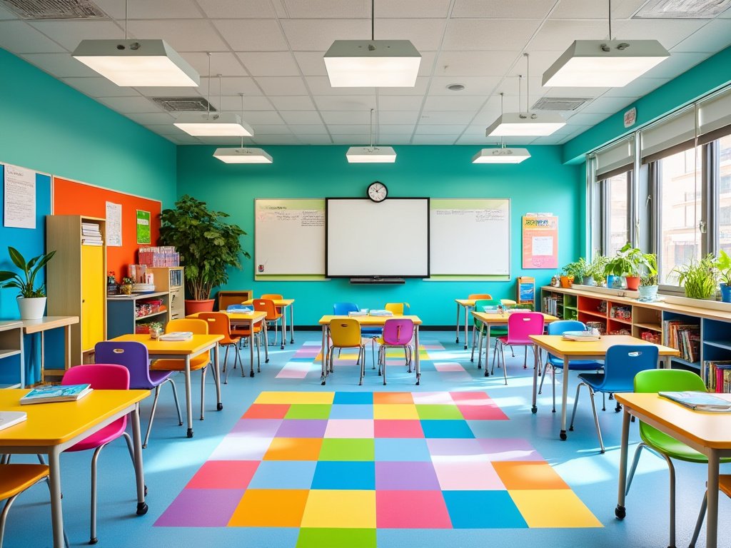
Color plays a crucial role in educational environments:
Visual Learning Aids
Educational materials use color coding to differentiate information, making learning more accessible and memorable. For example, different colors for different subjects or concepts.
Classroom Design
The colors in a classroom can affect student behavior and learning. Bright colors might stimulate creativity but could also be distracting if overused.
Accessibility in Education
Ensuring color contrasts are sufficient for students with visual impairments or color blindness, improving inclusivity in educational materials.
Color in Entertainment: Setting the Scene
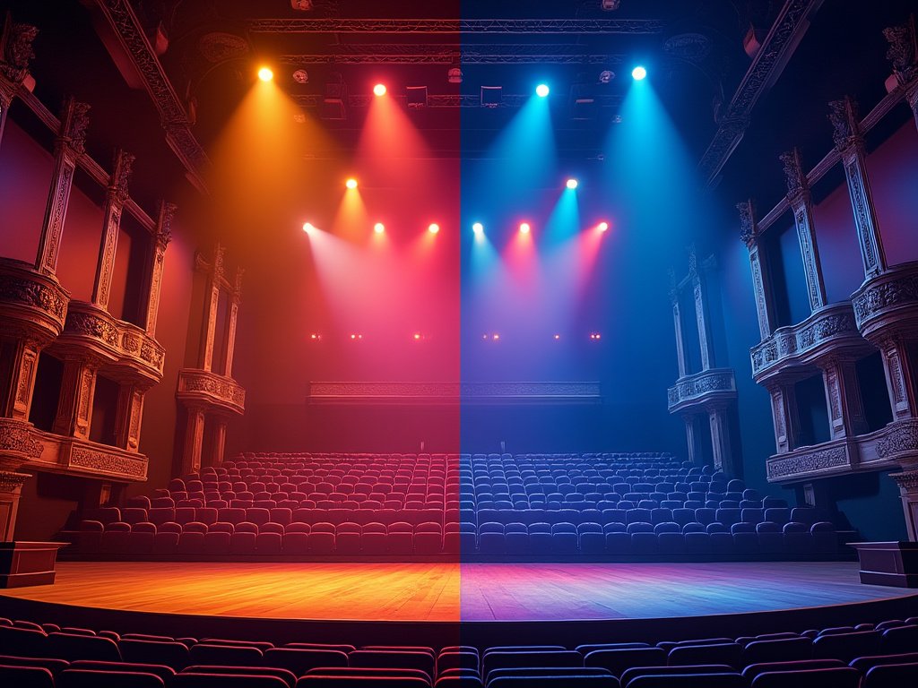
In entertainment, color is not just visual; it’s an emotional and narrative tool:
Film and Television
Color grading sets the tone of scenes. Warm colors might be used in flashbacks to evoke nostalgia, while cold, desaturated colors could depict dystopian futures.
Theater and Stage
Lighting and color are used to convey time of day, mood, or to focus audience attention on particular characters or parts of the stage.
Video Games
Color guides gameplay, indicates status (like health bars), and creates immersive worlds. Games might shift color palettes based on the player’s emotional journey or game time.
Music and Concerts
Live performances often synchronize light and color with music to enhance the sensory experience, affecting how audiences perceive and remember the event.
Festivals and Events
Thematic colors are chosen to create an atmosphere. For instance, the vibrant colors of Carnival or the specific palette of a cultural festival can define the experience.
Conclusion
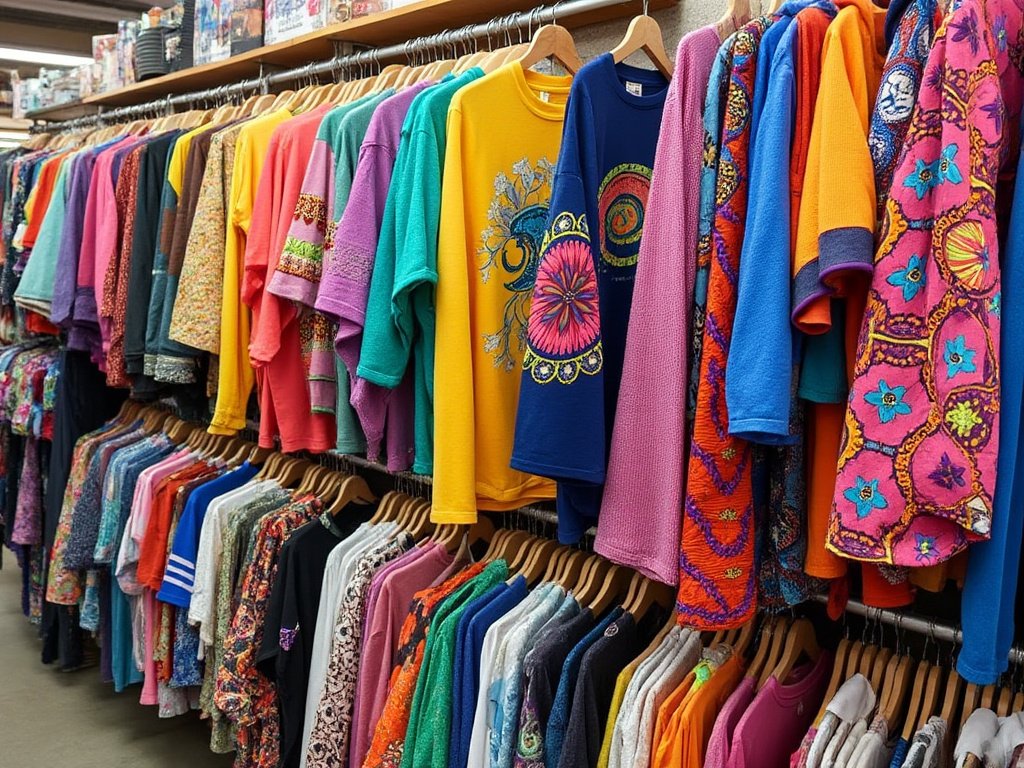
Color theory is not merely an art concept but a multifaceted discipline that spans across various fields like psychology, design, marketing, and fashion. It provides a framework for understanding how colors interact with each other and with human perception.
Mastering color theory can evoke specific emotions, alter perceptions, and communicate effectively without words. The applications are wide-ranging, from enhancing visual art to influencing consumer decisions in marketing or creating a personal style in fashion.
As technology and cultural contexts evolve, so does color theory, adapting to new mediums like digital interfaces while respecting traditional uses and cultural significance.
This dynamic interplay ensures that color theory remains a vibrant and essential study in modern life, offering endless possibilities for creativity, expression, and strategic communication.
Frequently Asked Questions (FAQ)
Q: What is the difference between RGB and CMYK?
A: RGB (Red, Green, Blue) is an additive color model used for digital screens where light is added together to create colors. CMYK (Cyan, Magenta, Yellow, Black) is a subtractive color model used in printing where inks absorb light to subtract colors.
Q: How do I find my personal color palette in fashion?
A: Personal color analysis often categorizes people into color seasons like Spring, Summer, Autumn, and Winter based on their skin undertone, hair color, and eye color. This helps in selecting clothing colors that enhance your natural features.
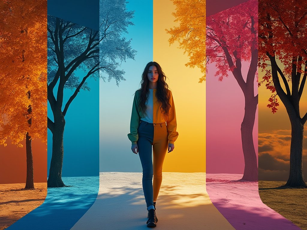
Q: Can color influence mood?
A: Yes, color psychology suggests that colors can significantly affect mood. For instance, blue can induce calm feelings, while red might increase energy or provoke hunger.
Q: What are complementary colors, and why are they used?
A: Complementary colors are directly opposite each other on the color wheel and provide maximum contrast, making each other appear more vibrant. They’re used to create dynamic visual interest or to highlight key elements in design or art.
Q: Is there a ‘best’ color to use in marketing?
A: There isn’t a universal ‘best’ color; it depends on the product, brand identity, and target audience. However, colors like red can grab attention, blue can build trust, and green often represents health or environmental friendliness.
Q: How does light affect how we perceive color?
A: The type of light (natural vs. artificial, warm vs. cool) can dramatically change how colors appear. For example, fluorescent lighting might make colors look washed out or different from how they appear under daylight.

Anna West, the visionary behind Clothes Color Guide, is our go-to for all things fashion. Merging the finest of runway trends with everyday style, she demystifies the world of color and pattern. While clothing is her mainstay, Anna also shares insights on interior design, pet care, and relationship advice. Dive into her articles and emerge with a vibrant perspective on style and life.
Reviewed By: Joanna Perez and Marcella Raskin
Edited By: Lenny Terra
Fact Checked By: Sam Goldman
Photos Taken or Curated By: Matthew Mansour
