Key Takeaways
- Bright colors like red, orange, and emerald green were popular in women’s fashion during the 1920s.
- Mauve and violet shades were trendy in the late Victorian and Edwardian eras.
- Black and white color schemes were prevalent in 1920s menswear.
- The 1930s and 40s saw the introduction of bold print patterns.
- Drab olive green and khaki dominated wartime utility wear.
- Pastels and feminine florals came into vogue post-war in the 1950s.
- Mod style in the 1960s popularized graphic black and white op art prints.
- Psychedelic prints and earth tones defined hippie style.
- Disco fashion embraced metallics, sequins, and bright neon shades.
From the lavish flapper dresses of the 1920s to the practical wartime uniforms of the 1940s, women’s fashion in the early 20th century experienced dramatic changes in color trends and style.
The vibrancy of the Roaring Twenties, somber shades of the Depression era, patriotic tones of wartime, and optimism of the post-war 50s all influenced prominent colors and patterns of the day.
Although men’s fashion in the early 1900s was generally more understated, designers began incorporating bolder colors and prints into menswear during this era. Exploring these shifting color trends in men’s clothing offers valuable insight into the social context and cultural zeitgeist of the early twentieth century.
Women’s Fashion Colors in the 1900s and 1910s
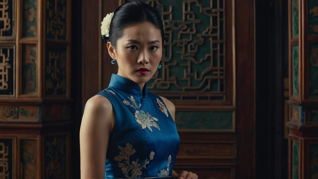
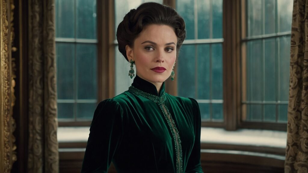
In the late Victorian and Edwardian eras of the early 20th century, deep jewel tones and moody hues dominated fashion trends. Luxurious colors such as emerald green, sapphire blue, and amethyst purple became especially popular in women’s gowns and day dresses of the period. Additionally, shades like mauve and violet rose to prominence, further defining the era’s distinctive color palette.
These muted colors were frequently combined with intricate trims and lace in black or ivory, creating striking visual contrast in Victorian fashion. The subdued tones and elaborate detailing contributed to an opulent yet somber aesthetic, characteristic of upper class women’s clothing in the era. This style reflected the formal elegance and understated sophistication expected in high society dress of the time.
The Rise of Vibrant Color in 1910s Styles
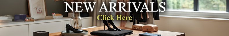
During the 1910s, women’s fashion underwent a transformation as restrictive corsets gave way to more relaxed, loose-fitting silhouettes. This shift in women’s clothing trends was accompanied by the rise of bold and vibrant colors in fashion, with shades like red, yellow, turquoise, and emerald green becoming especially popular. These eye-catching hues set the stage for the vivid color palette that would later define 1920s fashion. Younger flappers, known for their daring style, broke traditional fashion norms by wearing these bright colors in innovative garments such as drop-waist dresses and fringed skirts, pushing the boundaries of women’s style during this era.
Influence of the Ballets Russes
The groundbreaking costumes of the Ballets Russes significantly influenced color trends in fashion during the 1910s. Visionary designers such as Leon Bakst incorporated bold hues like orange, pink, and electric blue into imaginative and theatrical ballet costume designs. These striking and exotic color palettes became a source of inspiration for avant-garde fashion designers and couture houses of the era. Renowned designer Paul Poiret, for example, adapted the vivid Ballets Russes aesthetic into his innovative haute couture creations. His Oriental-inspired dresses in vibrant orange and green, designed for Denise Poiret, made a sensational impact on early 20th-century fashion.
The Color Palette Expands in 1920s Women’s Fashion
The 1920s saw an explosion of bright, vibrant colors across all aspects of women’s fashion. Hemlines rose and restrictive corsets vanished, ushering in playful new styles for the newly liberated flapper.
Vivid jewel tones remained popular, pairing emerald, sapphire, ruby, and citrine shades. But an expanded color palette also emerged with the increased use of synthetic dye techniques. Dynamic new hues like canary yellow, vermillion, and electric blue enlivened the fashions of the day.
Bright Red
Fiery tomato reds were ubiquitous on flapper dresses and evening garments. At a time when social norms were dramatically shifting, a bold red dress made a rebellious statement and signified the wearer’s modernity.
Vivid Oranges and Yellows
Pumpkin orange and bright marigold yellow color schemes added warmth and vibrancy to 1920s day dresses. These energetic shades conveyed the youthful optimism of the era.
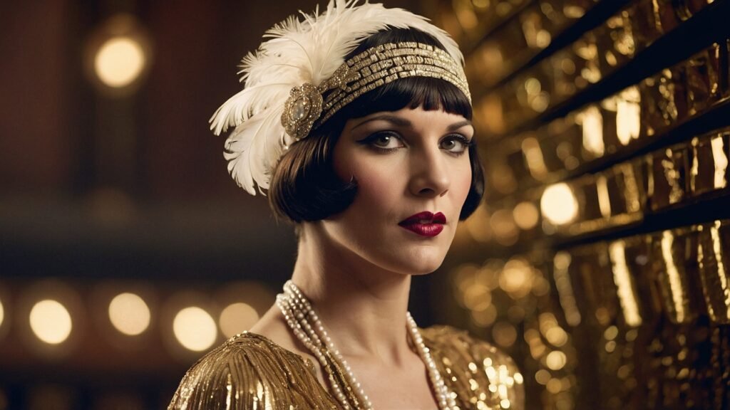
Emerald Green
Deep emerald and jade green hues remained a staple in 1920s formalwear. Sleek emerald evening gowns and beaded flapper dresses provided an elegant accent to the decade’s color trends.
Metallic Accents
The art deco movement influenced the addition of shiny metallic trims on dresses and shoes. Silver, gold, and bronze details added literal and symbolic brightness.
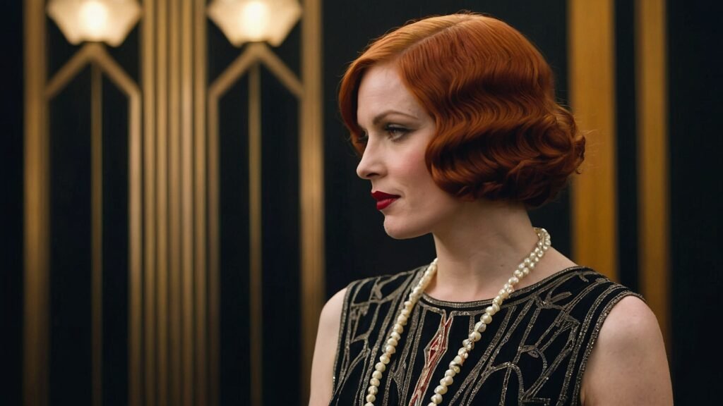
Masculine Color Schemes in 1920s Menswear
While women’s 1920s fashion innovated with an expanded color palette, men’s clothing remained more restrained. Traditional dark wool suits in navy, black, and charcoal gray continued to dominate menswear. The increased leisure activities of the era promoted casual wear like knickerbocker golfing suits in similar dark earth tones like hunter green, deep brown, and slate blue. The choice of muted, masculine hues distanced men’s fashion from the flamboyance of flapper styles.
Greys and Blacks
Most business and formal suits came in shades of black, charcoal, or steel grey, often with subtle stripe or plaid patterns. These somber colors maintained the serious and conservative aesthetic expected of businessmen.
Neutrals
Casual weekend sportswear favored neutral browns, tans, cream, and white for pants, sweaters, and shoes. These colors aligned with the outdoor leisure activities in vogue for men.
Bold Accents
While cut and fabric of suits remained traditional, small touches of vibrant color emerged in men’s neckties, pocket squares, socks and other accessories. Scenes of aviation, cars, or college life brought brightness to men’s looks.
New Color Combinations in 1930s Fashion
The 1930s moved away from the vibrancy of the previous decade and ushered in more subdued color palettes across both men’s and women’s fashion. Garment construction also shifted towards emphasizing the natural shoulder line while cinched waists came back into style. But wider skirts and looser trousers still required innovative ways to add visual interest. This resulted in an explosion of bold new prints and fabric pairings.
Checked and Plaid Patterns
Large-scale buffalo check and plaid patterns gained popularity for day dresses, suits, and coats. Black and white gingham prints also came into vogue, echoing the new silhouette’s graphic contrast of light and dark.
Color Blocking
Instead of all-over vibrant hues, color blocking emphasized strategic pops of color. Dresses might pair somber navy tops with bright crimson skirts, for example. This trend mirrored the sleek Art Deco aesthetic.
Warmer Neutrals and Pastels
Softer earth tones like rust, mustard, and moss replaced primary colors, bringing warmth to suits, day dresses, and coat. Likewise, pastel pinks, yellows, blues, and greens emerged as fashionable in women’s wear.
Nautical Looks
The nautical trend brought color schemes of navy blue with crisp whites into mainstream fashion. Anchor and sailing motifs reinforced these cool blue and white pairings.
Patriotic Colors Dominate 1940s Wartime and Utility Fashion
World War II exerted an enormous impact on the color story of 1940s fashion. Restrictions on fabrics for civilian use meant clothing had to be practical, sparing, and patriotic in its color choices. Bold prints and vibrant hues gave way to muted neutrals that echoed military uniforms. Blue, tan, olive drab, and brown came to dominate everyday wear.
Khaki and Olive Green
Earthy khaki green and olive drab were the most prominent colors of 1940s fashion. They mirrored the hues used in military uniforms and conveyed patriotic pragmatism. Women’s day dresses, workwear, and men’s suits favored these militia-inspired greens.
Navy Blue
Deep navy blue also carried patriotic meaning. Combined with clean whites, navy and white color schemes reflected the uniforms of the U.S. Navy. This nautical look translated widely to everyday and work fashions.
Greys
Charcoal, steel, and ash grey offered an alternative neutral that aligned with the wartime ethos. Grey suiting and utilitarian frocks blending with crowds and required no special fabrics.
Pastels as Contrast
The drabness of wartime necessitated occasional contrast with lighter hues. Soft pastel pinks, yellows, and blues in day dresses and blouses provided temporary optimism.
The Feminine Pastel Revival in 1950s Fashion
After years of wartime austerity, the 1950s sought to reclaim colorful, overtly feminine fashion. Designers leveraged new synthetic fibers to craft full, billowing skirts and dresses in candy-colored pastels. Pale pinks, mint greens, powder blues, and buttery yellows defined the era’s color trends. Soft floral prints and dainty accessories added decorative contrast without going overboard. The pastel and floral palette aimed to reflect domestic ideals and traditional gender roles.
Soft Pink
No color captures the femininity of 1950s fashion more than whispers of blush, carnation, and bubblegum pink. This “pretty in pink” trend extended from party dresses to pants ensembles.
Lemon Yellow and Lilac
Buttercream yellow and pale lilac purple complemented pink in rounding out the quintessential pastel trifecta of 50s style. These sweet hues appeared on full midi-length skirts and pert jacket suits.
Robin’s Egg Blue
Crisp yet soft robin’s egg blue offered a cool counterpoint to the warmth of pinks and yellows. This versatile pastel worked for day dresses, overcoats, suits, and evening gowns.
Floral Prints
Small-scale floral patterns in assorted pastel shades reinforced the feminine aesthetic. Roses, peonies, and cherry blossoms adorned full-skirted swing dresses and shirtwaist blouses.
1960s Mod Fashion and Psychedelic Prints
The youth counterculture explosion of the 1960s radically departed from the muted pastels of 50s style by embracing trippy prints, op art graphics, and earthy brights. Street styles like mod and hippie defined these new avant-garde color trends that broke free from tradition.
Black and White Op Art
The minimalist mod fashions leveraged black and white geometric prints, patterns, and color blocking. This op art aesthetic extended from shifts dresses to men’s suits in a unisex way.
Psychedelic and Kaleidoscopic Prints
Mind-bending patterns that mimicked hallucinogenic experiences defined the hippie’s eclectic style. Swirling rainbow tie-dyes, optical illusions, and distorted floral motifs were common.
Earth Tones
Warm earth tones like saffron, mustard, rust, and avocado aligned with hippie environmental ideals. Handcrafted and natural fabrics in these tones added to the organic movement.
Electric Neon Brights
For a more futuristic contrast, neon yellow, green, pink and orange prints also flooded the scene. These hyper-synthetic shades gave a shock factor to mod go-go boots and mini-skirts.
Metallic Disco Fashion of the 1970s
No color trend captures the glitz and decadence of 1970s disco culture more than metallics. Shimmering golds, silvers, and bronzes came to dominate both discotheque fashion and mainstream clothing. Sequins, lamé, glitter, and glossy satins created a glam look under the disco ball. But earthy tones also persisted through the decade for mellower daywear.
Silver and Gold
Shimmering metallics added sparkle and luxury to the disco scene. Slinky halter dresses, platform boots, and bell bottoms shone in silver and gold lame fabrics. Disco queens and kings wore these flashy metals unapologetically.
Glossy Satins
Satin fabrics with high shine epitomized the night life aesthetic. Hot pink, red, and electric blue satin jumpsuits, shirts, and wrap dresses glowed under dance floor lights.
Sequins and Rhinestones
Liberal use of sequins and rhinestone trim amplified the decadence of after-dark fashion. These decorative accents glittered on tops, dresses, and accessories.
Earth Tones Persist
For daytime, earthy brown, tan, olive, and terracotta colors continued their hold on casualwear like flared jeans, peasant blouses, and maxi dresses. These warmer neutrals aligned with mellower hippie mindsets.
Conclusion
Across five decades of evolving social ideals, political climates, and cultural movements, color trends in fashion constantly shifted to reflect the spirit of the times. The vibrant hues of the roaring 1920s dramatically differed from the muted wartime shades just twenty years later. Yet throughout the modernization of the early 1900s, color’s ability to capture a cultural zeitgeist persisted. Understanding these cyclical color trends provides deeper insight into our fashion history.
Frequently Asked Questions
What colors were popular in the 1920s?
Vibrant jewel tones like emerald green and sapphire blue remained stylish in the 1920s, but the era also introduced bold new bright colors like tomato red, sunshine yellow, and grape purple thanks to new synthetic dye techniques.
How did WWII impact clothing colors?
Wartime rationing and patriotic sentiment led to muted, earthy shades like olive drab, navy blue, tan, and charcoal dominating everyday fashion. Vibrant colors were viewed as unpatriotic and frivolous.
What sparked pastel colors in the 1950s?
After the drab colors of wartime utility wear, 1950s style swung towards ultra-feminine pastels like pink, lilac, and mint green. New synthetic fabrics allowed full, voluminous skirts and dresses in these soft hues.
Why was black and white mod fashion popular in the 1960s?
The mod youth subculture favored basic black and white color schemes in geometric op art prints and color blocking. This minimalist aesthetic rejected tradition and aligned with modernity.
What did disco fashion embrace color-wise?
Disco style fully embraced glittery metallics like silver, gold, and bronze. Sequins, lamé fabrics, satins, and rhinestones added shine and sparkle to quintessential 70s party looks.
How did Ballets Russes costumes influence fashion?
Fantastical Ballets Russes costumes designed by Leon Bakst featured vivid, exotic color schemes with bold oranges, pinks, and electric blues. These colors directly inspired avant-garde fashion designers.
What colors were popular for men in the 1920s?
Unlike flapper dresses, 1920s menswear remained subdued with dark, neutral suits in black, navy, and grey wool. Pops of color emerged in neckties, socks, and accessories.
What contributed to wider color options in 1930s fashion?
The 1930s moved beyond vibrant all-over color to introduce bold new prints like buffalo check and color blocking. This added visual contrast and interest.
How did 1930s prints reflect the era’s aesthetic?
Graphic black and white gingham and wide plaid prints echoed the sleek, angular Art Deco movement popular in the 1930s in architecture and product design.
Why were pastels revived post-war in the 1950s?
After the drab utility fashions of WWII, the 1950s sought to reclaim overtly feminine style through soft pastel colors like pink, blue, and yellow. New synthetic fabrics enabled full skirts and dresses.

Anna West, the visionary behind Clothes Color Guide, is our go-to for all things fashion. Merging the finest of runway trends with everyday style, she demystifies the world of color and pattern. While clothing is her mainstay, Anna also shares insights on interior design, pet care, and relationship advice. Dive into her articles and emerge with a vibrant perspective on style and life.
Reviewed By: Joanna Perez and Marcella Raskin
Edited By: Lenny Terra
Fact Checked By: Sam Goldman
Photos Taken or Curated By: Matthew Mansour