Key Takeaways
- Knowing your undertones helps you identify colors that enhance your natural look.
- Pair fabrics with the right hues to highlight each material’s character.
- Contrast, patterns, accessories, and textures all affect how color is perceived.
- Seasonal transitions and layering can breathe new life into your wardrobe year-round.
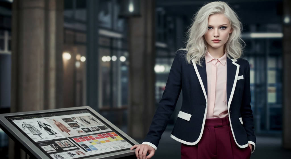
- Digital tools can be powerful resources for discovering new color combinations.
Clothing color choices can feel overwhelming. With endless shades and combinations, it’s easy to get stuck wearing the same two or three safe colors every day.
Fortunately, it doesn’t have to be complicated. When you know your personal undertones, understand how fabrics interact with certain colors, and learn a few techniques for layering and accessorizing, you can build a wardrobe that highlights your best features.
In this article, you’ll find all the methods, secrets, and practical steps to confidently pick the right color for every look. Get ready to transform your outfits from “so-so” to “wow!”
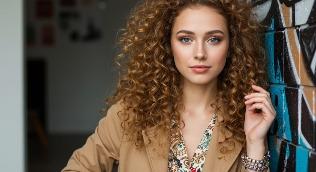
1. Understand Your Undertones

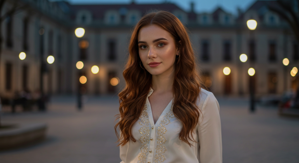
Choosing a color that works for you starts with an awareness of your undertones. It’s a bit different from talking about complexion or skin color alone. Undertones give you insight into whether warm or cool shades tend to work best with your look.
Checking Your Vein Color
A quick at-home test is to look at the veins on your wrist:
- If they appear blue or purple, you likely lean toward cool undertones.
- If they appear green, you likely have warm undertones.
- If you see both, you may be neutral and can rock both cool and warm shades.
This simple trick can guide you toward the color family that flatters you most.
Gold vs. Silver Jewelry Test
Another easy test involves your favorite metal. Try on gold and silver pieces:
- If gold lights up your face, you might prefer warm or earthy tones in clothing.
- If silver looks better, you’re likely suited to cool or jewel tones.
- If both look fantastic, consider yourself neutral.
Seasonal Light
Even if you discover you’re warm or cool, lighting can change your perspective. A color might look different in the morning sun than it does under fluorescent lights at work. Always do a quick mirror check in natural daylight before committing to a big purchase. A color that glows in the store might look off in your everyday environment.
2. Fabric and Color Pairing
Certain fabrics can either brighten or dull colors. Mixing the right shade with a specific material can turn a simple outfit into a head-turning ensemble.
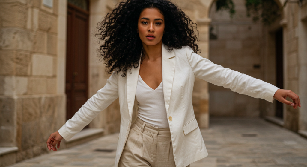
Crisp Whites with Linen
Linen is known for its breathable nature and slightly textured appearance. Pairing crisp white with linen garments creates a fresh, effortless vibe. You can opt for:
- White tops over natural beige linen pants.
- A white linen blazer with matching white trousers.
Both combinations scream minimalist chic without sacrificing comfort.
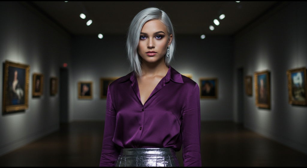
Rich Jewel Tones on Velvet
Velvet’s plush texture takes on a luxurious sheen when paired with jewel tones. Deep emerald, burgundy, sapphire, and amethyst look regal on velvet jackets, dresses, and blazers. Keep accessories neutral so the velvet piece can be the star of the show.
Colorful Cotton
Cotton is a versatile fabric that’s easy to care for. It looks fantastic with bold, saturated hues like cobalt blue, coral, or a bright turquoise. If you want a pop of color without going overboard, choose a cotton top in a solid bright shade and pair it with neutral bottoms or jeans.
3. Contrast & Body Proportions

Getting color right is often about how you contrast garments against each other. If you want to play up or down certain body parts, strategic contrast can help.
High Contrast Outfits
A high contrast look uses two colors that differ significantly, like black and white or navy and bright yellow. This approach draws the eye immediately and can be used to highlight a specific area. For instance, if you want to show off your waist, choose a top in one color and pants in a starkly different color.
Low Contrast Outfits
Low contrast dressing means choosing shades that are closer in value, like beige with light brown or charcoal with black. This style can create a lengthening effect, especially if you keep it monochromatic from head to toe. Low contrast is a subtle way to look taller.
Balanced Contrast
You can achieve a balanced contrast by choosing two moderate-intensity colors. Pair a medium navy sweater with medium-washed denim, for example. Neither piece outshines the other, resulting in a harmonious look.
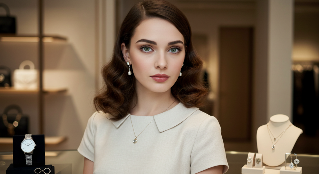
4. Neutral Colors

Neutral tones are the backbone of any wardrobe. They complement almost any accent color and are easy to mix and match.
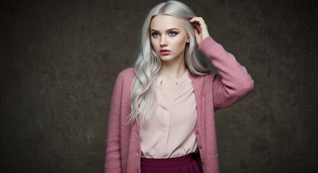
Warm Neutrals
Think beige, cream, camel, or tan. These neutrals skew slightly warmer and pair excellently with warmer undertones. They can also soften the brightness of an outfit, creating a cozy, approachable feel.
Cool Neutrals
Cool neutrals include charcoal gray, slate, and off-white with a blue tinge. They look great on cool undertones. Pair these with sharper pops of color like a bright pink scarf or a cobalt blue bag for contrast.
Universal Neutrals
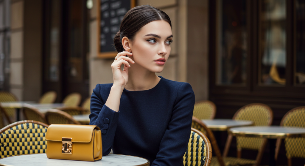
Colors like white, navy, and black are often seen as universal neutrals because they can anchor nearly any outfit. Even if you have warm undertones, a black blazer is usually still a win—just add a warm accent like a gold necklace or caramel belt if you need to bring your undertones to life.
5. Brights and Pops of Color
Choosing bright colors can be intimidating, but strategic usage can level up any outfit.
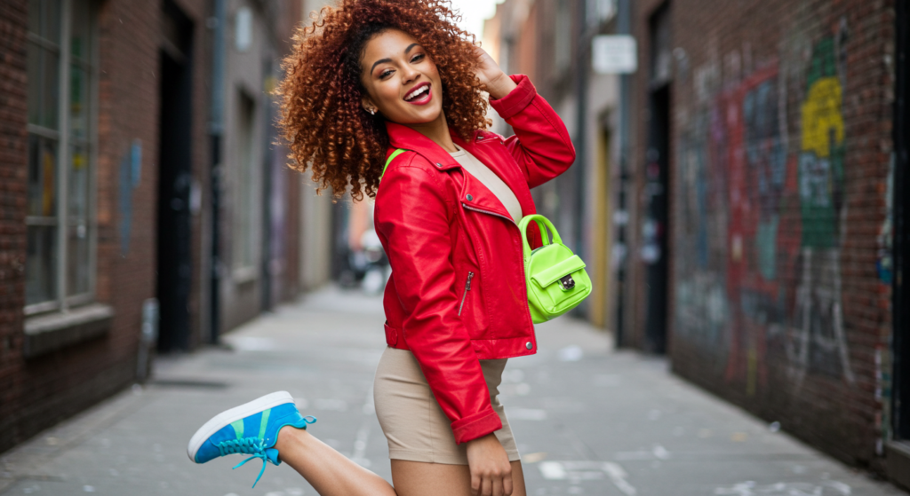
Statement Pieces
Pick one item to shine:
- A vivid red coat
- Electric blue heels
- Neon green purse
Keep the rest of the outfit subdued or neutral. This way, your statement piece becomes the focal point without overwhelming your whole look.
Subtle Accents
If you’re not ready for a big bold garment, use a bright accent in a smaller accessory. A candy-colored belt or a pastel headband can be enough to add personality. This approach also lets you test out colors you’re not used to wearing without a major commitment.
Color Blocking
Color blocking involves wearing large sections of bold, contrasting colors together. Picture an outfit where the top is bright orange and the skirt is royal blue. It’s a playful way to show style confidence. The trick is to keep the shapes and silhouettes simple so the colors remain the focus.
6. Color Coordination
A few color coordination principles can elevate your outfits from random mix-and-match to an expertly curated look.
Complementary Colors
These sit opposite each other on the color wheel (like red and green or purple and yellow). When paired, they heighten each other’s intensity. Small complementary accents, such as red earrings with a green dress, can be striking.
Analogous Colors
Analogous colors live next to each other on the color wheel (like orange, yellow, green). Combine them to create a smooth, blended appearance. This is great for gradient or tonal looks that have minimal contrast but still deliver depth.
Triadic Colors
Triadic colors are equally spaced on the wheel, forming a perfect triangle. Examples include red, blue, yellow or purple, green, orange. Balancing three bold shades can be challenging, but using one as the main color and the others for accents results in a vibrant, balanced outfit.
7. Seasonal Transitions

Seasons can impact your color choices, but that doesn’t mean you need a separate closet for each month. Adapting certain elements per season will keep you looking fresh.
Lighter in Spring & Summer
In warmer seasons, try:
- Light pastel shades (mint, lavender, soft pink)
- White-on-white ensembles with airy fabrics
- Subtle prints that reflect the brighter days
Deeper in Fall & Winter
As temperatures drop, deepen your color palette:
- Burgundy, forest green, and navy fit the cozy mood
- Rich brown leather jackets and boots
- Warm mustard or spice tones to add vibrancy
Mid-Tones Year-Round
Sometimes you don’t want to shift entirely to lighter or darker tones. Mid-tone colors (like medium blues, moderate greys, or dusty mauves) are flexible. They layer well with seasonal pieces, so you can wear them anytime.
8. Patterns & Prints
Patterns and prints can help you break free from monotonous solids, but you must choose wisely to avoid chaotic clashes.
Small Scale vs. Large Scale
Small-scale prints (tiny polka dots, subtle checks) are often easier to mix and can appear more refined. Large-scale prints (bold florals or oversized geometric designs) make a bigger statement. Choose large prints for a focal piece like a dress or jacket.
Mixing Patterns
If you’re feeling adventurous, wear more than one pattern. The key is to maintain a common color thread. For instance, pair a white polka dot top with black stripes if both share black and white. Keep silhouettes and accessories understated to prevent overkill.
Neutralizing Bold Prints
When you wear a strong print, you can calm it down with a neutral piece. Let’s say you have a bright floral skirt; pair it with a solid black or white top. This method makes the printed item stand out without dominating your entire look.
9. Texture & Shine
Texture plays a big role in how colors appear. Shiny fabrics reflect light, while matte ones absorb it.
Matte vs. Glossy
Matte fabrics, like cotton twill or jersey, can make bold colors look a bit more subdued. In contrast, glossy fabrics (satins, silks, or faux leathers) bring out the vibrancy. This difference can be used to your advantage if you want an understated or a more eye-catching effect.
Metallic Accents
Metallic fabrics come in gold, silver, copper, and even rose gold. They instantly add glam to any outfit. If you’re unsure, start small with a metallic clutch or pair of loafers. When you feel confident, you can introduce a metallic jacket or skirt.
Sequins & Embellishments
Sequins catch the light in all directions, so the base color can appear extra bright. If you decide to wear something heavily embellished, keep your accessories and other layers simplified. A fully sequined dress can be balanced with minimal jewelry and neutral heels.
10. Accessory Coordination
Accessories are like the supporting cast in your fashion story. Used strategically, they can either complement or contrast with your main color choices.
Matching Shoes & Belts
A matching shoe-belt combo used to be the gold standard of accessorizing. It still works well if you want a polished, put-together look. A black belt paired with black shoes is a classic example.
Contrasting Accessories
For a more modern approach, go for contrasting accessories. Try wearing a bright orange belt with navy shoes, for instance. The pop of orange stands out, adding interest without disrupting the whole outfit.
Layering Jewelry
Mixing silver, gold, and rose gold can be refreshing if done in a small, balanced way. When layering necklaces or bracelets, keep them in the same visual family. For instance, pair delicate chains together or layer chunkier bangles, but try not to mix delicate with very chunky pieces in the same set.
11. Color Trends

Fashion is cyclical, and every year different shades take the spotlight. Don’t feel pressured to overhaul your closet for each trend. Instead, pick and choose what suits you.
Runway Inspiration
Designers often showcase experimental color combos on the runway. While these can look extreme, they can also be a great source of inspiration. Maybe you won’t wear neon from head to toe, but a neon scarf or bag could be a fun nod to a runway trend.
Fast Fashion vs. Timeless
Fast fashion brands often promote the hottest shades of the moment at lower prices. This is an opportunity to try bold colors without significant cost. But for timeless staples, invest in higher-quality pieces in colors you’ll wear for years (like your best neutrals or your favorite statement hue).
Capsule Wardrobes
Capsule wardrobes focus on versatility. Typically, the color palette is neutral-heavy with a few accent colors. This approach makes daily outfit choices simple. If you want to add current trends, you can do so in small amounts—like a trendy color sweater or accessory that still complements your capsule’s core shades.
12. Layering Techniques
Layering is a year-round style tool. Knowing how to layer colors can open up a world of creative outfit possibilities.
Tonal Layering
This technique involves wearing different shades of the same color. Imagine layering a light pink blouse under a dusty rose cardigan with deeper berry pants. The variations create depth and prevent the outfit from looking flat.
Gradient Layering
A gradient effect is a subtle shift in color that almost looks like it’s blending from light to dark. If you love wearing blue, you might start with a pale sky-blue shirt, add a medium-blue jacket, and finish with navy pants. This approach is eye-catching but still cohesive.
Mixed Fabric Layering
Even if you’re wearing the same color, mixing different textures—like a chunky knit over a silky camisole—makes each color appear slightly different. This is an easy way to add visual interest without adding more hues.
13. Digital Tools & Apps

We live in a time where you can test-drive color combinations using digital tools before spending time or money.
Virtual Fitting Rooms
Some stores and apps now offer virtual fitting rooms. You can upload a photo or input your measurements to see how a garment might look. It’s not a perfect science yet, but it can save time, especially for color experimentation.
Color Palette Generators
A color palette generator can create coordinated sets of shades based on one input color. If you’re drawn to a specific hue—like dusty teal—these tools can show you complementary, analogous, and triadic matches.
Online Wardrobe Planners
Several apps let you digitize your wardrobe by uploading photos of your clothes. You can then try out different outfits virtually. This is a great way to figure out if that new orange blouse you’re eyeing will actually go with your existing jeans and shoes.
14. Personalizing Your Palette

Ultimately, color selection is personal. The best approach is one that makes you feel confident and comfortable.
Signature Color
A signature color can be something that you gravitate towards naturally—maybe a vibrant turquoise or a cool grey. Embrace it! Incorporate that color into accessories, outerwear, or even smaller details like nail polish and phone cases.
Adding Bold Shades
Even if you usually prefer neutrals, adding a bold shade or two can invigorate your style. This doesn’t mean you need an entire closet full of hot pink or neon orange. One statement jacket or pair of shoes in a bold color can work wonders.
Evolving Tastes
Your preferences can change over time. If you used to love pastels and now find yourself drawn to deeper shades, follow that instinct. Evolve your palette as your style and confidence grow. It’s all part of the fun of fashion.
Conclusion

Picking the right color isn’t about following a strict rulebook. It’s about finding shades that complement your undertones, suit your style, and make you feel great.
From understanding the interplay of color contrast to choosing the right fabric and layering techniques, there are countless ways to refine your look. If you remain open to experimentation—whether through small accents or bold statement pieces—you’ll continually discover new combinations that work for you.
Building a reliable palette doesn’t happen overnight. Give yourself room to explore, and remember that great style often stems from a balance of confidence, personal preference, and practical knowledge. Let these insights guide you, and you’ll never again wonder whether a color truly suits you.
Summary Table
| Technique/Concept | Key Point | Benefit |
|---|---|---|
| Undertones (Warm, Cool, Neutral) | Base guide for color families | Helps narrow down flattering colors |
| Fabric & Color Pairing | Match fabric texture with hue intensity | Elevates basic outfits |
| Contrast & Body Proportions | High, low, or balanced contrast | Shapes visual focus and can create elongation |
| Neutral Colors | Warm, cool, and universal neutrals | Versatile base for any outfit |
| Brights & Pops of Color | Statement pieces or subtle accents | Adds interest and boldness |
| Color Coordination | Complementary, analogous, and triadic combinations | Creates harmonious or dynamic ensembles |
| Seasonal Transitions | Light, deep, or mid-tone changes | Keeps wardrobe current and flexible year-round |
| Patterns & Prints | Scale and mixing techniques | Enhances creativity without overwhelming |
| Texture & Shine | Matte vs. glossy, metallic, sequins | Affects color perception and outfit flair |
| Accessory Coordination | Matching or contrasting with outfits | Completes and personalizes your look |
| Color Trends | Runway inspiration and capsule choices | Modern touches without losing personal style |
| Layering Techniques | Tonal, gradient, or mixed fabric layering | Adds depth and complexity to outfits |
| Digital Tools & Apps | Virtual fitting, palette generators, wardrobe planners | Simplifies exploration of new colors |
| Personalizing Your Palette | Signature color, bold additions, evolving tastes | Reflects individuality and growth |
FAQ
Q: How can I tell if a color is just “off” for me?
A: If you look in the mirror and notice your face appears washed out or sallow, the color might not harmonize with your undertones. Another clue is if you feel the color overshadows your features instead of enhancing them.
Q: Do I need separate wardrobes for summer and winter colors?
A: Not necessarily. Focus on layering and fabric weight instead of ditching entire color families. For example, a light sweater in a pastel shade can work in winter if paired with heavier coats or boots.
Q: How many colors should I have in my core wardrobe?
A: A good rule of thumb is three to five core neutral tones and two or three favorite accent colors. This balance gives you enough variety without overwhelming your closet.
Q: Can I wear white after Labor Day?
A: Yes! Fashion “rules” are more relaxed nowadays, and white can look fantastic in winter, especially in cozy knit sweaters or chic outerwear.
Q: What if I love a color that isn’t traditionally in my undertone group?
A: Go for it if it makes you happy. You can always balance it with accessories that bring in your undertone. For example, wear that bright pink sweater but add a statement necklace or scarf in a tone that suits your complexion.
Remember, fashion is about expressing yourself. Use these guidelines as a starting point, and let your personal taste—and confidence—shine through in your color choices.
By experimenting with undertones, fabrics, contrasts, and accessories, you’ll discover a wide range of looks that feel authentically you. Enjoy the journey of finding new and exciting ways to dress in colors that make you look and feel spectacular!

Neha Z. is not just any writer; she’s a storyteller who has graced the online world with her evocative prose for over half a decade. Venturing into the intricate nuances of women’s lives, she weaves stories that range from life’s highs and lows to the multifaceted essence of femininity. Each piece she pens radiates sincerity and artistry. As you delve into Neha’s musings, you’ll find reflections that echo your own journey and insights that inspire. Immerse yourself in her world, and let her stories touch your heart.
Reviewed By: Joanna Perez and Anna West
Edited By: Lenny Terra
Fact Checked By: Matthew Mansour
Photos Taken or Curated By: Matthew Mansour
