Key Takeaways
- Pick colors that match your home’s architectural style and the neighborhood vibe.
- Remember how trim, accent pieces, and landscaping can shift your color choices.
- Test paint samples in different lighting before fully committing.
- Think about durability and finish, not just color alone.
- Coordinate your exterior with elements like your roof, driveway, and outdoor decor.
Introduction
Choosing an exterior paint color might feel complicated. Which hue will balance the overall look? Will it blend with your surroundings? It’s easy to worry about choosing something too bright, too dark, or too bland. Nobody wants to invest time and effort, then end up regretting the result.
In this guide, you’ll learn a detailed approach that helps you decide on the perfect hue for your home’s outer walls. You’ll find answers to questions about matching colors with architectural details. You’ll also see tips on picking finishes that can hold up in various climates. Plus, you’ll discover product suggestions and outside-the-box ideas for spicing up your home’s curb appeal.
Let’s explore 14 sections, each with a few practical subsections, designed to make your final color choice easier. Get ready for step-by-step advice, lists, and even a summary table to keep everything organized.
Assess Your Home’s Architecture

Identify Your Style
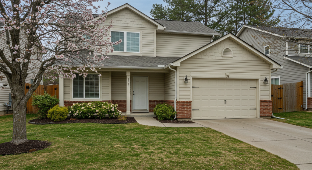
Different homes call for different palettes. A ranch-style house, for instance, could look sharp in subtle earth tones. Meanwhile, a Victorian might do better with bold color contrasts on the trim and siding. Recognizing your home’s core style helps narrow your choices.
Ask: Is it traditional, modern, Craftsman, cottage, or a split-level? Each style has certain lines and features. Those lines often guide which exterior colors could enhance them. If you see arches, columns, or decorative railings, think about tones that highlight those details.
Fitting Color Combinations
Don’t think you must stay inside one color family. You can mix neutral siding with a warm accent on shutters or porch railings. Or go two shades darker on the main walls and keep the trim crisp white. The trick is to keep the overall scheme cohesive.
Try a neutral base on a Victorian house, then add a vivid trim color if you want a slight flourish. For a Craftsman, you might pair earthy green siding with a dark brown door. Blending subtle contrasts draws the eye without overwhelming it.
When in Doubt
If you feel lost, look at photos of homes with similar architecture. Notice which shades they used for siding, shutters, and door frames. That might spark ideas. Another approach is to think about how you want your home to appear. Cozy? Classic? Bold?
Use a paint swatch fan deck from a trusted brand. Search each style category. You’ll see suggested colors that tend to fit well with each architecture type. That can cut down on guesswork.
Consider Neighborhood Context

Observe Other Homes
Drive around your block. Glance at neighboring properties. How do they handle color? While you don’t need to copy them, you can spot trends that might influence your choices.
If every home nearby leans on pale neutrals, a bright neon color might look out of place. On the flip side, if many neighbors have used dark blues or deep grays, you could stand out (in a good way) by selecting a slightly warmer tone in the same family.
Respect Homeowner’s Association Rules
When you belong to a homeowner’s association (HOA), check their guidelines. Some communities have strict rules on exterior paint. You might need to stay within certain color families. Skimming these details early saves you from frustrations later.
Speak with your HOA board or look up the official documents. They often have an approved list of color categories or recommended shades. Once you have that info, it becomes simpler to focus on workable options.
Balance With the Street View
Think about how your home appears from the curb. Whether you have a short driveway or a long private road, the position matters. If your home sits far from the street, you might choose a bolder color that draws the eye. Closer to the sidewalk, a subtler color might feel more balanced.
If you see large trees, large hedges, or thick foliage around your property, your exterior paint can coordinate with those natural elements. An off-white can contrast against green shrubs, while a soft green might blend too much. Decide if you prefer contrast or harmony.
Factor in Roof and Driveway Colors

Match or Contrast?
Your roof and driveway can guide your paint choice. If you have dark asphalt shingles, a lighter exterior often creates a pleasing balance. If your shingles are lighter, you might enjoy a deeper tone on your siding for a complementary effect.
Stand back and compare your roof color to various paint swatches. For instance, if the roof has hints of brown or gray, pick a siding color that shares those undertones. That subtle coordination can result in a polished look without feeling overly matched.
Think About Roofing Materials
Clay tiles, metal roofs, and asphalt shingles each have their own texture and color. That texture might dictate certain design choices. Clay tiles often pair well with neutrals, such as beige or muted olive, that mirror a Mediterranean or southwestern vibe.
If your home has a metal roof in a bright color—like green—pick a main paint shade that complements that. You don’t want the roof and walls to clash. Instead, find a unified palette that brings out each element’s best qualities.
Driveway Considerations
A concrete driveway could push you toward a cooler palette—maybe pale gray siding or slate-colored trim. Meanwhile, a darker stone driveway could pair with a creamy light exterior. Decide whether you want your driveway to blend with your house or create a deliberate contrast.
If your driveway has pavers with mixed undertones, you can tie that variety into your accent color. Let’s say the pavers contain hints of tan or rust. You might use a warm trim or shutter color that echoes those hints.
Study the Climate
Sun Exposure
Light intensity influences how paint looks. In bright sunlight, deep colors can appear less intense. Meanwhile, in a shady area, lighter colors can fade away. Observe your home at different times of day. Note which areas get strong sun and which remain shaded.
If you live in a region with extremely bright sun, consider a color a step brighter or bolder than you think you need. If you pick a subtle shade, it might get washed out. For shady climates, a color might appear more saturated than it does on a paint chip.
Temperature Effects
In hot climates, darker exteriors may absorb extra heat. Lighter hues can reflect sunlight and keep interior temperatures a bit cooler. In cold climates, a darker shade could help your home stay slightly warmer. That’s not the biggest factor, but it’s worth considering.
Some folks like a balance, choosing a medium tone for siding. That can reduce extreme heat absorption. You can also explore specialty paints made to reflect infrared light. These might give you more flexibility in your color selection.
Extreme Weather Conditions
Harsh winters, hurricanes, or desert winds can test your paint’s durability. High-quality exterior paint can handle peeling, fading, and cracking better than budget options. Ask yourself: do I need a paint that fights mold or resists salt air? Look for a product with the right protective additives.
Areas with frequent storms might need an extra-strong finish. Some paints hold up better against hail or heavy rain. Check the product’s warranty, too. A reliable warranty can offer peace of mind, especially in climates prone to harsh elements.
Explore Different Paint Finishes

Matte or Flat
Matte finishes have a soft, non-reflective surface. They can hide minor surface flaws because they don’t reflect light as strongly. However, they might collect dirt more easily. If you paint your home a light color, a matte finish might reveal smudges over time.
Matte paint can be a good choice for older homes with rough siding. It can give a classic or rustic vibe. If you prefer a more modern look, you might explore other finishes instead.
Satin or Eggshell
Satin and eggshell finishes provide a slight sheen. Many homeowners pick these for their exteriors because they strike a balance between looking classy and holding up well. They’re easier to clean than flat paint. A quick rinse with a hose or mild cleanser might remove dirt.
This finish can highlight subtle architectural details. If you have decorative trim or intricate siding, satin can give those features a gentle glow. It’s also a popular choice for trim paint.
Semi-Gloss or Gloss
If you want a bolder sheen, try semi-gloss or high-gloss. They’re easier to wipe down. They also let accent pieces pop. Think about painting your front door or shutters in semi-gloss for a standout look. A glossy door in black, dark red, or navy can draw the eye in.
Some folks avoid high-gloss on large exterior surfaces. It can show imperfections more clearly. It also might feel intense if used on entire walls. But for trim, shutters, and doors, it can boost visual interest and curb appeal.
Use Test Samples
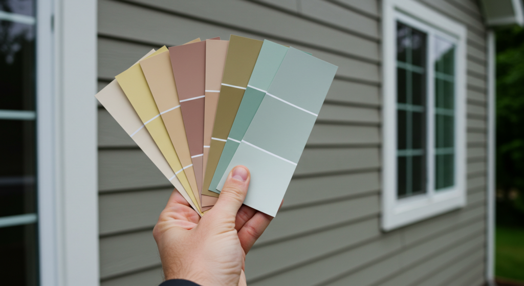
Swatch the Walls
Before deciding, apply sample patches. Paint small squares in different spots. That way, you see how the color plays out in both bright sun and deep shade. Pick at least two or three finalists and compare them side by side.
Look at these patches at different times of day. Morning light can make a color look cooler, while afternoon sun might warm it up. Snapshot how they appear in overcast conditions too. That testing can save you headaches.
Try Large Sample Boards
Instead of painting directly on the siding, some people use foam boards or heavy poster boards. Paint them with your sample colors, then move them around the exterior. This lets you test how each color interacts with trim, landscaping, and your roof without committing fully.
You can also step back and see how the color looks from the street. A small patch might not show the full effect. A bigger board helps you decide if the color feels right at a distance.
Observe for Several Days
Avoid rushing your decision. Watch the test patches for a few days. Track how color shifts from sunrise to dusk. Check if your home’s lighting changes during certain times. Maybe you have tall trees that cast shadows in the evening.
When you see a color that feels fresh in the morning but dull at midday, that might be a clue. Keep notes on each sample. Then pick the shade that stays appealing all day, or at least most of the day.
Consider Trim and Accent Placement

Decide on Trim Colors
Siding color is crucial, but trim color can create the finishing touch. Classic white trim pairs well with many main colors. Dark trim can sharpen the overall look if the walls are lighter. Some folks invert the scheme, making the main walls neutral and the trim bold.
Check paint brand suggestions for coordinating trim shades. Brands often group certain pairs that work well together. Or choose a trim shade two or three steps lighter or darker on the same paint strip as your main color.
Shutters and Doors
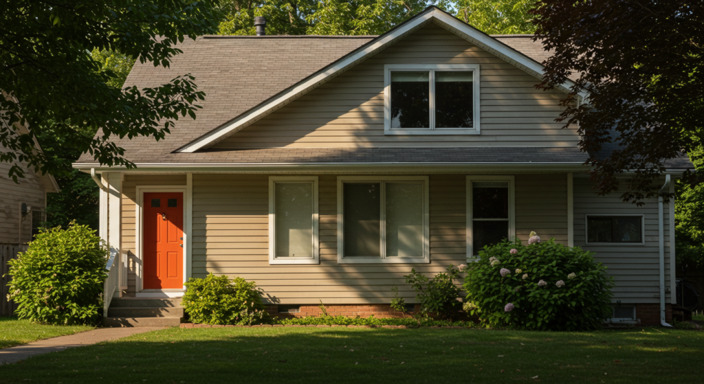
Shutters and doors can serve as accent pieces. Selecting a door color that contrasts with the walls can add excitement. If your house is a modest gray, a bright red door can draw eyes in. If you have shutters, match the door color or pick something complementary.
Let’s say your siding is a sandy beige. You might try navy shutters and a navy door. That might feel more formal. If you’d rather keep shutters subtle, paint them one or two shades darker than your siding. It all depends on how much you want them to stand out.
Unique Accents
Beyond trim, you might have eaves, columns, or decorative railings. Should they match the walls, the trim, or form a brand-new accent color? Think about how important these details are to the home’s architecture. If you want them to pop, choose a contrast color.
If you prefer a cohesive look, paint them the same color as the trim. This can unify the exterior. Either way, keep your overall palette limited to about two or three colors. Too many competing hues might make the home look fragmented.
Blend With Landscaping
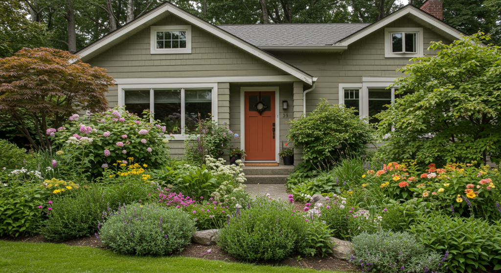
Coordinate Greenery
Look around at your yard. Do you have lots of shrubs, lawn space, or a garden bed packed with vibrant flowers? Those factors may influence which paint color feels harmonious. If you have lush greenery, a warm neutral or even a soft beige might pair well. If you have fewer plants, you can explore more striking paint choices.
Don’t be afraid to consider how blossoms in spring or summer might look against your home’s exterior. Contrasts can be beautiful. Some people choose an exterior that highlights the garden, while others want the garden to steal the show.
Hardscapes and Decks
Retaining walls, fences, patios, or decks might involve brick, stone, or wood. Tie them in by selecting an exterior paint color that echoes those materials. If your deck is stained a warm cedar, you might select a siding color that has subtle hints of that hue.
For brick retaining walls, try a shade that doesn’t clash. If the bricks are more orange, pick something that leans neutral or cool to maintain balance. If the bricks are deep red, a soft gray exterior can create an attractive pairing.
Seasonal Shifts
Landscapes change across the seasons. In fall, leaves can shift to gold or red. In winter, bare branches can leave your home more exposed. That might affect how your exterior color looks throughout the year. If you notice big color changes in the yard, decide if you want a paint color that stays appealing regardless of seasonal shifts.
It can be fun to see your home’s exterior stand out against brilliant fall foliage. On the other hand, if you’re in a warm region where everything stays green, maybe you want a color that complements evergreen shades all year.
Explore Complementary Color Pairs

Light-Dark Balance
Sometimes, you only need two main colors: one for walls, one for accents. Think about picking a pale hue for the siding and a deeper color for shutters and trim. This might feel balanced, especially on large homes. The lighter siding can make the house seem bigger, while the darker trim adds definition.
If you have a one-story house, you can flip that approach. Paint the siding a rich color, like deep taupe, then highlight the trim in white or pale gray. That might make the home appear grounded and cozy.
Classic Combinations
Certain combos have stood the test of time. White siding with black shutters, for instance, is always a smart choice. You could also try pale yellow siding with gray shutters for a soft look. For a more modern vibe, pair crisp white walls with charcoal trim.
Avoid formulaic thinking, but lean on tried-and-true combos if you want a foolproof approach. For instance, a navy exterior with white trim looks fresh. Taupe siding with burgundy shutters looks welcoming. There’s a reason these combos keep popping up: they work.
Unexpected Twists
If you feel adventurous, experiment with less common contrasts. Maybe pair a charcoal main color with a steel blue accent. Or try a subtle sage green siding with a dark teal door. Take small steps. Sometimes the difference between teal and sage can be dramatic.
You could even use a warm white siding and pick a single accent color for your door that’s bright—like a burnt orange or a clay red. That might deliver a fun twist without going over the top.
Leverage Samples of Finishing Details
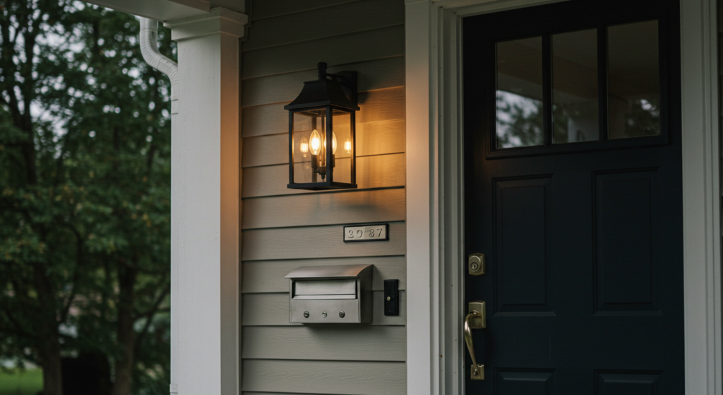
Exterior Lighting Fixtures
Sometimes we forget how our porch lamps or wall sconces fit into the color scheme. If those fixtures are brass, a certain color palette might complement them better. If they’re dark iron, you might lean toward a cooler tone. Stand outside at dusk to see how those fixtures look against potential paint samples.
If you plan on updating your lights, you can switch them to a finish that pairs with your new exterior. That might open more color options. For instance, black metal fixtures can look great with a wide variety of siding shades.
Door Hardware
Your door hardware also matters. Polished chrome, oil-rubbed bronze, or brushed nickel might guide your color approach. If you have a bold door color, simpler hardware could keep things refined. If you go with a more neutral door, a statement handle in a modern finish might add flair.
Think about selecting a color that complements the hardware’s tone. A bright brass handle might shine against a deep navy door. A brushed nickel handle might stand out on a black door. It’s another small detail that can elevate your home’s overall look.
Mailbox and House Numbers
Don’t forget your mailbox. Whether mounted to the wall or set on a post, it can accent your home’s exterior. Paint it the same color as your trim, or choose a contrasting color that ties in with your shutters. As for house numbers, pick a style and finish that aligns with your chosen palette.
These small details can look ordinary or become part of the design. If you want a cohesive impression, keep them in the same finish family as your lighting fixtures and door hardware.
Plan for Maintenance
Durability Matters
If you’re repainting every few years, that might get expensive. Look for a quality exterior paint with a strong warranty. Some premium brands offer formulas that resist fading for a decade or more. Spending a bit more upfront might save you from frequent touch-ups.
Check the label for features like UV protection, mold resistance, or mildew resistance. In coastal regions, salt in the air might wear on cheaper paints. Opt for something made for those conditions. That way, your chosen color stays fresh longer.
Touch-Up Strategy
Even the best paint might need the occasional touch-up. Keep a small stash of extra paint in a sealed container. Label it with the color code and date. That way, if you spot a patch that’s chipped or scuffed, you can fix it quickly.
Also, consider a finish that’s easier to clean. A satin or semi-gloss might let you wipe off dirt or bird droppings. Flat or matte finishes could require more effort to keep looking pristine.
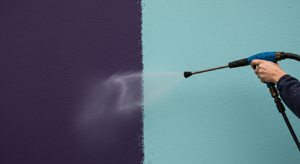
Power Washing
Regular maintenance might include power washing your exterior. This removes dirt and grime. If you live in a region with heavy pollen or dust, an annual wash could keep your paint job bright. Be gentle, though. Blasting with too much pressure might damage the siding.
Pick a mild detergent or a soap designed for house exteriors. That preserves your paint’s finish. This simple routine can prolong the time between major repaints and keep your home looking its best.
Think About Material Compatibility

Wood Siding
If your home has wood siding, you might explore stain instead of paint. A semi-transparent stain can let the natural grain shine while adding color. If you prefer paint, make sure the wood is clean and primed. Wood can soak up paint differently than vinyl or brick.
Pick a paint specially formulated for wood. It might have water resistance or even insect-repelling properties. Make sure to seal any gaps or cracks. That ensures a smoother finish and helps the paint adhere better.
Brick Exteriors
Exposed brick can look charming. Some homeowners choose to leave it unpainted, while others paint over it entirely. If you paint your brick, it often means committing to that look long-term. Removing paint from brick later can be tough.
If your brick is already painted, keep in mind that repainting might require thorough surface prep. Old flaking paint must be scraped off. Then a masonry primer is typically applied to ensure the new color bonds properly.
Vinyl and Other Siding
Vinyl siding has become common. Many people think they can’t paint vinyl, but specialized vinyl paint formulas exist. They’re made to flex with temperature changes and stick to the slick surface.
Check your siding manufacturer’s recommendations first. Some vinyl siding can warp if painted a color darker than its original shade. If you want a bold color on vinyl, choose paint designed to handle expansions and contractions without cracking.
Incorporate Decor Elements

Outdoor Furniture
If you have a front porch with seating, your exterior color might influence what furniture you pick. A bright set of chairs might blend with a neutral house color or pop against a darker one. You can also swap out cushions or outdoor rugs to match your chosen palette.
Even simple pieces, like a small bench or porch swing, can reinforce the overall aesthetic. Think about color coordination so the outside looks pulled together. The aim is a harmonious scene that draws in the eye and feels welcoming.
Garden Accessories
Planters, pots, and garden sculptures can either match your exterior or contrast with it. If your house is a soothing beige, a row of terra-cotta pots might feel warm and understated. If your exterior is dark gray, bright planters might bring bursts of color.
You could also tie in your accent color with your planters. For example, if your shutters are navy, pick navy planters near the porch. This unifies the design without overwhelming the front yard.
Seasonal Decor
Consider how holiday or seasonal decorations will look against your paint choice. If you tend to decorate for winter or put up string lights, a more neutral exterior might work as a versatile backdrop. Or if you love bright seasonal items, your house color can either complement them or stand apart.
Some folks coordinate wreaths, porch signs, or door decorations with their paint scheme. It’s a small detail, yet it can heighten the charm. If your door is a bold color, a wreath that echoes that color can create a cohesive look.
Budget Wisely

Cost of Paint
Not all paints are created equal. Premium brands might cost more, but they could save you from repainting soon. Look at the coverage ratings on each paint. A cheaper paint might require extra coats, meaning more gallons. In the end, it might not save you money.
Figure out how many gallons you’ll need by measuring your home’s exterior surface area. Also factor in trim paint. If you plan multiple colors, you’ll need enough for each hue. Don’t forget primer if it’s required.
Labor Expenses
If you plan to hire professional painters, their quotes can vary. Get at least a few estimates. Ask for references so you can see their previous work. A skilled painter can make your home look polished and might spot issues like cracked siding before painting.
If you’re handling the job yourself, plan for ladders, brushes, rollers, or sprayers. Think about the time commitment. Painting a two-story home isn’t small potatoes, so ensure you have enough help. Also, consider safety equipment like sturdy scaffolding if needed.
Unexpected Costs
Sometimes, you discover rotted siding or water damage when you scrape off old paint. That might require repairs before you apply the new paint. You could also need cleaning supplies or patching materials. Build a small contingency into your budget for surprises. That way, you’re not caught off guard.
It’s better to handle repairs first than to paint over problems. Proper prep ensures your paint lasts. Quick fixes now can prevent bigger headaches down the road.
Embrace Samples of Color Trends Wisely
Timeless vs. Trendy
Color trends come and go. Some years, bold blues or charcoal grays might be all the rage. The next year, earthy greens or off-white might be in style. A timeless shade might hold its appeal longer. If you plan to sell soon, a neutral palette might attract more buyers.
Still, if you love a trending color, don’t let that stop you. It’s your home, after all. Just be aware that a very trendy shade might feel dated faster. Another approach is to pick a timeless base color and use trendier colors on accents like shutters or doors.
Brand Recommendations
Paint brands often release annual color trend reports. They showcase popular palettes for interior and exterior use. Flip through these collections for inspiration, but keep your home’s unique features in mind. A color that looks great on a modern show home might not fit a classic colonial.
If you find a color in a trend brochure, test it thoroughly. Trends can be fun. Just confirm it works with your architecture, roof, and any permanent fixtures. Trends should guide you, not dictate your final choice.
Future-Proofing
Ask yourself how long you plan to stay in this home. If it’s your forever home, follow your personal taste boldly. If you might sell soon, pick something more universally appealing. Many buyers prefer neutral exteriors. So, if resale is a concern, that might influence your approach.
A compromise could be painting the main siding a safe color and making your door or shutters a bit more on-trend. That lets you refresh your look down the line without repainting everything. Swapping door color is easier than redoing the entire house.
Conclusion
Finding the right exterior color boils down to balancing architecture, surroundings, and personal taste. It might feel overwhelming, but careful planning and a handful of paint swatches can bring clarity.
Test colors in various lighting, keep track of your roof and driveway shades, and don’t forget how trim or accent features create a complete picture.
Your home’s exterior speaks volumes. It welcomes guests and represents your style. With thoughtful choices and quality materials, you’ll end up with a look that feels inviting and unique. That perfect color scheme might be just a few paint samples away.
Summary Table for Quick Reference

| Aspect | Key Point | Practical Tip |
|---|---|---|
| Architecture | Match color to style (Victorian, Craftsman, modern) | Use paint swatch guides by style category |
| Neighborhood Context | Blend with surroundings and HOA guidelines | Check HOA docs for approved color families |
| Roof & Driveway | Coordinate or contrast with roof shingles or driveway hue | Pick undertones that echo roofing materials |
| Climate | Factor in sun exposure, heat, and extreme weather | Use paint with protective additives for tough climates |
| Paint Finish | Choose matte, satin, or gloss based on looks and upkeep | Satin or eggshell often balances style and durability |
| Test Samples | Paint swatches in various lighting | Look at them morning, midday, and dusk |
| Trim & Accents | Complement or contrast with main siding color | Limit palette to 2-3 colors total |
| Landscaping | Plan around greenery, hardscapes, and seasonal changes | Let yard colors guide or highlight certain shades |
| Complementary Pairs | Combine light and dark or use classic combos | White + black, beige + navy, etc. |
| Finishing Details | Align lighting, door hardware, and mailbox | Match finishes (like black metal or brushed nickel) |
| Maintenance | Opt for durable paint and manage touch-ups | Store extra paint for quick fixes |
| Material Compatibility | Know how paint adheres to wood, brick, or vinyl | Use primers designed for the specific surface |
| Decor Elements | Coordinate outdoor furniture and seasonal decor | Keep accent colors consistent with shutters or trim |
| Budget | Weigh paint cost, labor, and repairs | Get multiple contractor quotes if hiring out |
| Color Trends | Balance trendy shades with timeless appeal | Use accent pieces for bold touches if unsure |
FAQ

1. How do I handle old chipping paint before a repaint?
Scrape off loose paint with a putty knife or paint scraper. Sand any rough edges. Use a suitable primer before applying the new coat. This helps the new paint adhere better and gives a cleaner finish.
2. What if my roof color looks odd with every paint swatch I try?
Try finding a paint with undertones that match the roof’s tones. Some roofs have subtle green or blue speckles. Look for paint chips with matching hints. If the conflict is too strong, consider painting the trim or door in a way that bridges the gap.
3. Can I use interior paint on my home’s exterior?
Exterior paint differs in formula and durability. It’s made to endure weather and temperature swings. Using interior paint outdoors can lead to peeling or cracking. Stick to paints labeled for exterior use.
4. Do I need a primer for every situation?
Not always. Some paints are self-priming if you’re repainting a surface in good shape. But if you have raw wood, exposed masonry, or big color changes, a dedicated primer helps achieve a smoother result.
5. How do I choose the right paint brand?
Look at reviews, product warranties, and guidance from local hardware stores. Reputable brands usually invest in research to improve color retention and durability. Take sample chips from a few brands, then compare how they look and feel.
That’s it. Now you have a thorough playbook for choosing the perfect exterior color for your home. With some thoughtful planning and careful testing, you can enjoy a fresh and appealing facade that lasts for years. Happy painting!

Neha Z. is not just any writer; she’s a storyteller who has graced the online world with her evocative prose for over half a decade. Venturing into the intricate nuances of women’s lives, she weaves stories that range from life’s highs and lows to the multifaceted essence of femininity. Each piece she pens radiates sincerity and artistry. As you delve into Neha’s musings, you’ll find reflections that echo your own journey and insights that inspire. Immerse yourself in her world, and let her stories touch your heart.
Reviewed By: Joanna Perez and Anna West
Edited By: Lenny Terra
Fact Checked By: Matthew Mansour
Photos Taken or Curated By: Matthew Mansour
