Key Takeaways
- Colors can shape how spacious or cozy a room feels: Lighter shades create an airy look, while darker hues bring walls closer.
- Lighting changes color perception: Test paint and fabrics in natural daylight and in evening lamp glow to avoid surprises.
- Balance bright accents with calmer tones: The 60-30-10 rule helps you arrange dominant, secondary, and accent colors.
- Texture and finish matter: Matte walls soften bold colors; glossy trim reflects light and adds subtle shine.
- Seasonal flexibility: Swap out pillows, throws, and small decor to freshen rooms without a full overhaul.
- Room-specific tips: Kitchens might benefit from matching cabinet and wall colors; bedrooms often need low-contrast, restful tones.
- Avoid overdoing trends: A small accent piece can capture a trend without locking you into a style you might regret.
- Practical resources: Use samples, paint swatches, and even augmented reality apps to preview your ideas.
Introduction

Ever walk into a home and feel instantly at ease, as though each room welcomes you? That calm may stem from smart color choices rather than expensive furnishings or major renovations. With the right paint shade or accent selection, you can shift a home’s vibe in a noticeable way.
Let’s step back from theoretical talk. Instead of labeling colors as “energizing” or “relaxing,” we’ll focus on real results you can see when you paint a wall or change your decor. This guide covers time-tested tips on color combinations, how lighting affects your final look, and which hues work best for different rooms.
If your living room feels cramped, we’ll discuss how to open it up using certain techniques. If you want to make a giant bedroom feel snug, we’ll look at darker tones that can bring walls closer without overwhelming you. We’ll also walk through how to balance vibrant colors with more neutral backgrounds—so you can add excitement without creating an eyesore.
There are many ways to explore these ideas. You can mix warm woods with cool paint or employ patterns to animate plain walls. You can adjust your palette every season with a few simple swaps. You can try using finishes like matte and gloss to trick the eye. We’ll discuss each topic in depth to equip you with everything you need for an impressive, cohesive look.
Think of each of the following sections as a puzzle piece. Together, they form a larger picture of how to unify your home’s aesthetic. Let’s get started on creating spaces that feel right for you and anyone who steps through your front door.
Understanding Color Basics for Home Decor

Primary Colors and Accent Placement
Color in a room works best in layers. One layer covers the major surfaces: walls, floors, and larger furniture items. Think of this layer as your base or primary color choice. Soft whites, grays, or warm tans often suit this role, especially if you want flexibility later.
Accents form the next layer. They add spark without dominating the space. Pillows, area rugs, and wall art often carry these accent shades. When you pick one accent tone—maybe teal or maroon—and repeat it sparingly, you create unity. This approach keeps a room from feeling scattered.
Another layer involves subtle touches, such as vases or picture frames. Their colors might echo or complement your accent color. This layering system shapes a balanced palette. It lets you switch things out with ease if trends or personal preferences change.
Warm vs. Cool Undertones
Some colors lean warm, while others lean cool. Warm undertones include subtle red or yellow elements. Terracotta, rust, or honeyed beige can add a cozy effect to large living areas. Cool undertones carry hints of blue or green. These can help small rooms feel more open by pushing the walls outward.
When selecting paint, hold a swatch next to a pure white sheet of paper. That trick helps you see if there’s a warm or cool hint in the color. Warm undertones often pair nicely with wood floors or gold-colored fixtures. Cool undertones match stainless steel appliances or brushed nickel hardware.
Mixing warm and cool can work if you follow a clear plan. For instance, use a warm neutral for walls, then add pops of a cool accent like navy pillows or artwork in turquoise. This combination energizes a room without making it feel mismatched.
Light and Dark Contrast
Shifting between light and dark colors can influence room proportions. Light walls usually increase the sense of space, while dark walls draw things closer for an intimate vibe. Pairing a light paint color with dark trim highlights architectural details. Reversing it—dark walls with light trim—can be striking, but test small areas first to see how they feel.
Don’t forget your ceiling. Painting a ceiling a few tones darker than the walls can make a tall room feel cozier. Painting it lighter than the walls can visually lift it. These small changes in value—how light or dark a color appears—often matter more than the actual hue.
Choosing Colors for Different Rooms

Living Room: The Social Hub
Your living room gets traffic during gatherings or casual hangouts. If the room is large, consider a warm neutral like a sandy beige or gentle clay. These shades keep the space inviting, especially at night with lamplight.
To add more depth, try a feature wall behind the sofa or TV in a bolder tone—maybe a deep green or smoky charcoal. Build on that color with a few pillows or decorative items in the same family. The rest of the furniture can stay relatively neutral for balance.
For smaller living rooms, keep the palette light. Pale grays or cream off-whites can open up the space. A pop of color on a bookshelf or mantle can still bring excitement. The key is restraint, letting the smaller dimension remain uncluttered.
Bedroom: A Personal Refuge
Sleep quality often hinges on a peaceful environment. Consider lower-contrast color schemes here. If the walls are medium gray, opt for trim just one or two notches lighter. That subtle distinction calms the eyes when you’re trying to wind down.
In bigger bedrooms, you can play with moody hues like slate, navy, or cocoa. These shades add a cocoon-like feeling at bedtime. Balance them with crisp white or pale cream linens to avoid a heavy look.
In a smaller bedroom, stick to soft neutrals or gentle blues, then rely on texture to bring interest. Layer different fabrics on the bed—linen, cotton knit, or velour throw blankets. That approach keeps the room cozy without feeling cramped.
Kitchen: Practical Color Solutions
Kitchens mix utility with daily interaction. A sage-green wall can pop next to white cabinetry. Or you can flip it by painting lower cabinets in a deeper hue and choosing lighter walls for contrast.
In a small kitchen, matching upper cabinets to the wall color can create a seamless flow that boosts perceived height. Lighter counters or a backsplash with gentle variation can add subtle character.
For larger kitchens, consider two-tone cabinets. You might paint the island a dark navy while keeping perimeter cabinets white. This gives depth to the room and sets the island as a central feature.
Lighting’s Role in Color Perception

Natural Lighting Considerations
A north-facing room gets cooler, dimmer daylight. Lighter, warmer paints can counteract any grayish undertones. For a sun-bathed, south-facing space, you might temper the bright light with a cooler color like pale sage, dusty blue, or even a muted pink.
Avoid choosing paint under harsh store lighting, then painting blindly. Pick small sample cans. Test them on poster boards at home. Move them around at different angles to see how they look at dawn, midday, and evening.
Artificial Light and Bulb Selection
Even the most perfect wall color can change under artificial light. Warm incandescent bulbs can amplify yellow or orange tones in your paint. LED bulbs might highlight cooler undertones in your decor.
If your living room uses warm white bulbs and your paint choice has a slight orange cast, you may end up with a space that feels too yellow at night. Switching to a neutral white bulb can correct that imbalance.
Also, consider task lighting. Overhead lamps can create shadows that alter perceived color depth. Table lamps or under-cabinet lights spread illumination across different surfaces, offering a more uniform glow.
Adjusting for Low-Light Rooms
Some spaces have limited windows or are tucked away in corners. If you paint those walls stark white, they can look dingy or gray. Instead, try a pale gold or light peach. Those reflect available light more warmly, making the space feel welcoming.
Another trick is to use a satin or eggshell finish. These finishes reflect light better than a flat matte, so the space won’t feel as dark. Use mirrors or reflective accents—like metallic picture frames—to bounce light around.
Using Color to Alter Room Size Perception
Expanding Small Areas
Light colors, especially those with a slightly cool undertone, can open up a tight space by reflecting more light. Painting walls, trim, and ceiling in almost the same shade tricks the eye into seeing a more continuous surface.
For example, a bathroom might benefit from a pale aqua on walls and a bright white on the ceiling. Keep the tile a complementary white or light gray. With fewer visual breaks, the room feels larger than it is.
Avoid high-contrast stripes or loud patterns in very small rooms. While these can be fun, they might visually shrink the space unless balanced carefully with plain areas.
Creating Cozy Nooks
A large, open area can sometimes feel sparse. Darker hues pull the walls in visually and create an intimate setting. One approach is to paint one accent wall in a deep teal or espresso color, then add drapes or curtains in the same shade. This method makes that wall feel closer, shrinking the perceived distance.
Pairing that accent with mid-tone neutrals for the other walls can keep the room balanced. You won’t feel overwhelmed by darkness, but you’ll still enjoy a warm, enclosed vibe that’s perfect for lounges or library corners.
Ceiling and Floor Illusions
Ceilings offer a chance to influence a room’s vertical sense. Painting a ceiling slightly lighter than the walls pushes it higher. Painting it darker can bring it closer for a snug environment.
Flooring works similarly. A lighter floor paired with lighter walls creates a spacious impression. On the other hand, a darker floor color can anchor the room, giving a solid foundation. That anchor can be helpful in very wide, open spaces where you want some sense of solidity.
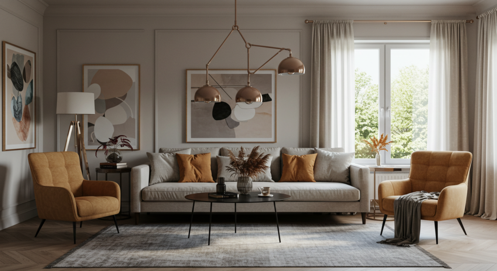
The 60-30-10 Rule for Balanced Palettes
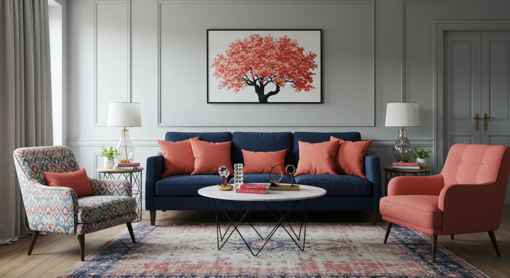
Dominant Color (60%)
Think of your dominant color as the leading actor. It usually covers the largest area—often walls or big furniture pieces like a sectional sofa. This color sets the mood and acts as a canvas for everything else.
Many people choose a neutral or muted tone for this dominant portion. Light gray, beige, or a soft greige are common picks. These neutrals let you introduce bolder secondary colors without clashing.
If you prefer more color, consider a gentle shade like pale sage or a subdued denim blue. These still function as calmer backdrops. They won’t overpower your design if you repeat them across large surfaces.
Secondary Color (30%)
Your secondary color supports the dominant color. This shade is typically more vivid than your dominant choice but doesn’t consume the room. You might select it for upholstery, area rugs, curtains, or even painted furniture pieces.
For instance, if your dominant color is a light warm gray, a secondary color might be teal, navy, or rust. That color appears on a sofa, accent chairs, or drapes, covering around 30% of the room’s visual space.
Repeating this secondary color in multiple areas can help tie the room together. A couch pillow in the same color as the curtains signals intention. It helps unify the design without feeling random.
Accent Color (10%)
This final color spices things up. It might be vibrant or surprising compared to your other shades. Think bright mustard, blush pink, or emerald green. It enters the scene in small ways—through throw pillows, vases, frames, or decorative bowls.
Because it only covers 10% of the room, you can take bigger risks. If you grow tired of that accent color later, you can easily swap it out. This fraction of color typically stands out more because it’s used sparingly, creating focal points.
Textures and Finishes: The Unsung Heroes
Matte vs. Glossy Surfaces
Matte finishes diffuse light. This can soften bright or bold colors on large surfaces like walls. Matte also hides minor imperfections better, making it a good choice for older homes or walls with slight dents.
Glossy finishes reflect light, so they add shine. High-gloss trim or built-in cabinets can bounce light around, which can brighten a darker room. Some prefer semi-gloss or satin for a gentler sheen that’s easier to clean than flat paint.
Using a matte wall with glossy trim adds subtle contrast, even if both are the same color. Light bounces off the trim, highlighting architectural details. This trick works well in hallways or living rooms where you want depth without introducing extra hues.
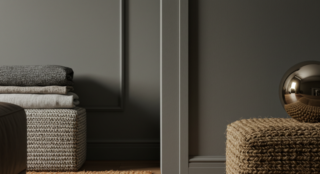
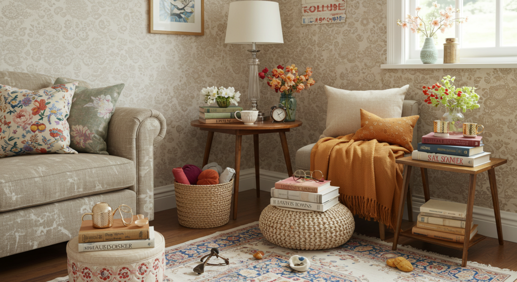
Layering Tactile Elements
Paint color is only part of a room’s story. Texture from furniture, fabrics, and accessories plays a big role in how we perceive color. A chunky knit throw might soften a leather couch. A woven jute rug might add contrast against smooth hardwood floors.
Even the weave of your upholstery matters. Velvet can appear darker in certain lighting, while linen might lighten a color. These small differences affect how the overall palette reads. Think of it as color in 3D, with texture adding extra detail.
Metallic and Reflective Accents
Gold, copper, brass, and steel can act like subtle color choices too. They each bring their own warmth or coolness to a space. A few strategic touches—like a brass lamp or a brushed steel table frame—can boost a room’s character.
Mirrors are another kind of reflective accent. They bounce color and light from one wall to another. Placing a mirror opposite a window can brighten a darker corner and let your existing color scheme glow in surprising ways.
Seasonal Color Adjustments
Light and Airy for Spring
When spring arrives, many people crave a fresh vibe. You can keep your core furniture the same and switch out accessories. Think pastel throw pillows, lightweight cotton or linen curtains, and maybe a fresh floral arrangement.
If your room’s base is neutral, these small additions can shift the overall impression. A mint-green or soft coral pillow can spark a new feeling, especially against a gray couch.
In places like the dining area, swap heavy winter tablecloths for something more breezy. Even a bouquet of tulips in a simple vase can introduce a spring color accent.
Bold and Playful for Summer
Summer invites a bit more fun. Outdoor spaces often get used more, but you can also introduce a bold vibe indoors. Consider bright turquoise or sunny yellow accent pillows for the living room.
If your walls are already warm, like beige or cream, try mixing in cooler accent items—blue glass vases, aqua planters, or a bright painting. These small changes often reflect the sunny weather outside and keep the room feeling lively.
Lightweight fabrics also help. Switch out heavy throws for breathable cotton blankets. Sheer curtains let more sunshine in, making your paint and decor glow.
Cozy and Rich for Fall and Winter
As cooler weather sets in, you can pivot to deeper tones. Add burgundy or forest-green pillows, layer chunky knit throws, or incorporate plush area rugs in your family room.
Another way to set a cozy mood is by adding textures like faux fur or velvet. They bring warmth and depth without needing to repaint your walls. Candles or warm-toned LED bulbs can also shift your home’s ambiance to something more comforting.
For the holidays, consider a pop of metallic. Gold or bronze candle holders, along with warm twinkle lights, can accent a space beautifully and complement your existing color theme.
Avoiding Common Color Mistakes

Following Trends Blindly
Trendy colors can look eye-catching in magazines, but painting a whole room that color can become a mistake if you tire of it. Instead, test a trend with smaller items first. A removable wallpaper accent or a set of fresh pillow covers can add that modern flair without committing your entire room.
This approach also helps you gauge the real look in your environment. Some hype colors might appear too intense under your home’s lighting or clash with your furniture’s style.
Ignoring the Lighting Factor
Never trust how a paint chip looks in a store or online. Lighting can alter colors drastically. Always bring samples home. Paint sections on scrap boards or even on the wall itself. View them in daylight, evening lamp light, and overhead lighting.
Rooms with minimal sunlight might need warm-toned paint or better lighting solutions. Meanwhile, rooms that get bright sunlight all day could look washed out with certain pastels. Catch these issues before you make your final decision.
Overcomplicating Color Flow
If you have an open floor plan, abrupt changes from one color to the next can disrupt the harmony. Make sure each space transitions smoothly into the next.
You can still differentiate zones with accent walls or feature pieces. Just keep one or two colors consistent throughout. It might be a neutral in the entryway that repeats in the living room trim, tying the rooms together visually.
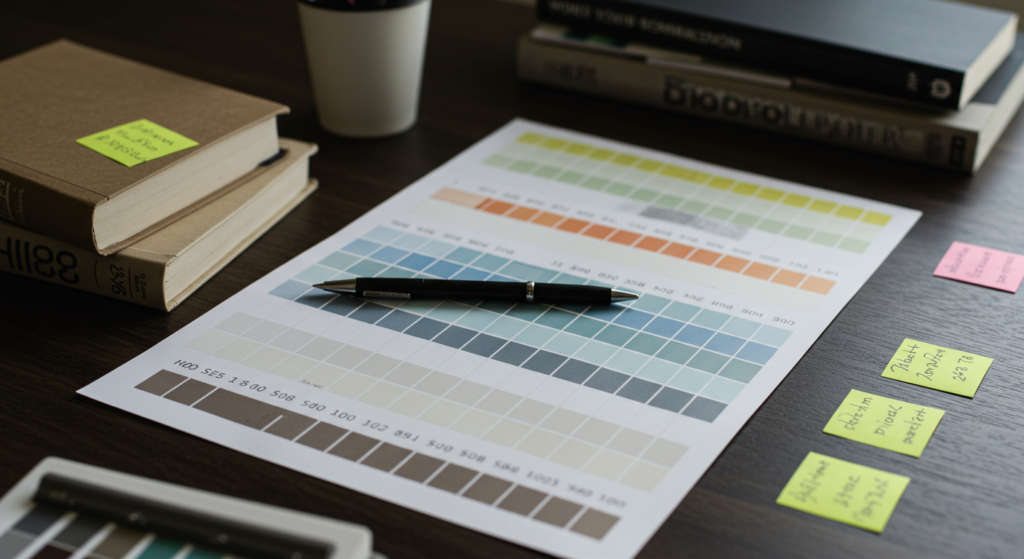
Practical Tools for Testing Colors

Paint Swatches and Sample Pots
Most hardware or paint stores offer small sample pots. Buying a few and painting test patches can prevent regret later. Apply multiple coats if needed, since color can change with each layer.
Testing on large boards is a smart solution. You can move them around to different walls, ensuring you see how the color looks in shadows or near windows. These boards help you spot any undertones or shifts in various types of light.
Digital Tools and Augmented Reality
Several smartphone apps let you preview paint colors on virtual room photos. Apps from leading paint brands help approximate how a color might look on your walls. While not perfect, these previews can narrow your choices before you start sampling real paint.
If you have a tablet, try snapping a picture of your space. Then use one of these color-visualization tools to experiment with different shades. It’s a fast way to see potential outcomes without spending on multiple paint samples.
Fabric and Material Swatches
Paint is just one piece of the puzzle. The rug, sofa, curtains, and throw blankets also matter. Bringing fabric swatches to the paint store (or taking paint chips to the furniture store) can help.
You might love a navy paint for the walls. But if your sofa leans more purple, those two might clash. Testing them in the same lighting ensures your entire setup stays cohesive.
Color Pairings That Work
Timeless Duos
- White and Black: Crisp and modern, this high-contrast choice works in kitchens, living rooms, or bathrooms. Consider black cabinets with white countertops or white walls with black window frames.
- Gray and Yellow: The brightness of yellow pops against a cool gray. This pair suits living rooms if you limit the yellow to accents—like pillows or a rug.
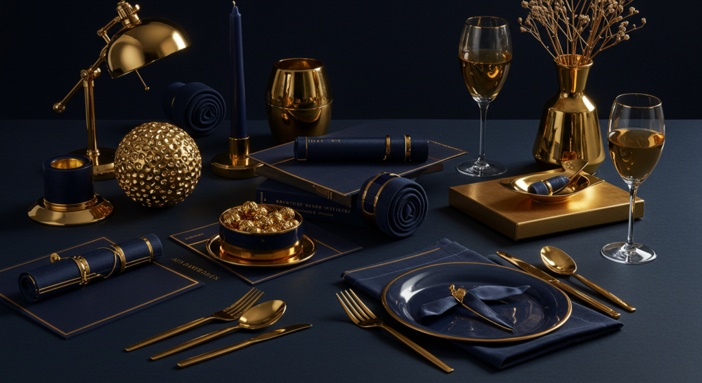
- Navy and Gold: Navy is a deep, cool shade that makes gold details shine. Think of navy walls with gold-framed artwork or gold hardware on navy cabinets.
Uncommon Combos
- Mustard and Teal: A dramatic pairing that can feel energetic. Use teal walls and add mustard accent pillows or side chairs.
- Olive Green and Terracotta: Earthy and welcoming, it works well in rooms with lots of natural light. Terracotta pottery or planters enhance an olive accent wall.
- Blush Pink and Charcoal: The softness of pink offsets charcoal’s depth. This combination can add modern flair to a bedroom or small den.
Monochromatic Schemes
A monochromatic setup relies on a single color in various shades. Perhaps you choose light blue walls, medium blue furniture, and deep navy cushions. This approach simplifies decision-making.
By layering different tints and tones, you create depth without mixing many colors. Varying finishes helps, too. Glossy side tables or shimmering pillows can stand out against matte walls, all in the same color family.
Incorporating Patterns Without Overwhelm
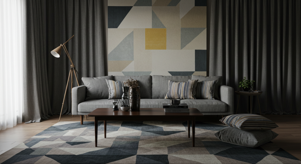
Matching Pattern Scales
When patterns clash, a room feels chaotic. A helpful rule: pair one large-scale pattern with one or two smaller-scale patterns. For example, a big geometric rug can coexist with small, subtle pinstripes on pillows.
Also, keep one color consistent across patterns. If your rug has navy shapes, find pillows that include a hint of navy, even if the pattern differs. This connection ties the look together.
Strategic Pattern Placement
Limit busy or high-contrast patterns to one or two focal pieces. A bold patterned sofa might be enough. You can repeat that pattern in a small accent pillow on a chair across the room, but avoid drenching every surface in complicated designs.
If walls have a statement wallpaper, keep other surfaces calmer. Solids or muted textures balance the wallpaper’s strong presence. Consider layering a simple rug and neutral furniture, letting the patterned wall stand as the star.
Combining Colors with Patterns
A multi-colored pattern can guide your entire color palette. If your patterned curtains have teal, mustard, and gray, use those shades in small accents around the room. Pick one of them as your secondary color and use another as your accent.
This coordinated approach ensures that your patterns and color blocks feel like a unified arrangement. You’ll avoid the randomness that happens when patterns and colors fight for attention.
Color and Furniture Selection

Highlighting a Statement Piece
Sometimes, you own a couch, sideboard, or table that stands out. Build your room around it. If you have a vivid red or peacock-blue sofa, pick your wall color and other accents to emphasize that sofa rather than compete with it.
A neutral wall might let that piece shine, or you could pick a subtle tone from the sofa’s color family for the walls. Then, add smaller accents that echo that shade across the room for balance.
Blending Furniture into the Backdrop
If you like a minimalist or calming look, consider matching larger furniture pieces to your wall color. For instance, a beige sofa against beige walls can feel seamless. This approach expands the visual space because the furniture doesn’t break up the room.
Keep it from becoming dull by layering textures. You could add a chunky throw blanket, a subtle pattern on a few pillows, or metallic legs on the sofa. These details offer visual interest.
Mixing Multiple Wood Tones
Some folks worry about clashing woods—oak floors, walnut coffee tables, cherry cabinets. A unifying paint color can make them work together. Warmer paint tones often complement warm-toned woods, while cooler paint tones pair well with cooler woods like gray-washed or white-washed finishes.
If you have multiple wood finishes, consider bridging them with an accent color that suits both. Maybe your darker walnut pieces pair with a lighter oak piece through an accent that picks up tones from each. This could be a patterned rug, art, or pillows that feature hints of both wood shades.
Kids’ Rooms: Fun Yet Functional

Gender-Neutral Color Ideas
Kids grow fast. Their interests change, too. A timeless color scheme saves you from repainting every year. Soft yellows, gentle greens, or pale grays can serve as a base. You can then add themed artwork or bed linens that reflect current hobbies.
This approach also works for siblings sharing a room. The walls remain neutral while each child can personalize their bedding or accessories without clashing. A pastel mint or a warm cream suits many styles.
Durable Paint and Fabrics
Kids’ rooms see plenty of action—scribbles, spills, scuffs. Choose paints marked as washable or scrub-friendly. They let you clean marks off the walls without stripping the color.
Consider stain-resistant or slipcover-friendly upholstery for chairs and ottomans. Floor rugs can be machine-washable if you anticipate regular messes. These choices give you peace of mind and keep the room looking fresh.
Planning for Long-Term Adaptability
We all love whimsical murals or cartoon themes, but kids’ tastes shift. Instead of painting a giant rocket ship, you could frame a large poster or decal that’s easier to remove.
Wall decals, removable wallpaper, or corkboard sections let kids personalize the room without forcing a total redesign later. The key is building a flexible palette that can evolve as your child matures.
Outdoor Spaces: Extending Color Beyond Walls
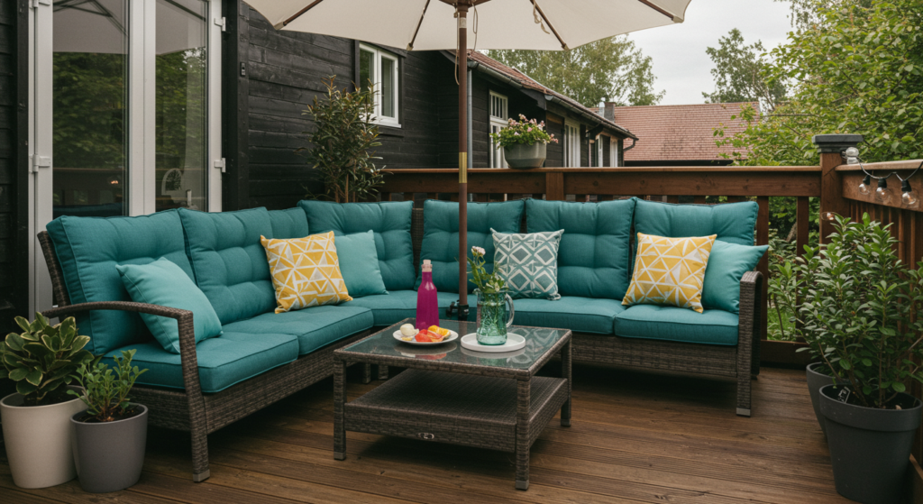
Patio and Deck Color Coordination
Your outdoor area often acts as an extension of your living space. If your interior leans toward cool neutrals, carry that vibe outside. Choose slate-gray cushions or a blue outdoor rug.
For a warmer interior, you might complement it with earthy furniture. Terracotta planters, burnt orange seat cushions, or wooden tables help tie the outside to the inside.
Since outdoor pieces face weather changes, pick fabrics labeled “weather-resistant.” They fade less in strong sun and can handle light rain or spills better than standard indoor fabrics.
Garden Accents and Plant Pairings
Colors in your garden also matter. If you plant bright flowers like petunias or geraniums, match your outdoor decor to them. A few well-placed planters in complementary hues can bring a sense of order.
Also, consider the view from inside your home. When you look out, do the colors harmonize with your interior? A bold red umbrella might clash with pastel-colored cushions inside, so try to maintain some continuity.
Front Door Statements
A front door painted in a bold color can boost curb appeal in a big way. Red, navy, or even a cheerful yellow door can catch the eye. This statement requires less commitment than painting your entire exterior.
If you choose a bold door, echo that color in smaller ways. Maybe the house numbers or mailbox share the same shade, or a wreath or potted plant near the entrance coordinates. These details pull the look together.
Budget-Friendly Color Updates

DIY Painting Projects
Repainting an entire room might cost less than you think, especially if you handle the labor yourself. Focus on smaller areas first, like a bathroom or guest room, to practice your technique.
For a quick refresh, paint doors or trim in a contrasting color. A white door with black trim can become an interesting design feature, even in a neutral space. Or paint the inside of a bookshelf in a vibrant shade, turning it into an accent piece.
Easy Swaps for Accents
Small items can make a big difference. Throw pillow covers, table runners, curtains, and lampshades often cost far less than a major piece of furniture. Changing them can revive a room’s style.
Look for clearance deals or online sales for accent items. You might find unique decorative pieces that fit your palette at thrift stores. Even a few new accessories can shift a room’s ambiance at a fraction of the cost of bigger changes.
Upcycling and Thrift Store Finds
Painting a secondhand wooden chair or table in a bold color can turn it into a statement piece. Sand and prime the surface, then apply a coat or two of quality paint. You can also replace dated hardware with modern pulls or knobs for a fresh look.
If you have leftover paint from another project, try using it on smaller objects like picture frames or decorative boxes. These repeated accents help unify your overall color scheme.
Home Office Colors and Ergonomics
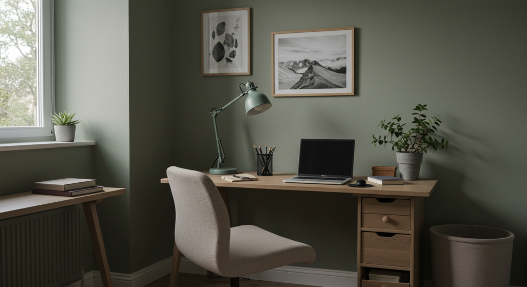
Choosing Calming Yet Focused Tones
A home office often blends relaxation with productivity. Aim for a color that is neither too dull nor too loud. Soft neutrals such as pale gray, gentle taupe, or a muted sage often hit that balance.
If you want a more energizing flair, consider one accent wall in a rich color like deep teal or warm terracotta. Keep the other walls lighter to avoid a closed-in feel. A subtle pattern or textured wallpaper behind the desk can offer inspiration without distracting you.
Lighting and Screen Glare
Consider how your wall colors bounce light around. A stark white wall near your monitor can reflect harsh light. This might strain your eyes. A slightly muted wall tone can reduce glare.
Position your desk to get natural light from the side, not directly behind or in front of you. If that’s not possible, use adjustable blinds or curtains to manage brightness. Paint finishes also play a role. A semi-matte or eggshell finish might be better than a high-gloss surface in an office setting.
Ergonomic Furnishings and Color Coordination
Pick a chair with durable upholstery in a color that fits your palette. A neutral tone often works best, so you can swap out accent pillows or footrests as needed. If your desk is wooden, ensure it harmonizes with the room’s color scheme or other wood finishes.
Keeping a unified look in your office can help you stay organized mentally. Clutter in color or layout can bleed into mental clutter. If you prefer a more eclectic style, select a unifying thread—maybe it’s brass hardware or repeated navy accents—to tie everything together.
Guest Room and Multi-Purpose Spaces

Flexible Color Palettes
Guest rooms sometimes double as home gyms, craft areas, or offices. A flexible color palette can adapt to these different uses. A gentle neutral like creamy white or light beige sets a backdrop that can handle rearranged furniture or changing equipment.
Add a pop of subtle color with a decorative pillow, small rug, or wall art. If you decide to convert the space for a new hobby or storage, you won’t need a full repaint.
Creating a Welcoming Atmosphere
Guests appreciate a peaceful vibe. Soft, medium-tone hues—like a dusty blue or a smokey lavender—work well if you want a bit more color than beige. Pair these walls with crisp white linens. The combination feels hotel-like without being sterile.
Include a few thoughtful accessories, such as a small plant or a cozy throw in a contrasting accent color. This simple addition shows that you’ve put care into the space, making it feel inviting.
Storage and Color Coordination
Guest rooms often hold spare linens, cleaning supplies, or out-of-season clothing. Keep the clutter hidden behind a unified storage system. Matching storage boxes or baskets in a color that complements the walls can help.
For instance, if your walls are pale green, choose storage bins in a deeper green or neutral gray. Label them cleanly. This approach keeps the multi-purpose room looking consistent rather than chaotic.
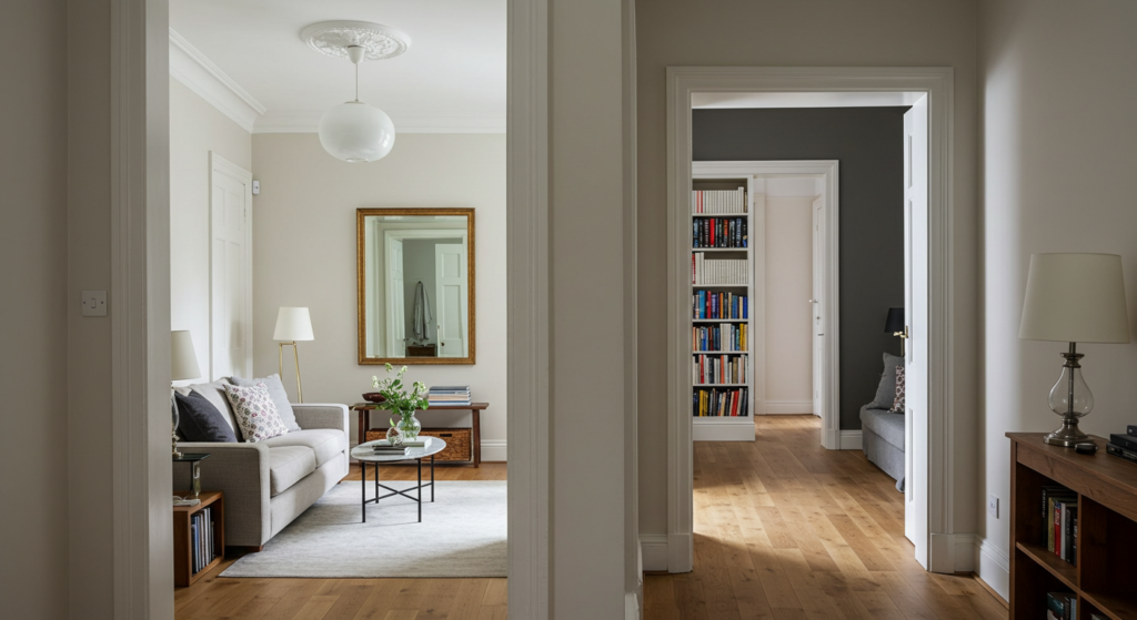
Hallways and Transitional Zones
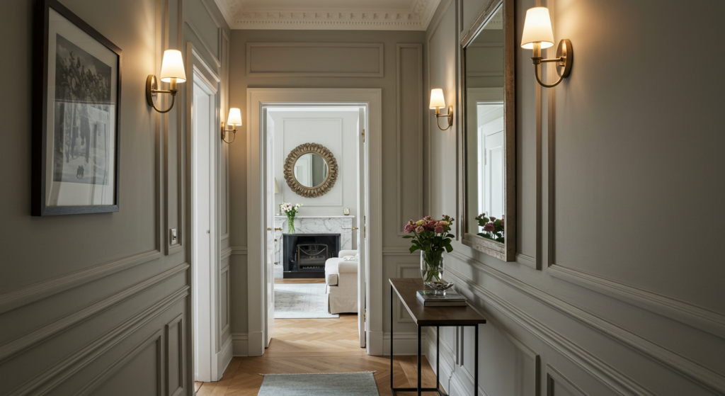
Flow Between Rooms
Hallways serve as connectors. Their color should bridge the styles of adjacent rooms. If your living room has warm tones and your bedroom leans cool, pick a hallway color that feels neutral enough to blend both.
You could also echo one accent color from each room in hallway artwork or a small runner. This subtle hint ties the entire space together. A coherent flow helps your home feel designed rather than haphazard.
Highlighting Architectural Features
If you have interesting trim, molding, or wainscoting in your hallway, you can paint it in a contrasting color to call attention to it. For example, pair pale walls with glossy black or charcoal baseboards to create a modern, eye-catching look.
Lighting in hallways is often limited, so consider a lighter or mid-tone color on the walls, paired with a reflective element like a mirror or a metallic sconce. This arrangement prevents the area from feeling dim.
Artwork and Accent Choices
Hallways offer prime gallery space. Neutral or softly colored walls let framed art pop. If the hallway is narrow, keep frames uniform in color and shape, so they don’t overwhelm the space.
Use accent pieces sparingly. A single console table with a bold lamp or a subtle decorative bowl might suffice. If you choose an accent color for the lamp or artwork, link it back to at least one other part of the home’s palette.
Laundry Room and Utility Spaces
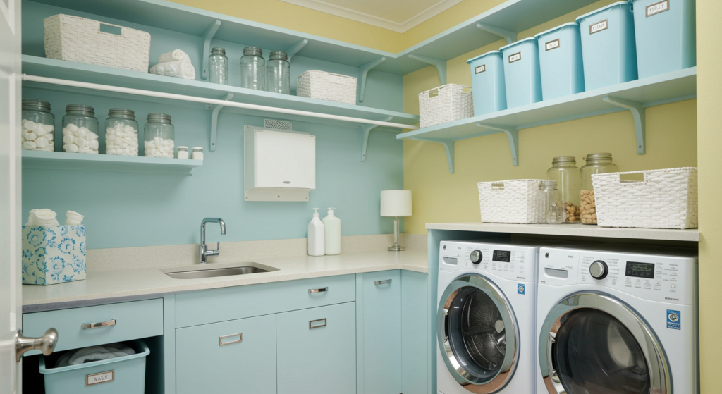
Bright and Functional Tones
Laundry rooms and utility areas often lack natural light. Bright colors, such as a cheery yellow or a crisp sky blue, can lighten the mood. If you prefer neutrals, pick something slightly warm, like a beige with a hint of peach.
Aim for paint finishes that resist moisture and are easy to clean. Satin or semi-gloss can handle occasional splashes and wipes. Consider also painting cabinets or shelving in a color that’s easy to spot stray items against, so you won’t lose small socks or tools.
Coordinating Appliances and Decor
Many laundry appliances come in white, stainless steel, or sometimes bold colors. If you have white appliances, a pastel wall can keep the space bright. If your appliances are stainless, a cool neutral or even a gentle teal might create a pleasing contrast.
Simple things like matching storage baskets or labeled jars for detergent can keep the space tidy. A small rug with a pattern can introduce a fun accent color and soften the area’s hard surfaces.
Easy Maintenance and Storage
Utility spaces can get dirty quickly. Pick surfaces that clean up fast. Floor tiles in a medium gray or beige hide minor stains. Shelves can be painted in a semi-gloss that won’t show scuffs as easily.
Consider mounting hooks or pegboards for small tools or laundry bags. Paint that pegboard in your accent color to add style to an otherwise utilitarian space. It’s practical and decorative at the same time.
Dining Areas and Color Engagement

Unifying the Dining Room
If your dining area is part of an open floor plan, coordinate the wall color with the adjacent living room. Try using the same hue but adjusting the shade slightly. This approach keeps the two areas distinct yet aligned.
For a standalone dining room, you can opt for a deeper color than in your living room. A warm mushroom brown, a muted wine red, or a classic navy can make mealtime feel special. Balance with lighter curtains or trim so the room doesn’t look too closed in.
Highlighting the Table and Chairs
The dining table often anchors the room. If you have a rich wooden table, consider a wall color that complements its undertone. Warmer woods pair nicely with creams or tans. Cooler woods can shine against pale grays or cooler neutral tones.
You can also paint your dining chairs for a fun twist. For instance, choose a set of neutral chairs but paint the chair legs or backrest in a bold accent color. Tie it to your table linens or a centerpiece for a cohesive look.
Selecting Lighting for Dining
Pendant lights or chandeliers often draw attention in a dining room. Their finish—whether brass, chrome, or matte black—contributes to the color palette. If your fixture is brass, you might echo that warm metallic in small table accents or picture frames.
Aim for dimmable bulbs so you can adjust the mood during meals. Warm lighting highlights deeper wall colors in a cozy way, making dinner gatherings feel intimate.
Conclusion
Color isn’t a random choice—it’s a design tool that shapes how spaces feel. You can make a compact room look bigger or a massive space feel more intimate.
You can highlight furniture or camouflage it, depending on your goals. With careful selection of finishes and accents, each area transforms into a place that matches your needs.
Take your time. Sample paints. Gather swatches. Measure lighting at different hours. Then, commit once you feel confident. Whether you paint an entire living room or just update a laundry nook, intentional color decisions add depth and style.
May these ideas inspire you to see your home as a canvas for creativity, where you can mix colors and textures in ways that serve both beauty and function.
Summary Table
| Space/Goal | Recommended Colors | Key Tips |
|---|---|---|
| Small Living Room | Pale gray, cream | Uniform color for walls & trim to boost space |
| Large Bedroom | Deep charcoal, navy | Keep linens light, add cozy feeling |
| Kitchen (Small) | Matching wall/cabinet colors | Extends visual space, unify upper cabinets |
| Kitchen (Large) | Two-tone cabinet scheme | Dark island, light perimeter for depth |
| Kids’ Room | Soft yellow, gentle green | Washable paint, flexible accents |
| Patio/Deck | Slate, earthy tones | Coordinate fabric with interior style |
| Guest Room | Creamy white, dusty blue | Neutral base for multi-purpose usage |
| Home Office | Muted sage, soft taupe | Avoid glare with semi-matte paint finish |
| Hallway | Light neutral or mid-tone | Bridge colors of adjacent rooms, add mirrors |
| Laundry Room | Cheerful yellow, pale blue | Choose easy-to-clean satin or semi-gloss |
| Dining Room | Warm mushroom brown, navy | Balance darker walls with lighter curtains |
| Outdoor Front Door | Bold red, navy, or bright yellow | Echo color in house numbers or small planters |
| Patterns & Textures | Mixed scales, shared color | Avoid too many busy patterns in small rooms |
| Budget-Friendly Updates | DIY paint, swap accents | Use thrift finds, coordinate repeated accents |
FAQs

Q: Can I paint a dark color in a small room without making it feel cramped?
A: Yes. If you keep trim, ceiling, and furnishings in lighter tones, a single dark accent wall can create a cozy focal point. Balance is crucial.
Q: Should ceilings always be white?
A: Not necessarily. A slightly lighter shade of your wall color can lift a space. A darker ceiling can bring a sense of comfort or drama if your room is tall.
Q: How do I pick a color for an open-concept space?
A: Choose a unifying base color that flows through all connected areas. Then vary accent walls or furniture colors to define smaller zones.
Q: Can metallic finishes clash with certain paint shades?
A: They can. Brushed nickel suits cooler paint tones, while brass or copper pair better with warmer colors. That said, you can mix metals if you repeat them thoughtfully.
Q: How many paint colors are too many in one house?
A: It depends on the layout. If your rooms are very separate, different colors may work. In open layouts, fewer is usually better. Choose a cohesive palette that transitions smoothly.
Q: Any tips for painting older homes with less natural light?
A: Opt for warmer neutrals or soft pastels that bounce the limited light around. Avoid stark white, which can look dull in dim spaces. Use satin or eggshell finishes and add mirrors or reflective accents.
Q: Is matching my couch to my walls a good idea?
A: It can be if you love a calm, seamless look. Vary textures to avoid a “blob” effect. Add a patterned throw or cushions for more interest.
Q: Can I use bold wallpapers in a tiny powder room?
A: Tiny spaces can handle bold statements, especially if they’re used sparingly. Keep fixtures simple and let the wallpaper shine. Try removable wallpaper if you’re unsure.
Q: What’s the simplest way to refresh a room on a tight budget?
A: Paint one wall, change throw pillow covers, and maybe add an affordable rug. These smaller updates can shift a room’s ambiance without draining your wallet.
Q: How often should I consider repainting a room?
A: Every five to seven years, or whenever you notice wear and tear. Accents can be swapped more frequently if you enjoy experimenting with new looks.
Feel free to mix and match these strategies for your home’s specific challenges. Each corner of your space can tell a cohesive story through color, texture, and smart planning. By taking advantage of lighting, finishes, and well-balanced palettes, you’ll create rooms that look and feel inviting for years to come.

Gabrielle J. Smith is the pulsating essence that brings life to the world of fashion and color. With an innate talent for understanding the nuances of hues, she has the uncanny ability to paint narratives with her words, diving deep into the realm of color trends and the art of harmonizing them. Not just an expert in the field, Gabrielle also plays a pivotal role in strengthening the cohesion of our team, ensuring growth and harmony. Each of her articles is a testament to her passion, weaving captivating tales that resonate with readers and fashion aficionados alike.
Reviewed By: Joanna Perez and Anna West
Edited By: Lenny Terra
Fact Checked By: Matthew Mansour
Photos Taken or Curated By: Matthew Mansour