Key Takeaways
- Color blocking involves grouping or segmenting areas of your home with contrasting or complementary hues to create dynamic sections.
- You can achieve a bold, stylish look without overwhelming your interior if you maintain balance with furniture, fabrics, and accent pieces.
- Careful planning and coordination of color blocks helps tie each room together and keeps the design from feeling random or disconnected.
- Embrace different materials (paint, fabric, tile) when creating color zones. This variety adds texture and depth to your design.
- Contrast is key. Consider pairing light and dark shades, or warm and cool colors, to define each section without needing color psychology references.
- Experiment on small surfaces before committing to large-scale changes. Swatches, sample boards, or painted test panels can guide your decisions.
- Focus on practical tips: measure your space, consider existing furniture, and seek color ties between adjoining rooms.
Introduction
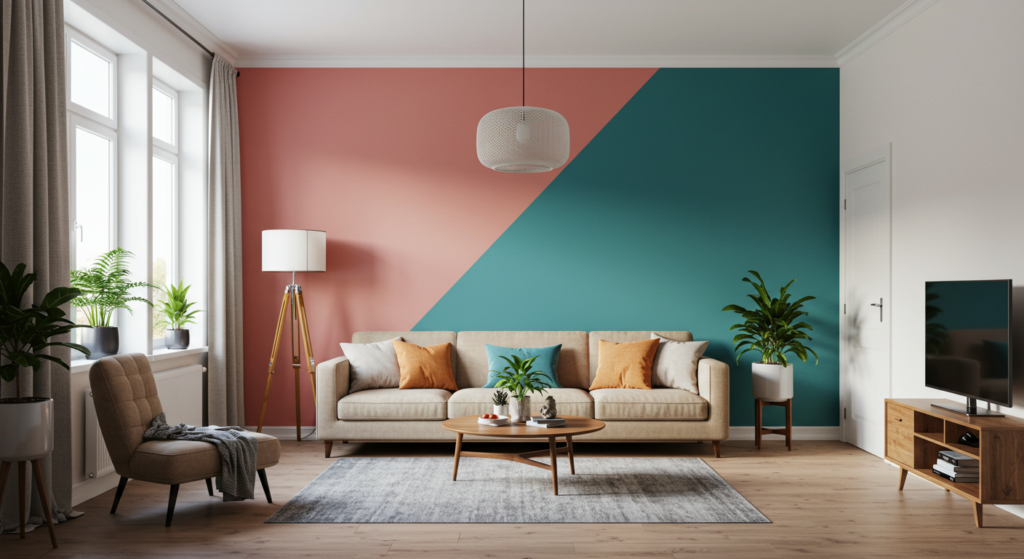
Why is color blocking such a buzzworthy approach in home decor? Because it gives an eye-catching spin to plain walls, furniture, and accessories without straying into clutter.
If you’ve ever felt that your living room or bedroom looks flat, color blocking can bring dimension, order, and style with just a few strategic strokes of the paintbrush or a well-chosen piece of furniture.
Though it’s a method that first showed up in fashion and art circles, interior designers saw its potential for living spaces. After all, bold contrasts or clever pairings aren’t limited to runways.
Most folks wonder if color blocking is too daring for average homes. Not at all. With thoughtful planning, you can shape your walls and corners into vibrant zones that highlight your sense of taste. And you don’t have to break the bank with fancy items.
Basic paint, contrasting accents, and a willingness to try new combos can transform your kitchen, living room, hallway—any space you want.
This guide covers the essential methods, tips, and real-life suggestions you’ll need to master color blocking. We’ll talk about choosing palettes, testing materials, contrasting textures, integrating decor, and avoiding common missteps.
Each section unpacks a central idea about color blocking, then branches into three practical subsections to give you step-by-step insight.
By the end, you’ll have enough information to move from inspiration to action without second-guessing every brushstroke or furniture swap. Let’s dive in and map out the vibrant potential waiting inside your home.
Understanding Color Blocking Basics
The Concept of Color Zones
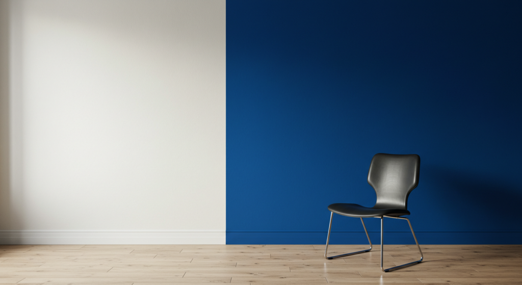
Color blocking in home design centers around dividing spaces into distinct color zones that create visual movement. Imagine painting one wall in a bold shade while leaving the adjacent walls neutral, resulting in a clear separation that feels intentional.
That painted wall can act like a stage for a sofa, artwork, or your favorite lounge chair. By using simple, geometric color fields—like rectangles of pigment—you direct attention and establish focus points.
Simple Beginnings
If you’re nervous about color blocking, start small. Pick one room and choose two hues. Perhaps a crisp white base with one bold accent color. Limit your accent to a section of a wall or a furniture piece, so it becomes a confident statement without dominating the space.
Experimenting on manageable surfaces helps you grasp what feels comfortable for your style. It also gives you room to adjust if you want bigger or smaller blocks later.
Common Pitfalls
Color blocking misfires when people pile on too many hues or ignore the existing room elements. That can create a jumbled environment lacking cohesion.
Another pitfall is choosing colors with no plan. Make sure each hue reinforces a unifying concept. Also, remember to bring in accent pieces that match at least one of your chosen hues. Scatter cushions or rug edges can unify your new color-blocked area.
Choosing the Right Palette

The Key to Balanced Hues
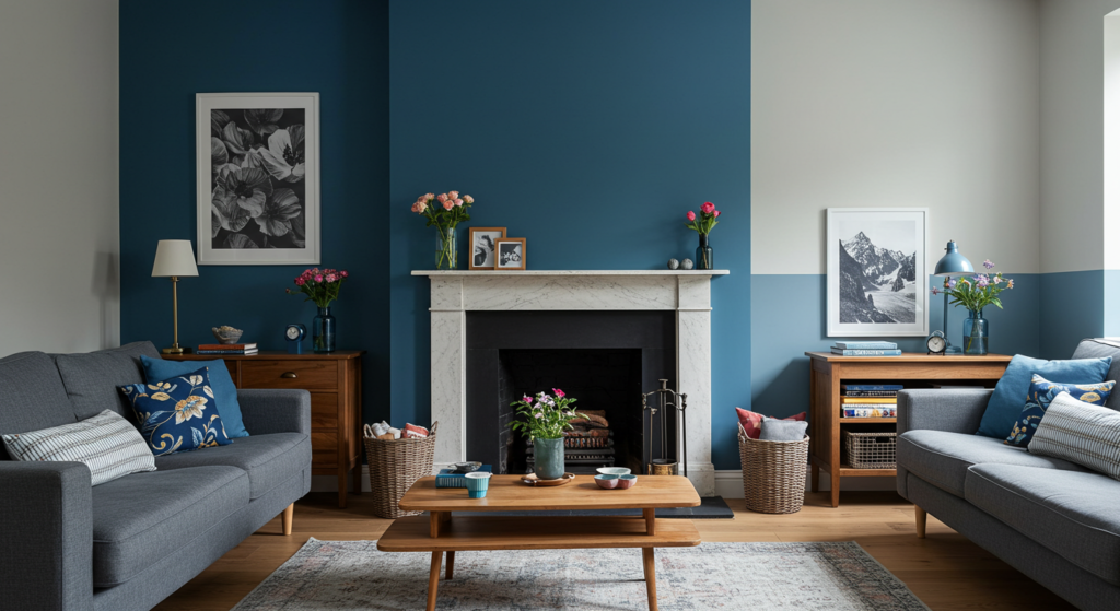
A powerful palette for color blocking relies on a balance of light and dark or warm and cool tones. Suppose you use a deep navy on one wall. You might offset it with light beige or off-white on adjacent walls. This contrast avoids an overload of intensity. If you want a playful feeling, pick two vibrant shades—like teal and canary yellow—and tone them down with neutral floors or understated furniture.
Tone Coordination
Tone coordination keeps color blocks from looking random. Let’s say you’ve chosen a bold red for your accent wall. If you want a second accent, select a red with slightly different brightness for the furniture or curtains. That approach harmonizes each element. This doesn’t mean all items have to match exactly, but ensure there’s a hint of repetition. Pillows, lamp shades, or table runners in related hues create a subtle echo that feels deliberate.
Accent Surfaces
Not every color block has to be a wall. Sometimes, painting your ceiling in a contrasting shade helps draw the eye upward. You could also paint a door frame or window sill in a bold color to frame your view. A color-blocked floor—say, a patterned tile or a large painted rug—can push your design further. Just stick to hues already in your chosen palette to keep consistency.
Tools and Materials to Start With

Essential Equipment
Before you take on color blocking, gather key supplies. High-quality paintbrushes and rollers give a clean finish. Painter’s tape is your ally for creating crisp lines and shapes. Having a decent ladder keeps you stable when you’re painting corners or ceilings. Don’t skip drop cloths to protect your flooring or furniture. A measuring tape helps mark boundaries, so your block shapes aren’t crooked or mismatched.
Types of Paint
Latex paint works for most interior projects. Its quick drying time and low odor help you finish faster. If you want a durable finish in high-traffic areas, consider semi-gloss or satin. That slight sheen can make your chosen color pop. For furniture or accent pieces, look into specialized furniture paint or chalk paint for a velvety texture. Always test on a small patch first to ensure you like the results.
Fabric and Soft Materials
Color blocking isn’t limited to painted walls. Curtains, upholstered chairs, throw blankets—these items can also define zones. If your walls are neutral, you can add a vivid drape or sofa cushion to mark a color-blocked section. Choose sturdy fabrics that complement your main hue. For instance, if your accent color is burnt orange, an ottoman or a pair of pillows in that shade can help tie the scheme together without extra paint.
Finding Inspiration for Your Blocks
Observation of Existing Decor
Sometimes the best ideas come from what’s already in your home. Look at your favorite rug, piece of art, or decorative bowl. Spot the colors that stand out and consider building your color blocks around those tones. This approach ensures you aren’t forcing a random palette onto a room that’s already established.
Browsing Samples and Swatches
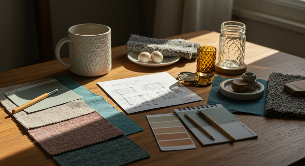
If you’re stuck, sample boards at paint stores or fabric shops can spark ideas. Collect swatches that strike your eye and assemble them on a small board. Rearrange them to see which combos work best under your home’s lighting. You might spot a hidden gem of a color scheme that you never would have considered otherwise.
Digital Tools and Apps
Though you’re aiming for a human touch in your final design, digital color palette generators or home design apps can be helpful. They let you preview how certain blocks look in a generic space. This preview prevents costly mistakes. Once you find a combination that pleases you, replicate it with real paint and fabrics in your own home. Use these tools as a guide, not an absolute rulebook.
Planning with Room Layout in Mind
Mapping High-Traffic Areas
It’s smart to think about the flow of foot traffic. In hallways or entryways, color blocking can guide visitors. A strong vertical stripe or large contrasting block on one side might direct movement in a pleasing way. This strategy also helps highlight an architectural feature, like a built-in shelf or bench, by surrounding it with a strategic color zone.
Balancing Open-Concept Spaces
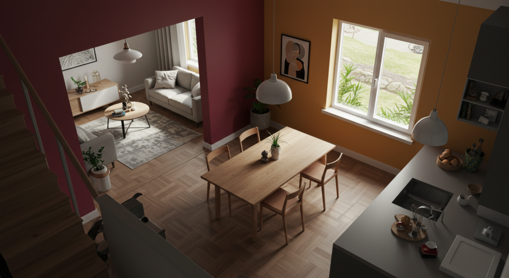
Open-concept layouts can feel too wide if you don’t define sections. Use color blocks to segment living, dining, and cooking areas without building walls. You might paint the kitchen island base in a contrasting hue from your main living area. That difference signals a shift in function. Just keep at least one unifying color running through all sections to maintain harmony.
Coordinating Adjoining Rooms
If you’re color blocking a bedroom and you want it to blend nicely with the hallway, sprinkle a touch of the bedroom’s accent color near the hallway entrance—maybe through art or a small rug. This subtle tie-in helps each room transition smoothly. It’s not about matching every detail but ensuring your home feels connected when you move from room to room.
Working with Different Design Styles
Modern Minimalist
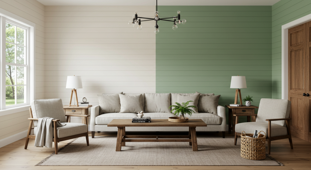
If your style leans modern, stick to crisp lines and a limited color palette. Think white walls with a single black accent block or a soft gray offset by a bright pop of one bold color. Minimal furniture shapes complement these blocks, making them feel intentional and sculptural. This approach fits lofts or open spaces with large windows.
Farmhouse Comfort
Farmhouse style often features natural materials like reclaimed wood. Here, color blocking might mean working with gentle neutrals and one stronger accent. For instance, paint the back of a built-in bookshelf in a warm sage green while keeping the rest of the wall white. Then, carry that green tone through table linens or large ceramic pieces. The blocks add interest without clashing with the room’s cozy vibe.
Bohemian Mix
Bohemian decor thrives on eclectic layering. If you love boho style, color blocking can add structure to an otherwise free-spirited space. For example, paint half a wall in a rich terracotta tone and let the rest remain a soft cream. Then decorate with patterned textiles, woven baskets, or rattan chairs that echo those shades. The result feels bright and artistic but not chaotic.
Furniture Placement and Color Blocking
Aligning Blocks with Furniture
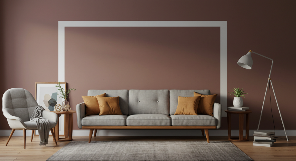
One trick is to frame a sofa or bed with a painted rectangle that stretches from floor to ceiling. This color rectangle sits behind the furniture, creating a visual anchor. The lines around that piece of furniture serve as a defined space. People walking into the room will see that area as a complete unit—perfect for reading corners or seating nooks.
Floating Furniture Solutions
If your sofa doesn’t sit flush with a wall, you can still color block around it. For instance, paint a section of the floor or a large rug in a contrasting color that mirrors the shape of the sofa footprint. This approach grounds a floating seating area, making it feel like its own zone in a bigger living space. Combine it with matching pillows or side tables to make it pop.
Highlighting Oversized Pieces
Big items, like a grand piano or a large dining table, often become the focal point by default. Use color blocking to underline that significance. If you have a massive dining table in a neutral tone, paint the ceiling above it or create a wide horizontal stripe on the surrounding walls in a color that contrasts with the table. This visual effect will draw eyes right to that main furniture piece.
Using Geometry and Shapes
Straight Lines and Stripes
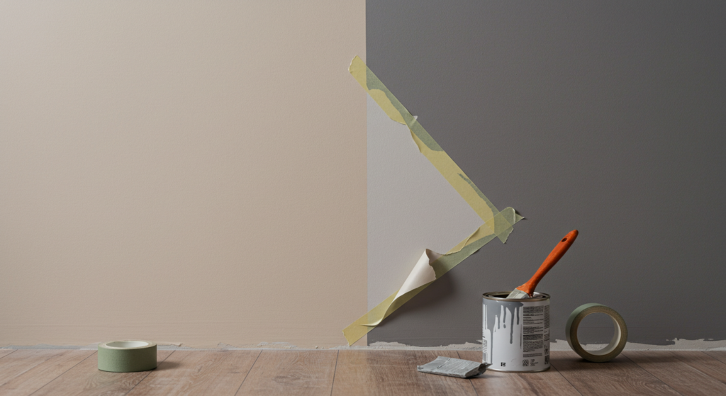
Most color blocking begins with sharp edges and rectangular shapes. You can paint a large vertical stripe on a plain wall, or run a broad horizontal band around a small powder room. The simplicity of lines lends clarity to where one zone ends and another begins. Keep your lines clean by using painter’s tape. Double-check your measurements so your stripes don’t drift off course.
Angled and Diagonal Blocks
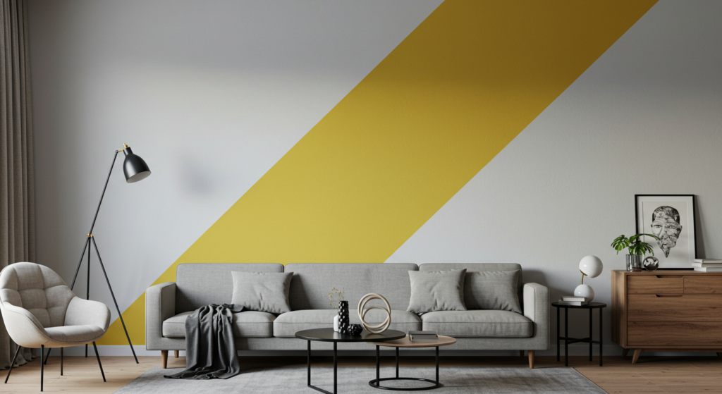
Diagonal or angled shapes can energize a space. For example, painting a diagonal slash across a wall in a bedroom can bring an artistic flair. You might put a soft pastel tone on one side of that diagonal and a deeper shade on the other. This method works well in teen bedrooms or creative studios, where you want a bit more playfulness in the design.
Curved Designs
Curved shapes aren’t as common in color blocking, but they can soften a room. You could paint a large circle or arch as a color block behind your bed’s headboard, acting like a stylish halo. Or paint a wavy border that wraps around a doorway. These whimsical lines add depth. Be cautious with curves, though; they require a steady hand and good planning to avoid lopsided edges.
Mixing Textures and Finishes

Paint Finishes
Instead of painting everything in the same finish, consider mixing matte, eggshell, and satin finishes to create subtle differences within your color blocks. For instance, a glossy finish for a rectangular accent can catch the light, while the rest of the wall stays matte. This contrast in sheen is understated yet interesting.
Fabric Accents
Bring texture through upholstery or wall hangings that match your blocks. A chunky knit throw might sit on a sofa that aligns with a painted block behind it, both in the same shade. This adds comfort and depth. If you have a reading nook with a color-blocked corner, a plush beanbag or velvet chair in that hue helps the area look inviting.
Tile and Stone Segments
In spaces like kitchens or bathrooms, color blocking with tile or stone can offer long-lasting results. A backsplash in a bold hue or a mosaic accent floor can serve as the block, while the surrounding areas remain neutral.
Mixing natural stone with colored tile can highlight transitions between cooking and dining zones, for example. Just ensure the colors coordinate, so the effect feels cohesive rather than patched together.
Balancing Light Sources
Natural Light
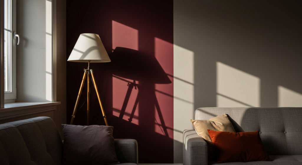
Large windows can either enhance or wash out your color blocks. Take note of how sunlight moves through your space. If a strong midday sun hits one wall, a darker color on that wall can appear lighter in the afternoon.
Test sample swatches on the actual wall to see how they behave at different times of day. You might be surprised how a color appears more vibrant in the morning and more subdued at night.
Artificial Lighting
Overhead fixtures, floor lamps, and table lamps all impact how your blocks look after sunset. Warmer bulbs can soften bright colors, while cooler bulbs might intensify them.
You could add a spotlight to highlight a bold accent wall, making the color block stand out as a feature. Try layering your light sources: overhead plus a few lamps or sconces. This layered approach makes the space feel cozy and reveals subtle color nuances.
Reflective Surfaces
Mirrors or glossy furniture can also affect how color blocks read. Mirrors bounce light around, possibly magnifying any bright block of color. You can use this to your advantage if you want a smaller color zone to appear more prominent.
Position a mirror opposite that block, and watch the space feel bigger and more dynamic. Just check that the reflection doesn’t create unwanted glare on your chosen paint finishes.
Maintaining Cohesion Over Time
Seasonal Adjustments
Your color blocking doesn’t have to stay the same year-round. Swap out accessories or small accent pieces to align with changing seasons. In spring, you might use lighter throw pillows that reflect the bolder color in your walls. When fall arrives, you can introduce deeper shades in drapes or cushions to complement your existing scheme without repainting everything.
Repainting or Touch-Ups
Paint can fade or chip, especially in busy areas. Keep extra paint on hand for quick fixes. A minor scratch on a color-blocked wall can become glaring if it’s left unattended. When you’re repainting, follow the same lines you originally marked so you don’t lose your crisp boundaries. If you want a slight shift, consider updating just one block while keeping the rest.
Updating Decor Accessories
Over time, you might grow tired of a certain color-blocked chair or rug. Rather than repaint the walls, just rotate out those furnishings for new ones in a complementary shade. This approach lets you refresh your space without a total overhaul. Also, swapping decorative pieces can introduce fresh shapes or textures that pair beautifully with your established blocks.
Common Mistakes and How to Avoid Them
Overdoing Contrast
While color blocking often relies on sharp contrasts, stacking too many high-intensity shades together can overwhelm a room. If you sense that your space feels cramped or busy, consider removing one accent color or toning down a bold hue. Often, a single dramatic color combined with neutrals creates a cleaner result.
Lack of Planning
Slapping paint on walls without proper measurements or tape lines leads to uneven blocks and sloppy edges. Grab a pencil and a level before painting. Draw out where your blocks will start and stop. Double-check each measurement. Good prep work saves time and frustration later, and it ensures your lines look crisp.
Ignoring Room Function
A color scheme that works for a living room might not fit a bathroom or kids’ room. Tailor your blocks to each space’s purpose. Kitchens often benefit from energetic shades that feel inviting for cooking. Bedrooms favor calmer tones so you can relax. Even if you love bold color, think about how you use that room day to day.
Product Suggestions and Decor Ideas
Paint Brands
Many paint brands offer samples that let you try small swatches. Consider well-known options like Behr, Benjamin Moore, or Sherwin-Williams. Their premium lines often have better coverage and durability. Look for collections that feature complementary colors within the same brochure. This shortcut can help you find pairs that match without overthinking.
Furniture and Accents
For a bold color-blocked area, choose a piece of furniture in a contrasting or coordinating hue. IKEA, Wayfair, and local thrift stores can be great sources. You might find a simple chair or dresser you can repaint. Choose items with clean lines if you want the color itself to stand out. If you prefer subtlety, select pieces that match one of your blocks and use their shapes to unify the look.
Decorative Pieces
If painting a large section still feels risky, add color through pillows, throws, rugs, and wall art that reflect your chosen scheme. A patterned rug that picks up the accent color can tie the entire room together. Artistic prints that feature geometric shapes in your palette can strengthen the color-blocking effect. Mix and match materials to add depth—like metal frames or wooden elements—to keep the design interesting.
Innovative Approaches to Color Blocking
Layered Blocks
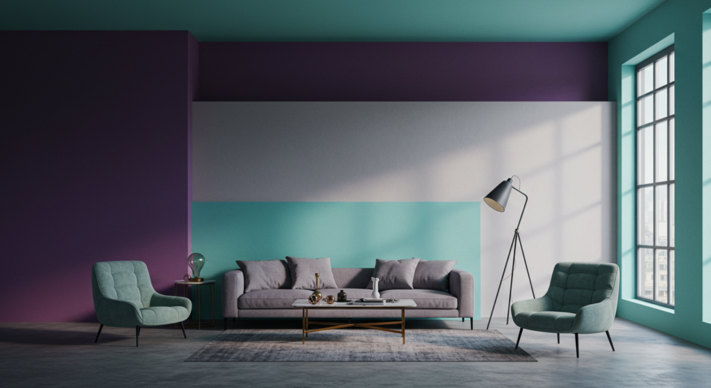
Stack multiple blocks on a single wall by layering them. For instance, paint a large rectangle in one color, let it dry, and then paint a smaller rectangle in a second color on top, offset by a few inches. This approach suggests depth and complexity. Layered blocks are eye-catching in dining rooms or home offices where you want a more artistic vibe.
Gradual Transitions
If you find stark contrast too harsh, try an ombre or gradient style that transitions smoothly between two shades. This is a softer interpretation of color blocking, but it still defines areas. For example, fade from a darker teal at the base of a wall to a lighter teal near the ceiling. It’s subtle, yet it provides a distinct color zone effect.
Mixed Mediums
Don’t restrict yourself to paint only. Combine paint with wallpaper or stenciling. Maybe half of a wall is wallpapered in a color that complements the painted portion. Or try a chalkboard paint section next to a glossy paint block so you can write notes or draw simple sketches. This approach can be engaging, especially in kitchens or children’s playrooms, since it makes the space interactive.
Long-Term Value and Resale Considerations
Appealing to Future Buyers
You might worry about how color blocking affects your home’s resale value. The key is moderation. While it can show personality, potential buyers might not share your taste. Stick with widely appreciated color combos that can be repainted easily. If you plan to sell soon, keep blocks subtle—like pairing a soft gray with a white wall—or be ready to neutralize them before listing the property.
Easy Reversibility
When using bold shades, remember that you or a future buyer can paint over them if needed. Color blocking is less permanent than structural changes like removing walls or redoing floors. If you anticipate changing your decor often, opt for smaller blocks that won’t require massive repainting jobs. This flexibility keeps color blocking from feeling like an irreversible commitment.
Maintaining Good Condition
Strong blocks make an impression if they’re neat and well-kept. Over time, general wear or fading may reduce their impact. Plan for periodic maintenance. If you keep your walls and accents in good shape, color blocking stays a positive feature rather than looking like a neglected design idea. Regular dusting and occasional spot cleaning preserve a crisp finish.
Conclusion
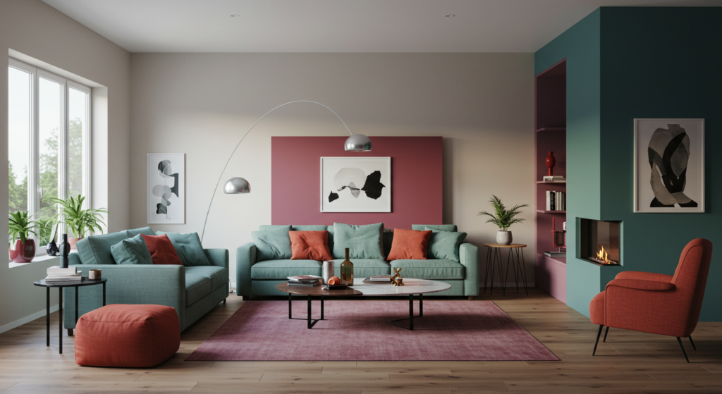
Color blocking invites you to shape your home in unique ways. You’re not confined to standard neutral walls or a single accent color. Instead, you can express your style with shapes, lines, and contrasts that set each space apart. The key is combining practical planning with imaginative flair. By measuring, prepping, testing swatches, and coordinating furniture, you can avoid haphazard results.
When used thoughtfully, color blocking ties together furniture, decor, and architecture. It can guide foot traffic, define open-concept areas, or amplify the presence of a beloved furniture piece. This method isn’t about coloring your home in wild ways just for show. It’s about embracing creative boundaries, highlighting key areas, and enjoying the fun of pairing shades in purposeful combinations.
Try it on a small section first, refine your approach, then expand if you like the outcome. Color blocking can breathe life into any space—be it a sprawling living room or a snug reading nook. With the know-how gained from these tips, you’re well on your way to creating visually striking interiors that look fresh, stylish, and balanced.
Summary Table
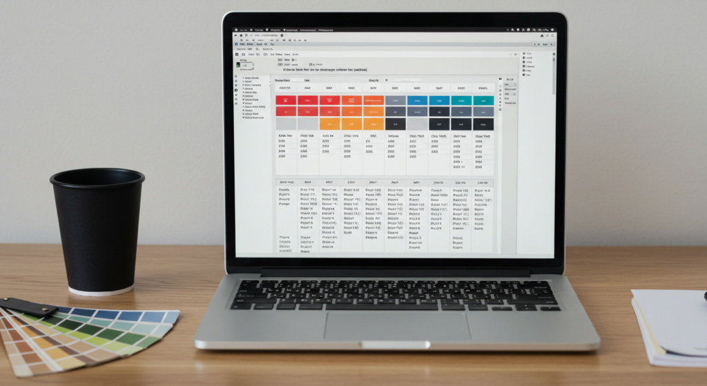
| Aspect | Quick Tips |
|---|---|
| Palette Selection | Combine one bold color with neutral shades or pair two bolds with a neutral. |
| Room Layout | Use color blocks to define open areas or highlight architectural features. |
| Furniture Placement | Align blocks behind key furniture or create color zones on the floor. |
| Shapes & Lines | Try rectangles, stripes, diagonals, or even arches for interest. |
| Finishes & Textures | Mix matte and gloss or add textiles matching your main color blocks. |
| Lighting | Check how natural and artificial light change your chosen hues. |
| Maintenance | Keep extra paint for touch-ups and switch accessories seasonally. |
| Design Styles | Adapt color blocking for modern, farmhouse, or bohemian themes. |
| Tools & Materials | Gather quality brushes, tapes, and consider special paint finishes. |
| Cohesion | Repeat accent shades in pillows, rugs, or wall art for unity. |
FAQ

1. Is color blocking only for large spaces?
Not at all. Even a tiny powder room can benefit from color blocking. Paint one wall in a contrasting shade or add a bright door frame. The key is using measured blocks so the space doesn’t feel crammed.
2. How many colors should I use in one room?
Most designers suggest two or three colors max. If you include a neutral hue, that helps balance the bolder shades. Using too many can confuse the eye and reduce the clarity that color blocking aims to achieve.
3. Do I need a professional painter?
Not necessarily, but careful measuring and taping are vital. If you’re comfortable with DIY painting and have a steady hand, you can do it yourself. However, a professional might help if you’re attempting complex shapes or if your space has tricky angles.
4. Can I mix wallpaper and paint for color blocking?
Yes. Wallpaper can serve as one block, while the painted sections act as the others. This offers texture and pattern without requiring advanced paint techniques. Just ensure the colors mesh well between the wallpaper design and surrounding paint.
5. What’s the easiest way to test out color ideas?
Try painting poster boards or foam boards in your chosen hues. Tape them on your walls and watch how they look over a few days under different lighting. This low-commitment method helps you avoid painting large areas that might need redoing.
6. Should my furniture always match my blocks?
Not exactly. It’s more important that furniture either complements or contrasts your blocks in a pleasing way. Sometimes, an accent chair or patterned ottoman can enhance the overall scheme without being an exact match.
7. Is color blocking expensive?
It can be cost-effective if you keep it simple. A couple of paint cans and some tape are much cheaper than a full renovation. If you add new furniture, the cost goes up, but you can often find budget-friendly items that fit your palette.
8. How do I create a subtle color-blocked look?
Choose colors that are close in tone, like a light gray and a slightly darker gray. The contrast is softer but still gives you that distinct zoned effect. You can also go with matte finishes or pastel shades for a gentler vibe.
9. Can I use color blocking to make a room look larger?
Yes. Using lighter shades for upper walls and darker ones for lower areas can give the illusion of higher ceilings. Or paint a single vertical stripe in a bold color to draw the eye upward. These tricks can make compact areas feel more open.
10. What if my blocks don’t turn out straight or even?
Mistakes happen. If lines are slightly off, you can trim the paint using an angled brush. In more serious cases, you might repaint that section. That’s why good prep—measuring carefully and using quality tape—is crucial for a polished outcome.
11. Can I color block my ceiling?
Yes. A contrasting or accented ceiling can lift the mood of a room. Pair it with walls in softer shades, or carry the ceiling color onto a partial wall for a cohesive block design. Just remember to coordinate with your overall scheme.
12. How can I ensure color blocking looks timeless?
Stick to simple shapes and proven color combos. Basic stripes or rectangles in classic hues—like navy, beige, or gray—tend to age well. If you crave trendier tones, incorporate them in smaller blocks or accessories you can swap later.
13. Will color blocking make my home harder to sell?
It depends on your palette. If the blocks are wild or unbalanced, potential buyers might be turned off. But if the scheme is well done and easy to repaint, it can be a selling point. Neutral-based blocks are often safer for resale.
14. Are there any design rules I should follow?
Prioritize balance and cohesion over strict design rules. Make sure each color has a purpose. Test your ideas, adjust if something feels off, and trust your intuition. After all, the goal is to create a space that’s both practical and visually appealing.

Neha Z. is not just any writer; she’s a storyteller who has graced the online world with her evocative prose for over half a decade. Venturing into the intricate nuances of women’s lives, she weaves stories that range from life’s highs and lows to the multifaceted essence of femininity. Each piece she pens radiates sincerity and artistry. As you delve into Neha’s musings, you’ll find reflections that echo your own journey and insights that inspire. Immerse yourself in her world, and let her stories touch your heart.
Reviewed By: Joanna Perez and Anna West
Edited By: Lenny Terra
Fact Checked By: Matthew Mansour
Photos Taken or Curated By: Matthew Mansour
