- Mediterranean blues encompass a wide spectrum from pale aqua to deep navy, each shade tied to the region’s natural environment
- The consistent presence of sea, sky, and traditional architecture creates a cultural color language unique to coastal communities
- Historical trade routes brought indigo and other blue dyes to Mediterranean ports, influencing local color preferences for centuries
- Whitewashed buildings with blue accents serve both practical purposes (reflecting heat) and aesthetic traditions
- These blues translate beautifully into fashion, offering versatile options that work across seasons and settings
- Home decor inspired by Mediterranean blues creates calming, timeless spaces that never feel dated
- The psychological effects of blue—calmness, trust, openness—align with the laid-back coastal lifestyle
- Understanding warm versus cool Mediterranean blues helps you choose shades that flatter your specific coloring
There’s something undeniably magnetic about the blues found along Mediterranean coastlines. From the sun-bleached doors of Santorini to the deep indigo tiles of Moroccan riads, these shades tell stories of sea, sky, and centuries of cultural evolution. This family of colors has transcended its geographic origins to become a globally beloved palette, appearing in everything from runway fashion to interior design trends. Understanding why coastal regions developed such a deep connection to these specific blues reveals not just aesthetic preferences but a fascinating intersection of climate, tradition, trade, and human psychology.
The Geography of Color: Why Blues Dominate Coastal Landscapes
The Mediterranean region’s distinctive blue palette didn’t emerge by accident. It’s the direct result of environmental factors that have shaped local aesthetics for thousands of years, creating a visual language that feels both natural and intentional.
Sea and Sky as Daily Inspiration
When you live surrounded by water, blue becomes more than a color—it becomes a constant companion. Mediterranean communities wake to it, work beside it, and watch sunsets paint it in countless variations. This daily immersion creates an almost unconscious preference for blue tones that feel like home.
The particular quality of Mediterranean light intensifies these blues in ways that other regions simply can’t replicate. The sun’s angle, the clarity of the air, and the reflection off limestone cliffs all contribute to creating blues that seem impossibly vivid. Locals naturally want to capture some of that vibrancy in their surroundings, leading to painted doors, ceramics, and textiles that echo what nature provides so abundantly.
Climate-Driven Color Choices
Blue paint on doors and window frames isn’t just beautiful—it’s practical. In hot climates, darker colors absorb heat while lighter colors reflect it. Blue strikes an interesting balance: it’s dark enough to provide visual contrast against white walls but light enough (in most Mediterranean applications) to avoid excessive heat absorption.
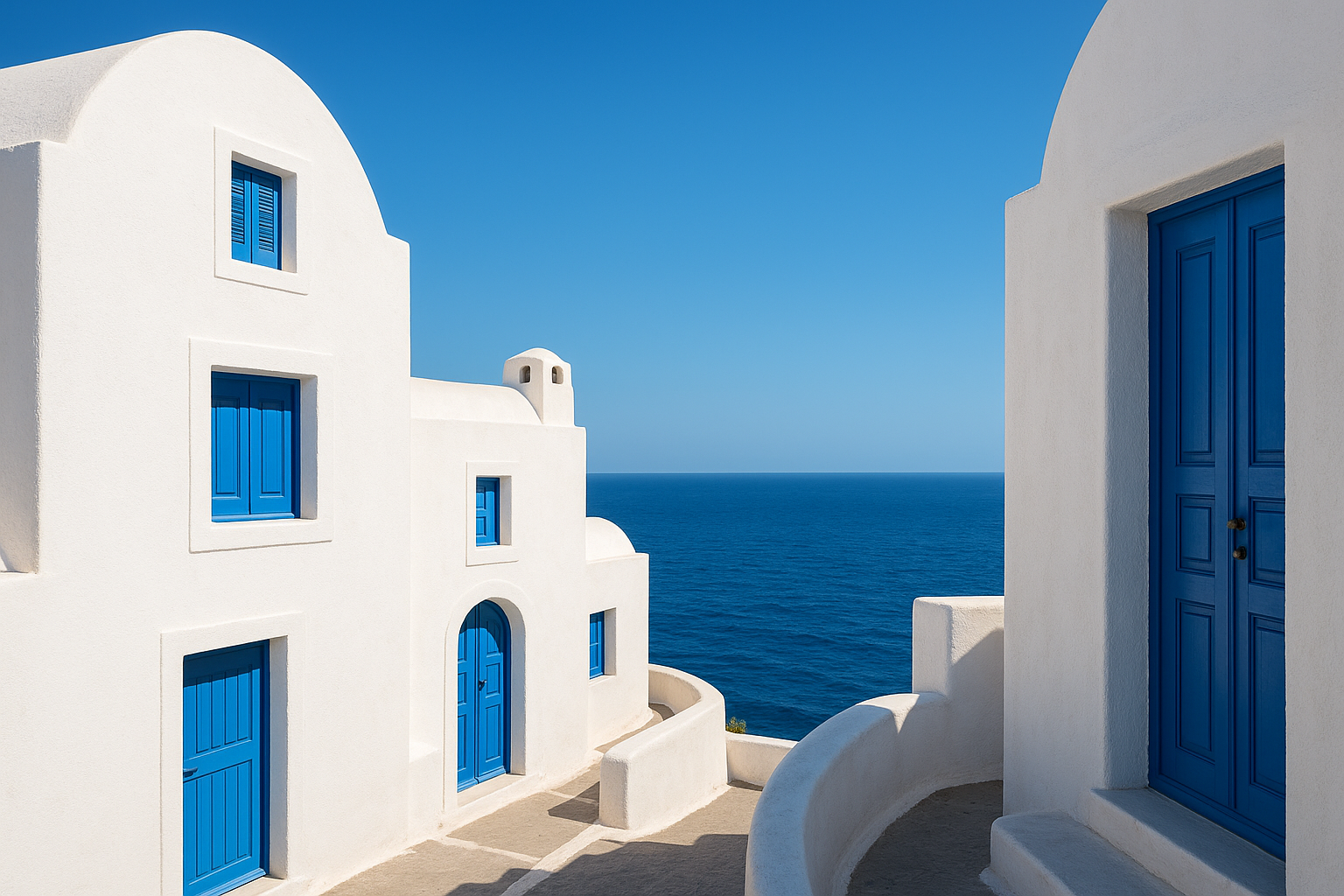
The white-and-blue combination so iconic to Greek islands originally served to keep interiors cool during brutal summers. The whitewash reflected maximum sunlight while blue details added personality without compromising thermal comfort. This practical foundation gave rise to an aesthetic so pleasing that it spread throughout the region and eventually the world.
Mineral Resources and Natural Dyes
The availability of blue pigments also played a crucial role. Lapis lazuli from Afghanistan traveled through Mediterranean trade routes, while local sources of azurite and cobalt provided materials for ceramics and paints. Indigo, whether from local woad plants or imported from India, gave textiles their characteristic blue depths.
These materials weren’t uniformly available, which created regional variations in blue preferences. Moroccan blues tend toward the deeper, more saturated end of the spectrum thanks to abundant local cobalt, while Greek blues often appear lighter and more turquoise due to different mineral compositions and painting traditions.
Historical Roots: Blue as a Cultural Marker
Blue’s significance in Mediterranean cultures extends far beyond mere decoration. Throughout history, this color has carried religious, social, and economic meanings that reinforced its prominence in daily life.
Religious Symbolism Across Faiths
In Christianity, blue represents the Virgin Mary and carries associations of heaven, purity, and divine protection. Churches throughout Italy, Greece, and Spain feature blue prominently in frescoes and decorative elements. This religious significance filtered into domestic spaces, where blue-painted elements might offer spiritual protection alongside their aesthetic appeal.
Islamic traditions also embrace blue as a color of protection and paradise. The intricate blue tilework of mosques in Turkey, Morocco, and Tunisia demonstrates sophisticated craftsmanship while conveying theological meanings about the infinite nature of heaven. These religious applications elevated blue from a simple decorative choice to a spiritually meaningful one.
The Evil Eye Connection
Throughout the Mediterranean, blue is believed to ward off the “evil eye”—the malevolent gaze thought to bring misfortune. This belief spans cultures from Greece to Turkey to North Africa, making blue-painted doors and blue glass talismans ubiquitous protective measures.
This superstition reinforced the practical and aesthetic reasons for choosing blue, creating a triple justification that made the color feel almost inevitable. When a single color offers beauty, comfort, and protection, it’s no wonder it becomes culturally embedded.
Trade and Wealth Indicators
Historically, blue pigments and dyes were expensive. A family that could afford to paint their door in vivid blue was signaling a certain level of prosperity. The intensity of the blue might indicate how recently it had been refreshed—a subtle status marker in communities where everyone recognized the significance.
This economic dimension explains why the most prestigious buildings often featured the most saturated blues. Wealthy merchants, religious institutions, and civic authorities used color as a statement of their resources and importance, establishing associations between blue and quality that persist today.
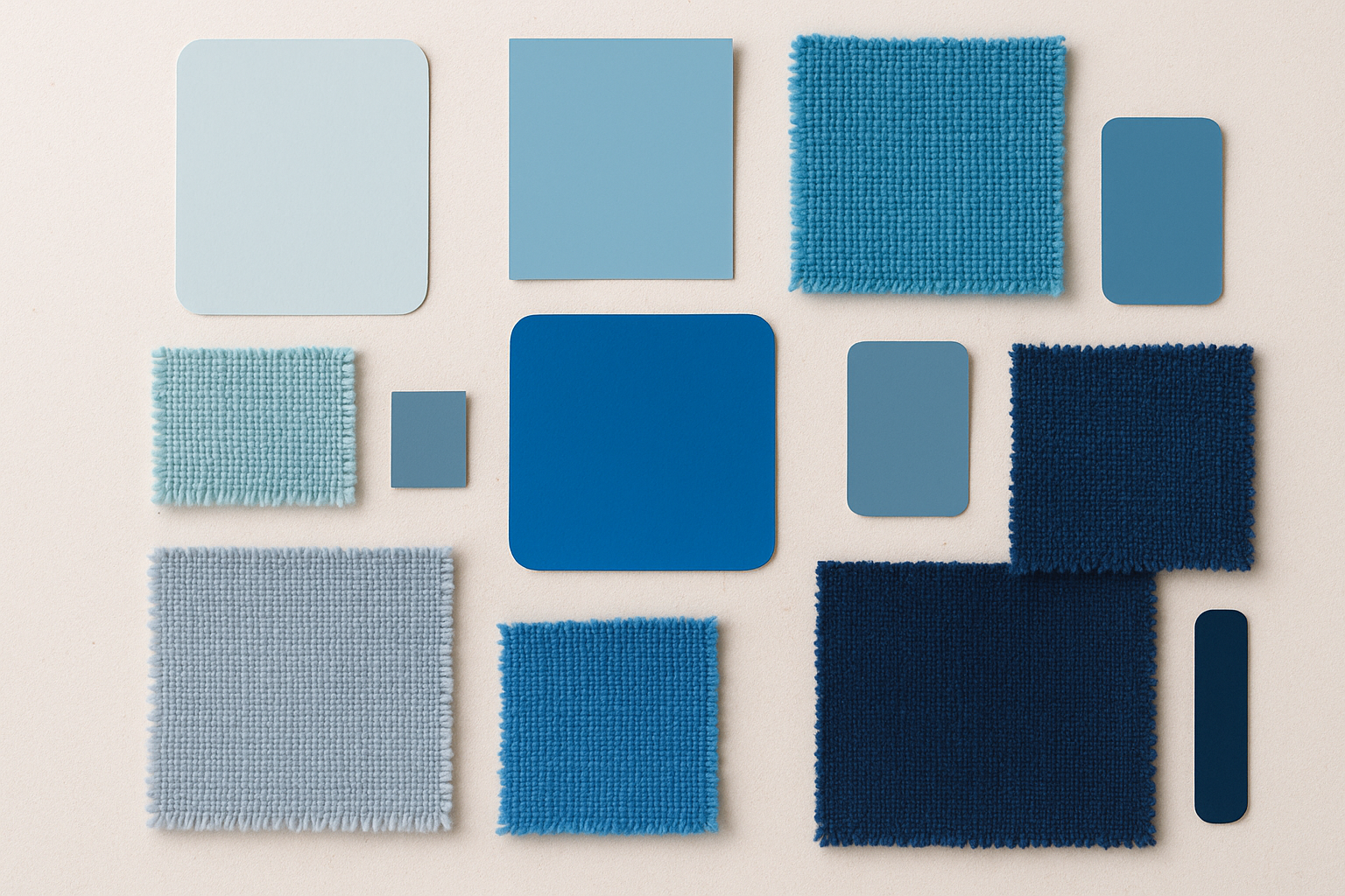
The Mediterranean Blue Spectrum
Not all Mediterranean blues are created equal. The region has developed a nuanced palette that ranges from the palest hint of sky to the deepest navy of twilight seas. Understanding these variations helps when incorporating them into your own wardrobe or living spaces.
Each shade carries its own associations and works best in specific contexts. Learning to distinguish between them allows for more intentional color choices that capture the exact Mediterranean mood you’re seeking.
- Santorini Blue: A bright, slightly chalky turquoise that appears on Greek island architecture
- Aegean Blue: A medium-depth teal with green undertones, reminiscent of Mediterranean coves
- Cobalt: An intense, saturated blue common in Moroccan and Portuguese tiles
- Majorelle Blue: The distinctive electric blue made famous by the Marrakech garden
- Mediterranean Navy: A deep, warm navy with hints of indigo, seen in formal ceramics
- Adriatic Blue: A cool, grayed blue inspired by the Italian and Croatian coastlines
- Turkish Turquoise: A bright blue-green seen in İznik pottery and mosque tiles
- Provençal Blue: A softer, more muted blue with lavender undertones from southern France
- Cerulean: The pure sky-blue that appears on clear Mediterranean mornings
- Indigo: The deep dye color historically traded through Mediterranean ports
- Maltese Blue: A distinctive dusty blue seen on traditional Maltese balconies
- Cycladic Blue: A pale, almost white-blue used in Cyclades island architecture
Mediterranean Blues in Fashion: From Tradition to Trend
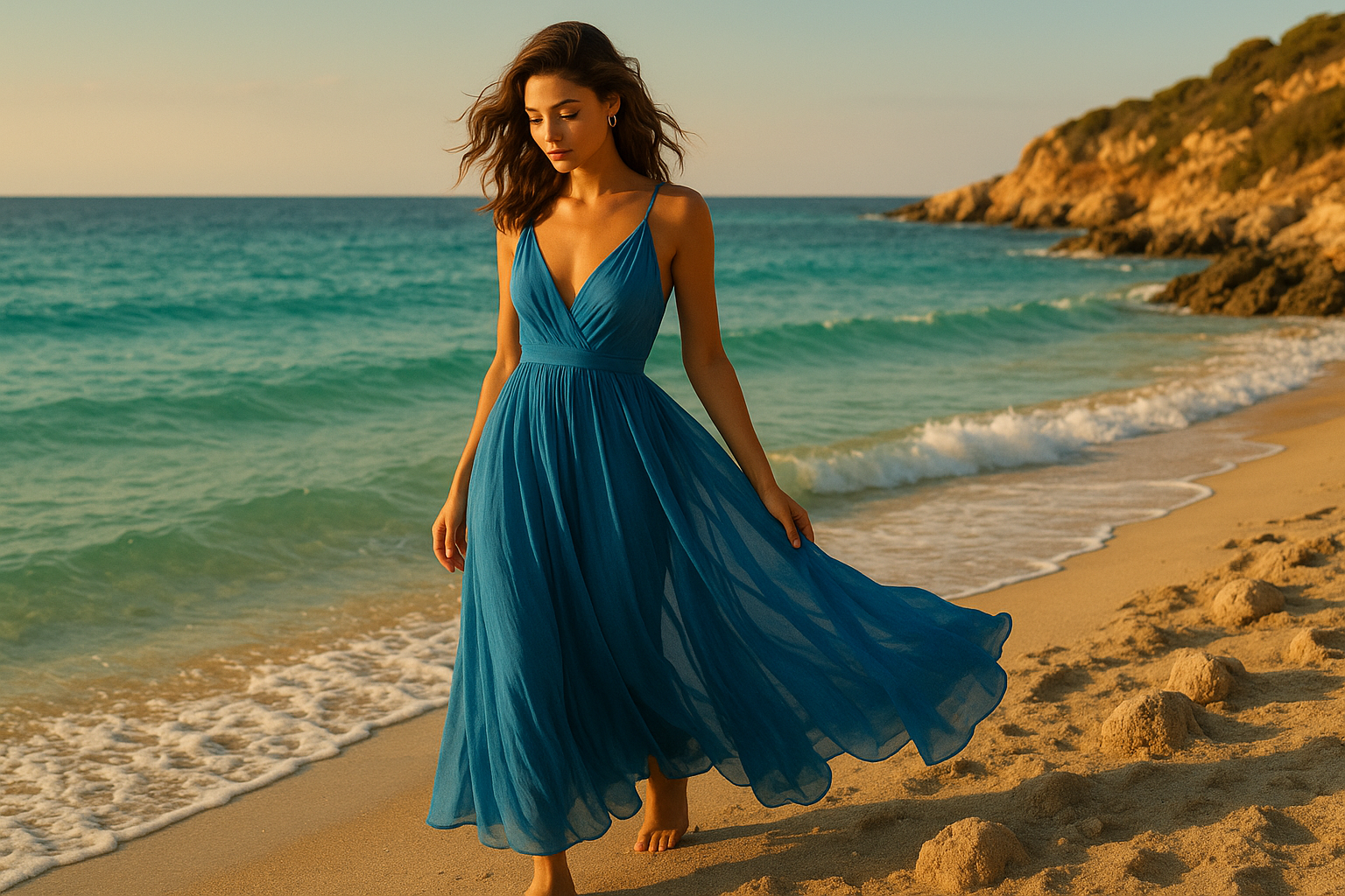
Fashion designers have long drawn inspiration from Mediterranean color palettes, translating coastal blues into garments that evoke vacation ease and timeless sophistication. These blues work particularly well in fashion because they complement a wide range of skin tones and pair beautifully with both neutral and colorful pieces.
The relaxed elegance associated with Mediterranean style translates perfectly into clothing. Whether in flowing maxi dresses, tailored linen shirts, or statement accessories, these blues suggest a certain effortless chic that fashion-conscious people find irresistible.
Spring and summer collections regularly feature Mediterranean-inspired blues because they capture the optimism of warm weather. However, deeper shades like cobalt and navy transition beautifully into fall and winter, making this color family genuinely year-round.
Linen and cotton fabrics in Mediterranean blues feel especially authentic, echoing the natural materials traditionally used in coastal regions. But these colors also work in silk, wool, and synthetics, adapting to different garment types and occasions.
The key to wearing Mediterranean blues well is understanding which shade flatters your coloring. Warmer skin tones often look best in turquoise and teal variations, while cooler complexions shine in true cobalt and Santorini blue. Neutral skin tones have the most flexibility, looking good in almost any Mediterranean shade.
Accessorizing with Mediterranean blues offers an entry point for those hesitant to commit to full garments. A turquoise scarf, cobalt handbag, or blue gemstone jewelry can introduce these colors without overwhelming a wardrobe.
White remains the classic pairing for Mediterranean blues, echoing the iconic architecture of coastal villages. But these blues also work surprisingly well with warm neutrals like sand, terracotta, and olive, creating sophisticated combinations that feel grounded rather than stark.
Pattern mixing with Mediterranean blues requires some care. Stripes feel nautical and natural, while florals can either enhance the coastal vibe (with the right scale and additional colors) or veer into territory that feels disconnected from the palette’s origins.
Home Decor: Bringing Coastal Blues Indoors
Interior designers consistently rank Mediterranean blues among the most requested color palettes for home spaces. These shades create environments that feel both calming and vibrant, managing to energize without overwhelming.
Living Spaces and Common Areas
Mediterranean blues work exceptionally well in rooms where people gather. The color’s psychological associations with openness and calm make it ideal for living rooms, dining areas, and kitchens. Even small doses—through throw pillows, ceramics, or artwork—can shift a room’s entire mood toward the relaxed coastal vibe.
For those hesitant to commit to blue walls, architectural details offer a middle ground. Blue-painted door frames, window trim, or built-in shelving create the Mediterranean effect without requiring a complete color overhaul. This approach mirrors how the color is traditionally used in coastal architecture.
Bedrooms and Restful Retreats
Blue’s calming properties make it a natural choice for bedrooms. Mediterranean shades, in particular, avoid the coldness that some blues can create, maintaining warmth while promoting relaxation. Lighter shades work well for walls, while deeper blues add drama through textiles and accents.
Layering different Mediterranean blues within a single bedroom creates depth and interest. A pale blue wall paired with cobalt bedding and turquoise accessories captures the full spectrum of coastal color without feeling chaotic. The key is maintaining tonal harmony while introducing variety.
Bathrooms and Water Spaces
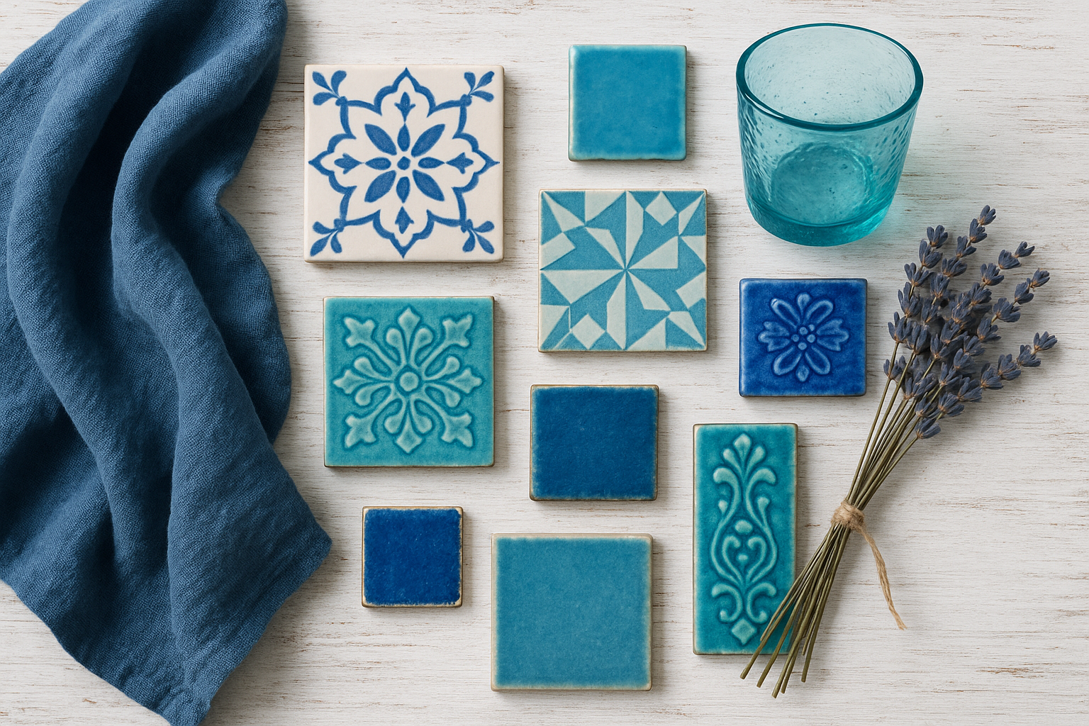
The obvious connection between blue and water makes bathrooms ideal spaces for Mediterranean colors. Blue tiles, whether in solid colors or traditional patterns, transform functional spaces into personal retreats. The association with cleanliness and freshness reinforces the color choice.
Consider incorporating handmade Mediterranean tiles for authentic character. The slight imperfections and color variations in artisan tiles add warmth that mass-produced alternatives can’t match. Even a small accent border can introduce this element affordably.
Regional Variations in Mediterranean Blue
While we often speak of “Mediterranean blue” as a single color category, the reality is far more nuanced. Each coastal culture has developed its own blue traditions, influenced by local materials, artistic heritage, and cultural preferences.
Understanding these regional distinctions allows for more authentic and intentional color choices, whether you’re decorating a room or building a wardrobe inspired by a specific Mediterranean aesthetic.
- Greece: Bright, chalky blues with slight turquoise tints, often appearing more saturated in harsh sunlight
- Morocco: Deep, saturated cobalt and rich indigo, frequently used in intricate geometric patterns
- Italy: Elegant Adriatic blues ranging from soft gray-blue to sophisticated navy in formal contexts
- Spain: Vibrant azul featuring in Moorish-influenced tiles and contemporary design
- Turkey: Distinctive turquoise with green undertones, central to Ottoman decorative traditions
- France: Muted, sophisticated Provençal blues with lavender and gray undertones
- Tunisia: Bold, bright blues similar to Moroccan traditions but often with unique yellow pairings
- Croatia: Cool Adriatic blues that appear almost slate-gray in certain lights
- Portugal: Rich azulejo blues that tell stories through painted tile murals
- Malta: Distinctive dusty blue-green seen on traditional wooden balconies
- Cyprus: Blend of Greek brightness and Middle Eastern depth, creating unique intermediary shades
- Lebanon: Sophisticated blues with ancient Phoenician purple undertones
The Psychology of Mediterranean Blues
Color psychology helps explain why Mediterranean blues feel so universally appealing. These shades tap into deep psychological associations that transcend cultural boundaries, making them effective wherever they appear.
Calm and Relaxation
Blue consistently ranks as the world’s favorite color across diverse populations. Research suggests this preference connects to evolutionary advantages—blue skies and clean water signaled safety and resources to our ancestors. Mediterranean blues, with their associations of clear seas and summer holidays, amplify these calming effects.
Studies show that exposure to blue can lower blood pressure and heart rate. The specific warm-toned blues of the Mediterranean seem particularly effective at inducing relaxation without the coldness that can make some blues feel sterile or unwelcoming.
Trust and Stability
Blue communicates reliability and trustworthiness across contexts. In business settings, Mediterranean blues offer a way to project professionalism while avoiding the corporate coldness of standard navy. The warmth in these coastal shades makes them feel more approachable.
This trust association explains why Mediterranean blues work so well in hospitality contexts. Hotels, restaurants, and spas frequently employ these colors to make guests feel secure and welcome, tapping into subconscious comfort associations.
Creativity and Openness
Unlike some calming colors that promote passivity, Mediterranean blues seem to encourage creative thinking. The expansive associations—vast seas, open skies—translate into psychological openness that benefits problem-solving and innovative thought.
This creative enhancement makes Mediterranean blues excellent choices for home offices and creative workspaces. The color calms anxiety without dampening the energy needed for productive work, striking a balance that pure white or gray spaces often miss.
Styling Mediterranean Blues: Practical Guidance
Knowing the theory behind Mediterranean blues is useful, but practical application is where these colors come to life. Here’s how to successfully incorporate this palette into your daily style choices.
Building Outfits Around Blue
Start with a single Mediterranean blue piece as your focal point. A cobalt blouse, turquoise dress, or navy trousers can anchor an outfit while you build around it with complementary pieces. This focused approach prevents the overwhelm of trying to incorporate too many blues at once.
Consider the formality level of different Mediterranean blues. Brighter turquoises read as casual and vacation-ready, while deeper cobalts and navies can work in professional settings. Match your blue choice to the occasion rather than defaulting to a single shade for every context.
Complementary Color Pairings
White remains the most classic partner for Mediterranean blues, creating a crisp contrast that evokes Greek island architecture. However, don’t overlook warm neutrals like sand, camel, and terracotta. These earthy tones ground the blues and create more sophisticated, less expected combinations.
For bolder looks, orange offers the most striking contrast to blue. The rust and coral shades common in Mediterranean pottery and textiles demonstrate how beautifully these opposite colors can work together when both are kept relatively muted or both pushed toward saturation.
Seasonal Adaptations
Summer calls for lighter, brighter Mediterranean blues in breathable fabrics. Think cotton sundresses in aqua, linen shirts in cerulean, and lightweight scarves in turquoise. These choices feel seasonally appropriate while capturing holiday ease.
Fall and winter allow deeper exploration of cobalt, navy, and indigo. These richer shades work beautifully in wool, cashmere, and heavier cotton, maintaining the Mediterranean connection while feeling appropriately weighted for cooler weather.
Modern Interpretations of Mediterranean Blue
Contemporary designers continue finding new ways to interpret Mediterranean blues, keeping the palette fresh while honoring its historical roots. These modern applications demonstrate the color family’s remarkable adaptability.
Current trends favor slightly desaturated Mediterranean blues that read as sophisticated rather than vacation-kitschy. These muted versions maintain the color’s essential character while feeling appropriate for urban contexts and year-round wear.
- Minimalist interiors using single Mediterranean blue accents against white backgrounds
- Fashion collections pairing Mediterranean blues with unexpected colors like chartreuse or coral
- Sustainable fashion brands using natural indigo dyes in contemporary silhouettes
- Tech companies incorporating Mediterranean blues into product design for trustworthy branding
- Wellness spaces using these blues for their documented calming effects
- Graphic designers choosing Mediterranean palettes for approachable, fresh visual identities
- Ceramic artists creating contemporary interpretations of traditional Mediterranean tiles
- Wedding themes drawing on Greek island aesthetics with sophisticated blue details
- Resort wear collections expanding the traditional vacation blue into year-round offerings
- Sustainable paint companies developing Mediterranean blue lines using eco-friendly pigments
- Jewelry designers working with blue gemstones and enamel to capture coastal colors
- Automotive designers using Mediterranean blues for both interiors and exteriors
Caring for Mediterranean Blue Pieces
Whether in fashion or home decor, Mediterranean blues require some specific care considerations. Blue pigments and dyes can be more susceptible to fading than other colors, especially in the vibrant shades that make this palette so appealing.
Fabric Care and Fading Prevention
Wash blue garments inside out in cold water to minimize fading. The combination of heat, friction, and detergent can quickly dull even the most vibrant Mediterranean blues. Air drying away from direct sunlight helps preserve color intensity.
Consider adding a color-preserving product to wash cycles for particularly valued blue pieces. These products help lock in dye molecules that might otherwise wash away over time, extending the life of your Mediterranean-inspired wardrobe.
Home Decor Maintenance
Blue textiles in sun-exposed areas will fade more quickly than those in shaded spots. Consider window treatments that filter UV rays in rooms where blue upholstery or curtains receive direct sunlight. Rotating cushions and throws distributes wear evenly.
Blue-painted surfaces may need more frequent touch-ups than other colors, particularly in exterior applications. Traditional Mediterranean communities repaint regularly, treating maintenance as part of the aesthetic rhythm rather than an inconvenience.
Ceramic and Tile Care
Mediterranean blue ceramics and tiles generally maintain their color well, especially those using traditional glazing techniques. Regular cleaning with pH-neutral products preserves both color and surface integrity. Avoid abrasive cleaners that might scratch glazes.
Grout around blue tiles can stain or discolor, drawing attention away from the beautiful tiles themselves. Regular sealing and appropriate cleaning maintains the clean contrast that makes Mediterranean tilework so striking.
Summary Table
| Blue Shade | Origin/Association | Best Uses |
|---|---|---|
| Santorini Blue | Greek Islands | Summer dresses, accent walls, ceramics |
| Cobalt | Morocco, Portugal | Statement pieces, tiles, formal wear |
| Turquoise | Turkey, Eastern Mediterranean | Casual wear, jewelry, bathroom decor |
| Provençal Blue | Southern France | Sophisticated interiors, workwear, linens |
| Mediterranean Navy | Throughout region | Professional attire, upholstery, formal occasions |
| Cerulean | Sky-inspired | Light layers, bedrooms, spring/summer fashion |
Conclusion
Mediterranean blues offer more than just aesthetic appeal—they carry centuries of cultural meaning, practical wisdom, and psychological benefits. Understanding the depth behind these colors enriches how we experience and use them, transforming simple color choices into connections with a rich heritage of coastal living.
Whether you’re drawn to the bright turquoise of Greek islands, the deep cobalt of Moroccan tiles, or the sophisticated navy of Italian coastlines, there’s a Mediterranean blue that fits your style and space. The key is approaching these colors with intentionality, understanding both their traditional contexts and their modern applications. When you wear or decorate with Mediterranean blues, you’re participating in a color tradition that spans millennia—and that timelessness is perhaps the greatest appeal of all.
Frequently Asked Questions
Why are Mediterranean buildings painted blue?
The blue paint tradition combines practical and cultural reasons. Blue reflects heat better than darker colors while providing contrast against white walls. Additionally, blue is believed to ward off the evil eye throughout Mediterranean cultures, and historically, the ability to afford blue pigments demonstrated prosperity. The prevalence of blue sea and sky also created a natural aesthetic preference for this color family.
What colors pair best with Mediterranean blues?
White is the classic pairing, echoing traditional coastal architecture. Warm neutrals like sand, camel, and terracotta create sophisticated, grounded combinations. For bolder looks, orange and coral provide striking complementary contrast. Gold accents add warmth and luxury, while olive and sage greens extend the natural, earthy palette of Mediterranean landscapes.
Which Mediterranean blue is most flattering for warm skin tones?
Warmer skin tones typically look best in Mediterranean blues that contain green undertones—think turquoise, teal, and Aegean blues. These shades complement the golden and olive tones in warm complexions without creating unflattering contrasts. Cobalt can also work if it leans slightly toward violet rather than pure blue.
How can I add Mediterranean blues to my home without repainting?
Textiles offer the easiest entry point—throw pillows, blankets, curtains, and rugs can introduce Mediterranean blues without permanent commitment. Ceramics and pottery in blue provide decorative accents with traditional authenticity. Artwork featuring coastal scenes, blue glassware, and small furniture pieces like side tables or accent chairs also work well.
Are Mediterranean blues appropriate for professional settings?
Absolutely, though shade selection matters. Mediterranean navy and deep cobalt work excellently in professional contexts, projecting trustworthiness while feeling less stark than black. Lighter turquoises may read as too casual for conservative environments but work well in creative industries. The key is matching the blue’s intensity to your workplace culture.
How do I prevent Mediterranean blue fabrics from fading?
Wash garments inside out in cold water and air dry away from direct sunlight. Use color-preserving laundry products for valued pieces. For home textiles, rotate sun-exposed items regularly and consider UV-filtering window treatments. Traditional Mediterranean textiles often used natural indigo, which develops a beautiful patina with age rather than simply fading.
What’s the difference between Greek blue and Moroccan blue?
Greek blues tend toward brighter, more turquoise-leaning shades with a slightly chalky quality that appears almost white in harsh sunlight. Moroccan blues are typically deeper and more saturated, featuring rich cobalts and indigos often used in intricate geometric patterns. These differences reflect local mineral resources, artistic traditions, and cultural preferences developed over centuries.
Can I wear Mediterranean blues year-round?
Yes, by adjusting shade and fabric weight. Lighter aquas and ceruleans in cotton and linen suit spring and summer, while deep cobalts, navy, and indigo in wool, cashmere, and heavier fabrics transition beautifully into fall and winter. The Mediterranean palette is broad enough to offer options for every season, though the vacation associations may feel most natural in warmer months.
]]>
Joanna Perez, with a degree in Creative Writing, excels in recommending distinctive clothing color mixes and trends that deeply connect with readers. She simplifies the often daunting task of color selection, making fashion decisions more personalized and impactful. Her passion for vibrant color palettes and the stories they tell makes her an indispensable voice in the fashion community.
Reviewed By: Marcella Raskin and Anna West
Edited By: Lenny Terra
Fact Checked By: Sam Goldman
Photos Taken or Curated By: Matthew Mansour