Key Takeaways
- Start with basic color theory: know your primaries, secondaries, and complements.
- Use the color wheel as a guide, playing with contrasting, analogous, and complementary hues.
- Balance boldness with neutrals and textures to avoid overwhelming the eye.
- Accessories, patterns, and layering techniques help you integrate multiple colors smoothly.
- Consider cultural influences, seasons, and personal body shape strategies to refine your palette.
- Embrace sustainable and ethical color choices for a more meaningful wardrobe.
- Keep experimenting, trust your instincts, and evolve with changing preferences.
Introduction
Color is the heart and soul of fashion. It injects personality, liveliness, and meaning into what we wear. When you learn to mix bold colors strategically, your wardrobe becomes a canvas of self-expression. Many of us shy away from strong hues, worried that pairing magenta with emerald or cobalt with mustard will lead to clashing rather than cohesiveness. However, the secret to mastering vibrant outfits is understanding color theory and applying a few tried-and-true techniques.
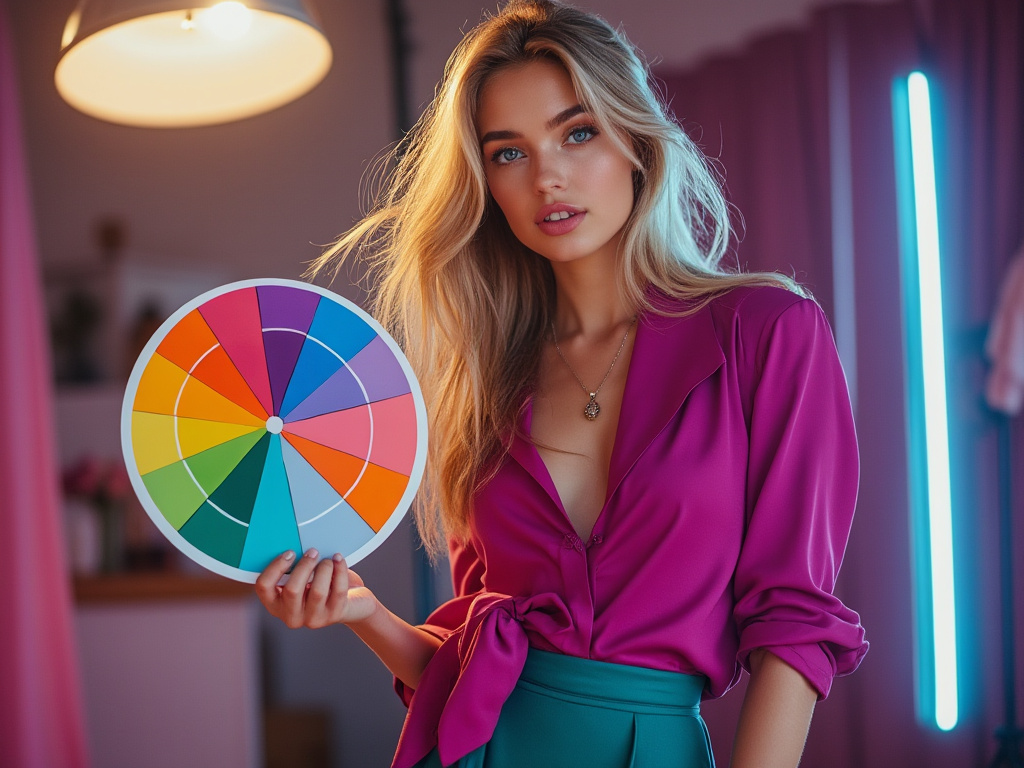
In this guide, we’ll explore how to create eye-catching looks that feel balanced, confident, and uniquely yours. We’ll delve into everything from choosing a base shade to layering patterns, playing with textures, embracing cultural influences, and even considering sustainable approaches. Whether you’re trying to refresh your everyday wardrobe or stepping into more adventurous territory, this comprehensive article will empower you to celebrate color and make it work for you.
1. Understanding Color Theory Basics
1.1 Primary, Secondary, and Tertiary Colors
Color theory starts with a basic roadmap. At its core, the color wheel consists of three primary colors—red, yellow, and blue. These cannot be made by mixing other hues. Combine two primary colors, and you get secondary colors: green (yellow + blue), orange (red + yellow), and purple (red + blue). Tertiary colors emerge when you blend a primary with a secondary, resulting in complex, nuanced hues like turquoise or vermilion. Understanding these fundamentals helps you see how colors naturally relate to one another.
1.2 The Color Wheel as Your Guide
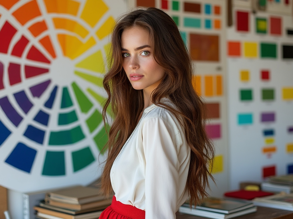
The color wheel acts as a reference tool to identify harmonious combinations. Adjacent colors (analogous) create a soothing, visually pleasing effect. Opposite colors (complementary) yield high contrast that can feel bold and energetic. The wheel is your map—use it to experiment and explore.
1.3 Warm vs. Cool Colors
Warm hues (reds, oranges, yellows) bring energy and vitality. Cool hues (blues, greens, purples) offer calmness and sophistication. Incorporating both warm and cool tones provides a sense of balance in your outfit. Think of a bright yellow blouse paired with cool navy trousers: instant harmony.
2. The Importance of Contrast
2.1 Complementary Colors
Complementary colors sit across from each other on the color wheel: think orange and blue, purple and yellow, red and green. They create sharp contrast that can make each color appear more vivid. To avoid overwhelming the eye, balance these combos by choosing one hue as the primary focus, while using the other more sparingly.
2.2 Contrast vs. Clashing
Not all contrasting colors clash. The key difference? Purpose and proportion. Clashing often happens when bold hues are combined without a unifying element. Introduce a neutral or a softer tone to bridge the gap. For example, if wearing fuchsia pants and a lime green top feels too intense, break it up with a white belt or neutral shoes.
2.3 Using Black and White as Anchors
Black and white pieces help anchor vibrant colors. A bright red skirt with a crisp white button-down shirt comes across as polished. Black can add depth, while white creates space and clarity within a colorful look. When in doubt, add black or white to maintain balance.
3. Choosing the Right Base Color
3.1 Neutrals as a Base
Neutral shades (white, beige, gray, navy, black) provide a clean slate for adding color. Start with a neutral foundation—say, a tan trench coat—and layer in bold accessories like a coral scarf or teal handbag. This approach makes experimenting less intimidating and ensures that the final result feels cohesive.
3.2 Going Bold with a Base
Alternatively, you can choose a bold base color to set the tone. A vibrant cobalt blazer or emerald dress can serve as the starting point, then you build around it with softer complementary hues. This method is perfect when you want a statement piece to be the star of your ensemble.
3.3 Seasonal Influences on Your Base
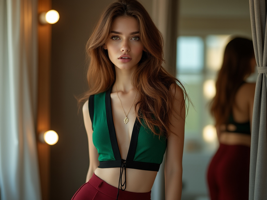
Seasonality often dictates our color choices. During spring and summer, lighter neutrals and bright accents feel fresh. In fall and winter, richer base colors like burgundy or deep olive set the stage for layered looks. Adapt your base depending on the time of year to ensure relevance and comfort.
4. Incorporating Accessories
4.1 Handbags as Color Accents
Your handbag is a small but impactful way to add a pop of color. If you’re wearing a muted outfit—say, all-black or a neutral two-piece—bring in a hot pink clutch or a vibrant yellow satchel. This simple trick creates interest without requiring a head-to-toe color commitment.
4.2 Scarves and Belts for Subtle Pops
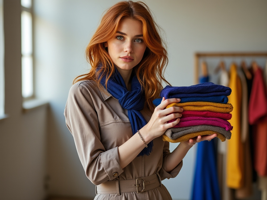
Scarves and belts are versatile accessories that can shift an outfit’s mood. Tie a bright patterned scarf around your neck, or cinch your waist with a bold belt. This technique is especially helpful when you want to test out a color trend or experiment with a hue you’re unsure about.
4.3 Jewelry and Minimalist Touches
Jewelry, from statement necklaces to colorful earrings, can highlight a hue in a subtle way. Even small details—like a turquoise ring or a red enamel bracelet—can tie together the colors in your outfit. These finishing touches hint at your personality without overpowering your look.
5. Playing with Patterns
5.1 Floral and Tropical Prints
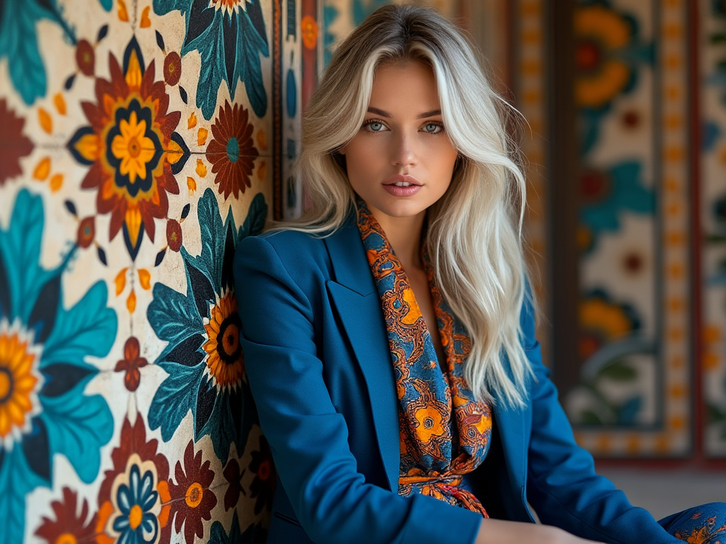
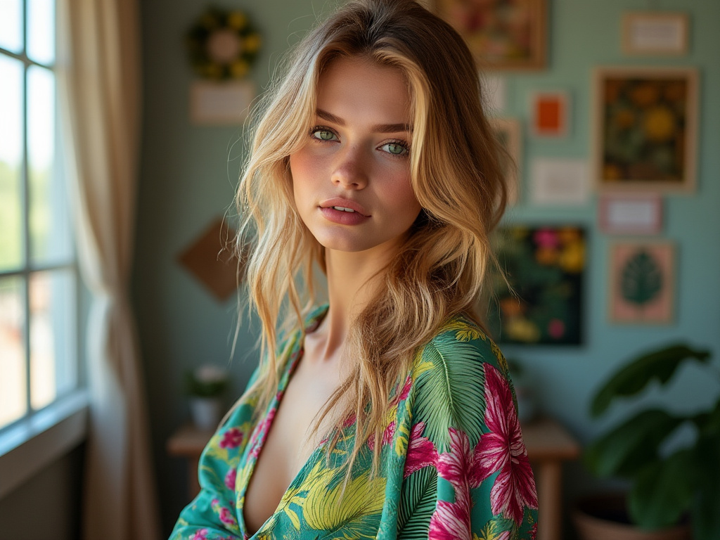
Floral and tropical patterns naturally mix multiple hues, making them a great starting point for learning how to blend colors. Pair a lush floral skirt with a top in one of the print’s accent colors. This creates unity and makes even the busiest patterns feel wearable.
5.2 Stripes and Checks as a Neutral Base
Striped and checked patterns, often considered “neutrals” in their own right, give a structured canvas for color play. A classic navy-and-white striped shirt can be paired with bright red pants or a green skirt, effortlessly merging boldness with timeless style.
5.3 Abstract and Geometric Prints
Abstract prints let you play with unexpected color combinations. Focus on one color in the pattern and highlight it in your accessories. If your geometric blouse contains burgundy, teal, and mustard, pick one—say teal—and wear teal shoes or carry a teal clutch to create a visual anchor.
6. Considering Fabric Textures
6.1 Velvet, Silk, and Satin
Luxe fabrics like velvet and silk intensify color depth, making hues appear richer and more luminous. A velvet emerald blazer or a silk magenta blouse enhances boldness. Pair these textures with simpler, matte fabrics for balance, ensuring the spotlight remains on the color.
6.2 Denim and Leather
Denim and leather, though often neutral in color (blues, blacks, browns), can contrast beautifully with bold shades. A bright sweater over jeans or a colored leather skirt with a neutral top creates interplay between texture and hue. The ruggedness of denim or leather underscores the vibrancy of the chosen color.
6.3 Lightweight vs. Heavyweight Fabrics
Mixing airy fabrics like chiffon or linen with heavier materials like tweed or wool can affect how colors appear. Light fabrics often reflect more light, making colors pop, while heavier fabrics absorb light, deepening hues. Consider fabric weight as part of your color strategy.
7. Balancing Color Intensity
7.1 Pastels and Neons
Pastels are soft and calming, while neons are bright and high-energy. Combining the two can be tricky, but it’s doable if you allow one to dominate. For example, pair a pastel pink blouse with neon-accented sneakers for a balanced, contemporary look that feels fresh, not frenetic.
7.2 Medium Tones for Everyday Wear
Mid-range tones (like mid-blue, rust, or olive green) are perfect for everyday outfits. They add color without feeling over-the-top. Start with a medium-toned piece and layer in slightly lighter or darker accents to create dimension and variety.
7.3 Jewel Tones for Elegance
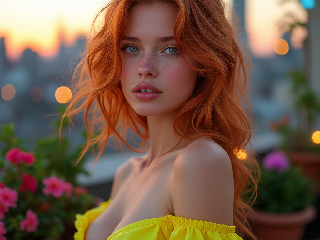
Jewel tones—think sapphire, ruby, emerald—offer rich, saturated color that elevates any look. Pair emerald trousers with a cream blouse and gold accessories for a luxurious feel. Jewel tones combine well with neutrals, metallics, and even each other if you keep the silhouettes simple.
8. Layering Techniques
8.1 Color-Blocked Layers
Color-blocking involves wearing solid pieces of different colors together. Think a cobalt skirt with a tomato-red blouse and a mustard cardigan. The key is to balance proportions and ensure the colors differ enough in tone that they don’t blend into one another.
8.2 Monochromatic Layering
Monochromatic outfits use variations of a single color to create a subtle yet impactful look. Wearing a spectrum of blues—from a pastel top to navy trousers—feels refined. Adding texture and pattern in the same color family adds interest without introducing new hues.
8.3 Ombre and Gradient Effects
Ombre pieces transition from one shade to another, giving you a built-in palette. Wear ombre dresses or tops and echo one of the shades in a coordinating accessory. This seamless flow of color allows you to embrace bold hues in a cohesive, effortless way.
9. Cultural Inspirations
9.1 Traditional Eastern Palettes
Many Eastern cultures incorporate bright colors with deep symbolism. Take inspiration from Indian saris, which often feature bold pinks, blues, and golds. Incorporate one or two colors into your Western wardrobe—like pairing a fuchsia top with gold earrings—for a global twist.
9.2 African Prints and Patterns
African textiles feature a wide array of vivid colors and intricate patterns. Drawing from these prints can push you out of your comfort zone. Consider using one statement piece—like a vibrant wax-print skirt—paired with a neutral top to let the colors and motifs shine.
9.3 Latin American Color Influences
Latin American style often celebrates bright hues—from Mexican embroidery to Brazilian carnival-inspired shades. A richly colored embroidered jacket or a pair of handwoven shoes can instantly lift a neutral outfit. These cultural influences bring storytelling and heritage into your wardrobe.
10. Dressing for Body Shape
10.1 Vertical Color Blocking
Strategically placed vertical color blocks can elongate your figure. Consider a dress with panels of contrasting colors running top to bottom. This not only adds visual interest but can also create a sleeker, leaner silhouette, especially if darker colors are placed along the sides.
10.2 Emphasizing Curves with Strategic Hues
Use brighter colors where you want attention. For instance, if you’re proud of your shoulders, wear a bright top with neutral bottoms. To highlight your waist, add a vibrant belt. This approach guides the eye and flatters your shape while showing off personality through color choice.
10.3 Minimizing Problem Areas
Darker colors recede, lighter colors advance. If you’re self-conscious about hips, choose deeper hues there and lighter hues above. This subtle color placement trick helps achieve a balanced proportion, making you feel more comfortable and confident.
11. Adapting to Different Occasions
11.1 Workplace Color Dos and Don’ts
In professional settings, bold color mixing needs finesse. Stick to deeper jewel tones or muted brights combined with neutrals. A burgundy blazer over a pale pink blouse, paired with black trousers, is bold but still work-appropriate. Avoid overly loud combinations that might distract from your professionalism.
11.2 Weekend Casual Color Play
Weekends are ideal for experimenting. Try pairing a lime-green sweater with rolled-up boyfriend jeans and red sandals. Embrace more playful combinations, and don’t worry about being too polished. This is the time to develop your personal color instincts.
11.3 Evening and Formal Events
For dinners and special events, embrace sophisticated color mixing. Metallics work beautifully with jewel tones, while subtle complementary colors can be layered in accessories. A navy gown with silver heels and emerald earrings creates a refined, memorable palette.
12. Seasonal Updates
12.1 Spring Pastels
In spring, nature’s blooms inspire softer colors—mint, lavender, pale peach. Mix these pastels to create airy, romantic looks. A mint blazer with a lilac skirt feels fresh and uplifting after a long winter.
12.2 Summer Brights
Summer calls for bold and bright hues. Citrus shades like lemon, lime, and tangerine feel sunny and energetic. Don’t hesitate to wear bold color-blocked dresses or neon accents. This is the time to turn up the saturation.
12.3 Fall and Winter Deep Hues
As cooler weather settles in, reach for earthy greens, burnt oranges, and deep reds. Combine them thoughtfully—an olive jacket, burgundy sweater, and mustard scarf create a warm, layered look that resonates with the season’s natural palette.
13. Sustainable and Ethical Choices
13.1 Recycled Fabrics and Eco-Friendly Dyes
Sustainability matters. Look for brands that use eco-friendly dyes and recycled materials. Beautiful color can be achieved responsibly. Knowing the story behind your clothes makes wearing bold hues feel even more special.
13.2 Supporting Fair-Trade Colors
Fair-trade practices ensure that artisans receive fair wages, and their traditional dyeing techniques remain preserved. Invest in hand-dyed garments from local cooperatives or global artisan groups. The colors you wear can reflect cultural heritage and ethical values.
13.3 Minimalism and Capsule Wardrobes
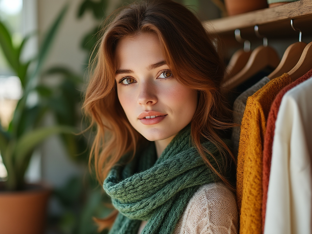
Colorful capsule wardrobes prove minimalism isn’t limited to black and white. Choose a handful of versatile pieces in a few complementary color families. This approach encourages creativity, as you learn to mix and match without excess consumption.
14. Personalizing Your Palette
14.1 Finding Your Signature Color
Maybe you always gravitate toward cobalt blue or vibrant coral. Embrace that color as your signature. Build outfits that highlight it in small or large doses. When you find a hue that makes you glow, it becomes a personal trademark.
14.2 Experimenting Fearlessly
Push boundaries. Try unexpected combinations—maybe burgundy with mustard, or teal with mustard-yellow pants. The more you experiment, the better your eye becomes at spotting what works. Sometimes, stepping out of your comfort zone leads to your best looks.
14.3 Evolving Over Time
Your color preferences will change as you do. Stay open to new influences, seasonal trends, and global palettes. Over time, your style will reflect your growth and experiences, turning your wardrobe into a dynamic, living expression of who you are.
Conclusion
Color is more than just decoration—it’s an emotional language that can shape how you feel and how the world sees you. When done well, mixing bold colors in fashion elevates your style from ordinary to extraordinary. By applying color theory, understanding contrast and harmony, and drawing inspiration from global cultures, you can craft vibrant outfits that reflect who you are.
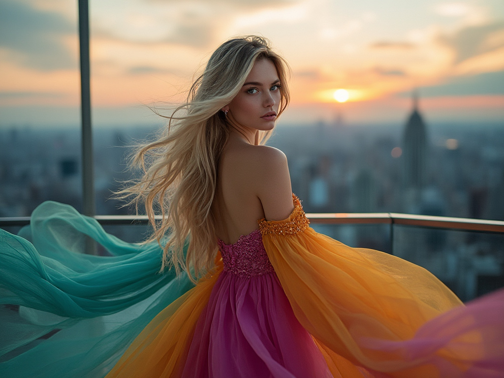
Remember, confidence is key. When you wear bold colors with intention and joy, you send a message that you’re comfortable in your own skin. So go ahead: mix that emerald blazer with the burnt-orange trousers, top it off with a patterned scarf, and let your wardrobe burst with life. Your style is a story—make it a colorful one.
Final Table: Color Harmonies and Their Best Uses
| Harmony Type | Examples of Color Combos | Best Used For |
|---|---|---|
| Complementary | Red & Green, Blue & Orange, Purple & Yellow | High-contrast outfits that stand out |
| Analogous | Blue & Green, Red & Orange, Purple & Pink | Smooth, harmonious looks with subtle flow |
| Monochromatic | Various shades of blue, pink, or green | Elegant, cohesive, and minimal ensembles |
| Accent with Neutral | Hot pink with white, mustard with beige | Grounding bold hues and maintaining balance |
| Jewel Tone Mixing | Emerald with Sapphire, Ruby with Amethyst | Luxurious, rich, and dressy appearances |
FAQ
Q: Is there a risk of looking too loud when mixing bold colors?
A: If you’re worried about going overboard, start by incorporating small pops of color against a neutral background. As you get more comfortable, you can gradually increase the amount of color until you find your personal comfort zone.
Q: How do I know which colors complement my skin tone?
A: Generally, warm skin tones glow with warm colors like coral, peach, and mustard. Cooler skin tones shine in blues, purples, and emeralds. Experiment with different shades to see which ones make you feel vibrant and confident.
Q: Can I mix more than two bold colors in one outfit?
A: Absolutely. The trick is to ensure they’re balanced. Let one color dominate and use the others as accents. Introduce a neutral piece to calm the overall look and prevent the outfit from becoming chaotic.
Q: What if I’m just starting to experiment with bold colors?
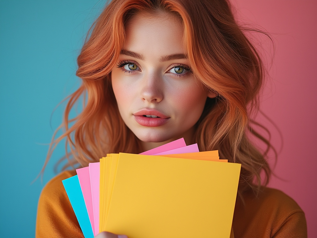
A: Begin with accessories—like a bold scarf or handbag—while keeping the rest of your outfit neutral. As you gain confidence, move on to larger pieces, like a colored blazer or bright trousers.
Q: Are there “rules” I must follow?
A: Fashion rules are guidelines, not laws. The more you understand them, the better you can break them creatively. Ultimately, confidence and personal expression matter most. If you love it, wear it.

Joanna Perez, with a degree in Creative Writing, excels in recommending distinctive clothing color mixes and trends that deeply connect with readers. She simplifies the often daunting task of color selection, making fashion decisions more personalized and impactful. Her passion for vibrant color palettes and the stories they tell makes her an indispensable voice in the fashion community.
Reviewed By: Marcella Raskin and Anna West
Edited By: Lenny Terra
Fact Checked By: Sam Goldman
Photos Taken or Curated By: Matthew Mansour
