Key Takeaways
- Pink can project soft elegance, yet it also brims with hidden passion.
- This color serves as a thoughtful bridge between calmness and energy, luring people in with balanced charm.
- Pink’s color symbolism varies across cultures, but it consistently channels warmth and authenticity.
- Designers and color marketing pros often rely on pink’s gentle aura to evoke trust and comfort.
- Its emotional impact can shape moods, transform spaces, and enhance brand identities without screaming for attention.

Introduction
Pink sometimes shows up in the corner of a room and quietly wins hearts. People may see it as a sweet pastel, but pink has multiple layers that deserve a closer look.
Did you ever stand in a store aisle, see a pink item, and think, “Why does this color calm me, yet also make me smile?” Perhaps you found pink a bit shy, or maybe you felt it was bolder than you first guessed. So odd, right?
In this blog post, we’ll explore pink’s essence. We’ll talk about its unique balance of softness and power. We’ll also reveal how color associations with pink help shape brand images, living spaces, and even our emotions. Pink fits in many domains—Color Branding, product design, interior layouts, and more.
Some folks might assume pink has no real identity beyond sweetness, but that’s not the truth. Pink wields a subtle depth that can shift how you feel, how you shop, and how you express yourself. Let’s dig into 14 sections where we’ll break down pink in a way you might never have read before.
A Glimpse Into Pink’s Symbolism and Personality
Pink stands out with a delicate fusion of resilience and vibrancy. Its surface often appears gentle, yet its spirit beams with sincerity and warmth. Many folks think pink conveys reliability, though it can also dance with subtle elegance and creativity.
Do you ever sense pink’s depth and understated passion? Some people do, and they appreciate how pink sparks calmness and optimism, though a faint mystery can also linger behind its pastel hues.
In many settings, pink showcases innovation and quiet sophistication. It never shouts, but it exudes a consistent energy—like a steady hum that soothes more than it overwhelms. You might see clarity in its softer shades, while deeper tints offer a sense of balance.
Pink’s sweet charm draws people’s eyes, and its gentle allure can feel almost authentic. Whether you’re looking for confidence, seeking a hint of wisdom, or craving a bit of spontaneity, pink can deliver—sometimes in ways no one anticipates.
At its core, pink cultivates a quiet tranquility mixed with dynamism. It’s a color that says, “I’m calm, but I can also spark you to move forward.” That’s its magic. In short, pink’s whole vibe sits at the crossroads of softness and strength, leaving plenty of space for anyone’s personal take on its meaning.
The Emotional Roots of Pink

The Calm Yet Vibrant Edge
Pink stirs up feelings of calmness in many cultures. Maybe you see pink flowers in a garden, and your breath slows.
This color invites peaceful vibes, yet its undercurrent can be surprisingly vibrant. Doesn’t that feel contradictory? Pink’s vibrancy lurks beneath a soft exterior, which often leads folks to see it as both gentle and lively.
That’s the magic behind Color Connotations for pink—softer than red, but still resonating with a warm energy that can energize the mind.
But wait, does it always sooth folks? Yes and no. Some days, pink’s quieter tone comforts. Another day, it might jolt you with its brightness. That small contradiction is key to pink’s character: it’s never fully one-dimensional.
A Little Bungle Here
Sometimes, a person might see pink and think it’s “kinda childish,” which can be a bit unfair. Pink can hold serious weight in Design Color Meanings—it’s not just frills and bows. If you pick a rich magenta or a deep rose, you’ll sense a calm-loud fusion that stirs hearts. Ain’t that a powerful surprise?
The Surprising Contrasts
Psychological color analysis suggests pink can create contrasts in mood and space. In Color Theory, pink often stands between red’s intensity and white’s brightness. So, it’s no wonder pink has an in-between identity. It’s pure but lively. This is the kind of emotional branding tool that companies harness when they want to appear both down-to-earth and spirited.
Have you ever walked into a pink-themed café? The environment feels cozy yet sociable. Pink’s presence can comfort you while also prompting you to chat longer with friends. That’s a testament to pink’s surprising ability to encourage calm conversation. It’s a color that hushes anxiety and invites friendly chitchat, though some folks still find it a bit too sweet for their taste. That’s their prerogative.
The Quiet Depth Within
Pink’s history in Cultural Color Meanings reveals another layer of depth. Western culture sometimes sees pink as playful or romantic, while in some Eastern contexts, pink can represent luck or positivity. These varied interpretations highlight pink’s ability to adapt across different settings. Pink can deliver softness, or it can stand for forward-thinking ideas.
Many colors and emotions share a dynamic interplay, but pink stands out with a sweet hush that leads you to reflect. It doesn’t push or demand. It gently nibbles at your mood. One might guess pink is always mild, yet it can also stir the soul. That’s the puzzle it sets forth: quietly pushing you to engage with its presence.
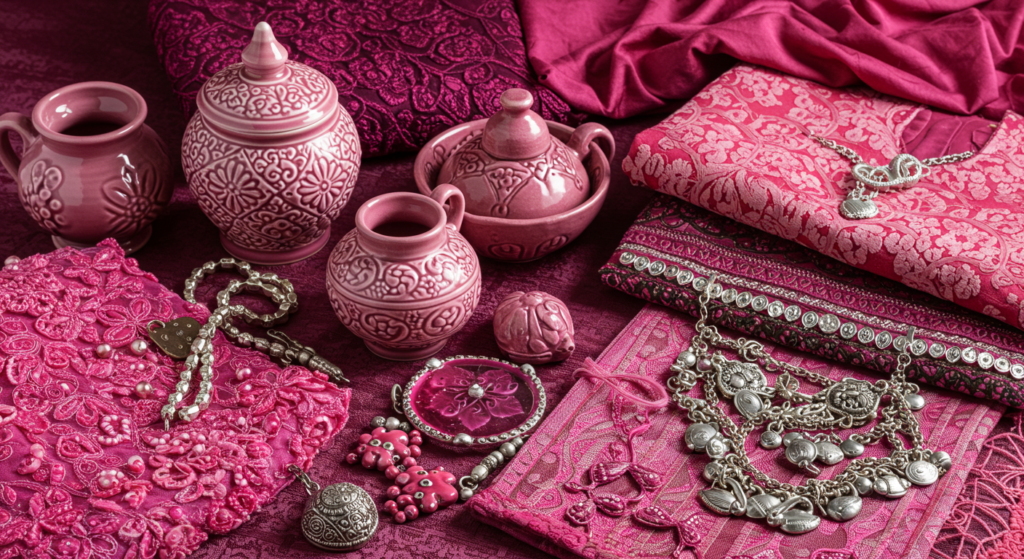
Pink in Cultural Color Meanings
Old Traditions and Pink
Ever wonder how pink was used centuries ago? In some old societies, pink showed up in religious art to mark a certain holiness or to represent youth. People liked its moderate warmth, though they didn’t always name it “pink.” Ancient artists had fewer color labels. They often blended red and white to create various tints they simply called “light red.”
Colors in Art carry layered stories. Pink, in some historical contexts, signified renewal. People associated it with dawn or budding flowers, connecting it with new beginnings. So, pink’s role was subtle, but it never fully hid.
A Modern Twist
In modern times, pink’s significance has exploded. If you watch design magazines, you see pink on everything from sneakers to phone cases. In many ways, pink reflects a certain bold statement: “I’m bright, but I’m also friendly.” This ties to Color Marketing strategies, where pink’s approachable vibe can connect with wide audiences.
Brands also adopt pink to highlight sweetness, softness, or compassion. Think of how certain pastry shops choose pink packaging. They want you to recall warm, tasty memories with a dash of inviting color. Meanwhile, tech companies sometimes mix pink into their brand palettes to add a playful or comforting edge.
The Pink Palette Across Nations
Cultural context shapes pink’s meaning. In Japan, pink is often linked to cherry blossoms, an important symbol of renewal and fleeting beauty. In the Middle East, pink can be used in decorative arts to add brightness without the boldness of red. Meanwhile, Western society sees pink as gentle, though that viewpoint is changing—shades like neon pink defy the old stereotypes.
Color Identity transcends borders, and pink’s global presence continues to expand. Each shade might carry its own identity, which fosters unique associations in various regions. Is there a universal color meaning for pink? Perhaps it’s warmth and a subtle push for new beginnings.
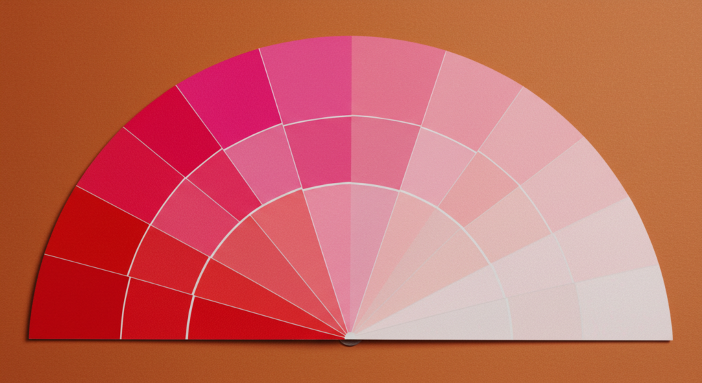
Pink’s Role in Color Theory
Balancing Opposing Tones
In Color Theory, pink rests between white and red. This vantage point allows pink to showcase multiple roles. It borrows red’s energy while white’s clarity tempers that fire. You get a balance that feels fresh, even to the eyes of a busy onlooker. Pink stands out, but it doesn’t overwhelm.
This balancing act explains why many Colors and Mood approaches see pink as the color of gentle reassurance. You might get a subtle spike of delight from pink, but that soon transitions into comfort. It’s a halfway point that fosters curiosity and calm.
Mixing Warm and Cool Elements
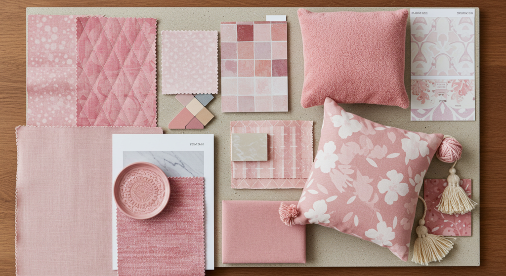
Pink can warm up a space, yet certain pinks carry a cool undertone. A dusty rose may feel more subdued and cozy, while a hot pink can look tangy and energetic. This makes pink a versatile choice for Interior Design Color Meanings. You can pick a hue that leans cooler for a sophisticated vibe, or pick a warmer pink for a welcoming environment.
Designers love pink’s ability to pair well with neutrals. A living room with gray walls and pink accents can radiate class without looking stiff. Meanwhile, pairing pink with more saturated colors—like teal or mustard—can create unexpected but harmonious contrasts. Is that approach bold? Sure, but pink can handle it, bridging warm and cool in a single stroke.
Pink’s Harmony in the Color Wheel
On the color wheel, pink belongs to the red family, yet it’s often treated as its own identity. Pink partners gracefully with complementary shades like green, but it also works with analogous shades like orange or purple. This versatility is one reason Universal Color Meanings place pink in a broad emotional range. People see it as supportive, romantic, friendly, or even modern, depending on which other colors stand by its side.
If you’re building a Color Palette for a brand or an art piece, pink can serve as a connector shade. Its ability to calm intense colors while still holding its own sets it apart. Pink doesn’t vanish, even when matched with bolder hues. Instead, it lifts them up by offering a gentle presence.
Pink and Emotional Color Meanings
Warm Comfort in Pink
When you see pink in a brand’s packaging, do you feel more relaxed? Pink often brings to mind welcoming spaces, cozy blankets, and sweet childhood memories. That’s not accidental. Many marketing professionals pick pink to signal a comfortable environment. This aligns with Color Impact in Design principles: certain colors put people at ease.
Pink stands at the intersection of kindness and approachability. It’s never too intense to scare someone off, but it’s not so dull that it fades into the background. If you’re trying to create a gentle mood, pink can be an easy go-to. Its warm comfort often transcends age groups and industries.
Subtle Softness Versus Bold Vibrancy
Pink can be soft, or it can be loud. Pastel pink soothes the eye, while electric pink dazzles you with a pop of energy. These extremes highlight Color Interpretations that revolve around pink’s layered personality. The soft version says, “I’m sweet and safe.” The bold version says, “I’m brave but still approachable.”
Even among the softer tones, you find nuance. A baby pink might feel airy, while a salmon pink leans more earthy. Each subtle shift can reshape your emotional reaction. That’s the fun of pink: it wields a wide range while remaining rooted in that same gentle vibe.
Enhancing Emotional Branding
For Emotional Branding, pink can add sincerity to a company’s image. Banks, hospitals, or service-based businesses might use pink to convey trustworthiness and care. It’s not just about cuteness; pink can signal emotional support. This ties in well with Visual Color Language, where colors speak to our feelings before words do.
If a brand wants to say, “We value empathy and calm,” pink is a safe choice. But it’s also flexible enough to say, “We’re bold and funky,” if they choose a neon shade. This duality helps brand managers use pink in campaigns that need both kindness and hype. Pink’s ability to shift from sweet to bold is a powerful asset in marketing.
The Science Behind Pink’s Influence
Psychological Effects of Pink
Scientific Studies on Color have often looked at pink’s effect on stress levels. A famed example is the “Baker-Miller Pink” test, where exposure to a certain bright pink shade supposedly lowered aggression in some settings. Though later findings questioned whether this effect lasts, many people still connect pink with soothing energy.
In Color Psychology Research, pink is sometimes grouped with other warm hues for its comforting traits. However, pink also shares some cool color traits, especially in pastel or dusty rose forms. It’s complicated! But that’s part of why pink continues to intrigue psychologists and designers alike.
Pink’s Impact on Mood Shifts
Many Color Influence on Behavior discussions reveal that pink can soften a person’s mood. People in a pink environment might unwind more easily. That doesn’t mean pink alone solves all tension, but it can help set a calm tone. This can prove handy in spa rooms or waiting areas. Pink might encourage a gentler environment.
Meanwhile, bolder pinks can encourage creative thinking. Some folks find a shocking pink can spark new ideas. Designers might use it in brainstorming corners, hoping to awaken playful energy. Pink’s range—soft to bold—helps shape emotional responses that shift between relaxation and excitement.
Subconscious Perceptions of Pink
Most of our color reactions happen beneath our conscious awareness. We see pink, and we instantly associate it with tenderness, romance, or sweetness. That’s the subconscious side of Color Perception. These automatic links might come from cultural signals or personal experiences. Regardless, pink tends to evoke a sense of comfort or gentle cheer, even if we don’t realize it.
If you want to harness pink’s potential, try to understand the cues your audience picks up. Are they used to seeing pink in playful contexts? Then your pink choice might trigger a nostalgic or positive reaction. But if they tie pink to something else, it might cause a different effect. Always consider that subconscious factor when using pink in marketing, art, or design.
Pink’s Role in Design Color Meanings
UI/UX and Pink
Websites and apps often feature pink in creative ways. A button might glow pink to signal a friendly call-to-action. A website’s background might add soft pink to bring warmth. In Design Color Meanings, pink can guide user behavior by evoking a sense of safety and approachability. People might be more likely to click a pink button if it feels gentle rather than alarming.
Why do so many subscription boxes use pink in their branding? Possibly because it stands out on a webpage but doesn’t feel aggressive. It’s an invitation rather than a demand. Pink fosters a sense of ease, reducing the friction a user might feel when taking an action. This technique is used frequently, even if you haven’t consciously noticed it.
Product Packaging and Pink
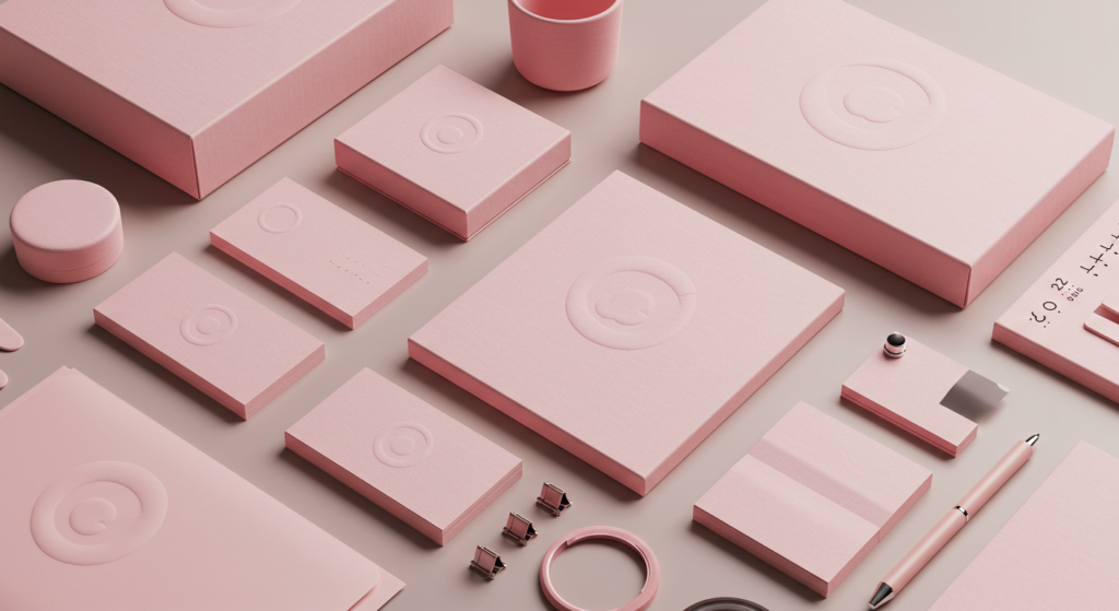
Many beauty and skincare products lean on pink because it implies caring and softness. Even high-tech gadgets sometimes arrive in pink packaging to stand out from the crowd of plain boxes. This aligns with Color Branding strategies, which recognize that pink can set products apart on a busy shelf.
Packaging designers know pink can evoke a sense of quality and comfort. A rosy blush on a box might hint at tenderness or luxury, depending on the brand’s overall look. It also pairs well with gold or silver accents, creating a refined aesthetic. That’s not just for show; it’s about shaping the consumer’s perception before they even open the box.
Interior Spaces and Pink Accents
In interior design, pink can transform a space. A pink accent wall can brighten a room without the intense energy of red. Pink furniture pieces, such as a pastel couch or plush rug, add a cozy vibe. If you combine pink with neutral tones like gray or beige, you create an environment that feels both modern and warm.
The key is balance. Overdo it, and a room might look overly sweet or juvenile. Use it sparingly, and pink can highlight architectural elements or produce a soothing corner. Colors and Mood experts note that pink’s effect in interiors often revolves around relaxation. It’s a popular choice in bedrooms, reading nooks, and lounge areas because of its gentle invitation to rest.
Using Pink to Shape Brand Identity
Pink for Trust and Care
Color Branding research indicates that pink can express empathy, making it a strong choice for charities or healthcare campaigns. When people see pink ribbons, for instance, they think of support and awareness. Pink has the power to unify communities around meaningful causes. That’s because pink quietly whispers, “We care about you.”
For businesses that want a welcoming persona, pink can set the stage. Pair it with navy or charcoal for balance. This approach says, “We’re refined but approachable.” Pink’s an anchor that draws attention while still feeling gentle. It’s a neat trick many brands use to become more human.
Standing Out in a Crowded Market
Brands fight for recognition, and pink can help them stand out. A pop of pink on a website or an ad can stop scrollers mid-swipe. In a sea of blue or black logos, pink disrupts the norm without shouting. This subtle disruption can intrigue potential customers.
Whether a company sells clothing, software, or organic snacks, pink can be the color that helps them remain top-of-mind. It’s distinct enough to be memorable yet not so loud as to alienate. The brand can pick a pastel or a bold fuchsia, each telling a slightly different story. Either way, pink remains a conversation starter.
Innovative Product Lines With Pink
Forward-thinking companies often use pink to signal newness. For instance, a cutting-edge device might launch in a rose gold or hot pink color option. That’s not simply about aesthetics; it’s also about brand identity. Pink implies innovation with a warm face. People get excited about something futuristic that also feels friendly.
In Color Trends, pink emerges every few years in fresh forms—millennial pink, rose gold, neon pink, and so on. Each wave breathes new life into product lines, tapping into pink’s versatile identity. Marketers see pink as a color that crosses demographics, from kids to adults who appreciate a twist on the usual black or silver gadgets.
Pink in Art and Creative Expression
Symbolic Colors on Canvas
Artists have long used pink to convey nuanced emotions. From romantic scenes to abstract forms, pink can represent tenderness or hidden intensity. It provides an alternative to red’s fiery tone, offering a calmer route to express love or desire. Colors in Art rely heavily on pink’s subtlety when a gentle approach is preferred.
Some artists incorporate pink to balance darker hues, using it as a focal highlight. Others paint entire pieces in variations of pink, creating an immersive sense of calm. Pink’s symbolic meaning can differ by the artist’s culture or personal style. But in nearly all cases, pink evokes a sense of layered beauty.
Performance and Stage Design
Stage designers use pink lighting to soften a set’s atmosphere. In theatrical Color Storytelling, pink can highlight innocence or vulnerability. It can also paint a dreamlike mood, especially when combined with other pastel lighting. Pink draws out the emotional side of a performance in a subtle but impactful way.
Because pink stands out without overpowering, it works well for transitions. A shift to pink lighting can signal a change in mood or setting. Directors might use pink to hint at romance or nostalgia. Audiences often pick up on these cues without noticing. Pink acts as a quiet narrator, guiding the emotional flow.
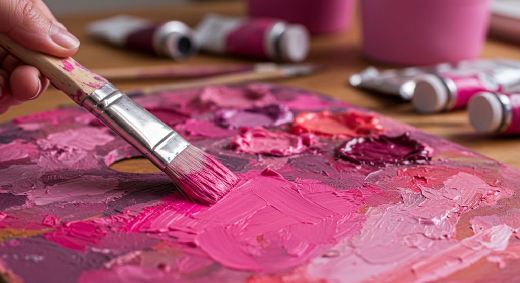
Crafting Personal Art at Home
You don’t have to be a pro to experiment with pink. Whether you enjoy sketching, painting, or digital design, pink can be your gentle companion. Try mixing it with bolder hues, or use it alone in varying shades. Watch how the vibe shifts as you tweak your pink palette. It might take a few tries, but pink’s forgiving nature welcomes experimentation.
Artists aiming for a mild effect might choose blush or pastel pink. Those who crave a vivid statement might choose magenta or fuchsia. Each shade conveys a distinct energy, though they all remain connected under pink’s broad umbrella. Have you tried layering pink on a black background? That surprising pop can spark an entire new direction in your work.
Pink in Everyday Fashion
Subtle Pop in Outfits
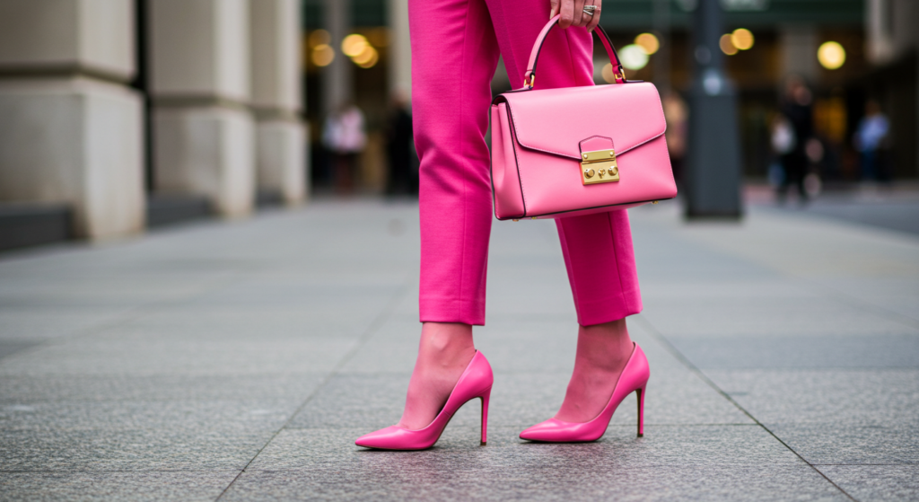
Pink can spice up outfits in small doses. A pink scarf or belt adds a flash of color to neutral clothing. That single accessory can shift an outfit’s entire mood. This Color Connotation of warmth and approachability helps you appear more open or friendly. Even a pink watch strap can catch the eye and generate compliments.
From Pastel to Neon
Pink’s range in fashion is wide. Pastels project innocence and softness, while neon pink screams energy. People who enjoy contrasts might pair pink with dark leather for an edgy vibe. Or they might combine neon pink with bold prints for a festival look. Pink is flexible—almost any style can find a pink that matches its tone.
Whether you’re going to a casual dinner or a fancy event, pink fits right in. A pastel pink blazer can be surprisingly versatile, blending with chinos or jeans. Neon pink workout gear can motivate you at the gym, thanks to that subtle color-based energy. Pink basically says, “I’m here, and I’m confident enough to wear something bright.”
Pink as a Unisex Option
While some folks still link pink with stereotypes, more people see pink as a unisex color. This is partly because pink’s connotations extend beyond traditional roles. A pink shirt can look strong and stylish on anyone. The color’s softness might actually add a surprising cool factor.
In Color Identity terms, pink stands out in a crowd that might otherwise stick to black or navy. Wearing pink can demonstrate a personal brand of creativity and openness. People often associate pink with positivity, so donning pink can broadcast an easygoing charm. If you wonder whether pink might not suit you, why not experiment? You might be pleasantly startled by the effect.
Harnessing Pink in Marketing Campaigns
Targeted Ad Campaigns
Marketing experts turn to pink for targeted ads when they want to evoke feelings of warmth or encouragement. A baby product campaign might lean on pastel pink to exude safety and gentleness. A cosmetics line might choose hot pink for a bold entrance. In Color Marketing, pink stands as a reliable tool that can vary in intensity.
One key strategy is pairing pink with strong copy that emphasizes compassion or self-care. Audiences often respond to that synergy, forging a tight bond between brand message and color choice. Pink’s capacity to blend caring vibes with excitement is a sweet spot for advertisers.
Social Media Branding
On platforms like Instagram or TikTok, pink backgrounds or text overlays catch attention. Scrolling users might pause because pink feels fresh amid the usual black and white. It’s no coincidence that pink-themed feeds gain traction. The color invites likes, shares, and clicks. People sense a cozy positivity, leading them to engage more often.
Hashtags referencing pink often flourish, bridging Color Narratives across social media. Influencers leverage pink backdrops to highlight products or share personal stories, though we won’t delve into personal experiences here. Suffice to say, pink acts like a gentle magnet online, pulling viewers in without harshness.
Public Events and Promotions
Companies that host events use pink banners or balloons to create a friendly environment. Pink décor can temper the chaos of a busy expo hall, transforming it into a more inviting space. It’s not unusual to see pink combined with other vibrant hues, creating a carnival-like atmosphere. People might feel more relaxed, thus more open to the brand’s messaging.
If you host a big promotion, pink can help your signage stand out. Pair pink text with a white or gray background for easy readability. That approach merges clarity with gentle energy, ensuring passersby notice your message without feeling overwhelmed. Pink serves as a perfect midpoint between bright invitation and subtle charm.
Pink Trends Across Generations
Millennial Pink and Beyond
A few years back, “millennial pink” exploded. You saw it on clothes, décor, tech accessories—everywhere. This dusty, muted pink appealed to many because it felt modern yet gentle. Some folks might say it’s overdone now. Still, that wave proved that pink could define an era’s style. Since then, new variations of pink keep emerging, from rose gold to neon magenta.
Trends come and go, but pink remains relevant. It gets reimagined every few years, which is why Color Trends watchers track its evolution. Pink’s staying power suggests we’ll see new spins on it. Perhaps you’ll see a new “vapor pink” or “retro pink” soon. The color continues to pivot with cultural shifts, always retaining its core softness.
Pink’s Appeal to Different Ages
Pink’s reach isn’t limited to kids or teens. Older adults also embrace pink, especially in subdued tones like dusty rose or muted coral. These shades convey grace and comfort without being too loud. Meanwhile, younger audiences might gravitate to hot pink or bubblegum shades for a playful flair.
In Color Psychology, pink doesn’t discriminate by age. Its emotional cues—warmth, ease, care—resonate with anyone. The shade you choose will define the vibe. Pastel pink for a nurturing setting, or neon pink for an energetic environment. Every generation finds its own pink that speaks to them.
Cultural Shifts in Pink’s Meaning
Across decades, pink’s meaning changed with cultural views. In the 1950s, pink soared in popularity for fashion and home décor. Later, it took on connotations of sweetness or romance. Today, it’s drifting into new territory, symbolizing independence or rebellious softness in some contexts. People keep reshaping pink’s identity to match the times.
This evolution shows pink’s surprising flexibility. It remains tied to tenderness, but it has expanded to include edginess. It can be rebellious, calm, playful, or even futuristic. That’s why it never fades away—it keeps adapting. Pink’s story continues, woven through shifting generational tastes.
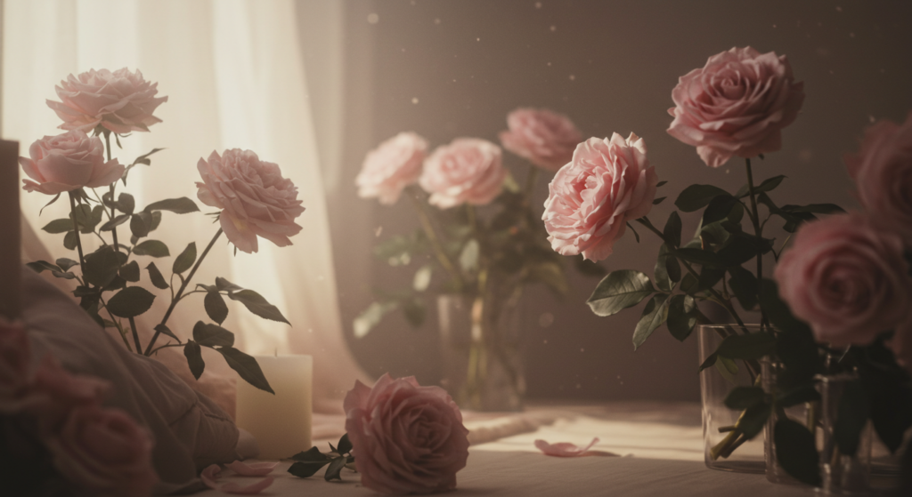
Pink in Nature’s Color Meanings
Pink in Flowers and Plants
Look at a pink rose or a blooming pink lotus. These flowers remind us that nature’s pink often signals renewal or affection. Their petals exude softness, yet they stand confidently against green foliage. Nature’s Color Meanings revolve around pink’s role as a beacon of delicate life. It’s vibrant without overshadowing the rest of the landscape.
Flowers like pink peonies, magnolias, or hibiscus each carry distinct cultural symbolism. Yet all share that blush hue evoking grace. People cherish pink flowers as gifts that express gentle love or kind support. When you see a pink garden, it invites you to stop and admire. That’s the effect of pink in nature—peaceful, quiet, but captivating.
Dawn’s Pink Skies
Pink in the sky signals the day’s soft start or gentle close. A sunrise that glows pink can spark hope, while a pink sunset soothes the mind after a long day. This ephemeral pink speaks to the fleeting nature of life’s lovely moments. People marvel at the pastel hues, snapping photos to capture the mood.
It’s no wonder many cultures link pink skies with optimism or reflection. Something about pink’s delicate presence in the atmosphere can hush your worries. When you see pink dawn, you might feel energized. When you see pink dusk, you might feel calm. This dual effect mirrors pink’s broader identity.
Pink Creatures in the Wild
From flamingos to certain fish or insects, pink stands out in the wild. These creatures flaunt pink plumage or shells, hinting at their unique traits. Think about flamingos, wading elegantly in shallow waters. Their pink color emerges from their diet, but it also positions them as icons of relaxed grace. People adore them for that playful, lazy beauty.
This natural Color Palette Meaning suggests pink isn’t just decorative. It can be a signal of health or maturity, at least in some animal species. Pink’s presence in nature also ties it to ideas of nurturing or positivity. When we spot a pink flower or creature, it can trigger a moment of wonder, reminding us how color shapes the environment around us.
Tapping Into Pink for Personal Spaces
Decorating Bedrooms
Pink in a bedroom can deliver serenity. Lighter shades on the walls or bedding create a soft glow. If you add a few pink throw pillows, you keep the vibe calm yet inviting. This resonates with Interior Design Color Meanings that highlight how pink fosters relaxation. A pop of pink in curtains or artwork can unify the space.
Be mindful of your color mix, though. Pairing pink with too much white might feel sterile, while pink with black might feel dramatic. If you want to keep it balanced, try neutrals like beige or gray. That approach yields a restful atmosphere without an overdose of sweetness.
Home Office Warmth
Working from home can be stressful. Pink’s subtle energy helps reduce tension. A pink accent wall or pink décor items can make your workspace feel less rigid. This color fosters friendly vibes, which might boost creativity or keep you from feeling drained. The exact shade matters, though—hot pink might spark excitement, whereas dusty pink might help you focus.
Color Impact in Design suggests that soft pink can support productivity by lowering anxiety. If you find yourself feeling restless, try adding pink elements. They can range from a pink desk lamp to a pink mouse pad. These small touches might change your day more than you expect.
The Joy of Pink Corners
If you don’t want an all-pink room, you can still create a pink corner. Place a pink chair with a matching rug in one spot, forming a reading nook. Let the rest of the space remain neutral. That small pocket of pink can become your cozy retreat. You might notice how you’re drawn to that corner whenever you seek peace or a quick mental break.
Pink corners can also serve as conversation spots if you have guests. People often find pink corners approachable, so they gravitate there. This phenomenon ties back to Color Associations: pink signals comfort and warmth. Your guests might stay longer, chat more, and feel at ease in that little pink alcove.
Pink and Its Connection to Mood Management
Soothing Stress
Do you ever wonder if pink can calm a racing mind? Some data from Psychological Color Analysis suggests that pink can reduce tension for some individuals, especially when it’s a softer tone. If you stare at a gentle pink for a few minutes, your breathing might slow. The same effect might not occur for everyone, but there’s anecdotal evidence it helps many people.
In stressful settings, pink can act like a visual diffuser. It’s not a miracle cure. But a pink environment might encourage more tranquil conversation and less agitation. If you run a counseling center or meditation room, a pink accent wall might nudge participants toward calm reflection.
Encouraging a Sense of Optimism
In mood management, pink offers a gentle nudge toward positivity. It’s not as attention-grabbing as bright yellow, but it can still lift spirits. Think about how you feel when you see a pink greeting card or pink wallpaper. There’s a subtle optimism that creeps in, often linked to happy memories or cheerful events.
That positivity extends to how we interpret pink in everyday contexts. Pink clothing might remind someone of a pleasant day. Pink décor might hint at fun gatherings or personal achievements. While it may not cure a bad day, pink’s presence can lighten the emotional load for a moment.
Mental Well-Being and Color Environments
Experts in Interior Design Color Meanings have long recognized that environment affects mental health. Pink’s capacity to reduce aggression has been cited in certain studies, though not all are conclusive. Still, the general consensus is that pink spaces often appear more soothing. People linger longer in pink-themed areas, likely because it feels safe.
If you’re designing a therapy room or a child’s play area, pink might be a wise choice. Keep the shade balanced—too bright might overstimulate, too dull might bore. Finding that sweet spot can yield a space where people feel free to breathe and express themselves. Pink’s potential for emotional harmony is a valuable asset in creating supportive environments.
Conclusion
Pink blends soft elegance with gentle power. It can be quiet and sweet, or it can burst with confident energy. We’ve walked through pink’s cultural resonance, its role in Color Psychology, Color Symbolism, and how it shapes brand identities, personal spaces, and even moods. Pink is more than a color for dainty items; it’s a color that has proven its emotional depth time and again.
Have you gained a fresh perspective on pink? Maybe you spotted ways to integrate pink into your living room or marketing plan. Perhaps you realized pink can represent subtle warmth, unwavering sincerity, or even daring flamboyance. It’s that wide range of possibilities that helps pink stand out among other hues. Pink is like a friend who can be gentle or spunky, depending on the occasion.
In the end, pink’s real charm lies in its flexibility. It molds to cultural contexts, brand images, and personal preferences. From the softness of pastel to the drama of magenta, pink stands ready to add a heartfelt glow wherever it’s used. That’s the meaning of soft elegance uncovered.
Summary Table
| Aspect | Pink’s Role or Effect |
|---|---|
| Symbolism & Personality | Balances warmth with subtle depth; fosters calm yet vibrant energy. |
| Cultural Meanings | Shifts across regions: renewal, tenderness, luck, or playful modern vibe. |
| Color Theory Position | Sits between white’s clarity and red’s passion, merging calm and spark. |
| Emotional Impact | Encourages comfort, eases tension, can spark gentle optimism. |
| Marketing & Branding | Adds trust, compassion, or eye-catching flair; stands out in crowded fields. |
| Interior Design | Softens spaces, calms moods, pairs well with neutrals and certain bold tones. |
| Fashion & Style | From pastel to neon, suits varied looks; unisex appeal grows. |
| Nature’s Lessons | Found in flowers, sunsets, animals; signals renewal and delicate beauty. |
| Mood Management | Potentially lowers aggression, fosters calm discussion or introspection. |
FAQ
Q1: Is pink really a soothing color or is that just a myth?
Pink often acts as a soothing color, especially in softer tones. Some research suggests that people can feel calmer in pink environments. This may vary by individual, but many find pink’s gentle quality calming.
Q2: Does pink only work for feminine brands?
No. Color Branding professionals say pink can suit a wide range of brands if used thoughtfully. It conveys warmth, care, and sometimes boldness. Many companies now adopt pink to stand out in tech, sports, and beyond.
Q3: How do I choose the right shade of pink for my home?
Look at the purpose of the room. Softer pink might help relaxation in a bedroom, while a brighter pink can energize a workspace. Test paint swatches in different lighting to find a tone that feels good to you.
Q4: Which colors pair best with pink?
Pink complements neutrals like gray, beige, or white. It also pairs well with complementary shades such as green, or analogous colors like coral and purple. You can experiment with vibrant combos, too, like pink with mustard or teal.
Q5: Are there cultural differences in pink’s symbolism?
Yes, definitely. In some cultures, pink signifies good fortune or renewal, while in others it represents romance or tenderness. It helps to research regional Color Symbolism if you’re designing for an international audience.
Q6: Can pink affect productivity in an office setting?
It can. Soft pink can calm tension, which may help people focus. For tasks that need creativity, a brighter pink could spark energy. Your shade choice should fit the mood you want in that office environment.
Q7: Will a pink brand logo appeal to all ages?
There’s no universal guarantee, but pink’s broad range often resonates with many age groups. Each tint or hue can speak to a different demographic. Keep your brand personality in mind when selecting the shade.
Q8: Can pink help relieve stress?
Some individuals feel less stressed in pink spaces. Researchers debate how long-lasting that effect is, but anecdotal evidence suggests pink’s gentle aura contributes to a more relaxed setting. Give it a shot and see if it works for you.
Q9: Does pink fade quickly in outdoor settings or signs?
That depends on the type of paint or fabric. High-quality materials with UV protection can maintain pink’s vibrancy outdoors. Lower-quality materials might fade faster under bright sun, so always choose weather-resistant options.
Q10: Can I mix pink with other warm colors like red or orange?
You can, but do so thoughtfully. Red might clash with certain pink tones, while pink and coral or a light orange can look unified. If you choose bolder combos, balance them with neutral accents so they don’t overwhelm.
Q11: What is Baker-Miller Pink?
It’s a specific bright pink shade once believed to reduce aggression in confined spaces. Some Scientific Studies on Color questioned its long-term impact, but the color is still famous for its calming claims.
Q12: Does pink help me sleep better if I paint my bedroom walls that color?
Some people find a pale pink wall soothing, which might help with relaxation before bed. However, everyone’s response differs. If pink helps you unwind, that could support better sleep.
Q13: Are neon pinks too harsh for interior design?
Neon pink can be intense. If you love it, use it as an accent—like a statement wall or a few pillows—so it doesn’t overpower the room. Pair it with cooler tones to offset the brightness.
Q14: Is pink a trend that will go away soon?
Pink has shown enduring appeal by evolving through different shades and cultural interpretations. Even if a particular pink trend fades, another pink will likely emerge. It’s more of a color mainstay than a passing fad.
Q15: Does pink have any effect on appetite or food choices?
Some folks claim pink can enhance dessert or sweet cravings, though evidence is mostly anecdotal. However, pink décor in a bakery or café may feel inviting, encouraging people to linger and order more treats.
Thanks for exploring pink’s multi-faceted charm. This color’s quiet depth and gentle power continue to surprise enthusiasts across design, fashion, and branding. May you find new ways to incorporate pink’s soft elegance into your life—or your next big project. Keep an open mind, and pink may just transform how you see the meaning of colors around you.

Neha Z. is not just any writer; she’s a storyteller who has graced the online world with her evocative prose for over half a decade. Venturing into the intricate nuances of women’s lives, she weaves stories that range from life’s highs and lows to the multifaceted essence of femininity. Each piece she pens radiates sincerity and artistry. As you delve into Neha’s musings, you’ll find reflections that echo your own journey and insights that inspire. Immerse yourself in her world, and let her stories touch your heart.
Reviewed By: Joanna Perez and Anna West
Edited By: Lenny Terra
Fact Checked By: Matthew Mansour
Photos Taken or Curated By: Matthew Mansour