- The Regency era (1811–1820) introduced a revolutionary shift toward soft, refined pastel colors in fashion and interior design
- Pale pink, powder blue, soft cream, and delicate lavender became symbols of elegance and social status during this period
- The influence of Neoclassical aesthetics drove the preference for lighter, more ethereal color palettes
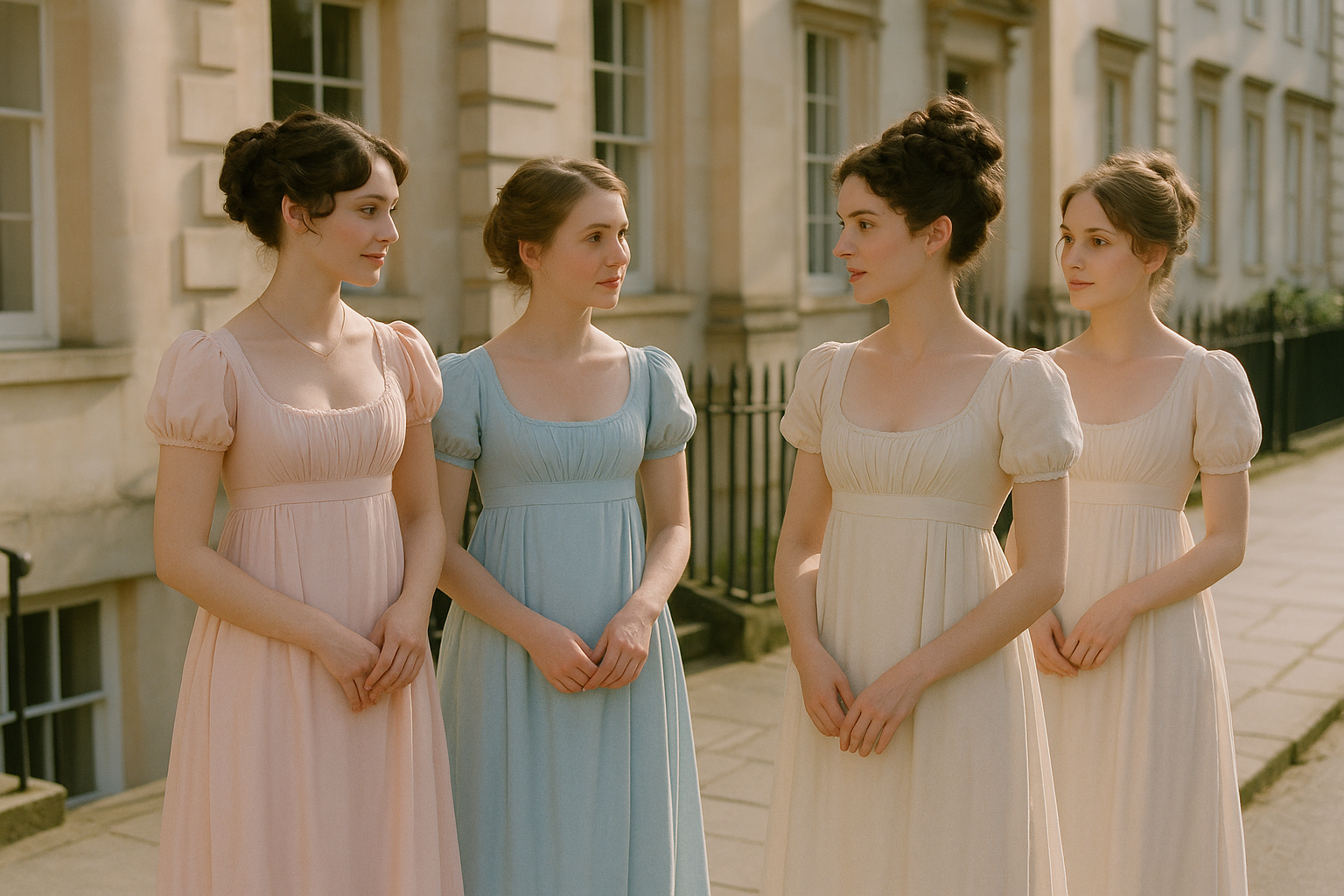
- White muslin dresses with pastel accents became the defining silhouette of Regency fashion
- Natural dyes from plants and minerals created the subtle, muted tones characteristic of the era
- Regency color choices reflected both practical considerations and philosophical ideals about beauty and nature
- The pastel palette of this era continues to influence modern fashion, interior design, and wedding aesthetics
- Understanding Regency colors helps decode the social messaging embedded in historical dress and décor
The Regency era stands as one of the most visually distinctive periods in fashion history, marked by an elegant restraint that transformed how people thought about color in clothing and interiors. Spanning roughly from 1811 to 1820—though its influence extended well beyond these dates—this era rejected the heavy brocades and vibrant satins of the Georgian period in favor of something altogether more refined: a palette of soft pastels that whispered rather than shouted. These gentle hues—pale pink, powder blue, buttery yellow, and the softest greens—weren’t merely aesthetic choices but reflections of a cultural moment that prized classical ideals, natural beauty, and a particular vision of feminine grace that still captivates us today.
The Historical Context of Regency Color Preferences
Understanding why the Regency era embraced pastels requires examining the broader cultural and political landscape of early nineteenth-century Britain. The period was defined by significant upheaval—the Napoleonic Wars, the regency of George IV due to his father’s illness, and rapid social changes that challenged traditional hierarchies. Against this backdrop, fashion became a way to signal stability, refinement, and adherence to classical ideals that seemed to promise a more ordered world.
The Influence of Neoclassicism on Color Choices
The excavations at Pompeii and Herculaneum in the mid-eighteenth century sparked a fascination with ancient Greece and Rome that profoundly shaped Regency aesthetics. Architects, artists, and fashion designers looked to classical antiquity for inspiration, imagining a world of marble columns and flowing white robes. While ancient Greeks and Romans actually wore quite vibrant colors, the weathered statues and ruins Europeans encountered appeared white, leading to a cultural assumption that classical beauty was inherently pale and restrained.
This misunderstanding proved culturally productive, inspiring a fashion revolution that emphasized clean lines, high waistlines, and colors that evoked the supposed simplicity of the ancient world. The empire-line dresses that became synonymous with Regency fashion—with their high waists sitting just below the bust—were designed to flow like the chitons of Greek goddesses, and the pale colors chosen to accompany these silhouettes reinforced the classical illusion. White became the foundation, but soft pastels provided subtle variations that allowed for personal expression within the boundaries of good taste.
Social Signaling Through Subtle Hues
In Regency society, color choices communicated volumes about a person’s wealth, taste, and social position. The ability to wear pale, delicate colors signaled that one didn’t need to work—these were impractical shades that showed every mark and required frequent replacement. White muslin, in particular, was almost impossibly difficult to keep clean, making its widespread adoption among the upper classes a deliberate display of leisure and domestic resources.
Pastels extended this logic while allowing for more variety. A young woman in a soft pink gown demonstrated both her family’s means and her own modesty and refinement. Brighter colors were associated with lower classes or with women of questionable reputation, while the most muted, sophisticated pastels indicated the highest levels of taste and breeding. This color coding was so well understood that Jane Austen’s novels, set during this period, frequently use dress colors to characterize their wearers without explicit commentary.
The Practical Realities of Regency Dyes
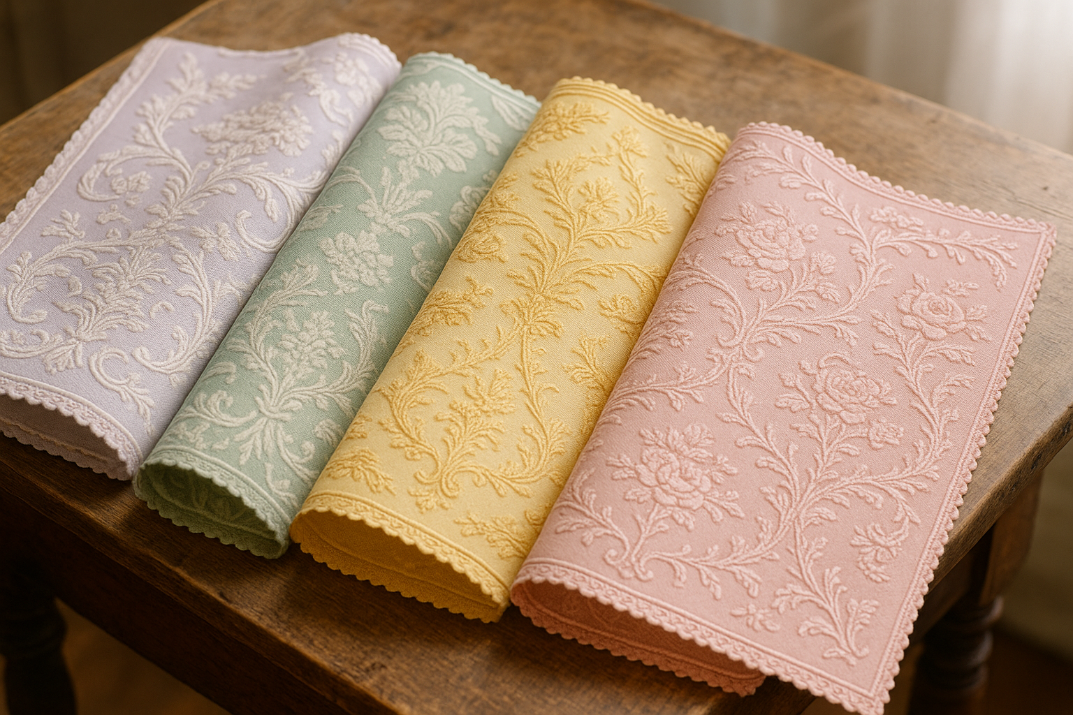
The pastel palette of the Regency era wasn’t purely a matter of aesthetic choice—it also reflected the technological limitations and possibilities of natural dyeing. Before the invention of synthetic dyes in the mid-nineteenth century, all colors came from plants, minerals, insects, or shellfish, and achieving consistent, vibrant hues was both difficult and expensive. Pastel shades, created by using smaller amounts of dye or by repeated washing that faded the color, were actually easier to produce than intense saturated tones.
Common dye sources included indigo for blues, madder root for pinks and reds, weld for yellows, and various combinations for greens and purples. The soft, slightly varied quality of natural dyes gave Regency fabrics a depth and subtlety that synthetic colors often lack—each piece of fabric had its own unique character, and colors shifted beautifully in different lights. This organic quality contributed to the romantic appeal of Regency dress and is one reason why modern recreations using synthetic dyes often fail to capture the authentic look of the period.
The Core Pastel Palette of the Regency Era
While the Regency palette encompassed a range of subtle hues, certain colors appeared with particular frequency and carried specific associations. Understanding these core colors provides insight into the visual language of the period and helps explain why certain combinations remain timeless today.
White and Cream: The Foundation of Regency Style
White muslin formed the backbone of Regency women’s fashion, particularly for day wear and young unmarried women. The fabric’s light weight and translucency created the flowing silhouettes that defined the era, while its pale color evoked classical purity. However, pure white was relatively rare—most “white” garments were actually closer to ivory, cream, or ecru, natural shades that resulted from undyed or minimally processed fabrics.
These warm off-whites proved more flattering to most skin tones than stark white and were slightly more practical, as they didn’t show minor discoloration as readily. The subtle variations between different white fabrics—cotton muslin, silk, and fine wool—created visual interest through texture rather than color, a sophisticated approach that allowed accessories and trim to provide accents without competing elements.
Pale Pink: The Color of Youthful Femininity
Pink occupied a special place in the Regency palette, associated with youth, innocence, and romantic possibility. Unlike the saturated pinks of later Victorian fashion, Regency pinks were decidedly soft—think blush, rose water, or the inside of a seashell. These gentle hues were considered appropriate for young women making their debuts in society, signaling their marriageable status while maintaining modest restraint.
The specific shade of pink a woman wore could communicate subtle information about her circumstances. Very pale pinks suited the youngest debutantes, while slightly deeper rose tones were appropriate for women in their early twenties. After marriage, women typically moved away from pink toward more mature colors, though pale rose remained acceptable for informal occasions. The color’s association with romance made it popular for ball gowns and evening wear, where the soft hue glowed beautifully by candlelight.
Powder Blue: Serene Elegance
Pale blue held associations with the sky, with water, and with the Virgin Mary, giving it connotations of purity, peace, and spiritual refinement. In Regency fashion, powder blue appeared frequently in both clothing and accessories, often paired with white or cream for a fresh, clean aesthetic. The color was considered flattering to blonde and light-haired women while providing elegant contrast for those with darker coloring.
Blue dyes, derived primarily from indigo, were among the most stable and reliable of natural colorants, which contributed to the color’s popularity. Unlike some other natural dyes that faded unpredictably, indigo-based blues aged gracefully, making them a practical choice for garments that needed to last. The various shades of pale blue available—from almost lavender tints to greenish aquas—allowed for considerable variety within the constraints of the pastel palette.
Essential Regency Pastel Combinations
The sophisticated color combinations of the Regency era demonstrate a nuanced understanding of how soft hues work together. These pairings continue to influence modern design and offer timeless inspiration for contemporary wardrobes.
Regency fashionistas understood that pastels need not be boring—by combining different soft shades with strategic use of white and subtle contrasts, they created looks of considerable visual interest while maintaining the refined aesthetic of the era.
- White muslin with pale pink sash and ribbon trim
- Cream silk paired with soft lavender embroidery
- Powder blue spencer jacket over white morning dress
- Pale yellow gown with white lace overlay
- Mint green accessories with ivory day dress
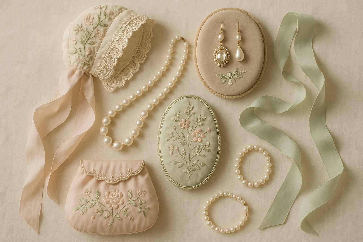
- Blush pink evening gown with pearl accents
- Soft peach paired with cream for afternoon calls
- Lavender morning dress with white fichu and cap
- Pale blue ribbons on cream bonnet
- Rose pink pelisse over white walking dress
- Butter yellow gloves with powder blue ensemble
- Seafoam green reticule with pale pink gown
- Cream shawl with multicolor pastel embroidered border
The Role of Color in Regency Fashion Categories
Color choices in the Regency era varied significantly based on the occasion, time of day, and the wearer’s age and marital status. Understanding these distinctions reveals how thoroughly color was integrated into the social fabric of the period. Morning dress, intended for at-home activities and informal visits, typically featured the palest colors—white, cream, and the softest pastels that wouldn’t appear overly elaborate for domestic settings.
Walking dress and carriage dress allowed for slightly more color, as these garments would be seen in public settings. Spencer jackets and pelisses in deeper pastels or even stronger colors like celestial blue or primrose yellow provided contrast against white dresses beneath. Evening and ball gowns offered the most scope for color expression, though even here, the palette remained decidedly soft by modern standards.
Half-mourning dress introduced another color category entirely—the soft grays, mauves, and lavenders worn during the final stages of mourning for a deceased relative. These subdued colors served a specific social function, signaling the wearer’s continued respect for the dead while allowing a gradual return to normal dress. The half-mourning palette influenced broader fashion, normalizing certain soft purple and gray tones as acceptable for general wear.
Seasonal considerations also affected color choices. Summer fabrics in light muslins and silks called for the airiest pastels, while winter clothing in heavier materials could accommodate richer, deeper tones. The transition seasons saw creative combinations that acknowledged changing weather while maintaining elegance—a warm rose pelisse over a cool blue gown, for instance, or a cream dress with golden-yellow trim as autumn approached.
Children’s clothing followed similar principles but with even more emphasis on white and the palest colors, emphasizing innocence and purity. Young girls wore predominantly white until their teens, when soft colors began to appear. Boys’ clothing allowed for more color earlier, though the pastel palette remained standard until they transitioned to adult men’s dress, which favored darker, more somber tones.
Servants’ dress occupied a distinct category, typically featuring darker, more practical colors that wouldn’t show wear as readily. However, the influence of the pastel aesthetic reached even below stairs—housemaids’ caps and aprons remained white, and livery for upper servants sometimes included pastel accents in the family’s colors. The contrast between servant and employer dress reinforced social hierarchies while still maintaining overall aesthetic harmony within the household.
Regional variations existed as well. London fashion set the standard, but provincial interpretations sometimes favored slightly stronger colors or more practical fabrics. Scottish dress incorporated traditional tartans alongside English-influenced pastels, while Irish fashion occasionally featured the greens associated with national identity. These regional differences added texture to the overall picture of Regency color use while operating within the same basic aesthetic framework.
The military uniforms of the period provided a striking counterpoint to feminine pastel fashion. Regiments wore distinctive colors—red coats, blue facings, gold braid—that stood out dramatically against the soft hues of women’s dress at balls and assemblies. This contrast was intentional and enhanced the visual drama of social gatherings where military men were present, their vibrant uniforms emphasizing their masculine role as protectors while women’s delicate colors reinforced ideals of feminine refinement.
Pastel Colors in Regency Interiors
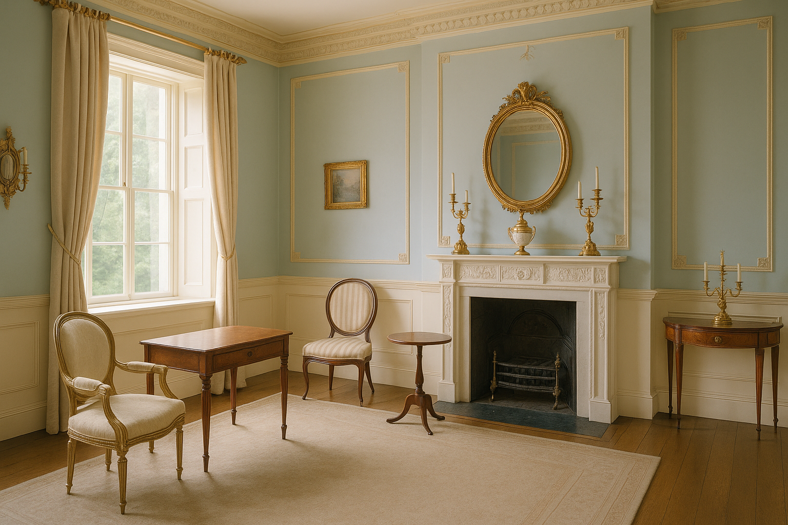
The pastel palette extended well beyond clothing to transform Regency interior spaces into harmonious environments that complemented the fashionable inhabitants. Interior design of the period embraced the same Neoclassical influences that shaped dress, creating rooms that served as perfect backdrops for elegant gatherings.
Drawing Room Color Schemes
The drawing room, as the primary space for receiving visitors and socializing, received particular attention in terms of color selection. Walls might feature pale green, soft blue, or warm cream, often with decorative moldings picked out in white or gilded for subtle contrast. The goal was to create an atmosphere of refined elegance that would flatter both the room’s occupants and their clothing.
Upholstery fabrics in these rooms often echoed or complemented wall colors, with striped silks in pastel tones being particularly fashionable. Curtains in pale silk or cotton muslin filtered light to create a soft, diffused atmosphere that enhanced the overall pastel effect. The coordination between architectural color, furnishing fabrics, and even the fresh flowers arranged in the room created immersive environments where every element contributed to the aesthetic whole.
Bedroom Palettes and Personal Spaces
Bedrooms allowed for more personal expression while still adhering to the overall pastel aesthetic. Women’s bedrooms often featured particularly feminine color schemes in soft pink, lavender, or pale blue, with white bed linens and curtains creating an atmosphere of purity and rest. The bed hangings, still common in this period for warmth and privacy, provided opportunities for decorative fabric in coordinating pastels.
Dressing rooms, where women prepared their appearance, required careful color consideration. The light in these spaces needed to accurately show how one would look in various settings, so neutral pale colors—cream, soft white, or the lightest gray—were often preferred. These backgrounds allowed clothing colors to read true and helped prevent unfortunate surprises when moving into different lighting conditions.
The Integration of Fashion and Interior Color
Regency hostesses understood the relationship between their interiors and their attire, often coordinating their dress to complement their rooms when entertaining. A woman in pale pink would appear to particular advantage in a drawing room with soft green walls, the complementary colors enhancing each other without clashing. This sophisticated approach to color extended even to flower arrangements, which were chosen both for their beauty and their harmony with the overall color scheme.
Portrait painters of the period took these considerations seriously, often depicting their subjects against backgrounds that enhanced their coloring and clothing. The resulting images show how completely the pastel aesthetic permeated Regency visual culture—from the subject’s gown to the furniture on which she sits to the curtains visible in the background, soft harmonious colors create a unified visual world that defines our image of the era.
Achieving Pastel Effects with Natural Materials
The soft colors of the Regency era emerged from a sophisticated tradition of natural dyeing that had developed over centuries. Understanding these techniques illuminates both the limitations and possibilities that shaped the period’s color palette.
Natural dyers worked with a vocabulary of colors derived from specific plant and animal sources, each with its own properties regarding intensity, fastness to light and washing, and interaction with different fiber types. Achieving the soft, elegant tones favored during the Regency required expertise in manipulating these variables.
- Indigo from woad or imported indigo plants created the range of blues from deep navy to palest sky
- Madder root produced pinks, corals, and reds depending on mordants and processing
- Weld (dyer’s rocket) yielded soft yellows and, combined with indigo, greens
- Cochineal insects provided brilliant reds that could be softened to pink
- Safflower offered both yellow and pink dyes depending on extraction method
- Oak galls and iron mordants created soft grays and blacks
- Walnut hulls produced tan and brown tones for trims and accessories
- Logwood created purples and lavenders, though with some fading issues
- Chamomile flowers yielded subtle golden yellows
- Elderberries provided violet tones, though not highly colorfast
- Onion skins created soft golden-orange hues
- Lichens produced unique mauve and purple tones specific to certain regions
- Brazilwood offered reds that could be modified to various pink tones
- Turmeric created bright yellows, often used for under-colors
Regency Color Symbolism and Social Meaning
Beyond mere aesthetics, colors in Regency society carried rich symbolic meanings that informed both fashion choices and social interpretation. Understanding this color language reveals hidden dimensions in period literature and art while illuminating the sophisticated visual communication of the era.
White and the Ideals of Purity
White’s association with purity, innocence, and virtue made it the default choice for young unmarried women, particularly at their formal debut into society. The white muslin gown became almost a uniform for debutantes, its delicacy and impracticality serving as visible proof of the wearer’s protected status. A young woman in white announced her availability for marriage while simultaneously asserting her moral fitness for that role.
Wedding gowns, contrary to popular belief, were not exclusively white during this period—any fine dress might serve for the ceremony—but white remained a popular choice for those who could afford it. The later Victorian codification of white wedding dresses as mandatory built upon Regency associations between white and bridal purity, though it took Queen Victoria’s famous white wedding gown in 1840 to cement the tradition firmly.
The Language of Flowers and Colors
The Regency era saw the development of floriography—the language of flowers—which assigned specific meanings to different blooms. This symbolic vocabulary extended to the colors associated with those flowers, creating an intricate system of communication through botanical gifts and decorations. A gentleman sending pink roses conveyed different sentiments than one sending white or yellow, and knowledgeable recipients could read these messages clearly.
These floral associations influenced dress color choices as well. Wearing a gown in a color associated with a particular flower could subtly reference that flower’s meaning—lavender for devotion, pink for admiration, pale blue for constancy. Young women particularly enjoyed encoding messages in their dress, adding layers of meaning to social occasions that might otherwise seem merely decorative.
Political and Patriotic Color Coding
In an era dominated by the Napoleonic Wars, color choices could carry political significance as well. British patriotic colors—red, white, and blue—appeared in various combinations, often softened to pastels for women’s wear but still recognizable as statements of national loyalty. Conversely, certain colors associated with French fashion might be viewed with suspicion during periods of particular tension with France.
Royal events prompted coordinated color choices among those wishing to demonstrate loyalty or connection to the crown. When celebrating military victories or royal occasions, hostesses might request guests to wear particular colors, creating visual spectacles of unified support. These coordinated displays demonstrated the power of color to communicate group identity and political allegiance within Regency society.
Evolution and Decline of the Regency Pastel Aesthetic
The soft, restrained palette of the Regency era didn’t last forever. By the 1820s, fashion began shifting toward richer, more saturated colors that would characterize the Victorian period. Understanding this transition helps explain both why Regency colors hold such appeal today and why they eventually gave way to different aesthetic priorities.
Technological Changes in Dyeing
Advances in chemistry gradually made more colors available at lower costs, reducing the practical advantages of pastel shades. New mordanting techniques allowed for brighter, more stable colors from traditional dye sources, while imported dyes from expanding colonial trade networks introduced new possibilities. As these options became available, the fashion for restraint began to seem less innovative and more merely limiting.
The eventual invention of synthetic aniline dyes in the 1850s would transform fashion color completely, making brilliant magentas, purples, and greens available to mass markets for the first time. But even before this revolution, the seeds of change were visible in the late Regency period, as deeper colors began appearing in fashionable contexts that would have seemed inappropriate a decade earlier.
Shifting Aesthetic Ideals
The Neoclassical ideals that inspired Regency pastels gradually gave way to Romantic aesthetics that valued emotion, drama, and historical references beyond classical antiquity. Medieval imagery, Gothic architecture, and nature in its wilder aspects captured the imagination of a new generation, and these inspirations called for different color treatment. The pale restraint of Regency style began to seem cold and artificial compared to the rich colors of historical paintings and natural landscapes.
Fashion silhouettes changed as well, moving away from the high-waisted, flowing lines that had harmonized so beautifully with soft colors. As sleeves expanded and waists returned to their natural position, the visual balance that had made pastels so effective shifted. The new shapes seemed to demand stronger colors to achieve visual impact, contributing to the overall move toward deeper, more saturated palettes.
The Legacy of Regency Color Sensibility
Despite its relatively brief dominance, the Regency pastel palette left lasting influences on Western aesthetics. The association of soft colors with elegance, refinement, and classical beauty persisted long after the specific fashion context had changed. Certain combinations—pink and cream, blue and white, lavender and gray—retain their sophisticated appeal precisely because of their Regency heritage.
Wedding fashion particularly preserved Regency color values, with white and soft pastels remaining standard for bridal parties well into the modern era. Spring fashion collections regularly return to Regency-inspired palettes, recognizing their perennial appeal. The era’s influence on interior design persists as well, with “Regency style” remaining a recognized category in decorating, characterized by the soft colors and elegant simplicity the period pioneered.
Practical Applications of Regency Color Principles
The color wisdom of the Regency era offers valuable lessons for modern wardrobes and living spaces. By understanding the principles that guided their choices, we can apply similar thinking to create harmonious, elegant environments today.
The key insight from Regency color practice is that restraint creates sophistication. Rather than competing for attention, colors in Regency schemes work together to create unified effects. Variety comes through subtle differences in shade and tone rather than dramatic contrasts, producing spaces and outfits that feel calm and refined rather than chaotic or demanding.
- Start with white or cream as a foundation and add soft color as accent
- Limit your palette to two or three related pastels plus neutrals
- Use texture variation to add interest without introducing more colors
- Consider how colors will appear in different lighting conditions
- Match color intensity levels—avoid mixing very soft and very bright tones
- Let one color dominate while others play supporting roles
- Use metallic accents (gold, silver) sparingly for subtle sparkle
- Consider the effect of your background on your chosen colors
- Remember that colors appear different against skin versus fabric
- Build coordination through undertones rather than exact matching
- Allow for natural variation within a color family
- Balance warm and cool pastels for visual interest
- Use deeper versions of pastels for grounding accents
- Consider seasonal appropriateness—cooler pastels for summer, warmer for winter
The Psychological Appeal of Regency Pastels
Modern color psychology helps explain why Regency pastels continue to attract and soothe. The soft, light-reflecting quality of these colors creates environments that feel open, peaceful, and welcoming—qualities we associate with safety and comfort.
Emotional Responses to Soft Colors
Research confirms what Regency designers intuited: soft colors reduce stress and promote feelings of calm. Pale blue lowers heart rate and blood pressure, pink has been shown to reduce aggression, and soft greens connect us psychologically to nature and growth. The pastel palette creates environments that support relaxation and positive social interaction—exactly what drawing room entertaining required.
These physiological effects help explain why hospitals, spas, and wellness spaces often employ similar color schemes today. The Regency intuition that gentle colors create gentle atmospheres has been validated by modern science, lending additional credibility to their aesthetic choices and encouraging contemporary applications of their color wisdom.
Cultural Associations and Timeless Appeal
Beyond immediate psychological effects, Regency pastels carry cultural associations that enhance their appeal. Soft colors connect us to ideas of refinement, elegance, and a slower, more gracious pace of life. In an increasingly hectic modern world, these associations offer respite—wearing or surrounding oneself with Regency-inspired colors becomes a small act of resistance against harshness and speed.
The continued popularity of Jane Austen adaptations and Regency romance novels keeps the era’s visual vocabulary alive in popular culture. Each new film version of Pride and Prejudice or Sense and Sensibility reintroduces audiences to the beauty of Regency color, inspiring fashion and interior design trends that reference the period. This ongoing cultural presence ensures that Regency pastels remain familiar and desirable rather than merely historical.
The Aspirational Quality of Historical Color
Adopting Regency color principles connects modern wearers to a romantic past that seems more elegant than contemporary life. Whether historically accurate or not, our image of the Regency era—all white muslin and soft pastels, refined manners and meaningful glances—offers an escapist alternative to modern realities. Dressing in these colors or decorating in these schemes becomes a way of participating in that idealized world.
This aspirational dimension helps explain why Regency-inspired color choices often appear in contexts associated with special occasions and elevated experiences. Wedding fashion, in particular, draws heavily on Regency aesthetics, using the era’s soft palette to create an atmosphere of romantic idealism appropriate to the occasion. The colors themselves become carriers of meaning and mood, transforming ordinary spaces and garments into something more magical.
Modern Applications of Regency Color Theory
Contemporary fashion and interior design regularly draw upon Regency color principles, adapting them to modern materials and contexts while preserving their essential elegance. Understanding how these adaptations work reveals the continuing relevance of Regency color wisdom.
Wedding and Special Occasion Styling
Bridal fashion remains the most direct heir to Regency color aesthetics, with white gowns and soft pastel bridesmaids’ dresses still standard. The Regency principle of using a pale foundation with coordinated accent colors translates perfectly to wedding party styling, where the bride’s white is complemented by attendants in harmonious soft tones. Blush, sage, and powder blue continue as perennial bridesmaids’ color choices, their Regency heritage lending them timeless sophistication.
Wedding décor similarly draws on Regency precedents, using soft color palettes to create romantic atmospheres for ceremonies and receptions. Flowers, linens, and lighting all work together in carefully coordinated schemes that would be entirely recognizable to a Regency hostess, demonstrating the lasting power of the era’s approach to harmonious color arrangement.
Everyday Wardrobe Building
Capsule wardrobe principles often incorporate Regency-style color coordination, using a limited palette of complementary soft tones to maximize outfit options from minimal pieces. The Regency insight that restraint creates elegance serves modern minimalists well, guiding them toward coherent wardrobes where every piece works with every other piece. Neutral foundations with carefully chosen pastel accents create versatile collections that feel polished without requiring excessive thought or resources.
Professional contexts particularly benefit from Regency color wisdom. The subtle sophistication of soft, coordinated colors reads as polished and intentional without appearing flashy or distracting. A wardrobe built on Regency principles projects competence and good taste—exactly the impression most professional contexts require.
Interior Design and Home Décor
Home interiors continue to employ Regency color strategies, particularly in spaces intended for relaxation and social gathering. Living rooms, bedrooms, and dining spaces benefit from the calming effects of soft, coordinated palettes, creating environments that support the activities they’re designed to host. The Regency approach of coordinating wall colors, textiles, and accessories remains standard practice among interior designers.
The current popularity of “quiet luxury” and “calm interiors” in design media reflects renewed appreciation for Regency-style restraint. After decades of bold color trends and maximalist approaches, many homeowners are rediscovering the appeal of soft, harmonious spaces that soothe rather than stimulate. Regency pastels offer a tested vocabulary for creating these environments, connecting contemporary preferences to historical precedent.
Preserving and Recreating Regency Colors
For historians, costumers, and enthusiasts interested in authentic Regency color, achieving accurate results requires understanding both the original techniques and their modern equivalents. The distinctive quality of period colors comes from their origins in natural materials, and capturing that quality requires attention to detail.
Museum collections provide the best evidence for authentic Regency colors, though even well-preserved garments have typically faded over two centuries. Researchers must account for this aging when analyzing original pieces, using textile analysis and historical documentation to reconstruct what colors would have looked like when new. This detective work reveals that many “Regency” colors in modern reproductions are actually too pale, as they copy faded originals rather than adjusting for the passage of time.
Contemporary natural dyers can achieve remarkably accurate Regency colors using traditional techniques and materials. The revival of interest in natural dyeing has produced detailed documentation of historical methods, allowing dedicated practitioners to recreate period colors with considerable authenticity. These handcrafted fabrics capture the subtle variations and depth characteristic of genuine Regency textiles—qualities difficult to achieve with synthetic dyes.
For those unable to access naturally dyed fabrics, modern textile manufacturers offer synthetic approximations that capture the visual essence if not the precise material nature of Regency colors. Careful selection can yield fabrics that photograph and drape in period-appropriate ways, making historical costume and decoration accessible to wider audiences. The key is understanding what makes Regency colors distinctive—their softness, their subtle undertones, their organic variation—and seeking modern materials that share these qualities.
Digital color matching presents particular challenges, as screen representations of colors depend heavily on monitor calibration and viewing conditions. Online shopping for Regency-inspired materials requires caution, as colors may appear quite different in person than on screen. When possible, ordering swatches before committing to larger purchases helps avoid disappointment and ensures that color choices align with intentions.
Historical paint manufacturers offer ranges specifically designed to replicate period interior colors, including Regency-appropriate pastels. These products, formulated with reference to surviving examples and historical documentation, provide accessible ways to bring authentic Regency color into modern homes. The best of these paints capture not just hue but also the slightly chalky, matte finish characteristic of pre-modern paint formulations.
Summary Table
| Color | Regency Associations | Modern Applications |
|---|---|---|
| White/Cream | Purity, youth, classical ideals, foundation of fashion | Wedding gowns, minimalist interiors, professional basics |
| Pale Pink | Romance, femininity, marriageable status | Bridesmaids’ dresses, romantic décor, spring fashion |
| Powder Blue | Serenity, constancy, Virgin Mary symbolism | Baby rooms, spa environments, summer clothing |
| Soft Yellow | Cheerfulness, morning wear, spring freshness | Kitchen accents, casual wear, optimistic spaces |
| Pale Green | Nature, growth, hope, country association | Botanical themes, wellness spaces, organic aesthetics |
| Lavender | Devotion, half-mourning, romantic sentiment | Bedroom colors, relaxation spaces, creative industries |
| Peach/Apricot | Warmth, approachability, flattering undertones | Portrait backgrounds, hospitality settings, warm minimalism |
| Soft Gray | Sophistication, transition, subtle elegance | Modern interiors, professional wear, technology aesthetics |
Conclusion
The Regency era’s embrace of soft, refined pastels represents one of fashion history’s most influential color moments, establishing aesthetic principles that continue to shape our sense of elegance and sophistication two centuries later. Far from being merely pretty or decorative, these color choices reflected deep cultural values—classical idealism, social hierarchy, gendered expectations, and philosophical ideas about beauty and nature. Understanding this context enriches our appreciation of Regency aesthetics while providing practical wisdom applicable to contemporary design challenges.
The enduring appeal of Regency colors lies in their psychological rightness—these soft, harmonious tones genuinely soothe and please in ways that modern research has validated. Whether we’re building a capsule wardrobe, decorating a home, or planning a special occasion, the Regency approach offers tested strategies for creating beautiful, cohesive environments. By studying how people of this elegant era used color to communicate, coordinate, and charm, we gain tools for enhancing our own visual worlds. The soft elegance of Regency pastels, born from a specific historical moment, transcends its origins to offer timeless guidance for anyone seeking refinement and grace in their color choices.
Frequently Asked Questions
What defined the Regency era in terms of fashion history?
The Regency era technically spans 1811-1820, when George IV served as Prince Regent during his father’s illness, though its fashion influence extended from roughly 1795 to 1825. The period is characterized by high-waisted empire-line dresses for women, inspired by classical Greek and Roman styles, with an emphasis on light, flowing fabrics and soft pastel colors. The rejection of elaborate Georgian styles in favor of simpler, more natural-looking fashion marked a significant shift in dress history that continues to influence bridal and formal wear today.
Why were pastels so popular during the Regency period?
Pastel colors dominated Regency fashion due to a combination of aesthetic philosophy, practical considerations, and social signaling. The Neoclassical movement valued what it imagined to be the pale simplicity of ancient Greek and Roman dress. Soft colors also demonstrated wealth, as pale fabrics showed dirt easily and required frequent replacement. Additionally, natural dyes of the period produced pastel shades more easily than saturated colors, making soft tones more accessible and consistent in quality.
What were the most common pastel colors in Regency fashion?
White and cream formed the foundation of Regency dress, particularly in the form of muslin for day wear. Beyond these neutrals, pale pink was extremely popular for young women, symbolizing youth and romantic availability. Powder blue, soft yellow, pale green, and delicate lavender also appeared frequently. The specific shades varied based on available dyes, with each color carrying social meanings that guided appropriate use based on occasion, age, and marital status.
How did social status affect Regency color choices?
Color choices in Regency society communicated wealth and social position in sophisticated ways. The ability to wear pale, delicate colors that showed every mark indicated leisure class status—working people needed practical, dark-colored clothing. Within the upper classes, the most refined and subtle pastels indicated the highest taste, while brighter colors were associated with lower social standing or questionable reputation. Young unmarried women wore the palest colors, while matrons could adopt slightly deeper tones appropriate to their settled status.
How can I incorporate Regency colors into modern style?
Start with white or cream as your foundation and add one or two soft pastel accents. Focus on creating harmony through related tones rather than contrast. Use texture variation—lace, silk, cotton—to add interest without introducing more colors. Consider how your colors will appear against your skin tone and in different lighting. The Regency principle of restraint creating sophistication translates well to modern capsule wardrobes and minimalist interiors, where coordinated soft colors create polished, versatile combinations.
What makes natural dyes different from modern synthetic colors?
Natural dyes produce colors with subtle variations and depth that synthetic dyes often lack. Each batch varies slightly, and colors shift beautifully in different lights. Natural dyes also tend to age gracefully, fading to related tones rather than becoming muddy or yellow. The organic quality of naturally dyed fabric contributes to the romantic appeal of authentic Regency textiles. While modern synthetics can approximate these colors, they rarely achieve the same living quality that characterizes genuine period pieces.
Why do Regency colors remain popular for weddings?
The association of white with bridal purity, established during and after the Regency period, has proven remarkably persistent. Soft pastels for bridesmaids and décor create romantic atmospheres that align with idealized visions of marriage and celebration. The Regency palette also photographs beautifully, producing timeless images that won’t appear dated decades later. Additionally, these colors work well across diverse skin tones and coordinate easily, practical advantages that contribute to their enduring popularity for wedding styling.
How did Regency color preferences eventually change?
By the 1820s, fashion began shifting toward richer, more saturated colors as Romantic aesthetics replaced Neoclassical ideals. Advances in dyeing technology made brighter colors more accessible, while changing silhouettes—lower waists, fuller sleeves—seemed to demand stronger colors for visual balance. The eventual invention of synthetic aniline dyes in the 1850s completed this transformation, making brilliant colors available to mass markets and relegating the soft Regency palette to nostalgic and formal contexts where it continues to thrive today.
]]>
Gabrielle J. Smith is the pulsating essence that brings life to the world of fashion and color. With an innate talent for understanding the nuances of hues, she has the uncanny ability to paint narratives with her words, diving deep into the realm of color trends and the art of harmonizing them. Not just an expert in the field, Gabrielle also plays a pivotal role in strengthening the cohesion of our team, ensuring growth and harmony. Each of her articles is a testament to her passion, weaving captivating tales that resonate with readers and fashion aficionados alike.
Reviewed By: Joanna Perez and Anna West
Edited By: Lenny Terra
Fact Checked By: Matthew Mansour
Photos Taken or Curated By: Matthew Mansour