Key Takeaways
- The 60-30-10 rule divides your outfit into three color proportions: 60% dominant, 30% secondary, and 10% accent color
- This formula eliminates guesswork by providing a reliable structure for combining any colors
- The dominant 60% color should be the most neutral or calming shade in your outfit
- Your secondary 30% color adds visual interest without overwhelming the overall look
- The 10% accent color creates focal points and brings personality to your ensemble
- This rule works with any color palette, from neutrals to bold statement combinations
- Understanding color temperature and undertones enhances the formula’s effectiveness
- The 60-30-10 principle applies beyond fashion to interior design, branding, and visual arts
Getting dressed every morning shouldn’t feel like solving a complex puzzle, yet many people find themselves standing in front of their closet, overwhelmed by color choices. The 60-30-10 outfit formula offers a simple, foolproof solution that professional stylists have relied on for decades. This elegant principle takes the anxiety out of color coordination by providing a clear mathematical framework that always produces harmonious results. Whether you’re dressing for a job interview, a casual weekend outing, or a special evening event, this formula adapts to any occasion while ensuring you look polished and intentional. By the time you finish reading this guide, you’ll never second-guess your color combinations again.

Understanding the Foundation of Color Proportion
The 60-30-10 rule didn’t originate in fashion—it actually comes from interior design, where decorators discovered that spaces feel most balanced when colors are distributed in these specific proportions. Fashion stylists recognized that the same principle applies beautifully to clothing, creating outfits that feel complete and visually satisfying without any single element fighting for attention.
Why These Specific Numbers Work
The human eye naturally gravitates toward visual harmony, and the 60-30-10 split creates what designers call “visual weight balance.” When you allocate 60% of your visible outfit to one color, it establishes a strong foundation that grounds the entire look. This dominant color acts as an anchor, giving your eye a place to rest while the other elements add dimension and interest.
Think of your favorite art pieces or well-designed rooms—they almost always follow similar proportional logic. The largest areas share one cohesive color family, while smaller accent pieces add pops of contrast. Your wardrobe works exactly the same way, and understanding this makes shopping and getting dressed infinitely easier.
The Psychology Behind Balanced Color Distribution
Colors affect mood and perception in powerful ways. By keeping your most prominent color calming or neutral, you create an overall impression of sophistication and thoughtfulness. The 30% secondary color introduces enough variety to keep things interesting, while the 10% accent provides that memorable detail people notice and compliment.
Research in color psychology consistently shows that well-balanced color schemes make people appear more competent and trustworthy. When your outfit follows the 60-30-10 formula, you’re unconsciously communicating that you understand proportion and detail—qualities that translate positively in professional and social settings alike.
From Theory to Practical Application
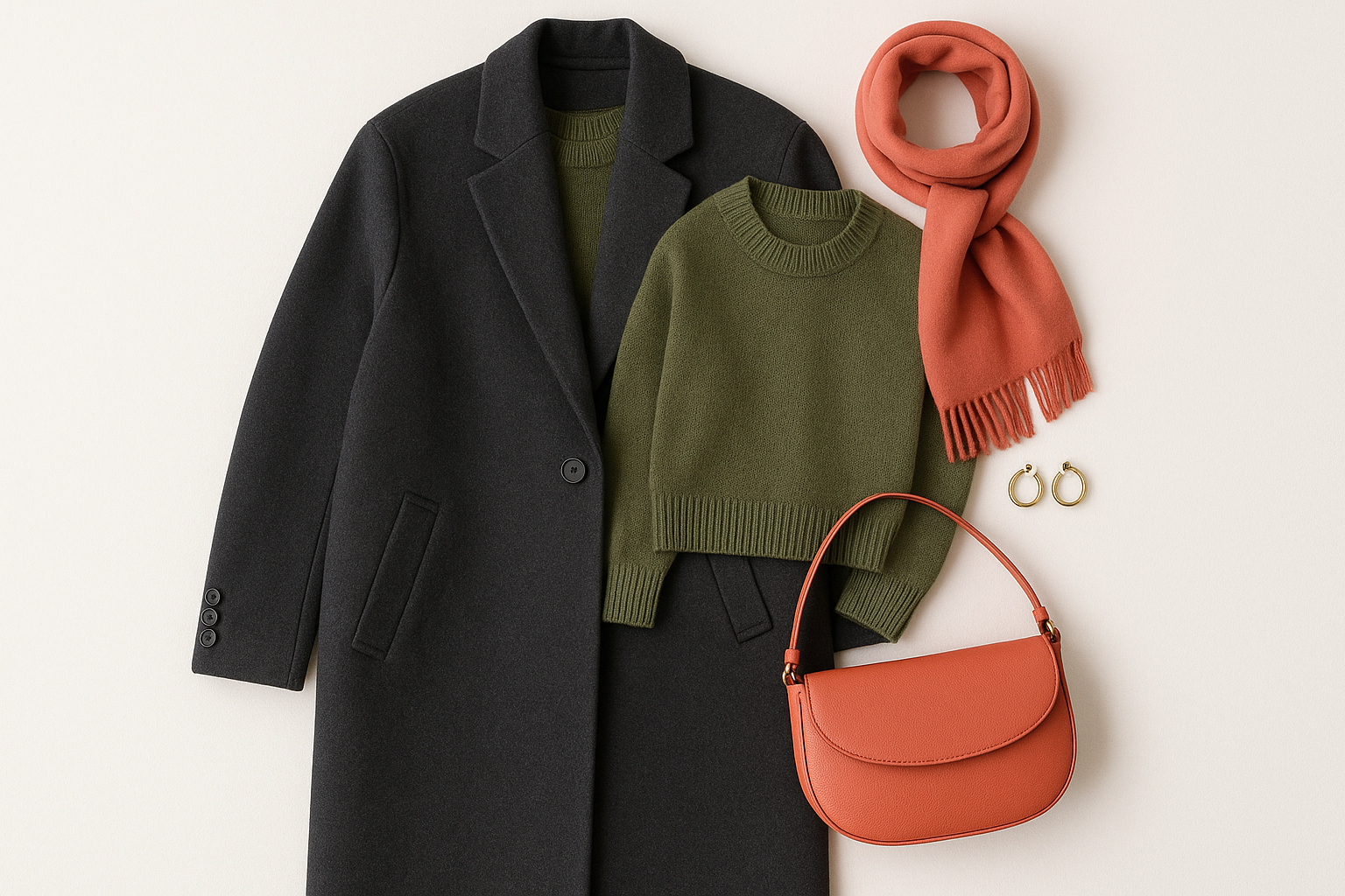
Translating percentages to actual clothing pieces becomes intuitive with practice. Your 60% typically comes from larger garments like trousers, dresses, or coats. The 30% might be a top, cardigan, or substantial accessory. The remaining 10% shows up in smaller details like jewelry, belts, shoes, or bags.
The beauty of this system lies in its flexibility. You don’t need to measure exact percentages—instead, think of it as a rough guide where one color clearly dominates, another plays strong support, and a third adds that finishing touch. Even if your proportions shift slightly, the principle still creates cohesive results.
Selecting Your Dominant 60% Color
Your dominant color sets the entire tone for your outfit, making this choice the most important decision in the formula. Most successful applications of the 60-30-10 rule use neutrals or muted tones as the dominant shade, creating a versatile canvas that allows the remaining 40% to shine without visual competition.
Neutral Foundations That Never Fail
Classic neutrals like navy, charcoal, camel, cream, and black serve as reliable dominant colors because they blend with virtually any secondary and accent choices. Navy blue, for instance, works equally well with soft pastels, warm earth tones, and even bold brights. This versatility means you can create multiple distinct looks from a single dominant garment.
Beyond the traditional neutrals, consider expanded options like olive, burgundy, and slate gray as your 60%. These richer alternatives still function as grounding colors while adding subtle sophistication. The key is choosing shades that feel foundational rather than demanding attention themselves.
Making Bold Colors Your Dominant Choice
While neutrals are the safer choice, fashion-forward individuals sometimes flip the formula by using a bold color as their dominant shade. A red dress, cobalt blue coat, or emerald green suit can absolutely serve as your 60%—the trick is selecting muted or neutral tones for the remaining percentages to prevent visual chaos.
When working with a bold dominant color, pay extra attention to undertones. A warm red pairs better with warm neutrals like camel and cream, while a cool red harmonizes with gray and black. This undertone consistency keeps even adventurous color choices looking intentional and polished.
Seasonal Considerations for Your Base Color
Your dominant color choice often shifts with the seasons, both for practical and aesthetic reasons. Lighter neutrals like cream, beige, and soft gray feel natural in spring and summer, while deeper shades like chocolate brown, forest green, and charcoal suit autumn and winter moods and wardrobes.
Consider how your dominant color will look in different lighting throughout the day. What appears as a sophisticated taupe under office fluorescents might read differently in golden hour sunlight. Testing your base garments in various light conditions ensures your 60% always represents your outfit as intended.
Building Your 30% Secondary Color
The secondary color introduces personality and visual interest to your outfit while still supporting rather than competing with the dominant shade. This 30% allocation gives you room to express style preferences and create distinct moods within the same foundational formula.
Successful secondary colors typically share a relationship with the dominant shade—either complementary, analogous, or within the same color family but at a different saturation or brightness level. This relationship creates visual harmony while providing enough contrast to prevent monotony.
- Complementary pairings: navy dominant with rust secondary, charcoal with blush
- Analogous combinations: camel dominant with terracotta secondary, forest green with teal
- Monochromatic variations: light gray dominant with charcoal secondary, cream with camel
- Contrasting neutrals: black dominant with ivory secondary, brown with cream
- Warm-cool balancing: warm taupe dominant with cool gray secondary
- Seasonal harmonies: burgundy dominant with dusty pink secondary for autumn
- Classic combinations: navy dominant with white secondary for timeless appeal
- Earthy palettes: olive dominant with sand secondary for natural sophistication
- Contemporary neutrals: charcoal dominant with camel secondary for modern elegance
- Soft contrast: dove gray dominant with lavender secondary for gentle dimension
- Rich undertones: chocolate brown dominant with rust secondary for depth
- Cool sophistication: slate gray dominant with ice blue secondary for crisp looks
The Power of Your 10% Accent Color
The accent color is where personality truly emerges. This small but mighty 10% catches the eye, creates memorable impressions, and transforms ordinary outfits into distinctive personal style statements. Think of it as the exclamation point at the end of a well-constructed sentence—small but impossible to ignore.
Accent colors often appear in accessories: a vibrant handbag, statement earrings, a colorful belt, or eye-catching shoes. These smaller pieces allow you to experiment with trends and bold choices without committing to larger, more expensive garments. A single pair of red heels can revolutionize a neutral wardrobe.
When selecting accents, consider what draws your eye. Some people gravitate toward warm pops like coral, mustard, or orange, while others prefer cool accents like cobalt, emerald, or fuchsia. Your accent color preferences often reflect personality—embrace what genuinely excites you rather than following rules too rigidly.
The placement of your accent color matters as much as the shade itself. Positioning accents near your face—through earrings, scarves, or necklaces—draws attention upward and makes your overall appearance more engaging in conversation. Accents at your feet or waist work well for full-body visual interest in photographs or presentations.
Multiple accent pieces in the same color create cohesion and show intentionality. A red belt paired with red earrings demonstrates thoughtful coordination, while scattered random colors might appear accidental. This repetition principle, called “echoing,” elevates your outfit from thrown-together to deliberately styled.
Metallics function brilliantly as accent colors. Gold, silver, rose gold, and bronze add warmth and polish without introducing a competing hue. This makes metallic accessories invaluable wardrobe investments—they accent virtually any color palette while adding sophistication.
Don’t overlook the power of unexpected accent placements. A colorful lining revealed when you remove your jacket, printed socks peeking above boots, or a bright phone case all serve as subtle style signals that reward closer observation.
Seasonal accent swapping offers an easy way to refresh your wardrobe without major purchases. The same navy-and-gray outfit transforms completely when you switch from summer’s coral accents to autumn’s mustard or winter’s burgundy. This versatility maximizes your existing pieces while keeping looks current.
Applying the Formula to Different Occasions
The 60-30-10 rule adapts seamlessly to any dress code, from ultra-casual to black tie. Understanding how to shift your color choices and proportions for different contexts ensures you always appear appropriately dressed while maintaining personal style.
Professional and Business Settings
Corporate environments typically call for conservative dominant colors: navy, charcoal, black, or brown establish professionalism and reliability. Your secondary color can introduce subtle personality—a soft blue shirt under a gray suit, or a camel blouse with black trousers. Keep accents refined: a quality watch, simple jewelry, or a structured bag in an understated shade.
For industries with more creative dress codes, you have room to push boundaries. A dominant burgundy blazer over cream trousers with gold accent jewelry reads as confident and stylish while remaining appropriate. The key is ensuring your color choices feel intentional rather than chaotic.
Casual Weekend Looks
Relaxed settings allow for more experimentation with the formula. Your 60% might be comfortable jeans (a denim blue base), topped with a 30% sweater in a coordinating shade, and finished with 10% accent sneakers or a statement bag. The proportions stay consistent even when the formality drops.
Weekend wear also welcomes bolder dominant choices. A bright yellow sundress (60%) paired with nude sandals (30%) and turquoise jewelry (10%) perfectly applies the formula while embracing summer playfulness. Casual contexts reward creativity within the structure.
Evening and Special Occasions
Formal events often flip typical color expectations. An evening gown in a rich jewel tone can serve as a bold 60%, with metallic accessories providing the secondary 30% through shoes and a clutch. The 10% accent might come from statement earrings or a dramatic bracelet.
For black-tie occasions where most guests wear similar colors, your accent choices become even more important for standing out. A red lip with black dress, an ornate hair accessory, or distinctive evening shoes all serve as that memorable 10% that makes your look uniquely yours.
Common Mistakes and How to Avoid Them
Even with a clear formula, certain pitfalls can undermine your color coordination efforts. Recognizing these common mistakes helps you troubleshoot outfits that feel “off” and refine your application of the 60-30-10 principle.
The most frequent error is treating all three color allocations equally, creating a visually chaotic outfit where no element dominates. Remember that the 60% should clearly read as the largest visual presence. If you can’t immediately identify which color is dominant when looking in the mirror, redistribution is needed.
- Using too many accent colors instead of one cohesive 10% shade
- Choosing a secondary color that visually competes with rather than supports the dominant
- Ignoring undertone consistency (mixing warm and cool tones poorly)
- Selecting accent colors that disappear rather than pop against your other choices
- Forgetting that patterns contain multiple colors that count toward percentages
- Making the accent color too large and overwhelming the intended proportions
- Choosing colors that work in theory but clash with your personal skin undertones
- Overcomplicating simple outfits when two colors plus a neutral accent would suffice
- Failing to consider how colors photograph versus how they appear in person
- Neglecting the impact of black as a dominant that can feel heavy without relief
- Ignoring how different fabrics affect color perception (matte vs. shiny surfaces)
- Treating the formula too rigidly instead of using it as a helpful guideline

Working with Patterns and Prints
Patterns introduce complexity to the 60-30-10 formula because they contain multiple colors within a single garment. Successfully incorporating prints requires analyzing which colors they contain and how those colors relate to your solid pieces.
Making Prints Your Dominant Element
A patterned dress or printed trousers can serve as your 60% by treating the print’s background color as the dominant shade. A floral dress with a navy background, for instance, gives you navy as the dominant, with the floral colors providing built-in secondary and accent tones. Your accessories should pull from colors already present in the print.
When prints dominate, keep remaining pieces simple. Solid colors from within the print palette for your 30% and 10% prevent visual competition. This approach lets the pattern shine while maintaining the balanced proportion that makes outfits successful.
Patterns as Secondary Elements
A printed blouse or patterned scarf works beautifully as your 30% secondary color. Choose prints where one color clearly relates to your solid dominant piece—a striped top with your dominant navy incorporated creates immediate cohesion. The other colors in the print then inform your accent choices.
Scale matters when combining patterns with solids. Larger, bolder prints need simpler, more neutral companions, while subtle patterns like pinstripes or small florals allow for more color variation elsewhere. Match the visual weight of your pattern to your overall outfit energy.
Mixing Multiple Patterns
Advanced stylists sometimes incorporate multiple patterns while maintaining 60-30-10 principles. The key is ensuring patterns share at least one common color and vary in scale. A large plaid coat (60%) over a small polka dot blouse (30%) with solid accent accessories demonstrates how this works.
When mixing patterns, reduce your color palette rather than expanding it. Two patterns in a three-color scheme feel intentional; two patterns each introducing new colors create chaos. Let the formula guide your restraint, and the results will appear editorial rather than accidental.
Color Temperature and Undertone Mastery
Understanding warm versus cool undertones elevates your application of the 60-30-10 formula from good to exceptional. Every color leans either warm (containing yellow or orange undertones) or cool (containing blue or pink undertones), and keeping your outfit’s temperature consistent creates sophisticated harmony.
Identifying Color Temperature
Hold any garment near a clearly warm item (orange or golden yellow) and a clearly cool item (royal blue or hot pink). Notice which comparison makes your garment appear more harmonious—that reveals its temperature lean. This simple test helps you categorize your wardrobe and make better pairing decisions.
Neutrals also have temperatures. Cream and camel lean warm, while gray and navy lean cool. Taupe can go either way depending on whether it contains more brown (warm) or more gray (cool). Recognizing these nuances helps explain why some “matching” neutrals feel off together.
Building Temperature-Consistent Outfits
The most harmonious outfits maintain temperature consistency across all three color allocations. A warm palette might include camel (60%), rust (30%), and gold accessories (10%). A cool palette could feature charcoal (60%), ice blue (30%), and silver jewelry (10%). Neither combination feels discordant because the undertones agree.
Intentionally mixing temperatures creates high contrast and energy—useful for creative or artistic contexts but potentially jarring in conservative settings. If you choose to mix, ensure the contrast appears deliberate by making it dramatic rather than subtle. A clearly warm orange accent against cool gray looks intentional; a slightly warm cream against a slightly cool white looks like a matching mistake.
Your Personal Undertones Matter
Beyond outfit harmony, colors should flatter your individual skin, hair, and eye undertones. Warm-undertoned individuals typically look better in warm palettes; cool-undertoned people shine in cool colors. Neutral undertones offer flexibility across both spectrums.
Position any color choice near your face in natural light to assess flattery. Harmonious colors make skin appear even and healthy; discordant undertones can create shadows, emphasize redness, or wash out your complexion. Your dominant color especially deserves this test since it comprises 60% of your visual presence.
Expanding Your Color Confidence
Once you master basic 60-30-10 applications with safe neutrals and classic combinations, you’re ready to push boundaries and develop a more distinctive personal color signature. This growth happens gradually through experimentation and attention to what feels authentically “you.”
Start expanding by choosing slightly bolder secondary or accent colors while keeping your dominant shade neutral. This low-risk approach lets you test new colors without committing to large, expensive pieces. A bright secondary scarf or bold accent shoes introduces new palettes safely.
- Try unexpected accent colors that express personality: a punk-inspired hot pink, a sophisticated mustard, or an artistic teal
- Experiment with monochromatic looks using three different tints of one color family
- Test complementary color schemes where your 30% directly opposes your 60% on the color wheel
- Explore triadic combinations using three colors equally spaced on the color wheel
- Play with analogous palettes where all three colors sit adjacent on the wheel
- Incorporate unexpected neutrals like blush, sage, or lavender as your 60%
- Use pattern mixing to introduce color complexity within the formula framework
- Try metallic as your secondary 30% rather than just the accent 10%
- Experiment with varying saturation levels: muted dominant, bright accent
- Consider texture as part of color perception: shiny fabrics appear lighter, matte appears richer
- Build capsule color palettes that work across multiple outfits
- Document successful combinations to reference for future outfit planning
Practical Wardrobe Building with the Formula
Applying the 60-30-10 rule extends beyond daily outfit assembly to strategic wardrobe building. Shopping with these proportions in mind ensures new purchases integrate seamlessly with existing pieces, maximizing versatility while minimizing closet clutter.
Investing in Your 60% Foundation
Since dominant colors form the basis of most outfits, invest quality budget here. Well-made neutral trousers, classic coats, and timeless dresses in your best dominant shades pay dividends through years of mix-and-match versatility. Choose fabrics that maintain their appearance through frequent wear and care.
Build your 60% foundation in colors that genuinely flatter you and suit your lifestyle. If you work in a creative field, your dominant pieces might be richer than traditional corporate neutrals. If your daily life is casual, comfortable dominant pieces in versatile shades serve better than formal options you rarely reach for.
Curating Versatile Secondary Pieces
Your 30% secondary pieces should work with multiple dominant garments. Before purchasing, mentally pair potential secondary items with at least three dominant pieces you already own. This test prevents impulse buys that only work with one specific outfit.
Secondary pieces offer more room for trend exploration since they’re smaller investments. A trendy color in a blouse or sweater lets you experiment without long-term commitment. When the trend fades, your core dominant pieces remain relevant.
Building an Accent Accessory Collection
Strategic accent accessory purchasing transforms your wardrobe’s versatility exponentially. Start with classic metallic jewelry that complements your dominant wardrobe undertones—gold for warm closets, silver for cool, or rose gold for flexibility. These basics pair with everything.
Add seasonal accent colors through affordable accessories. A coral summer bag, burgundy autumn belt, and emerald winter scarf let you adapt the same base outfits across the year. This approach keeps your wardrobe feeling fresh without constant large purchases.
Beyond Fashion: The Universal Principle
The 60-30-10 rule’s effectiveness in fashion reflects a broader truth about visual harmony that applies wherever colors combine. Understanding this universality helps you make better aesthetic decisions across multiple areas of life, from home decorating to professional presentations.
Interior designers pioneered this principle, and successful rooms almost always demonstrate these proportions. The wall color typically serves as the 60%, furniture and large textiles provide the 30%, and decorative objects deliver the 10% accent. Recognizing this pattern helps you diagnose why certain spaces feel balanced while others feel chaotic.
Graphic design and branding similarly rely on proportional color distribution. Effective logos and marketing materials establish clear visual hierarchy through dominant, secondary, and accent relationships. Noticing this in advertisements and packaging trains your eye for better color judgment everywhere.
Event planning and table settings follow the same logic. A wedding with navy dominant, blush secondary, and gold accents demonstrates the formula at scale. Party decorations with clear color proportions feel more sophisticated than random rainbow approaches.
Even digital spaces benefit from 60-30-10 thinking. Website designs with too many competing colors feel amateur, while sites with clear color hierarchy appear professional and trustworthy. Your personal social media aesthetic can also apply these proportions for more cohesive visual branding.
Nature itself often displays these proportions—perhaps explaining why the rule feels so intuitively right. A field of green grass (60%) with wildflowers (30%) and occasional butterflies (10%) demonstrates the principle organically. Our eyes evolved appreciating natural color distributions.

Summary Table
| Proportion | Role in Outfit | Best Choices |
|---|---|---|
| 60% Dominant | Foundation color, creates base and visual anchor | Neutrals (navy, charcoal, camel, cream), muted tones, or one bold statement color |
| 30% Secondary | Supporting color, adds interest and personality | Complementary or analogous shades, coordinating patterns, contrasting neutrals |
| 10% Accent | Finishing touch, creates focal points and memorable details | Bold pops, metallics, statement accessories, shoes, jewelry, bags |
Conclusion
The 60-30-10 outfit formula removes the guesswork from getting dressed by providing a reliable structure that always produces harmonious results. Whether you’re building a professional wardrobe, refreshing your casual style, or preparing for a special event, this proportional approach adapts to any context while ensuring you look polished and intentional. The formula works because it mirrors the way our eyes naturally process visual information, creating the balanced hierarchy that makes outfits feel complete.
Start applying this rule tomorrow with pieces you already own—you’ll likely discover that your favorite outfits already follow these proportions intuitively. As you practice, the calculations become automatic, and your morning routine transforms from stressful decision-making to confident assembly. Color coordination stops being something you worry about and becomes something you enjoy, opening the door to more creative exploration and a wardrobe that truly reflects your personal style.
Frequently Asked Questions
Can I use more than three colors in an outfit?
Yes, but additional colors should fall within your existing 10% accent allocation rather than adding a fourth proportion. Multiple accent colors work best when they share similar values or appear together in a single printed piece. Keeping extra colors within the accent percentage maintains the visual balance the formula provides.
What if my outfit has very visible shoes—do they count toward the percentages?
Absolutely. All visible elements contribute to your color proportions. Shoes often serve as either part of your 30% secondary color (when coordinating with other pieces) or your 10% accent (when making a statement). Consider your full outfit reflection when calculating proportions, including footwear.
How do I apply the 60-30-10 rule to all-black outfits?
Monochromatic black outfits can still follow the formula through texture and shine variation. Matte black serves as your 60%, a different texture like leather or silk provides 30%, and metallic accessories or a single color pop creates the 10% accent. This approach adds dimension to black-on-black looks.
Does the rule apply differently for different body types?
The proportions remain consistent regardless of body type, but color placement can create different visual effects. Placing darker colors in your 60% areas you want to minimize and brighter accents where you want to draw attention adapts the formula for individual figure flattery.
What happens if I accidentally create a 50-40-10 split instead?
The outfit will still look good if your colors harmonize well—the formula is a guideline, not a rigid requirement. However, if something feels “off,” check whether your secondary color is competing too strongly with your dominant. Reducing the secondary slightly often resolves visual tension.
Can prints count as multiple colors in my proportion calculation?
Yes. Analyze the colors present in any print and count their visual weight toward your proportions. A large floral print with 70% white background, 20% green leaves, and 10% pink flowers essentially provides a built-in color scheme. Let the print guide your solid color choices.
How do I know if my colors have matching undertones?
Compare each piece to a clearly warm item (like orange) and a clearly cool item (like royal blue). Colors that look better next to the same temperature share undertones. When in doubt, photograph your outfit in natural light—cameras often reveal undertone clashes our eyes miss in mirror checks.
Is it better to invest in dominant pieces or accent accessories?
Invest in dominant pieces since they form your wardrobe foundation and see the most wear. Quality neutral basics in flattering fits return value for years. Accent accessories can be more affordable and trend-forward since they’re smaller investments that change with seasons and personal style evolution.
]]>
Brenda Tillman is a color maestro who brings artistic brilliance to every piece she crafts. Passionate about imaginative expressions, she illuminates the world of fashion with her expert guidance on shades and combinations. Beyond her writings, Brenda is a culinary enthusiast and a global traveler, infusing her work with diverse insights. Her unique touch transforms simple color choices into art.
Reviewed By: Joanna Perez and Anna West
Edited By: Lenny Terra
Fact Checked By: Matthew Mansour
Photos Taken or Curated By: Matthew Mansour