Key Takeaways
- Soft, muted colors like sage, dusty blue, and warm beige naturally lower visual stress and create a sense of calm.
- Avoiding high-contrast combinations on busy days reduces cognitive load and helps you feel more grounded.
- Monochromatic or tonal dressing eliminates decision fatigue while looking effortlessly put together.
- Earthy neutrals act as visual anchors that signal stability and reliability to both you and others.
- Cool undertones like lavender gray and soft seafoam have a naturally soothing psychological effect.
- The “calm outfit” formula works across seasons by adjusting depth and warmth while keeping saturation low.
- Texture plays a role—soft fabrics in calm colors amplify the stress-reducing effect.
- Building a capsule of calming pieces ensures you always have a low-stress option ready for hectic mornings.
When your day is packed with meetings, errands, and endless tasks, the last thing you need is an outfit that adds to the chaos. The colors you wear have a measurable impact on how you feel throughout the day, influencing everything from your stress levels to how others perceive you. The “calm outfit” formula is not about being boring or invisible—it is about strategically choosing colors that work with your nervous system rather than against it. By understanding which hues promote tranquility and how to combine them effectively, you can dress in a way that genuinely supports your mental state during overwhelming days.
The Science Behind Calming Colors
Color psychology is more than a design trend—it is rooted in how our brains process visual information. Certain wavelengths of light trigger specific physiological responses, and understanding this connection can help you dress more intentionally when stress levels are high.
How Your Brain Processes Color
When light enters your eyes, it travels to the visual cortex where your brain interprets different wavelengths as distinct colors. This process happens almost instantaneously, but what many people do not realize is that color information also reaches parts of the brain associated with emotion and stress regulation. The amygdala, which processes emotional responses, reacts differently to various color stimuli.
Research has shown that cooler, less saturated colors tend to activate the parasympathetic nervous system, which is responsible for rest and relaxation. In contrast, highly saturated warm colors like bright red or electric orange can trigger a mild stress response, even when you are not consciously aware of it. This is why choosing the right colors on busy days is not just about aesthetics—it is about supporting your body’s natural calming mechanisms.
Why Saturation Matters More Than Hue
Many people assume that blue is automatically calming or that red is always stimulating, but the reality is more nuanced. The saturation level—how intense or muted a color appears—often matters more than the base hue itself. A muted terracotta can feel perfectly peaceful, while a neon blue might feel jarring and overstimulating.
When building a calm outfit, focus on colors that look like they have been softened with gray or white. These desaturated tones reduce the visual intensity that your brain must process, leaving more mental energy for the tasks that actually matter. Think of it as turning down the volume on your visual environment so you can think more clearly throughout the day.
The Role of Contrast in Visual Stress
Beyond individual colors, the contrast between pieces in your outfit significantly affects how calming or stressful your look feels. High-contrast combinations—like stark black paired with bright white—create visual tension that your brain continuously processes. This constant processing can contribute to mental fatigue over time.
Low-contrast outfits, where colors are closer in value and intensity, allow your visual system to relax. This does not mean everything has to be one color, but rather that the transitions between pieces should feel gentle rather than abrupt. The goal is visual harmony that lets you move through your day without your clothing demanding constant mental attention.
Core Colors for the Calm Outfit Formula
Building a wardrobe of calming colors starts with identifying which specific shades reliably promote tranquility. These colors form the foundation of your low-stress outfit options and can be combined in various ways depending on the season, occasion, and your personal style preferences.
Soft Neutrals That Ground You
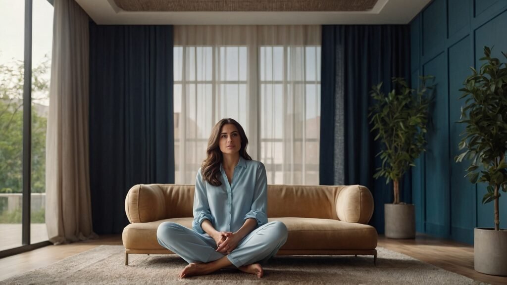
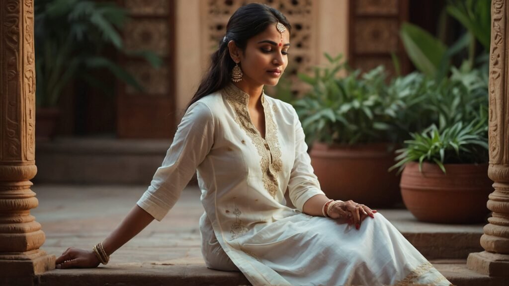
Warm neutrals like oatmeal, warm taupe, and soft camel create a sense of stability without feeling heavy or somber. These colors mimic natural materials like sand, stone, and undyed wool, which humans have been surrounded by for thousands of years. There is an evolutionary comfort in these earth-adjacent tones that transcends trends.
When you wear soft neutrals on stressful days, you are essentially wrapping yourself in visual familiarity. These colors do not demand attention or spark strong emotional reactions. Instead, they quietly support you, allowing your focus to remain on whatever challenges your day presents rather than on what you are wearing.
Muted Cool Tones for Mental Clarity
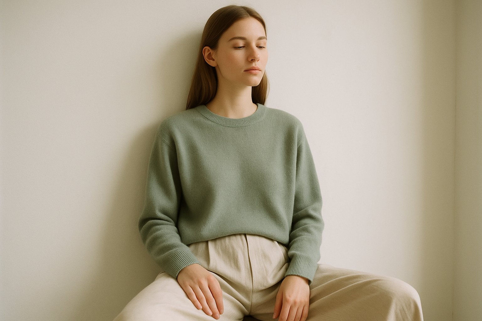
Dusty blue, sage green, and soft lavender belong to the family of muted cool tones that actively promote calm. Blue in particular has been studied extensively for its ability to lower heart rate and reduce feelings of anxiety. However, the key is choosing versions that are soft enough not to feel cold or clinical.
Sage green occupies a unique position as a color that feels both fresh and soothing. It connects to nature without being as vibrant as kelly green or as dark as forest green. Paired with soft neutrals, these muted cool tones create outfits that feel like a visual deep breath—exactly what you need when your schedule is overwhelming.
Warm Muted Tones for Comfort
Not everyone feels best in cool colors, and that is where warm muted tones come in. Dusty rose, muted terracotta, and soft clay offer the psychological warmth of their brighter counterparts without the stimulating intensity. These colors feel nurturing and approachable, which can be especially helpful on days when you need to interact with many people.
The beauty of warm muted tones is that they flatter a wide range of skin tones while maintaining that essential low-saturation quality that prevents visual stress. They work particularly well in the colder months when you want your clothing to feel cozy and enveloping rather than cold and detached.
Building Your Calm Capsule Wardrobe
Creating a collection of calming pieces ensures you always have stress-free outfit options available, even on mornings when you have zero mental bandwidth for styling decisions. The goal is not to replace your entire wardrobe but to curate a subset of pieces that work seamlessly together.
A well-planned calm capsule eliminates the paradox of choice that often makes getting dressed feel like yet another task on an already overwhelming to-do list. When every piece in the capsule coordinates with every other piece, you can grab items almost at random and know you will look put together.
- Start with two to three base neutrals in similar undertones—think oatmeal, warm gray, and soft taupe.
- Add one or two muted accent colors like dusty blue or sage green that complement your neutrals.
- Include pieces in varying weights so your capsule works across seasons.
- Choose fabrics that feel soft and comfortable, reinforcing the calming effect of the colors.
- Invest in quality basics like a well-fitting neutral tee, relaxed trousers, and a soft cardigan.
- Keep accessories simple—a neutral bag, minimal jewelry, and comfortable shoes in coordinating tones.
- Avoid patterns initially; solid colors are easier to mix and feel more visually restful.
- Consider your actual lifestyle when selecting pieces—comfort is essential for genuinely calm dressing.
- Store your calm capsule together so stressed mornings do not require searching through your entire closet.
- Rotate pieces seasonally but maintain the same color philosophy year-round.
- Replace worn items promptly—shabby clothing adds visual stress even in calming colors.
- Keep the capsule small enough to feel manageable but large enough to avoid outfit repetition fatigue.
Combining Calm Colors Effectively
Knowing which colors are calming is only half the equation—understanding how to combine them creates outfits that genuinely reduce visual stress rather than just featuring individual peaceful hues. The relationships between colors in your outfit matter as much as the colors themselves.
Monochromatic dressing, where you wear different shades and textures of the same color family, is perhaps the most reliably calming approach. An outfit composed entirely of soft gray tones, for example, eliminates contrast entirely while remaining visually interesting through texture and subtle shade variation.
Tonal dressing expands this concept slightly by combining colors that are closely related on the color wheel. Pairing dusty blue with soft sage creates a gentle gradient effect that feels harmonious and intentional without requiring precise matching.
When you do introduce contrast, keep it subtle. A warm oatmeal sweater with slightly darker camel trousers creates depth without the jarring effect of high-contrast combinations. The eye moves smoothly across the outfit rather than jumping between dramatically different areas.
Accent colors in a calm outfit should be muted versions of more vibrant hues. Instead of a bright red scarf, consider a dusty rose or muted terracotta. The pop of color adds visual interest without undermining the peaceful foundation you have built.
Texture becomes especially important when working with a limited color palette. A chunky knit sweater, smooth cotton trousers, and a slightly textured bag all in similar neutral tones create richness through tactile variety rather than color contrast.
Proportions also affect how calming an outfit feels. Generally, larger blocks of color feel more restful than many small color areas. A mostly solid outfit with one small accessory in a different tone feels calmer than an outfit with five equally sized color blocks.
Finally, consider the visual weight of colors in different positions. Darker tones at the bottom of an outfit and lighter tones at the top can feel more grounding and stable, which subtly reinforces the calming effect you are aiming for.
Seasonal Adaptations of Calm Colors
The calm outfit formula is not a one-season concept—it adapts throughout the year by shifting the specific shades you use while maintaining the underlying principle of low-saturation, low-contrast dressing.
Spring and Summer Calm Palettes
Warmer months call for lighter versions of your calming colors. Soft whites, pale oatmeal, and light sage work beautifully in spring when the world is waking up but you still want to feel grounded. These colors reflect light rather than absorbing it, helping you stay cool both physically and visually.
In summer, consider adding soft seafoam, muted lavender, and pale dusty blue to your rotation. These colors feel fresh without being bright, and they photograph well in the harsh sunlight that can make saturated colors look overwhelming. Linen and cotton in these shades enhance the breezy, relaxed feeling.
Autumn Calm Palettes
Fall naturally lends itself to calming colors because the season’s traditional palette—warm browns, muted oranges, and soft greens—is inherently desaturated. Embrace deeper versions of your summer tones: oatmeal becomes camel, pale sage becomes eucalyptus, and soft white transitions to cream.
Layering becomes your friend in autumn, and this is where tonal dressing really shines. A soft brown turtleneck under a slightly darker brown blazer with warm taupe trousers creates visual depth while maintaining that essential calmness. The key is keeping all pieces within the same color temperature.
Winter Calm Palettes
Cold months might tempt you toward dramatic black, but the calm outfit formula suggests softer alternatives. Charcoal gray, deep warm taupe, and muted navy offer the visual weight appropriate for winter without the starkness of true black. These colors feel substantial and protective without being visually aggressive.
Winter is also the time when soft pinks and muted berries can feel especially soothing against gray skies. A dusty rose sweater layered under a warm gray coat creates unexpected warmth on dreary days. The calming effect comes from the muted saturation, not the avoidance of color entirely.
The Psychology of Looking Calm
Beyond how calming colors make you feel, there is the equally important consideration of how they make you appear to others. On busy, stressful days, projecting calm can actually help you feel calmer through a psychological feedback loop.
When you dress in calming colors, people unconsciously perceive you as more approachable, trustworthy, and in control. This can lead to smoother interactions throughout your day, reducing the interpersonal friction that often adds to daily stress.
- Soft neutrals signal reliability and groundedness to colleagues and strangers alike.
- Muted blue tones are associated with competence and calm authority in professional settings.
- Avoiding bright colors on stressful days prevents the unconscious expectation that you should match that energy.
- Cohesive, low-contrast outfits suggest that you have your life together, even when you feel otherwise.
- Calming colors invite others to speak with you rather than feeling intimidated or overstimulated.
- Wearing soft tones can make you the “calm presence” in chaotic group situations.
- The “fake it till you make it” principle applies—dressing calmly can precede feeling calm.
- Others mirror the energy you project, so calm appearance often begets calmer interactions.
- In high-stress environments, your peaceful palette can become a subtle differentiator.
- Children and animals often respond more positively to people in soft, non-threatening colors.
- Calm colors age well in photographs, so work events captured on stressful days still look good later.
Common Mistakes in Calm Dressing
Understanding what not to do is just as valuable as knowing the right approach. Many well-intentioned attempts at calm dressing fall short because of easily avoidable errors that undermine the peaceful effect you are seeking.
Confusing Boring with Calm
The biggest misconception about calm dressing is that it means looking boring or forgettable. In reality, the calm outfit formula is about intentional simplicity, not lack of thought. An outfit in beautifully coordinated muted tones with interesting textures is far from boring—it is sophisticated.
The difference lies in the quality and fit of your pieces, the subtle interplay of shades, and the overall coherence of your look. A hastily thrown-together outfit in random neutrals looks sloppy. A thoughtfully curated calm outfit looks expensive and effortless. The goal is visual rest, not visual apathy.
Ignoring Undertones
One of the most common mistakes is mixing colors with conflicting undertones. A cool gray paired with a warm beige creates subtle visual tension that your brain registers even if you cannot articulate why the outfit feels “off.” This tension undermines the calming effect you are trying to achieve.
Pay attention to whether your pieces lean warm or cool and try to stay consistent within an outfit. If your soft blue sweater has cool undertones, pair it with a cool gray skirt rather than a warm taupe. The harmony created by matching undertones is a major contributor to visual calm.
Forgetting About Fit
Colors can only do so much if your clothing does not fit well. Clothes that are too tight create physical discomfort that overrides any psychological benefit from calming colors. Clothes that are too loose can make you feel sloppy and unprofessional, adding to rather than reducing your stress.
The calm outfit formula works best with pieces that fit comfortably—neither restrictive nor overwhelming. Think “relaxed but intentional” rather than “baggy” or “skin-tight.” Movement should be easy, and you should be able to forget about adjusting your clothes throughout the day.
Calm Colors for Specific Stressful Situations
Different types of busy days call for slightly different applications of the calm outfit formula. What works for a day packed with back-to-back meetings might differ from what suits a day of physical errands or a stressful travel itinerary.
High-Stakes Professional Days
For important meetings or presentations, combine calming colors with polished structure. A soft gray blazer over a muted blue blouse with tailored camel trousers projects competence while keeping your visual environment peaceful. Avoid the temptation to add a “power color”—you can command a room without visual aggression.
The key for professional settings is ensuring your calm palette does not veer into casual territory. Structured pieces in calming colors maintain authority while reducing the stress that comes from wearing high-contrast or overly bold outfits that demand constant confidence.
Physically Demanding Days
When your day involves a lot of movement—running errands, caring for children, or managing logistics—the calm outfit formula should prioritize comfort fabrics in calming shades. Soft cotton, breathable linen, and comfortable knits in oatmeal, sage, or dusty blue let you move freely while maintaining visual peace.
These days are not about impressing anyone but about getting through your tasks without additional stress. Stretchy waistbands, flat shoes, and fabrics that do not wrinkle support this goal. The calming colors add a subtle boost to your mental state while the practical construction handles the physical demands.
Travel Days
Travel is inherently stressful, making it an ideal time to deploy the calm outfit formula. Airport anxiety, security lines, and crowded planes all contribute to elevated stress levels that calming colors can help mitigate. Additionally, calm neutrals hide travel stains better than bright colors or stark white.
Layer pieces in coordinating muted tones so you can adapt to temperature changes without disrupting your visual calm. A soft gray sweater over a warm oatmeal tee with comfortable taupe pants creates a cohesive travel uniform that looks polished upon arrival while feeling comfortable throughout the journey.
Integrating Calm Colors Into Your Existing Wardrobe
You do not need to completely overhaul your closet to benefit from the calm outfit formula. Strategic additions and smart combinations can integrate calming principles into your existing wardrobe without requiring significant investment or discarding clothes you love.
Start by auditing what you already own for pieces in muted, low-saturation colors. You may find calming options you have been overlooking in favor of more visually demanding choices. Group these pieces together to see what combinations already work.
- Identify your most stressful regular days and plan calm outfits specifically for those occasions.
- Add one or two versatile neutral pieces that can calm down more vibrant items you already own.
- A soft gray cardigan can transform a bold outfit into something more peaceful.
- Replace worn-out basics with calming versions—same shapes, more soothing colors.
- Consider dyeing faded bright pieces to more muted versions of the same colors.
- Use calming accessories to temper outfits that are otherwise too visually demanding.
- Photograph your calm combinations for easy reference on stressful mornings.
- Gradually shift your shopping habits toward muted tones when replacing items.
- Keep one or two bright items for days when you genuinely want that energy.
- Notice how you feel in calm outfits versus vibrant ones to reinforce the habit.
- Share the concept with others who comment on your peaceful appearance.
- Build slowly—the calm capsule is a practice, not a one-time purchase.
The Role of Accessories in Calm Outfits
Accessories can either support or undermine your calm outfit, making thoughtful choices in this area essential. The goal is enhancement without distraction—adding finishing touches that complete your look without introducing visual noise.
Jewelry for Calm Dressing
Minimal jewelry in muted metals works best with the calm outfit formula. Soft gold, brushed silver, or rose gold add a subtle glow without creating the visual contrast that shiny or oversized pieces would introduce. Think single small earrings, delicate chains, and simple bands rather than statement pieces.
If you love jewelry and find minimalism challenging, focus on cohesion. Multiple pieces in the same metal and similar scale can still feel calm if they work together harmoniously. The key is avoiding the visual noise of many different styles, sizes, and metals competing for attention.
Bags and Shoes That Maintain Peace
Your bag and shoes are often the most visually prominent accessories, making their color choices particularly impactful. Neutral tones in quality materials support the calm outfit formula while still looking polished and intentional. A soft leather bag in warm taupe or a comfortable loafer in muted gray completes rather than complicates your outfit.
Avoid the temptation to add a “pop of color” through bright accessories on stressful days. While this advice is common in fashion, it works against the calming principle by introducing contrast and visual excitement exactly when you want peace. Save the red bag for days when you have mental bandwidth to spare.
Scarves, Hats, and Layering Pieces
Soft accessories in calming colors add both visual and physical comfort to your outfit. A cashmere scarf in dusty blue or a soft beanie in oatmeal contributes to the peaceful aesthetic while providing genuine warmth and coziness. These pieces invite touch and softness, reinforcing the calming effect.
Layering pieces like cardigans, light jackets, and wraps serve double duty as both practical additions and opportunities to add more calming color to your outfit. A soft gray cashmere wrap can elevate a simple outfit while providing comfort throughout temperature changes during your busy day.
Calm Colors Across Different Style Aesthetics
The calm outfit formula is adaptable to virtually any personal style. Whether you lean minimalist, classic, bohemian, or somewhere else entirely, the principles of low saturation and low contrast can be applied within your existing aesthetic preferences.
Minimalists often naturally gravitate toward calm colors, but the formula adds intentionality around combining those colors for maximum stress-reducing effect. Classic dressers can soften their traditional navy-and-white combinations by shifting to muted navy and cream instead. Bohemian styles can embrace earthy muted tones rather than the saturated jewel tones sometimes associated with the aesthetic.
The key is understanding that calm is not a style—it is a quality that can be applied to any style. A relaxed, California-cool outfit in soft sand and sage feels calm. An elegant Parisian-inspired outfit in muted gray and dusty rose also feels calm. The underlying color principles remain consistent even as the shapes and styling change.
Trend-forward dressers can apply the calm formula to current silhouettes and styles, simply choosing muted versions of trending colors. When a particular shade is having a moment, look for its softer, desaturated cousin to participate in the trend while maintaining your peaceful palette.
Athletic and casual dressers benefit enormously from the calm formula because activewear and loungewear in calming colors genuinely support relaxation. Instead of high-energy neon workout clothes, consider soft heather gray, muted sage, or dusty lavender for home workouts or casual days.
Even those who generally prefer bold, maximalist fashion can benefit from having calm outfit options for genuinely overwhelming days. These pieces do not need to replace your regular wardrobe—they serve as a tool for specific situations when visual peace is needed.
Summary Table
| Color Category | Best Shades for Calm | When to Wear |
|---|---|---|
| Soft Neutrals | Oatmeal, warm taupe, soft camel, cream | Professional settings, travel days, anytime you need grounding |
| Muted Cool Tones | Dusty blue, sage green, soft lavender, seafoam | Hot weather, high-anxiety situations, when you want mental clarity |
| Warm Muted Tones | Dusty rose, muted terracotta, soft clay | Cold weather, nurturing environments, when you want to feel approachable |
| Deep Calming Shades | Charcoal, deep taupe, muted navy, eucalyptus | Winter months, evening events, when you want visual weight without harshness |
Conclusion
The calm outfit formula is not about limiting your wardrobe or avoiding color—it is about understanding how your clothing choices affect your mental state and making intentional decisions to support yourself on demanding days. By choosing muted, low-saturation colors and combining them in low-contrast ways, you create a visual environment that allows your nervous system to relax rather than constantly processing stimulating input.
Building a collection of calming pieces does not require a complete wardrobe overhaul. Start with a few versatile neutrals, add one or two muted accent colors, and notice how differently you feel on stressful days when you reach for these items. Over time, the calm outfit formula becomes second nature—a reliable tool for managing the visual dimension of your busy, demanding life.
Frequently Asked Questions
Can I ever wear bright colors on stressful days?
Absolutely. The calm outfit formula is a tool, not a rule. Some people find that certain bright colors actually energize them in helpful ways on demanding days. The key is paying attention to how specific colors make you feel and making conscious choices rather than reaching for whatever is clean. If bright yellow genuinely lifts your spirits, wear it. If it adds to your overwhelm, you now have alternatives.
Does the calm outfit formula work for everyone?
The underlying principles of color psychology apply broadly, but individual responses vary. Cultural background, personal associations, and even current life circumstances affect how specific colors make you feel. Use the general principles as a starting point and adjust based on your own experience. If muted green makes you feel drained rather than calm, it is not the right calming color for you.
How do I know if a color is “muted enough” to be calming?
A simple test is to imagine adding gray to a pure version of that color. If the color you are considering already looks like it has had gray mixed in—softer, less vibrant, a bit dusty—it likely qualifies as muted. Another test is whether the color could blend into a natural landscape without standing out dramatically. Nature rarely produces neon.
Can patterns ever be part of a calm outfit?
Yes, but choose carefully. Small-scale patterns in similar muted tones can work within the calm formula. A subtle stripe in two shades of soft gray or a gentle floral in dusty rose and sage adds interest without visual chaos. Avoid bold patterns, high-contrast graphics, or busy all-over prints on days when you want maximum calm.
Will I look washed out in soft neutrals and muted colors?
The key is choosing muted colors in undertones that complement your skin. If warm neutrals make you look healthy and cool tones make you look tired, build your calm capsule around warm muted shades. The right muted color for your complexion will actually make you look more rested and put together than the wrong bright color.
How do I explain my calm outfit choices to people who expect me to dress more boldly?
You do not owe anyone an explanation for your clothing choices, but if asked, a simple “I find these colors more comfortable” usually suffices. For closer relationships, you might share that you are experimenting with how color affects your stress levels. Most people find this interesting rather than strange, and some may even want to try the approach themselves.
Can the calm outfit formula work in creative or fashion-forward workplaces?
Absolutely. Calm does not mean conservative or boring. In creative environments, a sophisticated tonal outfit in unexpected muted shades can actually read as more fashion-forward than obvious bright color choices. Focus on interesting silhouettes, quality fabrics, and subtle color interplay to maintain your creative credibility while supporting your mental calm.
How many pieces do I need for a basic calm capsule wardrobe?
A functional calm capsule can start with as few as eight to ten pieces: two to three tops, two to three bottoms, one to two layering pieces, and a couple of accessories. These should all coordinate so you can create multiple outfits without thinking. Expand from there based on your lifestyle needs and how often you want calm outfit options available.
Brenda Tillman is a color maestro who brings artistic brilliance to every piece she crafts. Passionate about imaginative expressions, she illuminates the world of fashion with her expert guidance on shades and combinations. Beyond her writings, Brenda is a culinary enthusiast and a global traveler, infusing her work with diverse insights. Her unique touch transforms simple color choices into art.
Reviewed By: Joanna Perez and Anna West
Edited By: Lenny Terra
Fact Checked By: Matthew Mansour
Photos Taken or Curated By: Matthew Mansour
