Key Takeaways
January brings a unique opportunity to embrace colors that reflect the season’s crisp, clean energy. Unlike the rich jewel tones of holiday dressing or the cozy warmth of autumn, January calls for a palette that feels fresh, intentional, and effortlessly sharp. Think of frost on windows, clear winter skies, and the satisfying simplicity of a blank calendar page—these are the visual cues that inspire the most effective January wardrobes.
Understanding Winter’s Natural Light
The quality of light in January differs dramatically from any other time of year. With the sun sitting low on the horizon and daylight hours at their shortest, natural light takes on a cool, diffused quality that affects how we perceive color. This shift in ambient lighting means that certain hues look remarkably better than others during the winter months.
How Low Winter Sun Affects Color Perception
The winter sun’s low angle creates a softer, more indirect light that flatters cool-toned colors beautifully. Warm oranges and yellows that pop brilliantly in summer can appear muddy or washed out under January’s pale sky. Meanwhile, cool blues, crisp whites, and sophisticated grays seem to come alive, appearing more vibrant and intentional than they might in warmer months.
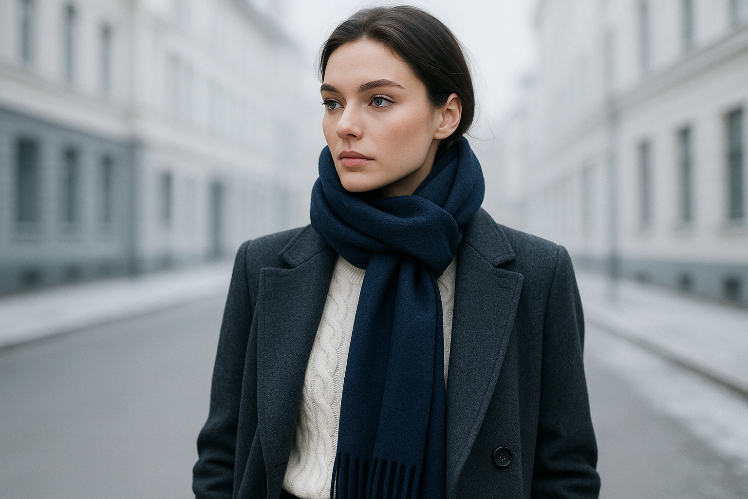
Understanding this light quality helps explain why certain colors feel instinctively “right” in winter. When you step outside in a charcoal coat and navy scarf, the colors harmonize with the environment rather than fighting against it. Your outfit becomes part of the seasonal landscape rather than an awkward contrast.
Why Cool Tones Photograph Better in Winter
For those who document their outfits on social media or simply want to look polished in winter photos, cool tones offer a distinct advantage. The blue undertones in winter light enhance rather than diminish cool-toned clothing, creating images that look balanced and intentional. Warm colors, by contrast, can create an unflattering orange cast when photographed in winter’s natural light.
This photographic advantage extends to professional settings as well. Video calls, headshots, and candid photos all benefit from clothing that works with rather than against ambient lighting. A crisp white blouse or slate gray blazer will consistently photograph well throughout the winter months.
Indoor vs. Outdoor Color Considerations
The January palette must work in multiple lighting environments, from bright office fluorescents to cozy restaurant lighting to the gray daylight of a winter afternoon. The beauty of clean, neutral colors is their adaptability—a well-chosen charcoal or navy piece transitions seamlessly between settings without looking out of place.
Consider how you’ll move through your day when selecting colors. A color that looks perfect in your bathroom mirror might appear completely different under your office’s overhead lights. January’s recommended palette of neutrals and cool tones minimizes these lighting-related surprises, ensuring consistent appearance across environments.
The Core January Color Palette
Building an effective January wardrobe starts with understanding the foundation colors that define the season’s aesthetic. These aren’t arbitrary choices—they reflect both the practical realities of winter weather and the visual harmony that comes from dressing in sync with your environment.
Winter White and Ivory Tones
Winter white represents January’s freshest, most modern choice. Unlike stark summer whites, winter white carries subtle warmth that prevents it from appearing harsh against cool-toned skin. Ivory, cream, and off-white variations offer similar sophistication while providing options for different skin undertones.
The key to wearing winter white successfully lies in texture. A chunky cable-knit sweater in cream reads as cozy and intentional, while a silk blouse in the same shade feels polished and refined. Mixing different textures within the white family creates visual interest without introducing competing colors.
Charcoal and Deep Gray Variations
Charcoal serves as January’s most versatile workhorse color. Deeper than medium gray but softer than black, charcoal offers visual weight without the starkness that can make black feel heavy. It pairs effortlessly with both warm and cool skin tones and works across casual and formal contexts.
The range of grays available provides endless mixing possibilities. A charcoal coat over a heather gray sweater with slate gray trousers creates a sophisticated monochromatic look that feels modern rather than boring. The subtle variations in tone add dimension while maintaining the clean aesthetic that defines January style.
Navy Blue as the Versatile Anchor
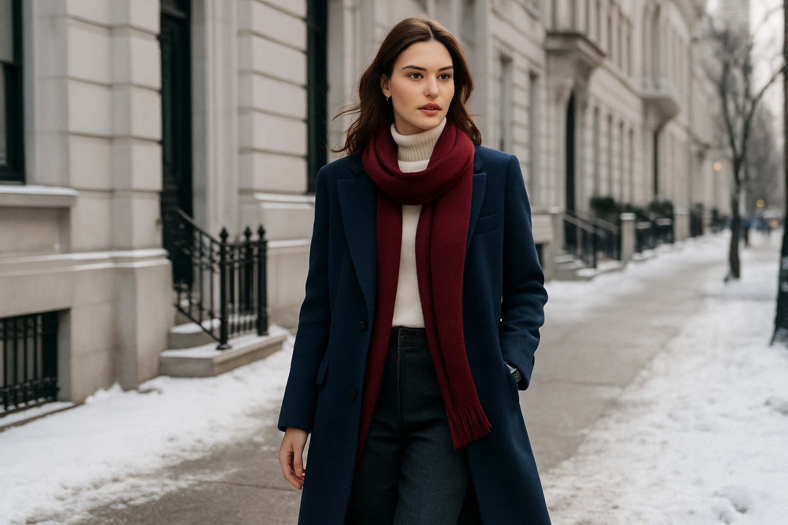
Navy bridges the gap between black’s formality and lighter blues’ casualness. As January’s anchor color, navy provides depth and sophistication while remaining approachable and versatile. It works equally well in professional settings and weekend casual contexts.
The best navy pieces have a richness that distinguishes them from faded or greenish versions of the color. Look for true navy with blue rather than green undertones—this cooler version harmonizes better with the rest of the January palette and maintains its impact across different lighting conditions.
Strategic Accent Colors for January
While the January palette emphasizes neutrals and cool tones, strategic accent colors prevent outfits from feeling monotonous. The key is selecting accents that complement rather than clash with the season’s dominant aesthetic.
Burgundy and Wine Tones
Burgundy offers warmth without brightness, making it the ideal January accent color. A burgundy scarf, handbag, or pair of gloves adds visual interest to a gray-and-navy outfit while maintaining the sophisticated mood. Unlike red, which can feel jarring against winter’s cool backdrop, burgundy blends seamlessly with the season.
When incorporating burgundy, treat it as a highlight rather than a dominant color. A single burgundy accent draws the eye without overwhelming the clean lines of your outfit. This restraint keeps the overall look sharp and intentional rather than busy or confused.
Forest Green and Deep Emerald
Forest green provides an earthy alternative to burgundy for those who prefer cooler accent tones. Like burgundy, it adds depth without brightness, creating visual interest while respecting January’s subdued aesthetic. Deep emerald versions carry more formality, making them appropriate for dressier occasions.
Green accents work particularly well with gray and navy combinations. A forest green sweater layered under a charcoal blazer creates a sophisticated color story that feels organic to winter without the predictability of all-neutral outfits.
Silver and Metallic Accents
For evening or special occasions, silver and pewter metallics align perfectly with January’s cool color story. Unlike gold, which can clash with the season’s blue-toned light, silver enhances the crisp, clean aesthetic. Subtle metallic touches in jewelry, shoes, or accessories elevate simple outfits without veering into holiday territory.
The key to wearing metallics in January is subtlety. A single statement piece or coordinated small accessories work better than full metallic garments. Think silver hoop earrings with a gray sweater or pewter ballet flats with navy trousers—touches that catch the light without dominating the outfit.
Building Monochromatic Winter Looks
Monochromatic dressing represents one of January’s most sophisticated styling approaches. By working within a single color family while varying texture and tone, you create outfits that look expensive and intentional with minimal effort.
Texture Combinations That Elevate January Outfits
When working with a restrained color palette, texture becomes your primary tool for creating visual interest. January’s fabrics—wool, cashmere, leather, silk—offer rich textural variety that compensates for limited color contrast.
Pairing different textures within the same color family creates sophisticated dimension. A matte charcoal wool coat over a slightly shiny silk blouse with soft cashmere trousers combines three textures while maintaining color harmony. The eye registers the variety without the visual noise of competing colors.
Knitwear plays a starring role in January texture combinations. Cable knits, ribbed patterns, and smooth jersey each read differently despite sharing the same base color. A cream cable-knit sweater feels entirely different from a cream cashmere turtleneck, allowing for variety within your white pieces.
Leather and suede add richness without introducing new colors. A gray suede ankle boot or black leather gloves provide textural contrast that grounds an outfit. These materials also photograph beautifully in winter light, adding depth to otherwise flat images.
Consider the weight of different textures when layering. Heavy fabrics like thick wool coats look best over lighter materials like silk or fine-gauge knits. This creates both visual and physical layering logic that reads as intentional and polished.
Sheer materials offer unexpected texture possibilities for January. A sheer black turtleneck under a charcoal blazer adds subtle visual interest while maintaining the clean aesthetic. The glimpse of skin through the fabric creates warmth without bright colors.
Mixing smooth and rough textures within one outfit adds sophistication. A rough tweed jacket over smooth silk, or nubby boucle with polished leather, creates the kind of textural story that makes simple outfits feel considered and complete.
Metallic threads woven into neutral fabrics offer subtle shimmer without overt sparkle. A charcoal sweater with subtle silver threading catches light beautifully without reading as dressy, making it appropriate for daytime wear while elevating the overall look.
Professional January Dressing
The workplace presents unique challenges for January dressing. You need colors that read as polished and professional while respecting the season’s aesthetic, all while transitioning between heated offices and cold commutes.
Office-Appropriate Winter White
Winter white works beautifully in professional settings when styled appropriately. A winter white blouse under a charcoal blazer reads as fresh and modern, while winter white trousers paired with a navy sweater offer a sophisticated alternative to standard black pants. The key is ensuring whites are truly clean—any yellowing or staining becomes more apparent in office lighting.
Layering prevents winter white from reading as too casual for the office. Rather than wearing a standalone white sweater, layer it under a structured blazer or vest. This adds the polish that professional environments require while still embracing January’s fresh aesthetic.
Building a Navy-Based Work Wardrobe
Navy serves as an excellent foundation for professional January dressing. Unlike black, which can appear harsh under fluorescent lighting, navy maintains its depth and richness across office environments. A navy suit or blazer provides the structure that workplaces expect while feeling fresh for the new year.
The versatility of navy extends to mixing with other January colors. Navy pairs equally well with gray, white, or black, allowing for varied combinations throughout the work week. This flexibility means fewer pieces can create more outfit options, simplifying morning decisions.
Gray Scale Professionalism
Different shades of gray offer endless professional outfit possibilities. A charcoal suit reads as formal and authoritative, while medium gray feels more approachable for creative workplaces. Light gray blouses and knits provide softness that balances darker suiting pieces.
The key to gray professionalism is avoiding colors that read as faded or worn. Invest in pieces that hold their color well and refresh your gray wardrobe when items begin to look dull. A crisp, fresh gray reads very differently from a tired, washed-out version.
Weekend January Style
Casual weekend dressing benefits equally from January’s clean color approach. The same color principles that create polished professional looks translate into relaxed weekend outfits that feel intentional rather than sloppy.
Casual Layer Building
Weekend January style revolves around comfortable layers in coordinating cool tones. A gray sweatshirt under a navy puffer jacket with charcoal joggers creates a cohesive casual look that could transition from coffee runs to afternoon errands. The coordination elevates basics beyond gym clothes while maintaining comfort.
Quality materials matter even in casual contexts. A well-made gray sweatshirt in heavy cotton reads very differently from a thin, cheap version. January’s limited color palette puts focus on individual pieces, making quality more visible than it might be in a busier outfit.
Athleisure in Winter Colors
Athletic-inspired pieces work beautifully within the January palette. Navy leggings, white sneakers, and a gray fleece create an outfit that works for both actual exercise and casual outings. The clean color story elevates athleisure beyond purely functional gym wear.
Mixing athletic pieces with non-athletic items creates interesting casual looks. Navy track pants with a cream cashmere sweater and white leather sneakers bridges the gap between dressed-up and relaxed, appropriate for a wide range of weekend activities.
Denim as a January Neutral
While not part of the strict January color palette, quality dark denim functions as a neutral within this framework. Deep indigo jeans pair seamlessly with whites, grays, and navy, serving as a casual foundation for weekend outfits. Lighter washes, however, can disrupt the clean aesthetic—stick with dark or black denim for January.
The key to incorporating denim is treating it with the same intentionality as other January pieces. Well-fitting, clean, dark jeans read very differently from faded, distressed versions. Choose quality denim that holds its color and shape to maintain the polished casual look.
- Cool colors like gray and navy convey reliability and professionalism
- White communicates cleanliness, organization, and fresh thinking
- The absence of bright colors can signal sophistication and restraint
- Monochromatic looks create an impression of intentionality and attention to detail
- Navy specifically reads as trustworthy and authoritative
- Gray suggests neutrality and balanced judgment
- Burgundy accents add warmth without sacrificing professionalism
- Clean, well-maintained clothing signals competence regardless of color
- Color consistency across an outfit suggests planning and attention to detail
- The January palette’s simplicity often reads as confident and assured
- Avoiding trendy colors can signal timeless taste and judgment
- Subtle color variations demonstrate sophisticated visual awareness
Color Psychology and First Impressions
Accessories That Complete January Looks
Accessories offer opportunities to refine and personalize the January palette. The right pieces elevate simple outfits while maintaining the clean aesthetic that defines the season.
Scarves and Cold Weather Accessories
Scarves serve both practical and aesthetic purposes in January. A gray cashmere scarf adds luxury while providing genuine warmth, and the drape creates visual interest around the face. Multiple scarves in different gray tones offer variety within a consistent color story.
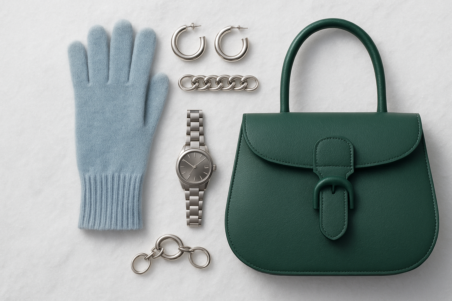
Gloves, hats, and earmuffs provide additional opportunities for color coordination. Matching these accessories to your coat or scarf creates a polished appearance, while intentionally contrasting burgundy or forest green gloves add strategic pops of color against neutral outerwear.
Bags and Leather Goods
January is an excellent time for structured leather bags in black, gray, or navy. These colors work with virtually any outfit while providing the polished finish that defines winter style. A quality leather tote in charcoal functions as both a practical work bag and a style statement.
Consider texture in leather goods as well as color. Pebbled leather reads differently from smooth, and suede offers another textural option entirely. A gray suede crossbody bag adds softness to an outfit dominated by structured wool pieces.
Jewelry Choices for Winter
Silver and white gold naturally complement the January palette better than yellow gold. The cool tones of these metals harmonize with cool clothing colors, creating a cohesive overall look. Statement silver pieces work particularly well against the neutral backdrop of winter whites and grays.
Pearl jewelry offers another excellent option for January. The subtle iridescence of pearls catches winter light beautifully while maintaining the sophisticated, understated mood of the season. A simple pearl necklace or earrings elevates basic outfits without competing for attention.
Building Your January Capsule Wardrobe
Creating a focused January wardrobe simplifies daily dressing while ensuring you always look polished. A well-planned capsule eliminates decision fatigue and guarantees coordinating pieces.
Essential Outerwear Pieces
A quality coat in charcoal or navy forms the foundation of any January capsule. This piece will be seen most often and should represent your best investment. Look for classic silhouettes in quality wool that will serve you for many winters to come.
A secondary outerwear piece in a contrasting neutral adds variety. If your primary coat is charcoal, consider a navy or camel option for days when you want visual change without compromising the clean aesthetic. Down puffers in navy or black provide practical warmth for the coldest days.
Knit and Layering Basics
Quality knits in white, gray, and navy form the core of January layering. A cream cable-knit sweater, a charcoal cashmere turtleneck, and a navy crewneck provide three distinct looks while maintaining color consistency. These pieces should fit well and hold their shape through repeated wear.
Cardigans and sweater jackets offer additional layering options. A long gray cardigan works over both casual and dressier base layers, transitioning from weekend lounging to office wear. Look for pieces that can function in multiple contexts to maximize your capsule’s versatility.
Bottoms That Mix and Match
Trousers and pants in charcoal, navy, and black ensure that any top in your capsule will coordinate. Quality wool trousers work for professional settings, while well-cut jeans in dark indigo serve casual occasions. Each bottom should pair seamlessly with every top in your collection.
Consider silhouette variety within your consistent color story. Wide-leg trousers, slim pants, and straight-leg jeans each create different looks while maintaining color coordination. This variety keeps the capsule feeling fresh despite its limited palette.
Maintaining January Garments
The investment in quality neutral pieces requires proper care to maintain their appearance. January’s colors show wear and staining more readily than darker alternatives, making maintenance particularly important.
Wool coats require proper hanging and occasional brushing to maintain their appearance. Use wooden or padded hangers that support the shoulders without distorting the fabric. Brush off surface dirt and lint regularly, and have coats professionally cleaned only when truly necessary to preserve the fabric.
White and cream pieces demand immediate attention to stains. Keep a stain stick in your bag for emergencies, and treat spots as quickly as possible. Wash whites separately and consider using color-safe brighteners to maintain their crispness throughout the season.
Gray and navy pieces show dust and lint more readily than black. A lint roller becomes an essential tool for keeping these colors looking fresh. Store pieces properly between wearings and steam or press as needed to maintain clean lines.
Leather goods benefit from regular conditioning to prevent drying and cracking in winter’s harsh conditions. Salt stains from sidewalks should be addressed immediately to prevent permanent damage. Store bags properly when not in use to maintain their shape and appearance.
Knitwear requires gentle handling to prevent stretching and pilling. Fold rather than hang sweaters, and use a fabric shaver to remove pills as they appear. Quality knits will last for years with proper care, making the investment worthwhile.
Rotate your pieces regularly to prevent excessive wear on any single item. Having multiple options in similar colors means no single piece bears the burden of daily wear, extending the life of your entire wardrobe.
Summary Table
| Category | Core Colors | Accent Options | Key Considerations |
|---|---|---|---|
| Outerwear | Charcoal, Navy | Camel, Forest Green | Quality wool, classic silhouettes |
| Knitwear | White, Gray, Navy | Burgundy | Varied textures, quality materials |
| Bottoms | Charcoal, Navy, Black | Dark Indigo Denim | Multiple silhouettes for variety |
| Accessories | Black, Gray | Silver metallics | Coordinate with outerwear |
Conclusion
January’s crisp, clean color palette offers a refreshing approach to winter dressing that feels both timeless and modern. By embracing whites, grays, and navy as your foundation, you create a wardrobe that photographs beautifully, transitions seamlessly between settings, and projects sophisticated intentionality. The limited palette actually simplifies dressing decisions while ensuring you always look polished.
The key to success with the January palette lies in quality over quantity and attention to texture and detail. When color variety is limited, each piece must earn its place through excellent fit, superior fabric, and versatile styling potential. This approach naturally builds a more thoughtful, sustainable wardrobe that serves you well beyond a single season.
Frequently Asked Questions
Can I wear black in the January palette?
Black works well within the January palette, especially for professional settings or as a grounding color in accessories. The key is treating black as one option among many rather than the default choice. Charcoal often creates a softer, more modern look while providing similar versatility.
How do I add personality without bright colors?
Texture, silhouette, and accessories offer endless personality possibilities within a neutral palette. Interesting jewelry, distinctive shoes, quality scarves, and unique bag shapes all express personal style without introducing clashing colors. The restraint of the palette actually highlights these individual touches.
Is winter white hard to maintain?
Winter white requires more careful maintenance than darker colors, but quality pieces are manageable with proper care. Treat stains immediately, wash or dry clean appropriately, and store carefully. Many people find that having fewer, better white pieces makes maintenance more feasible than a larger quantity of lower-quality items.
What if my skin tone is warm?
While the January palette emphasizes cool tones, warm-skinned individuals can adapt the approach by choosing creams over stark whites and ensuring grays lean slightly warm rather than blue. Navy and charcoal typically flatter all skin tones. Adding burgundy accents near the face can also warm up the overall look.
How do I transition this palette into February?
The January palette serves as an excellent foundation for late winter dressing. As spring approaches, you might gradually introduce soft pastels or warmer neutrals like camel and tan. However, the core pieces in gray, navy, and white remain useful year-round and don’t need to disappear when the calendar changes.
Can men follow the same guidelines?
Absolutely. The January palette translates perfectly to menswear, where navy, charcoal, and white already dominate. Men might emphasize different textures—tweed, oxford cloth, merino wool—but the color principles remain identical. A charcoal overcoat, navy blazer, and white oxford shirt exemplify classic masculine winter style.
What about patterns?
Subtle patterns in January palette colors work beautifully within this framework. Houndstooth, herringbone, and subtle plaids in gray and charcoal add visual interest without introducing competing colors. The key is ensuring any pattern uses only colors already within your palette, maintaining the clean, coordinated aesthetic.
How do I know if a gray is too warm or cool?
Compare the gray against a piece of white paper or fabric in natural light. Grays with blue undertones will appear cooler against the white, while grays with brown or yellow undertones will appear warmer. For the January palette, cooler grays typically work better, though a mix of both can add subtle dimension.

Anna West, the visionary behind Clothes Color Guide, is our go-to for all things fashion. Merging the finest of runway trends with everyday style, she demystifies the world of color and pattern. While clothing is her mainstay, Anna also shares insights on interior design, pet care, and relationship advice. Dive into her articles and emerge with a vibrant perspective on style and life.
Reviewed By: Joanna Perez and Marcella Raskin
Edited By: Lenny Terra
Fact Checked By: Sam Goldman
Photos Taken or Curated By: Matthew Mansour
