Key Takeaways
- Brown carries a sense of stability, comfort, and earthy calm in many cultures.
- It can influence emotions by creating a cozy and reliable atmosphere.
- Designers and brands often choose brown for its authentic feel and practical appeal.
- Brown fits well in interior design, marketing, and personal style when used with intention.
- Thoughtful use of brown can ground a space or product and foster a sense of security.
Introduction
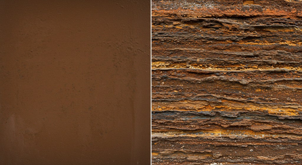
Brown seldom gets the spotlight, yet it resonates with profound warmth and reliability. This color emerges from nature’s palette—tree bark, rich soil, and roasted coffee beans.
Its presence fosters a comforting vibe that many associate with resilience, vibrancy, and sincerity. Brown rarely shouts; it speaks in gentle tones of loyalty and stability.
Think about how brown feels. It might remind you of old leather-bound books or a cherished armchair. These objects suggest reliability and warmth. Brown’s emotional impact flows from its grounding quality.
Some people link brown to dependable characters, while others see a more understated elegance. It can be down-to-earth, reassuring, and quietly confident. Brands often consider brown when they want to project authenticity, wisdom, or a touch of classic charm.
Brown’s symbolism can vary across different regions. In some places, it points to simplicity and humility. In other contexts, it can be tied to comfort food traditions, like chocolate or freshly baked bread, which create a welcoming mood.
As a design color, brown can blend into numerous color palettes for homes, offices, or digital interfaces. It offers a base that helps other hues pop, yet it never demands attention for itself.
In marketing, brown often appears in food packaging and coffee shop branding to convey an organic or wholesome essence. This approach links brown to earthy experiences and triggers a sense of trust.
Its use in emotional branding encourages a grounded and approachable feeling. Whether you’re curious about color theory, color psychology research, or simply wish to expand your palette, brown beckons you to notice its subtle power.
Below, you’ll find 14 sections with practical insights. Each one explores color meanings, symbolic colors, and strategies for making brown shine. Let’s discover how brown’s warm presence influences our moods, our design choices, and even our buying decisions.
Brown as a Symbol of Stability
A Quiet Foundation
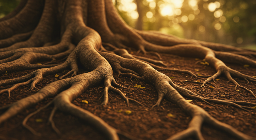
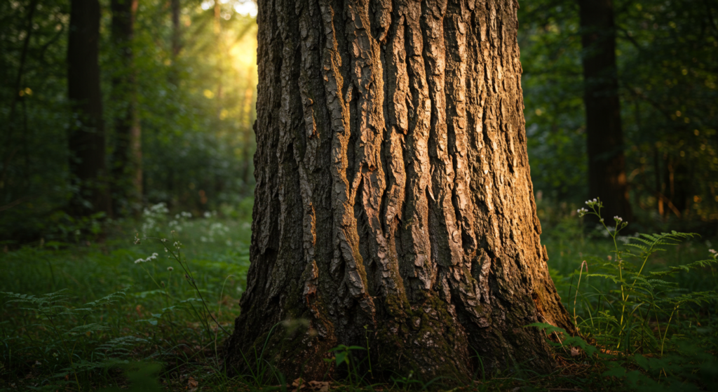
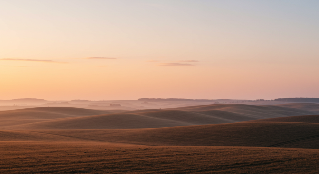
Brown stands out as a foundation hue because of its organic roots. It’s the color of tree trunks, fertile soil, and natural landscapes. This tie to the earth gives it a grounding effect. When we think of stability, we might picture the trunk of an old oak tree, sturdy and reliable through changing seasons. Brown’s presence hints at consistency and safety.
Emotional Anchoring
On an emotional level, brown is like a steady anchor. It can reduce nervousness and restlessness by adding a calming element to surroundings. Color symbolism studies suggest that browns, especially those found in nature, help people feel more centered. When you’re decorating a living space or designing a product, choosing shades of brown can create a sense of comfort that soothes the spirit.
Practical Expressions
Brown isn’t flashy. Instead, it emphasizes practical charm. Think of the sturdy boots we rely on in muddy terrains or the wooden table at the heart of family gatherings. These objects reflect endurance and reliability. Brown’s power lies in its natural inclination to be humble yet strong. Whether you’re a business or an individual, harnessing brown can help you project trustworthiness without shouting for attention.
Embracing Brown in Personal Style

Wearing Earthy Hues
In clothing, brown often speaks of a down-to-earth spirit. A simple brown jacket or pair of shoes can suggest low-key confidence. People sometimes pick brown accessories when they want to look polished yet not too flashy. Shades like chocolate, espresso, or camel adapt to many styles and match well with blues, greens, or even bright oranges.
Adding Brown Accents
If you’re not ready for a full outfit in brown, consider touches like a belt, a bag, or even jewelry with wooden elements. These small items can soften bold colors in your wardrobe. Brown accents offer a layer of calm, especially when paired with more energetic shades. They also bring a sense of originality—not everyone thinks of brown first when choosing accessories.
Personality Reflections
Personality-wise, brown hints at someone grounded, supportive, and possibly reflective of nature’s pace. Some people see it as old-fashioned, but many find beauty in its depth. Brown can also show a preference for comfort over trends. If you want your look to broadcast stability and mild sophistication, embracing brown in your personal style might be a good step.
Cultural Views on Brown

Eastern Perspectives
In several Eastern cultures, brown may represent humility and closeness to the earth. Ceremonies often use earthy tones as symbols of tradition. In some locales, monks wear brown or saffron robes to signify detachment from material pursuits. This color choice encourages a focus on spiritual life rather than external flair.
Western Interpretations
In Western countries, brown can carry a rustic charm, hinting at pastoral scenes, farmland, and homely comfort. Brown’s association with harvest and autumn can make it feel welcoming. It recalls warm fireplaces and gatherings around hearty meals. This interpretation often lends itself to design choices in cabins, countryside living, or cozy cafés.
Modern Shifts
As global trends change, brown finds new roles. Some see it as eco-friendly because it aligns with raw materials like wood, cork, or recycled paper. Younger generations might pair brown with vibrant colors to create a fresh twist on classic aesthetics. This reveals brown’s versatility—it can be both traditional and contemporary, bridging different cultural tastes.
Emotional Branding with Brown
Trust-Building
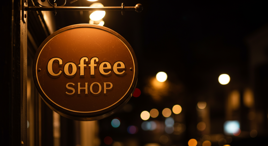
In branding, color can shape consumer reactions. Brown, with its link to security, can help a brand appear authentic and grounded. Coffee shops, for instance, employ shades of brown to highlight an organic or artisanal feel. The consumer subconsciously associates brown with earth-derived products, which sparks a sense of trust and comfort.
Cozy Storytelling
Emotional branding isn’t only about facts. It’s about a narrative that grabs people’s hearts. Brown can weave a story of warmth, reliability, and nostalgia. Marketing teams often use browns in packaging to reflect old-fashioned quality. A box with a textured brown pattern can feel more personal than a glossy bright design.
Consumer Loyalty
When customers find comfort in a brand’s look and feel, they’re more likely to return. Brown’s stable presence strengthens that bond. It suggests the brand values tradition and quality. Over time, this repeated encounter with a cozy color scheme builds a sense of loyalty—shoppers feel like they’re coming home to a familiar place.
Brown in Traditional Art
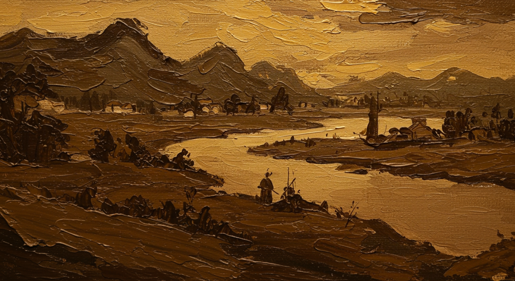
Classic Materials
Artists throughout history have relied on earthy pigments derived from clay, soil, or charcoal. These sources produce browns that bring depth and warmth to paintings. The color appears in classic portraits, landscapes, and religious art. Its organic tone helps blend the human figure with nature, creating a sense of unity.
Symbolic Motifs
In older artworks, brown could stand for humility or spiritual longing. Monks’ robes, rustic huts, and barren terrains all revolve around brown’s capacity to represent simple living. Religious iconography sometimes pairs bright gold with brown backgrounds to emphasize devotion rising from humble origins.
Timeless Appeal
Traditional art still fascinates viewers because of the subtle interplay of color. Brown’s ability to anchor a scene plays a big part. Even centuries-old pieces carry a sense of comfort and reality. The warm undertones help viewers connect emotionally with the images. This reveals why brown holds a special spot in art history.
Brown in Modern Design
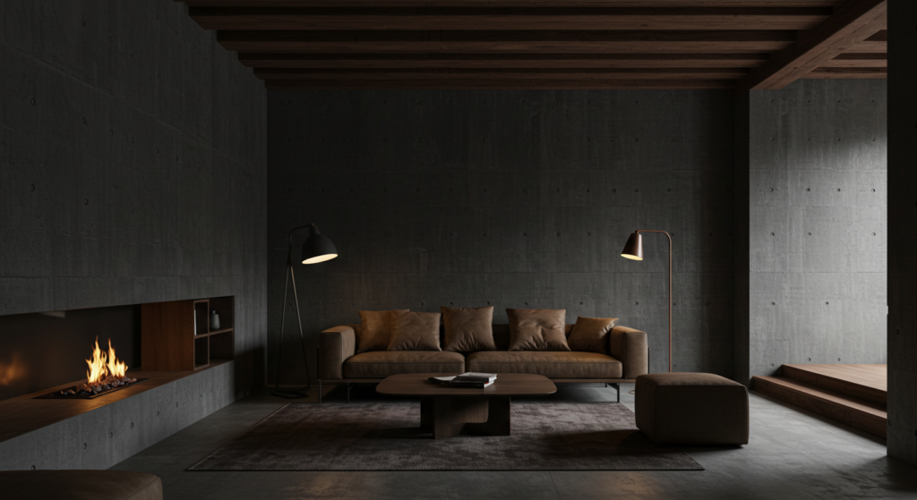
Minimalist Trends
In modern design, neutrals often rule. Brown fits right in, especially in minimalist themes that rely on calm backdrops. Interior designers use natural wooden floors or exposed beams to balance stark white walls. This interplay creates a gentle contrast that feels inviting rather than clinical.
Futuristic Twists
Some contemporary designers mix brown with sleek metal or glass. The organic-meets-tech blend highlights brown’s ability to play well with bold shapes and modern lines. Picture a coffee table with a metal frame and a live-edge wooden surface. The result is a conversation starter that bridges two styles in one piece.
Embracing Texture
Texture adds depth to modern spaces. Brown can appear in rough linens, woven baskets, or sculpted ceramics. These items soften minimalist rooms, introducing a layer of warmth. By varying textures, you bring brown’s comforting tone into the foreground without drenching a space in color.
Layering Brown in Interiors
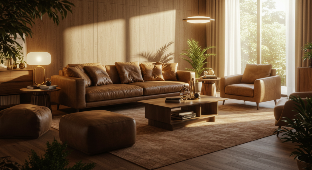
Flooring and Furniture
When layering browns, start with large surfaces. Wooden floors or big furniture pieces set the tone. If they’re dark, pick lighter shades for walls. If they’re light, experiment with deeper browns for rugs or tables. The contrast prevents a room from feeling heavy.
Textiles and Accessories
Small touches add life to an interior. Throw pillows, blankets, and curtains can showcase different textures of brown. Linen, suede, or wool each bring a unique feel. These layers make a home cozy while keeping it visually varied.
Complementary Hues
Brown works well with both cool and warm colors. Soft blues and sage greens brighten a brown-heavy space. Rich reds or oranges amplify brown’s earthy undertones. Designers often pair brown with neutral shades—like ivory or taupe—to maintain balance. The key is to avoid monotony by introducing contrast.
Brown’s Role in Technology Branding

Understated Professionalism
Technology brands often pick bright colors for logos or packaging. Brown, on the other hand, can communicate seriousness and dependability. A tech product with a brown logo might look less flashy but more stable. This strategy sets the brand apart in a sea of neon or metallic finishes.
Connection to Nature
Some tech firms aim to show they care about the environment. Subtle brown accents in packaging or device cases can reinforce that message. This might involve cardboard boxes with a natural look or product details that highlight recycled materials. Brown, in this case, suggests an honest approach.
Evoking Simplicity
Certain gadgets can overwhelm with complexity. Brown can offset that impression. By using a calm, grounded color, tech brands can make their devices appear simpler to use. This approach invites people who appreciate straightforward design and practical function over flashiness.
Food and Beverage Packaging with Brown

Organic Impressions
Many food brands select brown packaging to signal natural or whole ingredients. Paper bags, cardboard boxes, or burlap wraps in shades of brown hint that items inside are farm-fresh or minimally processed. This visual color language can reassure shoppers that products have an authentic origin.
Earthy Textures
Brown packaging often comes with a matte or kraft finish, which feels more approachable than glossy wrappers. The texture can also suggest handmade quality. Pairing brown with simple labels and muted typography helps products stand out through quiet confidence.
Telling a Story
A chocolate brand, for example, can use dark brown on its box to echo the richness of cacao. A tea brand might use lighter browns to reflect the calming nature of herbs. These storytelling cues help customers form a quick connection with the item and trust its quality.
Brown in Outdoor Spaces
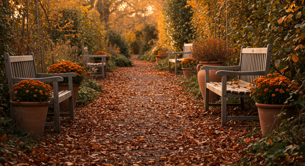
Garden Paths and Furniture
Brown in outdoor areas blends into the natural setting. Wooden benches, trellises, and fences create harmony with green plants. The color echoes the tree trunks and soil, forming a pleasing unity. It also helps highlight colorful blossoms, as the subtle brown background lets the flowers pop.
Balancing Stone and Soil
Stone or concrete can appear cold. Pairing them with brown mulch, wood chips, or terracotta pots introduces warmth. Brown’s presence counteracts the starkness of stone by adding a comforting layer. It’s an easy way to make a patio or pathway feel more welcoming.
Natural Restorative Energy
Spending time outdoors fosters a sense of peace. Brown’s link to nature can enhance that feeling. Whether it’s a wooden deck or a simple wooden swing, using brown elements in outdoor design reminds people of the earth’s calming pace. This color anchor soothes the senses and encourages relaxation.
The Psychology of Brown in Marketing

Grounded Messaging
Marketing campaigns often revolve around feelings. Brown can symbolize honesty and practicality. Ads that show chocolatey backgrounds or wooden textures speak to comfort and nostalgia. This approach can be effective when a company wants to appear genuine rather than flashy.
Quiet Confidence
Brown rarely feels aggressive. Brands that want a mellow but confident voice may include brown in their color palette. This tone conveys, “We’re here for the long haul and know our roots.” Consumers respond well to that message when they seek reliability over hype.
Niche Appeal
Not every product benefits from high-energy color. Health foods, artisanal crafts, and simple household tools can thrive under a brown theme. It helps them stand out among more vibrant competitors, especially if they aim for a niche that values slow living, organic practices, or homemade charm.
Crafting a Brown-Focused Color Palette

Gather Inspiration
Starting a new palette calls for exploring. Look at nature photos or art pieces that use brown in interesting ways. Notice how pine cones, tree bark, or coffee foam contain subtle color variations. Those real-world tones can shape your palette choices.
Create Contrast
A palette centered on brown can use other colors to create contrast and avoid dullness. Perhaps a deep espresso base, a warm caramel accent, and a soft cream highlight. The interplay of dark, mid-tone, and light keeps designs fresh. Splashes of teal or coral also add personality.
Test and Adjust
Before finalizing any palette, test it on mockups or small samples. Look at it in different lighting—natural daylight, evening lamps, or smartphone screens. Brown can shift tones dramatically under varying light conditions. A polished palette will work seamlessly in multiple settings and enhance the overall design.
Common Myths about Brown
“Brown Is Boring”
Some claim brown lacks flair. Yet brown’s understated style can be a strength. Pairing it with unexpected colors or materials can make a bold statement. Its warmth balances dramatic hues better than a flat gray might.
“It Only Belongs in Rustic Themes”
People often assume brown only fits rustic cabins or old-fashioned settings. But modern designers combine brown with sleek metals or geometric shapes to craft cutting-edge spaces. Brown’s versatility lets it shine in both traditional and futuristic environments.
“There’s No Range in Brown”
Brown covers a wide spectrum—coffee, oak, chestnut, cinnamon, sepia, mahogany. Each shade carries a unique feeling. By layering multiple browns or mixing different textures, you can create an eye-catching palette that highlights the color’s depth and variety.
Future Trends for Brown

Eco-Conscious Design
As more individuals seek sustainable products, brown is set to grow in popularity. Designers may focus on biodegradable packaging, wooden elements, and earthy color themes. Brown will stand out as a go-to choice for brands wishing to show a natural identity.
Digital Applications
Brown rarely dominates digital interfaces, but that may shift. App designers, web developers, and UI experts could adopt brown backgrounds for a calm user experience. Paired with white or pastel fonts, these designs can create an inviting online space that differs from the usual stark white or deep black screens.
Mixing Cultural Influences
As the world grows more interconnected, brown might blend global traditions in unique ways. Textiles, patterns, and craft methods from many places can unify under this hue. The result could be a design language that highlights the color’s timeless nature while adding fresh cultural elements.
Conclusion
Brown rarely begs for attention, yet its impact on our emotions, choices, and environments can be profound. Whether you’re decorating a space, selecting brand colors, or planning an outfit, brown’s warmth and reliability leave a lasting impression.
Its roots in nature make it a color that supports balance and invites reflection. Brown remains approachable and versatile, bridging tradition and innovation with ease.
When you harness brown correctly, you can communicate comfort without losing sophistication. In marketing, it resonates with customers who yearn for trustworthy products and genuine stories.
In design, it anchors spaces, letting bolder shades shine. In culture, it weaves through histories and ceremonies, linking back to ancient soil and daily life. Brown shows that sometimes the quietest presence speaks the loudest.
If you appreciate its calming aura, incorporate it in subtle ways—wooden frames, soft pillows, or an accent wall. If you wish to go big, embrace its full range, from light tan to deep chocolate, and pair those shades for dramatic yet comforting results.
Brown stands ready to infuse warmth wherever it’s placed. You only need to see its subtle magic to appreciate the stable foundation it provides.
Summary Table
Below is a quick reference that outlines key aspects of brown in different contexts:
| Aspect | Details |
|---|---|
| Core Traits | Warm, reliable, stable, comforting |
| Emotional Impact | Calming, grounding, fosters trust |
| Cultural Meanings | Symbolizes humility in some Eastern contexts; suggests rustic charm in Western views |
| Design Uses | Ideal in interiors (wood, textiles), branding (packaging, logo accents), and web design |
| Branding Benefits | Conveys authenticity, organic value, and dependable quality |
| Pairing Colors | Works well with blues, greens, creams, and richer warm hues like red and orange |
| Textural Applications | Suede, wood, stone, ceramic; each adds depth and variety |
| Myth Busting | Not always boring, not limited to rustic themes, huge range of shades available |
| Future Trends | Eco-focused designs, digital interface backdrops, blended cultural influences |
Feel free to explore each trait for deeper inspiration. Brown’s potential stretches far beyond its usual roles, offering a wide palette of meaningful possibilities.
FAQ
1. Is brown a good choice for a modern home?
Yes. Brown adds warmth to modern spaces. Balancing it with cool metals or glass can produce a sleek, contemporary style. Try mixing darker browns with lighter hues for a refined look.
2. Does brown make a room feel small or cramped?
That depends on the shade and how it’s used. Dark browns can create a cozy vibe but might shrink a space if overused. Add lighter furniture or bright accent colors to open up the room.
3. Why do so many coffee and chocolate brands use brown?
Coffee and chocolate brands rely on brown’s link to nature and comfort. This color triggers thoughts of roasted beans, earthy flavors, and wholesome origins.
4. How can I mix brown with other colors in graphic design?
Combine brown with cool tones like teal, sage, or slate blue for contrast. For a warmer palette, blend it with soft creams, rust hues, or even a hint of gold. Consider texture to add more dimension.
5. Are there any psychological drawbacks to using brown?
Too much brown in a setting can feel dull or heavy. Balancing it with complementary or contrasting colors helps maintain harmony. Also, ensure you pick appealing tones—some muddy browns can look dated or uninviting.
6. How can brown reflect brand personality?
Brown suggests dependability, tradition, and sincerity. If you want your brand to appear grounded and honest, it’s a fitting choice. Think about your product, audience, and competition before finalizing your color scheme.
7. Can brown work for tech and digital brands?
Yes, especially if you want to communicate trust, eco-awareness, or user-friendly design. It sets you apart in a market where bright colors often dominate. Brown’s laid-back nature can speak to a thoughtful brand style.
8. What are some quick tips for using brown in interior design?
Look at existing furniture. Decide if you want a dark or light floor. Introduce layers with textiles (pillows, rugs). Offset heavier tones with bright or neutral walls, and experiment with plants or metallic accents for visual interest.
9. Is brown considered masculine or feminine?
Brown tends to be viewed as gender-neutral. It focuses more on stability, nature, and coziness. It can fit any space or wardrobe without leaning too heavily one way or the other.
10. What’s the difference between neutral browns and warm browns?
Neutral browns have undertones of gray or taupe, appearing more subdued. Warm browns lean toward red or yellow, which feel cozy. Each can work depending on the mood you want to set.
11. Do different shades of brown have distinct meanings?
Yes. Lighter tans can suggest freshness and youthfulness. Darker browns, like walnut or espresso, imply maturity and depth. Each tone carries a unique emotional weight.
12. Will using brown help me connect with an eco-friendly audience?
It can. Brown naturally aligns with organic, earthy themes. Combine it with recycled materials or green messaging for a stronger impact on eco-conscious consumers.
13. How do I prevent a brown-heavy design from looking outdated?
Use accents in modern materials or shapes. Integrate fresh colors like mint, coral, or cool grays. Try geometric patterns or sleek furniture to keep your design current.
14. Are there any rules about wearing brown with black or navy?
Traditional advice once frowned on mixing those colors. Styles have evolved, and brown can work with black or navy if you pick the right shade. Add in a lighter neutral (white, beige) to balance the overall look.
Brown, with its warmth and reliability, has proven it can stand strong in many contexts. Whether you choose it for design, branding, or personal style, it rewards with a calm confidence that resonates across cultures and trends. Embrace its unique qualities and let brown lend its stable spirit to your projects.

Neha Z. is not just any writer; she’s a storyteller who has graced the online world with her evocative prose for over half a decade. Venturing into the intricate nuances of women’s lives, she weaves stories that range from life’s highs and lows to the multifaceted essence of femininity. Each piece she pens radiates sincerity and artistry. As you delve into Neha’s musings, you’ll find reflections that echo your own journey and insights that inspire. Immerse yourself in her world, and let her stories touch your heart.
Reviewed By: Joanna Perez and Anna West
Edited By: Lenny Terra
Fact Checked By: Matthew Mansour
Photos Taken or Curated By: Matthew Mansour