Key Takeaways
- Beige dominated neutral fashion for decades, but shifting cultural values are pushing warmer, more nuanced alternatives to the forefront
- Greige (gray-beige), oatmeal, mushroom, and putty are emerging as the next generation of go-to neutrals
- Climate-conscious fashion is driving interest in earth tones that feel connected to nature rather than artificially muted
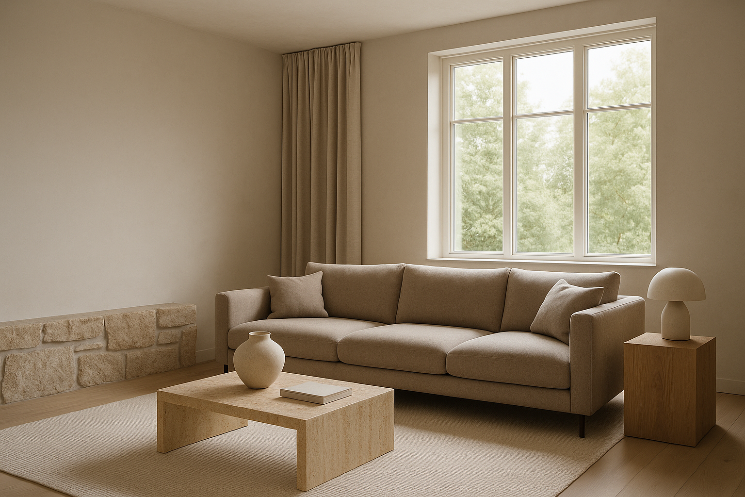
- The rise of “warm minimalism” in interior design is influencing fashion’s neutral palette preferences
- Undertone awareness has made consumers more selective—they want neutrals that actually flatter their skin
- Digital-first shopping means neutrals need to photograph well under various lighting conditions
- Sustainability concerns favor neutrals that pair with more items, reducing the need for excessive purchasing
- The new neutrals lean warmer overall, reflecting a collective desire for comfort and approachability post-pandemic
For the better part of three decades, beige held an almost tyrannical grip on the concept of “neutral.” It was the default for office walls, rental apartments, capsule wardrobes, and anything marketed as “timeless.” But fashion has a way of growing restless with even its most reliable staples. As we move deeper into the 2020s, a quiet revolution is taking place in the world of muted tones. The next generation of neutrals isn’t just replacing beige—it’s redefining what it means for a color to fade into the background while still making you look polished and intentional.

Why Beige Is Losing Its Crown
Beige became synonymous with safety, and in a world craving authenticity and character, safety started feeling like a liability. The color that once signified understated elegance began reading as bland, corporate, and disconnected from the earthy, textured aesthetic that dominates contemporary style.
The Overexposure Problem
Every trend has a saturation point, and beige reached its long before most people noticed. From fast-fashion basics to luxury handbags, the shade appeared so universally that it lost its ability to communicate anything specific. When everyone owns beige, owning beige says nothing about your personal style or taste level.
The digital age accelerated this fatigue. Social media feeds filled with identical beige-toned flatlays and outfit posts created a visual monotony that made viewers scroll faster. The color that was supposed to be timeless started feeling tired, prompting style-conscious consumers to seek neutrals with more personality and depth.
Undertone Awareness Changed the Game
Thanks to color analysis content flooding TikTok and Instagram, millions of people learned that not all neutrals are created equal. Traditional beige—often leaning yellow or pink—doesn’t flatter everyone. Cool-toned individuals discovered it made them look washed out, while warm-toned people found it competing with their natural coloring rather than complementing it.
This newfound undertone literacy created demand for neutrals that work harder. Consumers now want options: cooler taupes, warmer putties, and true balanced neutrals that don’t pull in unexpected directions. Beige’s one-size-fits-all approach suddenly felt outdated in a market that celebrates individual differences.
The Minimalism Backlash
The 2010s minimalism movement leaned heavily on beige as its aesthetic anchor. But as that era’s stark, sparse interiors gave way to warmer, more collected spaces, fashion followed suit. People wanted their clothes to feel lived-in and welcoming, not clinical and detached.
This shift doesn’t mean maximalism won—it means a softer, more humanized minimalism emerged. The neutrals driving this new aesthetic have visible warmth and texture. They reference natural materials like clay, stone, and dried grasses rather than the processed, commercial feeling of standard beige.
The Contenders: Neutrals Rising to Replace Beige
Several shades are competing for beige’s throne, each offering something the old guard couldn’t. These emerging neutrals share common traits: they photograph beautifully, flatter a wide range of skin tones, and carry enough visual interest to work as statement pieces while still functioning as basics.
Understanding these alternatives helps you future-proof your wardrobe and make smarter purchasing decisions as the color landscape continues to evolve.
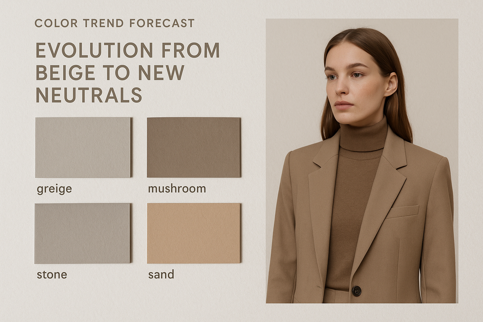
- Greige: The sophisticated gray-beige hybrid that splits the difference perfectly
- Oatmeal: A warm, creamy shade with visible texture that feels cozy and elevated
- Mushroom: Earthy gray-brown that references natural forms and organic living
- Putty: A warmer, more golden alternative that flatters warm skin tones beautifully
- Stone: Cool and grounded, perfect for those who found beige too yellow
- Sand: Similar to beige but with more depth and less pink undertone
- Ecru: The undyed fabric shade that speaks to sustainability and authenticity
- Fawn: A soft brown with gray undertones that feels modern and fresh
- Pebble: Neutral gray with warmth that bridges cool and warm palettes
- Clay: Rich, earthy, and warm—the aesthetic anchor of desert-inspired fashion
- Bone: Warmer than white, cooler than cream, universally flattering
- Driftwood: Gray-brown with visual texture that photographs exceptionally well
- Wheat: Golden warmth without veering into yellow territory
- Barley: Similar to oatmeal but with more gray undertone for cooler palettes
- Sandstone: The architectural neutral that brings instant sophistication

Greige: The Frontrunner
If one shade had to be named beige’s most likely successor, greige would win by a comfortable margin. This gray-beige hybrid offers the warmth people loved about beige while adding the sophistication of gray. It reads as intentional rather than default, modern rather than dated.
Interior designers embraced greige years before fashion caught up, proving its versatility across contexts. Now, fashion is following that lead, with luxury brands and high-street retailers alike featuring greige prominently in their neutral offerings. The shade works across seasons, flatters most skin tones, and photographs beautifully in both natural and artificial light.
What makes greige particularly compelling is its chameleon quality. Depending on the light and surrounding colors, it can read warmer or cooler, always adapting to its environment. This flexibility makes it incredibly practical for building a wardrobe that needs to work across different settings and occasions.
The shade also sidesteps beige’s association with blandness. Gray carries connotations of sophistication, urbanity, and intentional restraint. When blended with beige’s warmth, you get a neutral that feels both approachable and polished—a combination that resonates with contemporary tastes.
Fabric choice matters enormously with greige. In matte cotton or linen, it feels casual and relaxed. In wool or cashmere, it elevates to luxury territory. In silk or satin, it becomes evening-appropriate. This versatility across textures extends the shade’s range far beyond what traditional beige could achieve.
Styling greige requires attention to undertones in your other pieces. Pair it with warm browns, cognac, and camel for a cohesive warm palette. Alternatively, lean into its gray side with charcoal, navy, and black for a cooler, more urban feel. The shade accepts both directions gracefully.
Market data supports greige’s ascendancy. Search volume for the term has increased steadily over five years, with particular spikes during fall and winter when consumers seek sophisticated neutrals for layering. Brands report strong sell-through rates on greige pieces compared to traditional beige equivalents.
For those hesitant to abandon beige entirely, greige offers a comfortable transition. It shares enough DNA with its predecessor that existing beige-heavy wardrobes can accommodate greige additions without jarring contrasts. Over time, greige pieces can gradually replace beige ones, modernizing the overall palette without requiring a complete overhaul.
Oatmeal: Warmth Without Compromise
While greige takes the intellectual approach to improving on beige, oatmeal takes the emotional one. This creamy, textured shade evokes comfort, nourishment, and natural warmth. It feels like something you’d want to wrap yourself in on a cold morning.
The Texture Factor
Oatmeal succeeds partly because the name itself suggests texture. Unlike smooth, flat beige, oatmeal implies visual interest—flecks, variations, depth. This association makes oatmeal pieces feel inherently more interesting, even when the fabric itself is relatively uniform.
Designers have leaned into this textural association, frequently pairing oatmeal with chunky knits, boucle fabrics, and nubby weaves. These choices reinforce the shade’s cozy connotations and distinguish it from beige’s more corporate personality. An oatmeal sweater reads as inviting; a beige one reads as office-appropriate.
Warmth That Flatters
Oatmeal’s warmth comes from its cream and yellow undertones, but these are balanced enough to avoid the jarring quality that pure cream can have against certain skin tones. The shade glows without overwhelming, adding life to the face rather than competing with it.
This makes oatmeal particularly successful for tops, scarves, and anything worn near the face. Where beige could wash out warm-toned individuals and make cool-toned ones look sallow, oatmeal threads the needle more successfully. It’s become a favorite for loungewear and knitwear precisely because of this flattering quality.
Seasonal Versatility
Beige often felt locked into spring and summer, too warm-weather-coded for cold-month wardrobes. Oatmeal breaks free of this limitation. Its association with warmth and comfort makes it feel seasonally appropriate year-round, from lightweight summer linens to heavyweight winter knits.
This extended seasonal range makes oatmeal a smarter investment than traditional beige. Pieces work harder across more months, reducing the need for seasonally specific neutrals and supporting more sustainable consumption patterns.
Earth Tones: The Sustainability Connection
The rise of clay, terracotta, and warm browns as neutral alternatives reflects broader cultural shifts toward environmental consciousness. These shades reference the natural world directly—soil, stone, dried leaves—creating an aesthetic link between what we wear and the planet we’re trying to protect.
This connection isn’t purely symbolic. Earth tones often appear in natural and organic fabric collections, reinforcing the sustainability message. When a brand offers an undyed linen in its natural ecru shade, they’re communicating values alongside aesthetics.
- Clay: Rich red-brown that grounds any outfit with warmth and presence
- Terracotta: Lighter than clay, with more orange warmth and Mediterranean associations
- Sienna: Darker and more sophisticated, named for the Italian earth pigment
- Umber: Deep brown with subtle undertones that reads as deeply natural
- Ochre: Yellow-brown that bridges earth tones and warmer fashion colors
- Rust: Orange-brown with vintage associations and excellent layering potential
- Chestnut: Rich medium brown that works as both neutral and accent
- Cocoa: Deeper brown with warm undertones, universally flattering
- Cinnamon: Warm spice tone that adds interest without overwhelming
- Tobacco: Sophisticated brown with green undertones for added complexity
- Caramel: Sweet, golden brown that photographs beautifully in all lights
- Toffee: Similar to caramel but with more depth and less sweetness
- Espresso: Deep brown that functions as a softer alternative to black
Mushroom: The Designer Favorite
Among the emerging neutrals, mushroom has captured designers’ imagination most thoroughly. This complex gray-brown occupies territory beige never touched—simultaneously earthy and sophisticated, natural and refined.
The Organic Modern Aesthetic
Mushroom fits perfectly within the organic modern aesthetic dominating contemporary interiors and fashion. This style values natural materials, imperfect textures, and colors that look like they could have been pulled from a forest floor. Mushroom’s complexity—neither purely gray nor purely brown—gives it the depth this aesthetic demands.
Designers working in this space have made mushroom a signature shade. It appears in everything from architectural outerwear to flowing dresses, always reading as intentional and considered rather than merely neutral.
Undertone Flexibility
Mushroom’s strength lies in its balanced undertones. Unlike beige, which typically leans warm, or gray, which typically leans cool, mushroom sits in the middle zone. This makes it remarkably versatile across different skin tones and color palettes.
For cool-toned individuals, mushroom provides enough gray to feel harmonious. For warm-toned individuals, the brown undertones create connection. This dual nature makes mushroom pieces easier to incorporate into existing wardrobes regardless of personal coloring.
Photography Benefits
In an era where clothes need to photograph well for social media, mushroom excels. The shade holds detail and texture in images better than flat beige, appearing rich and dimensional rather than washed out. Under both natural and artificial lighting, mushroom maintains its character.
This photogenic quality has contributed to mushroom’s social media popularity. Pieces in this shade generate engagement and inspire saves, creating demand that feeds back into production decisions at fashion brands.
Cool Neutrals: Stone and Slate
Not everyone wants warmth in their neutrals. For those with cool coloring or a preference for crisper palettes, stone and slate offer sophisticated alternatives to beige that lean toward gray without abandoning approachability.
These cooler options work particularly well in urban environments and professional settings where warmth might feel out of place. They also pair more naturally with black, navy, and cool metallics—colors that dominate many working wardrobes.
- Stone: Medium gray with just enough warmth to avoid clinical coldness
- Slate: Blue-gray that bridges neutrals and cool fashion colors
- Pewter: Metallic-adjacent gray with sophisticated depth
- Graphite: Deep charcoal that works as both neutral and dark accent
- Cement: Urban gray with industrial associations and modern appeal
- Ash: Light gray with subtle warmth, excellent for layering
- Fog: Soft gray with slightly cool undertones, ethereal and modern
- Dove: Warm gray with pink undertones, flattering near the face
- Charcoal: Deep gray that replaces black for softer contrast
- Nickel: Cool gray with subtle metallic quality, polished and professional
- Smoke: Gray with slight purple undertones, adds mystery to neutral palettes
- Steel: Blue-gray with industrial edge, perfect for structured pieces
- Flint: Dark gray with brown undertones, bridging cool and warm
- Granite: Speckled gray effect that adds visual texture
- Silver sage: Gray-green that connects neutrals to natural world
Warm Alternatives: Putty and Sand
For those who loved beige’s warmth but found it too flat, putty and sand offer upgrades that retain the approachable quality while adding depth and sophistication.
Putty: Beige Grown Up
Putty takes beige’s warmth and pushes it slightly toward gray, creating a more sophisticated version of the familiar neutral. It’s what you wanted beige to be—warm without being sweet, neutral without being boring.
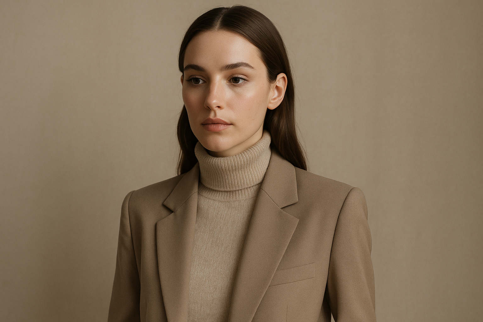
The shade works exceptionally well for tailored pieces. A putty blazer or trouser reads as elevated rather than basic, signaling intentional choices rather than default selections. This positioning has made putty a favorite for workwear updates and capsule wardrobe rebuilds.
Sand: Travel and Texture
Sand carries connotations of beaches, travel, and natural landscapes. This associative power gives the shade more personality than generic beige, even when the actual colors are quite similar. Naming matters in fashion, and sand sounds more interesting than beige.
The shade also implies texture—granular, natural, varied. This suggestion of visual interest makes sand pieces feel less flat than their beige equivalents, even when fabric textures are identical.
Styling Warm Neutrals
Both putty and sand pair beautifully with cognac leather, chocolate brown, and cream. They also work well with soft whites and can anchor outfits featuring terracotta, rust, or golden mustard accents. The key is maintaining warmth throughout the palette rather than introducing jarring cool elements.
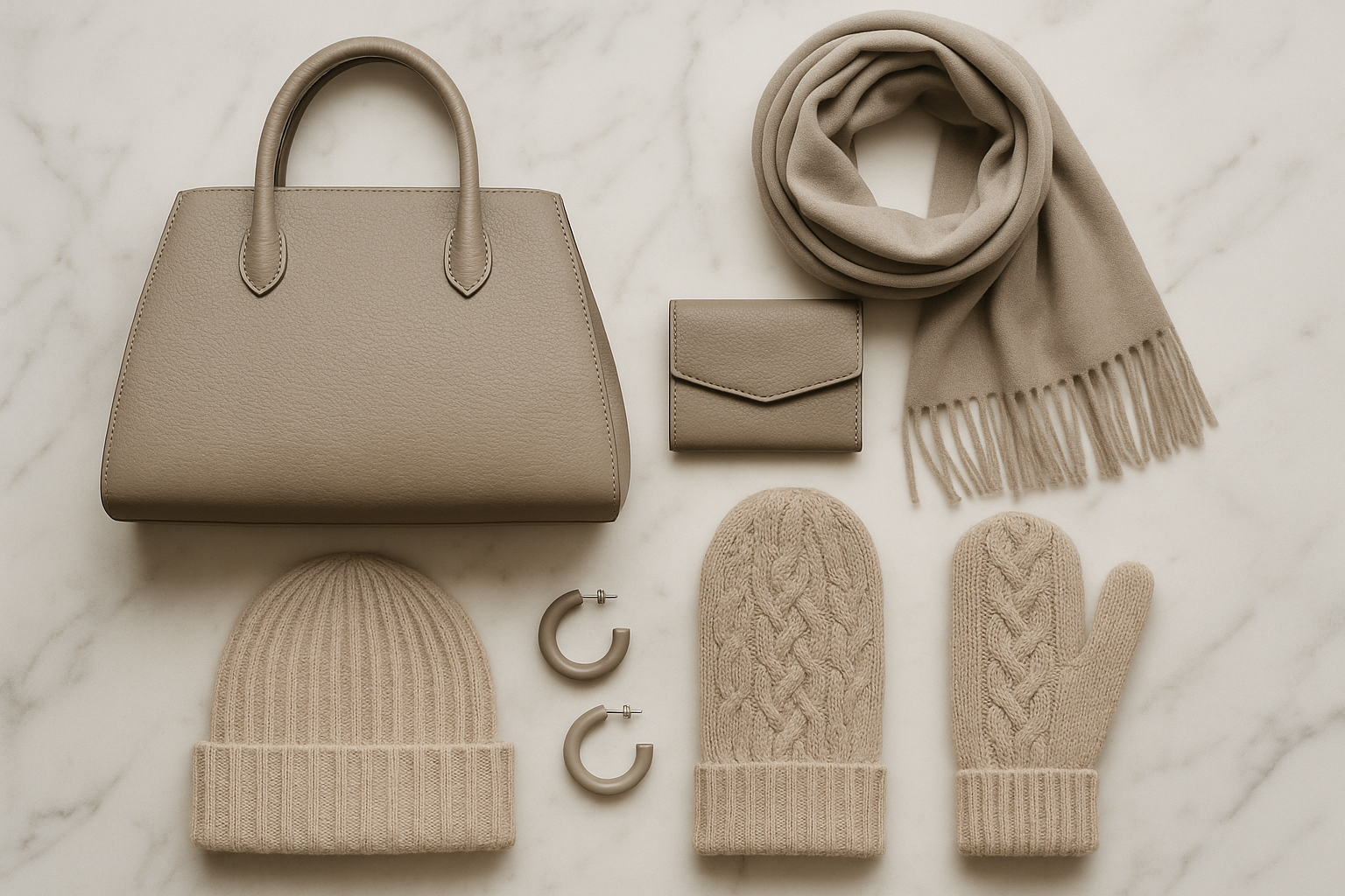
For those wanting to ease into these newer neutrals, start with accessories. A sand-colored bag or putty belt updates existing wardrobes without requiring major investment. As comfort grows, expand into larger pieces like trousers, knits, and outerwear.

The Technology Factor
How we shop and share fashion has fundamentally changed which neutrals succeed. Digital screens, social media photography, and online-only retail have created new selection pressures that favor certain shades over others.
Screen Appearance
Traditional beige often reads differently on screens than in person, sometimes appearing more pink or yellow than intended. The newer neutrals—particularly greige and mushroom—tend to translate more accurately across digital platforms, making online shopping decisions more reliable.
This screen-friendly quality matters enormously as e-commerce dominates fashion retail. Colors that look good in product photography and maintain accuracy across different monitors have natural advantages over those requiring in-person viewing to appreciate properly.
Social Media Dynamics
Instagram and TikTok favor colors that photograph distinctly and maintain visual interest in small, quickly-scrolled images. Flat beige tends to disappear in these contexts, while shades with more depth and variation hold attention better.
The algorithmically-driven nature of content distribution means that more visually engaging neutrals get shared more widely, creating awareness and desire that feeds back into purchasing decisions. This creates a positive feedback loop for interesting neutrals and negative pressure on boring ones.
Lighting Variability
Today’s consumers photograph their outfits in unpredictable conditions—ring lights, natural window light, restaurant ambiance, outdoor sunshine. Neutrals that look good across this variety of lighting conditions prove more satisfying than those optimized for a single context.
Greige, mushroom, and stone all handle lighting variability well. They shift subtly rather than dramatically, always reading as sophisticated rather than unexpectedly warm or cool. This adaptability makes them feel more reliable and worth investing in.
Building a Post-Beige Wardrobe
Transitioning from beige to newer neutrals doesn’t require replacing everything at once. A strategic approach allows gradual modernization while maintaining wardrobe functionality.
Assess Your Current Pieces
Not all beige is created equal. Some existing beige pieces may lean toward putty, sand, or oatmeal already—these can stay. Others that read as dated or unflattering become replacement priorities. Take inventory before purchasing anything new.
Photograph your beige pieces in natural light to assess their undertones objectively. Comparing these images to swatches of newer neutrals reveals which items integrate well and which create jarring contrasts in a mixed neutral wardrobe.
Strategic First Purchases
Begin with pieces worn near the face—a greige sweater, an oatmeal scarf, a mushroom cardigan. These high-impact items immediately update your appearance while older beige trousers or skirts remain serviceable below.
Outerwear offers another strong starting point. A coat or jacket in an updated neutral transforms outfits built from older pieces, providing instant modernization for the investment.
Mixing Old and New
Newer neutrals generally play well with existing beige—they’re not opposites but evolutions. An oatmeal sweater over beige trousers reads as intentional tonal dressing. A mushroom coat over a beige dress creates sophisticated layering.
This compatibility means you’re not starting over but building forward. Each new neutral addition improves the overall wardrobe while older beige pieces continue contributing until natural replacement time arrives.

Summary Table
| Neutral Shade | Best For | Undertone |
|---|---|---|
| Greige | Professional settings, all-season basics | Balanced warm-cool |
| Oatmeal | Knitwear, loungewear, cold-weather pieces | Warm cream |
| Mushroom | Designer pieces, organic modern aesthetic | Gray-brown balanced |
| Stone | Urban wardrobes, cool-toned individuals | Cool gray |
| Putty | Tailored pieces, sophisticated basics | Warm gray-beige |
| Sand | Summer pieces, travel wardrobes | Warm golden |
| Clay | Earth-toned capsules, statement neutrals | Warm red-brown |
Conclusion
The decline of beige isn’t about rejecting neutrals—it’s about demanding more from them. The shades rising to replace beige offer greater sophistication, better flattery across skin tones, superior photography performance, and deeper connections to contemporary values around sustainability and authenticity. Greige, mushroom, oatmeal, and their cousins aren’t just alternatives; they’re improvements.
For fashion consumers, this shift presents opportunity. Building a wardrobe around these evolved neutrals creates a more intentional, more flattering, more future-proof collection. The transition can be gradual, mixing new additions with existing pieces until the overall palette reflects current sensibilities. Beige had a good run, but the next generation of neutrals is simply better suited to how we live, shop, and share fashion today.
Frequently Asked Questions
Is beige completely out of style?
Beige isn’t disappearing entirely, but its dominance is ending. The shade still works in certain contexts and for certain individuals—those with warm, muted coloring often find traditional beige flattering. However, as a default neutral choice, beige is being replaced by more nuanced options that offer greater versatility and visual interest.
Which new neutral is most versatile?
Greige offers the greatest versatility for most people. Its balanced undertones work across warm and cool palettes, its sophistication translates across casual and professional contexts, and it photographs consistently well. For those uncertain where to start, greige provides the safest foundation for a modern neutral wardrobe.
How do I know which neutral suits my skin tone?
The drape test remains reliable: hold different neutral fabrics near your face in natural light and observe which ones make your complexion look healthy versus tired. Cool-toned individuals typically look better in stone, greige, and mushroom. Warm-toned individuals often prefer oatmeal, putty, and sand. Balanced or neutral undertones have the most flexibility.
Can I mix different neutrals in one outfit?
Yes—tonal dressing with multiple neutrals creates sophisticated, cohesive looks. The key is maintaining consistent undertone temperature. Mix warm neutrals with warm neutrals (oatmeal + putty + sand) or cool neutrals with cool neutrals (stone + greige + charcoal). Mixing across temperatures can work but requires more skill to avoid looking disjointed.
Should I replace all my beige pieces?
Not immediately. Assess which beige pieces still serve you well—those that photograph nicely, flatter your coloring, and feel modern can stay. Prioritize replacing items that read as dated or unflattering. A gradual transition maintains wardrobe functionality while incrementally updating your overall aesthetic.
Are earth tones considered neutrals?
Increasingly, yes. Shades like clay, terracotta, and cognac function as neutrals in many contemporary wardrobes, pairing easily with multiple other colors and serving as foundation pieces. The definition of “neutral” is expanding beyond beige, gray, black, and white to include these warmer, earthier options.
What colors pair well with these new neutrals?
Warmer neutrals like oatmeal and putty pair beautifully with burgundy, forest green, rust, and chocolate brown. Cooler neutrals like stone and greige work well with navy, black, burgundy, and cool metallics. Most of these new neutrals also pair easily with each other, enabling sophisticated tonal outfits.
Why do these neutrals photograph better than beige?
The new neutrals typically have more depth and complexity in their undertones, which translates to more visual interest in photographs. They also tend to maintain color accuracy better across different lighting conditions and screen types. Flat beige often shifts unpredictably in photos, appearing more pink or yellow than intended.

Brenda Tillman is a color maestro who brings artistic brilliance to every piece she crafts. Passionate about imaginative expressions, she illuminates the world of fashion with her expert guidance on shades and combinations. Beyond her writings, Brenda is a culinary enthusiast and a global traveler, infusing her work with diverse insights. Her unique touch transforms simple color choices into art.
Reviewed By: Joanna Perez and Anna West
Edited By: Lenny Terra
Fact Checked By: Matthew Mansour
Photos Taken or Curated By: Matthew Mansour
