Key Takeaways
- Undertones are the subtle hues beneath a color’s surface that dramatically affect how colors appear when placed together
- Every color contains warm, cool, or neutral undertones that determine compatibility with other colors
- Two colors may share the same name but look completely different due to their underlying undertone composition
- Understanding undertones is essential for creating cohesive outfits, interior spaces, and visual designs
- The three primary undertone categories are warm (yellow, orange, red), cool (blue, green, purple), and neutral (balanced mix)
- Lighting conditions significantly impact how undertones appear, making colors look different in various environments
- Skin undertones play a crucial role in determining which clothing colors will be most flattering
- Mastering undertone matching can elevate your style without requiring an extensive wardrobe overhaul
Have you ever purchased a gray sweater that looked perfect in the store, only to bring it home and discover it clashes terribly with your existing gray wardrobe? Or perhaps you’ve tried to match two navy items and found they look completely mismatched when worn together? This frustrating phenomenon has a scientific explanation rooted in the fascinating world of color undertones. The truth is that what we perceive as a single color is actually a complex mixture of pigments, each contributing subtle hues that affect how colors interact with one another and with our surroundings.
Understanding the Basics of Color Undertones
Color undertones represent the hidden foundation beneath what we see on the surface. While our eyes might register a color as simply “blue” or “beige,” there’s an entire spectrum of secondary hues working beneath that primary impression. These subtle influences determine whether a color leans warm, cool, or neutral, and understanding this concept transforms how we approach color coordination in every aspect of our lives.
What Exactly Are Undertones
Undertones are the subtle, underlying colors that influence the overall appearance of any hue. Think of them as the secret ingredient in a recipe—you might not be able to identify them individually, but they fundamentally change the final result. Every pigment, whether natural or synthetic, contains multiple color components that blend together to create what we perceive as a single color.
These secondary hues become apparent when colors are placed side by side. A white wall might appear perfectly neutral until you place it next to another white, suddenly revealing pink, yellow, or blue undertones you never noticed before. This revelation is why paint stores offer hundreds of “white” options and why matching colors across different materials proves so challenging.
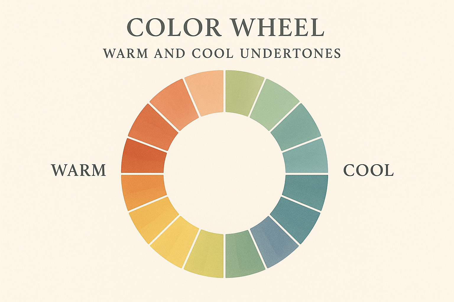
The Three Primary Undertone Categories
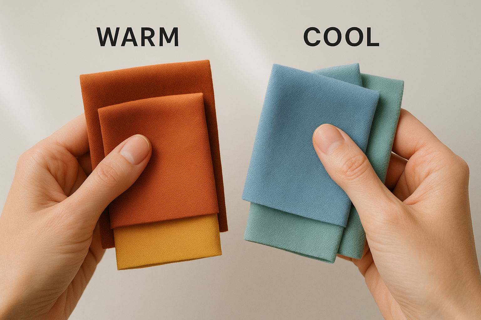
Warm undertones contain hints of yellow, orange, red, or gold. Colors with warm undertones feel inviting, energetic, and cozy. They tend to advance visually, meaning they appear to come forward in space. Warm undertones are prevalent in earthy colors like terracotta, cream, and olive, but they also exist in unexpected places like certain shades of pink or even some blacks.
Cool undertones feature blue, green, purple, or pink influences. These colors create a calming, sophisticated atmosphere and tend to recede visually, making spaces feel larger. Cool undertones appear in colors ranging from icy pastels to deep jewel tones. A gray with blue undertones reads entirely differently than a gray with brown undertones, even when they share the same level of lightness or darkness.
Neutral Undertones Explained
Neutral undertones occur when warm and cool elements balance each other out, creating colors that don’t strongly lean in either direction. True neutrals are relatively rare and highly versatile, capable of harmonizing with both warm and cool color palettes. This balanced quality makes neutral-undertone colors particularly valuable in wardrobes and design schemes.
However, achieving true neutrality in pigments proves challenging. Most colors labeled as “neutral” actually contain subtle undertones that become visible under certain lighting conditions or when compared to other colors. This is why a supposedly neutral gray paint might look blue on one wall and purple on another—it’s responding to the undertones of surrounding colors and the type of light illuminating it.
The Science Behind Undertone Perception
Our perception of color undertones involves complex interactions between light physics, pigment chemistry, and human visual processing. Understanding these scientific principles helps explain why colors behave in seemingly unpredictable ways and provides practical knowledge for making better color choices.
How Light Affects Color Appearance
Light quality dramatically influences how we perceive undertones. Natural daylight contains a full spectrum of wavelengths that reveal colors most accurately, but even daylight varies throughout the day. Morning light tends toward cooler, bluer tones, while evening light carries warm, golden hues. This explains why a color choice made at noon might look completely different at sunset.
Artificial lighting presents even greater challenges. Incandescent bulbs emit warm, yellow-toned light that enhances warm undertones while muting cool ones. Fluorescent lighting often casts a greenish or bluish tint that affects how colors appear. LED bulbs vary widely depending on their color temperature rating. Understanding your lighting environment is crucial for predicting how colors will actually look in their intended setting.
The Role of Pigment Chemistry
Pigments derive their color from their molecular structure, which determines which wavelengths of light they absorb and reflect. Natural pigments often contain multiple compounds that create complex undertone profiles. Synthetic pigments can be engineered for specific color properties, but even these involve trade-offs between hue, saturation, and undertone characteristics.
The mixing of pigments follows subtractive color principles, meaning combined colors absorb more light wavelengths and typically appear darker than their components. This is why mixing paints never produces colors as bright as digital displays, which use additive color mixing. The undertones of each component pigment interact in complex ways, sometimes producing unexpected results.
Human Visual Processing and Color Perception
Our eyes contain three types of cone cells, each sensitive to different wavelength ranges corresponding roughly to red, green, and blue light. The brain interprets signals from these cones to construct our perception of color. This process involves significant neural processing, meaning color perception is partly constructed by our brains rather than being a direct representation of physical reality.
Color constancy allows us to perceive objects as maintaining consistent colors despite changing lighting conditions, but this adaptation isn’t perfect. Our brains use contextual cues to adjust color perception, which is why surrounding colors influence how we see a particular hue. This phenomenon, known as simultaneous contrast, causes identical colors to appear different when placed against different backgrounds.
Common Undertone Challenges and Solutions
Recognizing common undertone-related problems is the first step toward solving them. These challenges appear across fashion, interior design, and visual arts, frustrating professionals and amateurs alike. By understanding why these issues occur, we can develop strategies to avoid them and create more harmonious color combinations.
The following list identifies specific undertone challenges and practical approaches to address them:
- Gray clothes appearing purple or green when worn together indicates conflicting undertones—stick to grays from the same undertone family
- White shirts looking yellow against certain skin tones suggests the fabric has warm undertones—seek out blue-based whites instead
- Navy blue items refusing to match often stems from mixing warm navy with cool navy—compare pieces in natural light before purchasing
- Beige walls clashing with brown furniture typically indicates warm-cool conflict—repaint with a beige that shares the furniture’s undertones
- Black garments appearing mismatched happens because blacks contain various undertones—true black is rare, so embrace the variation or choose pieces together
- Foundation makeup looking orange or ashy on skin results from undertone mismatch—test foundation on your jawline in natural light
- Red lipstick appearing unflattering often means the red’s undertone conflicts with skin undertones—warm skins suit orange-reds while cool skins suit blue-reds
- Paint colors looking different on walls than in sample chips occurs due to lighting and surrounding colors—test larger samples before committing
- Wood tones clashing with wall colors indicates undertone conflict—warm woods pair with warm paints, cool-toned woods with cool paints
- Jewelry appearing dull against skin suggests metal undertone mismatch—warm skins favor gold while cool skins favor silver
- Hair dye looking unnatural often results from ignoring natural hair’s undertones—work with your existing undertones rather than against them
- Coordinating prints and solids unsuccessfully happens when their undertones clash—identify the dominant undertone in prints first
- Mixing vintage and modern pieces looking jarring occurs because dye technologies have changed—undertones in older items may not match current products
Identifying Undertones in Different Colors
Learning to identify undertones requires practice and deliberate observation. Each color family presents unique challenges, and the methods for detecting undertones vary depending on the hue in question. Developing this skill transforms your ability to work with color, whether you’re building a wardrobe, decorating a room, or creating visual designs.
The key to undertone identification lies in comparison. Colors reveal their undertones most clearly when placed next to other colors, particularly those with known undertone profiles. Training your eye involves systematic comparison and attention to the subtle shifts that occur when colors interact.
White provides an excellent starting point for undertone training because its variations are relatively easy to detect. Pure white paper serves as a reference point—hold any “white” item against it, and undertones become visible. You’ll notice that most whites lean cream (warm), blue (cool), or gray (neutral but often containing its own undertones).
Gray presents more complexity because it can contain virtually any undertone. Blue-grays read as cool and sophisticated. Purple-grays feel romantic or moody. Green-grays suggest nature and calm. Brown-grays, sometimes called “greige,” provide warmth while maintaining gray’s neutrality. Identifying gray undertones requires comparing multiple samples simultaneously.
Beige and tan colors typically carry warm undertones but vary significantly in their specific warmth. Some beiges lean yellow, creating a fresh, lemony quality. Others tend toward orange or peach, feeling earthier. Still others contain pink undertones that can appear surprisingly cool. The furniture and fashion industries use countless terms for these variations, making direct comparison essential.
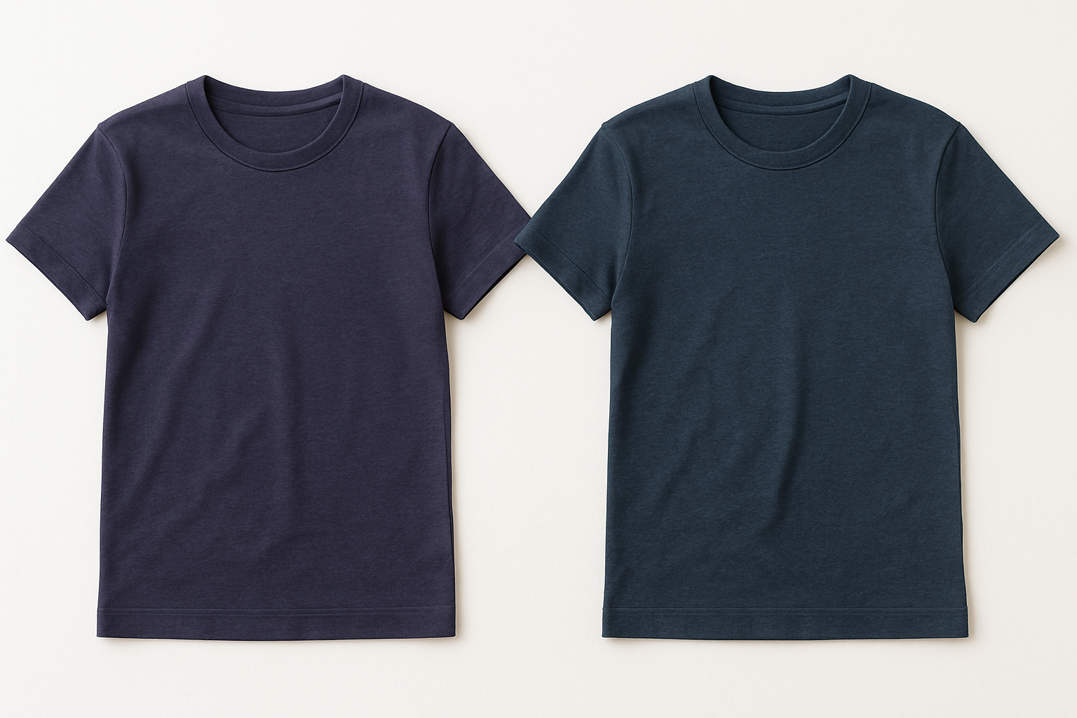
Navy blue ranges from nearly black with minimal undertone to distinctly purple-navy or green-navy variations. True navy sits in the cool category, but purple-tinged navies feel warmer despite containing a cool undertone color. Green-influenced navies have a military or utilitarian character distinct from dressy purple-navies.
Brown encompasses one of the widest undertone ranges of any color family. Chocolate browns often contain red undertones, while coffee browns lean toward yellow. Taupe introduces gray, cooling the brown. Cognac and caramel browns feel distinctly warm and golden. Espresso browns can appear nearly neutral or contain surprising purple undertones.
Even black, theoretically the absence of color, displays undertones in practice. Very few dyes and pigments achieve true black, and most commercial blacks lean warm (brownish-black), cool (bluish-black), or slightly colored in other ways. This explains why mixing black garments from different sources often produces visible mismatch.
Undertones in Fashion and Personal Style
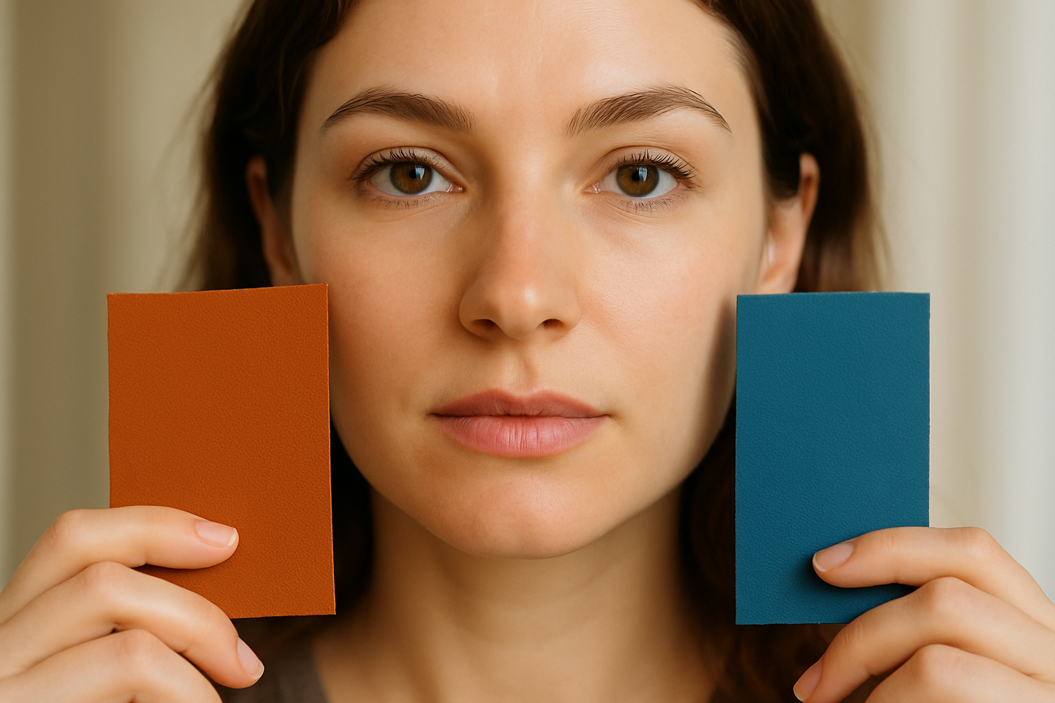
Fashion provides one of the most practical applications for undertone knowledge. The colors we wear interact with our skin, hair, and eye colors, creating either harmony or discord. Understanding these interactions helps us make clothing choices that enhance our natural coloring rather than competing with it.
Determining Your Skin’s Undertone
Skin undertone differs from skin tone—tone refers to how light or dark your skin appears, while undertone describes the underlying hue. People of all ethnicities and skin depths can have warm, cool, or neutral undertones. Several methods help identify your skin’s undertone, and using multiple techniques provides the most reliable results.
The vein test involves examining the veins on your inner wrist in natural light. Greenish veins suggest warm undertones, while blue or purple veins indicate cool undertones. If you see a mix of both, you likely have neutral undertones. This test isn’t foolproof but provides a useful starting point for further investigation.
Building an Undertone-Consistent Wardrobe
Once you’ve identified your undertone, building a cohesive wardrobe becomes more straightforward. Warm undertones pair well with colors containing warm undertones—think cream rather than stark white, olive rather than mint, rust rather than burgundy. Cool undertones harmonize with cool-leaning colors like icy pastels, blue-based reds, and pure white.
Neutral undertones enjoy the widest range of flattering colors, able to wear both warm and cool shades successfully. However, neutral-undertone individuals should still pay attention to the intensity and saturation of colors, as these factors affect harmony independently of undertone considerations.
Shopping Strategies for Color Matching
Store lighting rarely represents how clothing will look in daily life, making informed shopping challenging. Whenever possible, bring existing wardrobe pieces to compare with potential purchases. A smartphone photo of items at home provides a reference, though screens don’t perfectly represent colors.
Natural light testing near windows or outdoors reveals undertones more accurately than artificial store lighting. Many experienced shoppers step outside fitting rooms to evaluate colors before purchasing. Online shopping presents additional challenges—understanding how brands tend to photograph their products helps predict real-life appearance.
Undertones in Interior Design
Interior spaces bring undertone considerations to a larger scale, where mistakes become more visible and expensive to correct. Paint, furniture, textiles, and hard surfaces all carry undertones that must harmonize for a cohesive room design. The interaction between artificial and natural light further complicates color selection in interior environments.
Key undertone considerations for interior design include:
- Test paint colors with large samples on actual walls rather than relying on small chips
- Observe paint samples at different times of day as lighting dramatically affects appearance
- Consider fixed elements like flooring and countertops when selecting paint colors
- Match wood tones throughout a space or intentionally contrast them for visual interest
- Account for existing furniture undertones before committing to wall colors
- Use the largest fixed surface (usually flooring) as the undertone anchor for other selections
- Remember that glossy finishes reflect surrounding colors more than matte finishes
- White ceilings aren’t always the best choice—consider undertone-matched off-whites
- Trim color should complement rather than fight with wall color undertones
- Textiles can bridge undertone gaps when hard surfaces don’t perfectly match
- Consider how adjacent rooms’ colors will interact visually through doorways
- Rugs provide an opportunity to tie together multiple undertones present in a space
- Artwork introduces additional colors whose undertones should harmonize with the room
- Natural materials like stone and wood have inherent undertones that can’t be changed
The Role of Undertones in Art and Design
Artists and designers have understood undertones intuitively for centuries, developing techniques to manipulate color relationships for emotional and visual impact. Modern design education explicitly addresses undertone theory, recognizing its importance for creating effective visual communications.
Color Mixing and Pigment Selection
Traditional color mixing relies heavily on understanding pigment undertones. The common instruction to mix primary colors to create secondaries oversimplifies reality—a blue with red undertones mixed with a yellow with red undertones produces a cleaner orange than mixing blue and yellow pigments with conflicting undertones.
Professional painters develop intimate knowledge of their pigments’ undertone profiles. Limited palette painting, which uses just a few carefully chosen colors, demonstrates how undertone awareness allows creation of a full color range from minimal materials. Understanding which pigments mix cleanly and which create muddy results comes down to undertone compatibility.
Digital Color and Screen Considerations
Digital design introduces additional undertone complexities. Screens display color through light emission rather than pigment reflection, meaning colors behave differently than in physical media. However, undertone principles still apply—viewers perceive digital colors as having warm or cool qualities that affect emotional response and visual harmony.
The gap between screen display and printed output remains a significant challenge for designers. Colors that appear harmonious on screen may clash when printed due to the shift from additive to subtractive color mixing. Understanding both systems’ undertone behaviors helps designers predict and compensate for these differences.
Brand Color Consistency Across Media
Brand identity depends on consistent color reproduction across diverse applications—from digital screens to printed materials to physical products. Undertone drift across media can undermine brand recognition if not carefully managed. Professional brand guidelines specify color formulas for different reproduction methods to maintain undertone consistency.
The challenge intensifies when brands span global markets where printing standards and material availability vary. A brand’s signature blue might shift noticeably between regions if undertones aren’t carefully controlled. Major brands invest significantly in color quality control to maintain the emotional associations their colors have built over time.
Undertones Across Different Materials
Materials themselves influence undertone appearance, meaning the same pigment or dye can look different depending on what it’s applied to. Surface texture, reflectivity, and base color all affect how we perceive the final result. This explains why matching colors across different materials proves so difficult.
Fabric and Textile Undertones
Natural fibers absorb dye differently than synthetic materials, producing distinct undertone profiles even with identical dye formulations. Cotton tends to produce slightly muted, warm results. Silk takes dye brilliantly with pure, saturated color. Polyester often produces cooler, more synthetic-looking results that some find less appealing for certain applications.
Fabric weave and texture further influence color perception. Velvet’s deep pile creates shadows that darken and enrich colors. Satin’s sheen produces highlights that can shift undertone perception. Matte cotton reads more neutrally than shiny materials. These variables explain why matching fabric colors by eye rarely produces perfect results.
Paint and Finish Effects
Paint sheen dramatically affects undertone perception. Flat finishes absorb light and reveal undertones in their purest form. Satin and semi-gloss sheens reflect surrounding colors, which can shift undertone perception depending on what’s nearby. High-gloss finishes act almost like mirrors, substantially altering how color reads in a space.
The substrate beneath paint also influences final appearance. Paint on drywall looks different than the same paint on wood trim due to absorption differences. Primer selection affects undertone expression—some primers shift colors warm while others read cool. Professional painters account for these variables when recommending colors.
Metal and Mineral Undertones
Metals carry inherent undertones based on their composition. Gold obviously reads warm, while silver reads cool. But variations within these categories abound—yellow gold differs from rose gold, sterling silver from nickel. Brushed, polished, and matte finishes on the same metal can appear to have different undertones due to how they interact with light.
Natural stone presents undertone complexity that can frustrate homeowners and designers alike. Marble often contains veining with undertones that differ from the background color. Granite’s speckled composition includes multiple undertone influences. Selecting stone requires evaluating the overall undertone impression rather than focusing on individual color components.
Practical Undertone Exercises and Training
Developing undertone perception requires deliberate practice. Like any visual skill, sensitivity to undertones improves with focused attention and systematic training. The following exercises help build this valuable ability regardless of your starting point.
These practical exercises will develop your undertone perception:
- Collect paint chip samples in one color family and sort them by undertone rather than lightness
- Compare white items from around your home against a sheet of printer paper to identify their undertones
- Examine your existing wardrobe and group items by warm, cool, and neutral undertones
- Visit a paint store and compare chips labeled with the same color name from different brands
- Practice identifying the dominant undertone in photographs before analyzing their color components
- Compare fabric samples under different lighting conditions to see how undertones shift
- Look at makeup displays and identify the undertone base in foundations and concealers
- Analyze interior design photos to identify whether spaces use consistent undertone palettes
- Compare your skin tone against gold and silver jewelry to reinforce your undertone category
- Study how fashion brands style monochromatic outfits and notice undertone consistency
- Examine outdoor scenes to see how natural light reveals undertones in landscapes and architecture
- Compare smartphone photos of colors to real-life appearance to understand screen color limitations
Advanced Undertone Concepts
Beyond basic warm-cool-neutral categorization, advanced undertone understanding involves recognizing complex color relationships and intentional undertone contrast. These concepts enable sophisticated color use that creates visual interest while maintaining harmony.
Intentional Undertone Contrast
While matching undertones creates seamless harmony, deliberately contrasting undertones can produce dynamic, eye-catching results. Fashion designers and artists sometimes pair warm and cool undertones intentionally to create visual tension. The key lies in making the contrast look purposeful rather than accidental.
Successful undertone contrast typically requires other unifying elements. Colors might share similar value (lightness/darkness) or saturation while differing in undertone. Alternatively, a neutral element can bridge warm and cool components. Understanding the rules enables breaking them effectively for creative purposes.
Undertone Bridges and Transitions
Some colors naturally bridge warm and cool palettes, containing balanced undertones that harmonize with either direction. These bridge colors provide valuable flexibility in design and wardrobe building. Identifying these versatile shades simplifies color coordination significantly.
Teal, certain olives, and some mauves commonly serve as undertone bridges. These colors contain both warm and cool elements in relative balance, allowing them to complement a wide range of companions. Building a collection of bridge colors provides flexibility for mixing pieces across undertone categories.
Context-Dependent Undertone Reading
The same color can read as warm or cool depending on its companions. A mid-tone gray might appear warm when surrounded by blue-grays but cool when placed next to brown-grays. This contextual shifting explains why undertone assessments sometimes produce conflicting results and why real-world color matching requires flexibility.
Understanding context-dependent perception helps explain color disagreements between observers. People may perceive the same color differently based on adjacent colors, their own color vision characteristics, or learned associations. Acknowledging this subjectivity prevents frustration when others don’t see colors exactly as you do.
Putting Undertone Knowledge to Work
Theoretical understanding becomes valuable only when applied practically. Integrating undertone awareness into your daily color decisions transforms both major choices like paint colors and furniture, and minor ones like accessory selection and outfit coordination. The cumulative effect creates environments and appearances that feel effortlessly cohesive.
Starting with existing elements and working outward provides the most practical approach. Identify the undertones in fixed or unchangeable items—your skin tone, your flooring, your major furniture pieces—and use these as guides for subsequent choices. This strategy prevents the common mistake of selecting colors in isolation that don’t work in context.
Patience serves undertone-conscious decision-making well. Rather than making quick choices under pressure, take time to evaluate colors in their intended setting, under appropriate lighting, and in comparison with companions. This deliberate approach prevents expensive mistakes and builds confidence in color selection over time.
Documentation helps track what works and what doesn’t. Photographing successful color combinations, keeping fabric swatches, or maintaining paint chip collections provides reference for future decisions. This personal color library becomes increasingly valuable as you develop your undertone sensitivity.
Professional assistance remains valuable even with undertone knowledge. Interior designers, personal stylists, and color consultants bring experience with countless color combinations and can shortcut the trial-and-error process. Their expertise in undertone matching, combined with your developing awareness, produces excellent results efficiently.
Finally, trust your eye as it develops. Undertone theory provides a framework, but intuitive color sense improves with practice. If a combination looks right to you despite apparently breaking undertone rules, it may work because of factors you’re perceiving unconsciously. Color expertise combines theoretical knowledge with trained intuition.
Summary Table
| Undertone Category | Characteristics | Best Paired With |
|---|---|---|
| Warm | Yellow, orange, red, or gold influences; feels inviting and advances visually | Other warm colors; cream, olive, rust, peach, warm browns |
| Cool | Blue, green, purple, or pink influences; feels calming and recedes visually | Other cool colors; icy pastels, blue-reds, pure white, silver |
| Neutral | Balanced warm and cool elements; versatile and harmonizes widely | Both warm and cool colors; can serve as bridges between palettes |
Conclusion
Understanding color undertones transforms frustrating color mysteries into manageable, predictable relationships. The science behind why two “same” colors don’t match reveals that color is far more complex than simple labels suggest—every hue contains layers of secondary influences that determine how colors interact with each other, with lighting, and with our perception.
Armed with undertone awareness, you can approach color decisions with greater confidence and achieve more satisfying results. Whether selecting paint, building a wardrobe, or creating designs, undertone knowledge provides a foundation for choices that look intentional and harmonious rather than random and discordant. The investment in developing this visual literacy pays dividends across every area where color matters—which, ultimately, is nearly everywhere.
Frequently Asked Questions
How can I quickly identify if a color has warm or cool undertones?
The most reliable quick method involves comparison rather than isolated observation. Place the color next to a known warm reference (like a yellow-gold item) and a known cool reference (like a blue item). The color will appear more harmonious with whichever reference shares its undertone. Additionally, asking whether the color feels more like sunshine (warm) or shadow (cool) often triggers accurate intuitive responses.
Why do paint colors look different on my walls than they did on the sample chip?
Several factors cause this common frustration. Sample chips are viewed in store lighting, which differs from your home’s lighting. The small chip size doesn’t show how the color reads at scale. Surrounding colors in your space influence perception—adjacent wall colors, flooring, and furniture all shift how you see the new paint. Additionally, paint undertones interact with ceiling height and room orientation, affecting how much natural light they receive and at what angles.
Can people with neutral skin undertones wear any color?
Neutral undertones provide wider color flexibility than clearly warm or cool undertones, but “any color” oversimplifies. Neutral-undertone individuals still need to consider color intensity and saturation. Very muted colors might wash out neutral-toned skin, while extremely bright colors might feel overwhelming. The neutral category provides more options but doesn’t eliminate all color considerations—personal contrast level, hair color, and eye color still influence which shades look most flattering.
Why do my gray clothes always look purple or green?
Most gray fabrics contain undertones that become visible under certain lighting or when compared to other grays. True neutral gray is difficult to achieve in textile production. What reads as gray often contains purple, blue, green, or brown undertones that reveal themselves contextually. When these undertone-gray pieces meet grays with different undertones, the contrast highlights what each contains. Sticking to grays from the same brand or comparing pieces before purchasing helps maintain consistency.
How do seasonal color analysis systems relate to undertone theory?
Seasonal color analysis builds directly on undertone theory, categorizing people into seasons based on their dominant undertone (warm or cool) combined with their overall contrast level (light or deep). Spring and Autumn seasons have warm undertones, while Summer and Winter have cool undertones. Within each temperature category, the seasons differ by intensity—Spring and Winter favor clearer, brighter colors while Autumn and Summer suit more muted tones. This system provides a practical framework for applying undertone knowledge to personal style.
Does the undertone of my foundation need to match my skin exactly?
Foundation should match your skin’s undertone for the most natural appearance. However, “matching” allows some flexibility depending on your goals. A slightly warm foundation can give a healthy glow to neutral or cool skin, while a slightly cool foundation can brighten warm skin. The key is avoiding stark mismatches—warm foundation on cool skin appears orange, while cool foundation on warm skin looks ashy or gray. Testing foundation on your jawline in natural light reveals whether the undertone match works.
Can I mix warm and cool colors in the same outfit or room?
Absolutely, though success requires intention and bridging elements. Mixing temperatures can create dynamic visual interest when done purposefully. Using a neutral or bridge color between warm and cool elements helps them coexist harmoniously. Alternatively, keeping warm and cool elements spatially separated within a space or outfit reduces direct conflict. The key is making the combination look deliberate rather than accidental—confident proportions and clear focal points signal intentional mixing rather than undertone confusion.
How do I account for undertones when shopping online?
Online shopping presents significant undertone challenges since screen colors rarely match reality accurately. Reading product reviews that mention color accuracy helps, as does looking for multiple product photos taken in different lighting. Understanding how specific brands tend to photograph items—some consistently show colors warmer or cooler than reality—improves prediction. When possible, ordering from retailers with generous return policies allows real-world evaluation. Keeping notes about brands whose color representation you find reliable helps with future purchases.