Key Takeaways
- Mixing colors in fashion can be both practical and exciting.
- Out-of-the-box pairings liven up your wardrobe, making you stand out.
- A balanced approach—contrasts, complementary hues, or monochromes—elevates any outfit.
- Textures, fabrics, and accessories play a huge role in making color combos shine.
- Seasonal influences guide color popularity, but personal style always remains key.
- Experimentation and confidence often lead to the best results.
Introduction
Color combinations are the heartbeat of fashion. They transform simple garments into polished, eye-catching looks. Whether you lean toward timeless classics or crave bold, head-turning statements, choosing the right hues can shift an outfit from “nice” to “wow.”
It’s not just about grabbing a matching blouse or picking a pair of pants that doesn’t clash. It’s about using color synergy to present your personal style with ease.
In this comprehensive guide, we’ll explore trending color combinations that can freshen up your wardrobe. You’ll discover lesser-known pairings, tips for mixing neutrals with vibrant shades, and unique ways to build a cohesive style.
Think of it as your go-to resource for turning color theory into real-world outfits—without diving into the same old advice you’ve heard a million times.
Below, you’ll find 14 sections, each containing three detailed subsections. They highlight innovative ways to combine shades, discuss standout pairings you might not have considered, and show you how to pull it all off with confidence.
By the end, you’ll have the know-how to tackle any color dilemma and stride into your day with a look that’s on-trend and unmistakably you.
1) Vibrant Primaries
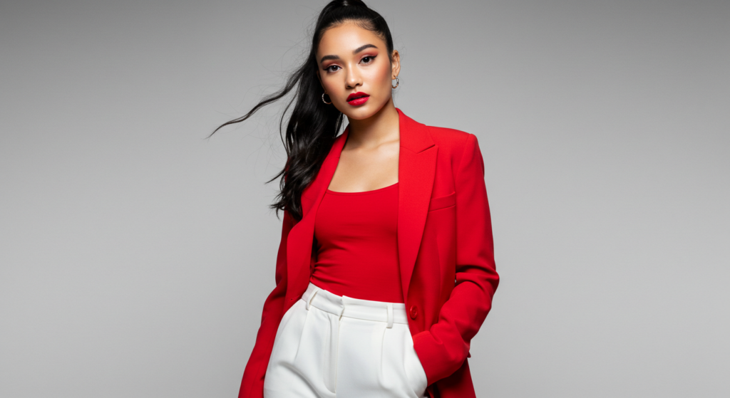
Bold Red and Crisp White
Sometimes the simplest pairings make the biggest impact. Bold red teamed with crisp white is a timeless combination, yet it remains consistently on-trend.
This combo looks fresh and energetic, creating a look that stands out without appearing busy. A bright red blazer paired with white trousers is a classic example.
To add a finishing touch, slip on minimal accessories—like a thin belt or sleek pumps—so the focus remains on the color contrast itself.
Electric Blue and Pure Yellow
If you crave attention, consider electric blue and pure yellow. These two primary-inspired tones might not sound subtle, but they can create a stylish statement when balanced correctly.
Think a cobalt-blue top with a bright yellow midi skirt. You can tone it down by choosing neutral footwear in white or nude. This color duo is especially fun in summer, injecting vibrancy into breezy dresses and cool jumpsuits.
Red, Blue, and a Touch of Neutral
When you want to combine multiple primaries without looking like a kid’s crayon box, add a calming neutral. For instance, a red top, blue jeans, and a beige trench coat.
The neutral coat tones down the brightness while still letting the main colors pop. This three-way combo is surprisingly adaptable—perfect for casual weekends or slightly dressy day-to-day looks.
2) Earthy Warm Tones
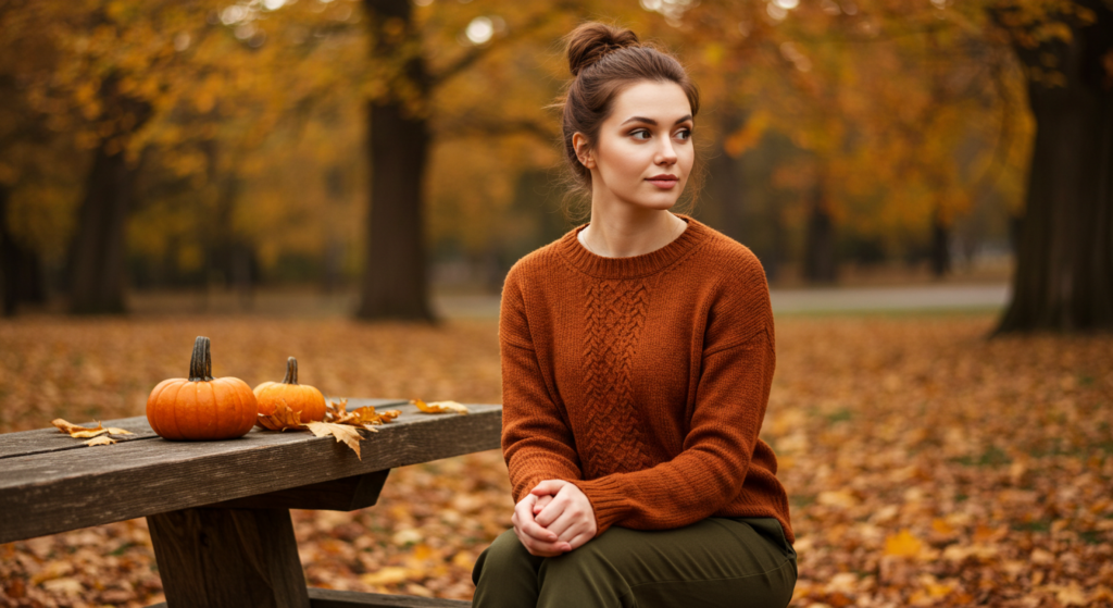
Olive Green and Rust
Olive and rust bring to mind autumn leaves, but they can be worn year-round by tweaking fabric choices. A linen olive blouse with rust-colored wide-leg pants feels relaxed and casual for summer. Swap the linen for heavier materials in cooler months.
The key here is to let each hue stand out equally—avoid overshadowing one with the other. Keep accessories minimal and stick to natural materials like leather or suede for an earthy finish.
Mustard Yellow and Terra Cotta
Mustard is a bold statement color, while terra cotta provides a warm but muted foundation. Pair a mustard top with terra cotta trousers for a comfortable, sophisticated vibe that isn’t loud.
This combination is especially flattering in fall when warm tones complement the season’s palette. If you need an extra layer, consider a brown leather jacket or a camel trench to maintain warmth in the color scheme.
Burnt Orange and Tan
Burnt orange is a sleeper hit for those who want color but are wary of neon. When mixed with tan, you get a balanced, wearable look that can fit many occasions.
It’s stylish for a day at the office when paired with classic pumps, yet casual enough for a weekend brunch if you incorporate relaxed silhouettes. Tan boots or a tan scarf can pull the outfit together without stealing the spotlight.
3) Cool and Calming Shades
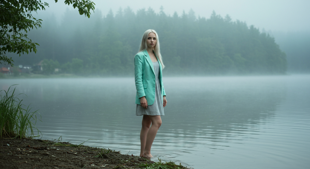
Mint Green and Soft Gray
When you’re aiming for subtlety, mint green and soft gray create a gentle, calming feel. The mint shade adds a bit of lightness, while gray keeps the overall outfit structured.
This works well with tailored pieces—like a mint blazer over a gray dress. If you want a bit of pop, consider adding a silver statement necklace or metallic accents on your shoes.
Lavender and Navy
Lavender might seem delicate, but paired with navy, it gains depth. Picture a lavender blouse tucked into navy trousers. The result is a polished look for semi-formal events or an elevated take on business casual.
Since lavender can vary in intensity, feel free to experiment with deeper or lighter tones. You can accessorize with a darker lavender scarf or incorporate navy stripes to bring some variety without clashing.
Teal and Charcoal
Teal carries a certain richness that charcoal complements wonderfully. A teal dress with charcoal accents—or vice versa—blends sophistication with a slight edge. For a modern touch, add geometric jewelry or a statement clutch in a metallic hue.
This color pairing is forgiving on various skin tones and can be dressed up or down depending on fabric choice (silk for evening, cotton for daytime).
4) Neutrals with a Twist
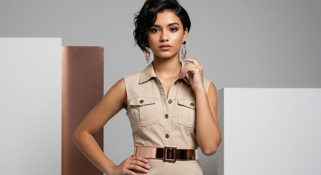
Beige and Rose Gold
Beige can sometimes feel bland. Pairing it with rose gold accents injects instant glamour. If you want an outfit that appears neutral but has a subtle pop, go for a beige ensemble—like a loose-fitting sweater and tailored pants—accessorized with rose gold jewelry or a rose gold belt. It adds a warm glow that elevates even the simplest pieces.
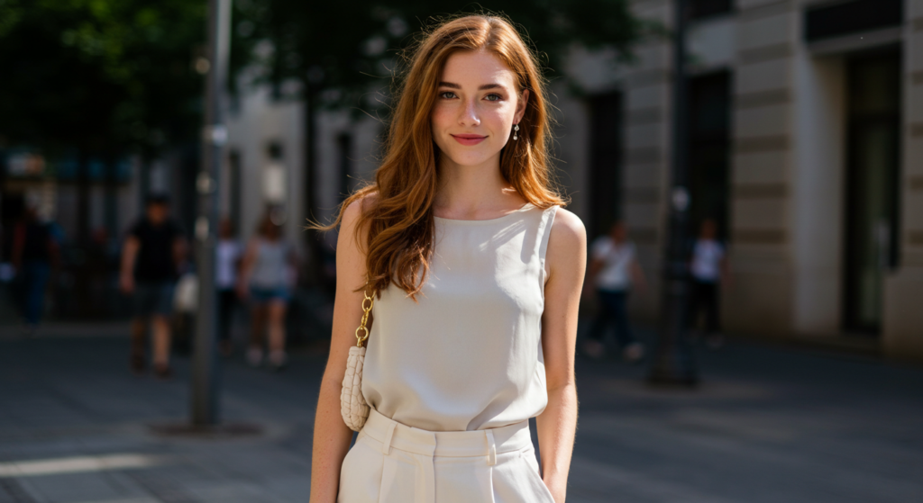
White and Greige
Greige—a mix between gray and beige—makes an understated statement. Combine it with white for an overall clean look that’s still interesting. You can wear a white turtleneck with greige pants or a greige sweater with white culottes.
Consider different fabric textures (like chunky knits paired with smooth cotton) to create dimension. A neutral handbag in greige or white ties the outfit together.
Camel and Off-White
Camel remains a favorite for coats, sweaters, and scarves. Partnering it with off-white keeps your ensemble looking sharp yet soft.
This duo often suits formal and casual settings. You could wear an off-white sweater dress and layer a camel coat over it for crisp fall days. Add neutral heels or boots to preserve a sleek, elongated silhouette.
5) Pastel Pairings
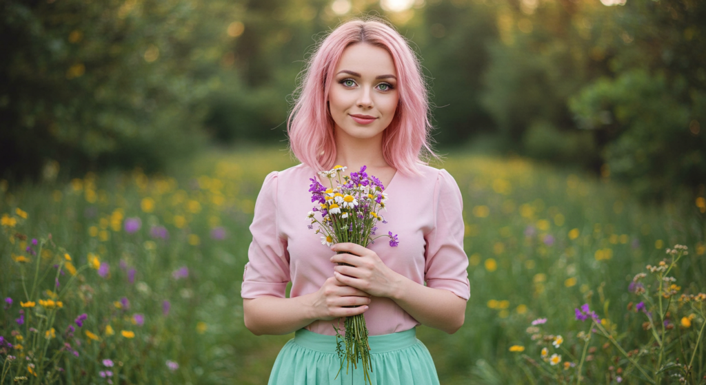
Pale Pink and Mint
If you want a whimsical vibe, pale pink and mint work wonders. They’re soft on the eyes yet make a fresh statement. To keep it adult-appropriate, select polished silhouettes—like a structured mint skirt with a pale pink blouse.
Finish with light accessories and a small bag in a complementary pastel. This outfit radiates a springtime charm but can also brighten up a chilly day when layered with neutral coats.
Soft Lilac and Powder Blue
Lilac and powder blue create a dreamy, ethereal combination perfect for events like garden parties or casual brunches. Imagine a soft lilac cardigan over a powder-blue slip dress, or powder-blue wide-leg trousers with a lilac button-up.
Silver accessories fit well here, reflecting the coolness of these hues. This is a pairing that looks particularly photogenic in natural lighting, so it’s fantastic for daytime outings.
Lemon Chiffon and Baby Blue
Lemon chiffon is like a whisper of yellow—it’s gentle, airy, and quite versatile. Partnered with baby blue, it forms a breezy color palette that brightens your look without going overboard.
If you worry about looking too pastel, ground the outfit with white sneakers or neutral sandals. A slight pop of metallic, such as a thin gold necklace, provides a refined finishing note.
6) Bold and Unexpected
Pink and Orange
Pink and orange might initially sound like a clash. Yet, when styled carefully, they exude confidence and energy. Choose tones that complement each other—think coral pink with tangerine orange.
You can also include a buffer piece in a neutral tone to help break up the intensity. This vibrant combo is perfect for warm-weather parties and beach weddings, offering a playful aesthetic that’s far from boring.
Purple and Yellow
Purple and yellow is another classic “opposites attract” pairing that can be surprisingly stylish. A deep purple velvet blazer worn over a yellow silk blouse creates a show-stopping blend of texture and color.
Keep bottoms neutral, like black trousers or a pencil skirt, to maintain balance. Don’t be afraid to incorporate pattern if it suits your style—a purple-and-yellow floral print can also be quite striking.
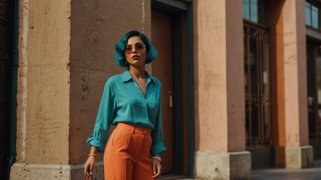
Turquoise and Coral
Turquoise and coral conjure images of tropical vacations. Why not bring that same vacation vibe into your everyday wardrobe? You can match a coral skirt with a turquoise top or try a turquoise blazer with a coral tank underneath.
If you’re feeling extra bold, add gold accents for a summery, glamorous touch. This combo transitions well into spring and summer but can also brighten up cooler seasons if styled with heavier fabrics.
7) Dark Palette Combinations
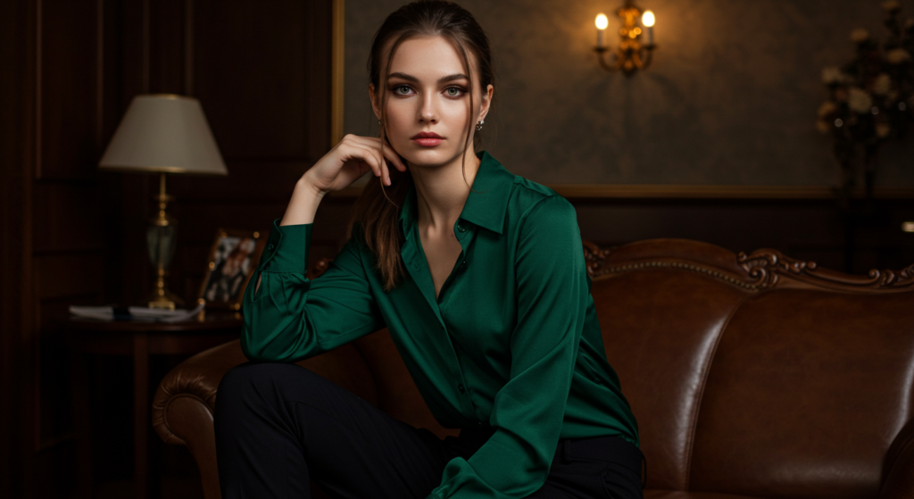
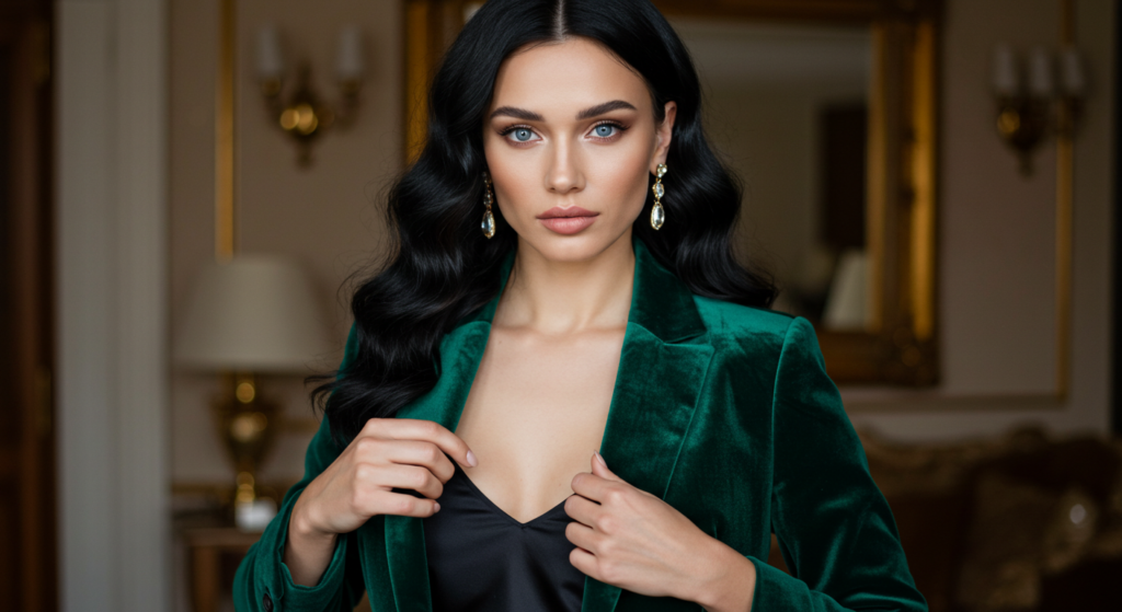
Black and Forest Green
For a sophisticated, moody feel, black and forest green work brilliantly. Think a forest-green satin blouse with black cigarette pants, or a structured black blazer over a forest-green knit dress. The dark richness of green pairs seamlessly with black’s classic edge.
Accessorize with gold or silver for a polished finish. This duo excels in evening settings, where the subtle contrast catches the eye without overwhelming the ensemble.
Charcoal and Burgundy
Charcoal and burgundy present a subdued but chic pairing. A burgundy turtleneck paired with charcoal trousers embodies understated elegance. For a more casual spin, try a charcoal sweatshirt with a burgundy mini skirt and tights.
If you want to give the look more depth, add texture through suede boots or a cable-knit scarf. It’s an easy option that still feels carefully styled.
Deep Blue and Brown
Blue and brown might sound simple, but deep shades elevate this combination to a refined level. A navy blazer over a chocolate-brown dress is a modern take on professional attire.
You could also wear a brown leather jacket with dark blue jeans for a casual yet sophisticated weekend look. The secret is to choose high-quality fabrics in each color to project an air of intent and style.
8) Color-Blocked Chic
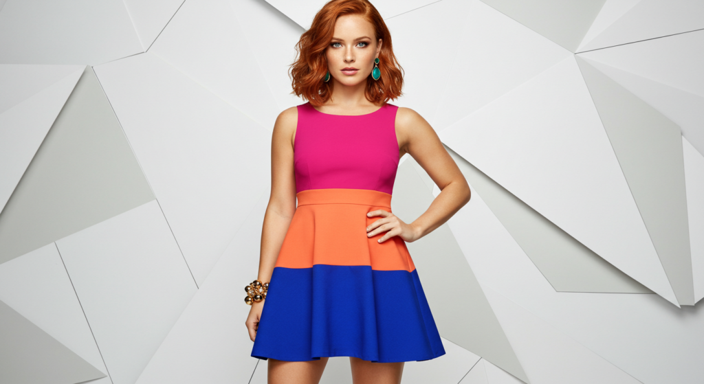
Tri-Tone Blocking
Color blocking often involves large sections of distinct colors on a single garment or spread across your outfit. For instance, you might wear a dress with three bold blocks—fuchsia on top, orange in the middle, and royal blue at the bottom.
This approach demands confidence, but it’s a great way to make a statement without patterns. Keep accessories minimal and let the color blocking steal the show.
Subtle Blocking with Neutrals
If bold color blocking feels too daring, ease into it by including neutrals. Maybe you have a white blouse, a black skirt, and a bright color-blocked jacket. The neutral base keeps your outfit structured, while the jacket adds excitement. Accessories can be chosen to match one of the colors in the jacket, tying everything together neatly.
Gradient Color Blocking
Gradient color blocking involves wearing pieces that shift gradually from one hue to another. You might pair a light pink skirt with a slightly darker pink top and a dark pink blazer. It’s a twist on monochrome dressing but with more visual interest. This can also be done in cooler shades like teal, aqua, and navy, delivering a subtle yet eye-catching flow of color.
9) Metallic Mix-Ins
Silver and Black
Silver pieces can add edge and shine to an everyday black look. A silver jacket with black jeans is casual, yet striking. For an evening event, consider a black maxi dress with silver statement earrings or a silver belt.
When you integrate metallics, keep the rest of your look simple so that the metallic item truly pops. Also, choose silver footwear carefully—a single silver accent can have a huge impact.
Gold and White
Gold and white channel a clean, luxurious aura. A white dress paired with gold sandals and a gold clutch speaks volumes without much effort.
Alternatively, a white blazer with gold buttons is a sophisticated take on a staple item. You can even mix different types of gold—rose gold, yellow gold, or vintage gold—for a nuanced look.
Copper and Navy
Copper is a less common metallic in apparel, making it a standout choice. When paired with navy, it offers an eye-catching contrast. A copper-toned skirt with a navy blouse, or a navy jumpsuit with a copper belt, strikes a balance between bold and refined. Be mindful of the copper’s finish; matte copper can look more casual, while glossy copper leans dressy.
10) Seasonal Spin

Spring Florals with Neutrals
Spring naturally invites florals, but you can modernize them by mixing in neutral color blocks. Pair a floral top rich in pastels with a solid neutral pencil skirt. Or take a neutral dress (like beige or off-white) and add a floral scarf in coordinating pastel hues. The result is a fresh, approachable look that feels seasonal without being cliché.
Summer Brights with Denim
Summer fashion screams bold. Combine bright tees—like neon green or hot pink—with casual denim shorts or jeans. This setup is relaxed yet memorable.
You can also turn to white denim for an even brighter vibe. When dealing with super bright colors, keep accessories understated—a simple necklace or minimal bag is enough. Let the color speak for itself.
Fall Layers in Moody Tones
Fall calls for layering, so use moody tones like plum, olive, and charcoal. You might wear a plum turtleneck underneath an olive vest, paired with charcoal leggings. The layering adds visual depth, and the colors blend seamlessly.
A neutral belt, like black or brown, keeps everything looking cohesive. For footwear, boots in matching moody colors provide a streamlined finish.
11) Patterns and Prints
Stripes with Contrasting Hues
Striped garments often come in neutral shades. Why not pair them with a contrasting color to freshen things up? A black-and-white striped top with vivid red trousers is simple yet bold. You could also throw on a bright green scarf or statement necklace to make the outfit pop. Stripes act as a neutral pattern, so don’t be afraid to team them with strong colors.
Floral Prints with Solid Accents
Floral prints can be the star of your look. Reinforce one of the print’s colors using a solid accent piece—like matching the flowers’ pink hue with a pink clutch. This amplifies the floral’s presence while maintaining balance. It’s a technique that works for dresses, skirts, or even floral blazers. Make sure to select your accent color carefully to avoid any visual noise.
Animal Prints with Unexpected Tones
Leopard or snakeskin might seem like they only pair with black, brown, or white. Yet mixing animal prints with unexpected colors creates a high-fashion vibe. Leopard print pants with a teal blouse, for instance, can look incredibly chic.
Focus on letting the print shine while ensuring the color complements rather than clashes. Add a little neutral—like a black belt—if you need some structure.
12) Accessories and Color
Statement Belts
A statement belt can pull together a look where colors might otherwise seem disjointed. If you’re wearing a color-blocked dress in pink and orange, a contrasting turquoise belt can provide a pleasing visual break. Alternatively, a neutral belt can anchor a bright outfit. Think of belts as a finishing touch that either complements or artfully contrasts your outfit’s main hues.
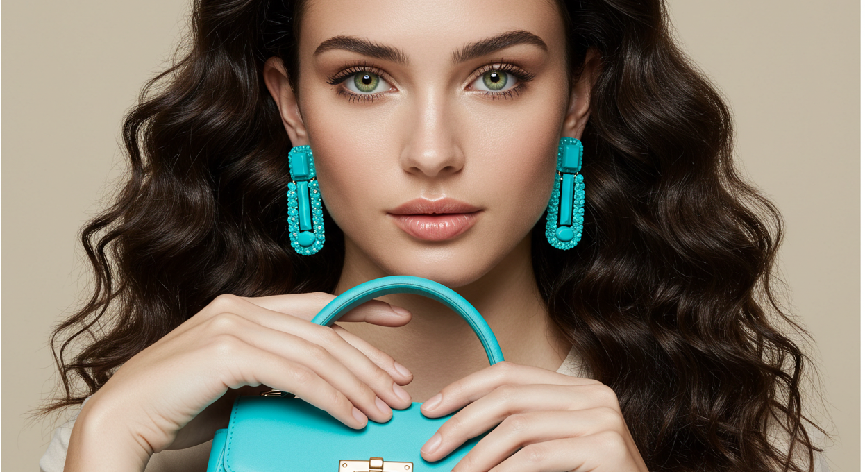
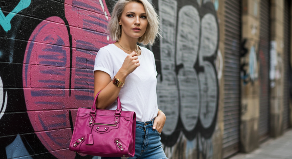
Colorful Handbags
Your handbag can be an accent piece that elevates an otherwise understated look. If you’re wearing neutral tones—like white, gray, or beige—opt for a handbag in a vibrant color such as electric blue or neon yellow. This small shot of color adds a modern edge without requiring a complete wardrobe overhaul. Conversely, if your outfit is already bright, a neutral bag keeps the focus on your clothing.
Shoes as the Focal Point
Colorful shoes are a fun way to experiment with trending shades. Red pumps with a little black dress or emerald green sandals with an all-white ensemble can transform your overall appearance. Just ensure the rest of your accessories don’t fight for attention. If your shoes are the focal point, keep jewelry and bags in subtle tones so the footwear can shine.
13) Texture Meets Color
Velvet and Jewel Tones
Velvet in jewel tones—think emerald, sapphire, or amethyst—creates a luxurious and eye-catching effect. A sapphire velvet blazer or an emerald velvet dress can be a striking statement.
Pair these rich colors with simpler textures and neutral tones to avoid an overly busy look. The contrast between plush velvet and sleek cotton or silk is undeniably captivating.
Satin and Pastels
Satin has a natural sheen that pairs gracefully with soft pastel shades. A satin mint slip dress or a pale pink satin blouse reflects light in a gentle, flattering way. Because satin can appear dressy, consider pairing these pastel pieces with casual elements like a denim jacket or white sneakers to achieve a balanced, high-low fashion vibe.
Leather and Bright Accents
Leather jackets or pants are usually found in neutral hues like black or brown. Brighten up the look with a pop of color—perhaps a bright turquoise turtleneck under a black leather jacket.
Or try a bold accessory like a neon clutch with brown leather pants. The interplay of texture (smooth leather) and bright color fosters a modern, edgy aesthetic.
14) Mixing High and Low Fashion
Designer Color Pops
If you own a designer piece in a standout hue—like a luxury handbag in fuchsia—use it to elevate your entire outfit. The rest of your attire can be from affordable brands, in complementary or neutral tones. This approach showcases your designer gem while proving that high fashion can integrate seamlessly with everyday items.
Street Style Vibes
Street style is often about mixing casual comfort with unexpected flair. That could mean pairing a vibrant hoodie with structured trousers and sleek sneakers.
Experiment with color overlays, like layering a neon green top under a mesh black tee. Street style encourages creativity, so don’t hesitate to add hats, scarves, or socks that reinforce or contrast your main colors.
Evening Glamour
Evening glamour doesn’t always mean head-to-toe black or predictable sparkles. Try pairing a luxe color—like burgundy or navy—with a glittery or metallic accent piece.
A black sequined clutch or gold statement earrings can tie the outfit together. When your color choices are deep and bold, subtle shine from accessories prevents the look from becoming monotonous.
Conclusion
Finding trending color combinations that fit your personal style can feel like an art form. Yet once you start, you’ll see the countless ways hues can blend into extraordinary outfits.
Whether you lean toward monochromes, vibrant contrasts, soft pastels, or moody darks, the key is to wear each color combination with confidence. Small details—like texture, fabric choice, and accessories—also matter. They ensure that your chosen palette not only looks good but feels cohesive from head to toe.
Experimentation is your friend. Don’t shy away from unusual combos. Mix prints, incorporate bold belts, and step into bright shoes to see how they transform your wardrobe.
Every outfit tells a story about your style. Let your colors speak up with originality and flair. Most importantly, wear what you love. Trends come and go, but a color combination that resonates with you will always shine.
Summary Table

| Color Combo / Theme | Key Idea | Styling Tips |
|---|---|---|
| Bold Red & Crisp White | High contrast, classic | Keep accessories minimal, let the red pop against white |
| Olive Green & Rust | Warm, earthy pairing | Choose natural materials like leather for accents |
| Mint Green & Soft Gray | Subtle, soothing mix | Ideal for tailored pieces with metallic accents |
| Beige & Rose Gold | Neutral with a glam twist | Elevate basics with rose-gold jewelry or belts |
| Pale Pink & Mint | Whimsical pastel blend | Use structured silhouettes for an adult-appropriate look |
| Pink & Orange | Bright and unexpected | Pick coral and tangerine shades for the best harmony |
| Black & Forest Green | Sophisticated, moody | Perfect for evening wear, highlight with gold or silver |
| Color-Blocked Tri-Tones | Vibrant, statement-making | Keep accessories simple to let the color blocking dominate |
| Gold & White | Luxurious yet clean look | Accent with minimal gold or mix different gold tones |
| Spring Florals with Neutrals | Fresh but not cliché | Reinforce floral colors with one neutral item for balance |
| Animal Prints & Unexpected Hues | High-fashion vibe | Let the print shine, use a contrasting color in a top or accessory |
| Velvet & Jewel Tones | Rich and luxurious | Pair with neutral textures to avoid visual overload |
| Leather & Bright Accents | Edgy meets colorful | Try neon or bold hues to break up the seriousness of leather |
| Mixing High & Low Fashion | Designer meets everyday | Highlight one luxury item with more affordable basics in complementary tones |
FAQ

Q1: Can I wear bold color combinations if my wardrobe is mostly neutral?
Absolutely. Start by introducing a single colorful item—like a bright sweater or accessory—paired with your neutral basics. As you grow more comfortable, experiment with two or more vibrant hues in one outfit. Neutrals are a great base that can highlight any pop of color you add.
Q2: How do I avoid looking too busy when mixing prints and bright colors?
Choose one focal piece, be it a pattern or a bold hue. Keep the rest of the outfit simple or in harmonizing shades. For example, if you’re wearing a bright floral skirt, opt for a neutral or single-tone top. Small tweaks like these maintain balance.
Q3: Is there a way to transition summer color combos into colder months?
Yes. Swap lightweight fabrics for heavier ones in similar hues—linen to wool, for instance—and layer with items like cardigans, jackets, or scarves. Darker or richer tones of your favorite summer colors also work well in fall or winter.
Q4: Do I need to match my accessories exactly to my outfit’s colors?
Not always. Accessories can either match or contrast. Matching accessories can create a cohesive aesthetic. Contrasting accessories, however, may make your ensemble more dynamic and modern. Choose whichever approach best fits your personal style and the look you want to achieve.
Q5: What if I want to wear multiple bright colors at once?
That can look amazing if you do it thoughtfully. Consider choosing colors that complement each other—like pink, yellow, and blue—and keep silhouettes clean. Also, limit patterns so your outfit doesn’t become overwhelming. A simple approach to bright colors ensures your outfit is bold without clashing.
Q6: How can I figure out which color combinations look best on me?
Experiment in front of a mirror with different shades. Pay attention to how they reflect against your complexion, hair color, and general personal style. Certain colors may enhance your overall glow, while others might not resonate. Trust your own eye, and don’t be afraid to try something new.
By incorporating these insights into your day-to-day outfits, you’ll discover that color is a powerful tool.
It can express mood, highlight your personal style, and make a statement without saying a word. Embrace the possibilities and have fun discovering trending color combinations that speak to you.

Anna West, the visionary behind Clothes Color Guide, is our go-to for all things fashion. Merging the finest of runway trends with everyday style, she demystifies the world of color and pattern. While clothing is her mainstay, Anna also shares insights on interior design, pet care, and relationship advice. Dive into her articles and emerge with a vibrant perspective on style and life.
Reviewed By: Joanna Perez and Marcella Raskin
Edited By: Lenny Terra
Fact Checked By: Sam Goldman
Photos Taken or Curated By: Matthew Mansour