Key Takeaways
- Gray stands out as a modern neutral that balances warm and cool tones in design.
- It offers a timeless quality that suits both traditional and contemporary styles.
- Cultural, emotional, and practical factors shape our color associations with gray.
- Designing with gray invites a layered approach, blending accents and tones for maximum impact.
- Gray’s symbolism reflects calmness, resilience, stability, and elegance in many visual color narratives.
- A well-chosen gray can enhance branding, interiors, fashion, and art.
Introduction
Have you ever paused to ponder the quiet strength of gray? Some see it as a dull color, while others find creativity in its subtlety. Gray often hovers between black and white, yet its range includes soft, fog-like shades and deep, charcoal-like tones. It holds a mysterious energy that sparks interest in design, branding, and everyday life.
Why focus on gray? Its neutral base calms our eyes, making it easy to pair with bright colors or stand on its own as a refined backdrop. Color symbolism research suggests gray projects reliability and stability, though personal taste may see it as serious or even stoic.
Below, we’ll explore the character traits of gray, from its resilience to its vibrancy (yes, gray can be vibrant!), before we move into deeper topics. If you’ve wondered how gray can evoke warmth, calmness, authenticity, or confidence, read on. Let’s show how this hue’s subtle power can shape mood, space, and identity.
Gray’s Symbolism and Personality Traits

Gray might feel understated, but look closer, and you’ll notice hints of sincerity in its consistent tone. It can display a sense of warmth when mixed with slight brown or beige notes. At the same time, cooler grays hint at mystery and depth. Designers praise gray’s elegance and creativity, while lovers of color see it as a canvas for more vivid hues.
Gray also brings a sense of balance and tranquility. These qualities help it feel reliable, which appeals to those seeking a stable foundation. Some interpret gray as a sign of wisdom—think of how older structures often weather into a pleasing gray patina. Others detect innovation in sleek steel grays used for modern gadgets.
In many contexts, gray glows with confidence and sophistication, making it a prime choice for office attire or brand materials. It suggests authenticity without pushing too hard. Its allure grows as people realize how flexible it is, shifting from light to dark with a single adjustment in tone. That sense of dynamism keeps it fresh.
In short: Gray exudes resilience and calmness, blended with an underlying sense of sincerity and understated charm. Readers may find their own unique responses to gray, shaped by culture, personal taste, and the setting in which they see it. Let’s dive into more details of this universal color.
The Intriguing Character of Gray

Embracing Gray as a Subtle Power
Does gray have power? Yes. Its subtle strength lies in the way it tempers environments and pairs with a range of textures. A smooth steel gray can enhance a bright accent color without clashing. Gray’s emotional color meanings show how it quietly elevates a space, providing a calm backdrop for bold statement pieces.
To visualize this, imagine a living room painted in a soft dove gray. That neutral background sets the stage for colorful pillows or an art piece on the wall. Meanwhile, a warm gray sofa can exude comfort and stability.
Why Gray Mesmerizes Us
People often overlook gray. Yet, it mesmerizes us with hidden layers and gentle undertones. Light passes through gray objects and reflects subtle variations. This effect can create a sense of depth and mystery—much like storm clouds that shift from pale silver to deep charcoal.
From an emotional perspective, gray can be viewed as balanced and even wise. It’s linked to reflection and thought. Our eyes don’t tire of looking at gray as they do with more intense colors. That’s why it often suits areas where we need to concentrate.
Key Qualities That Define Gray
- Timelessness: Gray rarely goes out of fashion.
- Adaptability: It can be warm or cool, depending on undertones.
- Elegance: From charcoal suits to sleek tech devices, gray conveys sophistication.
- Calmness: Soft grays reduce visual noise.
When combined with bolder shades, gray steps back and allows brighter hues to shine. But on its own, a refined gray can project a quiet confidence.
Gray in Culture and History

Historical Use of Gray
Gray’s cultural color meanings date back centuries. Ancient buildings often aged into a stony gray that represented solidity. Medieval paintings sometimes used gray to illustrate shadows, giving form to more vibrant parts of the artwork.
Textile history also reveals how gray wool or linen offered a practical choice for workers. This down-to-earth color stood for reliability and warmth during harsher weather. Over time, gray clothing came to symbolize seriousness or humility in certain cultures.
Cultural Perceptions
In some cultures, gray holds a spiritual meaning linked to reflection and introspection. In others, it might be associated with routine. Our personal connections with gray can also stem from memories of concrete cityscapes or overcast skies.
Whether people find it comforting or gloomy depends on context. For example, a sleek modern building of steel and glass can represent progress, while a foggy morning might evoke stillness. These dual perceptions keep gray interesting.
Modern Shifts in Gray’s Image
Today, gray is viewed as a modern neutral that speaks to refined taste. Designers lean on gray for open-concept homes, sleek electronics, and minimalist branding. Tech companies often use it to convey cutting-edge design without fuss.
In fashion, gray suits offer a confident edge without the heaviness of black. Athleisure brands incorporate gray for a fresh, energetic look. This shift in perception helps gray stay relevant, appealing to both tradition and modernity.
Gray’s Role in Emotional Impact

Soothing the Senses
Gray can soothe the senses because of its lack of extreme saturation. Soft gray walls in a bedroom may help people unwind. It doesn’t distract or overwhelm. Instead, it feels supportive, which aids emotional balance.
Consider a busy workspace. Adding gray elements, such as chairs or desks, can keep visual clutter low. People may feel more focused and at ease. This approach ties into color psychology research that links neutral tones to clarity.
Subtle Expressions of Mood
Even though gray is neutral, it conveys subtle mood shifts. Warmer grays (with brown undertones) feel cozy, while cooler grays (with blue undertones) suggest a crisp environment. This interplay shapes how we perceive a space or product.
For instance, a gray website backdrop might appear polished, urging visitors to explore content without color distractions. In branding, a soft gray logo can suggest approachability, while a darker gray might reveal strength or prestige.
Avoiding the Dull Factor
Some worry that gray might make a space bland. That risk exists if everything is the same shade. The key is layering. Mix light, medium, and dark grays. Introduce a pop of color—like a bright green plant—to break up monotony.
Texture also helps. Pair smooth gray walls with a rough gray stone fireplace or a fuzzy gray throw. This interplay of surfaces elevates the design, preventing a flat or dull look.
Gray in Interiors

Creating Cohesive Designs
Gray suits many interior design color meanings because it blends well with other colors. A gray wall offers a muted canvas for decorative accents. When planning a room, think about how warm or cool your desired gray should be. This detail affects whether you’ll use brown leather sofas or glass-and-chrome tables.
Try grouping various gray shades together. For a bedroom, pick a light gray bedspread paired with a darker gray headboard. That simple color palette can foster tranquility while keeping visual interest alive.
Tips for Painting Walls Gray
- Test paint swatches: Gray can shift based on light exposure.
- Examine undertones: Some grays lean toward blue, green, or beige.
- Balance: Consider warmer elements, like wood floors or gold fixtures, to prevent a sterile feel.
If your space has limited natural light, choose a lighter gray. If you have plenty of sunshine, darker grays can add drama without making the area feel cramped.
Gray’s Place in Different Rooms
- Living rooms: Warm grays paired with soft fabrics create a cozy vibe.
- Kitchens: Cool grays match stainless steel appliances for a sleek look.
- Bedrooms: Muted gray bedding sets a calm tone for restful sleep.
- Bathrooms: Light gray tiles can look spa-like and airy.
Gray in Fashion

Gray’s Quiet Confidence
Gray clothing has often represented a type of understated charm. Suits, coats, and sweaters in gray add versatility to a wardrobe. You can pair them with bright accessories or let them stand alone as symbols of balanced taste.
Men’s wear and women’s wear both embrace gray for reliable staples. The lack of intense pigment means it rarely clashes with other pieces. Its consistent, grounded feel gives off a vibe of composure.
Pairing Gray with Colors
What looks good with gray? Almost everything. You can layer it with navy, black, white, or bolder hues like crimson or emerald. Since gray sits between black and white, it behaves as a middle ground that complements either side of the color wheel.
Want an edgy touch? Pair a dark gray jacket with bold neon sneakers. Prefer elegance? Match a pearl-gray blouse with subtle silver jewelry. This flexibility is why gray remains a favorite in fashion.
Fabrics and Patterns
When using gray in clothing, texture matters. A gray tweed jacket signals refinement. A gray cotton tee leans casual. A metallic gray dress can appear dramatic and modern. Patterns like stripes, herringbone, or plaid also pop against a gray background.
Gray denim has become popular. Unlike classic blue jeans, gray jeans can feel sleek or avant-garde, depending on the outfit. The same principle applies to accessories: a gray scarf, hat, or bag exudes timeless flair.
Gray in Branding

Symbolic Colors in Brand Identity
Brands use visual identity through color to shape consumer perception. Gray can denote professionalism, stability, and technical prowess. It signals that a company doesn’t need bold color to stand out because its focus is on function or quality.
Examples: Tech giants and financial firms often incorporate gray in logos or marketing. It gives an aura of trust and modern efficiency. Car brands favor silver-gray for vehicles that project prestige and innovation.
Standing Out with Neutrals
A gray brand design can stand out when others chase bright palettes. If everyone else uses vibrant shades, a sleek gray approach can appear fresh, especially when paired with crisp typography and minimal ornamentation.
However, it pays to add a complementary accent color. A pop of blue or red against a gray logo draws the eye. This can guide user attention to calls-to-action on websites or packaging.
Emotional Branding with Gray
Emotional branding depends on the tone a business wants to set. Gray can soothe or instill confidence. It suggests a stable partner that cares more about substance than flash. This approach works for businesses in consulting, tech, or legal fields, where trustworthiness outranks hype.
But it’s important to avoid an overly dull look. A brand with only gray elements might seem too formal. Small color highlights—like a bit of teal or warm yellow—can add life without breaking the brand’s consistent look.
Gray in Marketing

Strategic Use of Gray in Ads
A gray background in an ad can focus the viewer’s gaze on a product photo or headline. Because gray feels neutral, it allows the featured item to pop, especially if that item has a lively color.
Brands sometimes use gray in social media posts to convey seriousness or confidence. It can also help a brand appear in step with tech trends. The color suggests modern minimalism that fits well with digital platforms.
Gray Across Different Mediums
Whether online or in print, gray can unify various marketing assets. It keeps images consistent. On a website, gray sections can break up content. In print ads, gray borders can frame visuals without adding visual tension.
Video content can also benefit from touches of gray for lower-thirds or text overlays, ensuring that colors don’t clash with the main footage. This approach can create a polished and professional style.
Marketing Pitfalls to Avoid
- Overusing gray: Too much can feel bland or uninspired.
- Lack of accent: Without a contrasting color, the viewer’s eye may drift away.
- Ignoring audience: Some audiences prefer more energetic color schemes.
Balance is key. A gray-centric campaign should still include interest points, whether through vivid icons, bold text, or dynamic imagery.
Gray in Art

Gray as a Versatile Medium
In painting, gray often appears as the blend of complementary colors or as a product of mixing black and white. Artists rely on gray for shading, shadows, and depth. Even bright works need a touch of gray to define form.
Watercolor artists might dilute black paint to produce gentle gray washes that add atmosphere to a piece. Oil painters can use varied gray hues to build dimension in landscapes or portraits. Gray reveals itself as a steady tool.
Symbolic Colors and Tone
Gray’s symbolic role in art can range from melancholic to hopeful, depending on context. A dark gray sky might suggest a stormy mood. A soft gray background can shift attention to a colorful subject in the foreground.
Gray can also highlight the concept of uncertainty or a lack of clear direction. This symbolic color effect shows up in abstract pieces that want to reflect ambiguous emotion. Sometimes, the simplest gray shape on a white canvas can pack the biggest punch.
Blending with Bold Elements
A popular technique is pairing bold shapes or lines with neutral gray spaces. An artist might place a bright red triangle against a gray background for contrast. Or they might layer dynamic brushstrokes of pink and blue on a gray underpainting to evoke energy.
This interplay fosters tension and harmony at once. It allows the bold color to shine while the gray provides balance. Curators often choose gray gallery walls for the same reason—it’s a neutral that makes art pop.
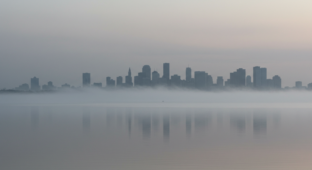
Gray in Nature

Observing Gray in the Wild
Nature boasts many gray tones. Consider the weathered bark of an old tree or the fur of a wolf. Stones, pebbles, and rocky cliffs showcase gray’s infinite variety. Even gray clouds rolling across the sky bring a sense of drama.
Animals that sport gray coats—elephants, koalas, dolphins—often symbolize wisdom, gentleness, or curiosity. Their subdued color helps them blend into their habitats. It also highlights other features, like tusks, eyes, or expressive faces.
The Emotional Color Meanings of Gray Landscapes
Gray beaches strewn with pebbles evoke a calm, introspective mood. Mountain ranges in grayish light can inspire awe with a hint of mystery. People drawn to these landscapes might find them meditative.
In photography, black-and-white images rely on shades of gray to create contrast. Many find these grayscale photos emotionally charged, as they strip away color distractions. The eye focuses on form and texture.
Nature’s Balanced Palette
Nature’s balance often appears in the mix of gray with green, brown, or blue. Moss on a gray rock. Fog drifting through forest trees. Stormy skies meeting green fields. These scenes remind us that gray has a place alongside more vivid elements.
This harmony inspires interior designers who want to replicate nature’s palette. Using a soft gray wall with earthy accents can mirror the feeling of a quiet forest clearing or a peaceful shoreline.
Balancing Warm and Cool Grays

Understanding Undertones
Warm grays carry hints of red, yellow, or brown. These undertones lend a cozy, earthy feel. Cool grays have notes of blue or green, leaning toward a crisp, almost icy quality. Identifying these undertones helps when matching fabrics, paint, or furniture.
Test a paint sample on your wall. Observe how it shifts in morning light versus evening. Warm grays may appear beige at dawn and more neutral later. Cool grays could look blue in certain conditions.
When to Use Warm Grays
Warm grays can soften a room. Think of them as a gentler neutral that pairs well with rustic wood or plush textiles. If you want an inviting space, lean warm. For instance, a kitchen with a warm gray backsplash complements granite counters and wooden cabinets.
Warm gray can also reduce the sterile feel in an office. Soft overhead lighting paired with warm gray walls fosters a friendlier environment, helping people feel at ease.
When to Use Cool Grays
Cool grays thrive in modern or minimalist settings. They work well with sleek lines, metal details, and high-gloss finishes. A cool gray living room might include chrome fixtures or glass surfaces that reflect light. The result is a bright, airy look.
Cool gray suits spaces with ample natural light, as it bounces sunlight around the room. In branding, a cool gray logo can feel sophisticated and forward-looking, appealing to tech-savvy audiences.
Gray and Design Psychology

Subconscious Reactions
Psychological color analysis shows that people often link gray to clarity and reflection. Because it doesn’t scream for attention, it lets the mind rest. Some who prefer gray in design seek a calm, stable environment free from bright distractions.
Still, gray can evoke seriousness if used too heavily. A corporate office wrapped in dark gray might seem intimidating. The solution is balance. Lighter shades or cheerful art can offset a heavier tone.
Gray’s Place in Color Theory
In color theory, gray is created by combining black and white, or by mixing complementary colors in the right proportions. It stands as the midpoint between extremes, symbolizing a bridge between opposing forces.
Designers often use gray to unify color palettes. When faced with clashing tones, a subtle gray addition can smooth the overall look. This synergy is why gray remains crucial in both digital and print design.
Practical Design Strategies
- Use gray for text on websites to reduce glare from pure black.
- Highlight key elements with color against a gray background.
- Combine multiple grays for depth: a medium-gray header, a lighter-gray body, and a darker-gray footer.
Such strategies keep the design coherent and approachable, reducing eye strain.
Gray’s Relationship with Other Colors

Pairing Gray with Warm Hues
Gray complements warm hues like red, orange, or yellow. These bright colors add life to gray, turning a neutral base into a dynamic palette. Picture a warm gray sofa with bright red pillows or a warm gray kitchen with copper fixtures.
This pairing keeps the energy balanced. The warm shade stands out, while the gray remains supportive. It’s a popular way to add comfort without letting the room feel overwhelming.
Pairing Gray with Cool Hues
Cool colors like blue, green, or purple pair naturally with cool grays. They create a modern or even futuristic effect. A steel-gray couch with teal pillows can appear sleek. A smoky gray wall behind vibrant green plants makes the foliage pop in a lively way.
Designers often combine gray with teal or turquoise in beach-themed rooms. The gray mimics driftwood or cloudy skies, while the blues remind us of water.
Monochromatic Gray Schemes
Some people love a monochromatic gray scheme. It can feel peaceful and let textures shine. The trick is to vary the intensity. Use a light gray rug, medium-gray furniture, and a deep gray accent wall.
This layering adds depth and prevents a washed-out look. If you long for a minimal aesthetic, a monochromatic gray palette might be your perfect match.
Gray in Technology and Trends

Tech Devices and Gray Finishes
Many gadgets and electronics feature gray finishes, from smartphones to laptops. This color signals sophistication, innovation, and a modern edge. The metallic sheen on these devices often reflects engineering precision.
People may prefer these devices because they blend into any style. A silver-gray laptop looks as good in a coffee shop as it does on an office desk. The color also resists looking dated, which extends the product’s perceived life.
Trend Forecasts for Gray
Color trend forecasters still see gray playing a role in design and marketing. Grays that lean toward warmth might become more popular as people crave cozy settings. Meanwhile, cooler metallic grays remain mainstays in the tech world.
Interior design trends sometimes shift toward bold accent walls, but gray remains a classic. It can anchor a room and help stronger colors pop. Designers who watch color marketing movements find that gray endures due to its adaptability.
Staying Fresh
To keep gray fresh, pair it with unexpected elements. A neon accent pillow on a smoky gray couch can look edgy. A gray-walled room with a neon green lamp can strike the perfect balance between calm and energetic. Even a small dose of an unexpected hue can rejuvenate a gray space.
Future Perspectives on Gray

Gray in Sustainable Design
As people focus on eco-friendly design, gray surfaces made from recycled materials (like steel or concrete) gain popularity. This approach merges environmental consciousness with a modern neutral aesthetic. Gray also hides wear and tear better than white, so it can extend product life.
New Shades and Treatments
Paint companies release new gray shades each year. Some have pearl or metallic finishes. Others shift toward pastel or taupe undertones. This constant evolution ensures gray remains on trend. Consumers may see more textured gray wallpapers, ceramic tiles, or even textiles that blend gray with subtle patterns.
Expanding Global Influence
Global cultures share designs faster than ever. Gray’s universal color meanings make it easy to adapt across borders. In some regions, it may symbolize minimalism, while in others, it speaks of calm reflection. That global exchange keeps gray in the spotlight.
Conclusion

Gray stands as a modern neutral that resonates with balance, stability, and understated charm. Whether in design, branding, art, or everyday style, it delivers a versatile canvas. From warm to cool, from light to dark, from cozy to cutting-edge, gray wears many hats.
This color’s emotional and cultural resonance ties to its role as a blank slate that can skew elegant, rustic, innovative, or serene. It harmonizes with bold hues or stands strong alone.
If you wish to enhance mood, interior harmony, or brand identity, gray may be your hidden gem. Its power lies in quiet confidence and the ability to uplift other colors without losing its own personality.
Summary Table

| Aspect | Key Insight |
|---|---|
| Emotional Impact | Calms, soothes, and grounds |
| Cultural Meanings | Reflects wisdom, routine, or humility, depending on region |
| Warm Grays | Cozy, inviting, pairs well with earth tones |
| Cool Grays | Crisp, modern, pairs well with blue or green |
| Branding Use | Conveys stability and professionalism |
| Marketing Strategy | Gray backgrounds highlight products, need accent for visual pop |
| Interior Design | Offers a neutral base that can range from soft serenity to bold drama |
| Fashion and Style | Versatile, understated flair, pairs with many colors |
| Artistic Application | Shadows, depth, contrast, and abstract expression |
| Nature | Stones, clouds, animals, and weathered textures |
| Pairing with Warm Colors | Highlights contrast, adds cozy energy |
| Pairing with Cool Colors | Creates sleek, refreshing vibes |
| Tech and Trends | Grays remain popular for gadgets, minimalism, and modern aesthetics |
| Future Outlook | Sustainable, adaptable, and evolving with new shades and finishes |
FAQ

Q1: Will gray make my home look dull?
Gray alone may appear dull if every element is the exact same shade. But by mixing lighter and darker grays, adding texture, or introducing accent colors, you can prevent monotony. Think about warm lighting and layered textiles to keep things interesting.
Q2: Which accent colors work best with gray?
The beauty of gray is that it plays well with most colors. Warm shades like red or orange create a lively contrast. Cool shades like blue or teal offer a crisp, modern feel. Even neutral accents like cream or black can add dimension.
Q3: Is gray a timeless choice or just a trend?
Gray has proven itself as a long-term favorite in interior design, fashion, and branding. It’s a natural fit for minimalist trends but also pairs well with classic décor. Because of its versatile nature, gray is likely to remain relevant.
Q4: How do I pick the right gray paint?
Sample several swatches on your wall. Watch how the color changes with sunlight or artificial lighting. Also note the undertone (cool or warm). If the space feels chilly, try a warm gray. If you want a sleek, modern vibe, go with a cool gray.
Q5: Can I use gray in a small space?
Yes, but go lighter if you’re concerned about the room feeling cramped. Light gray can make a small space feel airy, especially if paired with sufficient lighting and reflective surfaces.
Q6: How does gray function in branding?
Gray can communicate stability, professionalism, and modernity. It can help a brand appear serious and trustworthy. Pairing gray with a bold accent color often yields a fresh look that retains approachability.
Q7: Do different cultures see gray in contrasting ways?
Yes, cultural color connotations can vary. In some places, gray may link to modesty or wisdom. Elsewhere, it might seem ordinary. The context and usage shape these perceptions, so research the cultural background if it’s crucial for your brand or design.
Q8: Is gray suitable for emotional branding?
It can be. If you want to evoke trust, calmness, or a sense of reliability, gray works. It might not match brands aiming for a vibrant or playful image. Combine it with lively accents if you need more warmth or energy.
Gray, with its subtle depth and understated appeal, stands ready for endless creative uses. Whether you choose a hint of silver or a deep charcoal, this modern neutral can transform spaces, products, and messages. The key is to embrace its quiet power and harness it thoughtfully for a look that feels both classic and new.

Neha Z. is not just any writer; she’s a storyteller who has graced the online world with her evocative prose for over half a decade. Venturing into the intricate nuances of women’s lives, she weaves stories that range from life’s highs and lows to the multifaceted essence of femininity. Each piece she pens radiates sincerity and artistry. As you delve into Neha’s musings, you’ll find reflections that echo your own journey and insights that inspire. Immerse yourself in her world, and let her stories touch your heart.
Reviewed By: Joanna Perez and Anna West
Edited By: Lenny Terra
Fact Checked By: Matthew Mansour
Photos Taken or Curated By: Matthew Mansour