Key Takeaways
- Crimson stands for passion, intensity, and a vivid sense of boldness in design and art.
- It often connects with resilience, warmth, and confidence, though personal interpretations vary.
- Cultural ideas surrounding crimson shift. Some see it as a sign of celebration. Others link it to serious feelings like power.
- In marketing, crimson can capture interest or persuade buyers.
- In art and interior design, crimson adds a focused emotional pull, whether it’s a small highlight or the main color.
- Being aware of its psychological effects can guide branding, design choices, and atmosphere.
- Remember that context matters—crimson’s impact changes based on lighting, pairing with other colors, and even local traditions.

Crimson often steals the show. Its presence suggests energy, purpose, and, sometimes, an almost electric spark. When people first see crimson, they might think of love, desire, or even unstoppable energy. But there’s more beneath its surface. This color can glow with vibrancy, but also hold hints of mystery. It’s not just red; it’s a deeper, richer tone that calls attention.
Why does crimson carry so much weight? One reason might be that human eyes respond strongly to red hues. Our senses pick up on that wave of intensity. Another reason lies in centuries of cultural color meanings.
From ceremonial garments to modern branding, crimson remains a standout choice. It hints at sincerity, yet can also spark a fierce impression. It may seem simple on the outside, but it can stir deep emotional color meanings inside us.
This post explores the power of crimson. You’ll see how it stirs emotional color connotations, how it appears in design, and the ways it can push people toward certain actions.
We’ll also look at unexpected uses of crimson—from fashion trends to subtle interior accents. Whether you want to spice up your logo or choose a striking paint for your living room, these insights will help. Let’s begin our journey into the passionate and intense nature of crimson.
The Magnetic Nature of Crimson
The Heart of Crimson
Crimson stands for more than just red. It lies between bright scarlet and deeper burgundy, echoing a sense of intensity. It often symbolizes passion and boldness, which explains its wide use in color branding and color marketing. Some see it as an emblem of courage.
Others connect it with romantic expression. Whether in a painting or a piece of clothing, crimson calls attention without apologizing. Its emotional branding power runs high, tapping into people’s hearts and encouraging them to respond on an instinctive level.
Bright Fire or Deep Mystery?
Is crimson loud, or does it hide layers of meaning? Sometimes, it shows up like a flame, full of life and energy. Other times, it reveals something thoughtful, as though the color itself holds secrets. This dual nature contributes to its strong emotional impact.
One person might see it as a sign of optimism. Another might read it as something more reflective, hinting at depth. Crimson’s role in color theory suggests it can fit multiple identities, from unstoppable energy to understated elegance.
Emotional Pull
Colors carry weight in how people feel. Crimson’s emotional color meanings can change based on context. In a cheerful setting, it bursts with excitement and spontaneity.
In a more formal environment, it leans toward power. If we trace its background, we find cultural color meanings that link it to strong emotion and leadership.
Whether used in branding or daily life, crimson can guide moods and prompt certain actions. It’s no wonder color psychology research often spotlights red-based tones. They have a knack for inspiring intense emotional responses.
Cultural Impressions
East vs. West
Does crimson mean the same thing everywhere? That depends on location. Some eastern cultures see crimson or deep red as a mark of good luck, wealth, or health. Western cultures, on the other hand, might pair crimson with love or bravery.
These color associations shift based on local traditions, historical use, and shared narratives. A designer seeking to appeal to a global audience should keep that in mind. A shade that seems strong in one region might be viewed as inviting elsewhere.
Crimson in Celebrations
Weddings, ceremonies, and festivals often feature red-based tones, including crimson. In certain traditions, brides wear vibrant red to symbolize joy. In other events, red might appear in decorations or attire, suggesting happiness.
Crimson can also have spiritual significance. It may speak to the idea of life’s essence. For people who value ancient customs, crimson weaves a note of continuity. When you see it at a party or cultural event, it might reflect centuries of shared stories and beliefs.
Shifting Views
Over time, people’s perception of crimson has changed. Once, it was a costly dye reserved for the upper class. That made it a sign of status or authority. Today, crimson is more accessible, appearing in everything from everyday clothes to interior decor. A color that used to point to wealth now finds a place in simple designs. Those older ties still remain, though. That’s why crimson can hold an aura of grandeur, even in casual items. It hints at tradition while staying current.
Crimson in Art
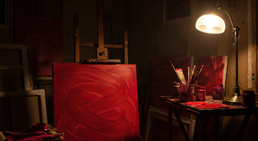
Historic Art Movements
Artists have used red-based colors for centuries, partly because of their strong pigment. Renaissance masters and modern creators alike turned to crimson for its depth. It helped highlight important figures, objects, or emotions.
In some pieces, red tones draw the eye to the center of a painting, controlling how viewers follow the story. Though art styles have changed, the appeal of intense reds has endured. It anchors a piece, providing a sense of life and vitality.
Crimson as an Accent
Not every piece of art drenches itself in crimson. Sometimes, a small touch of this color stands out more than an entire canvas covered in it. A single crimson detail might emphasize a focal point or spark sudden curiosity. Artists often use color narratives to guide interpretation. By sprinkling a bit of crimson within quieter tones, they create balance. This approach underscores the emotional effect of color. Even a small highlight can magnify the meaning behind color choices.
Common Artistic Techniques
Artists have multiple tricks when using crimson. Layers of paint can intensify it or dim it. In watercolor, a swift stroke of deep red might wash across a light background, forging contrast. Oil painting can show different finishes: matte for a subdued vibe, glossy for a bolder presence.
Mixed media art might pair crimson with textures like paper scraps or metallic elements. Each method shapes how people sense the color. By mixing it thoughtfully, artists expand the scope of color interpretation, giving crimson a fresh dimension.
Emotional Color Meanings and Crimson

Beyond Typical Associations
Some folks quickly think of love or anger when they see red. Yet crimson goes further. It combines passion, confidence, and mystery in one hue. Its core might remind people of the heart, symbolizing strong attachments. But it can also stand for energy, bold moves, or a rebellious streak. Emotional color meanings depend on personal views. Crimson finds a place in deeper, more nuanced feelings, like ambition or sincerity. This range sets crimson apart from simpler red hues.
Touching Human Instincts
Colors can spark gut reactions. Crimson often stirs an instinctual response, whether it’s excitement, caution, or attraction. This is part of color influence on behavior. Research suggests red-based tones raise awareness, cause slight physical reactions like quickened pulse, or prompt immediate focus. Crimson’s exact shade can change how strong those effects are. A bright variant might feel lively. A darker shade might feel haunting and regal at the same time. Designers and artists can use that energy to shape how viewers feel.
Channeling Crimson’s Essence
How do you tap into crimson’s emotional punch without making people feel uneasy? Balance is key. Pairing crimson with calm, neutral tones can soften its force. Integrating it with cool color symbolism, like pale blues, can keep it from overwhelming a design. In writing or photography, a pop of crimson guides eyes toward a target subject. This is the essence of color marketing: controlling how people engage with the message. By respecting the color’s power, one can channel its intensity for a pleasing effect.
Crimson in Branding
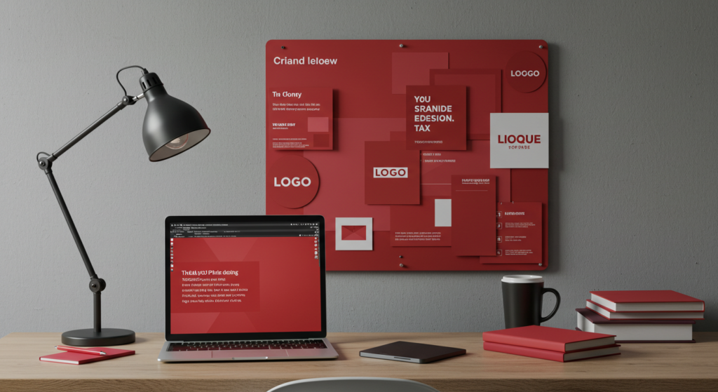
Building Trust or Excitement?
Branding with crimson can send a powerful message. Its bold nature can promise action, inspire customers, or convey excitement. Some companies choose crimson to stand out among duller hues, hoping to draw the eye. But overuse might feel pushy or urgent. In color branding, each shade forms part of a bigger brand identity. If a brand wants to create trust, it might rely on darker crimsons that suggest maturity. Meanwhile, a bright version can highlight fresh ideas or spark a sense of spirited drive.
Emotional Branding
Emotional branding depends on color connotations. Crimson speaks to intensity. It can fill a brand with passion, quick energy, or ambition. When used on packaging or logos, it may nudge shoppers to take a second look. This approach can stick in people’s minds. Colors and emotions link in deep ways, so a well-placed dash of crimson can keep a brand from blending into the background. The main goal is to evoke the right feeling: excitement, bold confidence, or even a more refined warmth.
Strategic Placement
Experts in marketing don’t just splash color randomly. They study color positioning. Crimson might appear in a brand’s accent elements—like a call-to-action button or a headline banner. It could also color key visuals, adding a confident statement. Strategic color usage respects the brand’s overall palette. When too many strong shades clash, the effect grows chaotic. A single, well-placed crimson icon, though, can guide viewers’ eyes and encourage them to follow the intended path. This approach helps shape a brand’s story while preserving visual harmony.
Crimson in Marketing Campaigns
Promotions That Pop
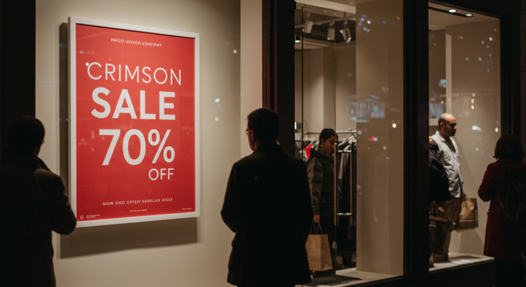
Businesses looking for quick attention often rely on red-based hues. Crimson, with its deeper flair, can feel premium yet urgent. In marketing campaigns, a bold sale sign in crimson can raise curiosity. Its link to intensity can prompt shoppers to click or walk through a store’s doors. Campaigns that focus on big events—like product launches—benefit from crimson’s ability to spark a reaction. People might recall that shade long after the advertisement disappears.
Seasonal Attraction
Crimson fits certain times of the year. Think about traditional winter holidays, where red plays a major part. Crimson sets a cozy tone that resonates with family gatherings and warm lights. Yet it also thrives in spring or summer events, contrasting against bright backgrounds. The color’s adaptability is part of its charm. Marketing teams can rotate it into different seasonal campaigns without losing its identity. From Valentine-themed promotions to patriotic festivities in some countries, crimson remains a top contender.
Balancing the Message
While crimson excites, too much of it can feel overwhelming. Brands risk pushing potential customers away by filling every element with heavy red. Instead, they can focus on subtle touches. A headline in bold crimson draws the eye, while the rest of the copy stays neutral. This method respects the color’s emotional power and maintains a friendly reading experience. When color is used with intention, the brand story feels smooth and inviting, never pushy or loud.
Crimson in Interior Design

Vibrant Wall Statements
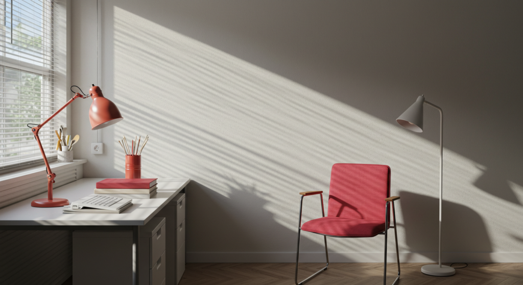
People who crave energy might use crimson on a single wall. That accent wall can spark conversation in a living room or dining area. It fills the room with warmth and an unforgettable vibe. Interior design color meanings revolve around how a space feels. A bold crimson wall can speak to confidence. Some folks enjoy the extra kick it provides, turning an ordinary area into a cozy statement zone. It also pairs well with deeper woods and metallic accents.
Subtle Accents and Furnishings
Not everyone wants to paint an entire wall crimson. Small doses, like throw pillows or curtains, can still offer that punch of color. A crimson rug near neutral furniture adds interest without dominating the space. This approach helps people tiptoe into the color’s power. They can test how the color influences their day-to-day mood before committing to a bigger design choice. Items like vases, cushions, or even a single piece of art in crimson can shift a room’s energy.
Lighting and Textures
Crimson can change under different lights. A bright, natural light might highlight its warmer tones. At night, under soft lamps, it may deepen, taking on a moody glow. Textures also affect how crimson is perceived. A velvet sofa in crimson looks plush and grand. A matte finish on a wall might feel soothing, whereas a glossy surface might reflect light, boosting the color’s intensity. Interior designers harness these nuances when they craft spaces that range from dramatic and bold to calm yet sophisticated.
Scientific Studies on Color

Observing Physical Reactions
Researchers sometimes measure people’s responses to color by tracking heart rate or brain activity. Deep reds often cause a small jump in energy. This effect might be tied to primal instincts that developed when red signaled caution or opportunity. While not everyone responds the same, the general trend remains strong. It’s one reason advertisers place red near buttons that prompt immediate action.
Emotional Ties in the Lab
Studies on color perception suggest that reds, including crimson, heighten emotional responses. Participants in certain experiments reported feeling alert or engaged around red stimuli. In some group tasks, people surrounded by red-based cues showed quicker reactions. This doesn’t prove that crimson alone causes changes. But it indicates that strong reds can stir some psychological effects. Still, personal taste and cultural background also play roles.
Practical Takeaways
Should you pick crimson just because of a few lab tests? Not necessarily. While data can guide decisions, no single color works best for every scenario. Crimson’s main benefit lies in its blend of energy, depth, and a hint of mystery. If your brand or space needs that spark, consider it. For more serene vibes, choose calmer tones. The key is to recognize how color can shape mood, then choose the right shade for your goal.
Color Theory in Action
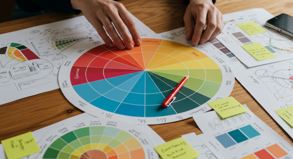
Warm vs. Cool
Color theory splits the color wheel into warm and cool families. Crimson rests firmly in the warm category, but it doesn’t always feel like a raging fire. It can have cooler undertones, especially if it leans toward magenta. Designers often play with these undertones to match a broader palette. If you blend a warm crimson with cooler shades like teal or gray, the color synergy can be striking. This method helps create balance and tension at the same time.
Complementary Choices
In color theory, opposite shades on the wheel add drama. Crimson’s companion might be a soft green or a greenish-blue. When paired well, each color intensifies the other. This can be a trick in marketing: place a crimson element next to its complement to focus attention. In interior design, carefully chosen complements can shape a balanced room that doesn’t look chaotic. The key is moderation. A small bit of contrast can highlight each color’s attributes.
Harmonious Blends
Not every designer wants intense contrast. A simple way to use crimson is through analogous color palettes. Picture a scheme with crimson, deep orange, and maybe a hint of burgundy. These colors share a parent hue, creating a sense of flow. People see it as pleasing and well-coordinated. Color connotations in such palettes tend to feel consistent, whether they’re bold or muted. This approach can suit those who prefer a more cohesive aura in art, branding, or home decoration.
Colors and Mood
Spontaneity and Drive
Have you ever felt a burst of motivation when you see something bright red? That’s the mood-boosting aspect of warm color symbolism. Crimson can energize a dull day or stir excitement for a project. People chasing new ideas might wear a crimson scarf or hang a red painting in their workspace. The color’s intangible push can spark fresh thinking and an eagerness to begin.
Grounded by Earth Tones
Crimson doesn’t always mean mania or fast pace. Pairing it with earthy browns or sandy beiges can calm the overall vibe. This blend emphasizes reliability and authenticity while still holding onto a bit of color presence. It creates a sense of comfort. Color identity shifts depending on the combination used. Crimson morphs from loud to thoughtful when placed alongside warm neutrals. This effect can be used in offices, living rooms, or brand visuals that aim to show both energy and stability.
Finding Balance
Some fear red tones because they worry about tension. But color context matters. Adding a cream or light gray backdrop can balance out crimson’s punch. The eye finds a place to rest, and the design feels steady. This approach also applies to branding or events. A large red banner might feel heavy without a buffer. Frame it with gentle shades. Let that extra space breathe. That’s how you strike a calm, pleasing mood while keeping the intensity of crimson intact.
Color Influence on Behavior

Urgency and Decision-Making
Time-limited ads often rely on red or crimson because they spark a sense of urgency. Whether it’s a flash sale or a last-minute event, that color can boost response rates. People might pause to investigate, worried they’ll miss out. This phenomenon relates to color impact in design. A well-timed splash of crimson can shift browsing into buying. But too much might feel spammy, so a balanced approach is vital.
Encouraging Action
Ever notice that many “buy now” buttons are red? That’s not random. Designers often test multiple colors to see which one prompts more clicks. Red-based hues tend to perform well in some scenarios because they catch the eye. That’s how color marketing merges with behavior. It’s not magic, but it’s a tangible tactic. Crimson’s slight depth can add a classy twist to the typical bright red. It suggests urgency and quality at the same time.
Pacing and Atmosphere
Crimson can also frame a slower, reflective vibe when used sparingly. It’s not always about quick action. If a brand wants to show sophistication, it might include crimson in its logo or packaging while keeping the rest of the design minimal. That subtlety shifts the color’s effect from urgent to poised. Atmosphere shapes behavior, so the final result depends on how, where, and why you place crimson.
Color Connotations in Different Contexts
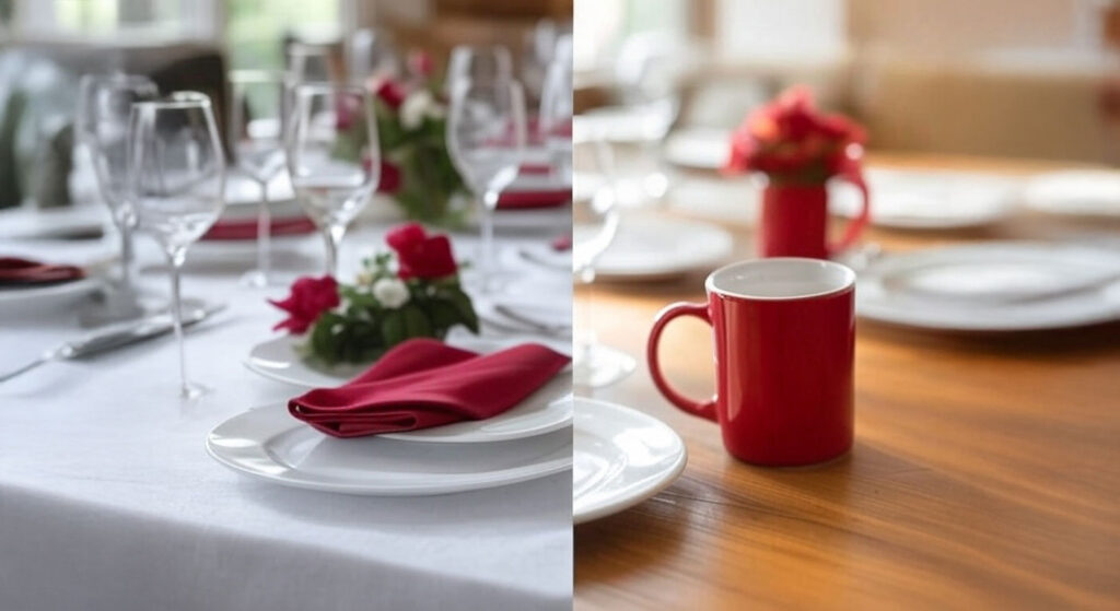
Formal vs. Casual
A formal setting often calls for deeper versions of red. Think of a velvet curtain or a classic tie. These details feel refined. In casual settings, a lighter or brighter crimson might appear on T-shirts or sports gear. The meaning behind color choices shifts with context. A glossy crimson invitation might speak to a black-tie event. A simple item in the same shade might fit a casual hangout. Understanding the environment helps you pick the right variation of crimson.
Personal vs. Public
At home, you can choose any color you want. That’s personal expression. Crimson might show up on a bedroom pillow or a painting on your hallway wall. In public spaces, color decisions often aim for broad appeal. A waiting room might have neutral shades so people feel relaxed. Yet, a trendy restaurant might choose a crimson accent wall to spark conversation. These different goals reveal how color identity depends on audience and intention.
Digital vs. Print
Crimson on a screen can shift in appearance based on display calibration. The same digital hex code might look lighter or darker on different devices. In print, variations in ink or paper can change the tone. Designers must watch these differences when using color for websites, apps, or business cards. They rely on swatches, test prints, and thorough checks to ensure the color remains consistent. A brand that prizes its crimson identity should keep that in mind across all materials.
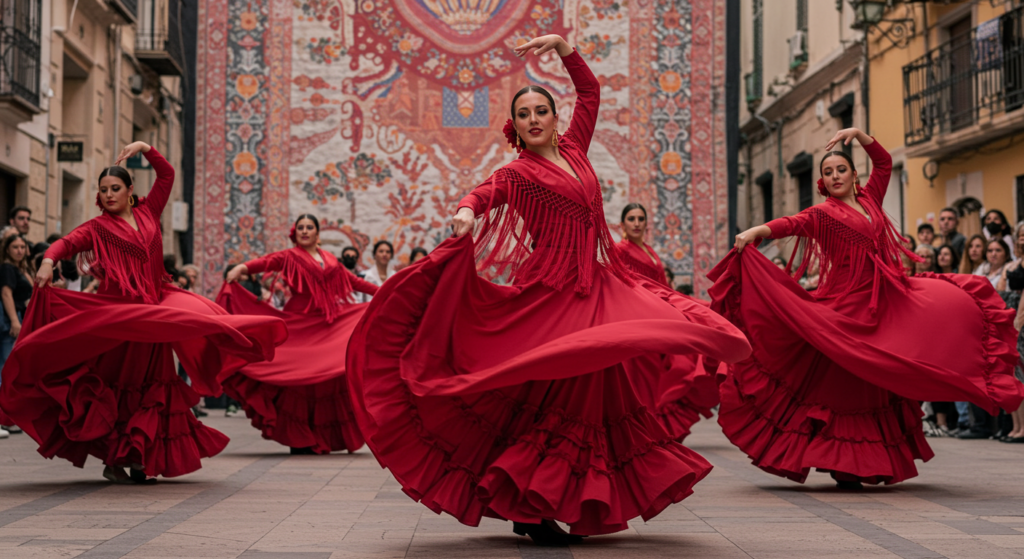
Crimson in Fashion
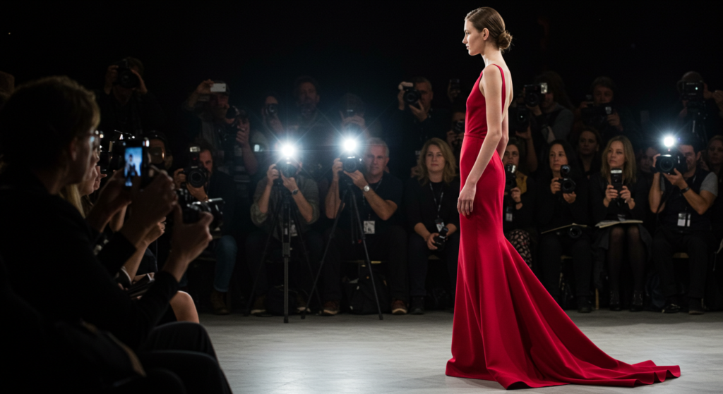
Statement Pieces
Crimson clothing commands attention. It might be a blazer for a big meeting or a dress for a special event. Those who pick crimson often want to show confidence or add a spark to their look. This color can flatter many skin tones, depending on its depth and undertone. In fashion, it communicates both boldness and charm. It can highlight the wearer’s creativity, especially when paired with understated accessories or shoes.
Subtle Pops
Not everyone wants to wear a full crimson outfit. Sometimes, a small detail can do the job. A crimson scarf, belt, or pair of earrings might be enough. These pieces can transform a neutral ensemble, adding interest without overpowering. It’s a safe way to experiment with color connotations. Some choose it to liven up a classic black-and-white outfit. Others add it to an earthy palette for a neat contrast. Either way, the presence of crimson can boost a look.
Accessory Power
Handbags, watches, or shoes in crimson can become conversation starters. A crisp white shirt paired with crimson heels or a bag can catch the eye in any crowd. People who enjoy subtle elegance might choose deeper tones of crimson. Those who want more pop might opt for a brighter variant. This flexibility is key to crimson’s enduring popularity in fashion. It keeps returning in color trends, from runway collections to everyday wear.
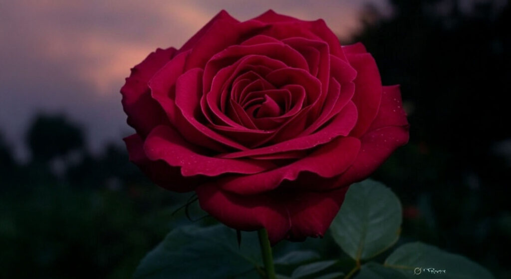
Crimson in Nature
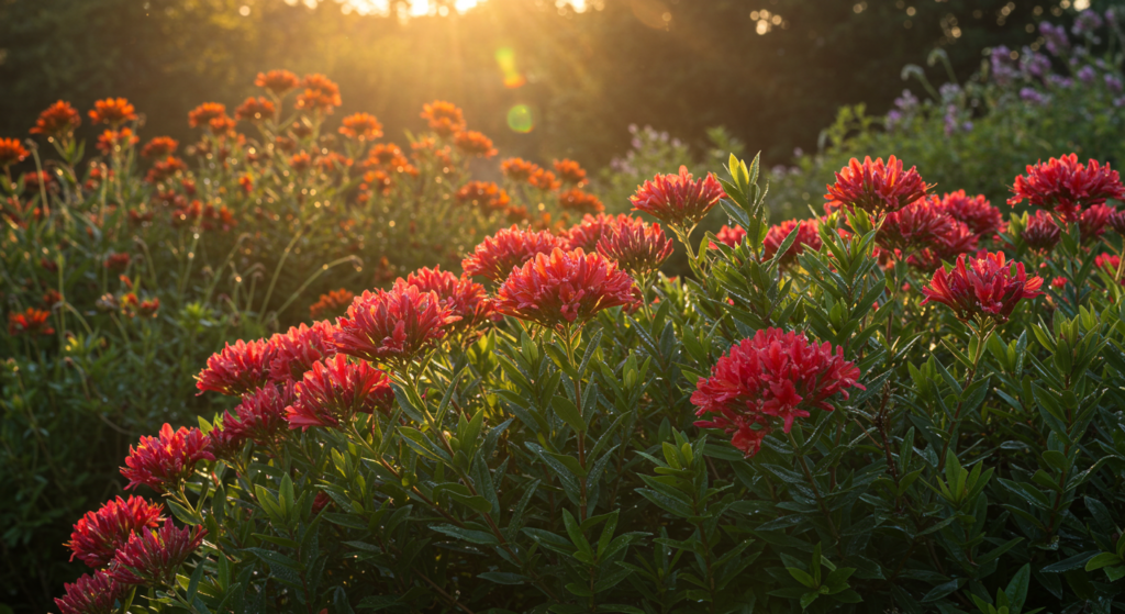
Flowers and Foliage
Some blooms arrive in a deep crimson hue that fascinates the eye. Roses, lilies, and other species show how nature’s color palette can stun us. Such flowers often stand for passion or devotion, which lines up with cultural color meanings. In gardens, these colors help pollinators spot them. It’s a natural form of visual identity through color. A patch of crimson flowers in a green setting provides a vivid contrast that captivates anyone strolling by.
Animal Signals
Certain creatures display red coloration as a sign of territory or to lure mates. Birds with crimson feathers might show off during mating rituals, while reptiles or fish might flash red spots to convey status. This is nature’s own color branding. Crimson, in the animal kingdom, signifies importance or readiness. Such signals appear across species, showing that the emotional impact of color isn’t limited to humans.
Natural Inspiration
Designers sometimes turn to nature to find fresh color ideas. The shape and hue of a crimson leaf can spark a paint scheme or influence a product design. Observing how sunbeams hit that shade near dusk might guide a photograph’s color composition. Nature’s color trends can translate into everything from fashion collections to interior design. Crimson stands out in many scenes—sunsets, turning leaves, or exotic flowers—reminding us that life’s tapestry is rich with color.
Conclusion

Crimson exudes intensity and passion like few other colors can. It appears throughout art, nature, fashion, and marketing, capturing hearts with its depth and energy. Many times, it stands for passion, vibrancy, and confidence, yet it can also feel warm and sincere. Its identity depends on how it’s used. A fiery accent might spark drive. A softer shade might channel elegance. Whether you’re an artist, designer, or curious explorer of color symbolism, crimson offers a rich palette of possibilities.
This color’s story stretches back through time. Once reserved for nobility, it now belongs to anyone who seeks a commanding presence. By mixing it with other hues or focusing on subtle details, you can craft a visual conversation that resonates.
Personal preference, cultural factors, and the right environment all guide how crimson will shine. As you plan your next project—or even just choose your next outfit—remember that crimson can carry a special emotional weight. Use it thoughtfully, and let its vivid spirit glow.
Summary Table
Below is a quick reference for using crimson and understanding its influence in different areas:
| Category | Key Points | Tips for Use |
|---|---|---|
| Symbolic Colors | Often linked with passion, intensity, confidence, sincerity. | Balance with neutral or cool tones to avoid oversaturation. |
| Cultural Color Meanings | Viewed differently worldwide; in some places, luck or celebration, in others, love. | Research local traditions before featuring crimson in events or branding. |
| Color Branding | Bold, stands out, can spark strong responses. | Use as an accent or main brand color to encourage engagement. |
| Interior Design Color Meanings | Adds warmth and focal points. | Try accent walls, throw pillows, or small decorative items. |
| Fashion and Style | Conveys statement or subtle interest. | Mix with neutral outfits for that perfect pop. |
| Marketing | Enhances urgency in sales and ads. | Avoid overuse to keep trust and credibility. |
| Color Psychology Research | Studies suggest heightened attention and energy. | Consider varying shades for different emotional effects. |
| Color Theory | Warm hue, can shift from bright to moody based on undertones. | Blend with complementary colors for standout effects. |
| Colors and Emotions | Can evoke excitement or power; might also feel regal. | Pair with calming shades if the environment calls for subtlety. |
| Nature’s Color Meanings | Found in flowers, sunsets, and animal signals. | Let natural inspiration guide interior or brand palettes. |
| Design Color Meanings | Sharp focal tool in logos, websites, and packaging. | Use in calls-to-action or highlights where immediate attention is key. |
| Scientific Studies on Color | Tied to higher alertness in some experiments. | Test variations to see which shade best suits your project. |
| Color Marketing | Strong visual identity helps brand recall. | Consider target audience’s cultural background for best reception. |
| Crimson in Art | Historic presence in paintings; used for emotional emphasis. | A small stroke of crimson can shape the entire focus of a piece. |
This table serves as a handy guide for quick reminders on how to leverage crimson’s emotional and aesthetic powers.
FAQ

Q1: Why does crimson feel more intense than a standard red?
Crimson has a deeper undertone that creates a richer presence. It sits between bright red and deeper hues like burgundy, offering both energy and a hint of intrigue. This tone often triggers heightened reactions because it looks bold and commands attention.
Q2: How can I use crimson in my home without making it feel overwhelming?
Start small. Pick accent pieces—like pillows or rugs—or paint a single wall. Pair it with neutral or cool shades that calm its potency. This way, you enjoy crimson’s depth without turning the space into a jarring experience.
Q3: Does crimson work for business branding, or is it too strong?
Crimson can be effective if used with intention. Many brands use it to project confidence, urgency, or excitement. The key lies in balance. A subtle splash on packaging or a logo can grab attention without coming across as too loud.
Q4: Are there any cultural issues I need to watch out for when using crimson?
Yes, some areas hold red-based hues in high regard for celebrations and luck, while others link them with caution or authority. Research local customs or consult individuals familiar with that culture before rolling out large-scale campaigns.
Q5: Is crimson suitable for all seasons in fashion?
Absolutely. In colder months, deeper crimsons add warmth and elegance. In warmer months, a brighter crimson can pop against lighter fabrics. A small accessory in crimson can make an outfit look current, no matter the time of year.
Q6: Will crimson always spark the same response in every person?
Not necessarily. Emotional reactions to color vary based on personal history, cultural background, and even mood. While many do find it exciting or empowering, a few might view it as too strong. There is no universal response to color.
Q7: How does lighting affect crimson’s look?
Lighting can shift crimson dramatically. Under bright natural light, it can seem vibrant and lively. In dim or artificial light, it might appear richer, leaning toward burgundy. It’s wise to test paint or fabric swatches in your actual space first.
Q8: Can I pair crimson with other warm hues, or will that clash?
You can blend crimson with other warm tones like orange or burgundy for an analogous scheme. This approach creates a sense of flow. Just be mindful of saturation levels so each hue has space to breathe.
Q9: Does crimson work for calm spaces like meditation rooms?
That depends on your personal tolerance and design goals. Crimson can spur energy, so it might not be the first pick for a meditative space. A softer or muted version could work if paired with softer neutrals. Test smaller items first.
Q10: Are there scientific reasons behind crimson’s attention-grabbing nature?
Researchers note that many red tones can quicken pulse or spark a sense of readiness. Crimson fits that pattern due to its hue. It’s not magic, but it reflects how humans are wired to notice red signals, possibly for reasons tied to survival.
Q11: Can I use crimson for a minimalist design?
Yes, but keep the space mostly clean and neutral, then insert a single crimson element. That pop will stand out even more in a minimalist setting. It’s a method that can make a modern room feel distinct with just one bold detail.
Q12: What if I want a color that’s slightly quieter than crimson?
You could pick a red with more brown or blue in it, like a maroon or a wine hue. These keep some of the drama of red tones but often read as more subdued. Adjusting brightness or saturation can also reduce intensity.
Q13: Does crimson work for all types of marketing, or only for certain products?
It can work across many sectors. A tech startup might use it for energy. A cosmetics brand could use it for a passionate vibe. A nonprofit might want to show commitment. It all depends on the brand story. Test the color with your audience for best results.
Q14: How do I keep my brand looking consistent across digital and print if I choose crimson?
Make sure to use color codes (like CMYK for print and RGB or HEX for digital) that match as closely as possible. Request proofs from printers before final production. Confirm that your brand guidelines specify the exact codes to avoid mismatched hues.
Crimson stands ready to transform your art, brand, or space with its passionate, intense energy. Whether it’s a bold statement or a subtle reminder of warmth, this color remains a powerful choice for those unafraid to stand out.

Joanna Perez, with a degree in Creative Writing, excels in recommending distinctive clothing color mixes and trends that deeply connect with readers. She simplifies the often daunting task of color selection, making fashion decisions more personalized and impactful. Her passion for vibrant color palettes and the stories they tell makes her an indispensable voice in the fashion community.
Reviewed By: Marcella Raskin and Anna West
Edited By: Lenny Terra
Fact Checked By: Sam Goldman
Photos Taken or Curated By: Matthew Mansour