Key Takeaways
- A color palette shapes how people see your brand.
- Balancing hues and neutrals strengthens brand consistency.
- Cohesive color usage helps you stand out across print and digital channels.
- Simple guidelines make sure everyone on your team applies colors in the same way.
- Careful testing and feedback loops keep your visual identity relevant.
Introduction

Ever notice how certain brands feel familiar at a glance, even before you spot their name or logo? That effect often springs from a well-chosen color palette. Brands that pick colors with a plan tend to enjoy more recognition and loyalty. Colors serve as swift signals—our eyes catch them before they read a single word. That means your palette can pull people in and shape their impression right away.
In many cases, color choices become part of a broader brand strategy. They support your visual identity, underscore your brand’s core values, and help you speak to your market. But how do you select hues that fit your identity without stepping into typical color clichés? And how do you keep things consistent over time, especially as your business grows?
This article lays out a practical blueprint for crafting a strategic palette. You’ll see tips, checklists, and actionable steps to help you fine-tune each color you select. The goal is to form a recognizable brand identity that feels fresh, relevant, and cohesive—no matter where your brand appears.
Setting the Stage for Strategic Branding

The Essence of a Palette
Every brand needs a set of colors that carry its personality. These tones often show up in logos, websites, packaging, signage, and advertising. Think of them as the visual framework for your entire brand experience. A strategic branding approach helps you pick colors that mirror your ethos while also appealing to your audience.
It’s easy to pick shades because they look cool or trendy. But if they don’t match your message or brand values, your audience can feel confused. The essence of a palette is to create a consistent, versatile foundation that works on every channel.
Visual Hierarchy and Brand Perception
Color choices affect brand perception by steering where the eye lands first and how the viewer moves from one visual element to the next. In print or digital spaces, a strong color hierarchy ensures your most important details pop.
- Highlight key calls to action: Use bold accent hues for clickable buttons or urgent messages.
- Guide the gaze: Subtler tints and neutral shades support main elements, preventing clutter.
- Keep text readable: Pair text color with background color for smooth legibility.
The right color usage, stacked with smart typography, can spark positive responses from your audience.
Combining Color with Other Elements
A color palette rarely stands alone. It usually partners with logos, fonts, illustrations, and photos. When these elements share a consistent style, you create brand consistency. If your brand includes an icon or shape that always appears in a deep navy, for instance, keep that same tone everywhere—online ads, letterheads, or event banners.
In addition, color works better when it aligns with your brand messaging. Words and visuals should reinforce each other. If your slogan conveys bold confidence, consider pairing it with a bright accent color that expresses energy.
Building a Cohesive Color System

Anchoring Your Primary Hue
Most brands start with a primary hue. That single color sets the mood for your visual communication. A restaurant focused on organic foods might pick a deep green that hints at nature. A tech brand might choose a crisp teal that looks energetic and modern.
To avoid confusion, stick with one main hue. Then expand your palette from there. This approach keeps your brand from feeling scattered.
Secondary and Accent Tones
Once your primary hue is set, add 2–3 secondary tones and 1–2 accents. Secondary colors offer variety but still feel compatible. Accent tones grab attention for highlights, icons, or small design elements. For instance:
- Primary: Dark blue (dominant)
- Secondary: Light teal, gray-blue
- Accent: Bright orange
With this tiered system, you’ll be able to fine-tune each element based on its importance. You’ll also ensure your brand identity stays cohesive across different media.
Balancing Neutral Shades
Neutral shades—white, off-white, light gray, charcoal—give your brand space to breathe. These subtle tones act as backgrounds, frames, or minimal text blocks. They prevent the main colors from feeling too intense.
Neutrals also help unify various design elements. If your palette feels cluttered, slip in a calm gray or soft cream background so the main hues can shine without fighting each other.
Aligning Color with Brand Values

Defining Your Core Identity
Before finalizing your colors, make sure you’re clear on what your brand represents. What kind of personality should it project? Is it playful, serious, or welcoming? These questions guide color choices more than you might expect.
For example, a brand that champions trust and stability might lean on a deeper, calmer set of hues. Meanwhile, a brand that aims to excite might pick brighter or unexpected tones.
Communicating Personality Through Color
Your brand’s personality should leap off the screen or shelf. If your brand is lively, your palette might include a strong accent color that “pops” in marketing materials. If your brand aims for elegance, perhaps subdued jewel tones or a refined black-and-white pair better fits the mood.
The trick is to let color do some of the talking. Think about the emotional message you want to send. Then pick shades that support that tone.
Crafting a Memorable Impression
Why do some brands stick in your mind? Often, it’s because their palette creates a quick mental link. Think about big coffee shops that use green, or a global shipping brand that uses brown in all its trucks and gear. Even if you strip out the name, you often know who it is.
A memorable palette does the same for your business. You don’t have to be a global chain to benefit. Even smaller brands can create strong associations by repeatedly using a consistent set of hues across packaging, signage, stationery, and social media.
Brand Guidelines for Consistency
Standardizing Color Usage
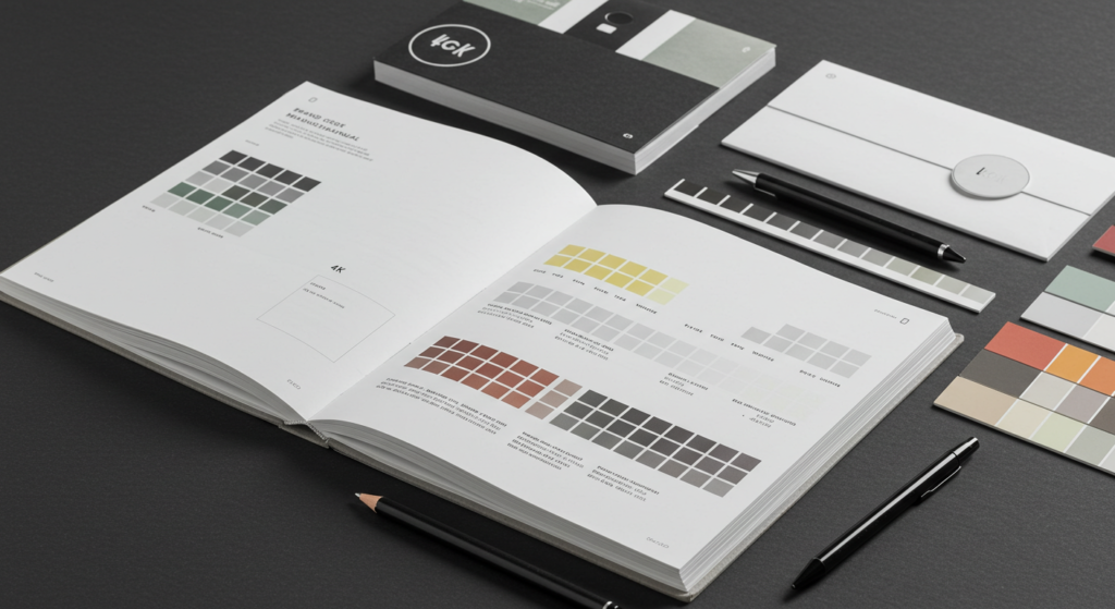
Written brand guidelines protect your color decisions by spelling out the exact hues you’ve selected. They typically list hex codes, CMYK references, and Pantone numbers. This clarity means no one has to guess if your brand’s blue is more teal or navy.
By setting these standards, you reduce the risk of off-brand materials. A slight shift in shade can weaken the consistency you’ve worked hard to build.
Creating Clear Documentation
Guidelines should be easy for designers, marketers, and print vendors to follow. Keep them concise and visually clear. Offer examples of each color in action. Show how different backgrounds or textures affect color usage.
Sometimes, you’ll need separate guidelines for digital branding vs. print production. Screen colors and printed colors can differ. Documenting each scenario helps everyone stay on the same path.
Adapting Across Media
Your brand might appear in many places: websites, social channels, billboards, or store shelves. Colors can shift when printed on glossy brochures vs. matte postcards. Even digital banners can appear different on older monitors or smaller screens.
Plan for these shifts when creating your guidelines. Offer best practices to preserve color accuracy, like using high-resolution images or calibrating monitors. By anticipating these variables, you keep a crisp visual identity no matter where you show up.
Practical Considerations for Digital Branding

Web-Friendly Formats
Colors often behave differently on screens than on paper. A hue that looks warm and soft in print might look washed out online. That’s why it helps to specify RGB (Red, Green, Blue) or hex codes for all digital work.
Also consider mobile device usage. Ensure your chosen shades look good on smaller screens. High-contrast combos help text stand out in mobile apps or mobile-friendly sites.
ADA and Accessibility Factors
Not everyone views color the same way. Some people face color blindness, low vision, or other visual challenges. Laws like the Americans with Disabilities Act (ADA) might require color usage that meets certain contrast ratios.
It’s wise to test your website or app with an online accessibility checker. Tweaking your color choices to boost contrast not only meets guidelines, but also makes your brand more welcoming.
Responsive Interface Design
In a user interface, color acts as a quick signpost. Buttons often share an accent color, while backgrounds stay neutral. If you shift layout elements for different screen sizes, make sure color relationships remain intact.
When a user hovers over a button or focuses on a form field, subtle color changes can confirm their action. That kind of feedback helps them feel at ease while browsing or shopping.
Typography and Color Synergy

Readability Meets Visual Appeal
Words remain central to brand messaging. Yet color can boost or harm readability. A pale text color on a white background can strain the eyes. A bright red text on a black background can feel harsh.
Aim for a balance. Let your color palette emphasize certain words, but keep the main text easy to read. Pair fonts with colors that highlight your brand personality without confusing the reader.
Hierarchy and Emphasis
Typography offers structure. Headlines, subheads, and body text each have different roles. Color choice can accentuate that structure. For instance:
- Headline: Dark, bold color to command attention
- Subhead: Slightly lighter hue that stands out yet feels cohesive
- Body Text: Neutral shade for comfortable reading
Combining type size, font weight, and color can guide visitors through your content in a logical way.
Balancing Contrast and Harmony
High contrast looks striking and can help text leap off the page. Low contrast can feel subtle and refined. The trick is to decide where each approach works best.
If your brand identity centers on minimalism, keep contrast gentle to maintain a sleek feel. If your brand’s style is high-energy, let your accent color push contrast to a sharper edge.
Brand Architecture and Color Strategies

Unified Identity for Sub-Brands
Large companies sometimes oversee multiple sub-brands. Each might share parts of a master color palette but get its own twist. For instance, a parent brand that uses burgundy and gold might allow a sub-brand to shift gold to mustard while still using a burgundy accent.
This unified approach builds trust. People recognize that the sub-brand still sits under the main umbrella.
Handling Mergers and Acquisitions
When two brands join forces, color can signal unity or maintain separate identities. You might choose a transitional palette that blends each brand’s main hues. Or you might adopt one brand’s palette and adapt it slightly.
The key is ensuring current customers don’t feel lost. They should see familiar aspects that tie back to the legacy brand they trust.
Color-coded Navigation
If you have a complex website or an app with multiple sections, color coding can help. Each section can have a designated highlight color for icons or menu items. This approach helps people remember where they are and how to get back to the main hub.
While color-coded navigation can aid user interface clarity, try not to overload your palette with too many bright tones. Keep it systematic so it doesn’t feel chaotic.
Color Testing and Feedback Loops

Gathering User Insights
Data helps. If you launch a new color scheme on your site, check user behavior. Do visitors click your calls to action more often now? Or do they bounce away? Short surveys or polls can measure how people feel about your new color usage.
Sometimes the audience sees color combos differently than your internal team expects. Fresh feedback can show blind spots.
Iterating on Palette Choices
Color selection isn’t a one-time decision. You might refine your palette after spotting patterns in user behavior. Maybe your accent color is too faint and doesn’t stand out enough. Or your backgrounds might seem boring.
Change gradually, though. A sudden color switch can confuse regular followers. Ease them in so they sense a logical shift.
Tracking Brand Perception
Colors can directly influence brand perception, especially on social media. A strong color presence in your feeds can help your posts pop among a sea of others. Monitor comments and track how often people mention your visuals.
If you see a rising tide of good responses, you’ll know your color strategy resonates. If reactions are lukewarm, consider small tweaks to brighten or soften your palette.
Creative Branding Through Unconventional Hues

Standing Out in a Crowded Market
Most of your competitors might stick to safe, expected color choices. A bold or unexpected hue can attract fresh attention. But it’s risky. If the chosen color goes against your brand personality, you risk looking insincere.
An offbeat color can be your main hue or a subtle accent. Test carefully before rolling it out across all materials.
The Role of Contrast
Contrast can be visual excitement. In packaging or web design, placing contrasting hues side by side can spark curiosity. This approach often works in marketing design for promotions or event posters, where you want to stop people in their tracks.
However, too much contrast can feel abrasive. Aim for balance so your visuals feel energetic yet inviting.
Avoiding Overstimulation
There’s a fine line between “eye-catching” and “eye-straining.” Overloading designs with loud colors creates confusion. The viewer might not know where to look. That kind of chaos rarely helps brand recognition.
By using one or two lively hues in combination with neutrals or calmer tones, you can stand out without overwhelming the viewer.
Visual Communication in Marketing Design

Integrating Color with Imagery
When you run campaigns with photography or illustrations, think about how the palette works with these visuals. A brand that mostly uses muted photos might pair them with bright brand colors for titles and borders. That mix can highlight important content.
Conversely, if your photos burst with color, keep your brand elements more subdued to avoid clashes.
Designing Ads that Pop
Good ads grab attention. They also deliver a clear message. Color can help do both. A bright background can instantly catch the eye. A high-contrast text color can amplify your offer or call to action.
Use clear headings, concise copy, and a well-placed logo in your brand colors. That way, potential buyers remember who you are, even if they scroll past quickly.
Social Media Consistency
Social platforms often compress images, which might slightly dull your colors. Preview your posts on different devices to confirm that your hues stay accurate. Also, try to keep your brand palette present in profile pictures, banners, or highlight covers.
A consistent approach helps followers recognize your brand amid countless updates. They’ll see your color scheme and associate it with you.
Brand Refresh and Rebranding Tactics

Signs It’s Time for a Refresh
How do you know when to update your palette? Maybe your brand looks stale. Or your audience has shifted, and your visuals no longer match their taste. Keep an eye on engagement metrics. If you see a big drop in brand recognition, it might be time to realign.
Preserving Familiar Elements
A total color overhaul can alienate loyal fans. Sometimes you only need minor adjustments. If you use deep purple, you could shift it slightly to a warmer or cooler tone while keeping the basic identity intact.
When done right, this approach preserves familiarity but injects new energy.
Transitioning with Minimal Confusion
If you decide on a bigger color change, roll it out with a clear plan. Update your website, social channels, product packaging, and other key materials at once. Announce the shift to explain why it helps the brand. This short-term push helps people connect with the new look quickly.
Global Reach and Cultural Sensitivities

Multi-Regional Color Strategies
When your brand spans different regions, color associations can vary. While typical color psychology is beyond our scope here, it’s wise to at least check if certain hues cause negative reactions in specific markets.
Consider small adjustments to maintain brand recognition while respecting cultural nuances.
Typography and Symbol Alignments
Color alone can’t carry your brand. If you expand into areas with different writing systems, you may need to adapt fonts or symbols. A color that works well in Roman text might look unbalanced when placed next to characters from another script.
Staying mindful of these differences keeps your brand identity welcoming worldwide.
Localizing Visual Assets
Your brand guidelines might allow local teams to tweak some colors, so long as they follow certain rules. For instance, a global beverage brand might let a region shift accent shades to align with local preferences while keeping the primary hue consistent.
Providing such flexibility can help your brand appear culturally aware, which can build trust.
Measuring Success with Analytics

Tracking Online Metrics
Data can show whether your color decisions support brand recognition. Check site engagement, click-through rates, and time on page. If visitors spend more time exploring your site after a color revamp, that might signal a positive shift.
Track conversion metrics as well. If more people sign up for your newsletter or buy your products, your color usage might be helping calls to action stand out.
Surveys and Feedback
Surveys can reveal how viewers react to color changes. You might ask:
- What vibe do our colors convey to you?
- Are the colors easy on the eyes?
- Do you recognize our brand from the colors alone?
Feedback offers clues about whether your palette resonates with people.
Shifts in Market Perception
Changes in brand positioning can happen gradually. Watch social mentions. Look for patterns in how people talk about your brand. If they mention how “fresh” or “modern” your visuals look, you know your color update might be hitting the mark.
On the other hand, if they say your brand feels off or messy, do some deeper investigation into your palette or overall identity.
Fostering Long-Term Brand Recognition

Evolving Your Palette Over Time
Trends come and go. Colors that feel modern this year might look tired soon. Think about how you can keep your palette flexible for minor changes. A brand can hold onto its core hue while updating secondary or accent colors as design trends shift.
This measured approach keeps you current without losing the identity you’ve built.
Maintaining Cohesion for Growth
As your company expands into new product lines or services, keep a close eye on color harmony. Introduce new shades only if they fit the overall scheme. Keep documentation updated so everyone knows the official color codes and usage rules.
By repeating signature colors across every consumer touchpoint, you create a sense of unity that can support brand recognition in any market.
Future-Proofing Your Strategy
No color plan stays perfect forever. Visual identity needs regular checkups. If you plan to launch a new app or step into a new category, test how your palette works in that space. Does it look crisp on smaller screens? Does it adapt well to new packaging shapes?
Your palette should grow with your brand, always sending the right signals to your audience.
Conclusion

A smart color palette can enhance brand recognition faster than most design elements. While many people fixate on logos or slogans, color often leaves the first impression—sometimes in a fraction of a second.
By choosing hues that match your brand’s focus, codifying them in clear guidelines, and testing them in real-world scenarios, you build a visual identity that stays on target.
A strong palette goes beyond making things look pretty. It connects with your brand messaging, supports user-friendly designs, and reinforces brand consistency across every possible platform.
By mixing creativity with practicality, you can craft a color strategy that not only holds up today but adapts to what comes next.
Summary Table

Below is a quick reference to guide your brand color strategy decisions. Use these pointers as a visual roadmap when you need to align your entire team around a cohesive approach.
| Focus Area | Key Insight | Action |
|---|---|---|
| Primary Hue | Defines your brand’s main tone | Pick 1 color that represents your core identity |
| Secondary & Accent Tones | Expand variety and highlight key elements | Limit to 2–3 supporting hues + 1–2 accents |
| Neutrals | Provide breathing space and balance | Choose grays, whites, or beiges that align with the main hues |
| Guidelines | Document color codes and usage | Share a clear, concise manual across teams |
| Digital Branding | Account for RGB/Hex and different screen types | Preview on multiple devices, test color contrast |
| Typography | Pair font and color choices for readable, engaging text | Adjust color contrast to suit headlines, subheads, and body text |
| Brand Architecture | Keep sub-brands visually linked to parent brand | Adapt main hues slightly for each sub-brand |
| Color Testing | Gather feedback and measure user behavior | Refine the palette with real data |
| Unconventional Hues | Stand out with bold or rare colors | Use with caution to avoid overwhelming designs |
| Marketing Design | Combine color and images for striking ads | Maintain brand consistency in all promotional materials |
| Rebranding | Update colors if metrics show decreased recognition | Keep some familiar elements to ease audience acceptance |
| Cultural Sensitivities | Adjust color usage for various regions | Stay consistent where possible, adapt if needed |
| Analytics | Track engagement, conversions, and social mentions | Listen to user feedback, iterate based on data |
| Long-Term Recognition | Allow colors to shift slightly as tastes change | Keep a core hue as an anchor, refresh secondary or accents |
FAQ

Q1: How many colors should be in a strategic palette?
There’s no strict rule, but many brands find success with one primary color, two or three secondary tones, and one or two accents. That setup offers enough variety without drifting away from a cohesive look.
Q2: Should my brand palette differ on social media vs. print?
The foundational hues remain the same, but slight adjustments might be needed. Monitors, phone screens, and printed materials can show colors differently. Keep your brand manual updated with tips for each medium.
Q3: Why is color consistency so critical for brand identity?
Consistent color usage helps people recognize your brand instantly. A mismatch in shade or tone can break that sense of unity. When you keep everything aligned, you build trust and familiarity.
Q4: Can a brand succeed without a strong color system?
Some brands rely on other elements, but most benefit from thoughtful color usage. A solid color system can speed brand recognition and strengthen your messaging, making it a helpful tool in your brand strategy.
Q5: What if I regret my color choices after a year?
Color decisions aren’t set in stone. Monitor performance metrics. If you see that your palette isn’t resonating, refine it. Start small—maybe tweak accent colors—so you don’t shock your audience or lose existing brand equity.
Q6: How do I test my palette with real consumers?
You can run small-scale focus groups, online polls, or A/B tests on your site. Show people different color versions of your product pages or ads, then track engagement and feedback. This data will guide your updates.
Q7: Do I have to stick with popular color trends?
Trends come and go, but your main color needs to support your brand long-term. You can tap into trends for accents or seasonal campaigns, yet your core palette should stay rooted in your brand values.
Q8: Is it possible to use bold colors without overwhelming people?
Yes. Bold colors can add excitement. The secret is controlling their use. Apply vibrant hues in small doses or pair them with soft neutrals so the overall design still feels cohesive.
Q9: Should I worry about color conflicts with competitive brands?
If a major competitor owns a specific hue in your sector, consider a different main color. You can still create brand differentiation by experimenting with shades, contrasts, or unique secondary accents.
Q10: Will strong brand colors limit future creativity?
A well-structured palette should still allow room to explore fresh ideas. You can tweak accents, try new design layouts, or shift supporting visuals while keeping your core hues intact.
Use these insights as you plan or update your visual identity. A strategic palette can anchor everything from your website’s UI to product packaging, all while fueling stronger brand recognition and a lasting impression.

Sam Goldman, with his intuitive grasp on the art of color selection, navigates the vibrant tapestry of fashion shades, ensuring each ensemble reflects the pulse of modern trends. His knack for crafting unique yet cohesive color combinations unravels the complexities of the fashion spectrum. Beyond being a mere sentinel, Sam’s dedication transforms every reader’s wardrobe journey into a harmonious blend of contemporary elegance and timeless allure. Dive into his writings and emerge with a refreshed perspective on fashion colors.
Reviewed By: Joanna Perez and Anna West
Edited By: Lenny Terra
Fact Checked By: Matthew Mansour
Photos Taken or Curated By: Matthew Mansour