Key Takeaways
- A thoughtful color refresh can spark new interest and reinforce brand loyalty.
- Color choices affect brand recognition, recall, and trustworthiness.
- Consistent use of color across touchpoints builds cohesion and brand identity.
- Careful planning and testing can prevent confusion or dilution of brand values.
- Rebranding efforts should align with broader strategy rather than chase short-lived trends.
How does color reshape a brand’s future? Many organizations wonder about the value of a color update. Some worry about losing loyal customers; others see new possibilities.
Color refreshes can spark fresh interest, reinforce a brand’s purpose, and energize its visual identity. It isn’t just about making a logo look modern. It’s about creating a cohesive brand story that resonates with both internal and external audiences.
Rebranding involves more than redoing a logo or slogan. It touches brand strategy, identity design, and the overall experience people have with a product or service. A color change, when chosen wisely, can shift perceptions, sharpen brand messaging, and help the organization stand out. Sometimes, a bold hue signals progress. Other times, a subtle shift shows respect for heritage while still making things feel current.
This article offers insights into color refresh strategies, ways to balance risk and creativity, and tactics to ensure consistency. It explores methods that can strengthen brand cohesion, plus tips on how to avoid common pitfalls.
Each of the 14 sections includes three focused subsections, complete with practical advice. There’s also a summary table for quick scanning, a conclusion that ties everything together, and a FAQ to answer common questions.
Dive in if you’re curious about color’s influence on brand recognition, brand personality, and brand positioning. Learn how an intentional hue shift could bring fresh life to your next rebrand.
Why Rebranding Matters in a Changing Market

Understanding the Drive to Refresh
In a busy market environment, brands often look for new ways to stay relevant. A refresh can breathe new life into a visual identity, especially if the old look feels stale. Colors can become tied to outdated ideas or technology. When this happens, a business risks seeming disconnected from current needs or tastes.
A strong color refresh signals adaptation, but it must fit an overall brand strategy. Some organizations swap colors just to chase novelty. That approach can confuse people who have come to trust the original look. A well-planned rebrand assesses whether a shift in color aligns with brand goals and brand guidelines.
Shifting Consumer Tastes
Customer preferences can change quickly. Sometimes, the color palette that worked a decade ago no longer resonates. Shifts in design trends, new digital platforms, and changing competitor visuals can make a once-iconic palette seem bland.
When done with care, a color refresh helps a company address these shifts. It can spark renewed interest and keep a brand from feeling outmoded. With the right blend of tradition and novelty, a refresh acknowledges past successes while laying groundwork for future growth.
The Cost of Staying the Same
Holding on to familiar colors can seem safe. But failing to adapt might cause a brand to fade into the background. Loyal customers may stay, but potential new ones might see outdated colors as a sign of old thinking.
A timely color shift can propel a brand into modern relevance. It supports brand differentiation and brand positioning. Done well, a refresh draws attention, stirs curiosity, and motivates users to take a closer look. Though it carries costs and risks, strategic color updates often pay off in visibility and improved perception.
The Role of Color in Visual Identity

Emotional Connections Without Going Overboard
Though color psychology can be a factor, many discussions about color rely on stale tropes. Instead, consider how color influences brand storytelling. People notice color first, often before reading any text. This initial impression can prompt an emotional or logical reaction.
A new hue might represent energy or stability. A paired set of colors may convey harmony or contrast. The goal is to ensure the palette aligns with a brand’s core values and personality. Avoid generic color associations. Instead, think about how each color complements the tone of your brand messaging and brand experience.
Standing Out in a Crowded Field
Brands often compete in busy spaces, from retail shelves to online feeds. Color choice is a quick route to distinction. Consider how major companies stand out by selecting bold tones or unexpected combinations.
In brand architecture, color helps segment sub-brands or product lines. By using unique hues for each branch, you can guide users to the right place. But everything should still feel unified under one umbrella. A strong brand identity design uses color to maintain both clarity and variety.
Linking Color to Memory
Think of color as a memory trigger. When people repeatedly see a color tied to positive experiences, their recall improves. That link can strengthen brand loyalty. Consistency in color usage across brochures, packaging, apps, and events helps build that bond.
A strategic color refresh can deepen these connections. If a brand is known for one color, a partial shift might be enough to stand out again. A complete overhaul may risk losing that mental link. It all depends on the brand’s history, audience, and aspirations.
Timing a Color Refresh
Recognizing Market Pressures
Economic shifts, emerging competition, or product innovations might prompt a color update. A brand that once led its sector can find itself overshadowed by new players with striking palettes. If your brand receives frequent feedback about being stuck in the past, it might be time to explore new hues.
Still, jumping too soon can waste resources. If a brand just updated colors last year, overhauling them again could frustrate loyal supporters. Evaluating the right moment is key. Market research and brand perception studies can clarify whether the problem is color, messaging, or something else.
Aligning with Organizational Milestones
Mergers, new product launches, or expansions into new regions often spark rebrands. These moments give a chance to fine-tune colors and reflect fresh goals. An upgraded color palette might symbolize a unified identity.
When a company merges, each side brings its own colors. Bringing them together under a shared set of hues can foster unity. A subtle approach might blend elements from each brand, while a bolder plan might select a completely fresh color scheme to represent a new direction.
Avoiding Trend-Chasing
Trends can inspire, but they can also mislead. Colors that look modern today may appear dated a few years later. It’s tempting to copy a competitor’s successful palette or to adopt a popular color from a design trend. But quick fixes can cause confusion if they lack a clear reason.
Instead, let color reflect a brand’s long-term objectives. Sometimes it’s okay to introduce an accent color that nods to trends while leaving core brand colors intact. That careful balance avoids making a brand feel too tied to a passing fad.
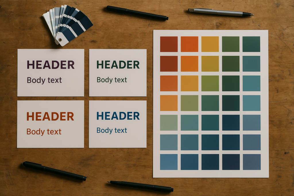
Building a Unified Palette

Core and Accent Colors
A unified palette usually includes core colors that show up everywhere and accent colors that highlight special elements. Core shades might appear on a logo, website headers, or packaging. Accent hues can mark calls-to-action or limited campaigns.
Think of the accents as the spices in a dish. They should add flavor without taking over. Overusing accent colors can be distracting, while underusing them can make a design feel flat. Finding the right balance strengthens brand cohesion across various channels.
Balancing Brand Personality
Colors should match a brand’s tone. Is the brand witty, serious, playful, or luxurious? Choose hues that reinforce those traits. A playful brand might use vivid tones, while a serious brand might stick to deeper or muted shades.
Personality should stay consistent across brand guidelines. If the brand stands for reliability, bright neon colors might conflict with that promise. Meanwhile, a creative branding agency might embrace bold contrasts to show innovative energy. The key is cohesion with core messaging.
Ensuring Flexibility
A color palette should work on multiple platforms. It must look good on print materials, digital screens, and large-scale outdoor ads. A color that shines on a glossy brochure might appear washed out on a website.
Testing colors on different devices and materials is vital. Consider how the brand’s main color appears on high-resolution monitors versus older mobile screens. Adjusting saturation levels can maintain consistency. Flexible design choices allow the brand to scale without losing impact.
Brand Consistency Across Touchpoints
Guidelines for Repetition
Consistent repetition of colors builds brand recognition. If you introduce a new shade in social media posts, weave it into the website design and physical collateral. The goal is a seamless user experience, where each color choice feels intentional.
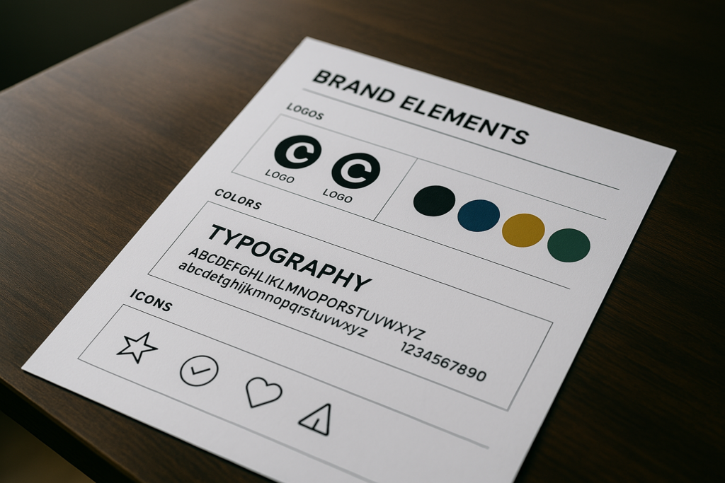
Clear brand guidelines help teams apply the palette in a uniform way. These guidelines can specify color codes for both print (CMYK) and digital (RGB or HEX). They might also define usage rules, like how to pair different hues or when to avoid certain combinations for readability.
Cross-Departmental Alignment
Color consistency shouldn’t live solely in the design or marketing departments. Other teams—from sales to product development—often create brand touchpoints too. Giving them easy-to-follow brand guidelines ensures a coherent experience for customers.
Encourage collaboration between groups. If the engineering team designs an app interface, they should know how to use the brand’s accent color for calls-to-action. If the events team prints banners, they should have precise brand colors. Alignment prevents jarring variations in color usage.
Avoiding Color Overload
A brand can get carried away with too many color choices. Multiple accent colors might confuse viewers, especially if they appear randomly. While variety can add energy, it can also dilute brand recognition.
Use color intentionally. Highlight important sections with accent hues, but keep background or filler areas in neutral shades. If you must introduce new colors, integrate them thoughtfully over time to maintain brand cohesion.
Testing and Validating Choices

User Feedback Sessions
Before a full rollout, invite select groups to give input on color variations. Show mockups of updated logos, packaging, and website designs. Ask direct questions about clarity, tone, and overall feeling.
Sometimes, internal bias can get in the way. Objective feedback from customers or partners can reveal surprising reactions. If many people find a certain hue confusing or off-putting, that’s a sign to pivot.
A/B Testing in Digital Spaces
Digital branding offers a chance to test color updates on a smaller scale. You could run two versions of a webpage or ad campaign, each with a different accent color. Track user engagement, click-through rates, or other metrics.
This data-driven approach refines color decisions based on real-world user behavior. While not all design choices should hinge on analytics, it’s wise to see how new hues affect brand performance.
Internal Alignment
Teams might disagree on color direction. Design folks might push bold contrasts, while product leaders prefer subtle changes. Getting everyone on the same page reduces confusion during rollout.
Hold cross-functional reviews where each party explains priorities. If brand messaging emphasizes trust and calm, colors should reflect that. If brand recognition depends on a well-known color, keep that in mind. Aligning early prevents costly tweaks later.
Legal and Trademark Concerns

Protecting Signature Colors
Some brands trademark specific shades (think of iconic jewelry boxes). If your color refresh includes a custom hue, consider legal protection if it’s central to brand recognition. Protecting a signature color can deter competitors from creating a confusingly similar look.
But remember, color trademarks can be complex. Each region has different rules. A color must be strongly tied to the brand and recognized by consumers. It’s not a guaranteed path, and legal fees can add up.
Trademark Searches
Before finalizing a color scheme, confirm no existing trademarks block your choices. Rebranding costs can skyrocket if you need to revise the palette after launch due to legal issues. A thorough search might not be exciting, but it prevents larger headaches.
Consider seeking legal advice on color usage if you plan to market in many countries. A color that’s fine in one region might face restrictions elsewhere. This step keeps global branding consistent and avoids last-minute changes.
Staying Within Fair Use
Sometimes, businesses reference competitor brand colors in comparative materials. Use caution. While color usage in neutral contexts is typically allowed, extensive copying can risk legal action. Keep color usage fair and respectful.
If your brand must share a market with others using similar palettes, highlight accent colors or unique design touches to stand out. Don’t rely on overlapping color usage as a direct strategy.
Practical Considerations for Logo Redesign
Assessing Existing Recognition
A logo often becomes the face of a brand. Its colors can feel deeply familiar to loyal customers. Changing them risks breaking that sense of trust, so weigh the pros and cons. If your logo is well-known, a complete color shift may surprise followers.
Many brands opt for subtle color updates, brightening or muting existing shades. Others keep the core color but adjust secondary elements. This approach preserves the link with the old identity while granting a fresh feel.
Simplifying Shapes and Palette
When updating logos, consider modern design trends that favor flat shapes, minimal gradients, and strong color blocks. Too many details can look cluttered on small screens or mobile apps. A simplified form can scale better and stay recognizable at various sizes.
Meanwhile, keep your palette tight. One or two key colors might suffice. Additional accent shades can appear in supporting graphics or packaging. Limiting the primary logo colors boosts memorability and clarifies brand positioning.
Printing and Production
Logos might appear on everything from large signs to tiny icons. Check that chosen colors print accurately. Certain neon or metallic tones may require special processes.
If your brand invests in merchandise, do test runs for apparel, pens, or other items. Ensure consistency in production so that each piece matches brand standards. Color mismatch in physical items can make a brand seem disorganized.
Communicating the Rebrand

Early Teasers
Before revealing a new color palette, build anticipation. Teasers can share subtle glimpses of an updated hue or shapes. Social media offers a place to spark interest without giving the full story.
Teasers might feature short posts hinting at upcoming changes. This approach can warm up audiences who might otherwise be startled by a sudden overhaul. It also gives your team a chance to gather feedback on initial reactions.
Internal Rollout
Employees are brand ambassadors. They should know about the rebrand’s color changes before the public does. Share brand guidelines, color codes, and usage rules. Explain the reasoning behind each hue and how it ties into the broader brand strategy.
When employees understand the new identity design, they can talk about it with confidence. Training sessions or style guides help everyone stay consistent. This is especially vital for sales teams, customer support staff, and anyone who interacts directly with clients.
External Announcement
Once the final colors are set, unveil them with clear explanations. Post a blog on your corporate site, send out press releases, or create a short video highlighting the shift. Show before-and-after visuals to help people understand the journey.
Transparent communication helps loyal fans accept the change. If your brand has a big following, consider doing a Q&A session. This fosters trust and addresses concerns. Be ready to clarify why you moved away from certain hues or kept some from the old scheme.
Maintaining Brand Momentum

Periodic Reviews
A rebrand isn’t always one-and-done. Over time, colors may need small tweaks as design styles shift. Schedule periodic reviews of your brand guidelines to ensure the palette still fits your brand’s story.
If brand loyalty remains strong, a minor adjustment can revive excitement. If you notice audience feedback about dull or outdated visuals, use that as a signal to revisit color choices. A brand should stay flexible without confusing people.
Cross-Channel Checkups
Keep track of how your updated colors display on new platforms. As technology advances, you might adopt fresh channels. A color that looked bright on older screens might look harsh on advanced displays.
Regular checkups help maintain consistency. If a new channel has different color requirements, adapt carefully to preserve brand expression. This ensures that as your brand expands, the color system remains easy to recognize and consistent.
Ongoing Education
New hires or partners may not know the reasoning behind your color refresh. Provide updated style guides and quick-reference sheets. Encourage anyone creating brand assets to follow these resources.
Staying vigilant about proper color usage can be challenging. But the reward is a brand that appears steady and professional across every medium. The more people understand your color guidelines, the fewer mistakes you’ll see in final outputs.
Color Refresh for Digital Experiences
Accessibility Standards
Digital branding must meet accessibility needs. Colors that look great can still be hard to read if there’s not enough contrast. A brand refresh is an ideal time to improve usability.
Check the contrast ratio between text and background colors. Consider how colorblind users perceive your palette. Accessibility fosters a positive brand experience for everyone. It also helps you avoid complaints or lost user trust.
Interactive Elements
Websites and apps rely on color cues to guide navigation. Buttons, links, and menus often need distinct shades to encourage clicks or show selection states. A color refresh should consider user interface patterns that your audience already understands.
Sudden color changes in interactive elements might cause confusion. If your old “Purchase” button was green and the new brand color is a shade of purple, ensure users can still locate that button quickly. Labeling and color usage need to go hand-in-hand.
Mobile Considerations
Colors appear differently on mobile screens than on desktop monitors. Some mobile devices enhance saturation. Others reduce brightness to save battery. During a color refresh, test a variety of devices to ensure consistent results.
User interface elements should remain clear on small screens. Watch out for text overlaying images that might wash out or darken the message. By considering these factors, the brand refresh can improve user satisfaction across platforms.
Combining Color Refresh with Typography
Matching Font Choices
Color and typography often work together to reinforce brand personality. A formal brand might pair a deep blue with a refined serif font. A playful brand might choose vibrant greens or pinks with friendly, rounded typography.
During a rebrand, avoid mismatched combinations that confuse viewers. If you shift to a more modern color palette, ensure your type choice also feels current. A new color scheme can inspire subtle font updates, making the entire identity feel cohesive.
Hierarchy and Readability
Headings, subheadings, and body text each need distinct formatting. Colors can highlight headlines or call-to-action segments. But keep a keen eye on contrast so text remains legible.
Another trick is using tints of your primary colors for background shading in different sections. This approach creates a clear visual hierarchy without introducing extra hues that might dilute brand identity.
Balancing White Space
In modern layouts, white space (or negative space) helps accentuate color. A brand with strong, bold tones might benefit from clean spacing that lets each color breathe. Too many elements packed close together can lead to visual tension.
White space also avoids fatigue for the reader. When they see bright colors framed by roomy margins, the content is easier to follow. Combine color with layout choices that improve clarity, so your brand’s message takes center stage.
Visual Cohesion in Marketing Materials

Print Collateral
Flyers, brochures, and banners still have a role in marketing. After a color refresh, update these materials to match the new palette. Even a slight mismatch in color codes can be obvious in print.
Some brands neglect older materials after a rebrand. This causes confusion when people see an outdated brochure next to a redesigned website. A thorough approach means phasing out old stock and printing updated versions to maintain brand consistency.
Social Media Graphics
Platforms like Instagram, LinkedIn, or others often serve as the first point of contact with prospective clients. Each platform may require different image dimensions. Adjust your graphics to fit these specs without losing brand identity.
Aim for consistent brand imagery. If the new color scheme calls for a bold accent color, incorporate it in post templates. That way, followers recognize your brand even if they scroll fast. Consistency drives brand recognition.
Event and Booth Design
Live events or trade shows can be strong opportunities to show off a brand refresh. Use large, eye-catching backdrops or banners that proudly display the new colors. Offer takeaway items in matching shades to reinforce memory.
Coordinating your brand color with the booth’s layout can increase impact. Visitors often remember the booth that stood out with thoughtful design. If the color palette is calm, highlight a single accent color for signage or interactive elements.
Global Considerations for Color Refresh

Cultural Sensitivities
Colors can carry unique meanings in different cultures. A hue that seems welcoming in one place might have a negative connotation elsewhere. Brands with international reach should investigate local interpretations.
For example, certain tones are linked to celebrations or mourning in some regions. A color refresh that appears neutral in one area could unintentionally offend or confuse another. Research can help you avoid costly missteps.
Localization Strategies
If your brand runs localized campaigns, consider how a global color system adapts. Some regions might require a slightly different accent color to suit local tastes. But keep core colors consistent to maintain brand cohesion.
Localization isn’t the same as rebranding in each country. Instead, it’s an adjustment of visuals and messaging to reflect local nuances. A single brand color can still hold everything together, supported by region-specific design elements.
Maintaining a Unified Global Identity
Even with localized touches, a core brand color should unify worldwide communications. This creates a sense of familiarity for people traveling or exploring your business online. A uniform color palette signals a singular brand voice, no matter the location.
A well-executed color refresh can streamline global branding. It can also encourage stronger cross-border recognition. By thinking ahead, brands can prevent clashing visuals in different places.
Measuring Success of the Refresh
Brand Recall Surveys
After the new colors launch, collect feedback about brand recognition. Send out surveys or include quick polls in newsletters. Ask if people notice any difference in brand visuals. See if they find the new look memorable.
These insights reveal whether the refresh achieved its goal of improved recall or if adjustments are needed. Sometimes, small tweaks can address confusion without scrapping the entire palette.
Web Analytics
Measure digital metrics like time on page, bounce rates, or click-through on buttons. If these numbers improve, the color update might be helping. If engagement dips, the new palette could be causing visual friction.
Don’t forget to check brand mentions on social media. Positive comments about the new look can confirm it resonates. Negative or puzzled reactions might indicate a mismatch between the refresh and your audience’s expectations.
Sales and Conversion
Ultimately, brands hope a rebrand supports growth. Track sales figures or lead conversions before and after the color refresh. If numbers rise, you likely did something right. If there’s no significant change, the color shift might be neutral or overshadowed by other factors.
Comparisons must account for seasonality or external economic factors. But a clear upward trend can reinforce that the rebrand had a positive impact, especially if marketing design was consistent with strategic branding goals.
Summary Table for Quick Reference
| Topic | Key Points | Action Items |
|---|---|---|
| Why Rebranding Matters | Staying current prevents stagnation. Must align with strategy. | Audit brand visuals, gauge market trends, plan refresh only when it fits larger goals. |
| The Role of Color in Visual Identity | Color shapes brand perception, fosters recall, and shows uniqueness. | Choose hues that fit brand personality, maintain consistency across channels. |
| Timing a Color Refresh | Look at market and internal milestones. Don’t rush if it lacks purpose. | Evaluate brand maturity, collect consumer input, watch out for short-lived fads. |
| Building a Unified Palette | Core vs. accent colors, balanced with brand personality and usage flexibility. | Define core hues, test accent usage, ensure uniformity in different mediums. |
| Brand Consistency Across Touchpoints | Guidelines, alignment across departments, and avoiding overload. | Publish clear brand rules, limit color variations, unify brand visuals. |
| Testing and Validating Choices | Gather feedback, run A/B tests, unite internal teams around the final palette. | Conduct focus groups, measure performance, refine palette if needed. |
| Legal and Trademark Concerns | Potential to protect signature shades, watch out for conflicts. | Consult legal experts, do trademark searches, consider color uniqueness. |
| Practical Logo Redesign | Assess brand recognition, simplify shapes, ensure production consistency. | Retain familiar elements, test printing, confirm clarity at various sizes. |
| Communicating the Rebrand | Tease changes, align internal teams, explain the purpose of the new colors. | Share style guides, unveil changes publicly, hold Q&A for transparency. |
| Maintaining Brand Momentum | Schedule reviews, adapt to new channels, keep staff educated. | Listen for user feedback, update guidelines as needed, guide new hires. |
| Color Refresh for Digital Experiences | Meet accessibility standards, be mindful of interactive elements, test on various devices. | Check contrast ratios, ensure consistent button styles, optimize for mobile screens. |
| Combining Color with Typography | Align font choice with color mood, ensure readability, use white space wisely. | Pick complementary fonts, define text hierarchy, avoid crowding. |
| Visual Cohesion in Marketing Materials | Unify print, social media, and event displays around the refreshed palette. | Update old flyers, standardize social post templates, plan booth designs. |
| Global Considerations | Address cultural nuances, localize if needed, keep a unified global identity. | Research regional color meanings, adapt accents carefully, keep core color consistent. |
| Measuring Success | Monitor recall surveys, web analytics, sales figures after the refresh. | Compare old vs. new data, refine if results aren’t meeting expectations. |
Conclusion

A color refresh can do more than freshen up a brand’s appearance. It can renew public interest, refine brand storytelling, and set a higher standard for future initiatives. Yet it’s not something to jump into without a plan. Research, strategy, and consistent execution drive success.
From building a unified palette to coordinating internal rollouts, each step ties back to fostering a cohesive identity. Consistency allows people to trust a brand. When they see the same colors on websites, packaging, and social media, they know the brand is intentional.
Keep in mind that rebranding is a cycle. As time passes, new platforms and consumer behaviors will challenge existing color choices. Smart brands make small refinements, learn from data, and stay open to fresh ideas. A color refresh should reflect the brand’s spirit and help it connect with the people it serves.
FAQ
How often should a brand refresh its colors?
There’s no exact rule. Some brands do small updates every few years. Others wait a decade or more before making big changes. The key is to watch user feedback, market conditions, and brand goals. If the colors start feeling irrelevant, it might be time for a shift.
Will changing brand colors confuse loyal customers?
It can, but not if handled thoughtfully. Communicate reasons for the update, keep familiar elements where possible, and offer clear visuals that show the connection to the old look. This reduces confusion and helps customers embrace the change.
Do I need a full overhaul or just slight adjustments?
It depends on whether your current color palette still holds value. Subtle tweaks might be enough if customers still recognize and appreciate your old hues. A bigger overhaul might be beneficial if the brand identity feels outdated or disconnected from company direction.
How can I ensure my new colors look right on all platforms?
Test, test, and test again. Check how each color appears on printed materials, older monitors, current smartphones, and different lighting conditions. Adjust brightness or saturation as needed. This approach maintains consistency across all touchpoints.
Should I focus on trends when picking new colors?
Trends can offer inspiration, but don’t let them dictate your entire look. A brand built on short-lived fashions may need frequent updates. Instead, focus on what truly represents the company’s character. If trends align with that, use them as subtle accents rather than the core palette.

Matthew Mansour, known in the fashion world as a storytelling virtuoso, weaves captivating tales centered around the mesmerizing universe of fashion hues. Possessing a sharp eye for detail, Matthew explores the profound layers of color combinations, turning the simple act of choosing an outfit into a lively adventure. His unique ability to blend emotion and innovation into his writings sets him apart in the sartorial sphere. Each article penned by him carries a touch of magic, inspiring readers to embark on a colorful odyssey through the diverse landscape of apparel shades.
Reviewed By: Joanna Perez and Anna West
Edited By: Lenny Terra
Fact Checked By: Marcella Raskin
Photos Taken or Curated By: Matthew Mansour