Key Takeaways
- Use a palette of harmonious tones to establish unity throughout each room.
- Combine textures—like woven rugs or matte wall surfaces—to add quiet dimension.
- Organize your space around practical color groupings that fit each area’s purpose.
- Employ soft contrasts to keep the environment serene, not dull.
- Adapt your decor approach seasonally without extreme overhauls.
- Choose calming furniture forms and materials that highlight subtle hues.
- Layer your rooms with accent pieces to maintain harmony and visual interest.

How can we craft a home that feels like a gentle retreat without relying on the same old ideas? That question drives many homeowners to explore sensory colors. These special hues, paired with mindful textures, transform ordinary rooms into havens of calm.
In this post, we’ll walk through practical methods to blend color with texture in ways that speak to a relaxed style. You’ll find tips on layering fabrics, balancing neutral and bold tones, selecting furnishings, and even adjusting decor from season to season.
By the end, you’ll have a plan you can adapt to any space—large or small—to ensure an atmosphere that soothes, intrigues, and welcomes.
The Power of Cohesive Hues

Finding a Base Palette
Where should you begin when planning colors for your home? Many decorators suggest starting with three main hues: one dominant color, one complementary accent, and one buffer or neutral. This trio sets a dependable framework and prevents confusion. For example, an off-white foundation can mingle with a muted green and a quiet gray. Those shades won’t clash, and they leave room for extra pops of color in accessories.
Unifying Rooms with Soft Transitions
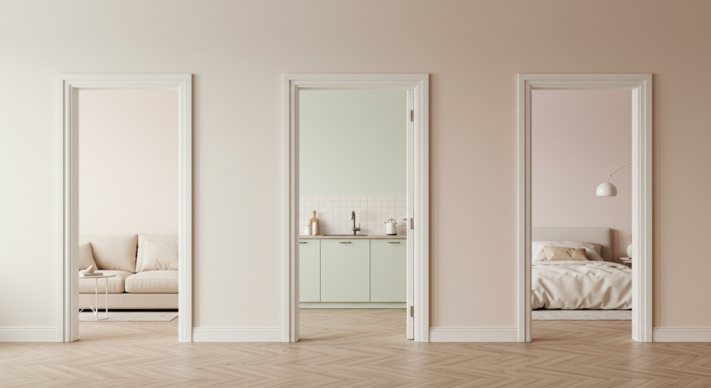
Sometimes, open-concept living spaces feel chaotic when every zone has a different color scheme. You can avoid that by soft transitions. If your living room is painted a gentle beige, continue that tone into the adjacent hall or kitchen trim. This approach makes each area distinct yet related. Subtle contrasts, like a pale teal accent in one zone and a deeper teal in the next, can highlight architectural transitions without jarring the eye.
Warm or Cool Undercurrents
A hue can read warm or cool based on its undertones. For a calm effect, keep warm or cool undertones consistent in connected spaces. A warm gray can meld nicely with a soft tan, while a cooler gray complements a cool mint. When you stay consistent, you reduce visual noise. You’ll also discover it’s easier to match textures—like warm wood or cool-toned stone—when your colors share a similar temperature.
Texture Tactics for a Calm Setting

Layered Fabrics
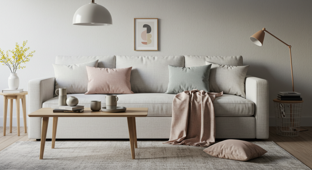
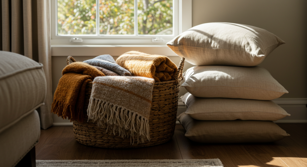
Texture isn’t just about color. It’s also about how each material feels. Layering fabrics is a strategic way to create quiet depth. Start with a sturdy woven rug in your living room, then add plush throw blankets on the sofa. Finish with a few cotton or linen pillows. These layers invite touch without making the space feel cluttered or overwhelming.
Smooth vs. Tactile Surfaces
Consider mixing smooth surfaces—like a simple marble coffee table—with tactile ones—like wicker storage baskets or rattan chairs. The contrast elevates each piece. A single material can become unremarkable if it’s repeated too much. By interspersing smooth finishes and textured elements, you let your eyes and fingers enjoy subtle variety. That variety can calm the senses when it’s balanced well.
Matte Paint Finishes
Instead of high-gloss or semi-gloss paint, which can create glare, opt for matte or eggshell finishes. These finishes diffuse light in a gentle manner. They also hide small imperfections better, which helps the walls feel welcoming rather than stark. Matte paint can bring out a hue’s softness and can support other calming textures, like velvet throws or sheepskin rugs.
Room-by-Room Color Focus
Living Area
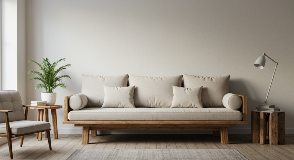
The living area deserves a color scheme that’s easy on the eyes. Sticking to neutral walls—like cream or a warm gray—gives you freedom to rotate accents. Then, incorporate a second color for sofas or chairs. A third accent might appear in decorative pillows, small rugs, or art prints. Subtle patterns in neutral tones also fit well. If you prefer a slight pop, choose a mild accent tone such as a dusty mauve or muted olive.
Kitchen
Kitchens can feel restful when you limit bright contrasts. One method involves painting cabinets in a soft pastel or warm neutral, while walls remain pale and complementary. Meanwhile, hardware like brass or matte black knobs adds small but noticeable detail. For countertops, consider mild stone or a composite with understated patterns. The visual effect should be clean yet inviting, especially if your kitchen opens to other rooms.
Bedrooms
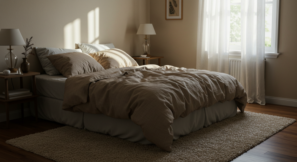
Bedrooms thrive on cohesive color and plush texture. Neutral walls can anchor the space, but choose textiles—like duvet covers or curtains—in a monochromatic color family. For instance, pair a gentle beige duvet with darker beige accent pillows and a light oatmeal rug. By layering related shades, you foster an environment that’s calm and even a bit luxurious. Soft lighting also matters: add adjustable sconces or low-lumen bulbs to maintain a restful mood.
Subtle Layering with Accent Pieces
Pillows and Throws
Accent pillows and throws are the simplest way to play with hue and texture. They’re affordable, easy to swap out, and can nudge the entire color scheme in a fresh direction. Choose pillows with tactile details, such as a chunky knit or embroidered pattern, but keep the color complementary. If your main palette is cream and sage, try accent pillows in a slightly darker sage with a hint of cream piping.
Rugs for Zoning
In open floor plans, rugs help define areas while adding softness underfoot. Look for rugs in calming colors like soft gray, gentle taupe, or pastel blues. Select materials that are comfortable but easy to maintain, such as wool blends or cotton weaves. Placing a rug under a dining table, for example, can anchor that zone. Meanwhile, a plush rug in a seating nook fosters a cozy spot for reading or sipping tea.
Decorative Objects
Small items—like handmade ceramic vases, woven baskets, or driftwood sculptures—introduce texture and color in modest doses. A neutral stone vase with a subtle speckled finish can echo the hues of your walls, adding dimension to side tables or shelves. By coordinating decorative objects with your overall theme, you keep everything visually serene.
Pairing Neutrals with Feature Tones
Why Neutrals Matter
Neutrals—cream, beige, gray, taupe—set the stage for a restful palette. They stand back so accent colors can shine without overwhelming the room. They also adapt easily if you decide to shift your accent hues. For example, a living space with beige walls can accommodate a gentle sky-blue sofa today and a muted terracotta piece tomorrow. Neutrals give you that freedom.
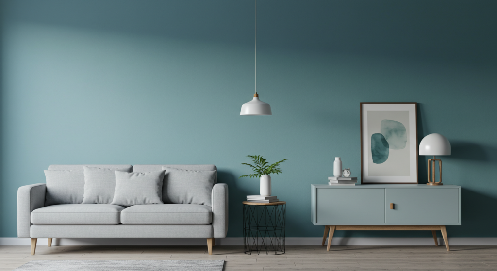
Feature Walls
Some homeowners prefer a feature wall that draws gentle attention. Select a subdued color—like an earthy green—on one wall, leaving the others in a pale neutral. This approach can work behind a sofa, bed, or fireplace. Keep the rest of the decor in sync, though. You wouldn’t want a color clash with your main pieces. A feature wall should enhance, not dominate, the setting.
Mixing Light and Dark Neutrals
Dark neutrals, like charcoal or deep taupe, can introduce depth when used sparingly. Maybe you paint a piece of furniture, like a buffet or hutch, in a rich charcoal. Then you pair it with lighter neutrals for balance. This trick helps certain pieces feel grounded. It also prevents an all-neutral room from appearing flat. Add texture, like a faux fur throw, if you want to keep the look soft and approachable.
Furniture Selections that Support a Calming Atmosphere

Streamlined Silhouettes
Ornate carvings or very loud patterns on sofas and chairs might distract from a relaxing vibe. Instead, look for streamlined silhouettes. Straight lines and gentle curves, with minimal detail, work well. Upholstery in calm hues—like a sand-colored linen—supports the idea of a soothing environment. Wooden frames can be finished in natural or matte stains to maintain a subdued tone.
Material Choices
Furniture materials influence how you perceive the room’s overall mood. Light woods, soft fabrics, and slightly textured surfaces introduce warmth without being flashy. If you like metal details, pick subdued finishes—such as brushed brass or black wrought iron. These finishes match a wide range of color palettes, letting you switch out cushions or throws whenever you feel like a minor change.
Comfort Priorities
Calming design also stems from comfort. Plush cushions, supportive seating, and well-placed lumbar pillows turn an ordinary sofa into a retreat. Look for furniture pieces that fit your daily routines. If you enjoy reading in a corner armchair, consider one that has soft upholstery and a footrest. That small detail might prevent you from adding unnecessary clutter later, because your main piece already meets your needs.
Wall Finishes and Materials

Painted Wall Strategies
Paint can transform a room quickly. For a peaceful environment, pick soft sheens or matte finishes. Test swatches at home since natural and artificial lighting can shift the appearance of certain hues. Avoid extremely bright or neon shades if you want a restful vibe. Sometimes a dusty pastel or even a slightly tinted white accomplishes more than a loud color.
Wallpaper and Wall Panels
Wallpaper can add subtle pattern and texture. Consider designs with gentle motifs, like small geometric shapes or faint stripes. Avoid busy prints, which can feel chaotic over large spans. In some cases, wooden paneling—painted or natural—brings warmth and visual structure. Horizontal shiplap in a soft gray can evoke a cottage-like calm, whereas vertical paneling in off-white can elongate walls in a small room.
Stone and Brick Accents
If your home already has a stone or brick feature—like a fireplace—highlight it by keeping surrounding walls minimal. If you add brick veneer yourself, select a color that harmonizes with your main tones, rather than shouting for attention. Sealed natural brick can provide an earthy note, especially if you pair it with neutral furniture and a few green or terracotta accessories.
Soft Furnishings for Comfort and Calm
Curtains and Blinds
Window treatments can shape the tone of a room. Thick curtains in a muted shade can block harsh sunlight while adding softness. If you prefer natural light, opt for sheer curtains in a gentle hue that still screens glare. Roller blinds in a neutral tone can hide away easily, giving a clean look when raised. Look for fabrics that drape well and feel smooth to the touch.
Cushions and Floor Pillows
Sometimes, a small cluster of floor pillows invites more relaxed seating. Select covers in a single color family but with varied textures—like a velvet cushion beside a woven cotton one. This approach keeps your palette consistent while introducing pleasant tactile variety. Floor pillows can also be swapped out seasonally for a quick refresh.
Throws and Blankets
Throws not only provide warmth but also present an opportunity to bring in a soft accent color. Suppose your main palette is comprised of warm gray and cream. A deep olive throw can enrich the arrangement, especially if you fold it neatly across a chair or sofa arm. Be mindful of your texture choices. A chunky knit can exude coziness, while a lightweight linen throw feels breezy.
Lighting Choices to Enhance Color Depth

Overhead Fixtures
Harsh overhead lighting can wash out delicate color variations. Instead, install dimmable fixtures or choose bulbs with a warmer tone. This helps maintain the subtlety of your palette. A classic pendant fixture in your dining area, for instance, should cast light that highlights the table’s surface without glaring on the rest of the space.
Task Lighting
Task lamps on side tables or desks can keep your color scheme intact while offering practicality. Position a reading lamp near a couch or a desk lamp in your workspace. Select shades that match or blend with your wall color. If the lamp is a statement piece, pick a finish like brushed nickel or antique brass, which pairs well with a range of calming colors.
Ambient Light Layers
Floor lamps, wall sconces, or even under-cabinet strips can create a layered lighting scheme. Each layer illuminates the room differently, revealing texture and hue in nuanced ways. For example, a soft LED strip under a kitchen cabinet can accent a gentle backsplash color. Meanwhile, a standing floor lamp in the living room might reflect off a light-toned wall, amplifying the area’s cozy look.
Seasonal Adjustments without Overhauls
Swap Out Textiles
Seasons change, but your foundation colors can remain the same. In spring, you might replace heavier knits with lighter fabrics. In autumn, bring back your plush blankets. By swapping out pillow covers, rugs, or throws, you add freshness without repainting or buying new furniture. This practice also helps prolong the life of your favorite pieces.
Adjust Lighting Tones
Longer days in summer may call for less reliance on overhead fixtures. You can shift to softer task lights or open your curtains more. In winter, you might choose bulbs with a slightly warmer glow to counteract the cold, subdued light outside. These small shifts respond to the environment while keeping your home’s color scheme stable and pleasing.
Minor Accessory Updates
Decor items—like vases, ceramics, or small sculptures—can reflect the season’s natural colors. In summer, maybe you set a bowl of greenery on your coffee table. In winter, you might lean towards frosted glass or metal accents that hint at crisp conditions outside. Rotating these pieces once per season keeps your space engaging.
Indoor-Outdoor Connection with Hues

Visual Flow to Outdoor Spaces
If you have a patio or garden visible through windows or doors, aim for a complementary color palette that connects indoors and outdoors. If your garden has earthy elements like terracotta planters, bring a small terracotta piece into your interior. This visual echo can help your inside space feel continuous with the outside, giving you an extended sense of calm.
Natural Materials
Wood, bamboo, and stone feel at home both indoors and outdoors. Use these materials on accessories or furniture placed near large windows. A simple wooden bench near a window might link your interior design to the nature outside, especially if the color of the wood echoes tree bark or nearby deck planks.
Subtle Green Accents
Some folks enjoy potted plants as a bridging element between indoor and outdoor spaces. If that’s part of your plan, keep the color of planters aligned with your main interior hues. Clay pots, white ceramic planters, or even textured baskets can highlight green foliage without adding jarring color. The result is a calm, natural synergy that ties your home’s color story to nature.
Eco-Friendly Materials and Shades
Low-VOC Paints
Paints containing fewer volatile organic compounds (VOCs) can help you maintain better indoor air quality. You can find these in an array of calming shades—from soft creams to pale blues. Low-VOC paints reduce strong chemical odors and still provide full coverage. It’s a win for both your well-being and your aesthetic.
Sustainable Textiles
Look for materials like organic cotton, hemp blends, or responsibly sourced linen. These fabrics often come in neutral or muted colors that work perfectly for a calming design. Their production can have a smaller environmental footprint, which is another bonus. Check labels to ensure your choices align with your values and preferred styles.
Reclaimed Wood Furniture
Reclaimed or upcycled furniture can bring warmth and character. Pieces made from salvaged wood often have unique grains or subtle imperfections that tell a quiet story. Sanding and finishing them in a neutral stain keeps them from appearing too rustic. If you find a local craftsman, you might even get pieces that match your chosen color scheme more precisely.
Storage and Display Solutions

Built-In Shelving
Built-in shelves, painted in the same color as the walls, can blend seamlessly into the background. This avoids visual clutter. You can then display a few carefully selected items—like textural baskets or small artwork—without breaking the sense of calm. Keep these displayed objects minimal to maintain an uncluttered look.
Hidden Storage
Ottomans with internal compartments, furniture with concealed drawers, or low-profile cabinets can hide items that might otherwise disrupt your calming theme. When you see fewer scattered belongings, your color palette and textures remain the star of the show. That helps each room breathe.
Open Display with Restraint
If you prefer open shelving for kitchenware or decorative objects, stay mindful about what you put there. Group items by color or material to keep the look cohesive. For instance, white dishes and pale wooden bowls might share a shelf. Too many scattered colors could jar your sense of tranquility.
Final Polishing: Accessories and Wall Art

Selective Artwork
A calming home doesn’t mean blank walls. Choose artwork that coordinates with your palette. If your walls are painted a cool gray, consider art pieces that feature subtle lines or minimal subject matter. Avoid vibrant neon prints. Alternatively, black-and-white photography can add a serene focal point. Frame your pieces in simple frames that echo your furniture’s finishes.
Decorative Mirrors
Mirrors reflect light and can enlarge a small room visually. If you place a mirror opposite a window, you catch a bit of the outdoor landscape or sky. That reflection can deepen the sense of space. Select a frame that blends with your scheme—perhaps a narrow wooden frame or a brushed metal. Mirrors also add a sleek texture element to your ensemble.
Subdued Metallic Accents
Metallic elements can brighten a space if used wisely. Try brushed gold candlesticks on a mantel or a small copper bowl on a side table. These touches shouldn’t dominate the room. Instead, they should appear as hints of brightness amid your calming palette, adding a bit of energy without overstimulation.
Conclusion

Creating a calming home with hue and texture is a journey of harmony. You begin with a reliable base palette, add complementary accents, and layer subtle surfaces so each element whispers.
Furniture supports the look by being comfortable and well-chosen, while textiles and lighting shape the ambience.
Even if you adjust for the seasons or personal preference, you can keep your foundation intact. The result is a place that soothes the eyes, eases the mind, and invites you to linger.
By merging gentle colors, balanced textures, and just the right amount of flair, your home can feel like a personal retreat—one that provides daily comfort without sacrificing style.
Summary Table

| Element | Recommended Approach | Quick Tip |
|---|---|---|
| Base Palette | Pick 1 dominant, 1 accent, 1 neutral for balance | Aim for similar warm or cool undertones |
| Texture | Mix smooth + tactile (rugs, fabrics, etc.) | Matte surfaces soften overall look |
| Furniture | Choose streamlined silhouettes in calm shades | Prioritize comfort + subtle shapes |
| Walls | Consider matte paint or subtle wallpaper | Avoid bright, loud tones |
| Lighting | Layer overhead, task, and ambient lamps | Warm bulbs preserve color depth |
| Accents | Pillows, throws, rugs in complementary hues + textures | Swap seasonally to refresh |
| Eco-Friendly | Low-VOC paints, reclaimed wood, organic textiles | Align with your style + values |
| Storage | Hide clutter with built-ins, concealed compartments | Fewer visible items = calmer vibe |
| Accessories | Add small sculptures, subdued metallics, mirrors | Keep frames + hardware consistent |
FAQ

Q: How do I choose a color that won’t overwhelm a small room?
A: In smaller spaces, neutral or soft pastels make the room look bigger. Stick to simple, matte finishes and bring in modest accents rather than bold, full-saturation hues. That way, the walls create a calm backdrop, and you can build interest through layered textiles or a few decorative items.
Q: Should I use the same color scheme in an open-plan area?
A: It’s wise to stay consistent with your main colors across open spaces, but introduce small shifts—maybe a deeper shade of your accent in one part of the space. This keeps unity without feeling repetitive.
Q: Can I still have bright colors if I want a serene home?
A: Bright colors aren’t off-limits. Just use them strategically. A few bold accent pillows or a piece of wall art in one statement shade can energize the area without overpowering it. Pair those bright spots with a neutral foundation to soften the impact.
Q: Is it a good idea to have different textures in each room?
A: Yes, as long as you keep the overall palette linked. If your living room includes a chunky knit rug, your bedroom might feature a plush velvet throw. They’re different textures, but if they share a color family or tone, the shift feels natural.
Q: How can I keep my home cozy in winter and light in summer without repainting?
A: Rotate decorative fabrics and lighting levels. In colder months, lay down thicker rugs, use heavier blankets, and switch to bulbs that give a slightly warmer glow. In summer, remove heavier layers and let more natural light in. You’ll maintain the same basic colors, but shift the feel with easy swaps.
Q: Do I need expensive designer items to create a calming look?
A: Not necessarily. The trick is to pick compatible colors, textures, and shapes. Even budget-friendly pieces can appear refined when coordinated well. Focus on a balanced composition and comfortable proportions, and your space will look cohesive and serene.
Q: Is there a way to add an accent wall without making the room too dark?
A: Yes. Pick a hue that’s one or two shades deeper than your base color. It’ll stand out, but won’t create a drastic contrast. Use a matte or low-sheen finish so it doesn’t feel overpowering, and keep the rest of the decor aligned with that hue’s undertone.
Q: Can I mix metals, like brass and chrome, in the same room?
A: You can mix metals if you keep them subtle. Combine warm metals (brass, copper) with cooler ones (chrome, stainless steel) by balancing their placement. For instance, brass cabinet pulls might pair with a chrome lamp base. Let one finish dominate so the effect stays harmonious.
Q: How do I ensure my children’s room remains calm but still fun?
A: Use low-contrast color combinations and gentle textures. Bright or playful elements can appear in toys, patterned bedding, or artwork. Make sure the main walls and larger furniture pieces are relatively neutral, so kids’ accessories don’t clash.
Q: How do I handle patterned wallpaper in a calming scheme?
A: Look for patterns with soft lines, small-scale motifs, or subtle colors. Large, bold prints can look busy. A gentle geometric or floral in a subdued colorway can add interest without overpowering the room. Keep other decor minimal to let the wallpaper speak quietly.
Q: What’s the simplest way to add texture if I don’t want rugs or heavy fabrics?
A: Incorporate smaller accents like woven baskets, textured throw pillows, or decorative bowls. Wall hangings made of natural fibers can also provide texture without covering the floor or large areas.
Q: Can I use black in a calming palette?
A: Yes, in moderation. Black frames for artwork or a black console table can ground lighter shades. Make sure black isn’t your main color, but a thoughtful accent that punctuates a serene palette.
Q: How do I pick a lighting temperature or bulb warmth?
A: Many people find 3000K to 3500K bulbs pleasant. They have a warm yet not overly yellow glow. This range lets your wall colors appear more accurate compared to cooler bulbs, which might shift everything to a bluish tone.
Q: Should I add scented candles or diffusers to enhance the experience?
A: Scent can heighten the relaxing atmosphere, though it’s not mandatory. If you enjoy mild fragrances, choose subtle scents—like eucalyptus or vanilla—so they don’t compete with your visual design. Make sure the vessels match your overall color scheme, and keep the fragrance level gentle.
That’s the heart of sensory colours: merging hue and texture to build a home that nurtures calm. Whether you’re redecorating one nook or refreshing an entire house, remember to stay true to your vision of coziness and subtle style.
By choosing your colors wisely, layering complementary textures, and refining each space with care, you’ll shape an inviting environment that soothes all who step inside.

Brenda Tillman is a color maestro who brings artistic brilliance to every piece she crafts. Passionate about imaginative expressions, she illuminates the world of fashion with her expert guidance on shades and combinations. Beyond her writings, Brenda is a culinary enthusiast and a global traveler, infusing her work with diverse insights. Her unique touch transforms simple color choices into art.
Reviewed By: Joanna Perez and Anna West
Edited By: Lenny Terra
Fact Checked By: Matthew Mansour
Photos Taken or Curated By: Matthew Mansour