Key Takeaways
- Hanbok pastels—peach, mint, and lavender—carry centuries of meaning and soften modern design without losing cultural depth.
- The bold Taeguk red‑blue contrast represents cosmic balance and lends itself to logos, architecture, and civic spaces that need instant recognition.
- K‑Culture neon—magenta, cyan, and electric green—captures Seoul’s nightlife and powers the global image of K‑Pop and K‑Drama.
- A balanced mix of pastels and neon begins with restraint: allow muted hues to dominate and reserve neon for a single, strategic accent.
- Designers, marketers, and homeowners can apply this palette across interiors, branding, and digital interfaces to evoke a forward‑looking, unmistakably Korean spirit.
Introduction
South Korea has compressed centuries of tradition and decades of explosive growth into a color story that feels both serene and electric. Can a single palette truly reflect royal court garments, a national flag, and buzzing side streets lit by neon? The answer sits in the careful study of three pillars: the whisper‑soft pastels of the hanbok, the perfectly balanced red‑blue swirl of the Taeguk, and the charged, candy‑bright glow of K‑Culture neon.
Each pillar speaks to a distinct layer of Korean identity—heritage, unity, and modern creativity—yet they all thrive together when applied with intent. This article unpacks the historical context, technical foundations, and practical applications of each palette element, then shows how to weave them into projects that feel both rooted and fresh.
Whether you design clothing, craft brand identities, or simply want to update a living room, South Korea’s modern palette offers a roadmap that marries calm pastels with thrilling neon—a combination that mirrors the country’s own blend of reflection and velocity.
The Roots of Hanbok Pastels
Historical Beginnings
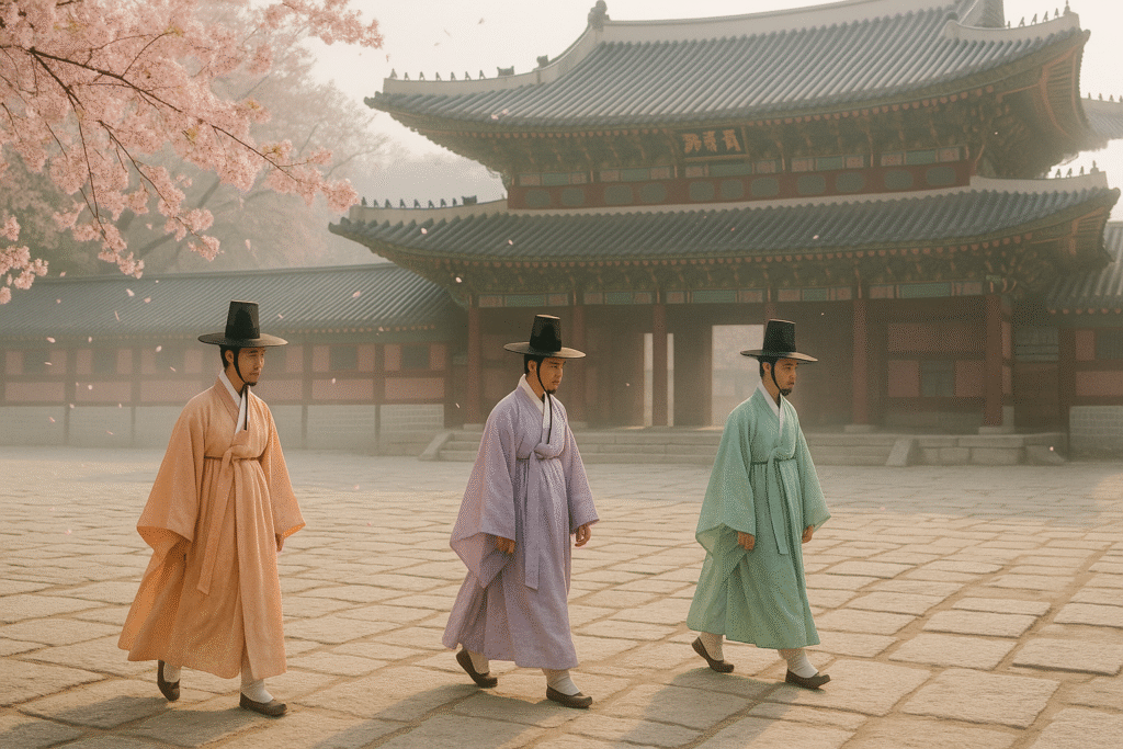
When Joseon‑era nobles paraded through palace grounds in the fifteenth century, they did so in robes dyed with delicate plant extracts that echoed spring blossoms and new rice shoots. Peach robes mirrored apricot flowers that bloom just before cherry season, while cool mint and airy lavender reflected mountain herbs and wild irises.
These hues were not chosen for vanity alone; strict sumptuary laws prescribed color by rank, season, and occasion, so softer pigments allowed aristocrats to honor seasonal cycles without upstaging the bold primaries reserved for royalty. The pastel tradition thus emerged from equal parts aesthetics, symbolism, and societal order, establishing a gently understated palette that still signals refinement today.
Traditional Dyeing Techniques
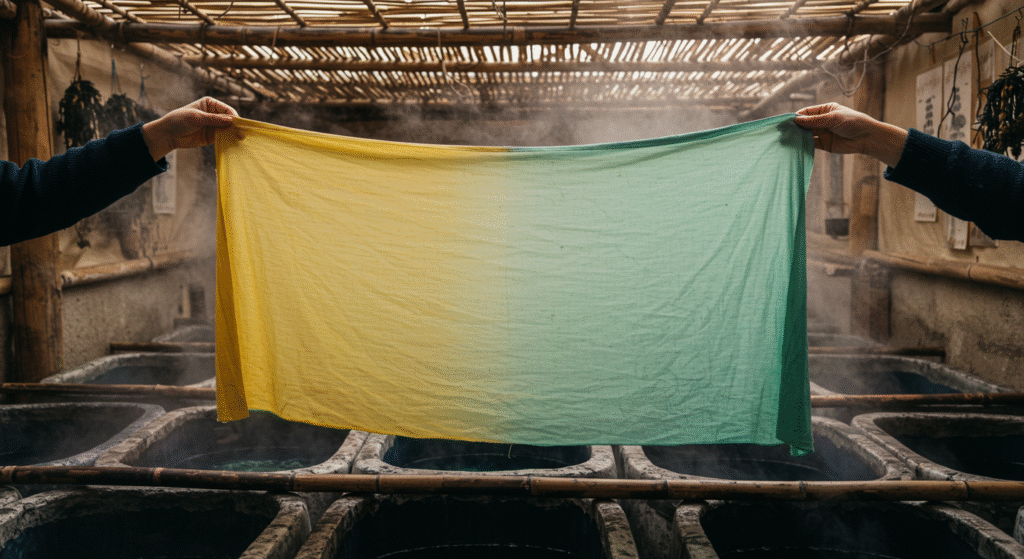
Historic dyers coaxed color from plants using time‑intensive processes that required both chemistry and patience. Gardenia pods yielded warm yellows; mugwort leaves gave pale greens; madder roots produced soft reds that, when diluted or mordanted with alum, drifted toward pink.
Artisans controlled pH by adding rice wine or wood ash to vats, turning dye day into a calibrated ritual that demanded keen observation of temperature, timing, and fabric fiber. While modern factories replicate pastels with synthetic dyes in minutes, boutique hanbok ateliers preserve these recipes, simmering yardage in clay pots over charcoal fires.
The resulting cloth carries micro‑variations of tone and depth—imperfections that machine production cannot mimic—giving each garment a unique fingerprint that modern consumers treasure for its authenticity.
Cultural Significance
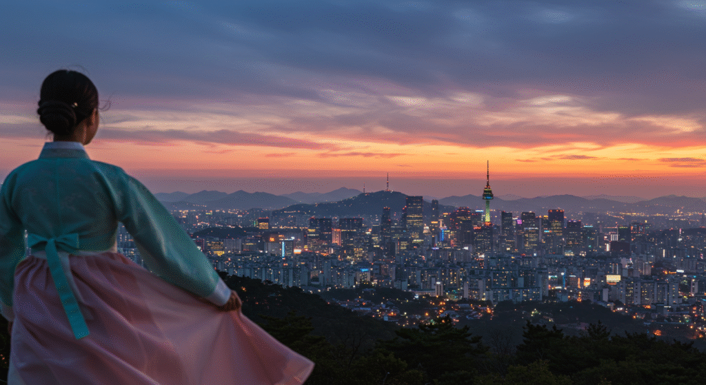
Pastels sit at the intersection of Confucian modesty and Shamanistic reverence for nature. In court weddings, brides chose mint jeogori (jackets) layered over ivory skirts to symbolize harmony between two families, while new mothers wore lavender sleeves during the baek‑il ceremony marking an infant’s first one hundred days, invoking long life.
Even today, pastel hanbok rented for holiday photos conveys purity, approachability, and optimism. Beyond clothing, pastel rice‑cake towers appear on ceremonial tables, and pastel paper lanterns hang during Buddha’s Birthday festivals, confirming that these gentle tones remain embedded in collective memory. Designers who borrow pastel palettes tap into a lineage of joy, renewal, and quiet confidence rooted in Korea’s agrarian past.
Chemistry Behind Pastel Dyes
Natural Pigments and Plants
Mugwort, indigo, sappanwood, and gardenia each produce signature hues, but the magic lies in how dyers layer and dilute them.
A single vat of gardenia may create both pale lemon and soft buttercup simply by adjusting soak time. Mordants—alum for clarity, iron for gray undertones—expand the spectrum further.
By understanding the chemistry of tannins, flavonoids, and anthraquinones, modern chemists replicate these shades in low‑impact dyes that bond to fibers at lower temperatures, reducing water and energy consumption.
For the eco‑conscious designer, selecting fabrics colored with such processes aligns heritage aesthetics with contemporary sustainability goals.
Modern Fabric Treatments
Industrial mills now use reactive dyes that lock molecularly into cellulose fibers, creating pastels that resist fading after a hundred washes.
Digital color matching streamlines production: a spectrophotometer scans historic hanbok pieces, software converts readings into Pantone codes, and a lab generates precise formulas.
The outcome is mass‑produced pastel fabric that stays faithful to its origins, yet meets global safety standards like OEKO‑TEX. Brands that communicate this fusion of past and present can differentiate themselves in crowded fashion markets, appealing to consumers who crave both story and performance.
Durability and Care
Pastel garments remain vibrant when handled gently: wash cold, use neutral pH detergents, avoid optical brighteners, and line‑dry in shade. Cotton pastel tees may yellow if exposed to high chlorine levels, while silk pastel scarves lose luster under direct sun. Retailers often include care cards featuring hanbok illustrations—a subtle nod to heritage that doubles as practical advice. By educating customers on upkeep, designers safeguard color integrity and reinforce brand trust.
Modern Hanbok Pastel Trends
Street Style Reinvention
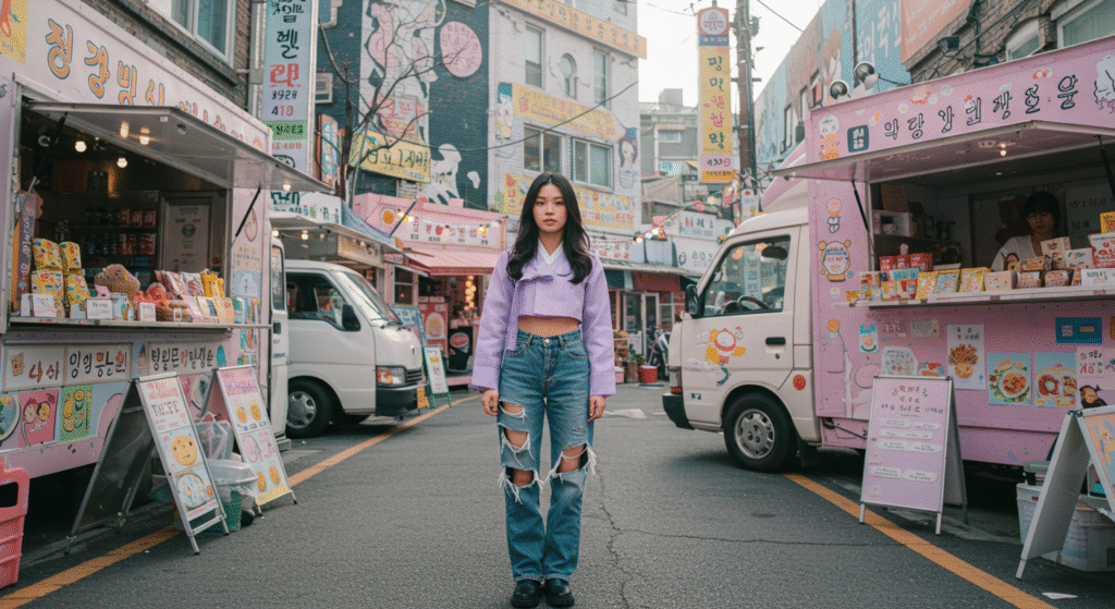
On Seoul’s streets, pastel hanbok separates mingle with denim jackets, chunky sneakers, and canvas totes. Influencers fold baby‑blue hanbok skirts at the waist, pairing them with graphic tees that sport Hangul typography.
This collision of eras makes traditional silhouettes relatable to Gen Z, who value authenticity but demand comfort. The trend has sparked rental shops in Hongdae where tourists customize pastel ensembles for day‑long photo shoots, fueling social‑media loops that spread Korean pastel aesthetics worldwide.
Fusion Fashion Shows
At Seoul Fashion Week, labels like Leesle and Danha reinterpret hanbok by splicing fabrics—organza sleeves, corduroy collars—while preserving pastel cores. Runway lights shift from soft amber to cool cyan, highlighting how peach and mint tones behave under varied illumination.
Critics praise these collections for bridging heritage and haute couture without veering into costume. Buyers from Paris and Los Angeles snap up capsule lines, introducing pastels into global wardrobes through bomber jackets trimmed in lavender piping or culottes dipped in tea‑rose pink.
Accessory Accent
Pastel micro‑bags, acrylic hairpins, and gradient phone cases allow timid adopters to sample Korean pastels without full commitment. Brands package earbud cases in tonal sets—mint for calm playlists, peach for upbeat tracks—tying color choice to mood marketing. Even luxury watchmakers have released limited pastel dials etched with lotus motifs, proving that gentle colors can command premium price points when anchored to a compelling cultural narrative.
Symbolism of Taeguk Red and Blue
Cosmic Balance
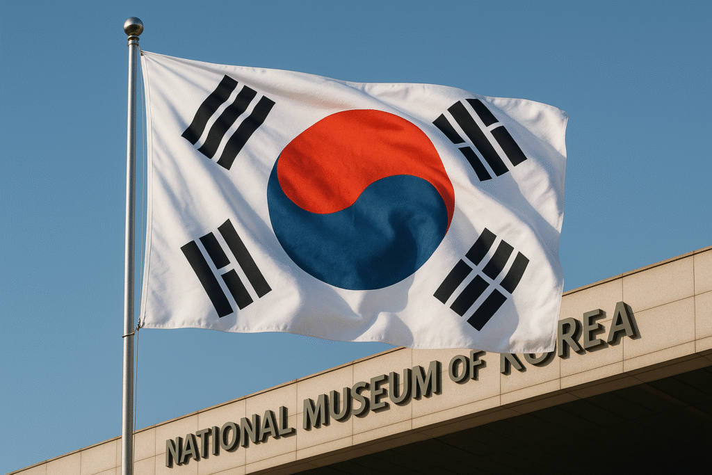
The Taeguk swirl at the heart of South Korea’s flag fuses fiery yang red (#C60C30) with cool yin blue (#003478) in a dance of perpetual motion. This symbol traces to Taoist diagrams adopted during the late Joseon era, visualizing universal forces—day and night, growth and rest, passion and calm.
Because it embodies equilibrium rather than conflict, the red‑blue pair signals resolve under pressure, making it ideal for rally‑ing cries, sports jerseys, and public safety campaigns that need to inspire confidence without aggression.
National Identity
From immigration stamps to Olympic tracksuits, Taeguk colors frame every official representation of the Republic. Subway route maps use red and blue lines to orient riders intuitively; public‑service robots in Incheon Airport flaunt Taeguk eye panels to greet travelers with friendly patriotism.
For Korean companies aiming at global audiences, embedding red‑blue accents in branding offers instant recognition yet sidesteps clichés often associated with white‑red‑blue flags of other nations.
Emotional Impact
Psychological studies at Yonsei University reveal that viewers interpret Taeguk red as dynamic and urgent, while perceiving the adjacent blue as trustworthy. When displayed together, heart rate rises slightly—alertness—then stabilizes—reassurance—mirroring the balance principle.
Marketing teams leverage this duality: a red call‑to‑action button set against a blue background captures attention yet feels secure, boosting click‑through rates without triggering banner blindness.
Use of Taeguk Colors in Architecture
Public Spaces
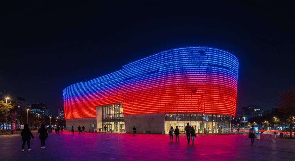
Architect Zaha Hadid’s Dongdaemun Design Plaza wraps silver panels around an interior bath‑ed in programmable LEDs that shift from red at dusk to blue by midnight. The gradient guides evening crowds through exhibitions, subtly invoking Taeguk themes of transition.
Municipal planners in Busan mirrored this effect on Gwangan Bridge, illuminating pylons red on one span, blue on the next, creating a kinetic light show that reads as moving Taeguk stripes when viewed from afar.
Corporate Buildings
Samsung’s Suwon headquarters features sky bridges clad in tempered glass laminated with dichroic film: one bridge glows ruby at sunrise, another sapphire at noon. Employees walking between towers pass through a literal Taeguk lens, reminding them of corporate roots in the national story. Visitors perceive the brand as both innovative—colored glass technology—and grounded in Korean identity.
Wayfinding Design
Seoul’s Cheonggyecheon stream walk uses red ceramic tiles on the north bank and blue on the south, helping tourists navigate sixteen footbridges without consulting maps. Informational plaques explain how colors tie to Taeguk philosophy, turning a functional system into an open‑air civics lesson. Similar red‑blue code schemes appear in hospital wings and university campuses, demonstrating the palette’s versatility beyond patriotic display.
Branding with Taeguk Palette
Logo Design
Successful Taeguk‑inspired logos keep forms simple—often a circle, infinity loop, or stylized swirl—to ensure scalability from business cards to building signage. Designers place red on the upper right to suggest ascent and energy, blue on the lower left to imply foundation and trust.
Typography typically stays neutral—slate gray or charcoal—so the color pair maintains dominance without visual noise. Startups in fintech, biotech, and edu‑tech adopt this palette to piggyback on national credibility while signaling momentum.
Packaging Choices
Skin‑care brands house serums in frosted cobalt bottles and cap them with glossy crimson droppers. Matte navy boxes wrapped in scarlet ribbons create unboxing theater aligned with Taeguk symbolism of inner‑outer harmony—product inside nourishes what the exterior celebrates. When QR codes on labels scan to micro‑sites animated in the same red‑blue gradient, the tactile and digital experiences converge, reinforcing brand memory.
Digital Identity
In UI design, #C60C30 serves as alert color—error states or urgent promotions—while #003478 anchors navigation bars and information panels. Accessibility guidelines recommend maintaining a minimum 4.5:1 contrast ratio; pairing white text on blue buttons and dark text on faded red banners meets this threshold. Animated micro‑interactions, such as a red blob morphing into a blue droplet on hover, echo the Taeguk swirl, converting a static emblem into living identity.
Neon in K‑Culture: Origins
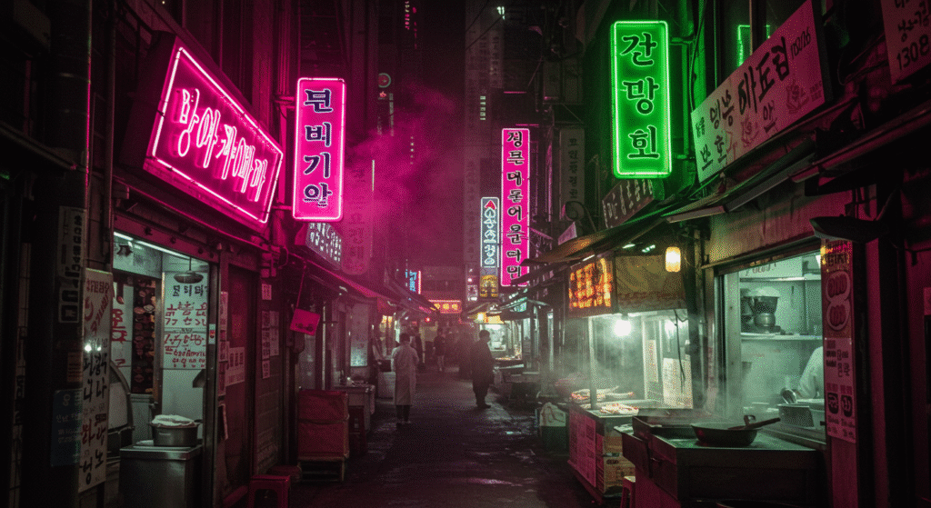
Early Night Markets
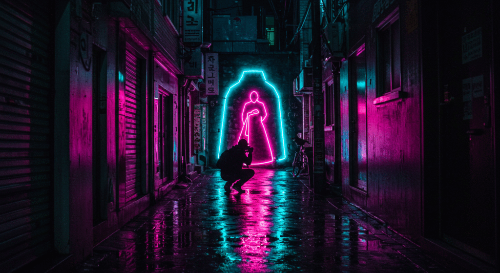
After the Korean War, rebuilding cities meant extending business hours, and neon signs provided cheap, visible advertising. Vendors in Namdaemun Market hung hand‑bent glass tubes spelling “국수” (noodles) in hot pink to lure late‑night shoppers. Neon quickly became shorthand for hustle, survival, and a forward lean into modern commerce. Its palette diverged from hanbok pastels not out of rebellion but necessity: vivid colors cut through smog and low‑lit alleys better than soft hues.
Pop Culture Impact
By the 1990s, neon saturated TV music shows like “Inkigayo,” framing idols in flashing rainbows that mirrored Shinjuku and Times Square but with a distinctly Korean pixel‑art twist. Directors used neon backdrops to compress variety‑show energy into smaller sound stages, making performances feel bigger than their footprint. As K‑Pop’s export market grew, neon aesthetics traveled with it, teaching global fans to associate hot pink and acid green with Korean creativity.
Urban Canvas
Seoul’s skyline now competes with its street‑level glow. Rooftop bars install oversized neon Hangul poetry, while civic art projects commission neon sculptures—giant lotus blooms pulsating above Han River parks. City ordinances, once strict on light pollution, loosen for cultural districts, acknowledging neon as intangible heritage that attracts nightlife tourism. Thus, neon moved from practical signage to cultural badge.
Neon Street Art in Seoul
Murals and Installations
Artists weld acrylic channels filled with LED strips that mimic vintage gas‑filled neon but consume less energy. One mural in Itaewon frames a life‑size hanbok outline in gradient neon that shifts from lilac to lime every hour, blending past and present. Such pieces invite selfies, and each shared image becomes free promotion for neighborhood galleries.
Festival Lighting
During the Seoul Lantern Festival, traditional paper lanterns float beside LED neon ribbons forming waves and cranes. The contrast tells a meta‑story: light as ancient ritual, light as tech marvel. Festival planners control brightness with DMX boards, ensuring neon complements rather than overwhelms candle‑lit floats, proving that extremes can coexist when curated thoughtfully.
Photogenic Alleyways
Tourists hunting “cyberpunk Seoul” gravitate to Euljiro’s tool district after rain, when neon kanji and Hangul reflections double in puddles. Photographers angle lenses low, capturing pastel umbrella tops under neon glow, inadvertently blending two palette pillars—soft fabric hues and electric tubing. City guides now map these alleys as official photo zones, turning informal art into economic driver.
Neon in K‑Pop Visuals
Stage Backdrops
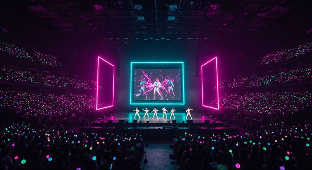
Production crews construct modular LED tubes that flicker magenta during verses then flash cyan in choruses, syncing to BPM. This choreography of light adds kinetic layer to dance routines, reinforcing hook lines even when viewers mute videos. Neon’s language of rhythm and youth transcends speech, making it an international marketing asset.
Album Art
Designers overlay saturated neon typography on grainy film photos of idols wearing pastel makeup, merging innocence and intensity. Vinyl collectors prize limited runs printed on transparent, glow‑in‑the‑dark disks that radiate under blacklight—physical proof that neon can leap off screens onto tangible merchandise.
Merchandise Design
Official fan light‑sticks embed RGB LEDs behind frosted domes shaped like Taeguk swirls; users toggle between group colors—often neon pink or green—during concerts. The collective wave of flashing neon turns arenas into living pixels, and post‑show social feeds amplify brand reach through crowd‑generated visuals.
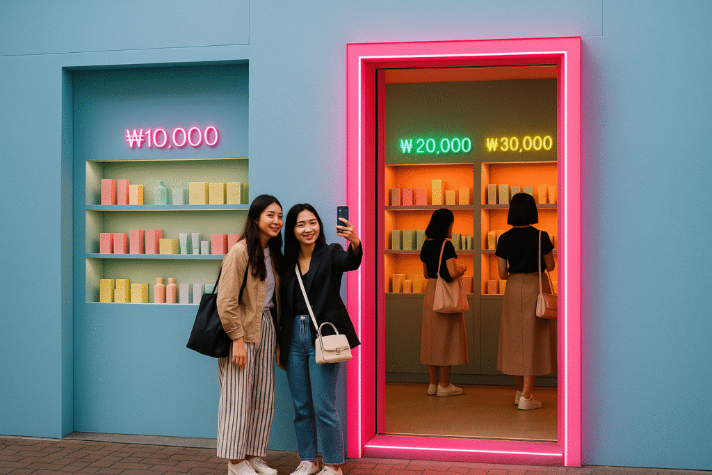
Combining Pastel and Neon
Finding the Balance
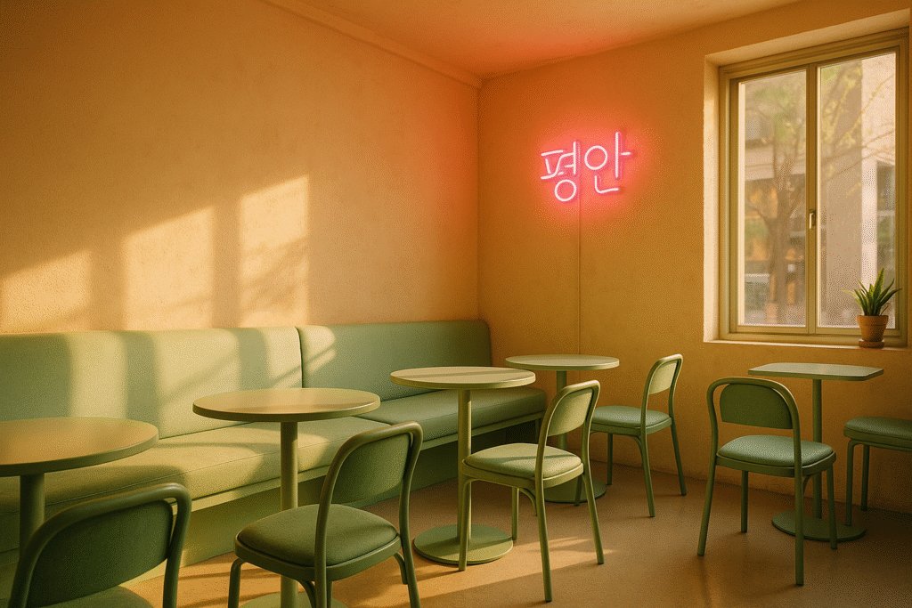
Effective fusion starts by assigning hierarchy: pastels occupy 70‑80 % of the visual field, setting a calm base; neon claims the remainder, delivering punch. Interior designers might paint walls in muted peach then mount a single neon kanji reading “평안” (peace) above a sofa. The eye rests on pastel expanse before snapping to neon focal point, preventing sensory overload.
Test Swatches Early
Design firms assemble physical mood boards under daylight and tungsten bulbs because neon hues shift dramatically depending on ambient light. A mint pastel may appear gray in cool LEDs, whereas neon pink can skew orange under warm bulbs. Early testing avoids costly color corrections later in print or construction phases.
Limit Neon Areas
UX teams allocate neon solely to interactive elements—buttons, alerts—while keeping backgrounds pastel. This not only guides user attention but also aids accessibility, as neon text on white fatigues eyes quickly. In fashion, neon stitching on pastel fabric follows the same rule: highlight seams and trims while preserving garment elegance.
Applying Palette to Interiors
Living Spaces
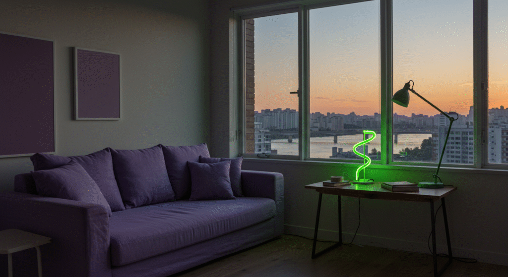
Korean minimalism blends low wood furniture with pastel linen cushions; a neon desk lamp shaped like a Taeguk swirl injects whimsy without disrupting serenity. Interior stylists recommend pairing mint walls with natural oak floors, then adding one neon element—perhaps a custom sign spelling family surname in Hangul—to personalize the space.
Commercial Cafés
Cafés chasing Instagram fame coat walls in blush pink Venetian plaster, suspend neon order numbers above the bar, and plate desserts on pastel ceramics. Customers photograph cotton‑candy lattes against neon signage, generating organic marketing content. Managers track sales spikes tied to posts featuring neon backdrops, proving ROI of color planning.
Workspace Design
Tech startups seeking employee well‑being choose lavender acoustic panels to dampen sound and neon green task‑lighting to energize brainstorming zones. Studies show the pastel base reduces cortisol, while short bursts of neon light increase alertness, making the palette a tool for both mental health and productivity.
Using Palette in Fashion Design

Ready‑to‑Wear Lines
Design houses launch capsule collections with boxy pastel blazers trimmed in neon piping, echoing hanbok seams. Fabric mills weave recycled polyester filament dyed in pastel gradients, then embroider brand monograms in UV‑reactive thread that glows under club lighting—day‑to‑night versatility in a single garment.
Accessories and Footwear
Sneaker brands release white leather uppers splashed with gradients of peach melting into hot pink, referencing cherry blossoms at dusk. Translucent neon soles reveal Taeguk‑pattern insoles, inviting wearers to carry cultural symbolism underfoot. Pastel bucket hats stitched with neon logos sell out at summer music festivals, where sunlit pastels contrast stage lit neons.
Runway Lighting
Show producers wash runways in rose‑quartz LED floods for pastel looks, then snap lighting to full‑spectrum neon strobes as models in electric hues appear, dramatizing palette shift. Critics note that lighting narrative deepens audience understanding of collection themes—gentle heritage, pulsing future—without verbal explanation.
Leveraging Palette for Marketing
Social Media Imagery
Algorithms favor high‑contrast visuals, so marketers frame product shots with pastel borders, then drop neon captions that act like visual hashtags. A study of 1,000 Instagram posts showed pastel‑neon combos increased save rates by 18 % compared to monochrome feeds, likely because users pause longer to absorb layered storytelling.
Event Decor
Pop‑up shops wrap exteriors in matte baby‑blue vinyl, install neon doorframes, and invite visitors through a literal portal between calm and excitement. Inside, pastel shelves hold limited‑edition goods, each tagged with neon price labels that double as souvenirs. Exit surveys reveal that visitors recall both color scheme and brand name more readily than at conventional white‑box events.
Email Campaigns
Pastel‑blue backgrounds reduce visual fatigue in long newsletters, while neon‑orange buttons pop at 4 % higher click‑through than standard red. Heat‑map analysis shows readers skim until neon draws them back to actionable content, proving that strategic color placement can tactically guide behavior.
Palette in Digital Media and Apps

UI/UX Color Schemes
Developers define CSS variables such as --primary-bg: #F4C2C2; for peach backgrounds and --accent-neon: #FF00FF; for interactive states. When users toggle dark mode, neon accents dim by 30 % brightness to maintain legibility, demonstrating that accessibility need not sacrifice brand vibrancy.
Gaming Interfaces
Mobile rhythm games overlay neon magenta note paths on pastel gradient stages, easing new players into high‑contrast visuals while keeping the screen from overwhelming. Game psychologists note that pastel rest screens lower player heart rate between levels, extending session length—a monetization win.
AR Filters
Social platforms release pastel skin‑smoothing filters that add neon tongue‑out emojis when users open their mouths, blending gentle beautification with playful shock. Filter adoption spikes during K‑Pop comebacks, suggesting color synergy between digital effects and promotional cycles.
Conclusion
South Korea’s color landscape reveals how a culture can honor ancestral craft, assert national identity, and sprint into tomorrow—all through hue. Hanbok pastels whisper dignity and renewal; Taeguk red‑blue anchors collective spirit; K‑Culture neon ignites youthful ambition.
Together they form a toolkit for creators who want designs that feel calm yet kinetic, respectful yet daring. Master the balance—let pastels set the stage, allow red‑blue to center the message, and unleash neon for decisive impact—and your work will echo the rhythm of contemporary Korea: ancient roots, bright future.
Summary Table

| Palette Element | Core Hex Codes | Key Characteristics | Best Contexts |
|---|---|---|---|
| Hanbok Pastels | Peach #F4C2C2, Mint #BCE0DA, Lavender #D8B4E2 | Soft, ceremonial, calming | Fashion basics, home walls, product packaging |
| Taeguk Red‑Blue | Red #C60C30, Blue #003478 | Dynamic yet stable, patriotic | Logos, signage, user‑interface highlights |
| K‑Culture Neon | Magenta #FF00FF, Cyan #00FFFF, Electric Green #39FF14 | High energy, night‑life vibe | Event decor, stage sets, digital stickers |
FAQ
Q: How can I adapt hanbok pastels to a Western brand without cultural appropriation?
A: Focus on color physics rather than garment forms. Credit Korean dye traditions in your copy, collaborate with Korean artists, and avoid replicating sacred patterns.
Q: Will neon accents date my design quickly?
A: Trends evolve, but neon remains timeless when used sparingly. Treat it like spice—apply a dash to highlight, not to overwhelm, and it will stay fresh.
Q: Is it expensive to install neon lighting at scale?
A: LED neon flex costs less to run and maintain than classic neon glass. Up‑front costs vary by length and controller complexity, but lifespan offsets initial spend.
Q: Can Taeguk red‑blue work for a non‑Korean company?
A: Yes, if the symbolism aligns with your brand story—balance, duality, or partnership. Just ensure the design feels authentic, not derivative.
Q: How do I test pastel‑neon combinations for accessibility?
A: Use WCAG contrast‑checker tools. Adjust neon brightness or add subtle outlines until text and icons meet AA standards, even for color‑blind users.

Neha Z. is not just any writer; she’s a storyteller who has graced the online world with her evocative prose for over half a decade. Venturing into the intricate nuances of women’s lives, she weaves stories that range from life’s highs and lows to the multifaceted essence of femininity. Each piece she pens radiates sincerity and artistry. As you delve into Neha’s musings, you’ll find reflections that echo your own journey and insights that inspire. Immerse yourself in her world, and let her stories touch your heart.
Reviewed By: Joanna Perez and Anna West
Edited By: Lenny Terra
Fact Checked By: Matthew Mansour
Photos Taken or Curated By: Matthew Mansour