Key Takeaways
- Embrace versatile colors that flatter your shape, from rich neutrals to vivid jewel tones.
- Experiment with layering and mixing hues to add depth, interest, and dimension to your looks.
- Select the right fabrics, textures, and accessories to make your chosen colors pop in any season.
- Build a personal palette that aligns with your style, comfort level, and body positivity.
When it comes to plus-size fashion, color is one of your most valuable style tools. The right shades have the power to celebrate your figure, highlight your curves, and make you feel more confident than ever. Forget old rules that limit your wardrobe to dull or uninspiring hues. Today, plus-size wardrobes brim with possibility—ranging from elegant neutrals to vibrant accents, and everything in between.
This guide will help you master color selection, mix and match tones like a pro, and create ensembles that put your curves front and center. We’ll cover everything from choosing your foundation colors to layering techniques, pairing patterns with solids, and selecting the right textures to enhance your look. By the end, you’ll have a complete roadmap for building a wardrobe that reflects your unique personal style while showcasing your full, fabulous shape.
Building a Confident Color Foundation
Starting with Versatile Hues
Before diving into brilliant jewel tones or daring color-block combinations, consider building a solid color foundation. Versatile shades—like classic black, rich navy, warm chocolate brown, and deep charcoal—create a neutral base that can anchor your entire wardrobe. These hues are not about blending into the background. Instead, think of them as supportive players that allow other colors to shine.
- A black wrap dress can become the canvas for a bold statement necklace in emerald green.
- A navy trouser can pair with a lavender blouse, bringing out the cooler undertones in both.
- A deep chocolate skirt can complement warm accents like rust, copper, and blush.
Creating Balance and Structure
When focusing on your curves, balance is key. Choose foundation shades that feel sturdy, supportive, and calming. A neutral base allows you to guide the eye where you want it to go. For instance, a dark pencil skirt creates a vertical line, elongating your silhouette. This allows you to experiment with lighter or brighter tops, knowing you have a balanced, flattering base. It’s about building a reliable backdrop that encourages you to be more daring with other pieces.
Coordinating Wardrobe Essentials
Your color foundation should also align with your favorite staples. If you love denim, invest in quality indigo or black jeans that pair well with almost any shade. If you favor tailored trousers, pick them in a rich neutral hue. Once these essentials form your wardrobe’s backbone, you can introduce more daring colors without hesitation. Having a strong set of basics ensures your entire wardrobe flows and nothing feels out of place.
Embracing Dark Neutrals
Going Beyond Black
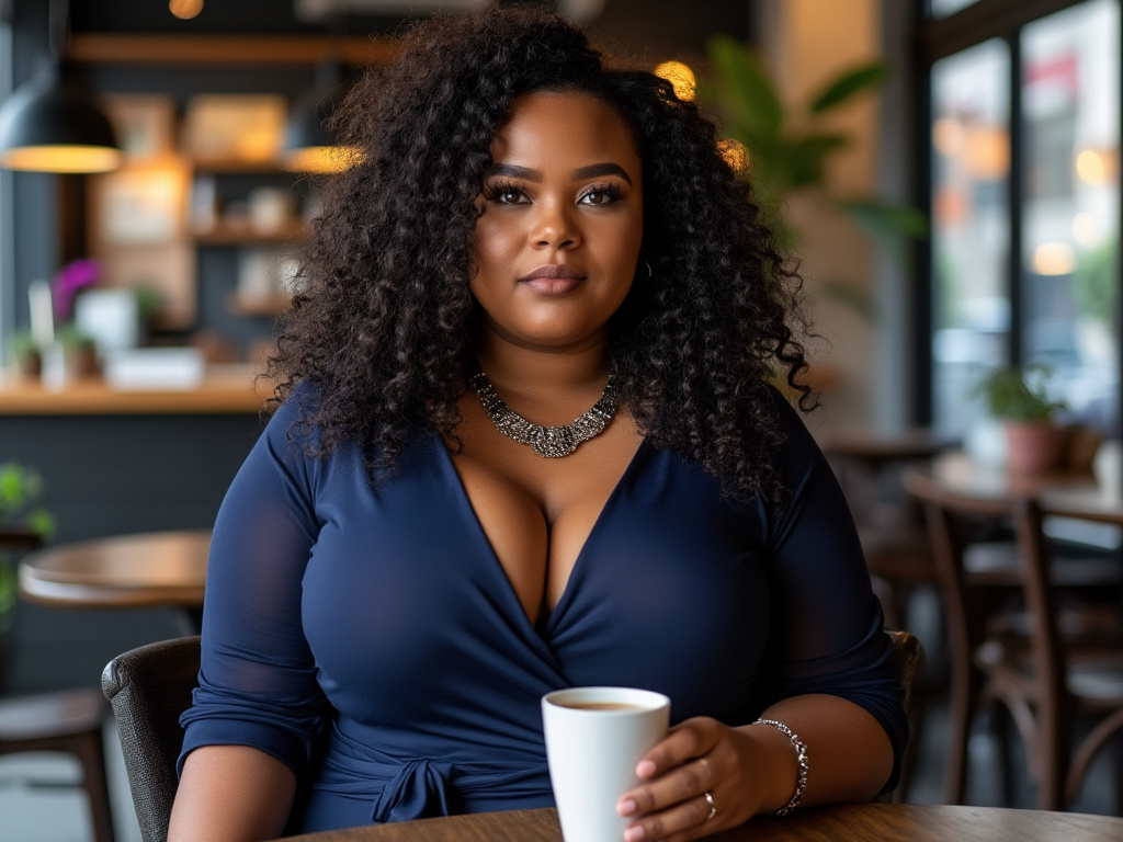
Black is a mainstay for plus-size fashion because it streamlines the silhouette. But don’t stop at black—experiment with dark neutrals like navy, eggplant, deep olive, and espresso brown. These shades are equally flattering and provide subtle shifts in your look. A deep olive wrap dress or an espresso brown blazer can add a richness that black sometimes lacks. This variety keeps your wardrobe from feeling repetitive and predictable.
Strategic Placement of Dark Shades
Where you place these dark neutrals matters. If you’d like to draw attention away from certain areas, wear darker colors there. For example, if you want to emphasize your upper body’s shape, choose a fitted navy top with a lighter or patterned skirt. This subtle contrast keeps your outfit visually engaging. On the other hand, if you love your lower half, a pair of dark trousers paired with a vivid top can shift focus upwards.
Mixing Dark Neutrals with Light Accents
Dark neutrals pair beautifully with lighter tones. For example, a charcoal gray tunic can come alive when matched with a soft mauve scarf. Or an eggplant blouse can pop against a cream-colored cardigan. This interplay between dark and light is what gives dimension. Don’t hesitate to mix multiple dark neutrals together—navy and black can coexist—then soften the look with a pastel accessory to break any heaviness.
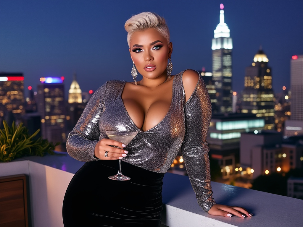
Exploring Vibrant Jewel Tones
Celebrating Depth and Saturation
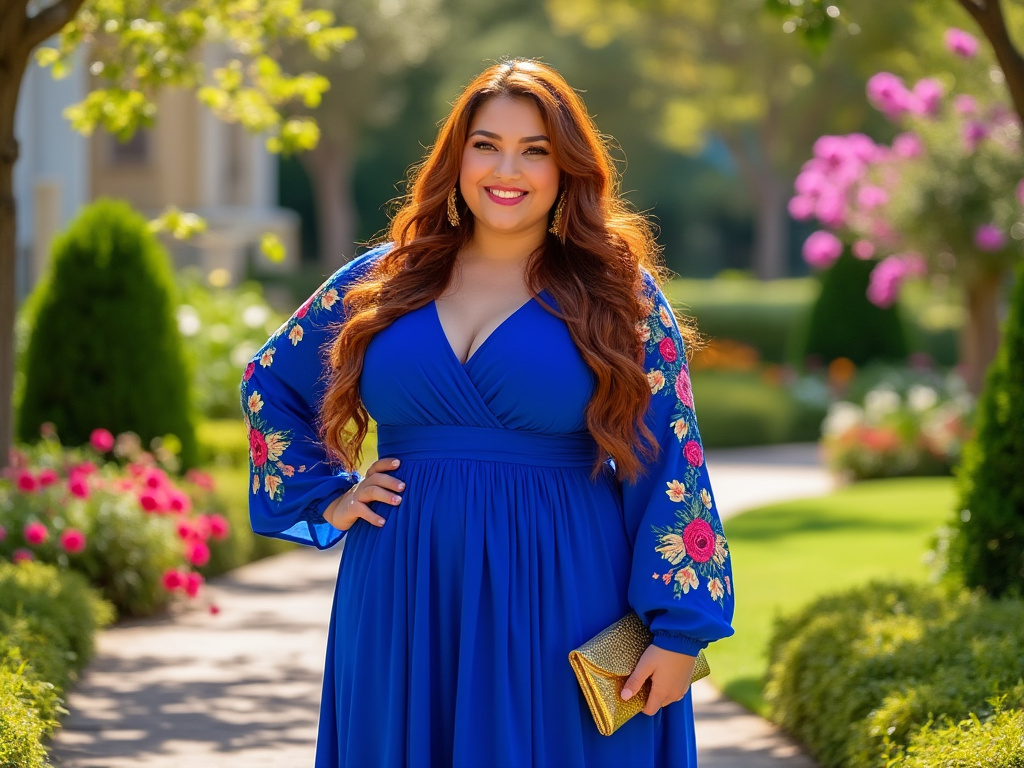
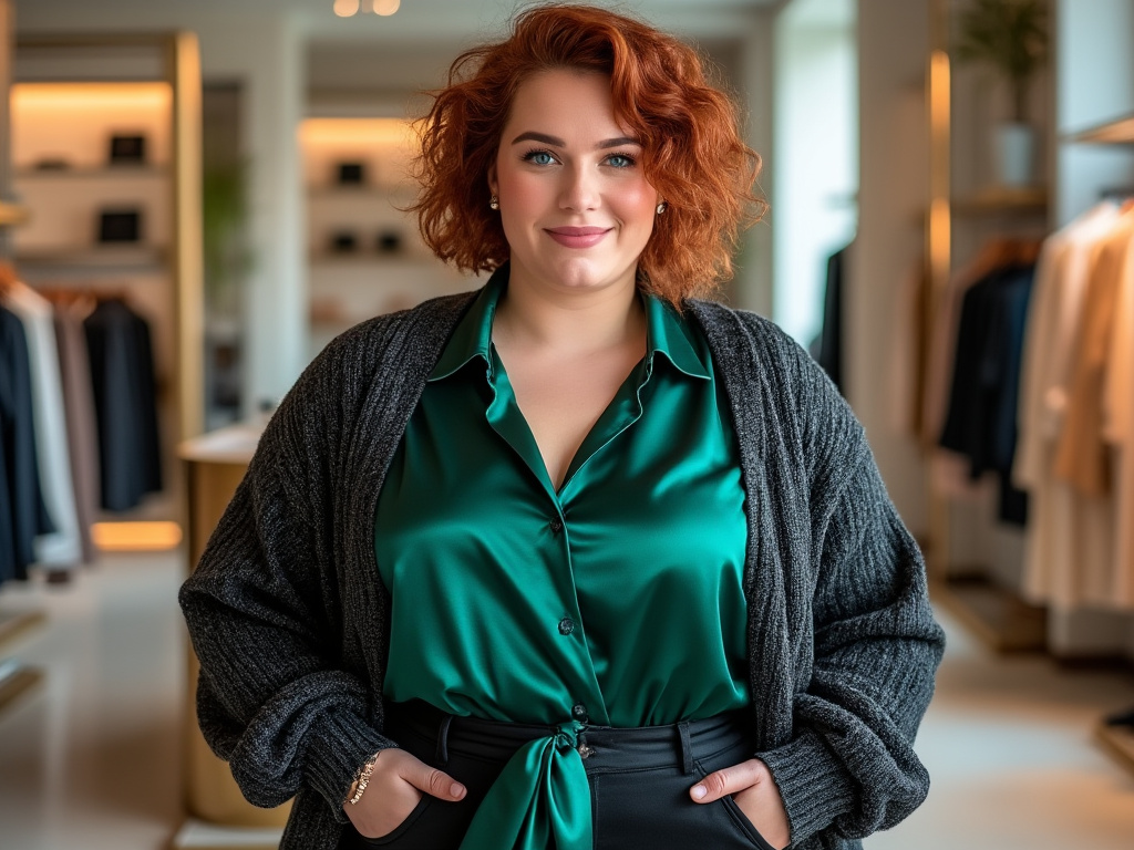
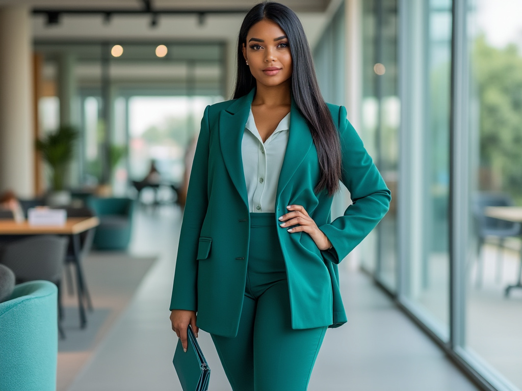
Jewel tones—think emerald, ruby, sapphire, and amethyst—are a game changer for plus-size fashion. Their rich saturation enhances curves by providing depth and allure. These shades look luxe, regal, and timeless. If you want a single piece that makes a statement, choose a jewel-toned dress. The saturated hue hugs curves and stands out without feeling loud or overwhelming.
Pairing Jewel Tones with Neutrals
Jewel tones shine brightest when set against a neutral backdrop. For example, an emerald blouse looks stunning with black trousers and silver accessories. Or try a sapphire cardigan layered over a cream tank and navy jeans. The contrast makes the jewel tone the centerpiece of your look, guiding the eye exactly where you want it.
Layering Multiple Jewel Tones
For the adventurous dresser, consider combining jewel tones. An amethyst blouse paired with a deep emerald skirt can be both bold and harmonious if anchored by a neutral piece like a black belt or nude heels. The trick is to let one jewel tone dominate while the other accents it. This kind of thoughtful color story highlights your shape in a richly artistic way.
Color Blocking Strategies
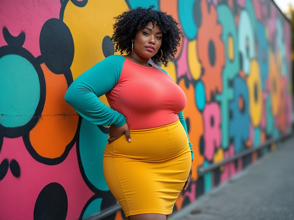
Defining Your Shape with Bold Blocks
Color blocking can accentuate curves and define your waistline. By using blocks of solid color, you create distinct visual sections that shape your body. For example, a dress with a darker side panel and a brighter front panel can visually trim your waist. Conversely, a bright band of color at the natural waistline can highlight the curve between your bust and hips.
Combining Complementary Colors
When color blocking, choose shades that work in harmony. Pair a warm coral top with a burgundy skirt or a teal tunic with a mustard belt. As long as the shades don’t clash, this approach can transform basic pieces into a runway-worthy ensemble. Remember, the goal is to celebrate your curves, so choose color blocks that flatter your natural shape.
Using Accessories to Reinforce the Block
Accessories can also play a part in color blocking. A wide belt in a contrasting color placed at your waist can reshape your entire look. Add earrings or a bag that echoes one of the blocked colors to tie it all together. This creates a unified, confident statement that celebrates your body in a bold way.
Mixing Pastels and Mid-Tones
Softening the Silhouette with Pastels
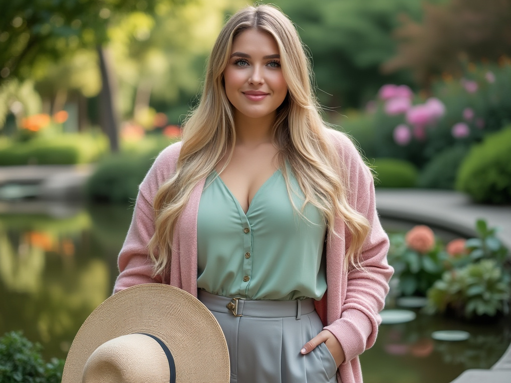
Pastels and mid-tones—like dusty rose, soft lilac, muted blues, and gentle greens—offer a softer approach to color. These shades can highlight your curves in a subtle, romantic way. A blush pink wrap top or a pale blue midi dress adds a gentle glow to your look. The softness of these hues can contrast beautifully with curves, giving your outfit an elegant flow.
Balancing Sweetness with Structure
While pastels can sometimes feel too sweet, adding structured silhouettes keeps the look polished. A tailored pastel blazer pairs perfectly with dark trousers. A soft lavender top can balance a sleek pencil skirt. This blend of delicate color and strong form brings out the best in your figure. Plus, lighter shades near the face can brighten your complexion and draw eyes upwards.
Combining Pastels and Mid-Tones for Depth
Don’t be afraid to layer pastels with slightly deeper mid-tones. A light mint top with a denim jacket and taupe pants can create soft depth. Or try a pastel peach blouse layered under a mossy green cardigan. The interplay of gentle tones can be as impactful as bolder shades, but in a more understated, whisper-soft manner.
Seasonal Color Selections
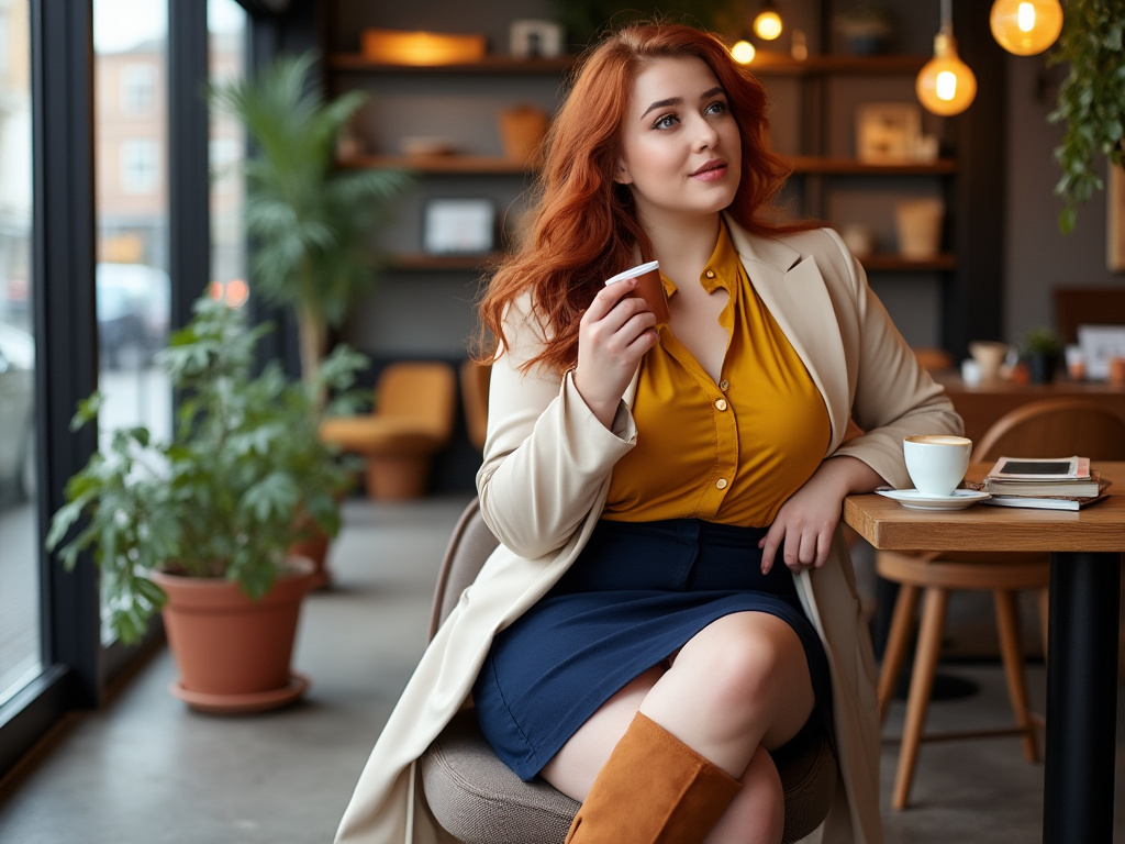
Embracing Warm Hues in Cooler Months
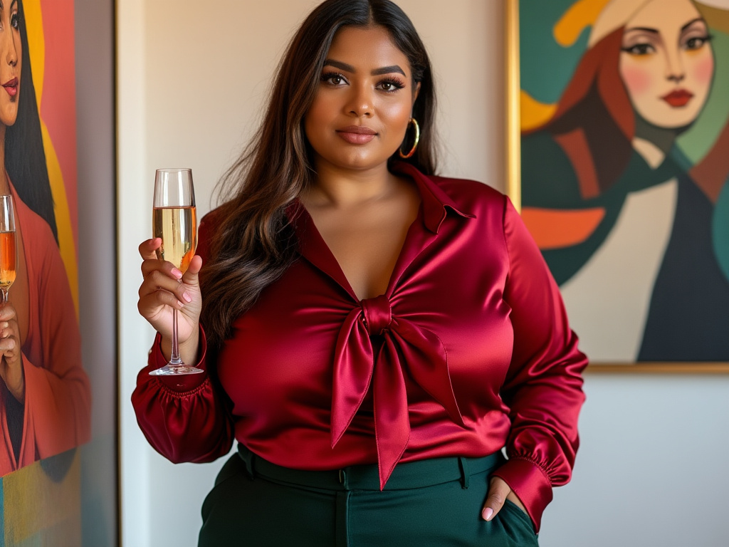
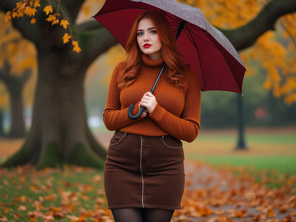
In fall and winter, warm earthy tones like rust, burgundy, mustard, and forest green feel perfectly at home. These shades cozy up to your curves, creating looks that feel both comforting and chic. A burgundy wrap dress with black tights, for instance, gives a flattering shape while nodding to the season’s mood. Adding a rust-colored scarf can enhance depth and draw attention to the face.
Brightening Spring and Summer Looks
When temperatures rise, explore breezy colors like aqua, coral, butter yellow, and fresh mint. These hues add lightness and airiness to your outfits, reflecting the brighter environment. A coral sundress or a mint blouse can highlight your silhouette without feeling weighed down. Introduce white accents—a linen blazer or a white denim jacket—to make these colors pop even more.
Transitions Between Seasons
Use transitional shades—like mauve, teal, and dusty blues—to bridge the gap between seasons. A mauve cardigan can pair with a floral dress in spring and still work over a darker top in early fall. By choosing versatile transitional colors, you extend your wardrobe’s range and maintain flattering silhouettes all year long.
Pattern and Color Integration
Choosing Patterns that Complement Curves
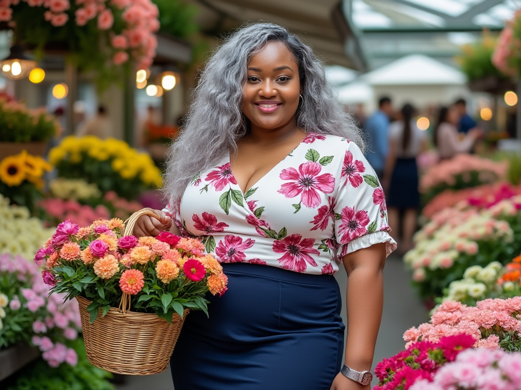
Patterns can be intimidating, but they’re another way to celebrate color. Opt for patterns that flow with your curves, like diagonal lines, soft florals, or abstract shapes. These prints can add visual interest and help guide the eye along your natural shape. Choose patterns with colors that complement your chosen palette—perhaps a floral top with jewel-toned blossoms or a geometric print featuring warm neutrals.
Grounding Patterns with Solid Colors
To avoid overwhelming your figure, pair patterned pieces with solid colors. For example, a floral blouse with a navy skirt balances out the look. The solid piece gives the eye a place to rest and highlights the patterned piece’s colors. This mix ensures that your curves remain the focal point, rather than letting the print dominate.
Mixing Patterns Thoughtfully
If you’re feeling adventurous, you can even mix patterns. The key is to keep a consistent color thread running through both prints. For instance, if your skirt has a soft green leaf motif, choose a top with small green accents. Keeping patterns within a related palette ensures they’ll enhance, not compete with, your silhouette.
Metallics and Shimmering Tones
Incorporating Metallic Accents
A touch of shimmer can elevate your look. Metallic tones—like gold, bronze, silver, and copper—reflect light and add visual intrigue. Metallic accessories, like a gold belt or a silver clutch, highlight areas you want to draw the eye. A bronze statement necklace against a darker dress can brighten your face, while a metallic sandal can elongate your legs.
Subtle Shimmer in Clothing
If you prefer a more integrated approach, seek out garments with metallic threading or subtle shimmer in the fabric. A top woven with gold thread pairs beautifully with black trousers, or a silver metallic pleated skirt can add fluid movement to your shape. This approach lets you enjoy a bit of sparkle without going full-on glam.
Balancing Shine with Matte Textures
Pair shimmer with matte textures to prevent an overly shiny look. For example, wear a metallic top under a matte jersey blazer, or slip on a shimmer cardigan over a cotton dress. The contrast in texture enhances your shape and ensures the metallic finish stands out against a calmer background.
Bold Accents Through Accessories
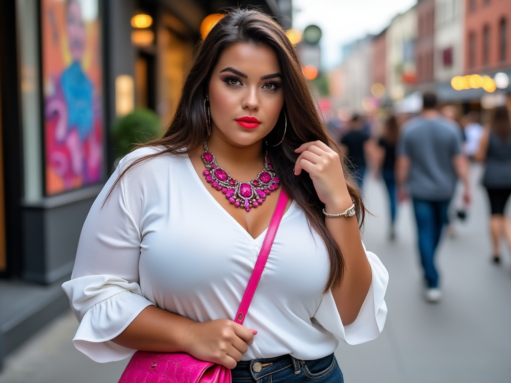
Adding Pops of Vivid Color
Accessories offer a low-risk way to test daring colors. A bright orange handbag or a fuchsia scarf can bring any neutral outfit to life. These pops of color create focal points that draw attention where you want it. For instance, if you’ve chosen a simple black dress, a fiery red belt can highlight the waist and add a confident twist.
Matching Accessories to Outfits
To ensure cohesion, pick accessories that repeat or complement your outfit’s existing hues. A teal necklace paired with a teal stripe in your skirt ties the look together. Matching accessories show intention, making you look polished and put-together. This strategy is perfect for days when you want to appear effortlessly stylish.
Experimenting with Proportions
Accessories can also play with proportions. Larger earrings or statement necklaces can draw attention to the face, while a wide belt emphasizes the waist. Using accessories strategically ensures they enhance rather than overwhelm your figure. Play with scale to find the balance that flatters your body and personal style.
Balancing Warm and Cool Tones
Identifying Warm vs. Cool Shades
Warm tones (reds, oranges, yellows) and cool tones (blues, greens, purples) each have their appeal. Mixing them can add complexity to your outfit. For instance, a warm mustard top can be paired with a cool navy skirt. The contrast makes both colors more vivid. This dynamic interplay can emphasize curves, as the eye follows the different tones across your silhouette.
Using Neutrals as a Bridge
If mixing warm and cool tones feels tricky, use neutrals to bridge the gap. A cream blazer can sit between a warm-toned top and a cool-toned skirt, helping the colors harmonize. Neutrals act like peacekeepers, ensuring no single shade takes over. This approach keeps your look balanced and flattering.
Gradual Transitions in Color
For a cohesive look, try transitioning from one tone to another through gradient-like steps. For example, pair a warm coral blouse with a neutral taupe pant and finish with cool teal accessories. The result feels intentional and interesting, flattering your shape and showing that you know exactly how to play with color.
Layering Colors for Dimension
Using Jackets, Cardigans, and Vests
Layering adds depth to your outfit and highlights your curves from multiple angles. A structured blazer can shape your shoulders and waist, while a longline cardigan skims over your hips. Choose layers in complementary colors—like a blush cardigan over a plum dress—to introduce dimension that keeps the eye moving.
Mixing Textures and Fabrics
Play with fabrics in different colors to create even more dimension. A silky emerald blouse under a chunky knit vest in charcoal gray adds visual complexity. The textures and colors interact, framing your shape and adding interest. This approach not only highlights your curves but also makes your outfit feel richer and more layered.
Light and Dark Layering Techniques
Layering light over dark or dark over light can sculpt the appearance of your figure. A light, open-front cardigan over a dark top creates vertical lines, making you look taller. Reverse that with a dark jacket over a lighter blouse to emphasize the shape of your torso. Experimenting with layering helps you discover what best flatters your body.
Texture and Fabric Considerations
Enhancing Color with the Right Fabrics
Certain fabrics make colors more vibrant or subdued. Satin or silk can deepen jewel tones, while cotton or linen can soften brighter shades. A rich velvet dress in sapphire looks lavish, while a cotton coral blouse feels breezy. Understanding how fabric affects color intensity helps you choose pieces that highlight your curves and personal style.
Avoiding Overly Thick Layers
While layering is great, be mindful of not adding unnecessary bulk. Opt for fabrics that drape well and maintain your shape. Jersey, rayon, and certain polyester blends can hug curves without adding volume. This ensures that the colors you’ve chosen stay front and center, enhancing your figure rather than distorting it.
Combining Sheer and Opaque Fabrics
Sheer overlays can soften bold colors beneath and highlight the outline of your silhouette. A sheer blouse over a colorful camisole allows the hue to peek through in a subtle way. Pairing opaque and sheer layers can create a gentle gradient of color, drawing attention to your best features.
Monochromatic Looks for Plus-Size
Embracing a Single Hue
Monochromatic dressing involves wearing variations of a single color. This technique elongates and streamlines your figure. A head-to-toe navy ensemble, for example, creates a long visual line. The subtle differences in tone—like a slightly lighter blazer with darker trousers—add quiet sophistication while letting your curves shine without interruption.
Playing with Tone Variations
Within a monochromatic look, you can mix lighter and darker tones of the same hue. For instance, wear a pale blue top with mid-tone blue pants and cobalt shoes. This not only creates visual interest but also highlights different parts of your figure. This approach celebrates your shape while keeping the outfit cohesive.
Adding Texture for Interest
Monochromatic doesn’t mean boring. Introduce texture to prevent flatness. A ribbed knit sweater, smooth silk blouse, or suede pumps in the same color family adds dimension. Texture makes your single-hue look dynamic and highlights your body’s natural lines.
Discovering Your Personal Palette
Assessing Your Existing Wardrobe
To find your personal palette, look at what you already own and love. Notice which colors make you feel confident and which you wear repeatedly. This inventory helps identify a color theme. Perhaps you gravitate toward warm terracottas or fresh blues. From there, you can add complementary hues that enhance your curves and express your style.
Experimenting Without Fear
Don’t be afraid to try colors outside your comfort zone. Test a bold magenta scarf or a teal skirt. If it feels right, embrace it. If not, move on. Finding your palette is a journey, and each experiment teaches you something about which colors flatter your shape and personal vibe. Over time, you’ll refine a set of hues that become your go-to favorites.
Evolving with Trends and Seasons
Your personal palette isn’t fixed. As trends change or seasons shift, new colors may catch your eye. Feel free to adapt and evolve. The key is to keep the focus on what makes you feel beautiful, confident, and ready to celebrate your curves. Fashion is fluid, and your color choices can grow with you.
Conclusion
Color is a powerful ally in plus-size fashion, allowing you to celebrate your curves, experiment with style, and express your personality.
From deep neutrals to lush jewel tones, from soft pastels to daring color blocks, your palette can transform the way you present yourself to the world. By using complementary hues, layering thoughtfully, and selecting the right fabrics, you create outfits that feel tailored to you.
Remember, there are no fixed rules—only guidelines to help you achieve your best look. The colors you choose should reflect your individuality and the shape you’re proud to own.
Use this guide as a starting point, then continue exploring, discovering, and refining your personal color story. Your curves deserve to shine, and the right colors will make them glow.
Final Table
Below is a quick reference guide to some key color choices and their ideal uses:
| Color Type | Example Shades | Ideal Uses |
|---|---|---|
| Dark Neutrals | Navy, Charcoal, Espresso | Base pieces, anchoring brights, flattering silhouettes |
| Jewel Tones | Emerald, Ruby, Sapphire | Statement dresses, blouses, focal pieces |
| Pastels & Mid-Tones | Dusty Rose, Soft Lilac, Mint | Softening looks, layering with neutrals |
| Warm Earthy Hues | Rust, Mustard, Forest Green | Seasonal fall/winter outfits, grounding elements |
| Bright Accents | Coral, Fuchsia, Turquoise | Accessories, small pops of color |
| Metallics & Shimmers | Gold, Silver, Bronze | Accessories, subtle fabric details |
| Monochromatic Tones | Various shades of one hue | Streamlining silhouette, elongating figure |
FAQ

Q: Is black really the most flattering color for plus-size fashion?
A: Black is a classic choice because it creates a smooth, elongated line. However, many other dark neutrals and even jewel tones can be just as flattering. It’s about finding what makes you feel confident, not limiting yourself to one shade.
Q: Can I wear bright colors if I’m plus-size?
A: Absolutely. Vibrant hues celebrate your curves. Start by adding bright accessories or a statement piece and see how it makes you feel. Over time, you can incorporate more bold colors into your outfits.
Q: Do I have to follow any color “rules” to look good in plus-size fashion?
A: Traditional rules are just guidelines. Feel free to break them if it helps you express your style. Experiment with different colors, textures, and combinations until you find what feels true to you.
Q: How can I mix patterns without looking too busy?
A: Stick to a shared color thread. If both patterns share at least one color, they’ll likely complement each other. Let one pattern dominate and use the other as an accent, so your look remains balanced.
Q: Should I avoid pastel colors because they are light?
A: Not at all. Pastels can look elegant and flattering, especially when paired with structured pieces or layered with deeper tones. Light colors can highlight curves in a gentle, sophisticated way.
Q: What’s the easiest way to start experimenting with new colors?
A: Begin with accessories. Try a bright scarf or colorful shoes. Once you see how these accents enhance your look, you can move on to bolder clothing choices.
Use this guide as a toolkit to develop your personal color strategy. Embrace your curves, choose colors that resonate with you, and watch as your style grows into a true reflection of who you are. Enjoy the journey of creating a plus-size wardrobe that’s vibrant, versatile, and utterly you.
Gabrielle J. Smith is the pulsating essence that brings life to the world of fashion and color. With an innate talent for understanding the nuances of hues, she has the uncanny ability to paint narratives with her words, diving deep into the realm of color trends and the art of harmonizing them. Not just an expert in the field, Gabrielle also plays a pivotal role in strengthening the cohesion of our team, ensuring growth and harmony. Each of her articles is a testament to her passion, weaving captivating tales that resonate with readers and fashion aficionados alike.
Reviewed By: Joanna Perez and Anna West
Edited By: Lenny Terra
Fact Checked By: Matthew Mansour
Photos Taken or Curated By: Matthew Mansour
