Key Takeaways
- Bronze combines the steadfast quality of brown with the elegant sheen of gold.
- This color often represents durability, warmth, and refined taste.
- When used wisely, bronze brings confidence and depth to design, branding, and art.
- Cultural perceptions of bronze vary, but many see it as a symbol of timeless worth.
- Balancing bronze with other colors creates a harmonious palette that feels inviting yet distinctive.
Introduction

What draws you to bronze? Maybe you see its subtle glow in old sculptures or intricate fixtures. Perhaps you appreciate how it adds a warm, gentle shine without the flash of gold. Bronze holds a distinct place in the spectrum, merging earthy undertones with a soft metallic surface. People often connect it with durability, class, and honest craftsmanship.
In this post, we look at color meanings and the color symbolism of bronze. We discuss its cultural significance and how it impacts our feelings. We also explore color psychology, showing how this shade can nudge our minds in subtle ways. You’ll find tips for design color meanings, branding, and more. If you wonder how to use bronze for a design project or interior space, keep reading. Our goal is to keep things practical, clear, and full of creative insights.
Below, we begin with the essence of bronze. We examine its main traits and help you see how it combines warm color symbolism with a mature sense of grace.
The Essence of Bronze: Symbolism and Personality Traits
Warmth in a Metal Hue
Bronze feels cozy yet polished. It has a base that leans toward brown, which adds stability and comfort, while its metallic shine nods to golden highlights. If you picture a bronze sculpture, you might sense resilience in every curve. This special mix gives the color an air of reliability and warmth. Many individuals find it grounded but also a bit elevated.
Depth and Refinement
When we think of metals, we often imagine glamor. Bronze, though, brings a quieter form of sophistication. Its depth suggests a story beneath the surface—like a wise elder who speaks softly but with impact. Because of this, bronze resonates with those seeking understated class rather than flashy embellishment. It embodies dignity and experience.
An Earthy Yet Elegant Character
In nature, bronze can form as a patina on copper or through the alloys that shape it. This natural grounding ties it to authenticity and tradition. At the same time, bronze remains timeless. It appears in sculptures, monuments, old coins, and architectural details. People might sense calm maturity or a practical approach to life. Overall, bronze stands apart as warm, real, and quietly impressive.
The Emotional Impact: Warmth and Class in Action

Subtle Confidence
Bronze doesn’t shout. It speaks softly, yet it carries weight. Using bronze in branding or interior design can lend an aura of quiet self-assuredness. This might fit a business that wants to project dependability without seeming rigid. Or it can shape a room into a cozy spot that still feels refined. Bronze stands ready to boost confidence in a measured, calm way.
A Gentle Invitation
Many colors make loud statements. Bronze, on the other hand, draws people closer, whispering of tradition and comfort. If you want to create a space that invites conversation, consider adding bronze accents. It complements neutral palettes while inserting a hint of depth. The emotional color meanings here suggest friendship, approachability, and cultivated charm.
Ideal for Balanced Sophistication
Imagine a brand that desires to appear professional yet wants to keep a hint of warmth. Bronze suits that goal. It suggests you take pride in your work but remain accessible. In design, it pairs well with cooler tones that highlight its undertones without overpowering them. This balance can leave a lasting impression on clients or guests.
Cultural Color Meanings: Bronze Across the Globe

Historical Significance
Bronze has seen centuries of use in tools, sculptures, and currency. In many ancient cultures, bronze signified innovation (in times past) and prosperity. As a result, people came to view it as a strong, valuable material. It carried positive cultural color meanings tied to craft and ingenuity.
Ceremonial Uses
Throughout history, bronze appeared in rituals, ornaments, and prized treasures. Some cultures continue to award bronze medals for achievement, which conveys respect. This color also shows up in certain religious contexts. Its subdued glow can represent humility or dedicated faith. In each cultural setting, bronze collects unique associations.
Modern Worldwide Views
Today, bronze often blends with modern design while retaining a hint of old-world charm. Global markets use it in packaging for premium goods, especially when brands want to stand out from typical gold or silver. Though not as flashy, bronze maintains a worldwide appeal as an underdog metal that brims with quiet prestige.
Bronze in Design: Practical Applications
Building Contrast
In many design projects, color contrast shapes a piece’s look and feel. Bronze works well when paired with lighter, airy tones such as beige, cream, or pale gray. These lighter shades let bronze shine without competition, drawing attention to crucial design elements. Bronze can also contrast well with deep navy, fueling drama while keeping the design tasteful.
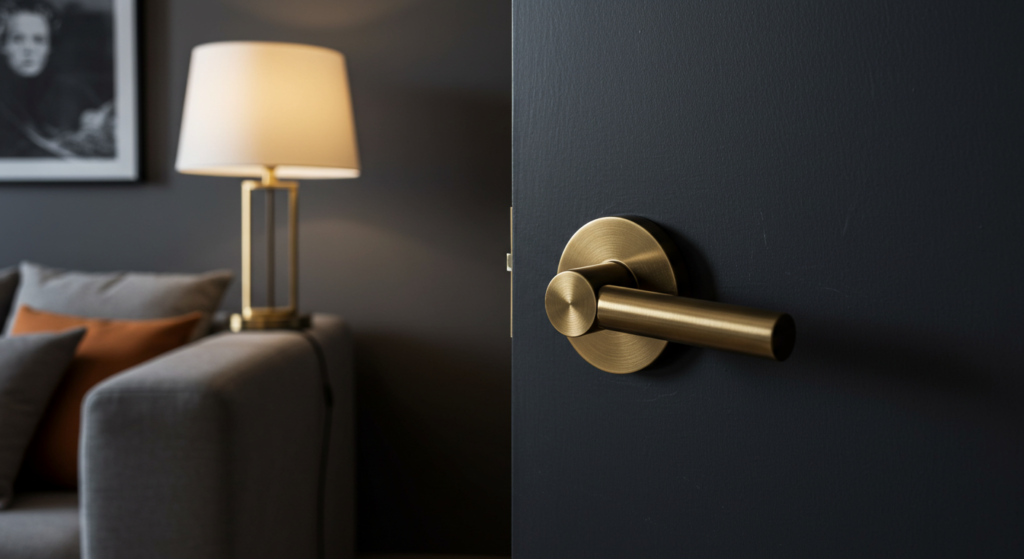
Textural Highlights
Bronze often appears in hardware—door knobs, drawer pulls, lamps. These items create a textural impact in an otherwise plain setting. The metallic gleam breaks up uniform backgrounds. When used thoughtfully, these touches of bronze help a space or design pop. Even small sprinklings of bronze can shift your perception, adding interest and depth.
Reflective Qualities
Compared to matte browns, bronze offers subtle reflection. This reflective side can enhance dimension in a room or design layout. It may also contribute to a sense of motion or brightness if angled near natural light. Designers often use bronze mirrors or metallic wall pieces to enlarge tight interiors. This trick accentuates space without overwhelming the overall scheme.
Bronze and Branding: A Unique Identity
Fostering Trust
Brands often chase colors that exude stability and trust. Bronze, with its sturdy undertones, can help a company appear grounded. Consumers might see a bronze logo and sense reliability. For organizations dealing with long-term commitments—like real estate or investments—bronze suggests they have a secure foundation.
Standing Apart From Gold
Gold is common in branding for luxury. But some audiences perceive gold as too flashy. Bronze, however, fills that gap by offering a refined touch without coming across as ostentatious. It may appeal to consumers who want sophistication but dislike overt glamour. This distinct choice can create a memorable brand presence.
Appropriate for Heritage Brands
Companies with a long history sometimes favor bronze to show their roots. The color’s link to tradition can match a heritage brand’s identity. A subtle metallic accent in logos or packaging can reinforce a story of craftsmanship and legacy. Such an approach draws on color identity to speak to loyal customers who value authenticity.
Bronze and Marketing: Standing Out From the Crowd

Emotional Connection
Marketing often relies on emotional cues, which colors can prompt. Bronze holds a steady, comforting vibe that can coax feelings of trust. When used in product packaging, it hints that the product has a warm, timeless appeal. This emotional branding approach stands out when competitors rely on cooler or more sterile shades.
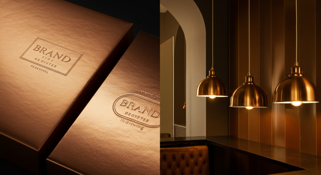
Premium Positioning
Bronze packaging signals quality without the same level of extravagance as gold or silver. Brands that want to appear slightly upscale—but still approachable—can harness bronze. This strategy may align with items that blend tradition and innovation, whether in gourmet foods, boutique beverages, or artisanal crafts.
Memorable Campaign Elements
Marketers seeking fresh visuals might consider bronze-tinged ads or digital banners. A bronze border or accent can catch the eye in a sea of typical colors. Pair this with text in white or black for clear contrast. The distinctive glow can become part of a brand’s signature across social media and print materials.
Bronze in Interior Spaces: Setting the Mood
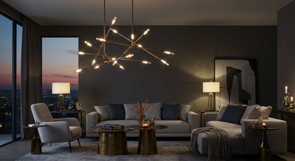
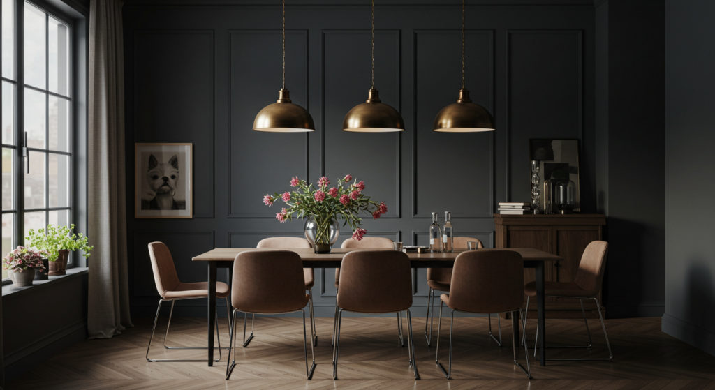
Cozy Lighting Effects
Lighting fixtures made from bronze cast a soft glow. Their warm metallic surfaces reflect bulbs’ light in a mellow way. This transforms a room into an inviting nook. A bronze chandelier or lamp can anchor a living space, producing an atmosphere that encourages relaxation and intimate conversation.
Rustic or Modern?
Bronze can lean either rustic or modern, depending on the surrounding décor. Against reclaimed wood and earth tones, bronze accents emphasize a pastoral feel, reminiscent of country living. In a sleek, contemporary space with minimal clutter, the same bronze piece reads as artistic and bold. Its versatility allows it to adapt to many styles.
Pairing With Textiles
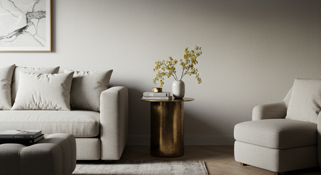
Think about your curtains, pillows, or rugs. When you add bronze details—like a bronze-framed mirror or side table—these pieces can tie a room together. Bronze frames near plush or woven fabrics bring contrast. You get a mix of metal and textiles, leading to a balanced look that feels curated yet comfortable.
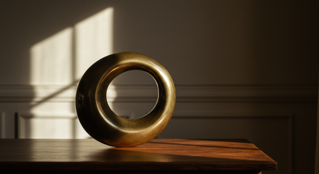
Bronze in Art: Telling a Story Through Symbolic Colors

Sculptural Heritage
Artists and patrons have revered bronze for centuries. Sculptures made of bronze often survive across eras. This durability reinforces the color’s symbolism of longevity and resilience. Art historians see it as an ancient medium that still resonates with modern audiences.
Painted Expressions
Not all bronze art is literal metal. Painters use bronze-like pigments to convey warmth. They might incorporate metallic highlights that shift under changing light. These shimmering sections can represent movement, energy, or transformation. In abstract pieces, bronze areas might evoke the earthy side of the color wheel.
Combining Bronze With Other Symbolic Colors
Artists who explore colors and emotions sometimes merge bronze with bright hues to highlight contrast. Bronze next to vibrant reds can suggest passion anchored by wisdom. Placed beside cool blues, bronze may hint at calm strength. The interplay of colors weaves a complex emotional tapestry that catches the viewer’s eye.
Bronze in Nature: Inspiration From the Earth

Natural Metals and Minerals
Bronze itself is an alloy, but the metals behind it—copper, tin, sometimes zinc—come from the earth. These raw materials have a rustic beauty. They inspire color palettes that feel organic. Many design ideas stem from observing stones, ores, and patinas found in natural environments.
Earthy Landscapes
Picture a late afternoon field with tall, sunlit grasses turning golden-brown. That moment echoes a bronze hue. Nature offers color narratives where bronze emerges in tree bark, autumn leaves, or soil with coppery tones. Designers often pull from these visuals when creating mood boards for interior or brand themes.
A Time-Honored Connection
Humans have relied on bronze for millennia. This ongoing relationship reveals how we find meaning and utility in natural elements. Whether forging a statue or mixing paints, we keep discovering fresh ways to appreciate and interpret bronze’s essence in our daily lives.
Psychological Effects of Bronze: Subtle Influence on Behavior

Encouraging Stability
Psychological color analysis often shows that brown and earth tones create a sense of security. Bronze inherits that grounding influence. Subconsciously, people may feel more anchored in a setting that includes bronze fixtures or accents. This stable effect helps foster calm moods in workplaces or public areas.
Sparking Curiosity
Bronze’s glow can spark mild intrigue. It’s different from typical neutrals and far from overly bright colors. Visitors to a home or event might pause to examine a bronze sculpture, noticing its subtle shine. This curiosity can encourage conversation and add a sense of discovery.
Supporting Confidence
Because bronze stands as a balanced metal color—less flashy than gold, more unique than brown—it can bolster confidence. In marketing materials, it signals a steady foundation without shouting for attention. The psychological effects of color remind us that such nuances can shape how an audience perceives a brand, a product, or a space.
Bronze Trends: Staying Timeless Yet Modern
Shifts in Popularity
Color trends come and go. Bronze, however, keeps a steady following. Interior design cycles show phases where brass or brushed nickel take the spotlight. Yet bronze remains an option for those wanting something warm and appealing. Its consistent presence points to its timeless character.
Resurgence in Decor
Many modern homeowners rediscover bronze hardware. They combine it with fresh color palettes, such as cool grays or off-whites. This keeps spaces bright while featuring a cozy accent. Some choose bronze over gold or silver because it adds a handcrafted vibe without looking dated.
Incorporating Contemporary Finishes
Recent finishes like oil-rubbed bronze or aged bronze keep the color relevant. They carry a hint of texture that aligns well with industrial or artisanal interiors. These finishes can also soften harsh lines, bridging the gap between modern architecture and classic charm.
Color Pairings: Harmonizing With Bronze

Complementary Tones
If you want a bold look, place bronze beside teal or turquoise. This color palette draws on the warm-cool contrast that feels dynamic yet balanced. Bronze also pairs well with burgundy for a rich, layered effect. Both combinations yield a confident statement in branding or interior design.
Subtle Neutrals
For a calmer approach, surround bronze with creamy neutrals. Think beige, taupe, or even light gray. These colors let bronze accents stand out. The result is a subdued environment where touches of bronze give definition and spark. Consider this for living rooms or brand assets aiming for understated elegance.
Textural Considerations
Remember that bronze involves shine. Pairing it with matte textures—like chalky paint or soft textiles—heightens its reflective aspect. Conversely, layering it near glossy surfaces can produce a mesmerizing interplay of reflections. Balance is key. Too many competing shines can overwhelm, while too many dull surfaces may hide bronze’s unique glow.
Actionable Tips: How to Use Bronze in Different Contexts
In Branding
- Logo Accents: Add a thin bronze outline or metallic detail to a simple black-and-white logo. This upgrade can inject warmth and sophistication.
- Packaging: Use bronze foil stamping for product labels or boxes. This subtle shine often signals quality.
- Digital Design: Apply bronze to banner backgrounds in online ads, particularly for high-end or artisanal products.
In Interiors
- Statement Fixtures: Choose bronze faucets or drawer pulls in a kitchen or bath. This detail can unify a design and draw the eye.
- Lighting: A bronze chandelier or pendant light radiates warmth. Dimmer switches highlight the metal’s reflective side.
- Wall Art: Hang a bronze-framed mirror or a metallic print to break up flat wall surfaces.
In Fashion and Accessories
- Jewelry: Bronze earrings or bracelets offer a vintage vibe without heavy cost.
- Footwear: Metallic bronze shoes or accents on boots can elevate casual wear.
- Handbags: A bronze buckle or zipper detail stands out on a neutral bag, adding just enough flash.
Overcoming Challenges: Avoiding Bronze Overload
Balancing Metallics
It’s easy to overdo metals. If bronze is the star, limit other metallics like gold or silver. Too many different sheens can lead to visual chaos. Instead, pick one main metallic accent and keep the rest subdued. This approach allows bronze to shine on its own.
Maintaining Tasteful Placement
Bronze can look overwhelming if it covers vast surfaces. Instead, feature it in smaller doses. A bronze focal piece draws attention. Meanwhile, neutral surroundings keep the overall effect from feeling cluttered. This principle applies whether you’re decorating a space, designing a website, or styling an event.
Avoiding a Dull Look
Bronze pairs well with certain neutrals, but if everything in a room is brown-ish or gray-ish, the result might feel drab. To solve this, add pops of color, such as greenery or subtle blues. These additions ensure bronze remains the hero but doesn’t drain the space of energy.
Conclusion
Bronze stands as a color that merges warmth, class, and understated charm. This unique blend of earthiness and metallic sheen offers practical uses in branding, interior design, art, and beyond. Its enduring popularity showcases how it speaks to a deep human desire for comfort and reliability.
Whether you choose bronze for a brand logo or a set of kitchen fixtures, its emotional impact remains steady. It fosters trust, sparks curiosity, and brings a gentle glow. Throughout history, bronze has carried cultural color meanings of wisdom and craftsmanship, and it still draws admiration in modern contexts. Its comforting effect, paired with its subtle shine, invites people to slow down and appreciate genuine quality.
In color psychology research circles, many see bronze as a grounded choice that reflects stability and confidence. Yet it never feels stale. Bronze adapts across eras and styles, offering a fresh take on metal finishes and earthy palettes. Now that you’ve explored bronze color symbolism and its many applications, you can integrate it into your designs, branding, or personal spaces with renewed creativity. Take a risk with bronze. Let its quiet strength elevate your next project.
Summary Table

| Aspect | Key Points |
|---|---|
| Symbolism | Resilience, warmth, class |
| Personality Traits | Reliable, creative, wise |
| Emotional Impact | Encourages trust, sparks curiosity |
| Cultural Meanings | Ancient associations with craftsmanship and humility |
| Branding/Marketing Use | Suggests stability, premium feel without flash |
| Design Tips | Works best with neutrals or bold contrasting shades |
| Interior Applications | Great for fixtures, lighting, frames |
| Artistic Perspectives | Longstanding choice for sculptures, modern metallic highlights in paintings |
| Psychological Effects | Fosters calm confidence, invites subtle attention |
| Challenges | Balance metallic tones, avoid too many shiny surfaces |
| Pairings | Complements teal, burgundy, cream, and gray |
| Timeless Appeal | Retains popularity across design trends |
| Actionable Insights | Use in logos, packaging, lighting, hardware, accessories |
| Overall Essence | A warm, lasting color that exudes richness and quiet strength |
FAQ

Q: Is bronze better than gold for an elegant brand image?
A: “Better” depends on the brand’s identity. Bronze has a grounded, warm quality that can feel less flashy than gold. If you need a refined yet approachable vibe, bronze might outshine gold. If you want a more traditional luxury look, gold remains a classic choice.
Q: How can I keep bronze accents from looking old-fashioned in my home?
A: Pair bronze with contemporary materials like glass or brushed concrete. Choose sleek silhouettes for fixtures and keep the color palette balanced. This helps bronze look modern instead of dated.
Q: Does bronze work for minimalist interior styles?
A: Yes. Use clean lines and a mostly neutral palette. A single bronze accent—like a chandelier or a small side table—can become a focal point. This approach provides warmth without compromising minimalism.
Q: Can I mix bronze with other metals in one room?
A: You can, but do so sparingly. Combine two metals at most. One can be your main metallic color, while the other appears in smaller details. This prevents an overly busy look.
Q: Is bronze suitable for corporate branding?
A: Absolutely. Bronze can suggest dependability and tradition. It often fits well with companies wanting to appear stable and genuine, while still standing out from typical corporate blues or grays.
Q: Will bronze clash with vibrant colors like red or orange?
A: Not necessarily. Bronze and red can create a rich, layered impression. If you fear overload, choose a muted shade of red or use small pops of red. With orange, proceed similarly. Adjust the intensity so bronze remains the star or an equal partner.
Q: Does bronze hold any spiritual or symbolic meaning?
A: Various cultures view bronze as a symbol of endurance, wisdom, or craftsmanship. Some tie it to religious ceremonies and see it as humble yet valuable. The specific meaning depends on personal and cultural perspectives.
Q: Can bronze accents work in children’s rooms?
A: They can, though children’s spaces often feature brighter or softer colors. If you want bronze in a child’s room, use it in small details, like drawer pulls or lighting. Pair it with fun, lively patterns so the room stays playful.
Q: How do I keep bronze surfaces shiny and clean?
A: Generally, wipe bronze with a soft cloth and mild soap. For real bronze items, periodic polishing can maintain its gleam. Always check care instructions for specific finishes (e.g., oil-rubbed bronze) to avoid damage.
Q: Is bronze a cool or warm color?
A: Bronze falls on the warm side. Its undertones stem from brown and gold, which both lean warm. Still, it’s not as bright as many warm shades. This subtlety helps it blend well in different color schemes.
Q: Does bronze represent third place because of bronze medals?
A: Some tie bronze to a third-place finish, but in everyday design or branding, the association isn’t that strong. Instead, it’s often viewed as an earthy metal that projects timeless value.
Q: Are there variations of bronze I should know about?
A: Yes. You’ll find finishes like oil-rubbed bronze or antique bronze. Each finish carries a distinct tone and texture. Pick the variation that best suits your style—some look darker and more rustic, while others appear lighter and more polished.
Q: Can bronze help me sell more products?
A: If it aligns with your brand, bronze might catch the eye and convey quality. This can help differentiate products from competitors. Pair it with strong brand messaging and compelling packaging design for best results.
Q: What is the main reason people choose bronze in design?
A: Many appreciate its warm glow and sense of history. It offers elegance without the glare of brighter metals. Designers often reach for bronze when they want a comfortable yet refined accent that stands out in a subtle way.
By using bronze thoughtfully, you can tap into its fusion of warmth and class—a blend that resonates with many audiences. Whether you place it in your home, brand it on your product line, or feature it in artwork, bronze invites a sense of authenticity, tradition, and understated prestige. Enjoy experimenting with this versatile color and see how it can enrich your creations.

Gabrielle J. Smith is the pulsating essence that brings life to the world of fashion and color. With an innate talent for understanding the nuances of hues, she has the uncanny ability to paint narratives with her words, diving deep into the realm of color trends and the art of harmonizing them. Not just an expert in the field, Gabrielle also plays a pivotal role in strengthening the cohesion of our team, ensuring growth and harmony. Each of her articles is a testament to her passion, weaving captivating tales that resonate with readers and fashion aficionados alike.
Reviewed By: Joanna Perez and Anna West
Edited By: Lenny Terra
Fact Checked By: Matthew Mansour
Photos Taken or Curated By: Matthew Mansour