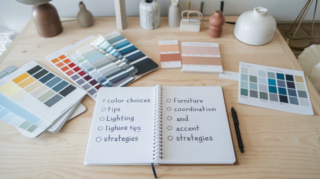
Key Takeaways
- Pick a central hue to unify all spaces.
- Check undertones so colors don’t clash under certain lighting.
- Balance warm and cool tones to maintain harmony.
- Use accent hues in small quantities to tie rooms together.
- Coordinate furniture and textiles for consistent flow.
- Test color swatches under different light conditions.
- Try patterns that support your main palette.
- Remember neutrals can be powerful linking elements.
- Consider seasonal swaps for fresh variety.
- Accessorize mindfully to keep each room cohesive.
Have you ever strolled through a house and felt each room was telling a totally different story? One bedroom might look like a beach retreat, while the hallway looks like a moody library. This mismatch can throw off the entire feel of your home. If you want to avoid that chaos, a cohesive color scheme is your best friend.
I recall a time I visited a friend’s home. She had bright orange cushions in her living room next to a pea-green rug that seemed to protest its own existence. While each item alone was stunning, together they staged a riot of color that felt disjointed. If you’re seeking to avoid a bumpy ride like that, read on.
Cohesion doesn’t mean every room has to wear the exact same color. Instead, it means there’s a visual plan that links each space. You might carry a color family from one area into the next, or you might choose small accent pieces that connect the dots. Let’s explore the steps. If you’re wondering if it’s easy, it can be simpler than folks expect, but it does require some planning.
By the end of this long read, you’ll have tips, product suggestions, unusual ideas, and plenty of examples. I’m excited to dive in. Let’s begin with a crucial starting point: choosing that foundational color.
Setting the Foundation with a Main Color

Consistency in home decor often starts with a single main color that sets the tone. But how do you pick it? Are you craving bright? Maybe calm? Let’s see.
Choose a Timeless Hue
Timeless means it won’t appear outdated next year. Some folks love deep navy, while others love gentle cream. A color like soft gray can ground many decor styles. The question is: will you tire of it fast? Try to think about how you’ll feel in six months.
Pick a color that can handle shifts in trends. If you like a bit of drama, you might choose a serene charcoal. If light is your preference, go for a breezy ivory.
Small grammar slip: People sometimes say “I want a long-lasting color scheme that doesn’t get me bored too soon,” but be sure to consider more than your immediate excitement. Think about guests or your future self.
Test Paint Swatches
Homeowners might skip sampling. That’s a big mistake. Paint swatches exist for a reason: you need to see how light hits that color at 9 AM, 2 PM, and 7 PM. Put swatches on your walls or even big poster boards. Move them around to see if they still sing in shady corners or near windows.
Consider how different bulbs (LED vs. incandescent) affect the hue. Warm bulbs can turn a pale blue into a greenish color. Might that be a problem for you? Possibly.
Coordinate with Key Furniture
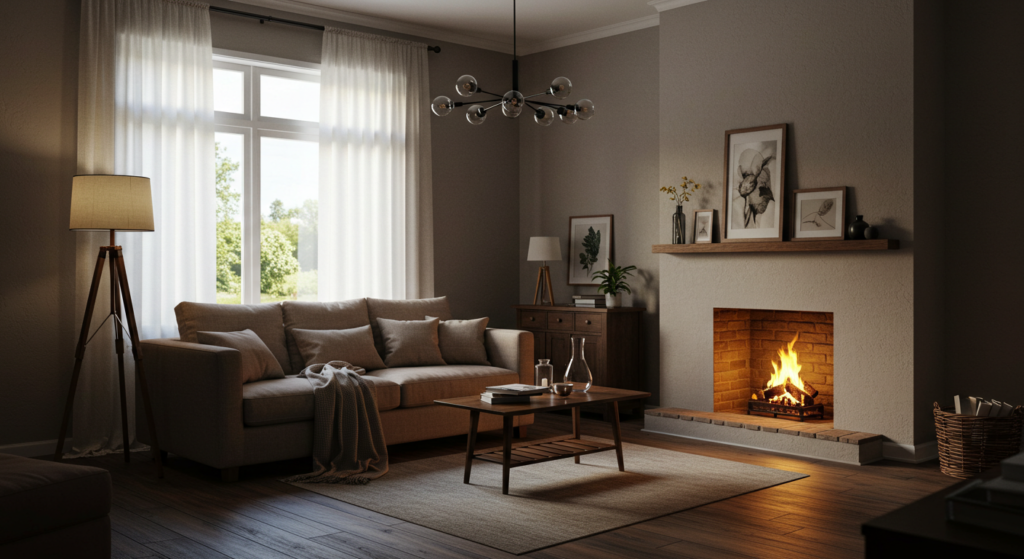
You might own a gorgeous sofa. If it’s teal, you can revolve your palette around it. Perhaps your dining set has a dark walnut finish. That finish might prefer a warm beige or a gentle olive on the walls. Or you might have a high-contrast living room that wants a neutral background to let bold furniture pop.
Think about big items like rugs or wardrobes. Let them guide your choice. Often, color synergy emerges when main furniture plays nicely with wall paint and accent pieces.
Understanding Undertones

Undertones are like sneaky color ninjas. You think you’ve selected a straightforward beige, but under certain light, it reveals a pink or green side. That can catch you off guard.
Recognizing Cool vs. Warm
It’s not rocket science. A warm undertone leans red, yellow, or orange. A cool undertone leans blue, green, or purple. If you find a gray that looks a tad purplish, you’ve got a cool undertone. If your cream looks slightly peachy, it’s warm.
Check your color chip against a blank sheet of white paper. You’ll see if it reads more warm or cool. Don’t forget to do the same test at your local paint store.
Matching Undertones with Decor
Your big green couch might reveal a warm or cool note. Suppose it has a golden hue in certain lighting. Then your walls might need to match that warmth. If you mismatch undertones, your eyes might detect subtle discord.
Small grammar error is ok sometimes, so here’s one: “You don’t want your walls feeling like they belong in another home entirely, do you.” That would be sad.
Practice with Simple Neutrals
Sometimes, neutrals can be trickier than bold tones. A warm white might clash with a cool rug. If you’re not sure, compare a few neutrals side by side. One might appear pinkish next to another that’s more beige. Suddenly, you realize how tricky undertones can be.
Considering Light in Each Room
Light can shift a color’s appearance. One room might get tons of sunlight, while another is in the basement. This factor matters when you want to maintain a cohesive scheme.
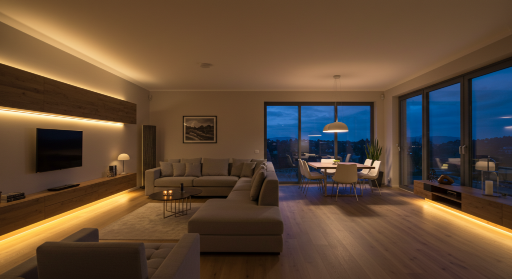
Natural vs. Artificial Lighting
If you have large windows in your living room, color might glow during the day. By night, your lamps can alter that glow. Something that looks fresh in daylight can feel dull under a lamp’s warm bulb. In a dark hallway, you might choose a lighter shade from the same color family so it feels consistent but brighter.
Direction of Light
North-facing rooms can feel cooler, so a color with warm undertones might balance that. South-facing rooms can handle cooler undertones if you want them to keep a balanced feel. East or west windows might shift color appearances throughout the day.
A small question: do you want the same paint color in these rooms, or do you want to adapt it for each exposure? You can do either. Some pick a lighter or darker version of the base color for variety.
Choosing Flexible Bulbs
LED bulbs come in different color temperatures: warm white, daylight, etc. You can unify your home’s color scheme by choosing consistent bulbs. If your hallway has warm white bulbs, keep the same style in other rooms. That helps colors remain stable from space to space.
Coordinating with Furniture and Floors

Walls are important, but they don’t exist in a vacuum. Your floors and furniture matter. If your floors are a cool gray laminate, will a bright orange accent wall complement that? Possibly, but only if you do it with intention.
Think About Floor Tones
Hardwood might have a red or golden tone. A tile floor might lean gray, while vinyl could be neutral or warm. A big question: do you want a contrasting wall color or something that flows easily? For instance, a golden oak floor might pair well with earthy browns or greens, tying in a nature-inspired palette.
Furniture as Color Guide
Maybe your largest item is a navy velvet sofa. That could guide everything from accent cushions to drapery. If your dining chairs are turquoise, you might want to echo that color in the adjacent living space with smaller accessories or even a piece of art.
Rugs and Curtains
A rug can anchor a room. If your rug is a bold, patterned piece, its colors can unify the rest of your decor. Curtains also add vertical color. If you want your open-concept space to flow, keep the curtain color in a similar palette from room to room. A mismatch can jar the eye.
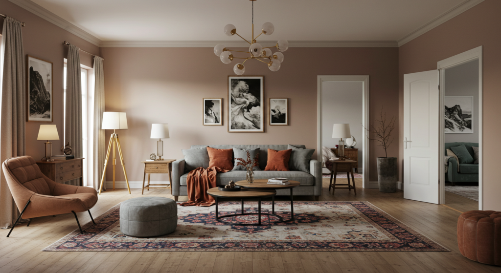
Combining Warm and Cool Tones

Cohesion doesn’t mean you only pick warm or only pick cool. Mixing them can create a unique balance, but you need to do it with some caution.
Pairing Opposites
Some folks try a warm taupe with cool-toned accessories like a teal vase or a pale blue cushion. That contrast can feel dynamic. Another approach is using cooler wall paint but introducing warm wood furniture. Such combos can keep a space from feeling flat.
Transitional Spaces
Hallways or entryways can help transition from one color temperature to another. If your living room is mostly warm neutrals and your kitchen is in the cooler range, a transitional area can share elements from both color groups. Maybe a runner rug in the hallway has both warm browns and cooler blues.
Keep Ratios Balanced
If your main color is warm, let cool accents be about a quarter of the overall palette. A small mismatch can create tension, but if you keep the ratio in check, it looks intentional. Overdo it, and the space might appear confused.
Embracing Neutrals as a Linking Element
Neutrals like white, beige, gray, and greige can act as bridges between different spaces. They keep the look cohesive while allowing each room its own personality.
Selecting a Consistent Neutral
Choose one or two base neutrals. Maybe it’s a classic white trim and a soft gray wall in most spaces. That means if you vary accent colors in each room, they still belong together since your neutral base is consistent.
Layering Shades of Neutrals
Mixing multiple neutrals can add depth. Perhaps the living room has a cozy beige sofa, and the hallway has a crisp white bench. Both can complement a uniform trim color. As you walk through the home, the shared neutral presence keeps things tied together.
Creating Visual Breathers
Too many bold colors can tire the eye. Neutrals serve as a resting point. If you have a loud accent wall in the dining room, the neutral walls in the adjacent corridor give your eyes a break. No one wants a color carnival all the time, right?
Using Accent Hues Strategically

An accent hue can act like a ribbon that links each space. You might pick an unexpected pop of color, like mustard, coral, or mint, and repeat it in small ways across rooms.
Small Pops, Big Impact
Accent pillows, decorative bowls, lampshades, or art frames can tie a home together. It’s a fun approach if you love variety but still want a consistent thread. Maybe you love saffron yellow. Put a saffron throw pillow in your living room, a saffron vase in your kitchen, and saffron napkins in the dining area.
Rotating Accents
If you’re prone to getting bored, keep your accent items easy to change out. Curtains, cushion covers, or table runners can be swapped seasonally. That way, your base color remains cohesive, but you infuse new energy with accent changes.
Minor spelling mistep: “Changing accent pices can be a quick fix when you want to shift the vibe in a hurry.”
Consider Metallic Accents
Metallics like brass, gold, silver, or copper can also unify spaces. If you pick one metal finish (like brushed nickel), repeat it in light fixtures, cabinet pulls, and maybe side table legs. This subtle consistency can support your color choices.
Integrating Textiles for Color Flow
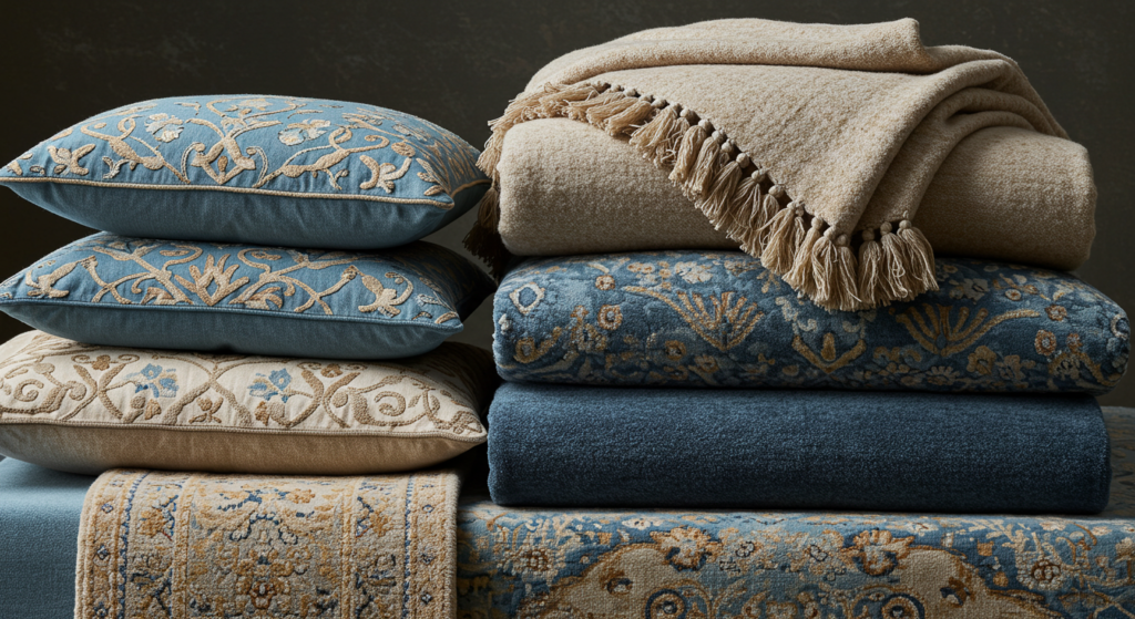
Textiles carry color and texture. They can bring comfort too. From soft blankets to throw pillows and area rugs, these pieces can keep your color scheme feeling consistent.
Match Textiles Across Rooms
If your sofa pillows in the living room are burgundy, maybe your bedroom’s throw blanket can share a burgundy tone. That continuity might appear small, but it helps tie the home together. You don’t have to be matchy-matchy, but a hint of the same color goes a long way.
Mix Materials
Different fabrics can highlight your main colors in fresh ways. Velvet in the living room, cotton in the kitchen, linen in the bedroom. As long as you keep a color theme, it can still look coherent. Variety in texture can add richness without losing the thread.
Layer Rugs
Open-concept homes sometimes need area rugs to define zones. You could select a neutral rug in the living area, while the dining rug includes a pattern that references the living room’s accent hue. This approach helps each space stand out while still connecting through shared colors.
Blending Patterns Wisely
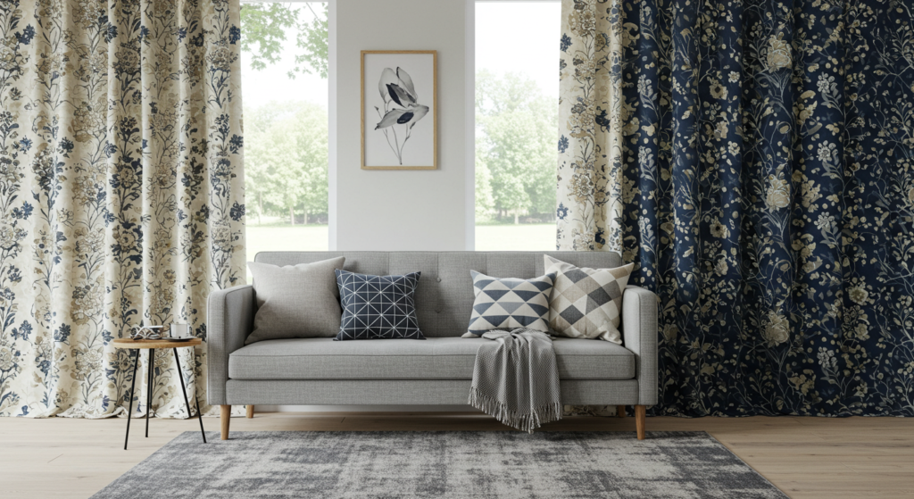
Patterns can add personality, but they can also turn chaotic if not curated. If you love stripes, florals, geometrics, or abstract prints, they can all exist together with the right strategy.
Stick to One Color Palette
A striped navy-and-white pillow can coexist with a floral curtain if both share navy or white as a base. Meanwhile, you can introduce geometric patterns in a rug that also includes those same hues. Don’t worry if they differ in style, as long as the color family is consistent.
Scale of Patterns
Vary the size. A large floral print pairs well with smaller stripes. If everything is large-scale, the room can feel visually noisy. If everything is tiny-scale, it might feel busy, too. Keep a mix of big and small.
Use Solids to Ground Patterns
If you go heavy on patterns, you might need solid pieces to break them up. Maybe your sofa is a solid hue, while accent pillows show different patterns. Or your bedding is patterned, but the headboard remains a solid neutral color.
Linking Trim and Ceiling Colors

Some folks forget about trim and ceilings. They can unify or break a color scheme depending on how you paint them.
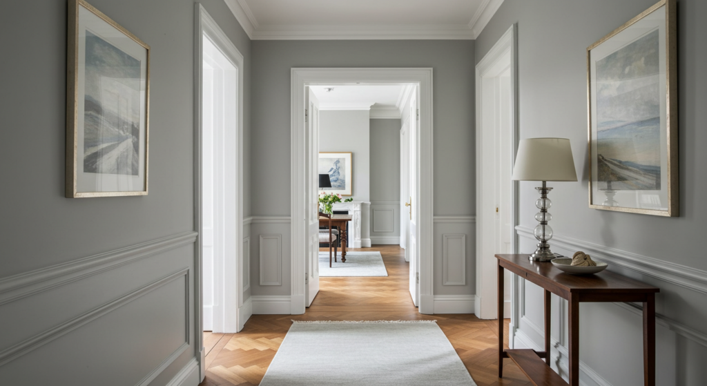
Consistent Trim Across Rooms
Choosing a classic white or off-white for all trim can unite different wall colors. If each room’s trim is the same color, you create a visual line that ties spaces together.
Ceiling as a Canvas
People often default to white ceilings. But you could try a slight tint that complements your wall color. If you have a very pale gray on the walls, a ceiling that’s a lighter version of that gray can appear cohesive and sophisticated.
Accent Ceiling
In some cases, painting the ceiling in a bold accent color can become a statement. This might work best in a dining room or a bedroom. If you do it, keep the trim consistent throughout your home to maintain flow.
Creating Multi-Room Flow
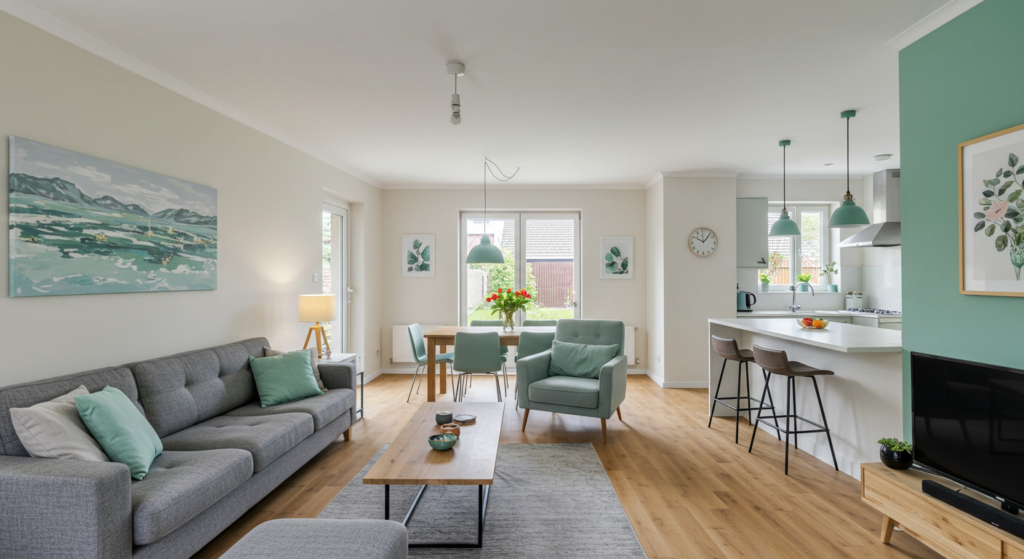
If your home is open-concept or you simply want each room to flow into the next, you need a clear plan so your color scheme doesn’t feel random.
Choose a Palette of Three to Five Colors
Pick three to five main colors that you love. Assign each room a different combination from that pool. This method ensures the whole home feels connected, but each room still has its own identity.
For instance, if your palette is navy, ivory, sage, and gold, you might focus on navy and ivory in the living area, sage and gold in the bedroom, and a mix in the hallway.
Transition Zones
Pay attention to doorways or open archways. If you can see the next room from your current room, ensure the colors complement. Perhaps the accent pillow in the living room is the same color as the wall in the dining area. That visual connection can smooth out transitions.
Keep Flooring Consistent
Having the same flooring throughout multiple areas can do wonders for unity. If you need different flooring (like tile in the kitchen, wood in the living), try matching color tones. That helps each floor type blend with the other.
Seasonal Adjustments

Our home might want a fresh vibe in different seasons. Some people switch out decor to reflect changes in temperature or daylight hours. Let’s talk about a few easy ways to do that without messing up your cohesive palette.
Lighten Up in Warmer Seasons
In spring or summer, you can swap heavy blankets for lighter throws and pillows. Choose items in cooler hues if your base is neutral. That can keep your rooms breezy.
A mild grammar slip: “No reason to keep that thick plush blanket out in July, it might make you sweat.”
Deepen Colors in Colder Months
When autumn or winter arrives, bring in richer shades. Swap those airy drapes for heavier fabric in the same color family. If your accent hue is navy, go for plush navy velvet pillows or a darker navy table runner.
Decor Elements
Use season-appropriate decorations that match your main palette. For instance, if your accent color is burgundy, add small burgundy pumpkins in fall or burgundy ornaments during holiday season. Maintaining your chosen color keeps your home’s scheme intact while still feeling seasonal.
Sticking to a Budget
Creating a cohesive color scheme doesn’t need to break the bank. There are frugal ways to keep everything aligned.
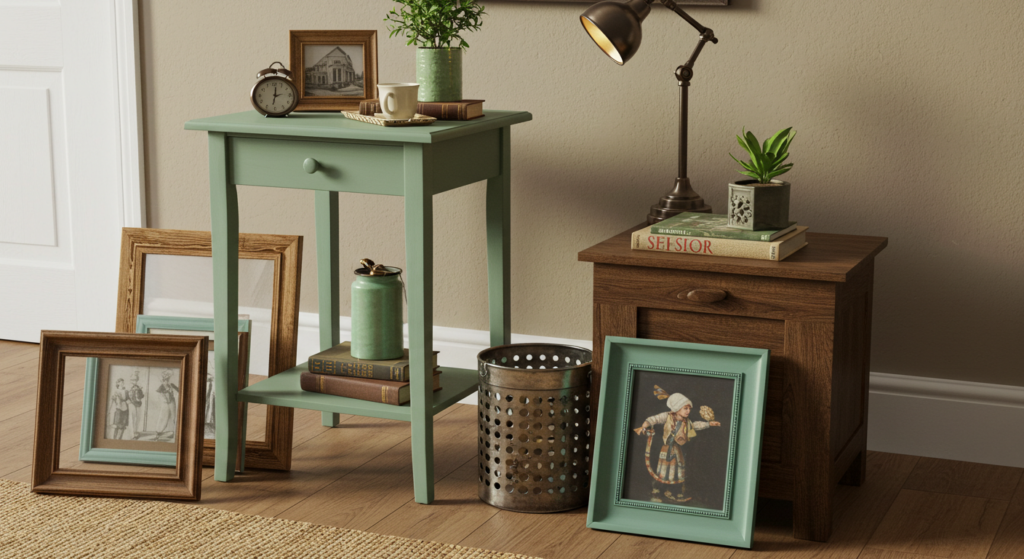
Reuse and Repurpose
Sometimes you can repaint old frames, chairs, or shelves in your chosen accent color. Replacing everything can be expensive, but a quick coat of paint or new upholstery can tie pieces together.
Shop Secondhand
Thrift stores, online marketplaces, and garage sales can yield amazing finds. You might stumble upon a lamp that, with a new shade, suits your color plan. Or an old coffee table you can refinish. This can keep your color scheme consistent without costing a fortune.
Paint as the Great Unifier
Paint is one of the cheapest ways to unify. If your budget is small, invest in paint. For example, using a consistent trim color or painting mismatched furniture in a single color can unify a space fast.
Accessorizing for Harmony

Accessories let you add personality without overshadowing your main color scheme. They can finalize your cohesive look in small but meaningful ways.
Display Coordinated Collections
If you collect items, display them in a color that fits your plan. Maybe a set of matching ceramic vases or a series of teal glass bottles on a shelf. This repetition of color can bring a sense of unity.
Artwork and Photography
Choose frames that match your trim or accent color. Or pick art that features colors from your palette. A painting with bits of your main hue can subtly reinforce the overall theme.
Little Details Count
Coasters, napkin holders, or small desk organizers can all reflect your color scheme. That might sound too detailed, but these finishing touches can tie the entire look together when repeated across different spaces.
Incorporating Unusual Color Splashes

Sometimes, you want a surprising twist that doesn’t derail the entire palette. Let’s explore some offbeat ideas.
A Bold Doorway
Painting an interior door in a bright hue can energize your space. If your palette is mostly neutrals, a pop of aqua on a door can be exciting. Just ensure that door color appears somewhere else, like in a pillow or table centerpiece, to avoid a random look.
Unexpected Furniture Color
Try painting the inside of a bookshelf in a vivid color. Or pick a bright barstool seat in the kitchen. These surprises can keep your cohesive scheme from becoming dull, especially if that color ties back to another accent in the living area.
Painted Furniture Legs
Sometimes painting just the legs of a table or chairs with your accent hue can link spaces in an unassuming way. Imagine a white table with bright coral legs that match your coral throw pillows. Quirky, but fun.
Finalizing the Look with Personal Touches

Now that you’ve established paint, furniture coordination, and accessories, it’s time to add your unique flair. This is where your home truly becomes yours.
Family Heirlooms
Got a vintage clock from grandma? Work it into your color scheme. Maybe you repaint it or place it near items that match its existing color. Blending these sentimental pieces with your palette can make your decor look more meaningful.
Sentimental Artwork
Photos or art you love can be framed in your accent color. Or you can choose black frames if that helps unify a more varied set of artwork. Either way, your personal items become part of the grand color plan.
One Quick Personal Anecdote
I once hung a painting my cousin made that featured a swirling teal wave. At first, it seemed at odds with my mostly neutral living room. I ended up adding teal pillows and a teal-trimmed rug, and the painting suddenly felt like it had always been there. A small twist changed my entire living space.
Conclusion
Choosing a cohesive color scheme isn’t rocket science, but it does demand forethought. By focusing on a main color, watching undertones, and harmonizing furniture with walls and accessories, you can transform each room into a delightful extension of a bigger, unifying vision.
Remember that you don’t have to be boring. You can mix and match patterns, or highlight surprising accent hues. You can even shift things seasonally. If you keep a consistent thread—be it a neutral base, repeated accent color, or unified trim—your home will feel like one complete story rather than several random chapters.
When you’re done, you’ll have a home that impresses guests and feels comforting to live in every day. And if you ever decide you want a change, you can switch out small items or repaint furniture. Your foundation remains stable, letting you easily adapt as your tastes evolve.
So go forth, gather your paint chips, rummage through your decor stash, and make each room a part of a cohesive whole. Your eyes—and maybe your friends—will thank you.
Summary Table
| Element | Tips | Purpose |
|---|---|---|
| Main Color | Pick a hue you won’t tire of; test in various light. | Sets the overall mood and anchors the scheme. |
| Undertones | Match warm or cool undertones with furniture & floors. | Prevents clashing and maintains harmony. |
| Lighting | Consider natural & artificial; pick consistent bulbs. | Keeps color appearance stable throughout the home. |
| Furniture | Coordinate big items (sofa, table) with chosen colors. | Ensures each room ties into the core palette. |
| Accent Hues | Use pillows, vases, or frames for repeating color pops. | Links rooms without painting every wall the same color. |
| Neutrals | Carry a neutral base; create visual “breathers.” | Bridges different spaces; prevents color overload. |
| Patterns | Combine prints that share color families; vary scale. | Adds interest without causing chaos. |
| Trim/Ceiling | Keep trim consistent; consider tinted or accent ceilings. | Ties rooms together; offers subtle or bold statements. |
| Multi-Room | Use 3-5 colors for the entire home; vary combos. | Maintains flow while giving each room uniqueness. |
| Seasonal | Swap lighter/warm items in spring-summer, heavier in winter. | Refreshes look without redoing entire palette. |
| Budget | Paint, upcycle, shop secondhand. | Achieve cohesion without overspending. |
| Accessories | Unify with frames, pillows, table decor, or small items. | Finalize the color link across rooms. |
| Unusual Pops | Try painting doorways or furniture legs. | Creates fun surprises while staying within palette. |
| **Personal Touch | Display heirlooms or art that fit your palette. | Makes the space truly yours. |
FAQ

Q: How do I avoid making my home look too uniform if I use the same color in every room?
A: Use different shades or tones of that color in each room. Add accent pieces in a complementary hue for variety. Keep a shared thread (like consistent trim), but let each space have a unique twist.
Q: Can I mix different wood tones in a cohesive color scheme?
A: Absolutely. Keep an eye on the undertones in your wood finishes. If you have warm-toned oak, pair it with other warm woods or bring in accent colors that complement those undertones. A unifying neutral can also help.
Q: Do I need to repaint if my floors clash with my chosen color palette?
A: Not necessarily. Use area rugs or layered textures to bridge that gap. Choose decor and accent hues that tie the floor color into your broader scheme. Repainting can help, but you might solve it by focusing on complementary colors in furniture and accessories.
Q: Which paint finish is best for a cohesive look—matte, eggshell, or semi-gloss?
A: It depends on the room. Matte can hide wall imperfections in bedrooms. Eggshell or satin is often used in living areas or kitchens, as it’s easy to clean. Semi-gloss can work well on trim or doors. Keeping your trim the same finish throughout can enhance cohesion.
Q: What if I hate the color I chose after painting one room?
A: It’s frustrating, but better to figure that out early. Try switching to a lighter or darker shade, or pick a new accent color that complements the disliked hue. You can also paint a small portion or a large poster board first to test before committing to all walls.
Q: How can I add patterns without making my space feel busy?
A: Stick to a color family. Vary the pattern scale—mix larger, bolder prints with smaller, more subtle prints. Use solid-colored items to give visual rests. That way, patterns remain intentional and not overwhelming.
Q: Is there a quick way to add color without painting the walls?
A: Yes, decorate with pillows, rugs, curtains, and art. You can also paint small furniture pieces or create an accent color on items like cabinet doors. Vinyl decals or removable wallpaper can also be used if you want something less permanent.
Q: Can I mix modern and vintage items in a cohesive color plan?
A: Of course. Use color as the link. Pick a main color or two and ensure that both the modern and vintage pieces share those colors or accent them. Mixing eras can look amazing when they’re tied together by consistent hues.
Q: How do I keep an open-concept space from feeling too scattered with multiple “zones?”
A: Use rugs, furniture layout, and partial wall paint changes to define each zone, but keep the same main color or accent color throughout. This visually separates areas while still feeling like one big, cohesive environment.
Q: My living room gets tons of sunlight, but my bedroom barely gets any. How do I maintain a consistent color scheme?
A: Choose the same base color but vary its shade. Use a brighter version in the dimmer room, so it appears consistent under low light. The sunny room can handle a deeper hue. Keep accent colors matching in both areas.
Q: Does each door have to be the same color throughout the house?
A: Not necessarily. Some people prefer consistency, but painting a special door in a fun accent hue can be charming. If you do so, repeat that accent color in other parts of the home to avoid a random mismatch.
Q: Are there any rules about matching hardware and light fixtures to the color scheme?
A: You don’t have to match them all perfectly, but keep them complementary. For instance, if you choose brushed nickel kitchen handles, also use brushed nickel light fixtures. Mixed metals can look stylish if done carefully, but repeating one metal can tie the whole look together.
Q: I’m worried about going bold. Should I stick with neutrals for safety?
A: Bold colors can be exciting. If you’re nervous, start with a single accent wall or smaller accessories. You can build confidence as you see how it transforms the room. Neutrals are safe, but a bold pop can inject life into your home.
Experiment, have fun, and enjoy the vibrant sense of harmony that emerges when each room plays off one another. If something feels off, tweak small details until it clicks. Happy decorating!

Brenda Tillman is a color maestro who brings artistic brilliance to every piece she crafts. Passionate about imaginative expressions, she illuminates the world of fashion with her expert guidance on shades and combinations. Beyond her writings, Brenda is a culinary enthusiast and a global traveler, infusing her work with diverse insights. Her unique touch transforms simple color choices into art.
Reviewed By: Joanna Perez and Anna West
Edited By: Lenny Terra
Fact Checked By: Matthew Mansour
Photos Taken or Curated By: Matthew Mansour